Kitsch interior design is the rare decorating philosophy where more is genuinely more, and where a flamingo lamp sitting next to a velvet sofa isn’t a mistake — it’s the whole point. I’ve spent months testing color combinations and flea market finds in my own place, and nothing transforms a flat, forgettable room faster than committing to this aesthetic without apology. You need three things: a willingness to mix eras, a tolerance for loud color, and the nerve to ignore every minimalist mood board you’ve ever saved. Rooms that embrace kitsch interior design stop reading as spaces and start reading as personalities.
The word itself comes from the German verb “kitschen” — literally “to slap something together” — and 19th-century art dealers used it as a mild insult for cheap, sentimental work. Today it’s a badge of honor. Modern kitsch interior design pulls from 1950s Americana, 1970s maximalism, Pop Art, and childhood nostalgia all at once, and the result is rooms that feel like they’ve been lived in by someone genuinely interesting.
What you’ll find in this post:
- How to pull off a kitsch living room without it looking like a prop warehouse
- Kitsch bedroom layering — patterns, eras, and the one mistake everyone makes with bedding
- Kitschy kitchen decor: cabinet colors, retro appliances, and the backsplash move that works every time
- The color logic behind kitsch — why neon pinks and mustard yellows coexist without fighting
- What modern kitsch interior design borrows from Pop Art and what it leaves behind
A Kitsch Living Room Stops Being a Room and Starts Being a Point of View
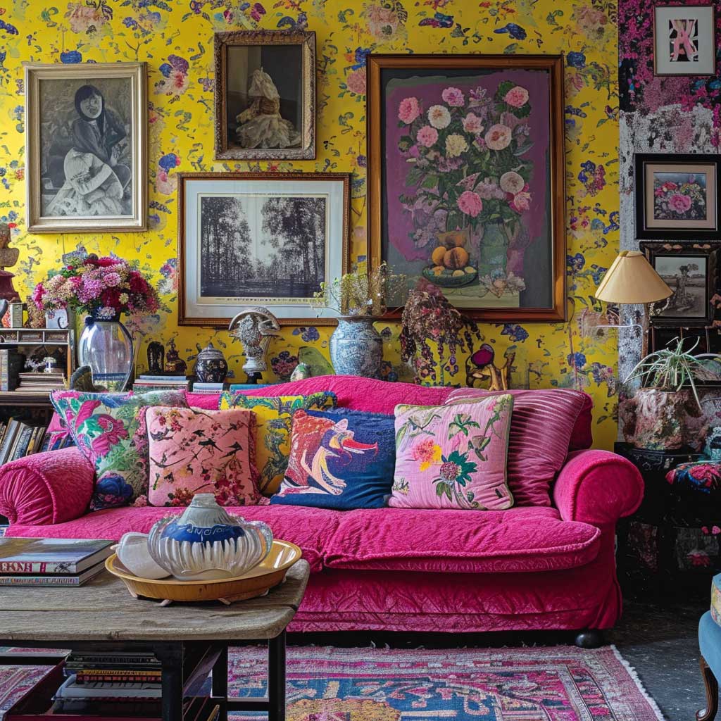
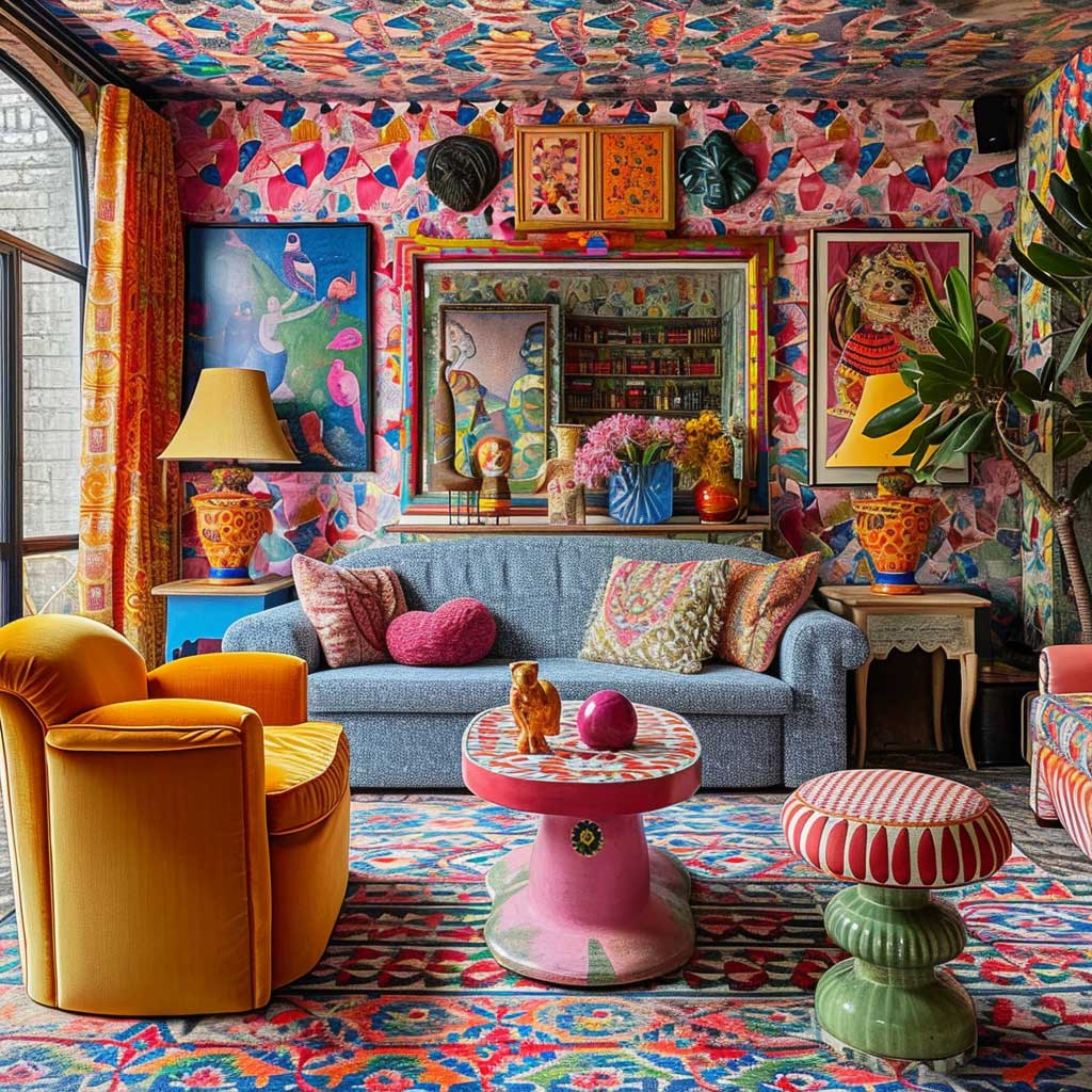

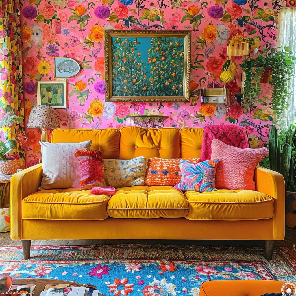
My go-to starting point for any kitsch living room is the wall treatment, and I never start with paint alone. Bold, retro-patterned wallpaper — the kind featuring oversized florals, op-art geometry, or actual Pop Art imagery — does the heavy lifting that no accent wall can replicate. You’ll notice that once the wallpaper goes up, every furniture decision becomes cleaner because the room already has a visual spine. Rooms without that anchor tend to look random rather than intentional, which is the single biggest failure mode in kitsch decorating.
Furniture in a kitsch living room functions like a casting director’s reel — each piece has to be interesting enough to deserve the frame. I’ve paired a $200 mustard-yellow velvet sofa from a thrift store with a $40 mid-century coffee table and the combination looks more deliberate than rooms where everything matches from the same retailer. The trick is a shared color thread: pull one hue from the sofa and repeat it in at least two other spots — a cushion, a lamp base, a ceramic on the shelf. Vintage sofas in velvet or boldly patterned upholstery are the anchor; modern, minimalist side tables stop the room from tipping into clutter.
Don’t layer every surface with objects at the same density. I stole this trick from a set decorator: imagine the room photographed from the doorway, then identify the three spots your eye lands first. Those three spots get your best pieces — a vintage lampshade, a pop culture figurine, a flea market print in a mismatched frame. Everything else supports them. Filling every shelf equally is what makes a room look like a storage unit rather than a kitsch interior design statement.
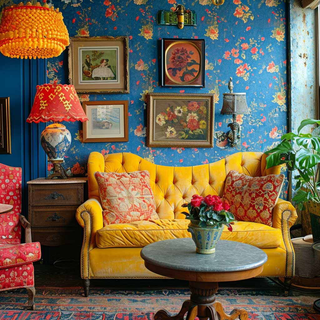


Color is where most kitsch living rooms either fly or crash. The palette I’ve seen work consistently: one electric anchor (neon pink, electric blue, acid green) paired with a mid-tone warm neutral on the largest furniture piece, then bright accents in two or three supporting hues. Floors and ceiling stay calm — natural wood, white, or concrete gray. You need that relief. A room where every surface competes at the same volume reads as visual noise, not kitsch interior design. Think of it like a band: the neon is the lead singer, the neutral sofa is the rhythm section.
What doesn’t work: matching your kitsch pieces to a single decade. Rooms that commit entirely to, say, 1970s styling lose the tension that makes kitsch interesting. It’s the collision between a 1950s ceramic poodle and a 2020s neon sign that creates the jolt. I own two of these neon signs — one reads “GOOD VIBES” in hot pink, one is a vintage-style martini glass — and they both look better next to old things than new ones. If you want to understand how kitsch sits within the broader maximalist tradition, this breakdown of maximalist interior design covers the shared logic between the two approaches.
Kitsch Bedroom Layering Rewards the Collector, Not the Shopper


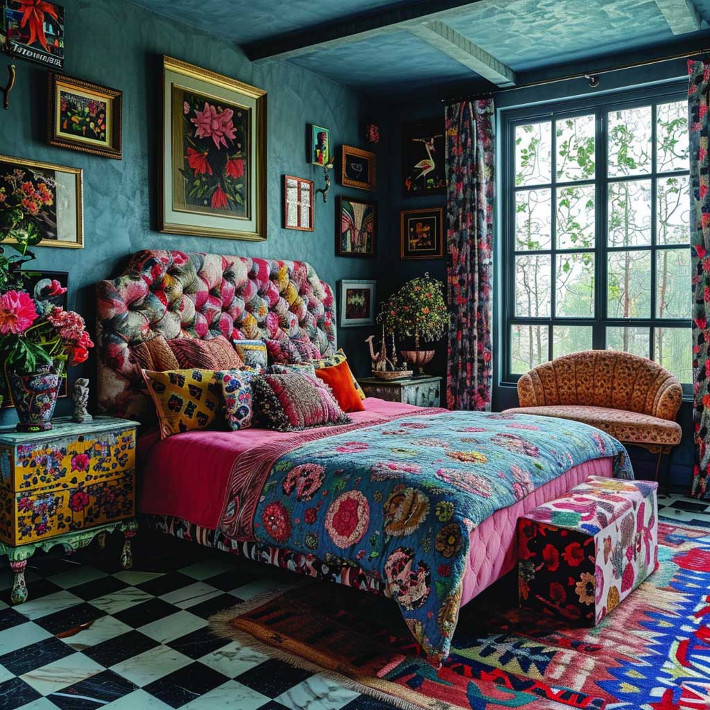
The kitsch bedroom is the one room in the house where you’re allowed to put every obsession on display simultaneously — and the result should feel like a hotel room designed by a very specific, very confident person, not a storage facility. Start with the bed frame. A vintage frame in a loud color (I’ve bought a painted brass one for $85 at an estate sale) or an ornate upholstered headboard in a pattern nobody sane would call subtle — that’s the room’s protagonist. Everything else responds to it.
Bedding is where most people blow the kitsch bedroom. Matching sets from big-box stores flatten the whole room into a catalogue page. What actually works: a floral duvet with geometric throw pillows, or a striped quilt layered under an embroidered coverlet in a clashing color. Each layer should look like it arrived from a different decade. I’ve had three visitors ask where I bought “that combination” and the honest answer is: nowhere, because it’s three separate things from three separate places across five years.
Furniture works best when the pieces share a color echo rather than a period. A 1960s mid-century dresser in walnut next to a 1980s-style chunky armchair in emerald velvet — they’ll coexist if you put a mustard-yellow table lamp between them that picks up something from each. The lamp becomes the translator. Without that shared reference point, the furniture just looks mismatched rather than intentionally eclectic.
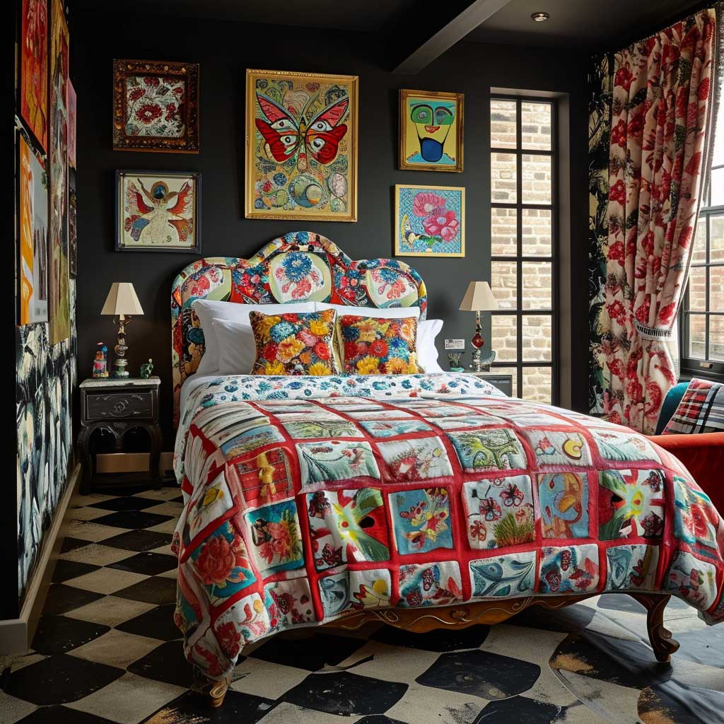

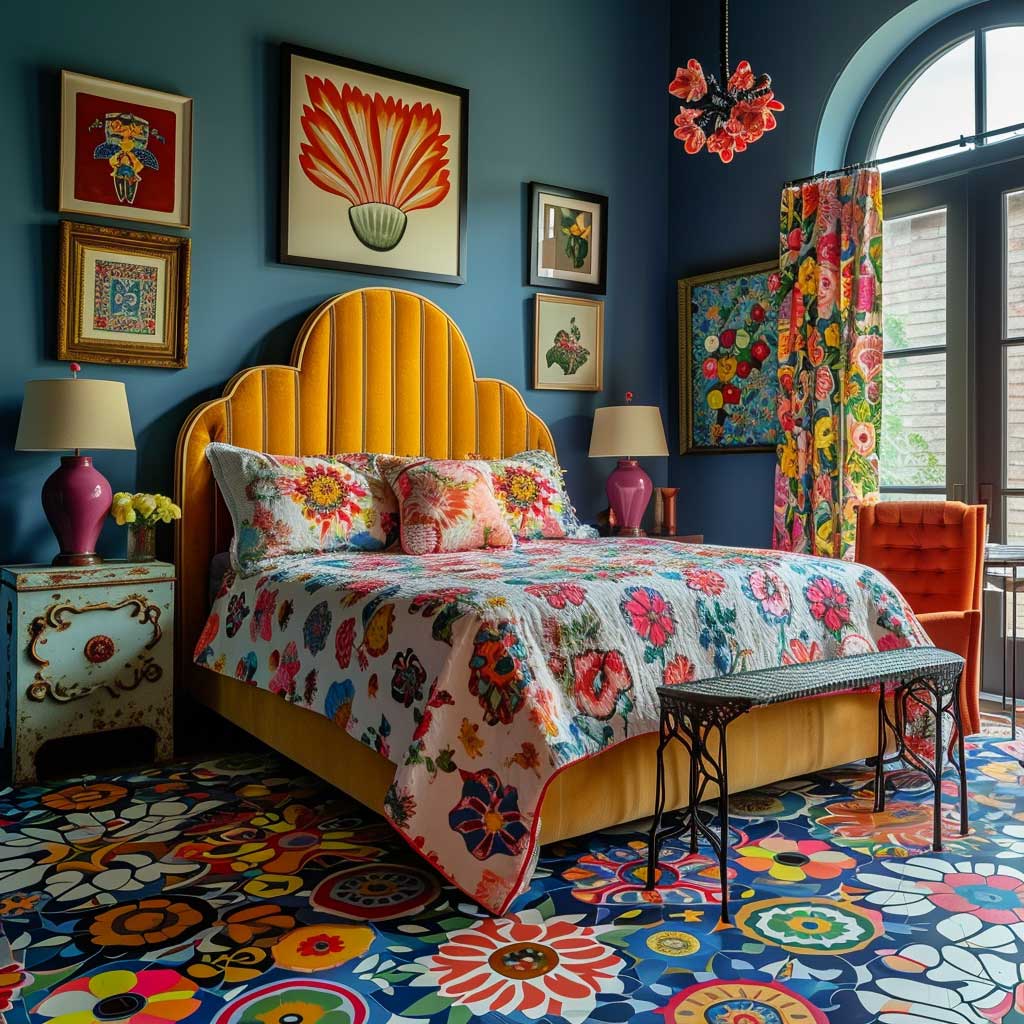
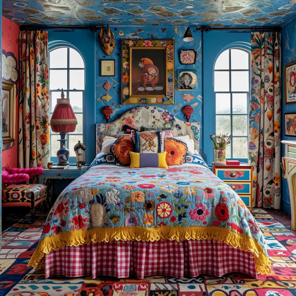
Gallery walls in a kitsch bedroom should feel collected, not curated. The difference? Curated means twelve matching frames in the same metal finish. Collected means a vintage travel poster next to a 1990s band print next to a handmade needlepoint your grandmother made — in frames that are completely unrelated to each other. You’ll notice the collected version has more visual pull because the inconsistency forces your eye to move across the wall and actually read each piece. Uniform framing stops that movement cold.
Lighting is the unsung detail that determines whether a kitsch bedroom reads as intentional or chaotic. A lamp with a neon-colored base or an unexpected silhouette — a ceramic mushroom, a flamingo, a retrofuturist globe — works as both illumination and a standalone art object. Overhead lighting on a dimmer keeps the room from going flat at night. What I’d avoid: recessed can lighting alone, which drains all the personality from a kitsch room the moment the sun goes down.
⚠ Don’t Do This in a Kitsch Bedroom
Buying a “kitsch starter kit” from one retailer — matching flamingo pillowcase, pink neon lamp, and retro poster sold together as a set — produces the exact opposite of kitsch. It looks like a theme room at a budget hotel. Real kitsch interior design is built from pieces with genuinely different origins: different eras, different countries, different original owners. The moment everything comes from the same aesthetic algorithm, the personality evaporates. Shop second-hand first, always.
Kitschy Kitchen Decor Lives in the Tiles, the Appliances, and One Brave Cabinet Color
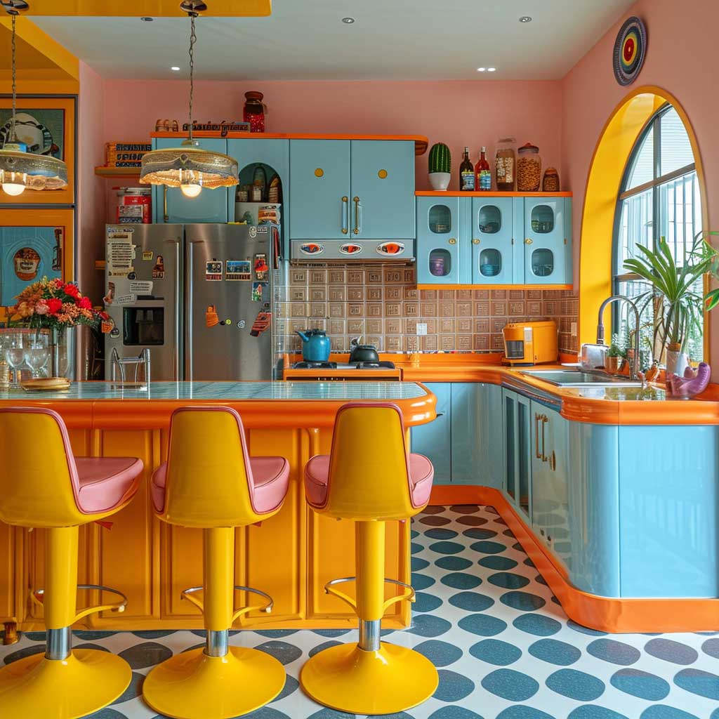
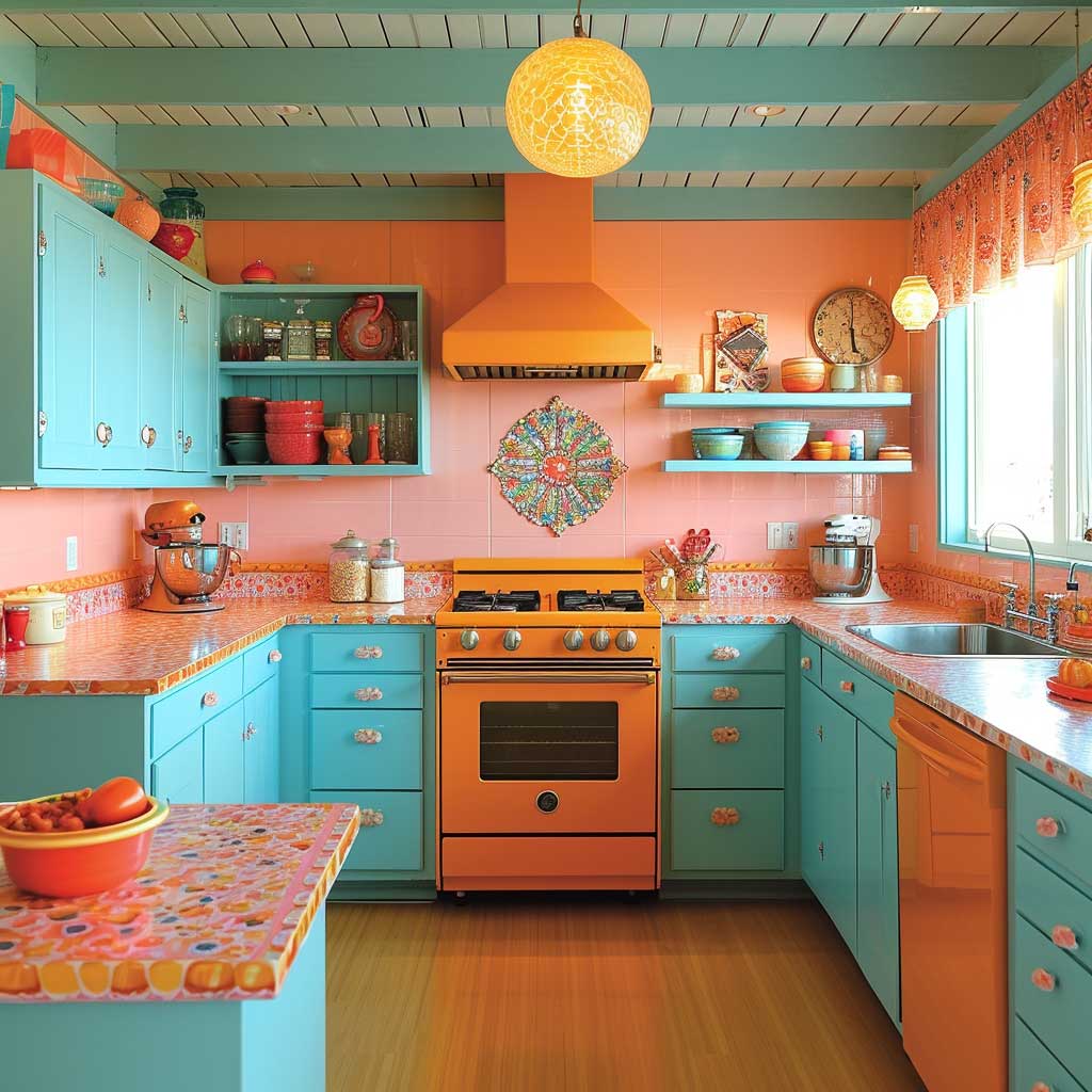

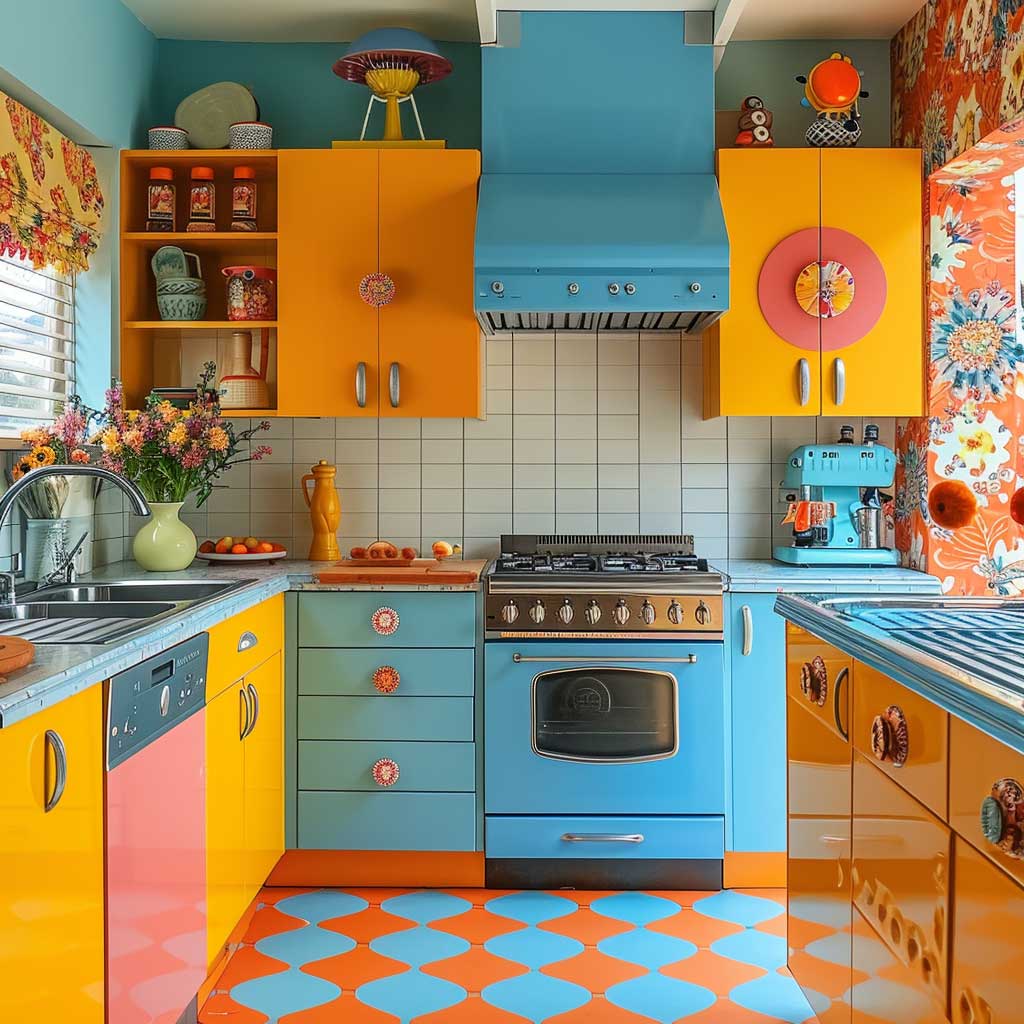
Kitschy kitchen decor is not a contradiction in terms — kitchens are, arguably, where the aesthetic fits most naturally. The kitchen is already a room full of functional objects that don’t take themselves seriously: a ceramic rooster, a novelty timer shaped like a tomato, a refrigerator covered in magnets from every city you’ve ever visited. Kitsch just formalizes that energy and gives it a color strategy. The question isn’t whether your kitchen can handle kitsch. It’s whether you have the nerve to commit.
Cabinet color is the biggest single decision in a kitschy kitchen. Turquoise, cherry red, and lemon yellow are my three proven performers — each reads as retro without sliding into costume territory. What I’ve learned after repainting my own kitchen cabinets twice: the second color you choose, for lower cabinets or an island, matters as much as the first. A turquoise upper paired with a cream lower feels balanced. Turquoise upper paired with cobalt lower is a headache by Tuesday. Retro brass or ceramic hardware at around $4-8 per handle (you can find these at most hardware and home stores) lifts even a mediocre cabinet color into something that reads as intentional.
Backsplash is where the real kitsch kitchen personality lives. Patterned encaustic tiles — the geometric, hand-painted kind popularized in Mediterranean and Moroccan design — run around $12-25 per square foot and do more visual work than any other surface in the room. Brightly colored laminates are the budget option and look surprisingly good when the rest of the room is well-executed. What doesn’t work: a subtle subway tile backsplash in a room with bold cabinets. The contrast just reads as unfinished rather than intentionally restrained.


Retro appliances are the fastest way to anchor a kitschy kitchen, and the Smeg brand (starting around $500 for a toaster, $1,800+ for a full refrigerator) is the obvious choice for anyone who wants the look without hunting vintage. Big Chill makes a comparable American-market alternative with more color options and slightly lower price points. I’ve had a cherry-red Smeg kettle on my counter for three years and it generates more comments from visitors than anything else in the kitchen — which tells you exactly how much visual leverage a single retro appliance carries.
Decor in a kitschy kitchen works best when it looks like accumulation rather than purchase. Vintage tin signs ($15-40 at flea markets), hand-thrown ceramic pieces in clashing glazes, and a collection of retro cookbooks displayed spine-out on open shelving — these read as genuinely personal. Generic “kitchen-themed” wall art from mass-market home stores kills the effect immediately. For specific retro wall decor combinations that work in kitchens — including the pop art poster and checkerboard floor pairing — these retro kitchen wall decor ideas break down the logic behind each approach.
What does kitsch kitchen decor get wrong most often? Stopping at one bold element and playing everything else safe. A turquoise cabinet in a room with beige walls, white subway tile, and stainless steel hardware isn’t kitsch — it’s an accent. Real kitschy kitchen decor requires at least three elements pulling in the same direction: bold cabinet color, a statement backsplash, and decor objects that double as conversation starters. The detailed framework for balancing kitsch elements across kitchen surfaces at Tarraula maps out the exact hierarchy of visual planes that keeps the room from collapsing into noise.
Modern Kitsch Interior Design Borrows from Pop Art and Keeps the Irony
Modern kitsch interior design has a specific intellectual ancestor: Pop Art. Andy Warhol’s Campbell’s Soup cans and Roy Lichtenstein’s comic book panels were doing in gallery spaces exactly what kitsch does in living rooms — taking objects from mass consumer culture and treating them with the same formal seriousness as high art. You need to understand that lineage to understand why modern kitsch feels different from just “colorful.” There’s a knowing wink in every flamingo lamp and every velvet Elvis. The irony is structural, not accidental.
The practical upshot: modern kitsch interior design works best when the objects have a legible cultural reference. A neon sign in a retro diner typeface, a lava lamp (Mathmos, the original brand, sells them from around $60), a vintage-style radio from Crosley — each of these carries a specific cultural memory that gives the room depth. Generic “colorful” objects without that reference read as simply loud. The reference is what turns noise into signal.
Pattern mixing in modern kitsch follows one rule I’ve never seen fail: if two patterns share a color but differ in scale, they coexist. A large-scale floral and a small-scale geometric in the same mustard-and-teal palette work together. The same floral against a same-scale stripe in the same colors creates a tension that’s exhausting rather than energetic. Scale difference is the shock absorber. I’ve tested this across four rooms and the rule held every time.
Modern Kitsch vs. Plain Maximalism — Quick Comparison
| Feature | Modern Kitsch | Plain Maximalism |
|---|---|---|
| Cultural reference | Required — pieces carry a wink | Optional |
| Color logic | Neons + one strong neutral anchor | More is more, no rule |
| Object sourcing | Secondhand and vintage preferred | New or vintage equally valid |
| Irony | Built in — the point is the knowing wink | Not required |
| Pattern discipline | Scale variation required | Clash is acceptable |
Final Thought
Kitsch interior design is a commitment, not a collection of purchases.
The rooms that pull it off share one quality: every piece looks like it has a story behind it. Not a retailer. A story.
Start with one room. Pick a palette anchor — one electric color you’ll build from. Then buy secondhand first, always. The flea market find beats the mass-market prop every single time because it carries the memory that makes kitsch mean something.
Save this post — you’ll want to come back when you’re ready to commit to the flamingo lamp.
Related Topics