Brown window trim exterior done right reads like walnut furniture against limestone — grounded, warm, and impossible to date. I’ve seen this color work on white clapboard, red brick, and raw stone cladding, and it doesn’t fail any of them. The key is knowing which shade of brown you’re actually choosing, because “brown” covers everything from pale caramel to near-black wenge, and those two don’t behave the same way on a facade. Pull the wrong one and you end up with a house that looks like it’s wearing mud. Get it right and the frames carry the whole exterior.
Modern exterior window design has moved hard toward contrast over the last few years. Architects aren’t defaulting to white trim anymore — dark earthy frames against pale walls, brown against pale grey, warm bronze tones against board-and-batten are all showing up in build projects over $400k. You’ll notice the pattern once you start looking: the houses that photograph well on Pinterest consistently have a frame color that picks up the secondary tone of the siding, not the primary one. Brown does that job quietly without screaming “I made a design decision here.”
Quick Scan
- Brown trim on white siding: use a mid-brown, never raw sienna — it reads orange by noon
- Brown frames on red brick: go gray-brown (Benjamin Moore Cromwell Gray) to make brick tones richer
- Brown trim on stone: match the mortar undertone, not the stone face color
- Dark brown vs. light brown: dark on large windows, lighter trim on smaller cottage-scale openings
- Modern exterior window design skews flat profile, 1×4 maximum — anything wider kills the clean line
- Budget: expect $40–$70/gallon for quality exterior trim paint that doesn’t chalk in 18 months
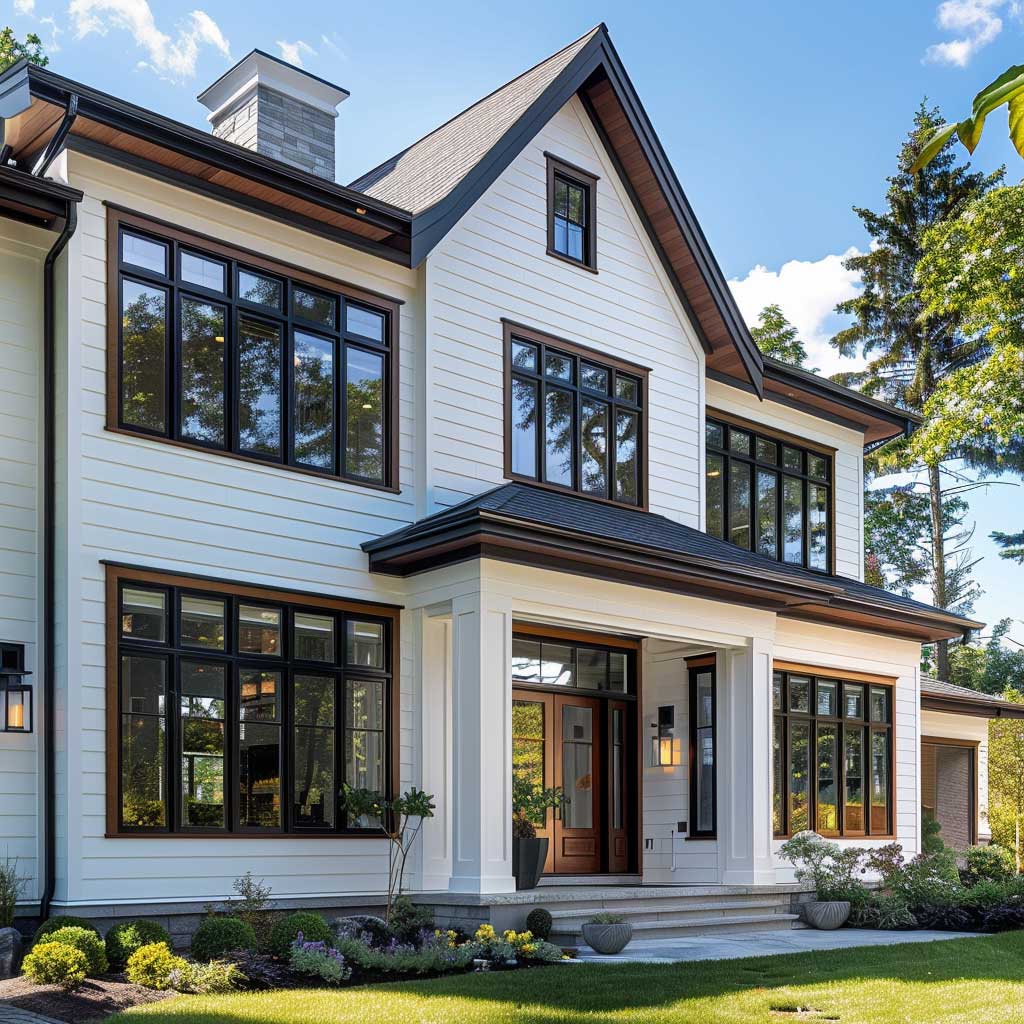
White Siding Needs Brown Trim More Than It Needs Black
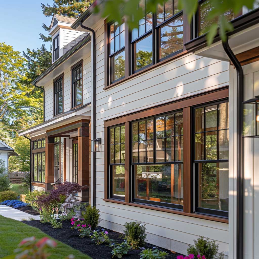
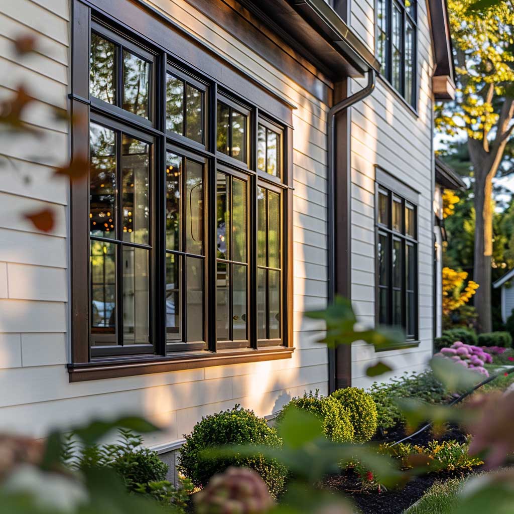


My go-to recommendation for white siding is Sherwin-Williams Urbane Bronze — it’s a gray-brown that costs around $79 a gallon and shifts subtly depending on which direction the wall faces. North-facing walls make it read darker and more elegant. South walls bring out a warm caramel undertone that feels like aged teak. Neither is wrong; you just need to test a swatch outside for 48 hours minimum, not inside under a store lightbulb.
Brown window trim exterior on white siding creates the kind of contrast that architects call “weight distribution” — the frames anchor the openings without competing with the wall. The mistake I see constantly is choosing a trim that’s too saturated. A flat chocolate, applied straight from the bucket, turns orange at 2pm when the sun hits it straight-on. You want a muted brown with a grey or green undertone to survive different light conditions through the day. Sherwin-Williams “Roycroft Copper Red” is not that — I’ve watched it age badly on three different houses in my street.
Flat 1×4 profile trim is the right choice for modern exterior window design on white siding. Wider than that and you start drifting toward Colonial Revival, which is a fine style but probably not what you’re going for. The profile sits slightly proud of the siding surface, and that shadow line — maybe 3/8 of an inch — does more visual work than any color choice. It’s the gap, not the trim, that the eye actually reads. Explore different exterior window trim options to compare profile depths and materials before committing to a color.
Large windows framed in brown on a white house also read as modern exterior window design rather than traditional — which surprises most people. The reason is scale. Floor-to-ceiling or oversized windows are a contemporary architectural signal; the brown frame reinforces the warmth the glazing brings in without sliding the whole exterior into craftsman-cottage territory. Keep the trim flat, keep the sill proportional, and resist adding any decorative cap molding unless you’re committing to a full historical style.
Stone Cladding Makes Brown Trim Look Like It Grew There

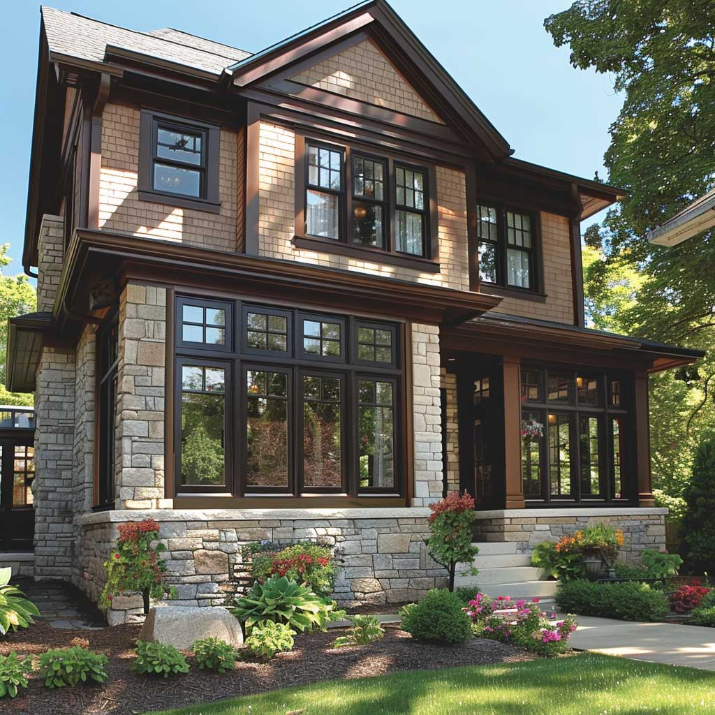

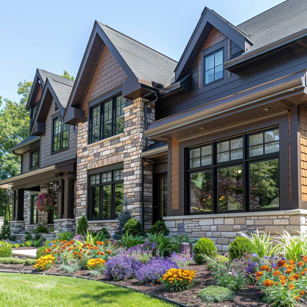
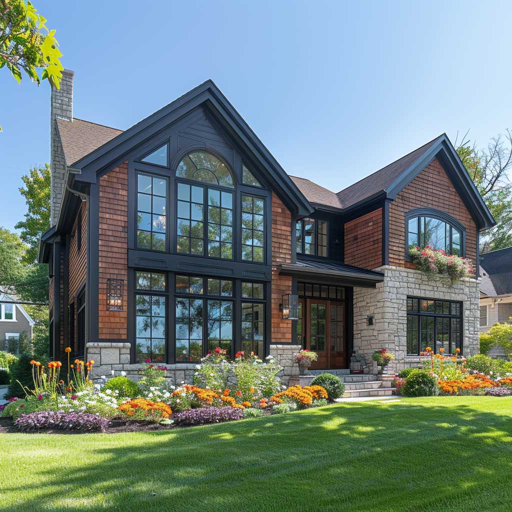

Stone and brown trim is the combination that produces the “this house has always been here” effect — like the building predates the neighborhood by fifty years. I’ve bought two sets of Benjamin Moore samples specifically to find the right brown for a limestone-clad build: Harrison Tavern Brown and Gettysburg Gray. The Gettysburg won because it matched the mortar joint tone rather than competing with the stone face. That’s the rule with stone: match the mortar, not the rock. The rock is already doing its job.
Brown window trim exterior on a stone house needs to be darker than you think. The texture of stone absorbs visual weight, which means a mid-tone brown disappears entirely when you step back twenty feet. I’ve watched homeowners choose a trim they loved up-close that became invisible from the street — all that careful color selection wasted because they never tested it at distance. Go one full shade darker than your instinct tells you. If you’re drawn to a warm walnut, go espresso.
What doesn’t work: trying to match the trim to the stone color exactly. Monochrome reads well on stucco and fiber cement, but stone has so much inherent tonal variation that a matching brown trim just creates visual noise — like wearing a plaid shirt with a plaid jacket in two slightly different plaids. You need a relationship between the two colors, not an echo. The depth difference is what creates the frame that makes the window readable as an architectural element. See how exterior window trim ideas for brick houses handle the same contrast challenge with masonry-based facades.
Landscaping scale matters more here than in any other exterior combination. A stone house with brown trim that’s surrounded by low ground cover loses half its visual drama. You need vertical plant material — columnar trees, tall ornamental grasses, mature climbing hydrangea — to echo the height of the facade. The landscaping frames the house the same way the trim frames the window. Skip this and the whole composition looks like it’s squatting on the ground.
Don’t Do This
Don’t use a glossy finish on any brown exterior trim. I made this mistake on a craftsman remodel and the trim ended up looking like plastic laminate every time it rained. Sheen level matters: satin finish for the trim body, flat or eggshell for the siding. Gloss amplifies every imperfection in the wood or fiber cement beneath it — nail holes, grain raises, brush marks — and turns a $500 paint job into a $2,000 regret. Stick to satin. Also, avoid any brown that has a visible red or orange undertone on a stone facade — those clash catastrophically with the cool minerals in most natural stone and aged brick. Test in three different lighting conditions before you buy more than a quart.
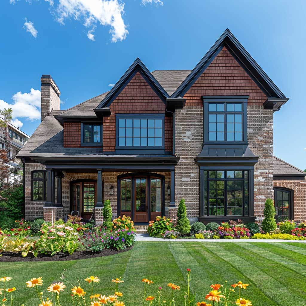
Red Brick Stops Fighting With Brown Trim and Starts Working With It
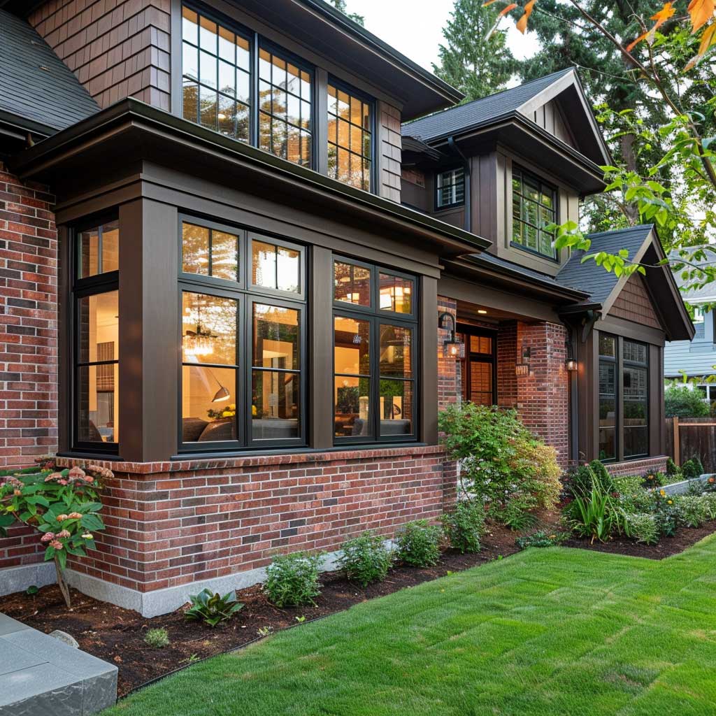


Red brick defaults to white trim in North American residential construction because it’s safe. Safe is boring — and more critically, white trim on red brick makes the windows the focal point of the elevation instead of the architecture. Swap in a gray-brown and something different happens: the brick tones get richer, the red reads more intentional, and the windows recede into the composition the way they’re supposed to. Benjamin Moore Cromwell Gray is the specific color I keep coming back to for this. It’s $85 a gallon and it’s a chameleon that hits different on every wall orientation.
Brown window trim exterior on brick is the combination that professional architects tend to choose when they’re designing for longevity rather than trend-chasing. The gray-brown undertone in a color like Cromwell Gray or Sherwin-Williams Dovetail picks up the cooler minerals in aged brick, making the facade look like a considered material decision rather than a paint job. You’ll notice that new builds using this combination photograph as though the house is twenty years old — which is a compliment in the world of architectural photography. Exterior window framing trim designs with masonry cover the profile options that work specifically with brick coursing.
What shade of brown for a red brick house? Avoid anything with a warm chestnut or orange undertone — you’re already dealing with the iron oxide in the brick and stacking warm on warm turns the elevation muddy by afternoon. I tested Sherwin-Williams Roycroft Vellum on a brick colonial and it looked like the owner had matched the trim to dried mud. Not the look. Cool-based browns — ones with grey or green undertones — create actual separation from the brick tone rather than merging with it. The gap between the two colors is where the visual interest lives.
A well-maintained garden doubles the impact of brown trim on brick — but the plant choices matter. Lush green foliage creates the contrast that makes both the brick and the trim legible from the street. Sparse or brown-edged plantings kill the effect entirely; the warm earth tones of dying plants blend into the facade and everything reads flat. Boxwood hedges or Japanese forest grass at window height are reliable anchors. Box costs about $18–$25 per plant at a proper nursery and earns its price in structural contribution to the composition.
| Exterior Material | Recommended Brown Shade | Color to Avoid | Approx. Cost/Gallon |
|---|---|---|---|
| White siding | Sherwin-Williams Urbane Bronze | Raw sienna / orange-brown | ~$79 |
| Red brick | Benjamin Moore Cromwell Gray | Warm chestnut / Roycroft Copper Red | ~$85 |
| Natural stone | Benjamin Moore Harrison Tavern Brown | Tone-matching the stone face | ~$85 |
| Board-and-batten | Sherwin-Williams Dovetail | Glossy finish in any brown | ~$79 |
| Stucco / fiber cement | Benjamin Moore Gettysburg Gray | High-sheen semi-gloss brown | ~$85 |
Final Word
Brown window trim exterior works because soil is already a neutral — everything growing out of it agrees with it automatically.
The combination doesn’t fail because brown sits at the intersection of the warm and cool spectrum — it mediates between red brick and grey mortar, between white siding and green landscaping, between pale stone and dark roof. No other trim color does this across so many different facade materials without a fight.
Spend the extra $20 per gallon on quality. A Wooster Shortcut brush ($6 at any hardware store) handles trim edges cleanly and saves hours of taping. Test the swatch in three light conditions — morning, noon, and late afternoon — before committing to more than a quart.
Save this post before you head to the paint store — the specific shade names above are the ones that actually work, not the ones that photograph well under store lighting.
Related Topics