With modern architectural techniques, it has become possible to implement a beautiful, simple house design even on an extremely complex site that is practically not suitable for construction. An example of such a solution was the object of the architectural bureau Dietrich Untertrifaller Architekten.
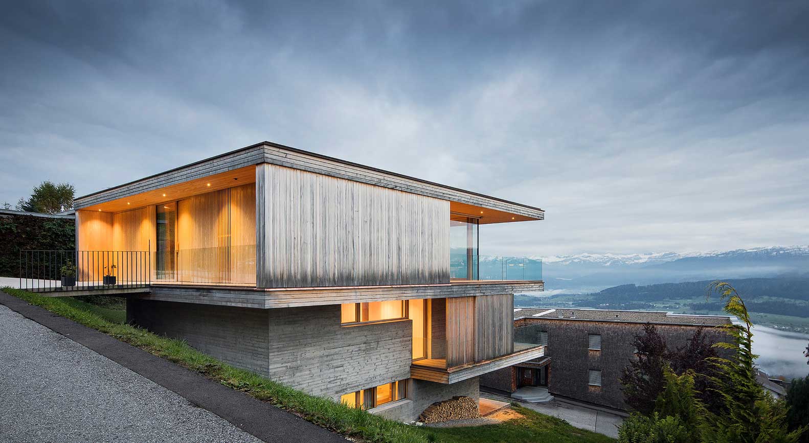


The company presented a spacious three-storey villa on a steep slope in the Austrian town of Sulzberg. At first glance, the site seems completely unsuitable for building a house. But the architects not only adapted the structure to the landscape, but also turned the disadvantages of the slope into advantages – the solution turned out to be original, steep and comfortable.
How did you adapt the beautiful, simple house design to the sloped plot?
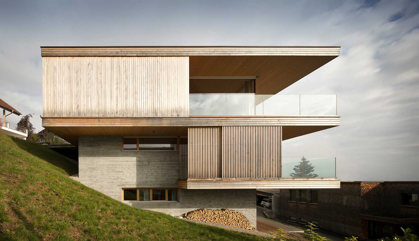
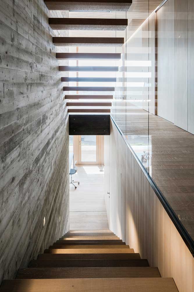
The first and main method of adaptation was the construction not in width, but in height. Instead of using hundreds of meters of land for the arrangement of living spaces, they used a small part of the site and erected a spacious living space with a vertical orientation – in total, it turned out to be three floors.
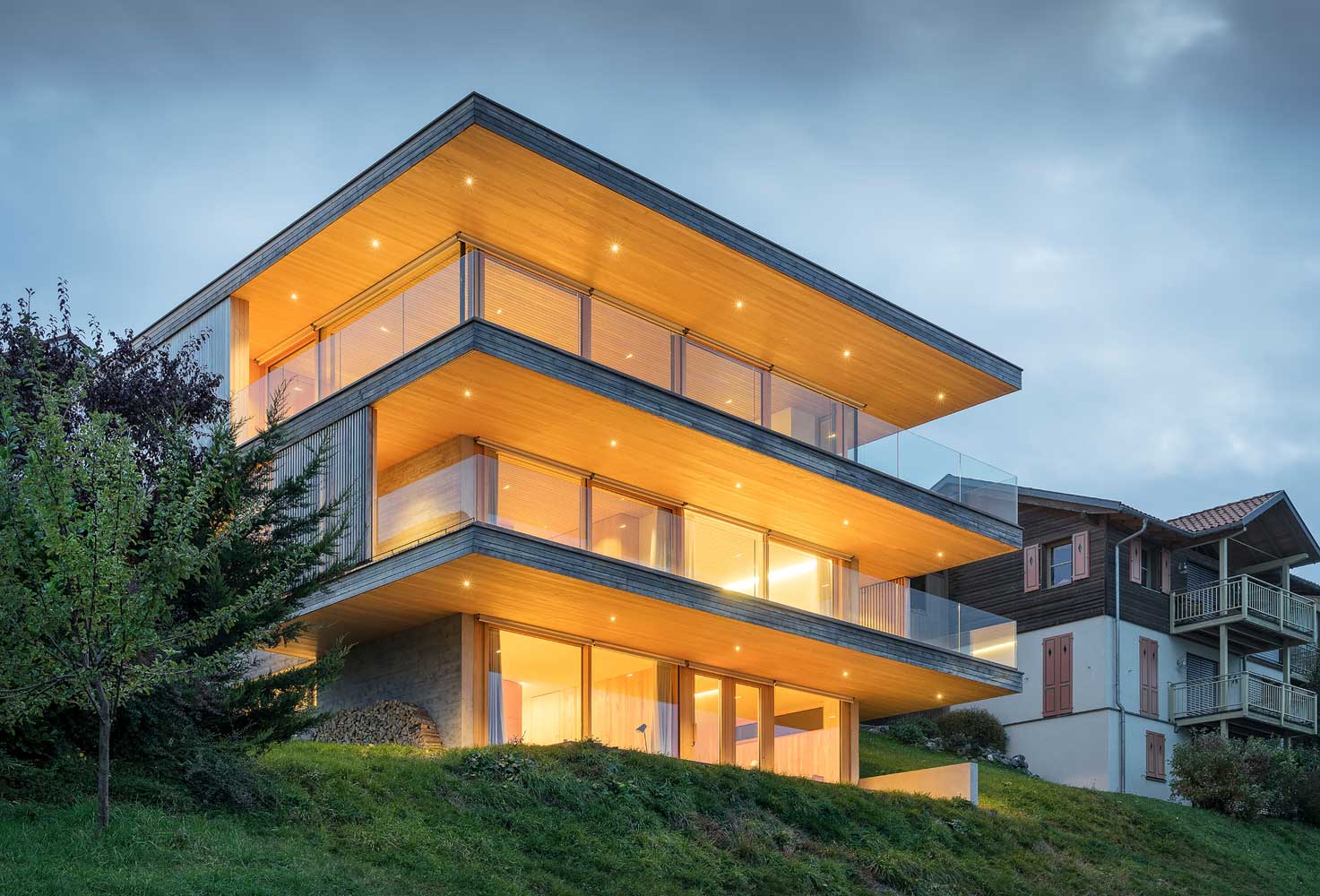
A simple and beautiful house grows, stretches upward along with the landscape. At the same time, with each next floor, it receives more space, which made it possible to add additional space here. This is another adaptation trick. Oriented the building with windows to the south.
Massive yet light, simple and beautiful home
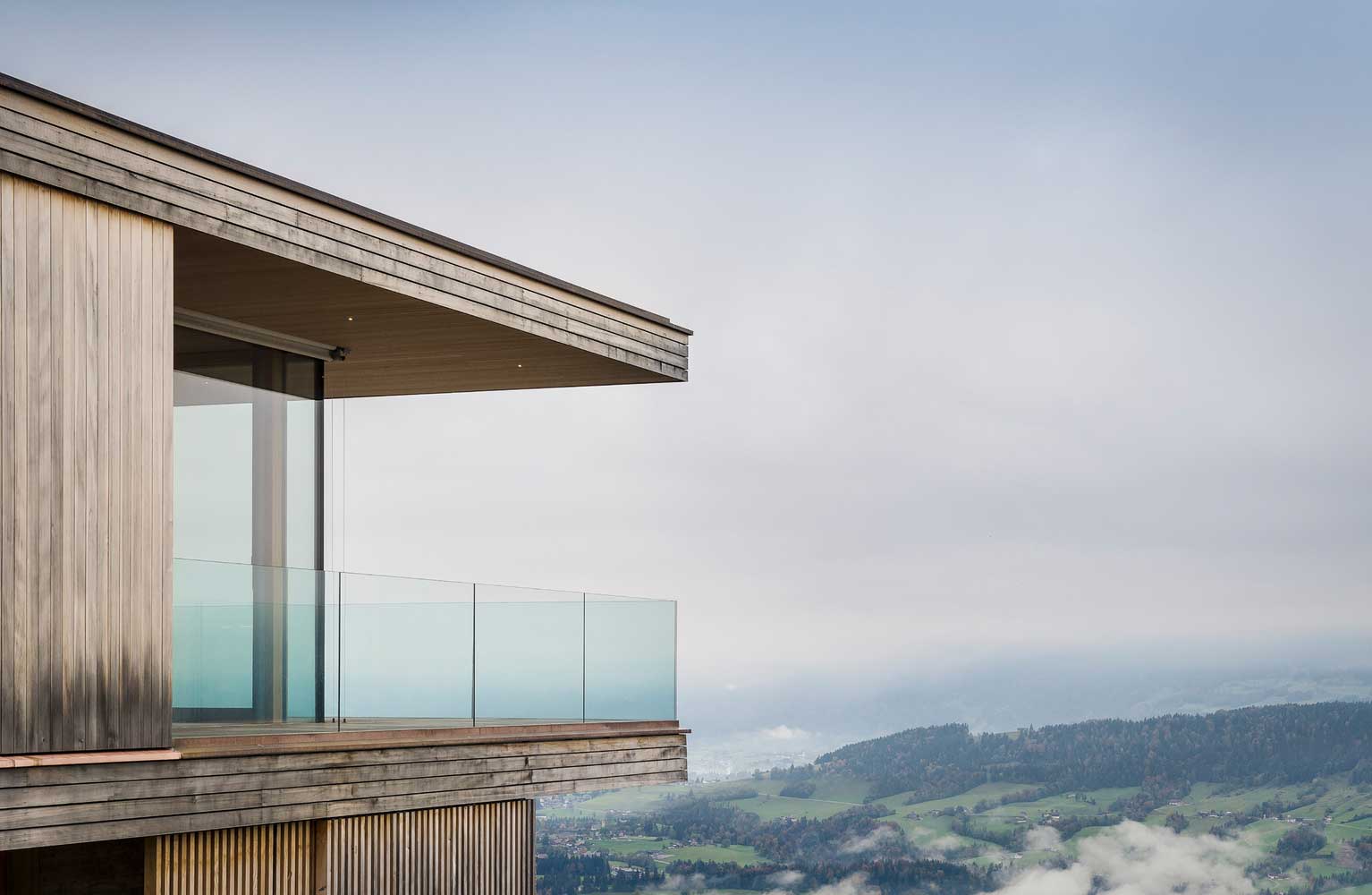
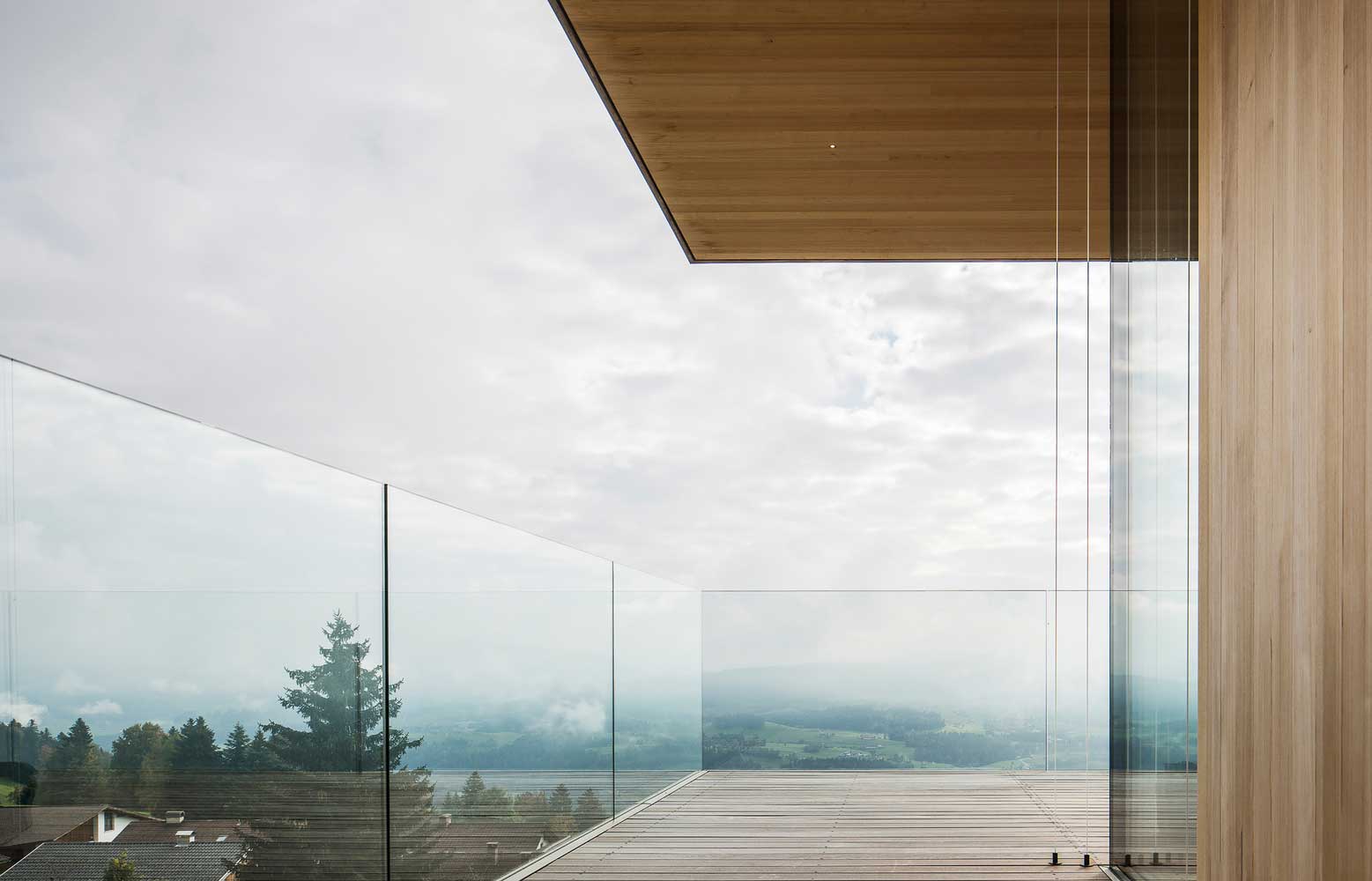
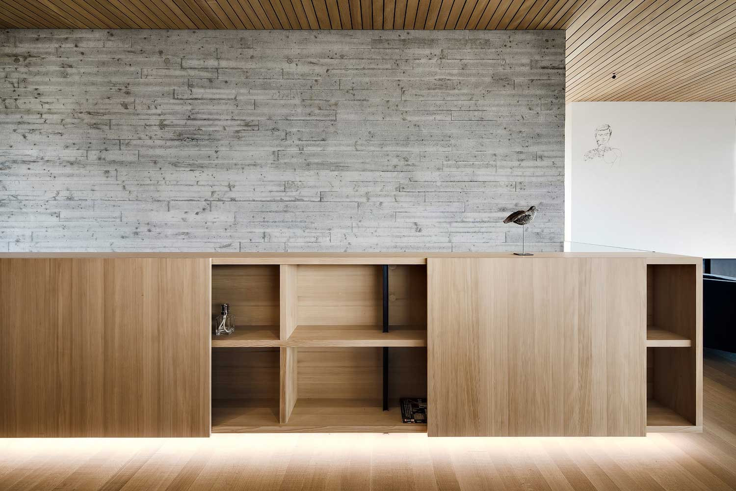
The next feature of the three-storey villa was its visual lightness and weightlessness due to the large amount of glass, open structures, and free planning. A simple and beautiful house is filled with air, light, and its entire southern side is a continuous panoramic glazing overlooking the town, valley and mountains.
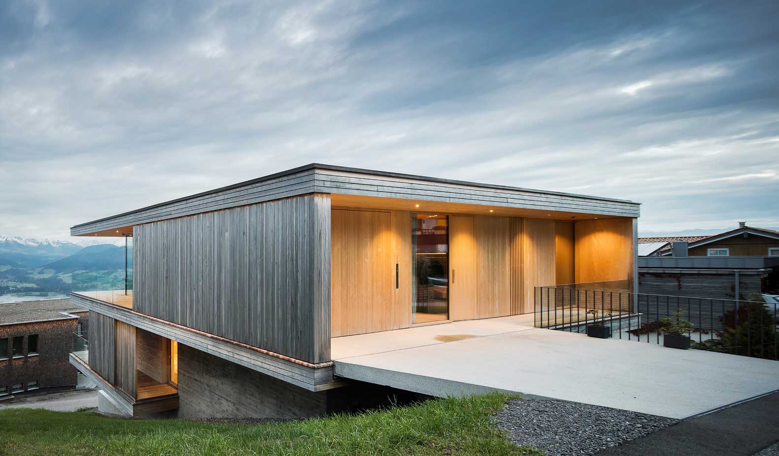
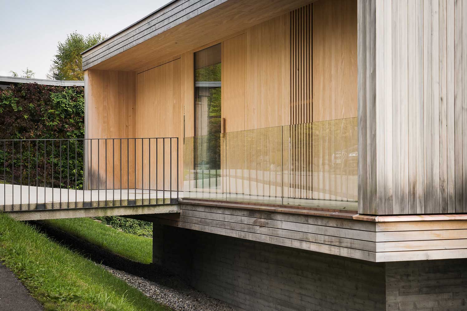
At the same time, the cantilever roof provides a dosed supply of light, due to which the premises do not overheat from the sun’s rays on hot days. The spacious outdoor terraces also add lightness to the house. Although they are located under the roof canopy, there is no feeling of being isolated and cramped. The glass railing also adds spaciousness and lightness.
Unusual delineation of zones in a beautiful, simple home design
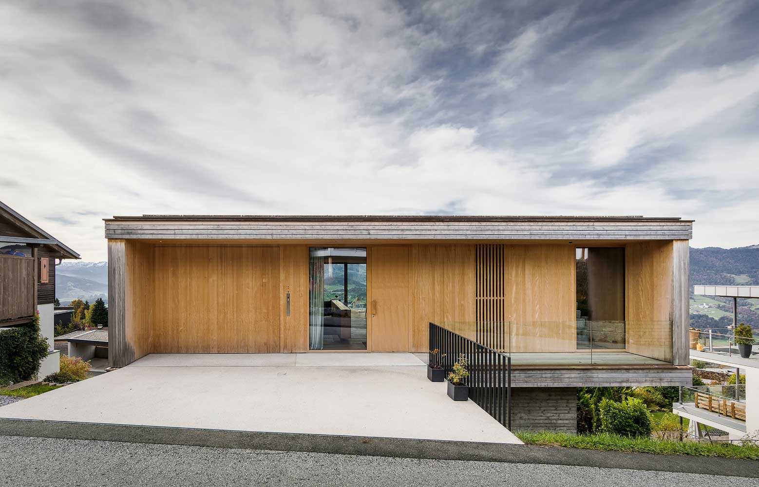
An impressive highlight of the beautiful and simple house was that, thanks to the construction on a steep slope, the main entrance from the street was made not on the first, but on the third floor. The building and the slope are connected by a bridge. In this regard, the villa received a rather unusual, unconventional configuration in the context of the location of living spaces.
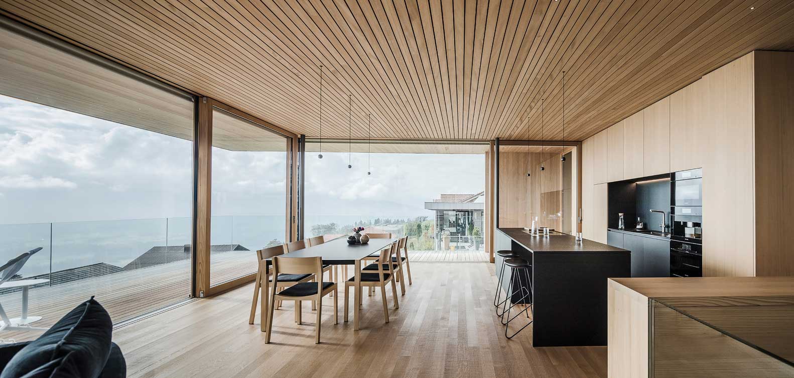
If usually public, social spaces begin at the entrance on the lower floor, and gradually with each new floor the zones become private, then here we observe the opposite effect. The living room, guest rooms and even the garage are designed from above. And to the bottom are more private rooms, bedrooms, children’s rooms.
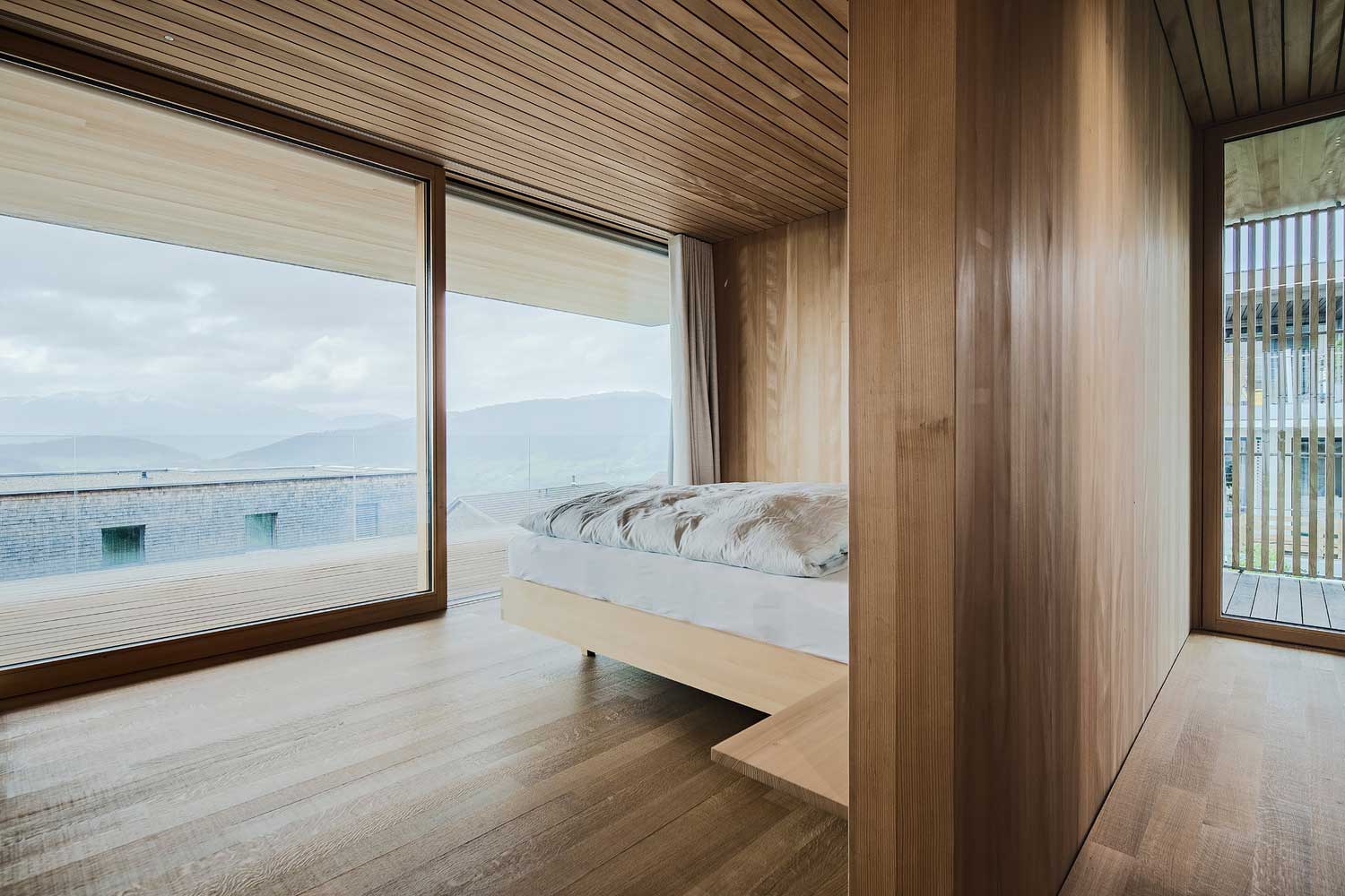
The beautiful, simple design of the house managed to surprise with such a configuration. It is exclusively built into a seemingly awkward site. But it was only thanks to the slope that the most extraordinary and interesting ideas were realized. Panorama at a height of hundreds of meters, non-standard, but such a convenient layout, lightness and openness of spaces.
| Architects | Dietrich | Untertrifaller Architekten |
| Images | Albrecht I. Schnabel |
