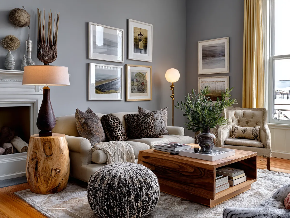
Room colour design is the one decision that touches every other element in a space — the furniture reads differently, the light behaves differently, even the size of the room shifts depending on the palette on the walls. Simple room colour design isn’t a compromise; it’s a deliberate choice to let fewer shades do more work, creating modern living spaces that feel resolved rather than restless.
The rooms in this article follow three distinct approaches: a soft-toned minimalist bedroom, a bright and airy living room, and a black-and-white monochrome kitchen. Each relies on restraint, and each shows how much you can say with a limited palette. Stylists consistently point to neutral-led rooms as the easiest to live with long-term — and the easiest to photograph for a reason.
Interior paint typically lasts five to seven years in bedrooms and living rooms before it needs refreshing, according to professional painters — which means the colour you choose has to hold up across seasons, furniture rotations, and shifting natural light. That’s not a small ask from a paint chip.
– Simple room colour design works by limiting the palette and amplifying texture instead.
– Minimalist bedrooms in soft blues, greys, and warm whites support better sleep and easier decorating.
– Bright living rooms rely on reflective light-toned walls — one gallon of quality paint covers 350–400 sq ft per coat.
– Monochrome kitchens need finishes that vary (matte vs gloss) to avoid flatness within one colour family.
– Interior walls in bedrooms and living rooms hold up well for 5–7 years with quality paint before a refresh is needed.
– The biggest mistake in all three room types: choosing paint under store lighting without testing it at home first.
What a Minimalist Bedroom Actually Needs From Its Colour
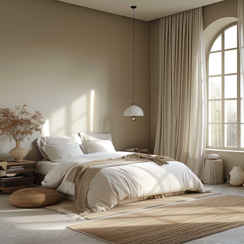
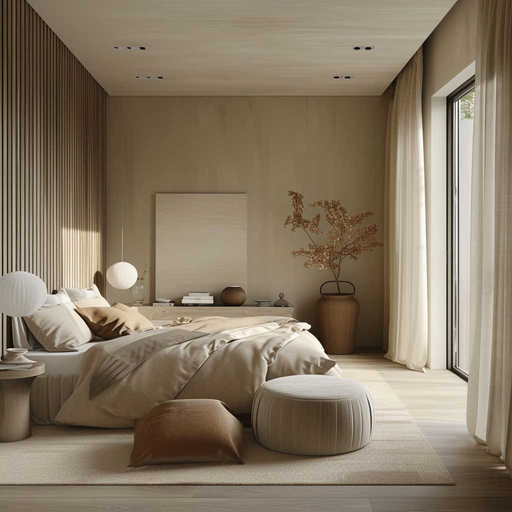
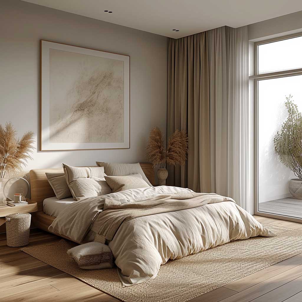
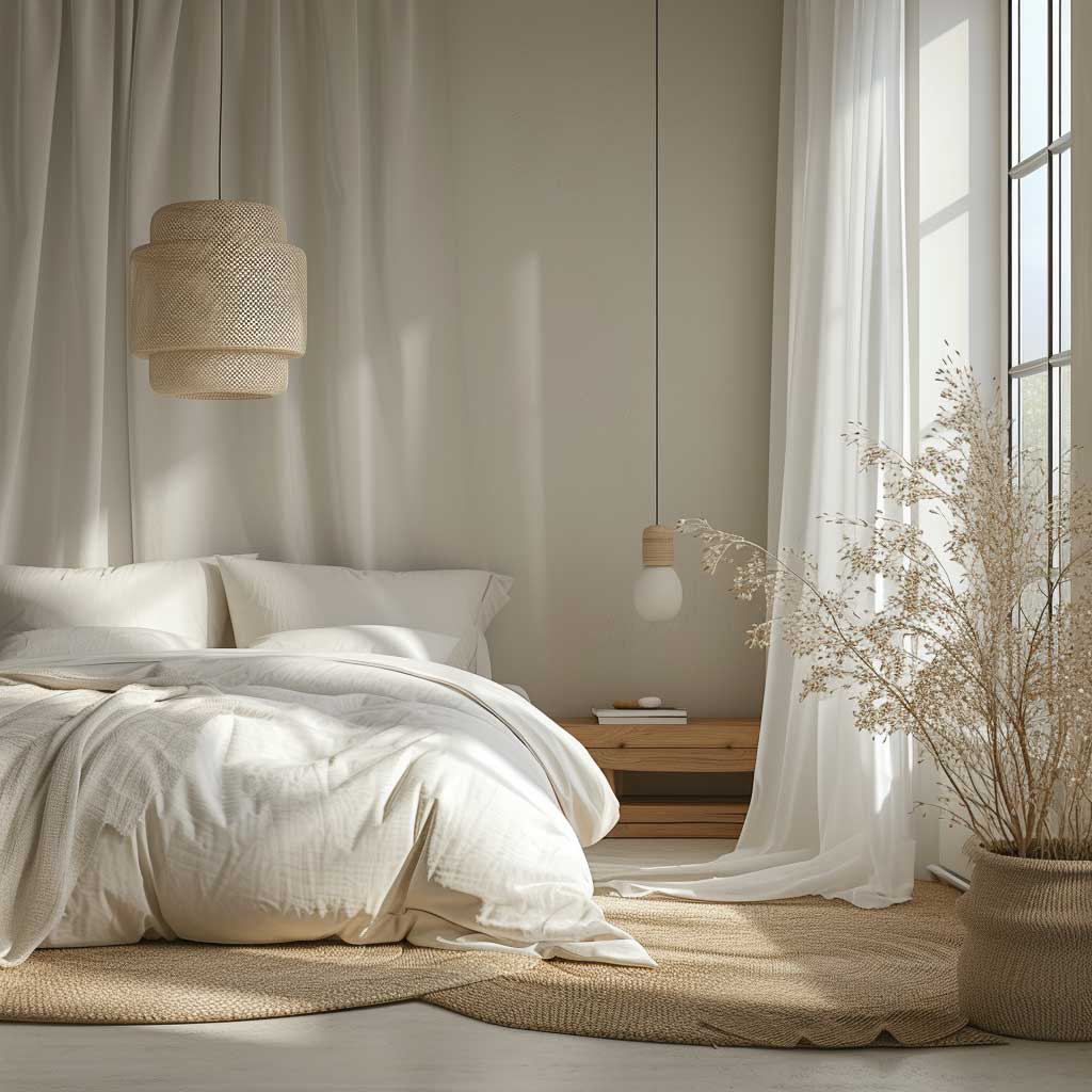
Simple room colour design for a bedroom starts with a single question most people skip: what does the room face? A north-facing bedroom reads every cool-toned grey as slightly blue by mid-afternoon, while a south-facing room can handle those same shades without the chill. Sherwin-Williams Repose Gray SW 7015 — one of the brand’s most consistently recommended neutrals — has an LRV of 58, placing it in the mid-range where it adapts to different exposures without going flat or purple under artificial light. That flexibility is exactly what a minimalist palette requires.
The colour alone isn’t the mechanism. What makes soft greys, cool blues, and warm whites feel restorative in a bedroom is contrast management. Stylists recommend keeping the wall colour, bedding, and larger textile pieces within two to three tonal steps of each other — close enough to feel unified, far enough to read as layered. A plush wool rug in oatmeal against warm white walls is the same logic as a stone countertop against off-white cabinetry: the tension is quiet, but it’s there. Avoid pairing a cool grey wall with warm yellow-toned wood floors; the undertones fight and neither reads correctly.
What doesn’t work as well as it looks on a mood board: bright white in a bedroom with very little natural light. True whites have LRV scores of 85 and above, which means they reflect everything — including the colour of your flooring and curtains — back at the wall. In low-light bedrooms, this turns “clean and minimal” into “washed out and flat.” A warm white with a cream or greige base (think Benjamin Moore Swiss Coffee) absorbs that effect and still photographs well. The rule here is to test any white-family paint on a 30cm square at 9pm under your actual bedside lamps before committing to a full room.
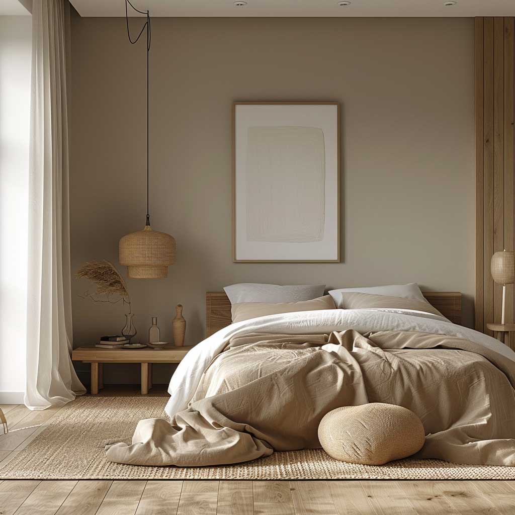
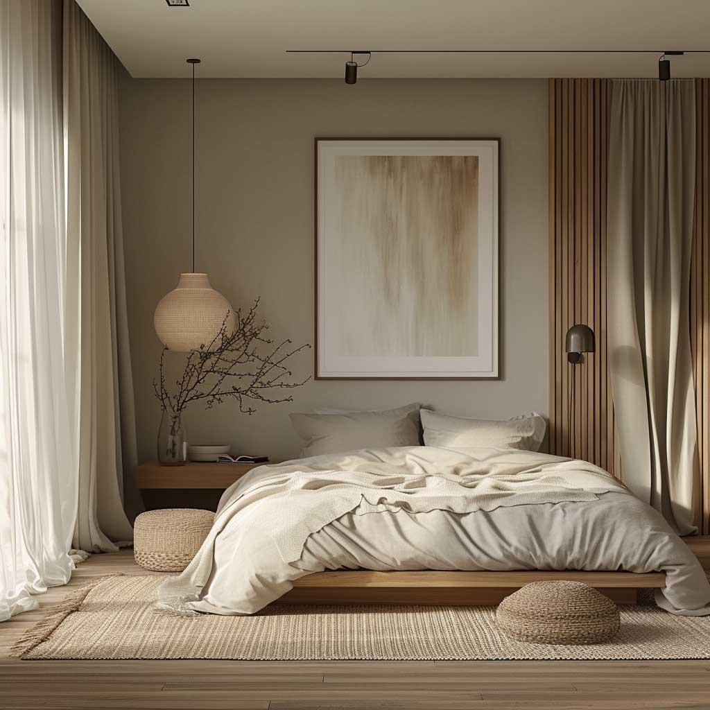
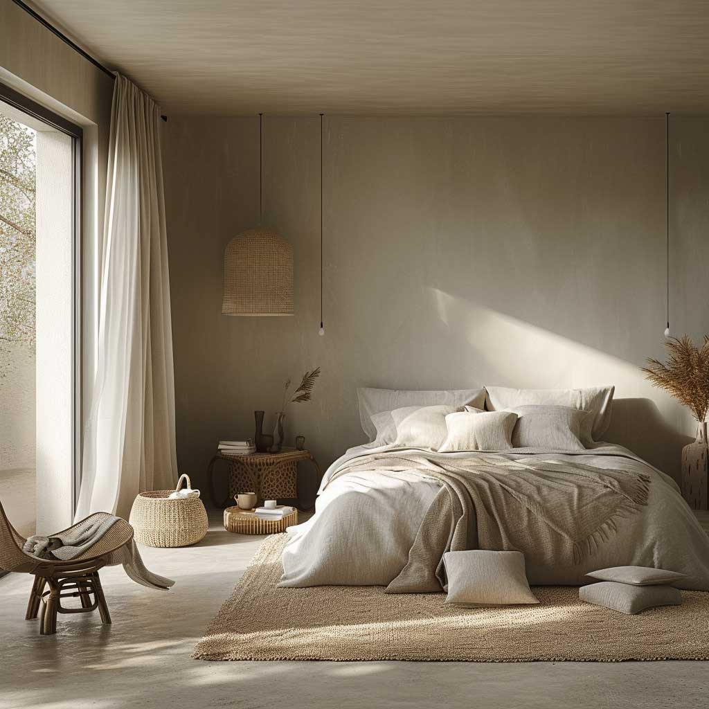
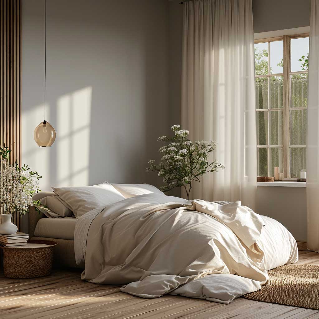
Texture does the decorating that additional colour would otherwise handle. Soft linens, a plush wool rug, and natural wooden surfaces provide enough tactile variation to keep the space from reading as sterile. Think of a plain grey wall as the pause between sentences — it gives the furniture and textiles room to land. For simple bedroom design that holds up over time, the colour is never the event itself; it’s what makes everything else easier to look at.
Lighting after dark is where most minimalist bedrooms fail. During the day, soft greys and warm whites shift toward cream and sand as sunlight moves across the room — which looks intentional and beautiful. After 8pm under warm artificial light, cool-toned walls can pull toward lavender or green depending on the undertone. The fix is layered light sources — a warm-bulb bedside lamp at 2700K alongside dimmable overhead lighting — rather than a brighter ceiling fixture trying to compensate alone. A room that looks right at midnight is a room that actually rests you.
Repaint frequency for adult bedrooms runs every five to seven years with quality paint and proper prep, according to professional painters — which makes the colour decision genuinely consequential. A trendy sage that reads well in 2025 might feel dated by 2030 if you chose it because it was everywhere rather than because it works with your specific floors and light. The safest long-term move in a minimalist bedroom: stick to the neutral family with a clear undertone direction, and let the textiles carry any seasonal personality.
Light-Reflective Walls Do Half the Work in a Living Room

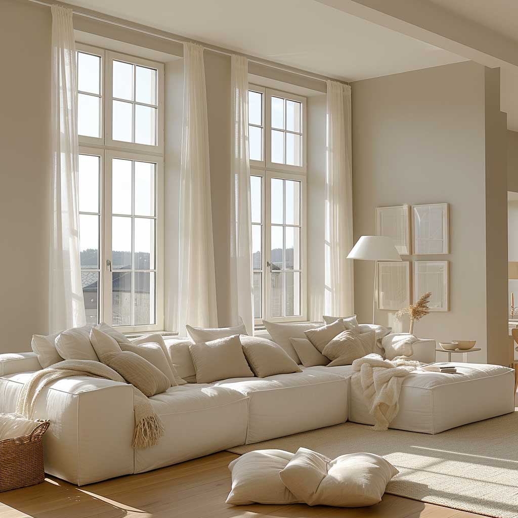
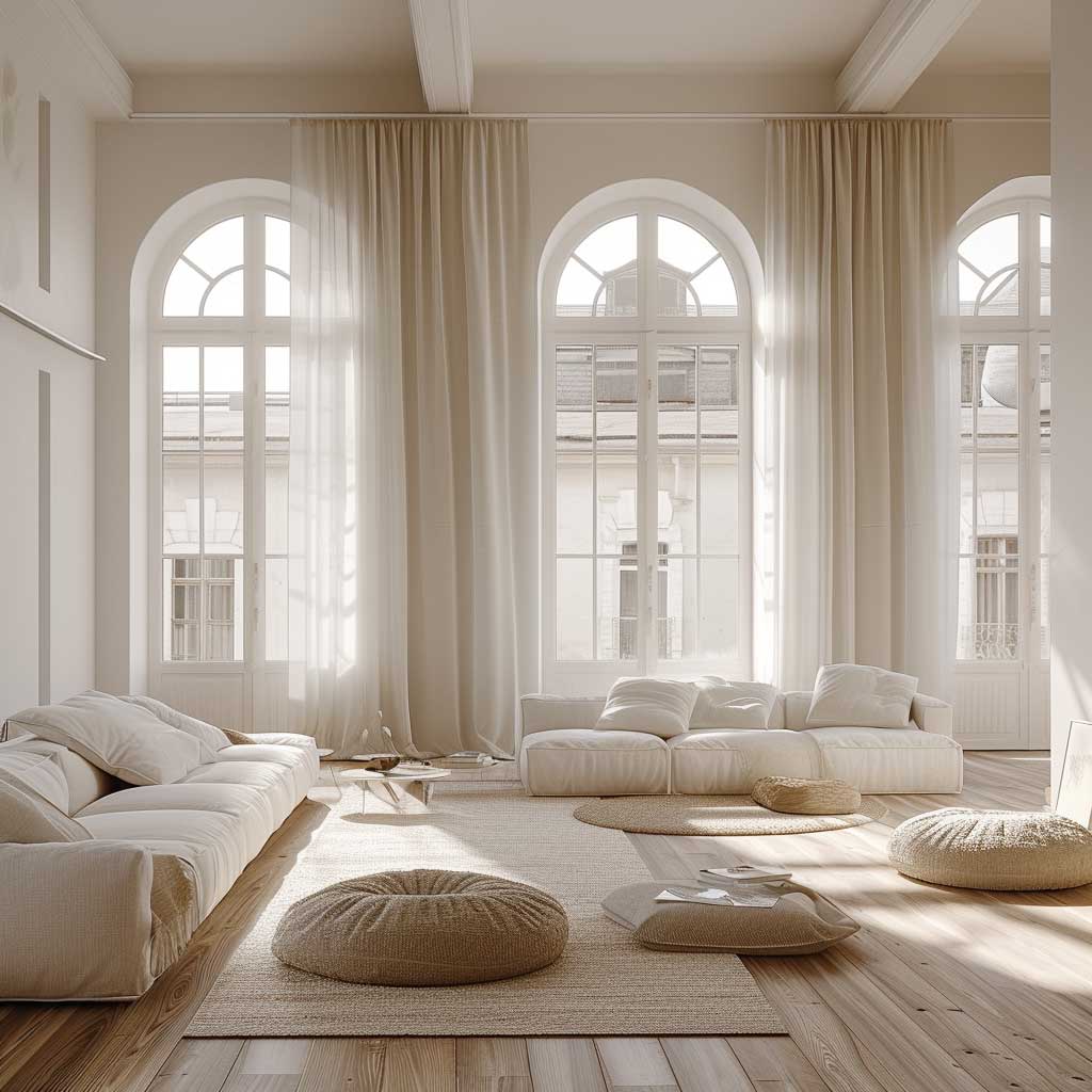
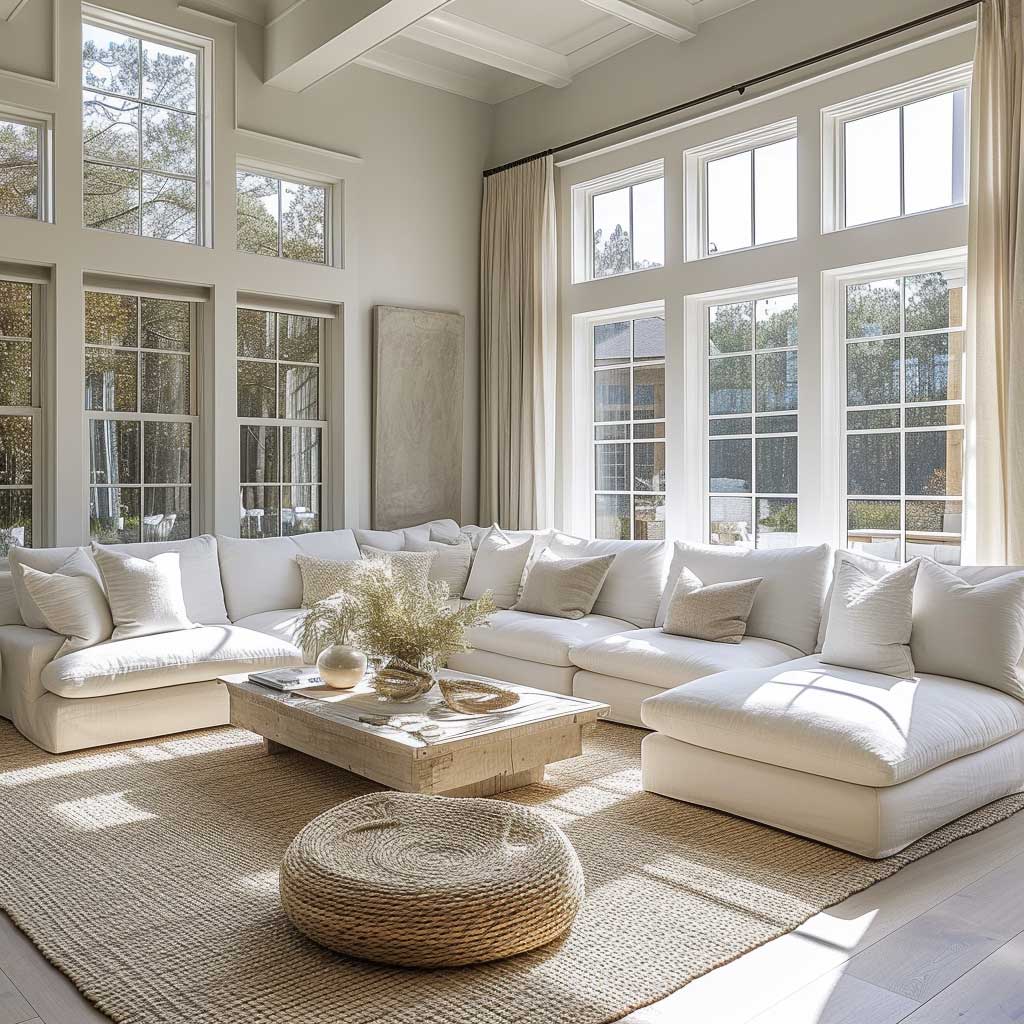
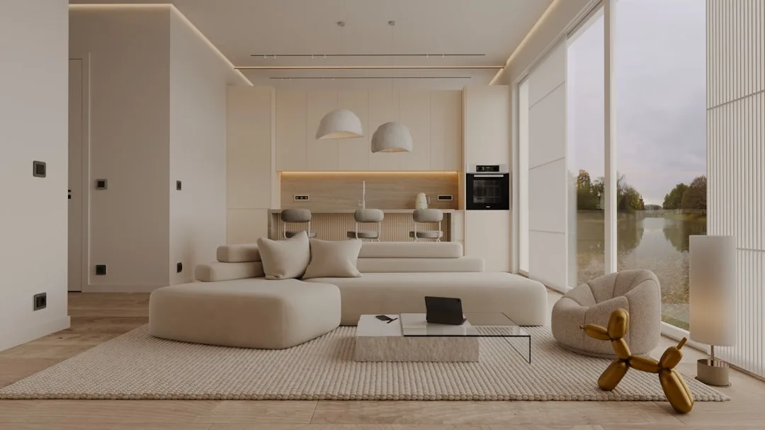
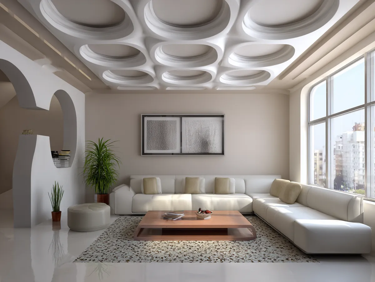
A bright, airy simple room colour design for a living room depends almost entirely on the LRV of the paint you pick. Soft whites, pale beiges, and light greys in the LRV 75–90 range reflect enough light to make a standard living room feel 20–30% larger — not because the walls physically move, but because the eye perceives high-reflectance surfaces as receding. One gallon of quality interior paint covers 350 to 400 square feet per coat, according to Sherwin-Williams; a standard living room typically needs two coats, so budget two to three gallons before you start. Skimping on paint volume is the fastest way to end up with uneven coverage and patchy corners that look worse than the original wall.
Does a light-coloured living room look dated quickly? That depends entirely on how you accessorise it. The walls themselves — in a reliable warm white like Sherwin-Williams Alabaster SW 7008 or a pale greige — have stayed in style for over a decade and show no signs of leaving. What dates a room is the accessory layer: the overly trendy throw pillows, the fast-furniture coffee table, the art that chased a five-minute colour moment. A simple, light-toned room colour design is precisely what allows you to rotate those accessories without repainting. Think of it as a magazine page with very good margins — the content changes, the layout holds.
Furniture arrangement matters as much as the wall colour in a bright living room. Stylists recommend leaving enough floor space visible that you can see the actual floor material — it acts as a fifth wall in terms of colour contribution. If the floor is warm-toned hardwood and the walls are cool-toned pale grey, you’ll fight that tension every time you try to decorate. Match the undertone of the wall colour to the undertone of your largest fixed surface (usually the floor), then let everything else orbit around that pairing.
Don’t paint a bright living room with cool-toned stark white if the floor is warm oak. The contrast reads as a mistake, not a statement. The wall and floor undertones need to agree.
Don’t assume light walls mean no personality. A pale, warm-white room with zero textural contrast — no rugs, no varied fabrics, no art — just looks unfinished. Reflective walls need something to reflect.
Don’t pick a living room colour from an online swatch. Screens oversaturate every tone. Print a sample, tape it to the wall, and check it at 9am, 2pm, and 9pm — the three most distinct light conditions in a day.
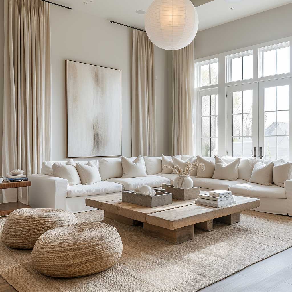


Texture is the only way a single-toned bright room avoids looking like a showroom floor. Plush rugs, woven baskets, leather and linen fabrics, and matte-finish ceramics all read differently under the same light — which creates visual movement without adding competing colours. A room with four flat, smooth surfaces and a pale wall is boring regardless of how well the colour was chosen. The variety comes from what you bring into the space, not from adding more hues to the wall.
For more modern living room paint colour options beyond the pale-neutral range — including sage, midnight blue, and charcoal — the principle stays the same: choose based on your room’s light direction and fixed surface undertones, buy quality paint, and test on the wall before committing to a full room. Living rooms in moderate use typically hold a quality paint job for five to seven years, which is enough time to know whether you truly liked the colour or just thought you did in the store.
Monochrome Kitchen Design — Where Simple Room Colour Gets Interesting


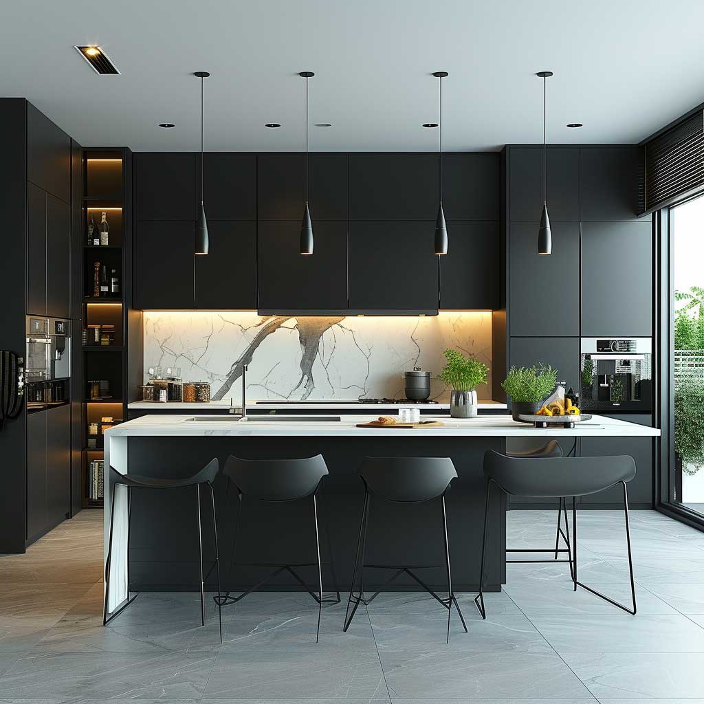
Monochrome kitchen design is the application of simple room colour logic at its most structured: two shades, maximum, doing the full visual job through contrast and finish variation rather than colour variety. A kitchen painted or fitted entirely in black and white — with grey as the mediator — works because the eye fills the gaps with light, shadow, and reflection rather than hunting for another colour to land on. The design rule that holds this together is the 60-30-10 ratio applied within the single colour family: 60% of the dominant tone (usually white or off-white walls and upper cabinetry), 30% of the contrast tone (black or charcoal lowers and island), and 10% of texture and hardware in metal finishes.
Kitchens require paint every three to four years due to heat, grease, and steam — significantly more frequently than bedrooms — which means the finish you choose matters as much as the colour. A flat or matte finish on kitchen walls looks sophisticated but shows every splash and cannot be scrubbed without removing the paint. Stylists recommend a satin or eggshell finish for kitchen walls and a semi-gloss for cabinetry, which cleans with a damp cloth and holds up to daily contact without scuffing. The trick here is using two finishes within the same colour: matte grey walls paired with semi-gloss grey cabinetry read as intentional variation, not inconsistency.
Cabinetry carries the bulk of the visual weight in a monochrome kitchen. Matte black lower cabinets pull depth into the base of the room while white or off-white uppers lift the ceiling line — a combination that effectively makes a standard-height kitchen feel taller without any structural changes. The mistake most people make here: using all four walls in a deep tone in a kitchen under 200 square feet. A kitchen might have only 200 to 300 square feet of paintable wall area due to appliances and cabinets, meaning a single dark tone on all walls can feel suffocating without the balance of light upper surfaces. One feature wall or the cabinetry alone carries the dark colour far more effectively.


Countertops and backsplash are where a monochrome kitchen gains its texture signal. Materials like quartz and marble with natural grey veining introduce movement into the white base without adding a competing colour — it’s the visual equivalent of a whisper rather than a shout. For more on how monochrome kitchen wall decor can add geometric and textural depth through backsplash and art choices, the principles translate directly to this palette. A solid-black countertop against white uppers is the cleanest look, but requires daily wiping — black surfaces show water marks, fingerprints, and crumbs at a rate that white countertops simply don’t.
Lighting in a monochrome kitchen needs to be warm-toned (2700K to 3000K), not the cool white common in budget LED strips. Cool light in a black-and-white kitchen reads clinical — like a professional kitchen, not a home one. Under-cabinet lighting at 2700K warms the countertop surface and adds the dimension that keeps the design from feeling flat. Pendant lights above an island in a matte black or brushed chrome finish stay within the palette while providing the point light sources needed to make marble veining and wood grain visible. Flooring in polished concrete, geometric tile, or lighter hardwood anchors the scheme without fighting for attention — the floor is the quietest surface in the room precisely because everything above it is already doing the work.
| Room Type | Palette Approach | Repaint Frequency | Key Risk |
|---|---|---|---|
| Minimalist Bedroom | Soft greys, cool blues, warm whites (LRV 55–85) | Every 5–7 years | Undertone mismatch with flooring |
| Bright Living Room | Pale neutrals, warm whites, light beiges (LRV 75–90) | Every 5–7 years | Texture-free surfaces reading as sterile |
| Monochrome Kitchen | Black, white, grey — matte/semi-gloss variation | Every 3–4 years | Dark tones in small footprint closing the room |
According to the Sherwin-Williams paint calculator, a standard gallon covers 350 to 400 square feet per coat on smooth, sealed surfaces — a useful baseline before buying, since kitchens often need two to three gallons due to precision cutting around cabinets and appliances even in smaller spaces. Buying one gallon short is far more disruptive than having half a gallon left over, which you can store for touch-ups over the three-to-four-year lifespan of a kitchen paint job. Buy on the generous side, store the remainder sealed, and label it with the colour name, finish, and purchase date. That single step saves a full afternoon of colour-matching three years from now.
For a detailed reference on how light interacts with kitchen surfaces and what the Sherwin-Williams professional colour tool can show you before committing, the Sherwin-Williams Repose Gray SW 7015 page is worth a look even if grey isn’t your final choice — the undertone analysis and room visualiser apply the same way to any neutral-family colour.
Room Colour Design
Restraint Is the Skill — Not the Limitation
A bedroom in soft grey, a living room in warm white, a kitchen in black and white: none of these are default choices. They are precision decisions that require knowing your light direction, your floor undertone, and your repaint timeline.
Quality interior paint runs $55 to $120 per gallon depending on brand and line. Buying cheap costs you extra coats, extra weekends, and a finish that shows its age in two years instead of seven.
Test on the wall. Check at three times of day. Commit to the finish, not just the colour. Save this post.
Related Topics