The way we approach painting our homes is undergoing a massive transformation. For years the standard practice involved painting walls one shade while leaving the ceiling bright white and the trim a glossy neutral. Today designers and homeowners are abandoning this fragmented approach in favor of something much more cohesive and immersive. By taking a single muted hue and applying it across multiple surfaces you can instantly elevate the sophistication of your main gathering spaces. This technique wraps a room in a continuous blanket of soothing tones creating an atmosphere that feels intentionally crafted and remarkably calm. It is a powerful design strategy that fundamentally shifts how light and shadow play across your architecture.
Understanding The Basics Of Soft Color Drenching In Modern Living Rooms
To fully grasp why soft color drenching is becoming the most sought after interior color trend we must first look at how we have traditionally painted our domestic spaces. Historically the standard rule of thumb dictated that ceilings should be painted flat white to reflect maximum light while baseboards window casings and doors were typically painted in a semi gloss white to highlight the architectural details. While this approach certainly provides a clean and crisp aesthetic it also creates harsh visual breaks throughout a space. Every time the eye travels up a wall and hits a stark white ceiling or looks down and registers a bright white baseboard the visual flow is interrupted. These contrasting lines subconsciously chop a room into distinct horizontal and vertical segments which can actually make a space feel significantly smaller and more disjointed than it truly is.
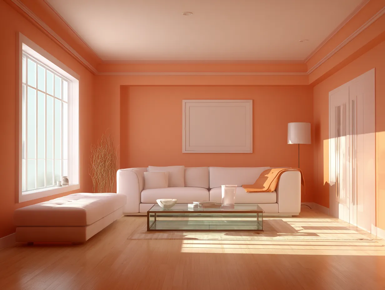
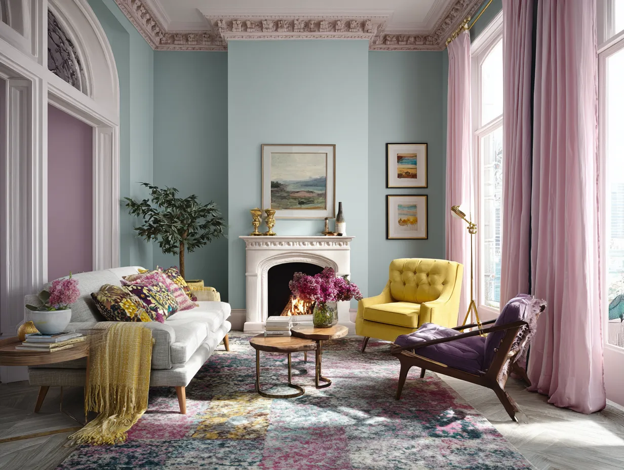
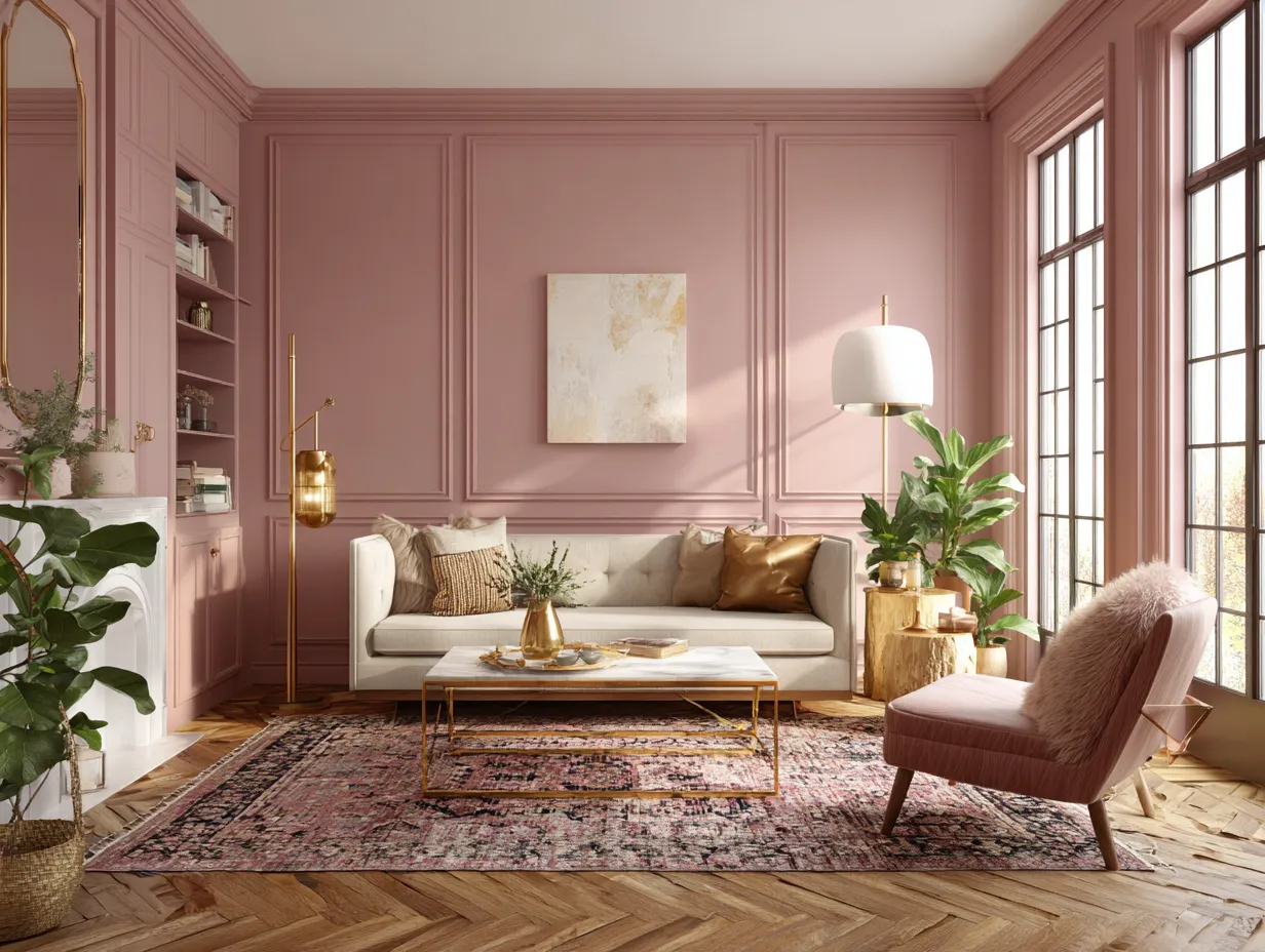
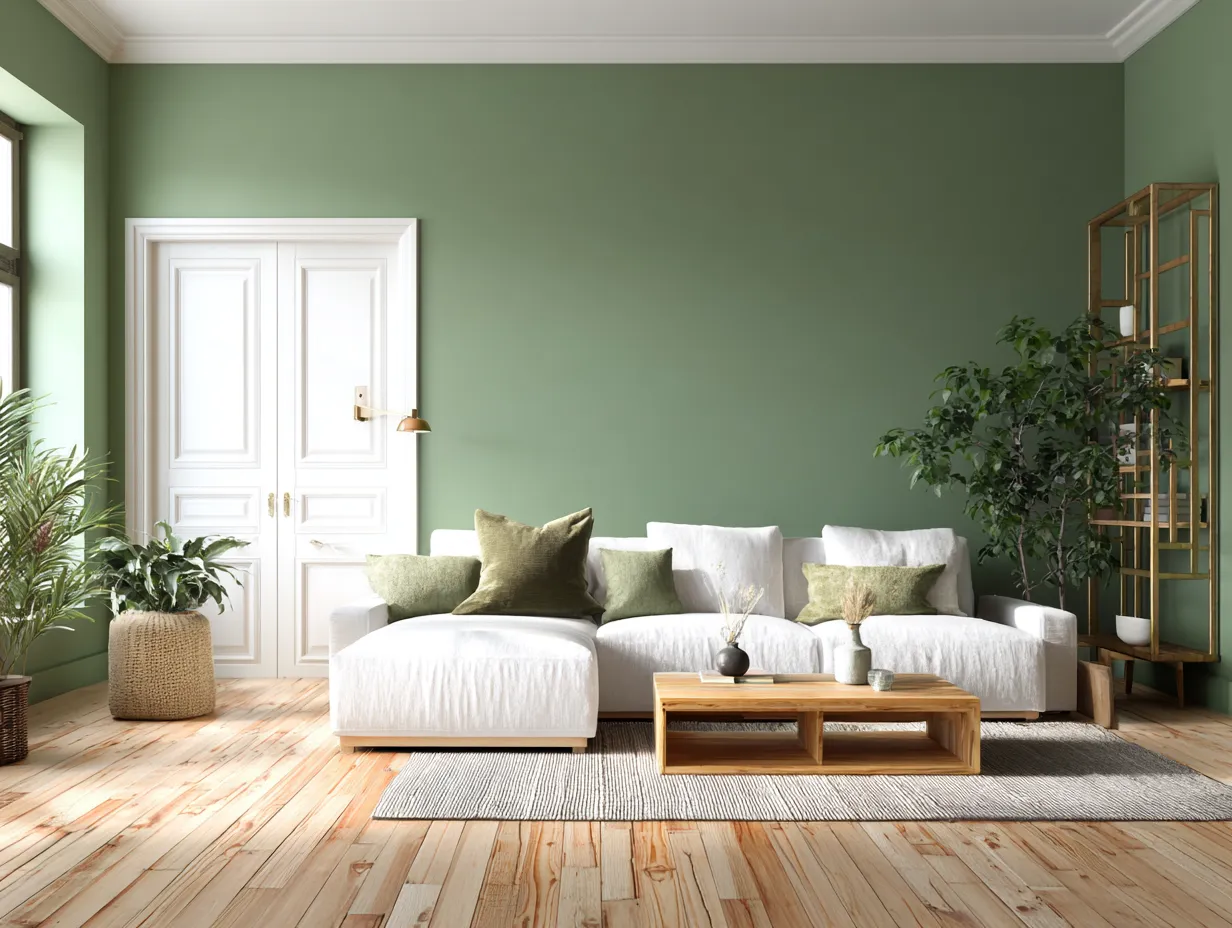
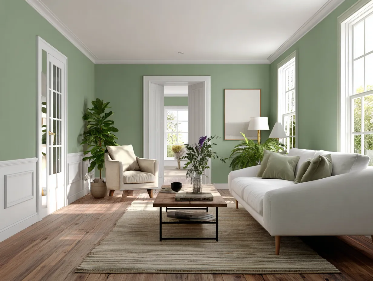
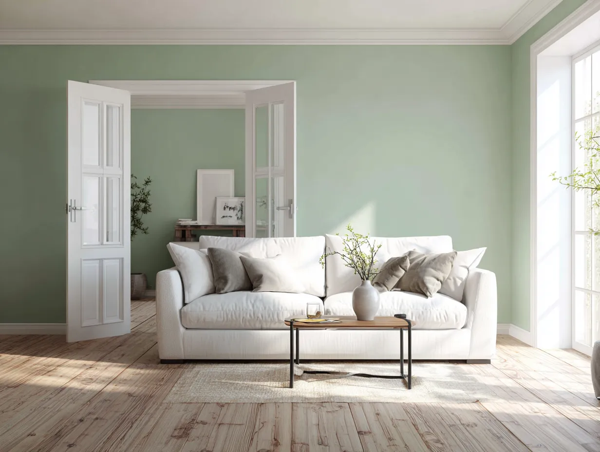
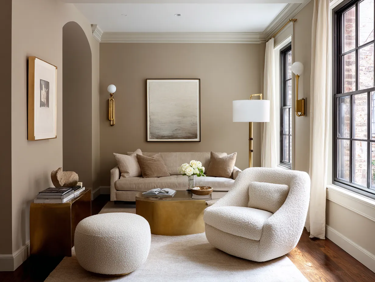
By applying a single continuous shade across all of these surfaces you effectively erase those harsh visual boundaries. When the walls baseboards crown molding doors and ceiling share the exact same pigment the architecture of the room begins to blur in the most beautiful way possible. The eye is no longer drawn to the perimeter of the room or the abrupt transitions between materials. Instead the room becomes a singular unified envelope. This lack of visual interruption creates a profound optical illusion particularly when it comes to ceiling height. Because there is no stark line delineating where the wall ends and the ceiling begins the walls appear to stretch upward infinitely making standard ceilings feel grand and expansive.
The psychological impact of wrapping a space entirely in one hue cannot be overstated. When you walk into a living room that has utilized this monochromatic technique the immediate sensation is one of being embraced. The continuous color provides a grounding calming effect that is incredibly soothing to the nervous system. The space feels deliberate curated and inherently relaxing. This is why soft color drenching is particularly effective in spaces designed for unwinding after a long day. It removes the visual clutter of contrasting trim allowing the mind to rest and focus entirely on the comfort of the environment rather than the geometry of the architecture.+1
A common concern when adopting this comprehensive painting strategy is the fear that a room will feel flat or monotonous without the traditional white trim to provide contrast. However this fear ignores the fundamental physics of light and shadow. Even when you use the exact same paint color on every single surface the natural architecture of the room ensures that the color will read differently depending on the angle and the light source. The way natural sunlight hits a vertical wall is completely different from how it washes across a horizontal ceiling or catches the curved profile of crown molding.
These varying light interactions create a stunning natural gradient throughout the room. The corners of the space will pool with deeper shadows emphasizing the richness of the interior color while the surfaces directly facing windows will appear significantly lighter and more vibrant. Furthermore you can enhance this subtle contrast by varying the paint finishes while keeping the pigment identical. Utilizing a velvety matte finish on the expansive walls and ceiling paired with a durable satin or eggshell finish on the doors and trim creates a tactile contrast that is incredibly sophisticated. The slight sheen of the trim will catch the light and subtly stand out against the flat walls providing all the architectural definition you need without breaking the continuous flow of the color.
Choosing The Perfect Muted Interior Color For Your Space Upgrade
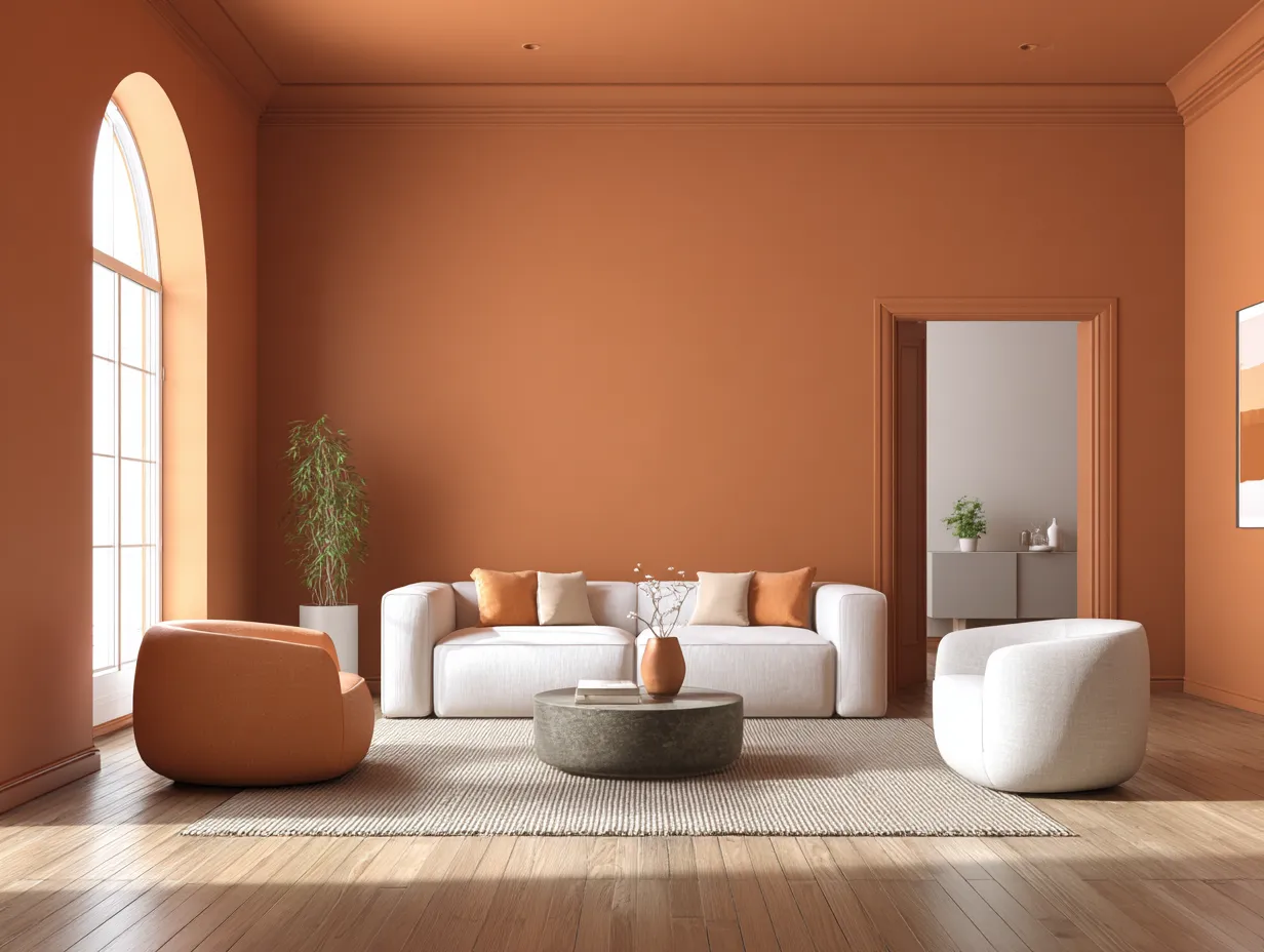
Selecting the right hue is the most critical step when planning a living room upgrade of this magnitude. While bold jewel tones and deep moody shades have their place in maximalist design the concept of soft color drenching specifically relies on muted earthy and organic tones to achieve its signature calming effect. The goal is not to overwhelm the senses with aggressive pigmentation but rather to create a gentle wash of color that feels as natural as an overcast sky or a misty forest. When a color is destined to cover the ceiling the doors and the trim it needs to possess a certain level of restraint. Shades that are too vibrant will quickly become visually exhausting when amplified across hundreds of square feet of surface area.
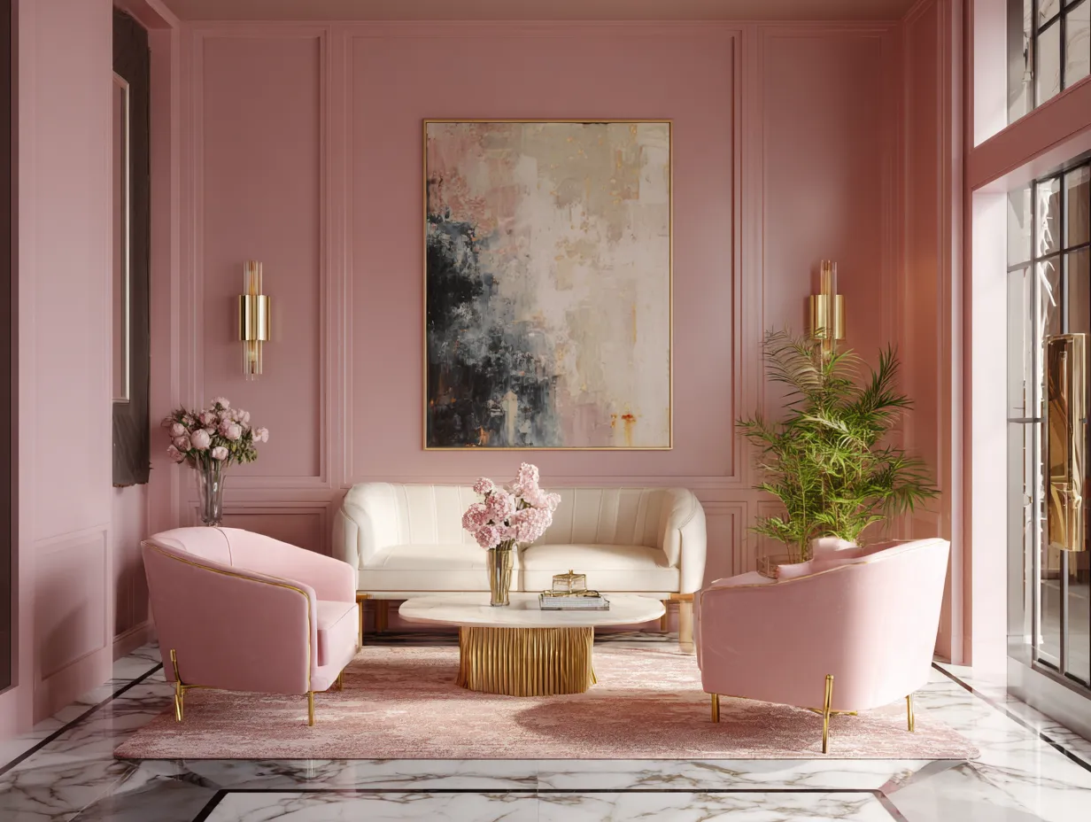
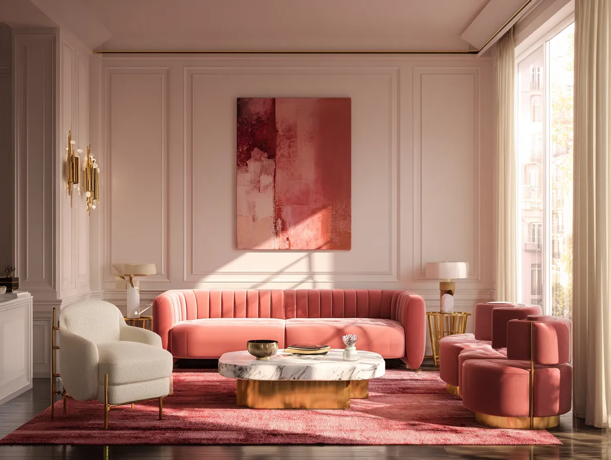
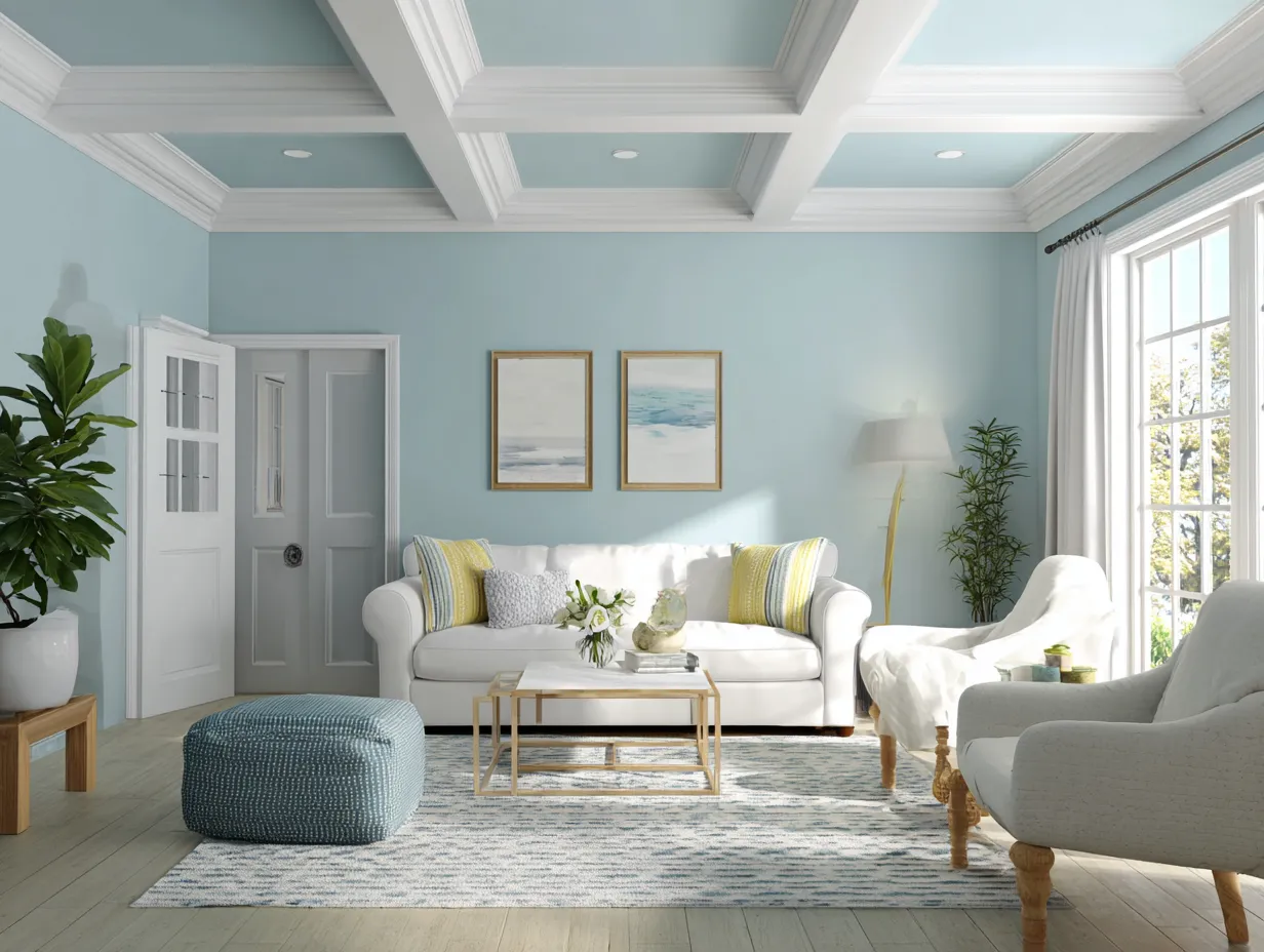
The current shift in design favors warm complex neutrals and dusty pastels over the sterile greys and stark whites of the previous decade. Think along the lines of warm oatmeal soft plaster muted sage green dusty terracotta and pale buttery yellow. These shades carry enough pigment to make a definitive design statement but possess enough grey or brown undertones to remain grounded and sophisticated. The undertones are the secret weapon of these muted shades. A flat pastel pink can easily look juvenile but a dusty rose with heavy brown undertones feels incredibly elegant and mature when wrapped around an entire room.
When you commit to painting every surface you must acutely understand how light interacts with your chosen shade throughout the day. Natural light is the ultimate wildcard in interior design. A soft clay color that looks perfectly balanced in a sun drenched south facing room might look entirely different in a north facing room that only receives cool indirect light. In a north facing space cool light can emphasize the grey undertones in a paint making a warm taupe appear suddenly icy. Conversely the golden afternoon light of a west facing room can amplify warm undertones making a subtle peach shade feel unexpectedly fiery.
Because of this intense interaction with light testing your interior color choices is absolutely mandatory. You cannot rely on a tiny paper swatch when planning a soft color drenching project. You must paint large sections of your walls preferably right next to the trim and ideally a section of the ceiling. You need to observe how the color shifts from the crisp morning light to the warm afternoon sun and finally under your artificial lighting at night. Artificial lighting introduces its own set of variables as warm toned bulbs will enhance different pigments than cool white bulbs.
Another crucial factor to consider during the selection process is a phenomenon known as color bouncing. When a single hue is painted on all four walls and the ceiling the color reflects off of itself intensifying the overall saturation of the room. A muted olive green that looks perfectly subdued on a single accent wall will appear significantly greener and more vibrant when it is bouncing off the opposite walls and radiating down from the ceiling. To combat this amplification designers often recommend selecting a shade that is one or two stops lighter on the paint card than your initial instinct. This ensures that once the room is fully saturated the final result remains a gentle wash of color rather than an overwhelming sensory experience. By carefully considering the undertones the light direction and the amplification effect you can select a shade that truly transforms your space into a serene sanctuary.
Styling Furniture And Decor Around A Monochromatic Painted Room
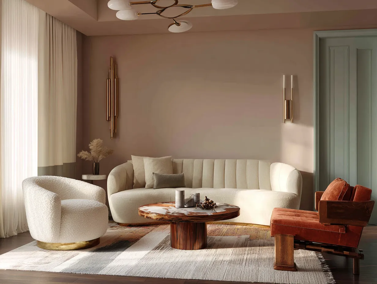
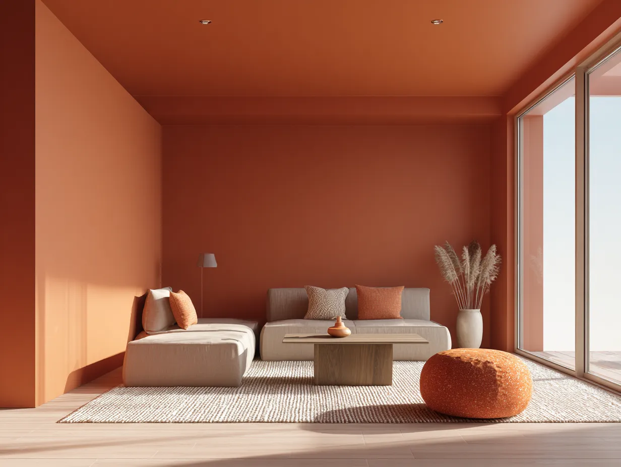
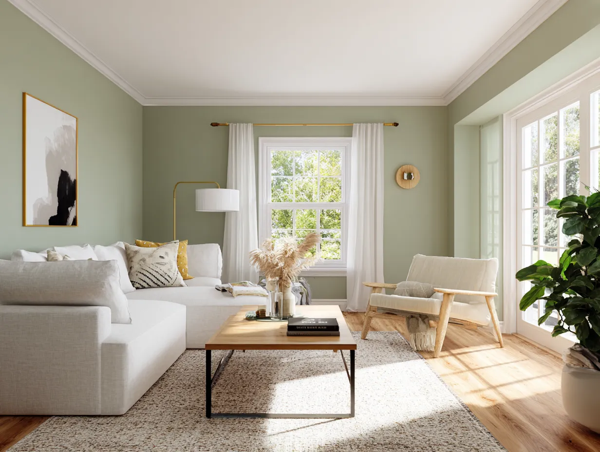
Once the paint has dried and the space is fully enveloped the next challenge is furnishing and decorating a room that lacks traditional architectural contrast. In a standard room with white trim the contrast is built directly into the walls. In a space utilizing soft color drenching the walls ceiling and trim recede acting as a singular dramatic backdrop. This means your furniture textiles and artwork must step up to provide the necessary visual interest and depth. Without careful curation a monochromatic room can easily slide from calming to simply boring. The secret to preventing this lies in the masterful application of texture contrast and reflective surfaces.
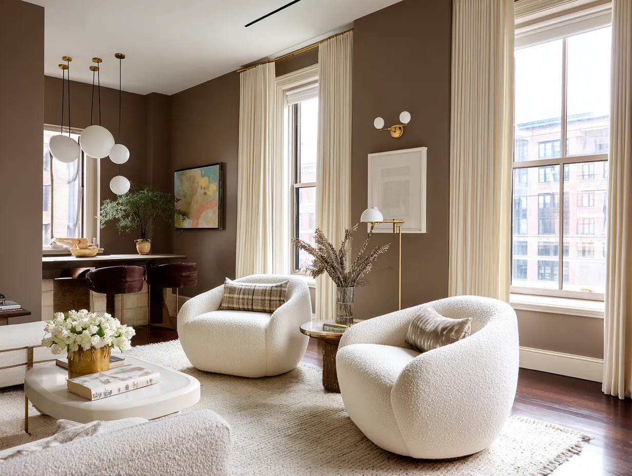
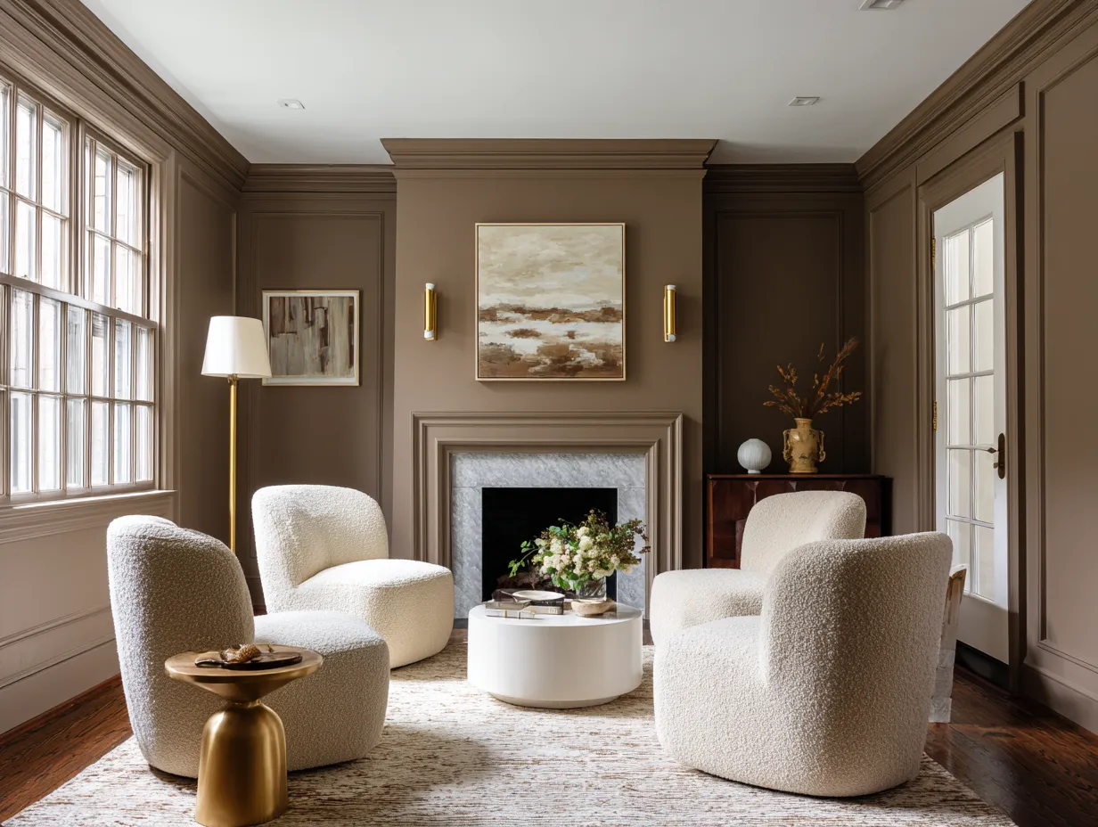
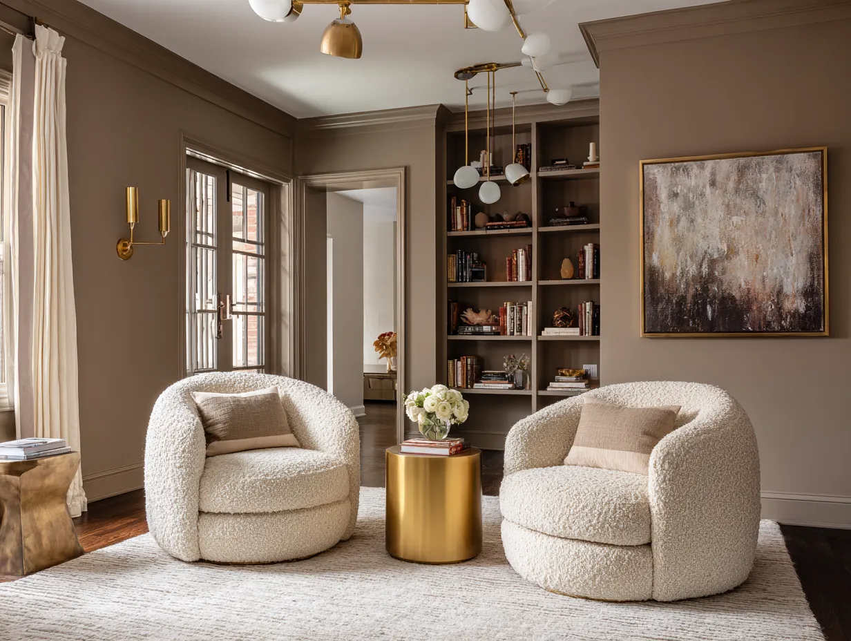
Texture becomes the primary tool for creating depth when color variation is minimized. If your walls are a smooth matte sage green filling the room with flat smooth furniture will result in a lifeless design. You must introduce a wide variety of tactile materials to engage the senses. Heavy linen sofas nubby boucle armchairs deeply grooved wooden side tables and thick woolen rugs are essential components. These varied textures absorb and reflect light differently adding crucial layers of visual complexity to the living room. The interplay between a sleek polished stone coffee table and a highly textured woven rug creates a dynamic tension that keeps the eye moving and engaged even against a uniform background.
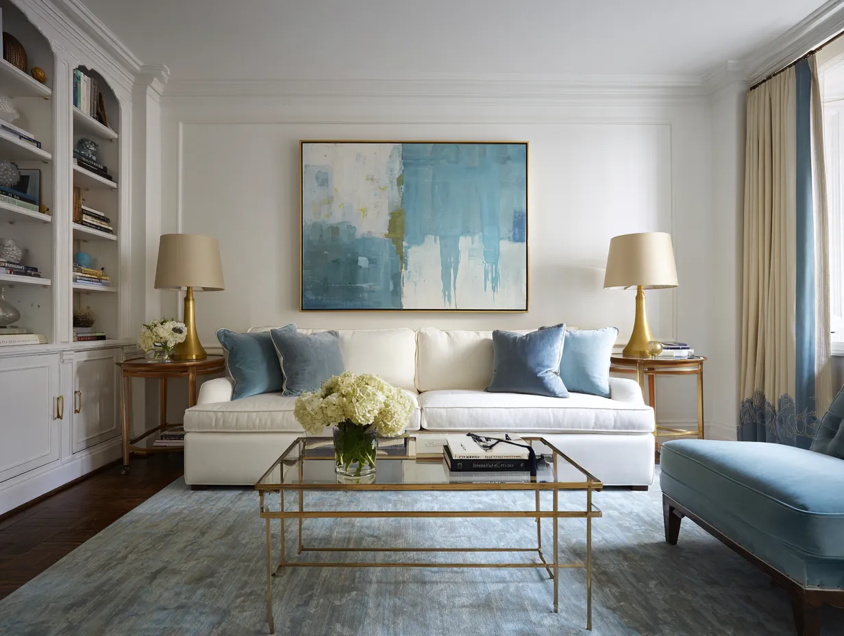
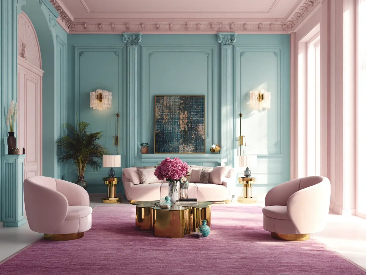
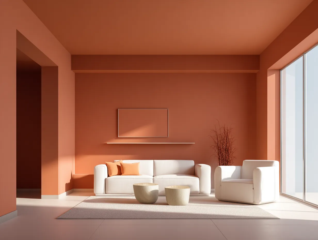
When it comes to selecting furniture colors against a unified interior color you have two primary styling avenues. The first is to lean entirely into a tonal look selecting upholstery and decor that sit just a few shades lighter or darker than the walls. For example pairing muted terracotta walls with rust colored velvet chairs and pale peach linen curtains creates an incredibly rich layered environment that feels relentlessly cohesive. The second approach is to introduce sharp high contrast elements. Placing a crisp white structural sofa and stark black accent chairs against a soft dusty blue background creates a striking modern aesthetic where the furniture pops dramatically against the receding walls.
Artwork and wall decor take on an entirely new life in a saturated room. A beautifully wrapped room acts much like an upscale art gallery providing a solid distraction free canvas for your favorite pieces. Without the interruption of contrasting crown molding or bright white door frames the eye is naturally drawn directly to the art. Large scale abstract canvases or meticulously curated gallery walls look particularly stunning against a muted backdrop. The frames themselves become important architectural elements. Thick ornate gold frames or sleek matte black borders stand out sharply providing necessary geometric structure to the continuous wash of paint.
Lighting fixtures serve a dual purpose in this environment acting as both illuminators and sculptural decor. Because the ceiling matches the walls a statement chandelier or a sweeping modern pendant light becomes a prominent focal point. This is the perfect opportunity to introduce metallic finishes which are vital for adding glamour and brightness to the space. Unlacquered brass polished nickel or rich oiled bronze hardware reflects light beautifully piercing through the continuous matte paint. By thoughtfully layering varied textures introducing strategic contrast and utilizing reflective metals you ensure that your living room upgrade feels dynamic expertly curated and endlessly inviting.
Final Thoughts On Upgrading Your Home With Cohesive Paint
Embracing a unified painting strategy represents a bold step away from conventional design rules offering a pathway to create spaces that are profoundly calming and visually expansive. By wrapping your gathering areas in soothing muted tones you eliminate harsh visual boundaries and allow the architecture to flow seamlessly. This method not only elevates the perceived value and sophistication of a space but also creates a deeply comforting environment tailored for relaxation. Committing to this immersive design approach allows you to completely redefine the atmosphere of your home proving that sometimes the most impactful changes come from rethinking how we apply the simplest of materials.+1
Related Topics


