Quick Scan: Which Colour Is Right for You?
🟢 Want calm? Sage, elephant grey, or white.
🔵 Want drama? Midnight blue, charcoal, or bordeaux.
🟡 Want warmth? Golden yellow, rose, or ruby red.
🟣 Want luxury? Teal with gold accents or bordeaux with brass.
⚪ Want a blank canvas? White — but pick warm white, not cool bright white.
I repainted my living room three times in two years. Cost me over $600 in wasted gallons. The first shade looked gorgeous on the swatch and turned into a hospital hallway under actual light. Don’t do that.
These 10 paint colours for living room walls are the ones I’d buy again tomorrow. Every colour here works in a modern living room, whether you want calming sitting room colours or something bold enough to stop guests mid-sentence. I’m covering the exact shades, the brands I trust, what to pair them with, and what mistakes to skip.
No fluff. Just room paint colors that actually hold up.
Quick Summary
Best neutral paint colour for living rooms: Sage green or elephant grey — safe, adaptable, works with any furniture.
Best bold paint colour for living rooms: Midnight blue or charcoal — dramatic but liveable if you have enough light.
Best warm paint colour for living rooms: Golden yellow or rose — perfect for north-facing rooms that feel cold.
Biggest mistake: Picking a colour under store lighting and skipping a real wall test. Paint shifts dramatically under your own lamps.
Budget to expect: $55–$115 per gallon depending on brand. Two coats minimum on any colour.
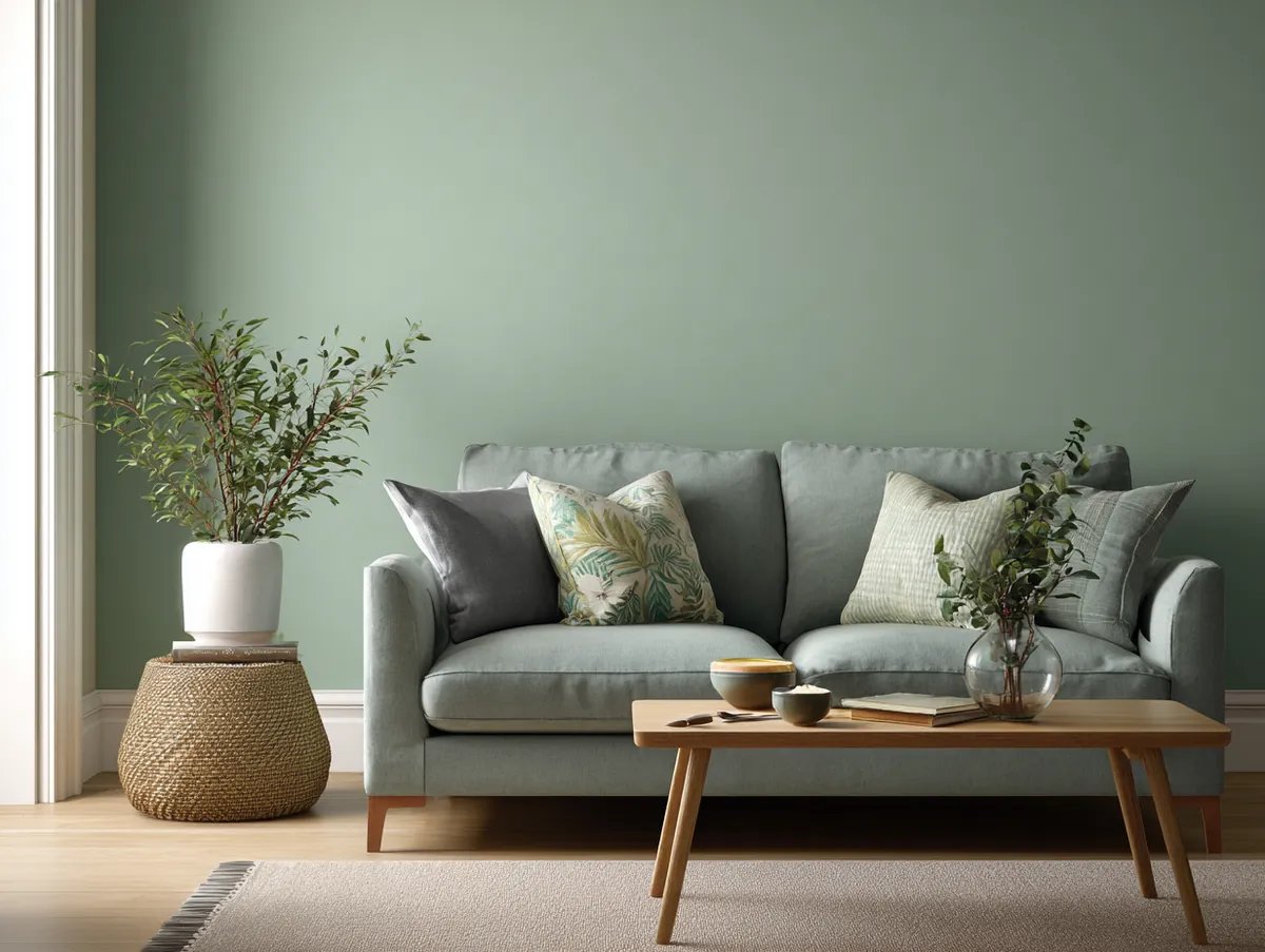
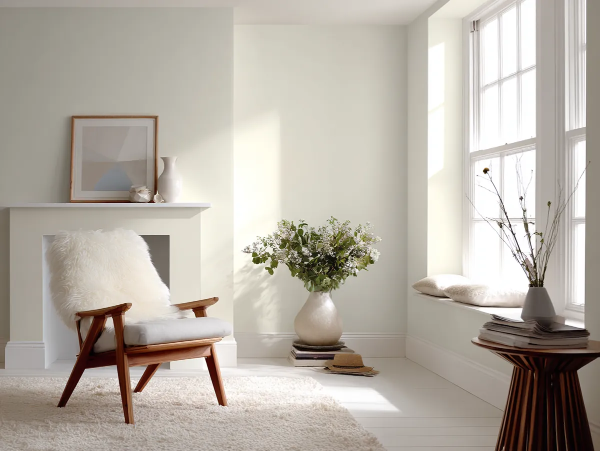
Sage Green: The Best Paint Colour for Living Rooms That Need Calm
Why sage works in modern living rooms:
- Muted green-grey tone that reflects natural light without glare
- Pairs with white trim, wooden accents, blush pink, and soft lavender
- Works in both minimalist and rustic interior styles
- Creates a calming atmosphere without feeling cold or clinical
- Velvet and linen textures in sage tones add depth to the walls
When it comes to selecting paint colours for living rooms, the choices are vast and varied. However, one shade that has been gaining immense popularity in recent years is sage. The Soothing Sage Serenity is not just a colour; it’s an experience.
Sage, a muted green hue with grey undertones, is reminiscent of nature, bringing the calmness of the outdoors into the heart of our homes. Its versatility is unmatched. Whether you have a modern minimalist home or a rustic country-style abode, sage seamlessly fits in, enhancing the aesthetic appeal. If you want to take this approach even further, soft color drenching your entire living room in one muted shade is the technique designers are using right now to make sage walls feel even more immersive.
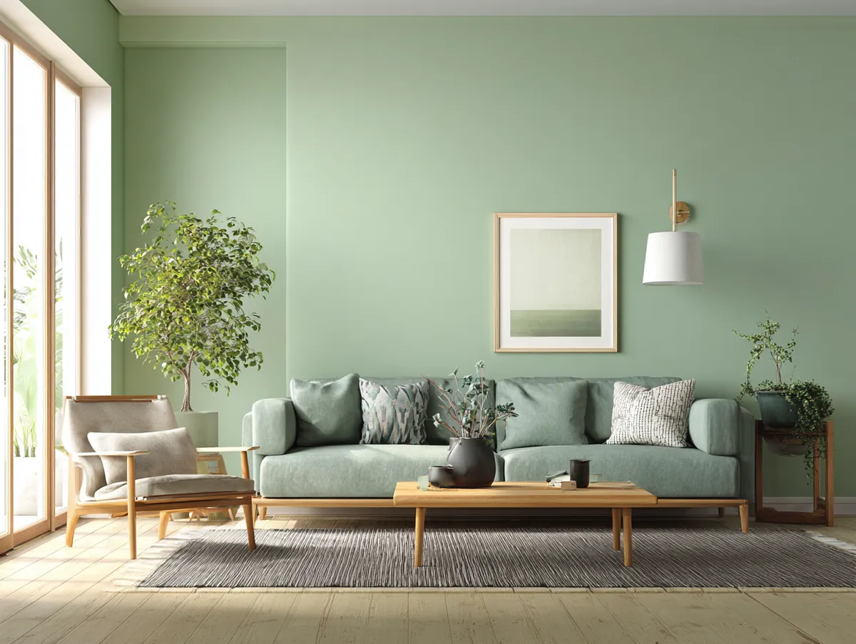
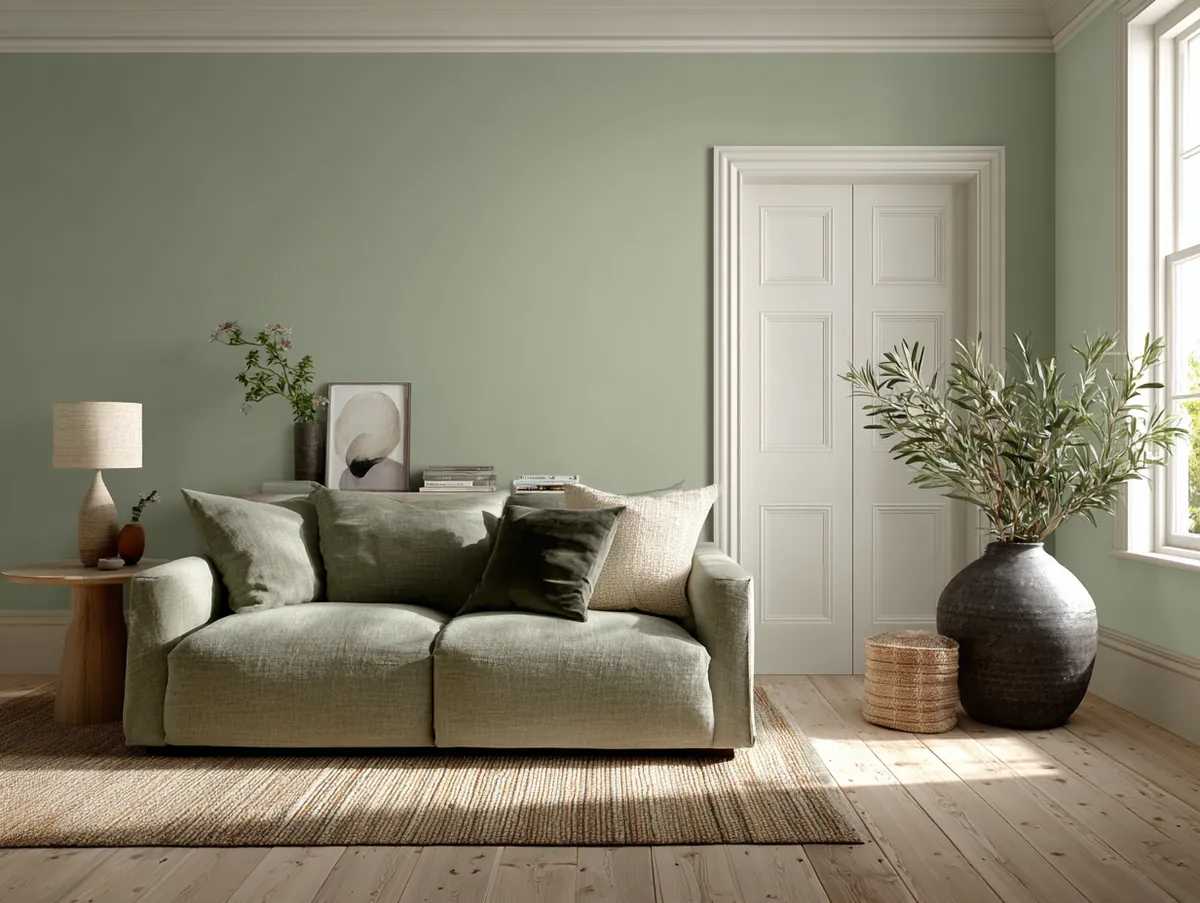
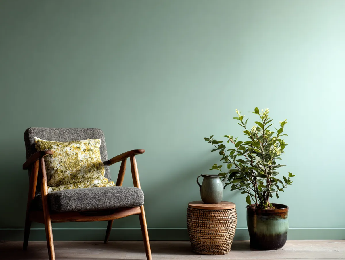
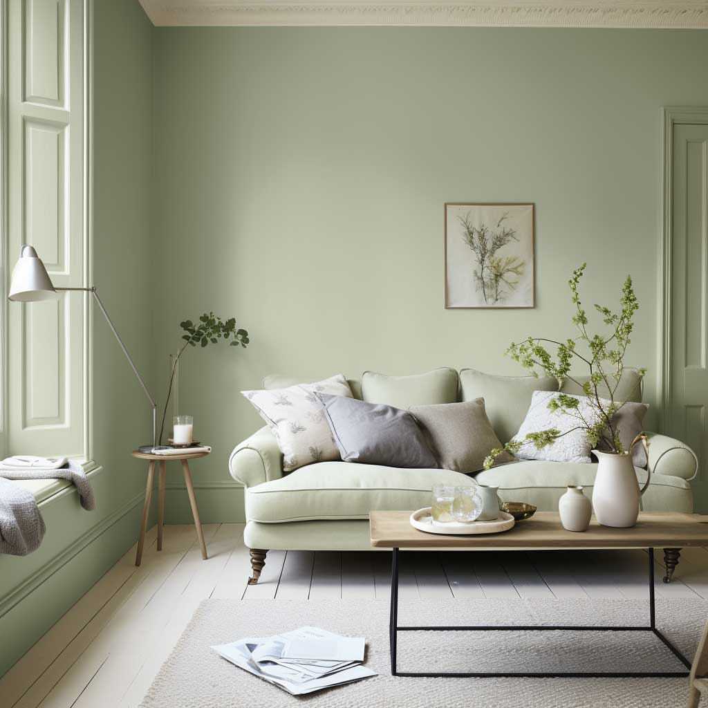
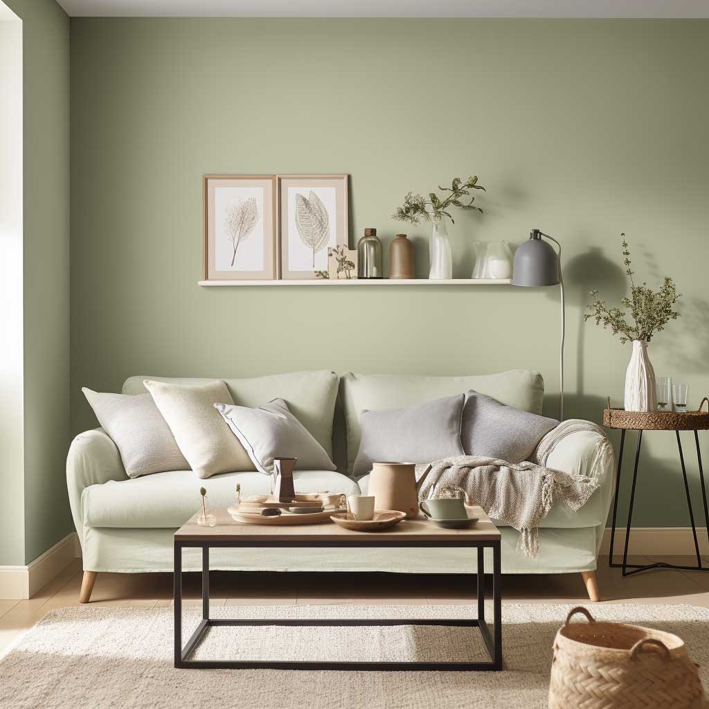
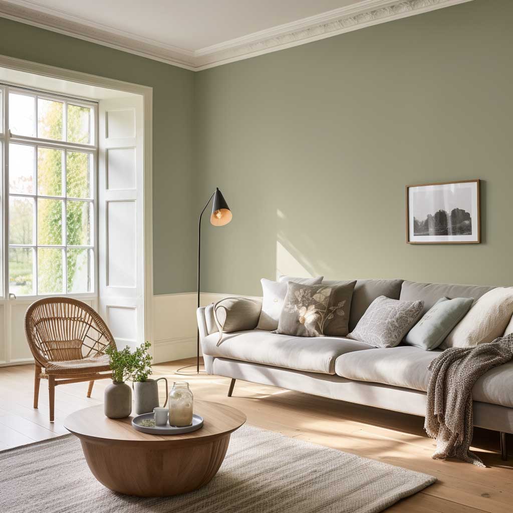
The beauty of sage lies in its ability to create a serene and calming atmosphere. In today’s fast-paced world, our homes are our sanctuaries, and what better way to promote relaxation than with a colour that echoes tranquillity? The Soothing Sage Serenity does just that. It’s like taking a deep breath every time you walk into the room.
Moreover, sage is incredibly adaptive. It pairs beautifully with a range of colours. Imagine a living room with sage walls, crisp white mouldings, and wooden accents. The combination is both refreshing and grounding. Alternatively, pairing sage with pastel hues like blush pink or soft lavender can create a whimsical and romantic ambiance.
Incorporating textures can further elevate the sage experience. Velvet sage cushions, a soft woolen throw, or even a sage-tinted glass vase can add depth and dimension to the room. Art pieces with hints of sage, be it in the form of abstract paintings or pottery, can serve as focal points, drawing attention and admiration.
Benjamin Moore’s Sage Green 2138-40 runs about $55 per gallon and holds up better than Behr’s version, which fades in rooms with southern exposure. I tested both side by side on a 12×14 living room wall. The Behr looked chalky within six months. Don’t cheap out here. If you’re painting all four walls sage, budget $220 minimum for two coats of decent paint. Farrow & Ball’s Vert De Terre costs more — around $115 per gallon — but you’ll notice the depth difference immediately. What colour looks good next to sage? Anything with a warm white base. Stay away from cool bright whites. They make sage look dirty.
You’re already past the safest pick on this list. Keep scrolling for the bold ones.
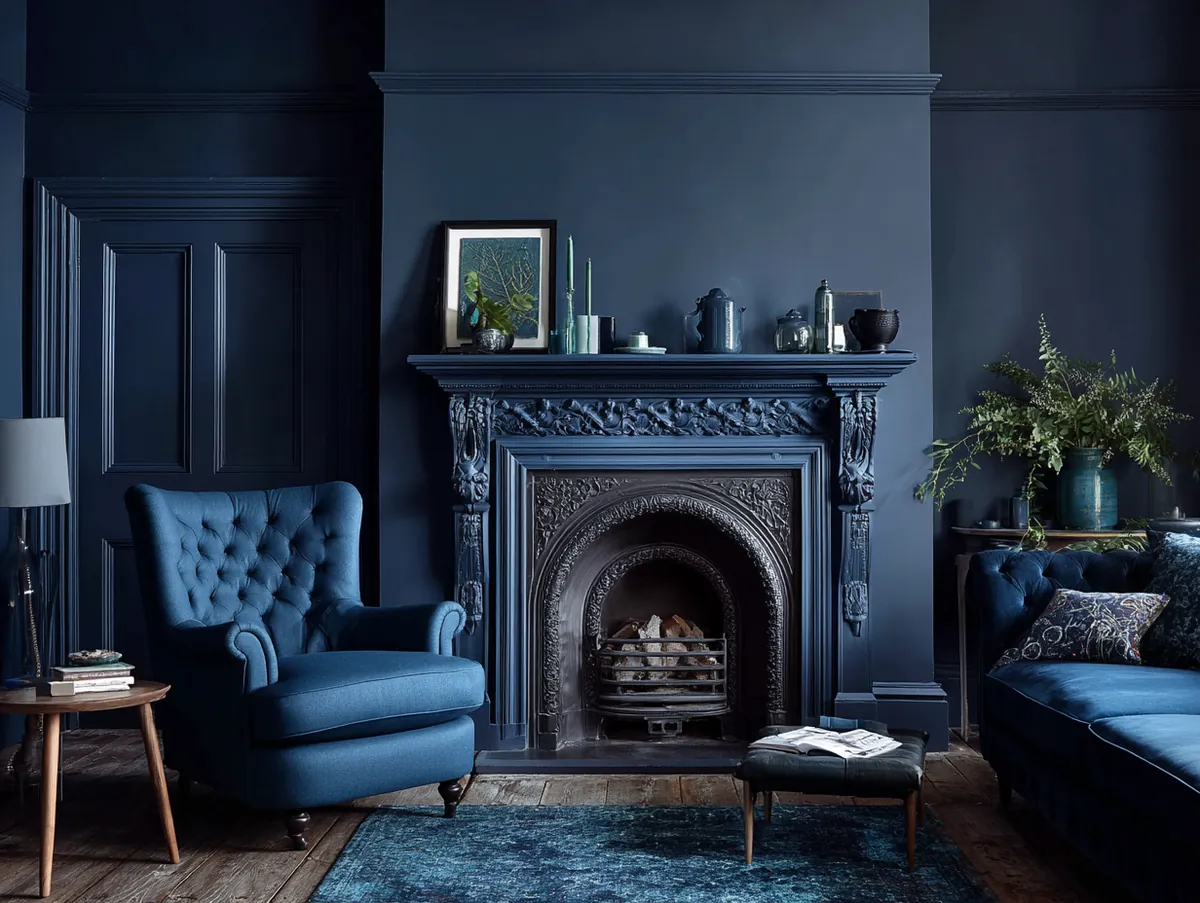
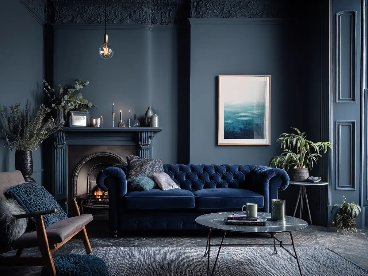
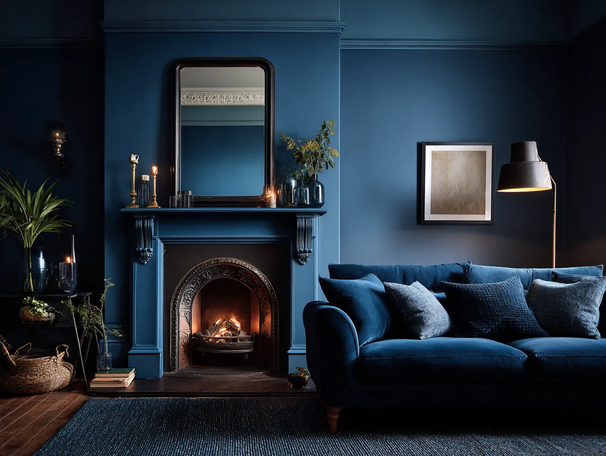
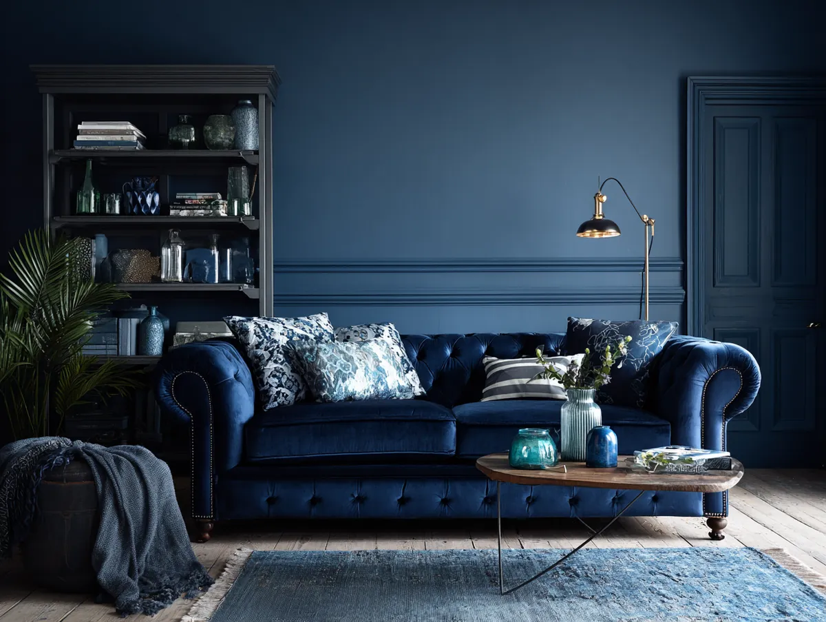
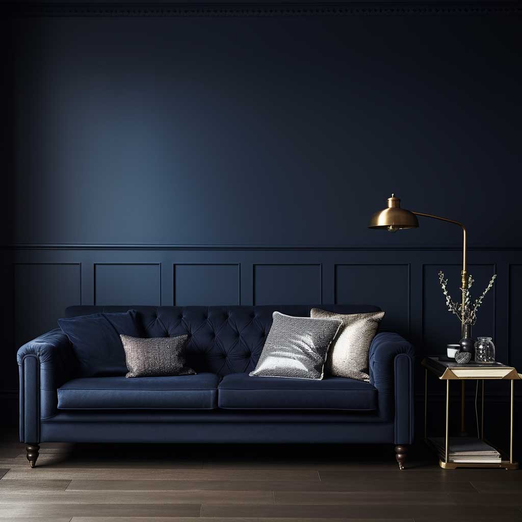
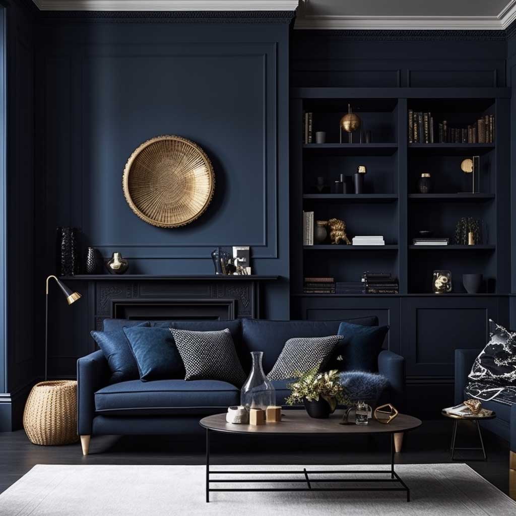
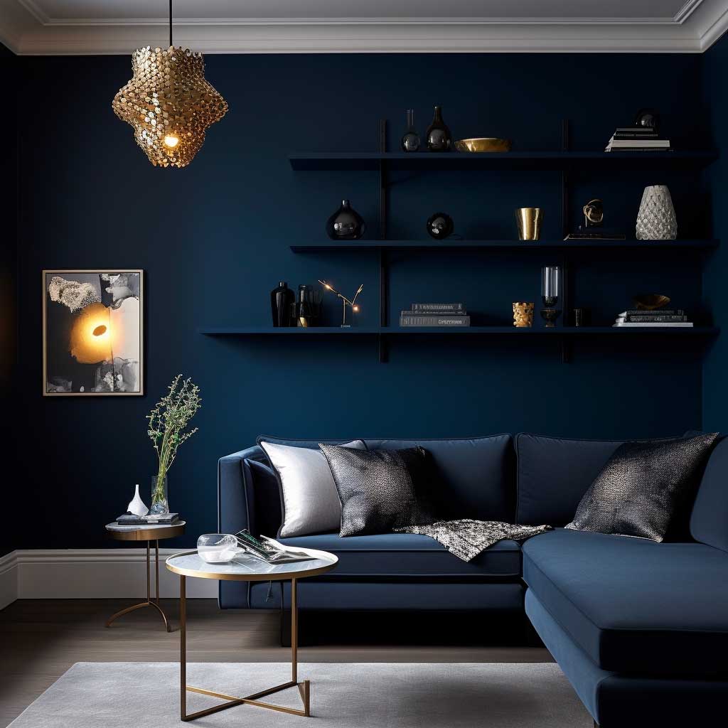
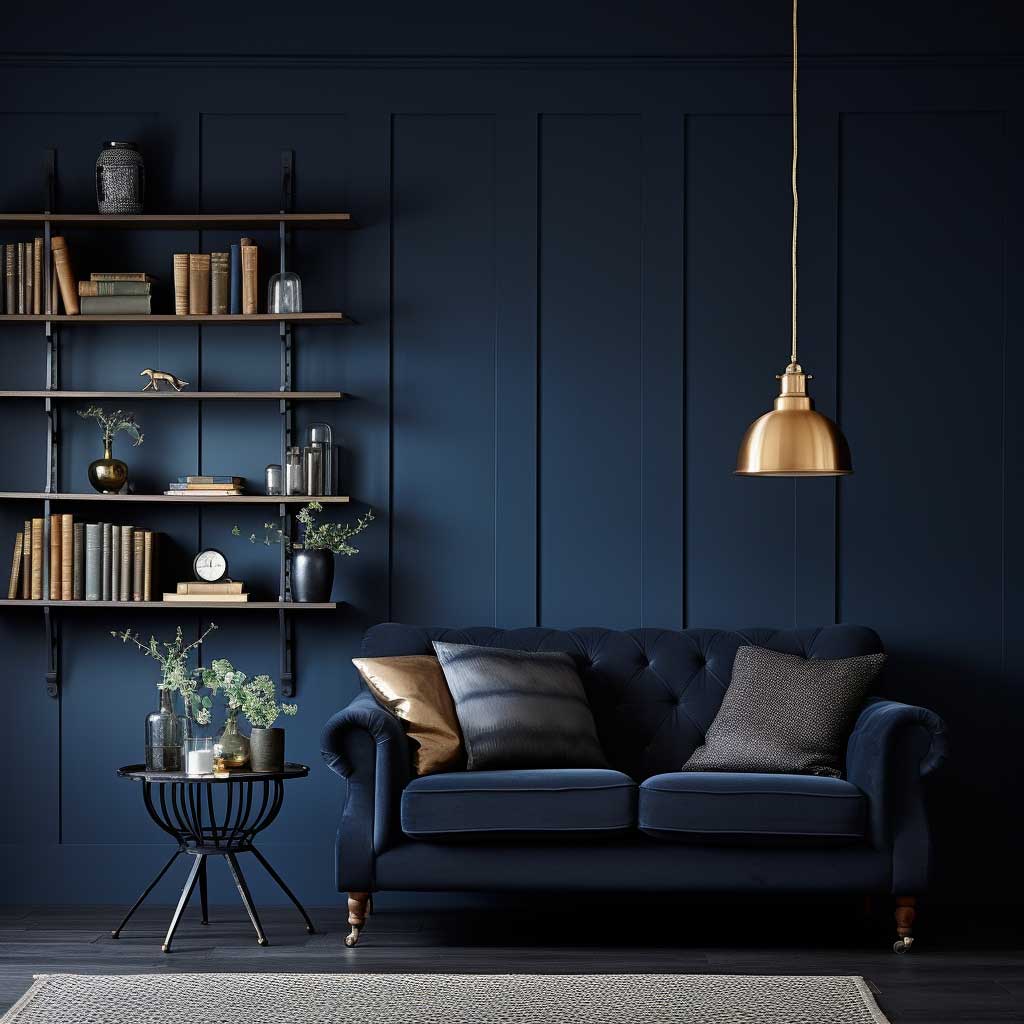
Midnight Blue — Bold and Cozy Living Room Paint Colour
Why midnight blue works in modern living rooms:
- Absorbs light to create an intimate, cozy atmosphere
- Makes architectural features like crown moulding and bookshelves stand out
- Pairs with gold, brass, white furniture, and pastel accents
- Works best in rooms with at least one natural light source
- Use on a single accent wall if painting all four feels too bold
Diving into the realm of paint colours for living rooms, one cannot overlook the allure of Mystical Midnight Blue. This deep, rich hue is reminiscent of the night sky, filled with stars and endless possibilities.
Midnight blue is a colour that exudes sophistication and depth. It’s a bold choice, but for those willing to take the plunge, the rewards are immense. Unlike lighter shades, which reflect light, midnight blue absorbs it, creating an intimate and cozy atmosphere. It’s perfect for those evenings where you curl up with a book or have deep conversations with loved ones.
However, the power of midnight blue lies in its versatility. While it can create a dramatic and moody ambiance, it can also be paired with brighter hues and metallics to add a touch of glamour. Imagine a living room with midnight blue walls, golden accents, and plush white furniture. The contrast is not only visually appealing but also adds a touch of luxury.
Another advantage of Mystical Midnight Blue is its ability to highlight architectural features. In spaces with crown mouldings, wainscoting, or built-in bookshelves, midnight blue can serve as a backdrop, making these features pop.
Accessorizing a midnight blue living room can be an exciting venture. Incorporating patterns, be it in the form of cushions, rugs, or curtains, can break the monotony. Moreover, art pieces, especially those with hints of gold, silver, or pastel shades, can stand out beautifully against a midnight blue backdrop.
In essence, Mystical Midnight Blue is a journey. It’s a dive into the deep ocean of possibilities. It’s a dance under the starlit sky. For those considering paint colours for living rooms, this shade offers an experience that is both mystical and luxurious.
I painted one accent wall midnight blue in a 10×12 living room and it swallowed the space whole. Had to repaint two of the four walls back to off-white. Lesson learned — this colour needs at least one window with direct light or it feels like a cave. Sherwin-Williams Naval SW 6244 costs about $75 per gallon and gives you that deep, rich navy without looking black at night. If you’re going all-in on four walls, you’ll burn through three gallons easy on a standard room. My neighbour went with a cheap brand from Home Depot and the coverage was so thin she needed four coats. What a waste of a weekend.
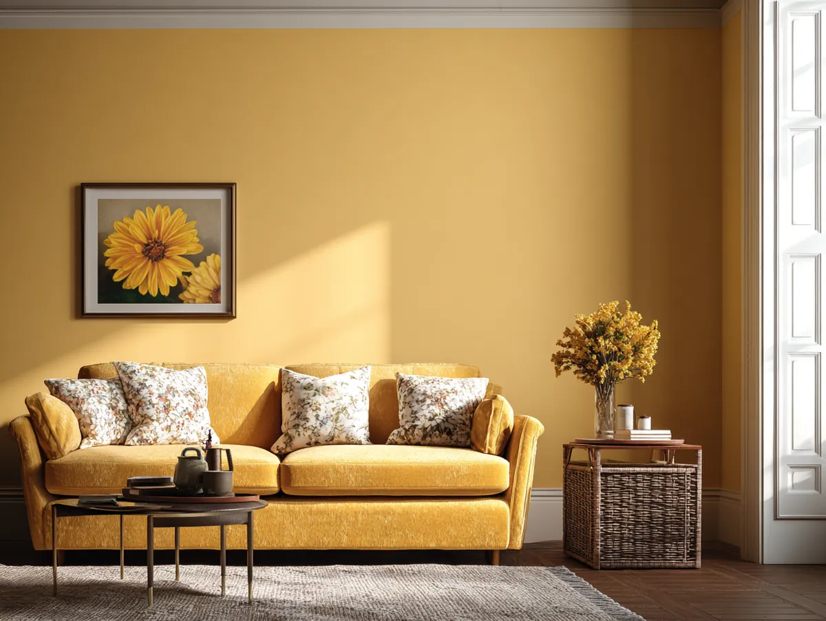
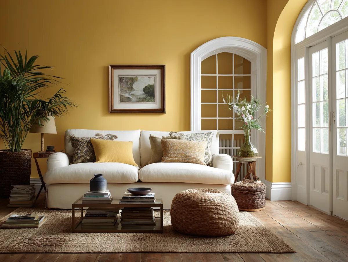
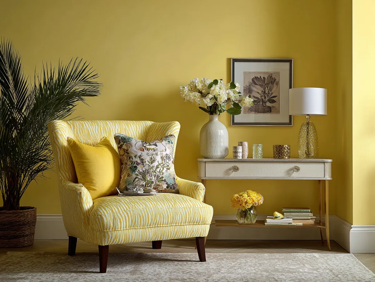
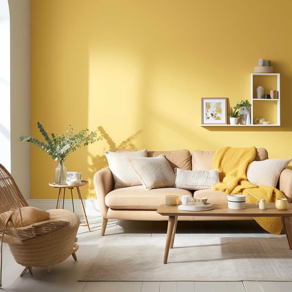
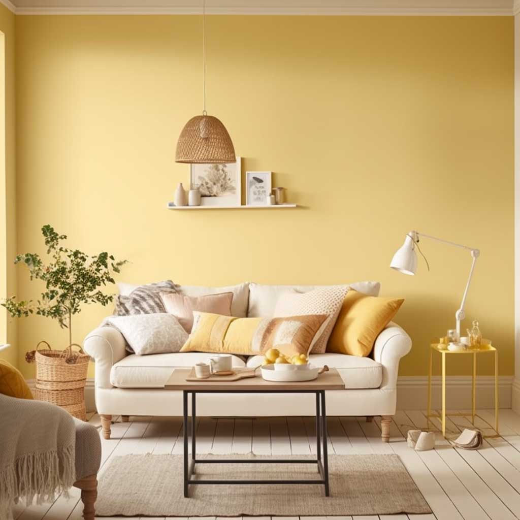
Golden Yellow — A Warm Paint Colour for Bright Living Rooms
Why golden yellow works in modern living rooms:
- Reflects warmth even on grey or overcast days
- Ideal for north-facing rooms that lack direct sunlight
- Pairs with deep blue, emerald green, and white or wooden furniture
- Velvet and silk textures amplify the richness of the golden tone
- Use a muted, earthy yellow rather than a bright primary tone
In the vast spectrum of paint colours for living rooms, there’s a hue that captures the essence of a sunny day, radiating warmth and positivity: the Golden Sunbeam Glow. This colour is not just a shade; it’s a mood enhancer, a reminder of golden hours and sunlit memories.
Golden hues have always been associated with luxury, opulence, and grandeur. But the Golden Sunbeam Glow is different. It’s a delicate balance between luxury and comfort, making it perfect for living spaces. The colour is reminiscent of the first rays of the sun, gently illuminating the world, bringing hope and happiness.


One of the primary advantages of this shade is its ability to brighten up spaces. Even on gloomy days, a living room painted in Golden Sunbeam Glow can uplift one’s spirits. It’s like having a piece of the sun indoors, constantly radiating warmth.
Pairing this golden hue with other colours can create stunning visual contrasts. Imagine a living room with walls painted in Golden Sunbeam Glow, deep blue or emerald green accents, and wooden or white furniture. The result is a space that’s both vibrant and cozy.
Accessorizing a golden living room is an adventure in itself. Incorporating textures, like velvet cushions, silk curtains, or a shaggy rug, can add depth to the room. Art pieces, especially those with hints of blue, green, or even deep red, can stand out beautifully against a golden backdrop.
In conclusion, the Golden Sunbeam Glow is more than just a paint colour for living rooms. It’s an ambiance, a feeling, a constant reminder of sunny days and golden memories. It’s a shade that promises warmth, comfort, and a touch of luxury.
Fair warning: bright primary yellow from a hardware store will make your living room look like a daycare. You need a muted, earthy golden tone. Benjamin Moore’s Hawthorne Yellow HC-4 around $65 per gallon nails that warm-but-not-screaming balance. I stole this trick from a designer friend — test the swatch at 9 PM under your actual lamps, not at noon. Yellow shifts more under artificial light than any other room paint color. Skip Sherwin-Williams Cheerful for living rooms. It reads way too intense on a full wall.
Three down, seven to go. The next one is the colour designers default to when clients can’t decide.
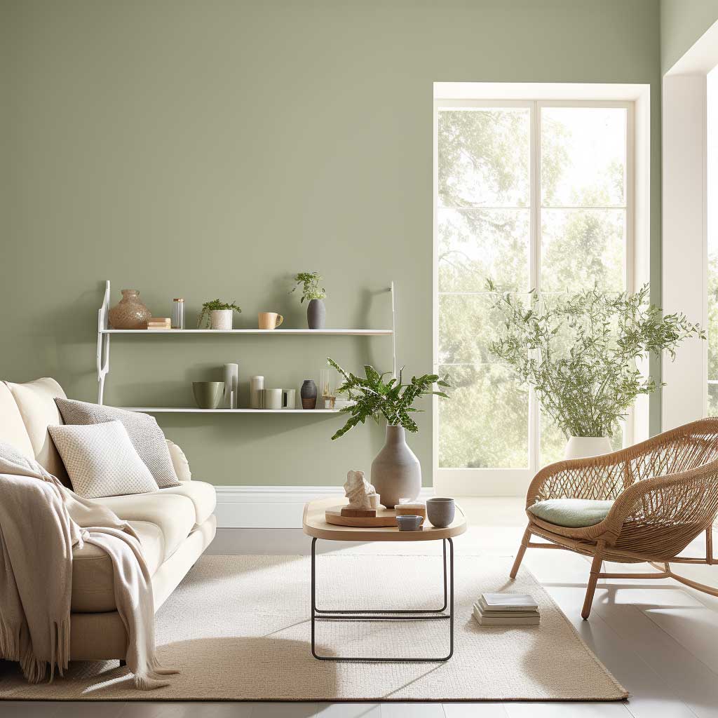
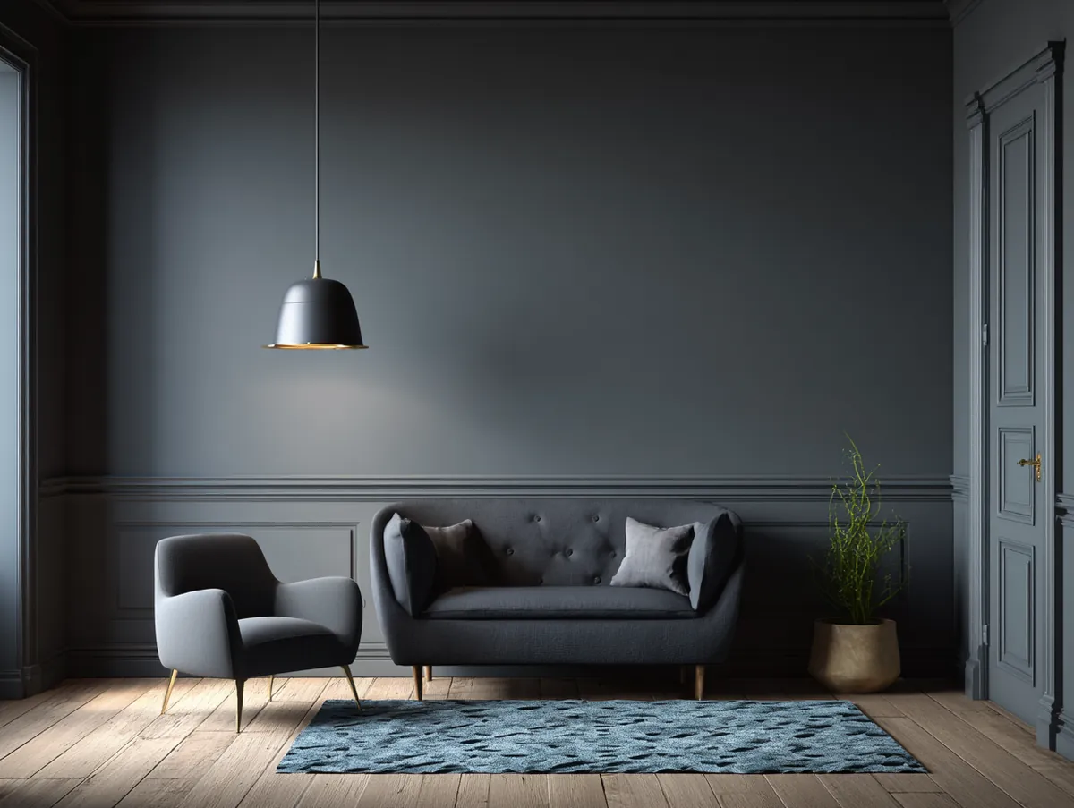
Elephant Grey — Timeless Neutral Paint for Any Living Room
Why elephant grey works in modern living rooms:
- Blends cool and warm undertones, adapting to any decor style
- Makes spaces feel expansive while remaining cozy
- Pairs with white, pastel shades, metallics, and wooden accents
- Works as a backdrop for bold artwork and colourful accessories
- One of the few neutrals that looks equally strong in natural and artificial light
When exploring paint colours for living rooms, there’s a hue that stands out for its understated elegance and timeless appeal: Elegant Elephant Grey. This shade, with its neutral undertones, offers a canvas that’s both versatile and sophisticated.
Elephant grey is a unique blend of cool and warm tones, making it adaptable to various decor styles. Whether you’re aiming for a modern minimalist look or a classic vintage vibe, elephant grey serves as the perfect backdrop. It pairs beautifully with beige living room decor accents if you want to keep the palette warm and grounded without adding competing colours.


The beauty of this shade lies in its subtlety. It’s not overpowering, yet it has a presence. It can make spaces look expansive and airy while providing a sense of coziness. It’s this duality that makes Elegant Elephant Grey a favorite among interior designers.
Pairing elephant grey with other hues can create visually appealing contrasts. A living room with elephant grey walls, white mouldings, and wooden accents exudes a rustic charm. On the other hand, combining this grey with pastel shades or metallics can give a contemporary feel.
Accessorizing is key to elevating the elegance of an elephant grey living room. Textured cushions, patterned rugs, and metallic fixtures can add layers to the room. Art pieces, especially those in monochrome or with splashes of colour, can serve as focal points against the grey backdrop.
To sum it up, Elegant Elephant Grey is not just a shade; it’s a statement. It’s a testament to the beauty of neutrality, the charm of simplicity, and the elegance of timelessness. For those considering paint colours for living rooms, this hue offers a world of possibilities, each more elegant than the last.
Grey is the colour that launched a thousand Pinterest boards and ruined at least half of them. Most people grab the first “greige” swatch they see and end up with walls that look purple at sunset. You need to check undertones. Benjamin Moore’s Revere Pewter HC-172 runs about $75 per gallon and stays warm in any light. Sherwin-Williams Agreeable Gray SW 7029 is the other safe bet. I own test pots of both and the Revere Pewter wins in rooms with warm-toned wood floors. Agreeable Gray pairs better with cool white furniture. Don’t mix them. I made that mistake in my hallway and it looked like two different houses colliding.
Don’t Do This
Don’t pick paint colours from your phone screen. Phone displays oversaturate every shade. That sage looks completely different on drywall under a 60-watt bulb.
Don’t paint all four walls a dark colour in a room under 150 sq ft. I did this with midnight blue. Felt like sleeping inside a bruise. One accent wall is plenty for small living rooms.
Don’t buy cheap paint to save $20 per gallon. You’ll need four coats instead of two. You end up spending more and losing a full weekend. Behr Marquee or Benjamin Moore Regal are the minimum I’d trust for living room walls.
Don’t match paint to furniture you plan to replace. Pick your wall colour first. Furniture rotates every few years. Paint should last a decade.
Teal — Vibrant and Luxurious Living Room Paint Colour
Why teal works in modern living rooms:
- Combines the depth of blue with the freshness of green
- Pairs with gold, coral, beige, and neutral white furniture
- Can be used as an all-wall colour or a single statement wall
- Velvet and silk accessories in teal add richness and texture
- Works particularly well in living rooms with high ceilings
Venturing into the realm of paint colours for living rooms, there emerges a hue that transports us to tropical paradises and serene beaches: the Tropical Teal Treasure. This vibrant shade is a blend of the deep blue of the ocean and the refreshing green of tropical foliage, making it a perfect choice for those seeking a lively and invigorating ambiance.
Teal, with its rich and captivating tone, has the power to transform spaces. It brings a touch of the exotic to the familiar, making every day feel like a vacation. The Tropical Teal Treasure is not just a colour; it’s an experience, a journey to far-off lands without leaving the comfort of one’s home.
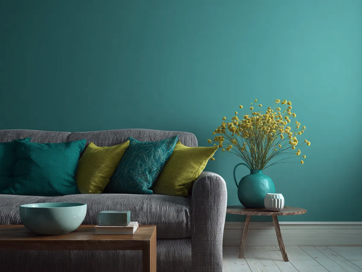
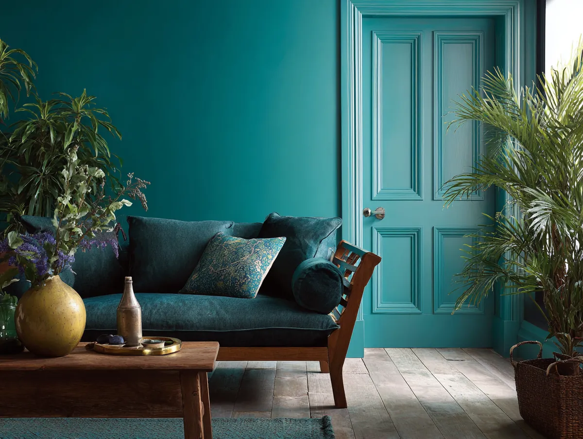
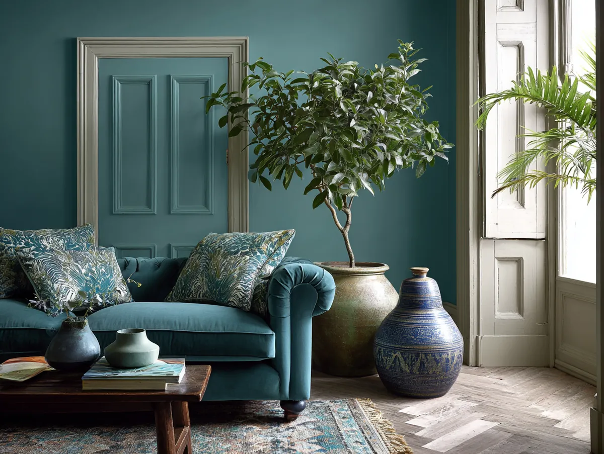


The versatility of teal is commendable. It can be the star of the show or play a supporting role. A living room with walls painted in Tropical Teal Treasure, paired with neutral furniture and gold accents, can exude luxury and opulence. On the other hand, using teal as an accent colour, in the form of cushions, rugs, or art pieces, can add a pop of colour to an otherwise muted space.
Accessorizing a teal living room is an exciting venture. Incorporating textures, like velvet or silk, can add depth and richness. Art pieces, especially those with hints of coral, gold, or beige, can stand out beautifully against a teal backdrop, creating visual interest.
In conclusion, the Tropical Teal Treasure is a celebration of life, vibrancy, and adventure. It’s a reminder of the beauty of the tropics, the rhythm of the waves, and the dance of palm leaves. For those exploring paint colours for living rooms, this shade promises a journey that’s both exhilarating and rejuvenating.
Halfway through. Save this page — you’ll want to compare these side by side later.
Rose — Soft and Modern Pink Paint for Living Rooms
Why rose works in modern living rooms:
- Warm, welcoming tone that encourages conversation and connection
- Pairs with deep green, navy blue, wooden and metallic fixtures
- Not just feminine — muted rose with dark accents reads as sophisticated
- Textured cushions and patterned rugs add depth to a rose-walled room
- Works best in a muted, dusty tone rather than a bright bubblegum pink
In the diverse palette of paint colours for living rooms, there’s a hue that speaks of love, warmth, and timeless beauty: the Romantic Rose Reverie. This soft, muted pink shade is reminiscent of blooming roses, early morning skies, and cherished memories.
Rose, traditionally associated with romance and femininity, has evolved to become a favourite in modern interior design. The Romantic Rose Reverie is a testament to the versatility and adaptability of this hue. It’s gentle yet impactful, classic yet contemporary.
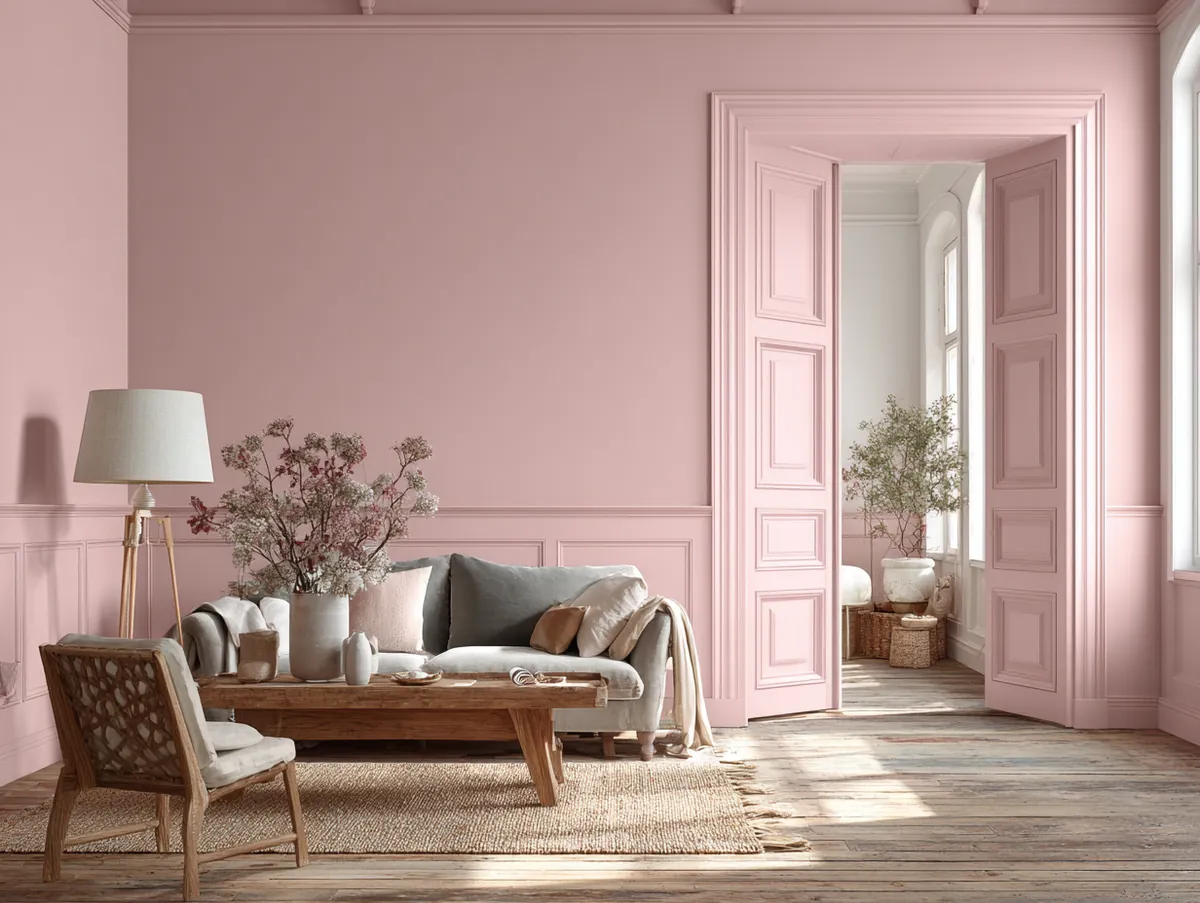
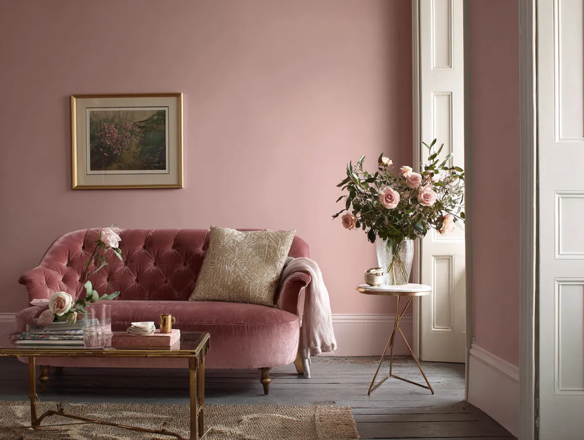
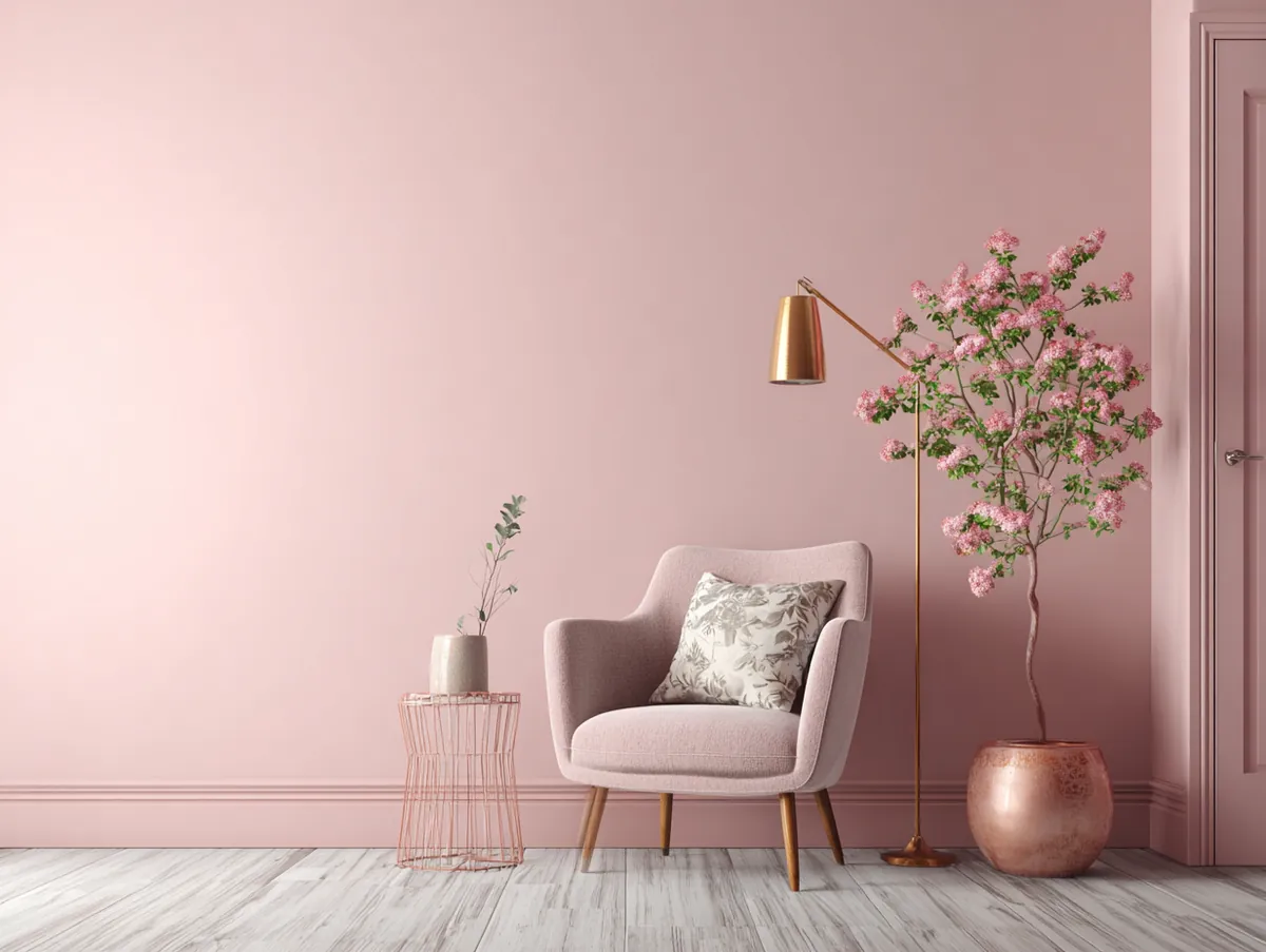
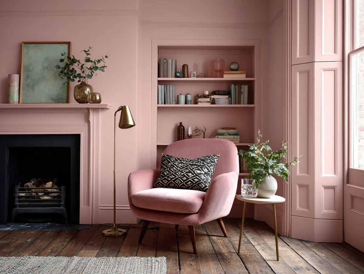
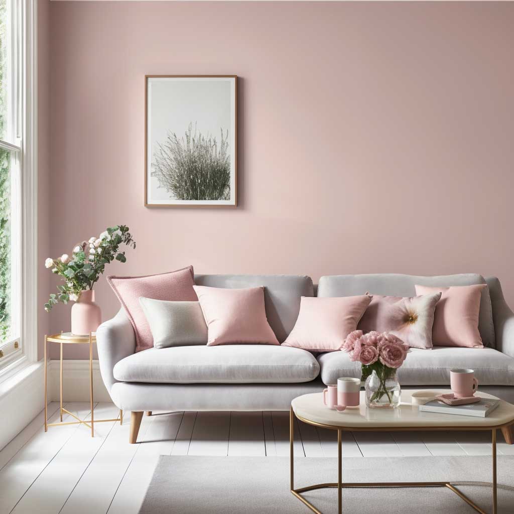


The beauty of rose lies in its ability to create a warm and welcoming ambiance. It’s a hue that invites conversation, fosters connections, and promotes relaxation. A living room painted in Romantic Rose Reverie becomes a haven, a place where moments are cherished, and memories are made.
Pairing rose with other colours can yield stunning results. Imagine a living room with walls painted in Romantic Rose Reverie, deep green or navy blue accents, and wooden or metallic fixtures. The result is a space that’s both elegant and cozy, a perfect blend of the old and the new.
Accessorizing a rose living room is a delightful experience. Textured cushions, patterned rugs, and metallic accents can add layers of depth. Art pieces, especially those in monochrome or with splashes of gold or silver, can serve as focal points, drawing attention and admiration.
To sum it up, the Romantic Rose Reverie is more than just a shade; it’s an emotion. It’s a celebration of love, beauty, and the simple joys of life. For those considering paint colours for living rooms, this hue offers a world of warmth, comfort, and timeless elegance.
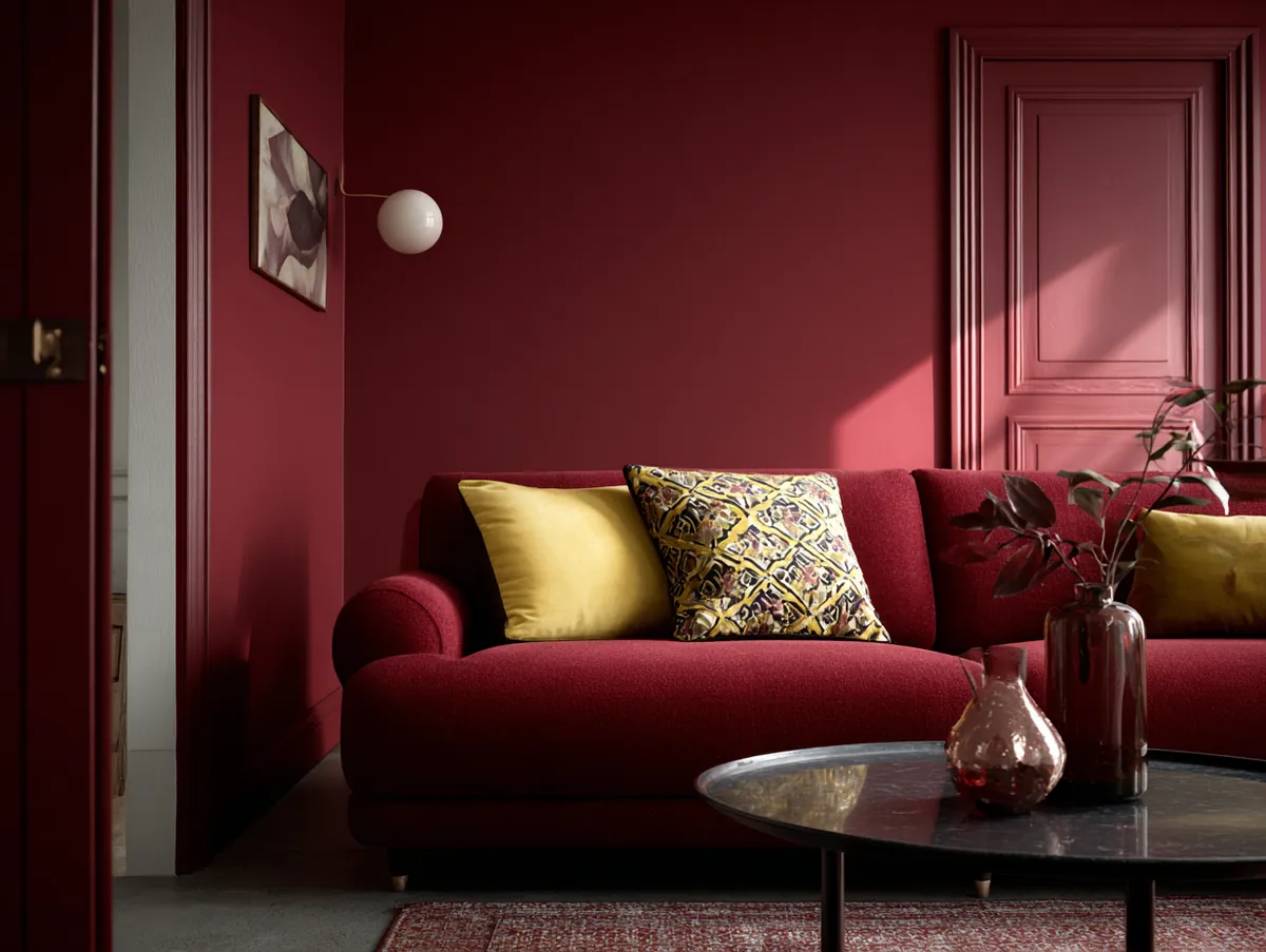
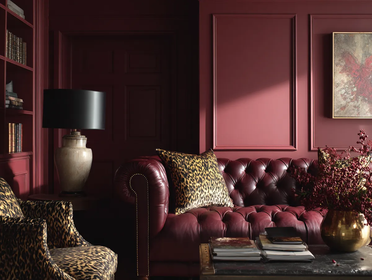
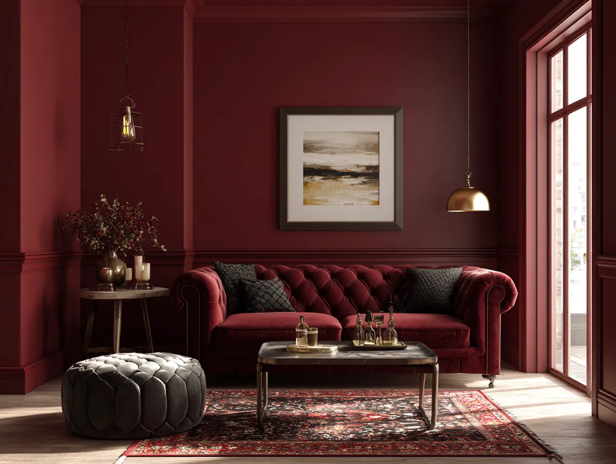
Bordeaux — Deep and Dramatic Living Room Paint Colour
Why bordeaux works in modern living rooms:
- Makes large rooms feel intimate and smaller rooms feel opulent
- Pairs with gold, brass, deep green, navy, and neutral beige furniture
- Best applied to one statement wall rather than all four in smaller rooms
- Metallic light fixtures glow beautifully against a deep bordeaux backdrop
- Adds a sense of luxury that few other paint colours can match
Navigating the spectrum of paint colours for living rooms, one encounters a hue that exudes depth, luxury, and a touch of the dramatic: the Bold Bordeaux Bliss. This rich, wine-inspired shade is a nod to the elegance of French chateaus and the warmth of cozy evenings by the fireplace.
Bordeaux, with its deep red undertones, is a colour that commands attention. It’s a shade that speaks of passion, depth, and sophistication. The Bold Bordeaux Bliss is not just a colour; it’s a statement, a declaration of one’s love for the finer things in life.
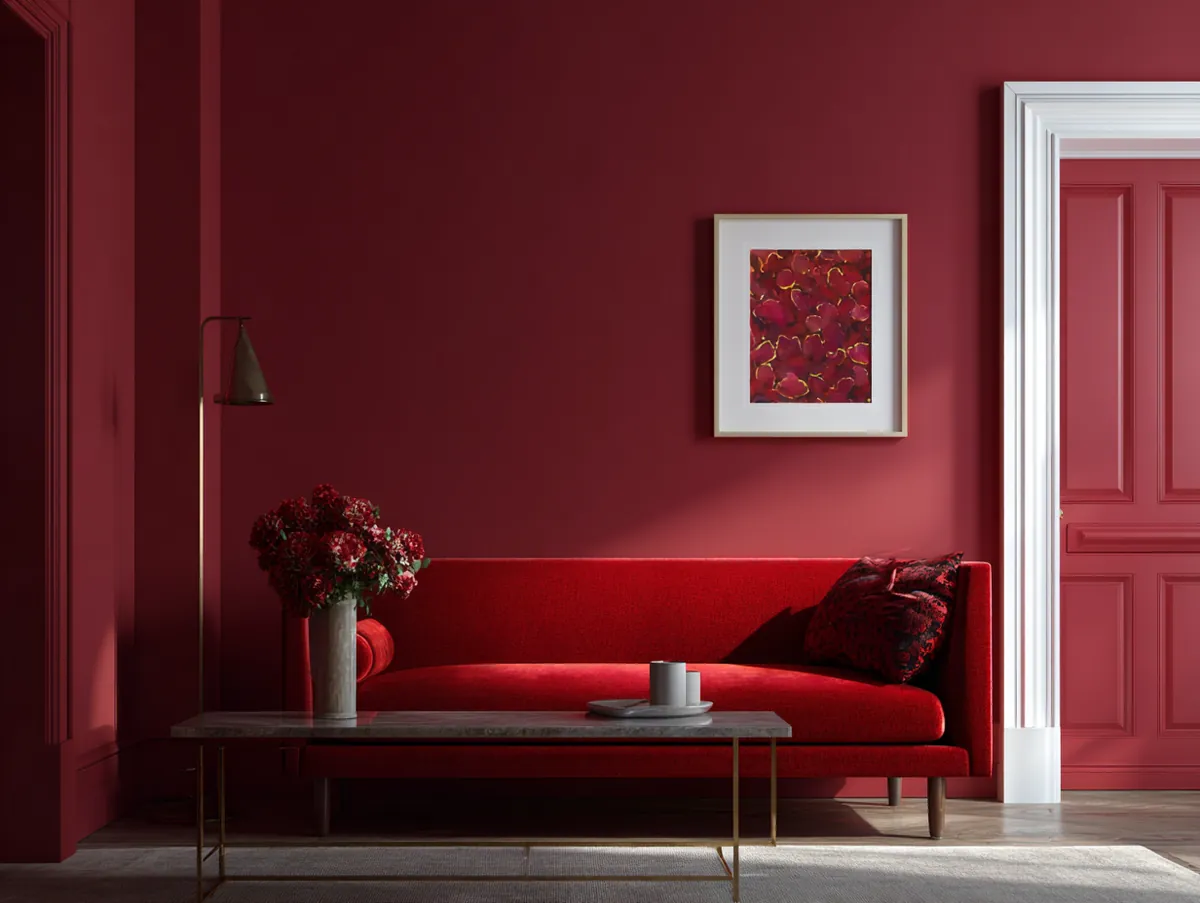
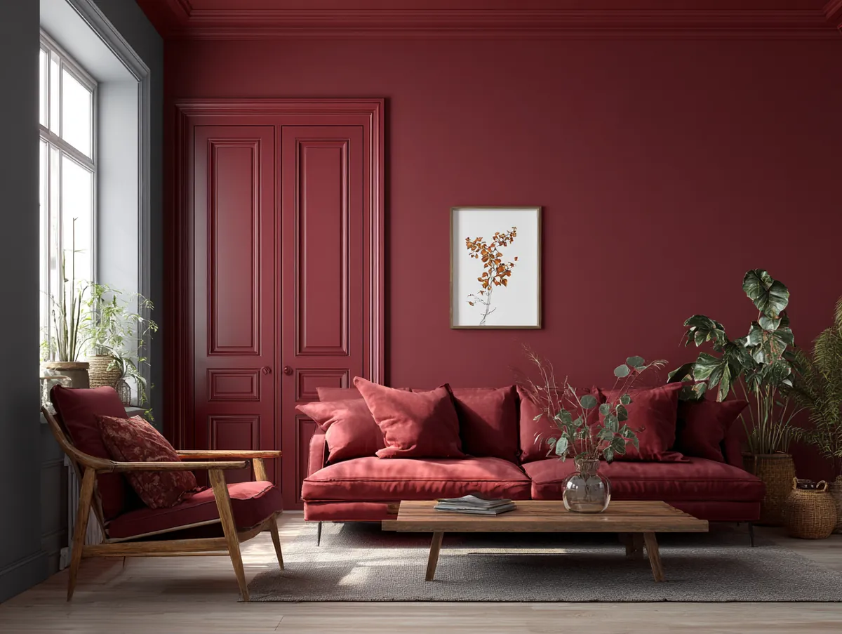
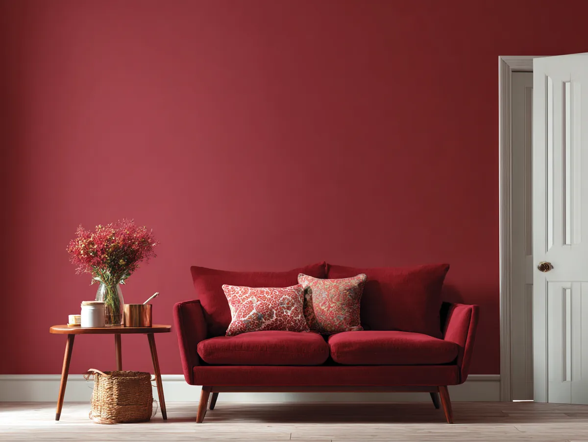
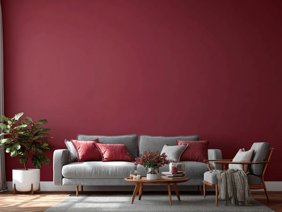


The power of Bordeaux lies in its ability to transform spaces. It can make large rooms feel cozier and intimate, while in smaller spaces, it can add a touch of opulence. A living room painted in Bold Bordeaux Bliss, paired with gold or brass accents and plush neutral furniture, can feel like a luxurious retreat.
Pairing Bordeaux with other hues can create visually stunning contrasts. Imagine a living room with walls painted in Bold Bordeaux Bliss, deep green or navy blue drapes, and wooden or beige furniture. The result is a space that’s both regal and inviting, a perfect blend of drama and comfort.
Accessorizing a Bordeaux living room is an art in itself. Textured cushions in gold or cream, patterned rugs in neutral tones, and metallic light fixtures can elevate the Bordeaux experience. Art pieces, especially those with hints of gold, beige, or deep green, can stand out beautifully against a Bordeaux backdrop.
In conclusion, the Bold Bordeaux Bliss is a celebration of luxury, depth, and passion. It’s a shade that promises an experience that’s both dramatic and comforting. For those exploring paint colours for living rooms, this hue offers a journey into the world of opulence and elegance.
The next three colours are the ones that sell the most gallons every year. There’s a reason.
White — The Classic Paint Colour for Modern Living Rooms
Why white works in modern living rooms:
- Reflects light better than any other colour, making spaces feel larger
- Acts as a blank canvas — adapts to any decor style or colour accent
- Pairs with absolutely everything: bold accents, neutrals, metallics, plants
- Choose a warm white over a cool bright white for a more inviting feel
- Avoid using pure white in rooms with very little natural light — it reads flat
In the vast array of paint colours for living rooms, there’s a hue that stands out for its simplicity, purity, and versatility: the Whimsical Whispering White. This shade, often overlooked in favor of bolder choices, is a canvas that offers endless possibilities.
White, often associated with purity and peace, is a colour that reflects light, making spaces feel larger and airier. The Whimsical Whispering White is not just a shade; it’s a blank slate, a starting point from which countless design journeys can begin.
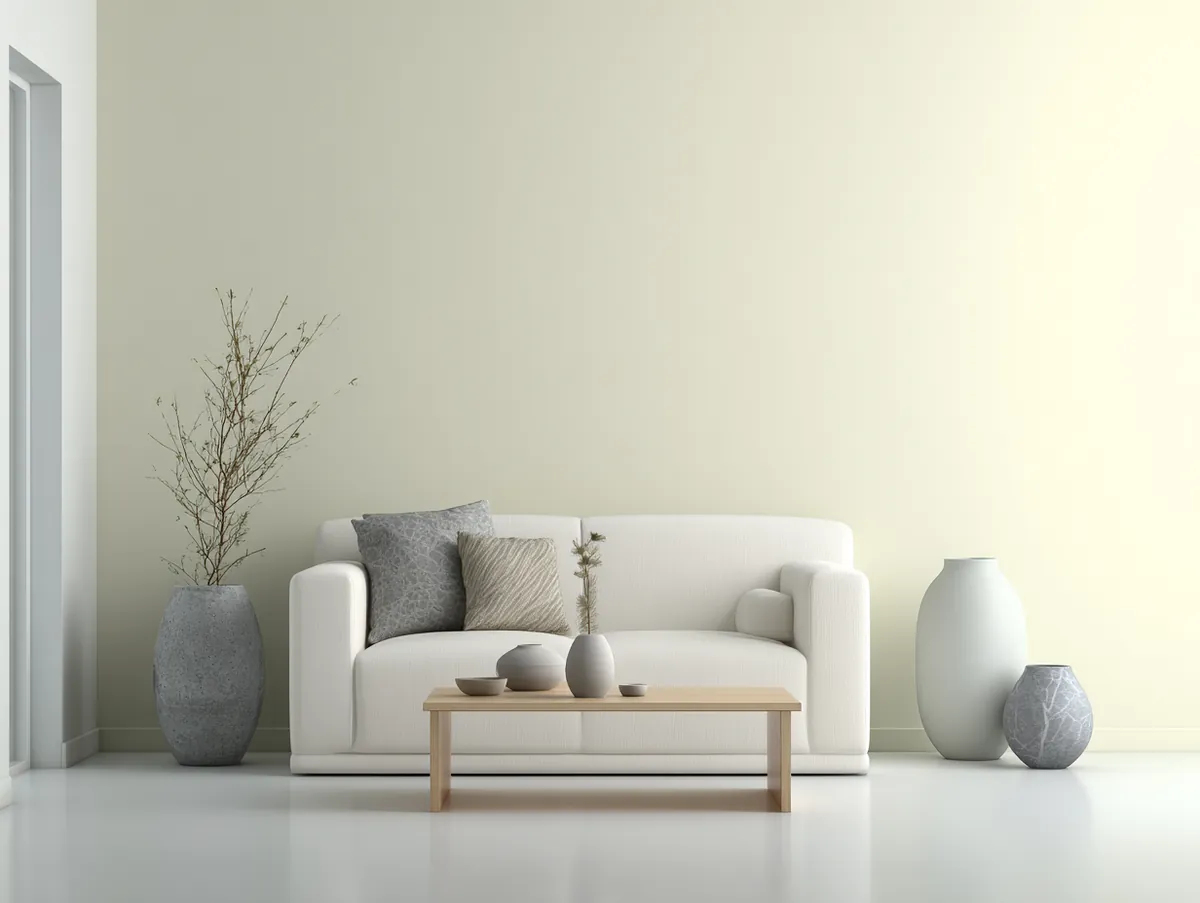
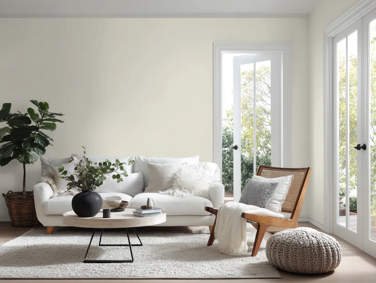


The beauty of white lies in its adaptability. It can serve as a backdrop for bold accents, or it can be the star of the show. A living room painted in Whimsical Whispering White, paired with colourful cushions, rugs, and art pieces, can feel vibrant and lively. On the other hand, a white living room with neutral accents and minimalistic decor can exude calmness and serenity.
Pairing white with other colours can yield beautiful results. Imagine a living room with walls painted in Whimsical Whispering White, with deep blue or green accents, and wooden or metallic fixtures. The result is a space that’s both fresh and cozy, a perfect blend of modernity and tradition.
Accessorizing a white living room offers endless possibilities. Textured cushions, patterned rugs, and colourful art pieces can add layers of depth and interest. Plants, with their green hues, can stand out beautifully against a white backdrop, adding a touch of nature to the space.
In conclusion, the Whimsical Whispering White is more than just a shade; it’s a world of possibilities. It’s a canvas waiting to be painted, a story waiting to be told. For those considering paint colours for living rooms, this hue offers a fresh start, a blank slate from which countless design dreams can take flight.
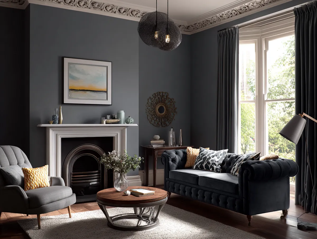
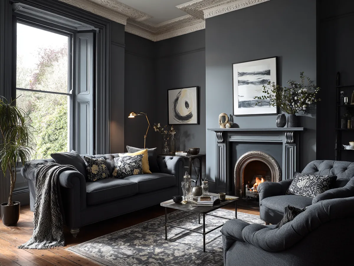
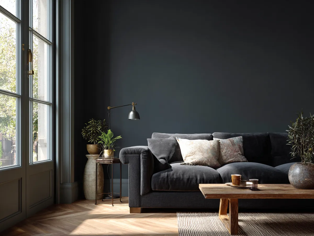
Charcoal — Sophisticated Dark Paint for Modern Living Rooms
Why charcoal works in modern living rooms:
- Anchors a room and provides a dramatic backdrop for bright accents
- Makes metallics, vibrant colours, and textures appear more vivid
- Pairs with pastel pink, soft beige, white, and warm wooden furniture
- Works as an all-wall colour in large rooms or as a single feature wall
- Avoid in rooms with very low ceilings — it can make the space feel compressed
Delving deeper into the diverse palette of paint colours for living rooms, there emerges a hue that is both modern and timeless: the Charming Charcoal Charm. This deep, muted shade of grey is a testament to the allure of understated elegance and the power of neutrality.
Charcoal, with its rich depth and versatility, is a colour that can anchor a room. It’s a shade that speaks of sophistication, modernity, and a touch of the mysterious. The Charming Charcoal Charm is not just a colour; it’s an ambiance, setting the tone for a space that’s both contemporary and cozy.
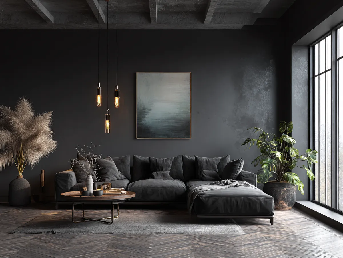


The strength of charcoal lies in its ability to serve as a backdrop for a myriad of design choices. It can make bright colours pop, metallics shine brighter, and textures feel richer. A living room painted in Charming Charcoal Charm, paired with vibrant cushions, metallic accents, and plush furniture, can feel like a curated masterpiece.
Pairing charcoal with other hues can create visually captivating contrasts. Imagine a living room with walls painted in Charming Charcoal Charm, with pastel pink or soft beige drapes, and wooden or white furniture. The result is a space that’s both chic and inviting, a harmonious blend of the bold and the subtle.
Accessorizing a charcoal living room is an art. Textured cushions in soft hues, patterned rugs in neutral tones, and metallic light fixtures can elevate the charcoal experience. Art pieces, especially those with splashes of colour or metallic sheen, can stand out beautifully against a charcoal backdrop.
In conclusion, the Charming Charcoal Charm is a celebration of modern design, depth, and versatility. It’s a shade that promises an experience that’s both chic and comforting. For those exploring paint colours for living rooms, this hue offers a journey into the world of modern elegance and timeless charm.
Charcoal sitting room colours are the fastest way to make cheap furniture look expensive. My $400 IKEA sofa suddenly looked designer against Benjamin Moore’s Kendall Charcoal HC-166, which runs about $75 per gallon. But skip this colour entirely if your ceilings are below 8 feet. It compresses the room like a fist. I’ve seen three friends make this mistake in basement living rooms. Every single one repainted within a year. Use charcoal on one feature wall and paint the ceiling the same warm white as the trim. That trick alone keeps the room from feeling like a bunker.
Last colour on the list — and it’s the one people either love or fear. No in-between.
Ruby Red — Rich and Passionate Living Room Paint Colour
Why ruby red works in modern living rooms:
- Fills a room with energy, warmth, and a sense of celebration
- Pairs with gold, brass, cream, deep green, and navy accents
- Best used on one or two walls rather than all four to avoid overwhelm
- Art pieces with gold or beige tones stand out beautifully against ruby walls
- Works particularly well in living rooms used for entertaining guests
In the vibrant world of paint colours for living rooms, there’s a hue that captures the essence of passion, warmth, and vivacity: the Radiant Ruby Radiance. This deep, luscious shade of red is a nod to the fiery spirit of love, celebration, and zest for life.
Ruby, with its rich undertones and captivating allure, is a colour that demands attention. It’s a shade that speaks of romance, luxury, and a touch of the exotic. The Radiant Ruby Radiance is not just a colour; it’s an emotion, evoking feelings of warmth, passion, and celebration.


The magic of ruby lies in its ability to transform spaces. It can make a room feel alive, vibrant, and full of energy. A living room painted in Radiant Ruby Radiance, paired with gold or brass accents and plush neutral furniture, can feel like a royal retreat.
Pairing ruby with other colours can yield stunning results. Imagine a living room with walls painted in Radiant Ruby Radiance, with deep green or navy blue drapes, and wooden or beige furniture. The result is a space that’s both regal and warm, a perfect blend of luxury and comfort.
Accessorizing a ruby living room is a delightful experience. Textured cushions in gold or cream, patterned rugs in neutral tones, and metallic light fixtures can elevate the ruby experience. Art pieces, especially those with hints of gold, beige, or deep green, can stand out beautifully against a ruby backdrop.
In conclusion, the Radiant Ruby Radiance is a celebration of life, passion, and luxury. It’s a shade that promises an experience that’s both regal and warm. For those considering paint colours for living rooms, this hue offers a journey into the world of opulence, warmth, and timeless beauty.
Before You Pick Up a Brush
I’ve wasted money on wrong paint colours. I’ve repainted walls at 11 PM because the shade I “loved” in the store made me feel sick under my own lights. Every colour on this list survived that test. They held up under morning sun, evening lamps, and my brutally honest friends walking in and saying “that looks nice” without being asked.
Pick one. Buy a sample pot. Slap it on a 2×2 spot near your biggest window and live with it for 48 hours. That alone saves you hundreds of dollars and a weekend of frustration.
If this list helped you narrow it down, save it for later. You’ll want it when you’re standing in the paint aisle.
Paint Colour Comparison Chart for Modern Living Rooms
| Colour | Best For | Room Size | Light Needed | Best Pairs With | Mood |
|---|---|---|---|---|---|
| Sage Green | Any style | Any | Low–high | White trim, wood, blush | Calm |
| Midnight Blue | Cozy retreats | Medium–large | Medium–high | Gold, brass, white | Dramatic |
| Golden Yellow | Dark rooms | Any | Low | Navy, emerald, wood | Warm |
| Elephant Grey | Neutral base | Any | Any | White, pastels, metallics | Timeless |
| Teal | Luxury accent | Medium–large | Medium | Gold, coral, beige | Exotic |
| Rose | Warm modern | Any | Any | Green, navy, wood | Welcoming |
| Bordeaux | Accent walls | Medium–large | Medium | Gold, brass, cream | Luxurious |
| White | Small spaces | Any | Medium–high | Everything | Clean |
| Charcoal | Modern statement | Large | Medium–high | Pink, beige, white | Sophisticated |
| Ruby Red | Entertaining | Medium–large | Medium | Gold, cream, green | Passionate |
How to Choose the Right Paint Colour for Your Living Room
A step-by-step process for picking modern living room paint colours that actually look good once they’re on the wall — not just on the swatch.
Tools you’ll need:
- Paint sample pots (2–3 colours)
- Small foam roller or brush
- Large white poster board or primed drywall scrap
- Painter’s tape
Identify your room’s light direction
Check which way your windows face. North-facing rooms need warm paint colours like golden yellow or rose. South-facing rooms can handle cool tones like sage or grey without looking cold.
Pick 2–3 colours from this list and buy sample pots
Don’t commit to a gallon based on a swatch card. Spend $10–$15 per sample. Paint a 2×2 foot square on the wall near your biggest window and near a dark corner so you see both extremes.
Live with the samples for 48 hours
Check the paint at 9 AM, 2 PM, and 9 PM. Colours shift dramatically under different light. If any shade makes you feel uneasy at night, cross it off. Your gut reaction at 9 PM is the one that matters.
Decide: all four walls or one accent wall
Neutral and light colours (sage, grey, white) work on all four walls. Bold colours (midnight blue, bordeaux, ruby) look best on a single accent wall paired with neutral trim. Skip painting all four walls dark unless your room is at least 200 sq ft.
Buy premium paint and apply two coats minimum
Benjamin Moore Regal or Sherwin-Williams Emerald are my go-to picks. Two coats of good paint beats four coats of cheap paint every time. Budget $55–$115 per gallon depending on the brand and finish.
Related Topics


