For years, the undisputed champion of modern interior design was a highly clinical, glaringly bright aesthetic that prioritized a sense of pristine minimalism above all else. Homeowners and designers alike flocked to paint their walls, trim, and ceilings in the most absolute, unyielding shades available, creating spaces that felt akin to art galleries or high-end laboratories. However, a profound shift is currently sweeping through the design world, rooted in a collective desire for environments that offer genuine comfort, understated elegance, and a true sense of sanctuary. The era of cold, uninviting minimalism is fading, making way for a highly sophisticated approach that embraces the subtle, enveloping beauty of heavily nuanced palettes. This transition focuses on utilizing rich, tactile shades that mimic natural elements, transforming flat, visually fatiguing rooms into deeply restorative havens that exude an enduring, quiet luxury.
Elevating Everyday Living With Creamy Off Whites
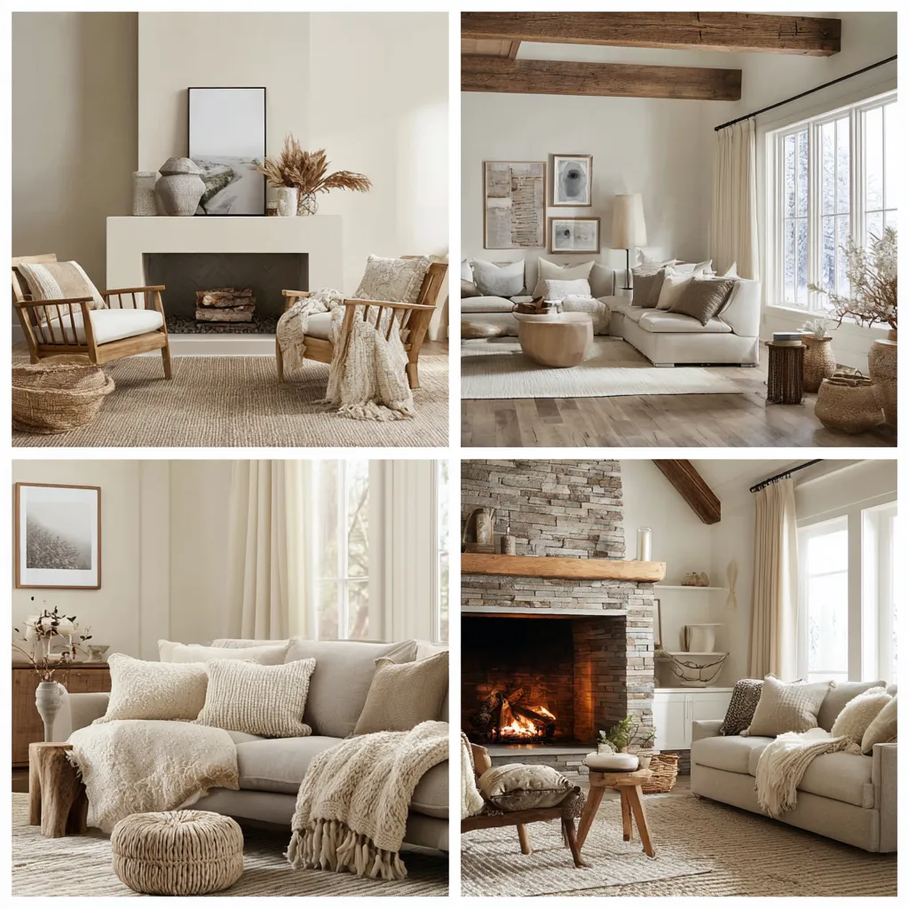
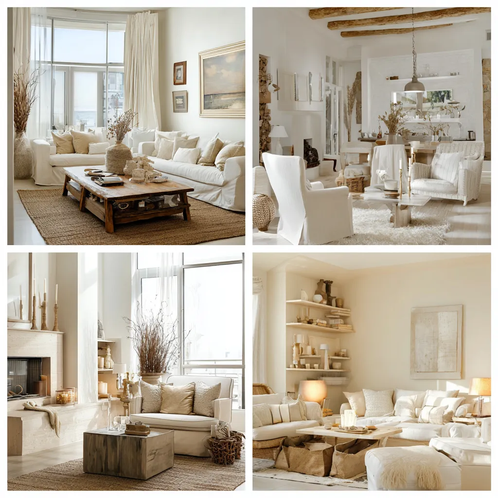
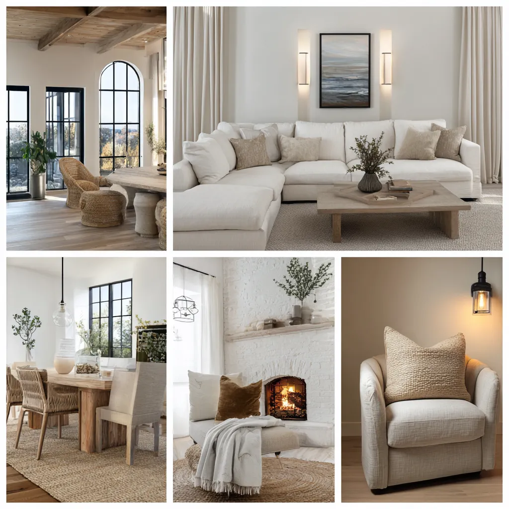
The movement away from aggressively bright interiors is deeply rooted in our psychological response to our immediate environment. Historically, stark white was utilized to convey a sense of absolute cleanliness and modern efficiency, often acting as a blank canvas intended to make furniture or artwork pop. However, living continually within a perfectly blank canvas can result in profound visual fatigue. Environments devoid of warmth often feel sterile, echoing sound harshly and failing to provide the psychological embrace we inherently seek when returning home. Stepping away from these icy, unyielding tones and embracing creamy off whites introduces a vital layer of humanity and softness back into our primary living spaces. These highly nuanced shades possess complex undertones—ranging from subtle hints of blush and ochre to delicate beige and pale stone—that interact dynamically with changing light throughout the day, ensuring the walls never feel flat or mass-produced.
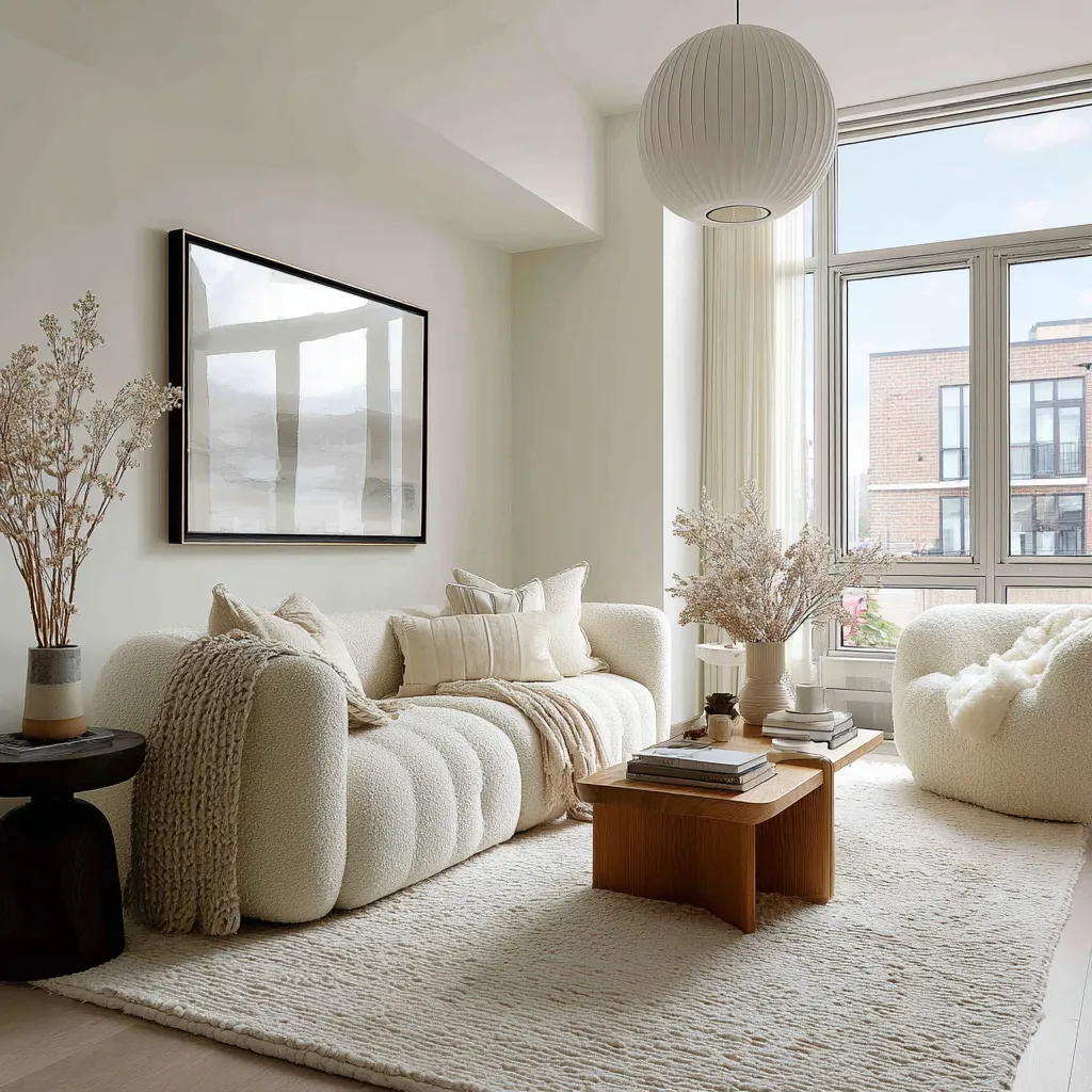
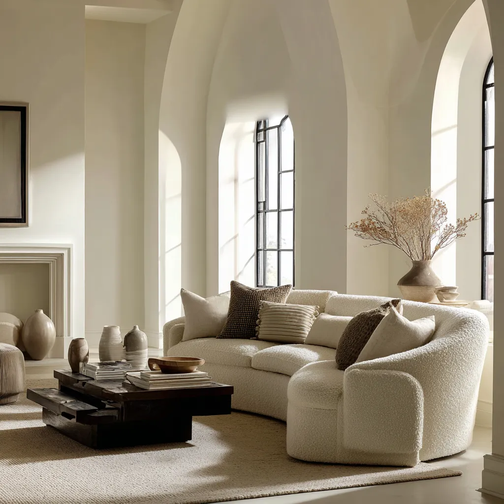
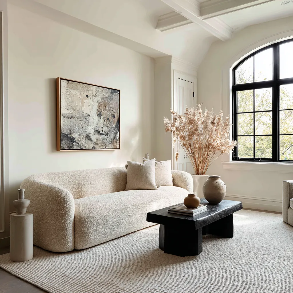
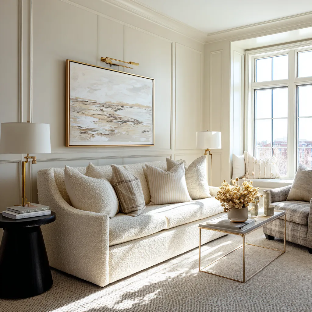
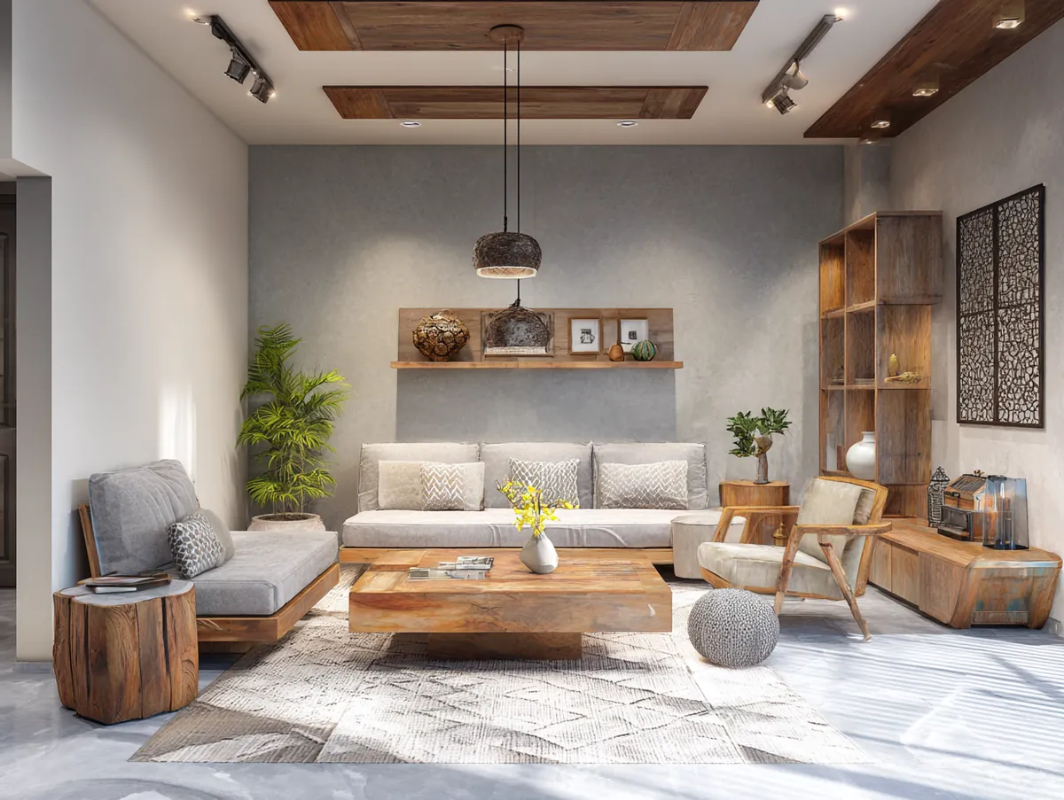
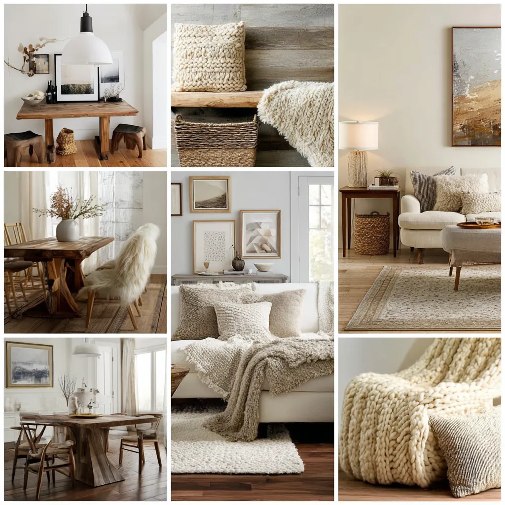
Implementing creamy off whites in a main living area requires a masterful approach to layering and texture to achieve that sought-after atmosphere of quiet, understated opulence. When you remove loud colors and harsh, glaring backgrounds from a room, the tactile qualities of your furnishings become the primary visual language. To prevent a monochromatic space from feeling one-dimensional, you must introduce a rigorous variety of materials. Imagine a living room where the walls are bathed in a soft, alabaster tone. Against this gentle backdrop, a massive, deep-seated sofa upholstered in a heavy, nubby bouclé introduces immediate visual friction and physical comfort. Layering this with cashmere throw blankets, heavy linen drapery, and a hand-knotted wool rug in varying shades of cozy warm neutrals creates a landscape that begs to be touched. This meticulous attention to material quality and textural contrast is the absolute hallmark of elevated, timeless design.
Furthermore, these softer, more nuanced tones act as the perfect, harmonious bridge between a home’s architecture and its interior furnishings. Stark white often creates a harsh, unforgiving boundary line between the walls and the furniture, causing pieces to look as though they are floating disconnectedly in a void. Conversely, creamy off whites possess an inherent physical weight that gently grounds the space, wrapping around corners and softening the sharp architectural angles of a room. This enveloping effect makes large, cavernous living rooms feel remarkably intimate, while simultaneously allowing smaller, cramped spaces to breathe without feeling clinical. The walls essentially become an active, contributing participant in the overall design narrative rather than just a passive, glaring background.
The lighting strategy within these spaces must also be carefully recalibrated to maximize the impact of your chosen palette. The harsh, blue-toned LED lighting that often accompanied ultra-modern, icy interiors will completely destroy the delicate undertones of cozy warm neutrals. Instead, lighting must be approached with the intention of mimicking the golden hour of natural sunlight. Utilizing bulbs with a color temperature between 2700K and 3000K ensures that the artificial light casts a flattering, fireside-like glow across the textured surfaces of the room. When this warm light grazes heavily plastered walls, linen lampshades, and unlacquered brass fixtures, it highlights the immense depth and sophistication of the creamy off whites, transforming the living area into a beautifully serene, glowing retreat that feels both incredibly luxurious and fundamentally welcoming.
Designing A Restful Retreat Using Cozy Warm Neutrals
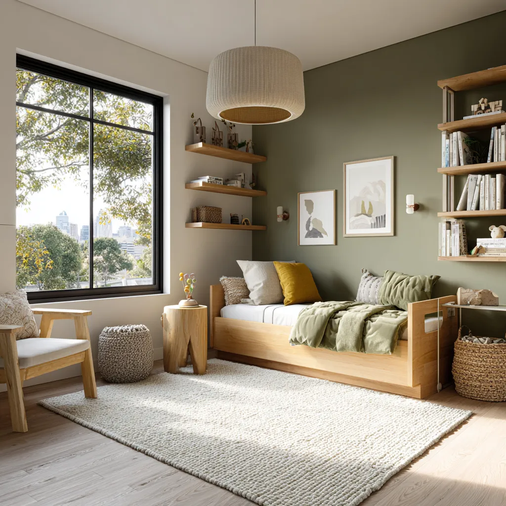
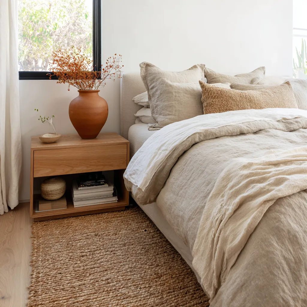
The bedroom is arguably the most critical environment in the home for entirely abandoning the clinical, highly stimulating aesthetic of the past decade. The primary objective of any sleeping quarter is to promote immediate, profound relaxation and restorative rest. Waking up to or trying to fall asleep in a room painted in a glaring, unyielding stark white can subconsciously raise cortisol levels and keep the brain in a state of high alert. To combat this, design experts are heavily championing the use of cozy warm neutrals to craft highly personalized, sensory-rich sanctuaries. These organic, earth-derived tones—think pale oatmeals, soft bisques, and muted taupes—mimic the soothing, predictable elements of the natural world. By enveloping a bedroom in these highly specific shades, you signal to your nervous system that it is time to decompress, creating an environment that feels inherently protective, quiet, and deeply secure.
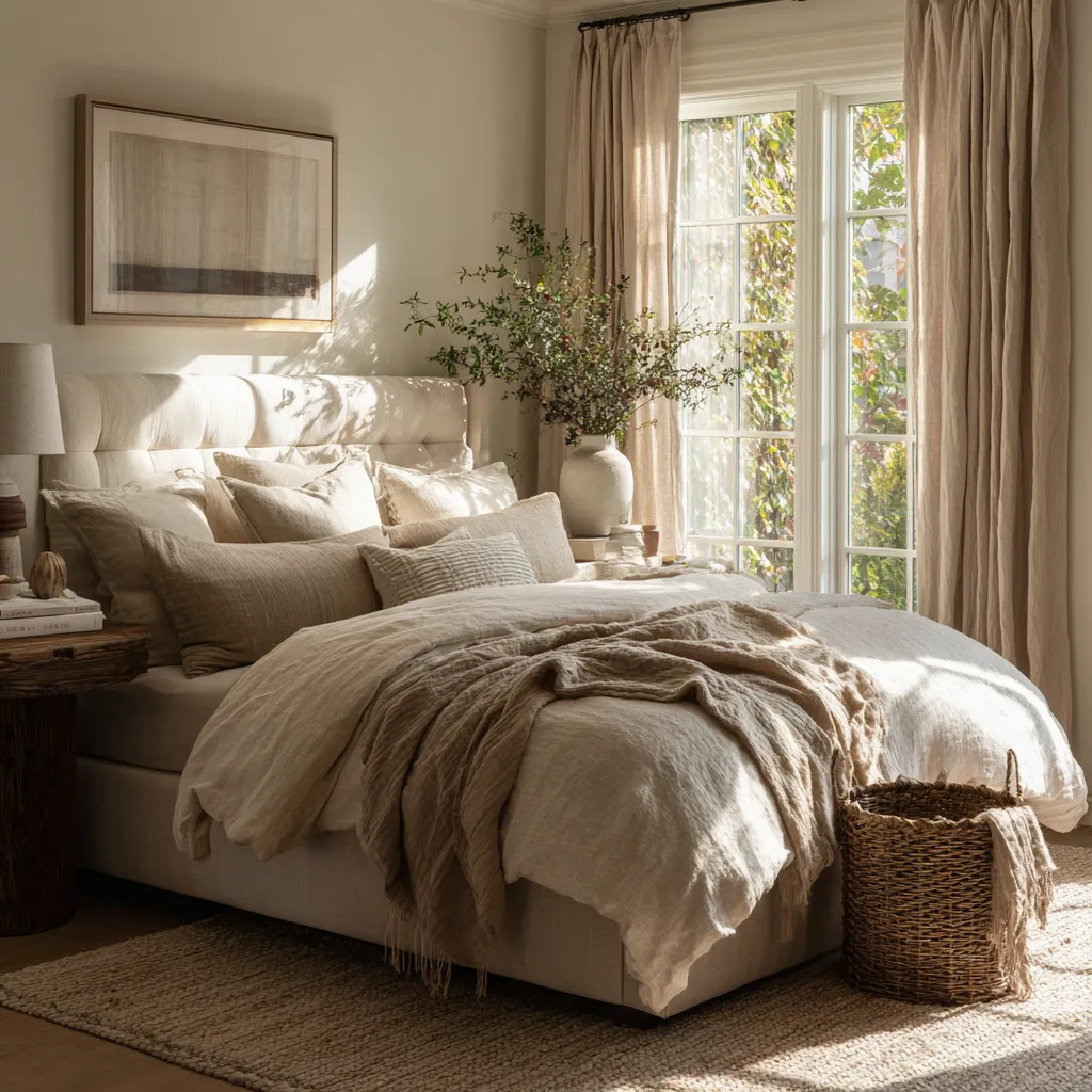
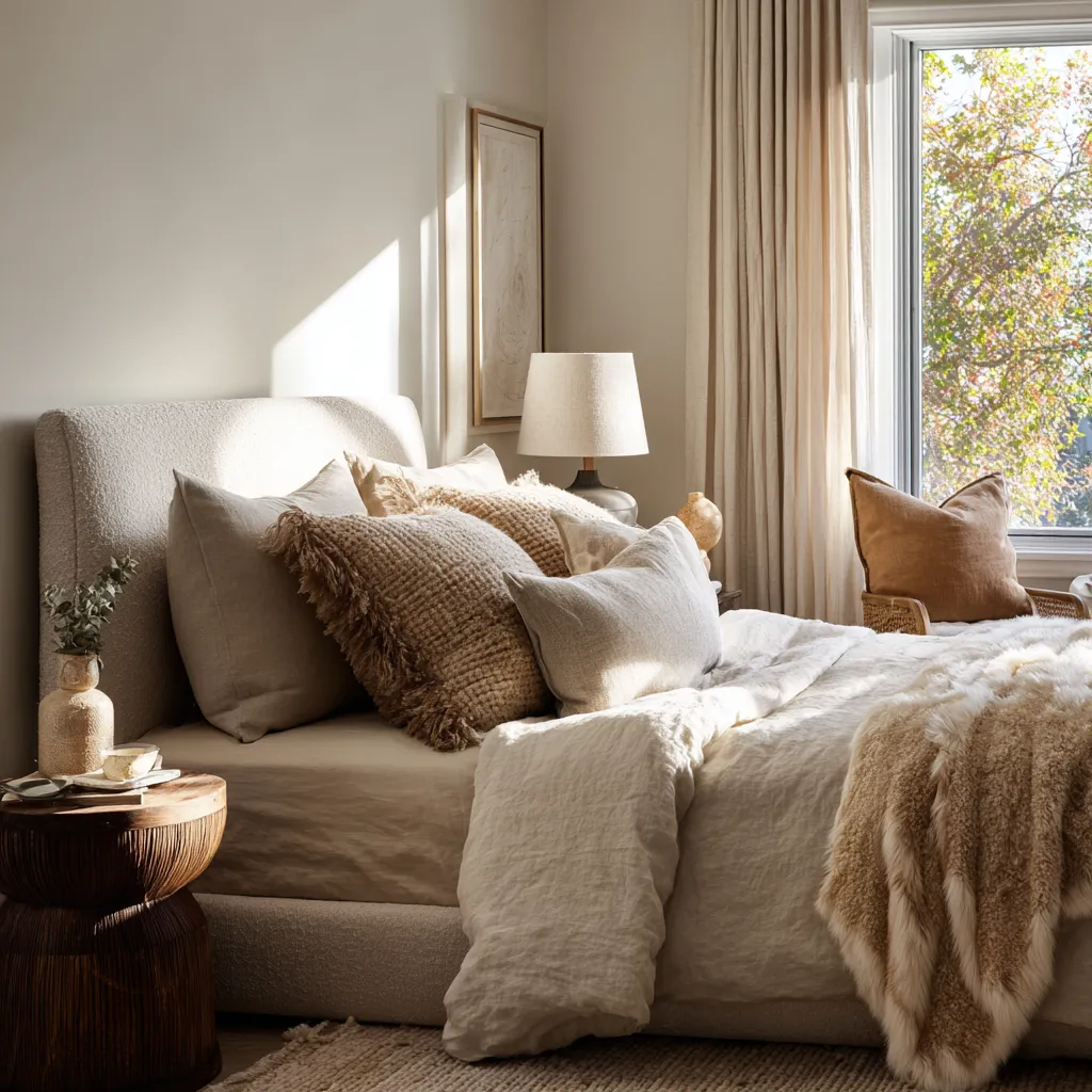
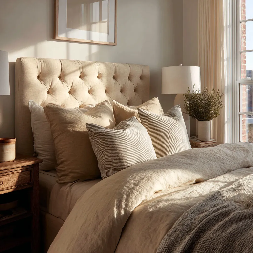
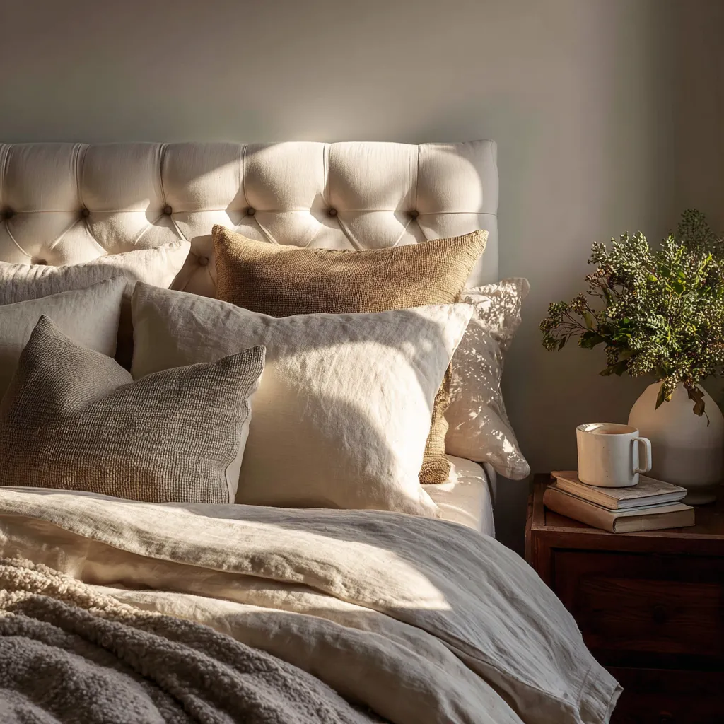
The successful execution of a bedroom rooted in cozy warm neutrals relies heavily on the obsessive curation of the bed itself. In a room dedicated to understated elegance, the bed must serve as a monumental landscape of unparalleled comfort. Instead of outfitting the mattress in perfectly matched, hotel-style bright sheets, the goal is to build a deeply dimensional, slightly imperfect arrangement of premium textiles. Begin with foundational sheets crafted from unbleached Egyptian cotton or organic bamboo, which naturally possess a beautiful, soft ivory hue. Layer upon this a heavy, stonewashed European flax linen duvet in a rich oatmeal or pale fawn color. The natural rumple of the linen, combined with the gentle, earthy tones, provides an immediate visual heaviness that grounds the room. Throw blankets crafted from brushed alpaca or thick, chunky merino wool add the final layer of tactile indulgence, proving that a space does not need vibrant colors to feel overwhelmingly luxurious and intentionally designed.
Beyond the bedding, the architectural treatments within the room must support this softening endeavor. Wrapping the entire space—including the baseboards, crown molding, and the ceiling—in carefully selected creamy off whites is a transformative technique known as color drenching. When you eliminate the high-contrast lines typically created by standard bright ceilings and trims, the edges of the room effectively blur and recede. This continuous, unbroken application of color creates a seamless, cocoon-like atmosphere that is incredibly conducive to sleep. The room loses its rigid, boxy feeling and instead becomes a soft, enveloping chamber. To enhance this architectural softening, window treatments must be equally substantial. Floor-to-ceiling drapery crafted from heavyweight, lined fabric in shades that perfectly match or closely complement the wall color will absorb ambient street noise and completely block out intrusive light, furthering the feeling of a secluded, private haven.
The integration of natural, organic materials is the final, crucial step in solidifying this highly sophisticated aesthetic. Cozy warm neutrals are perfectly complemented by elements drawn directly from nature. Incorporating bedside tables crafted from deeply grained, bleached walnut or lightly oiled white oak introduces a beautiful, grounding energy without the harsh contrast of dark espresso or black furniture. Decorative accents should be heavily edited and highly textural—think an unglazed, matte ceramic vase holding dried botanicals, or a piece of abstract art featuring heavily impastoed layers of beige and cream. Even the hardware on doors and dressers should be considered; swapping out cold, polished chrome for tumbled brass, aged bronze, or wrapped leather adds a final, exquisite touch of subtle, lived-in patina. Through this meticulous, highly intentional layering of tones and textures, the bedroom transcends mere decoration and becomes a masterclass in restorative, elegant living.
The Enduring Sophistication Of Creamy Off Whites In The Kitchen
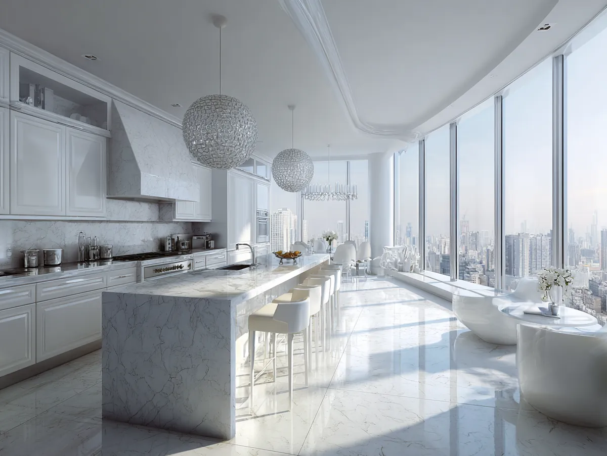
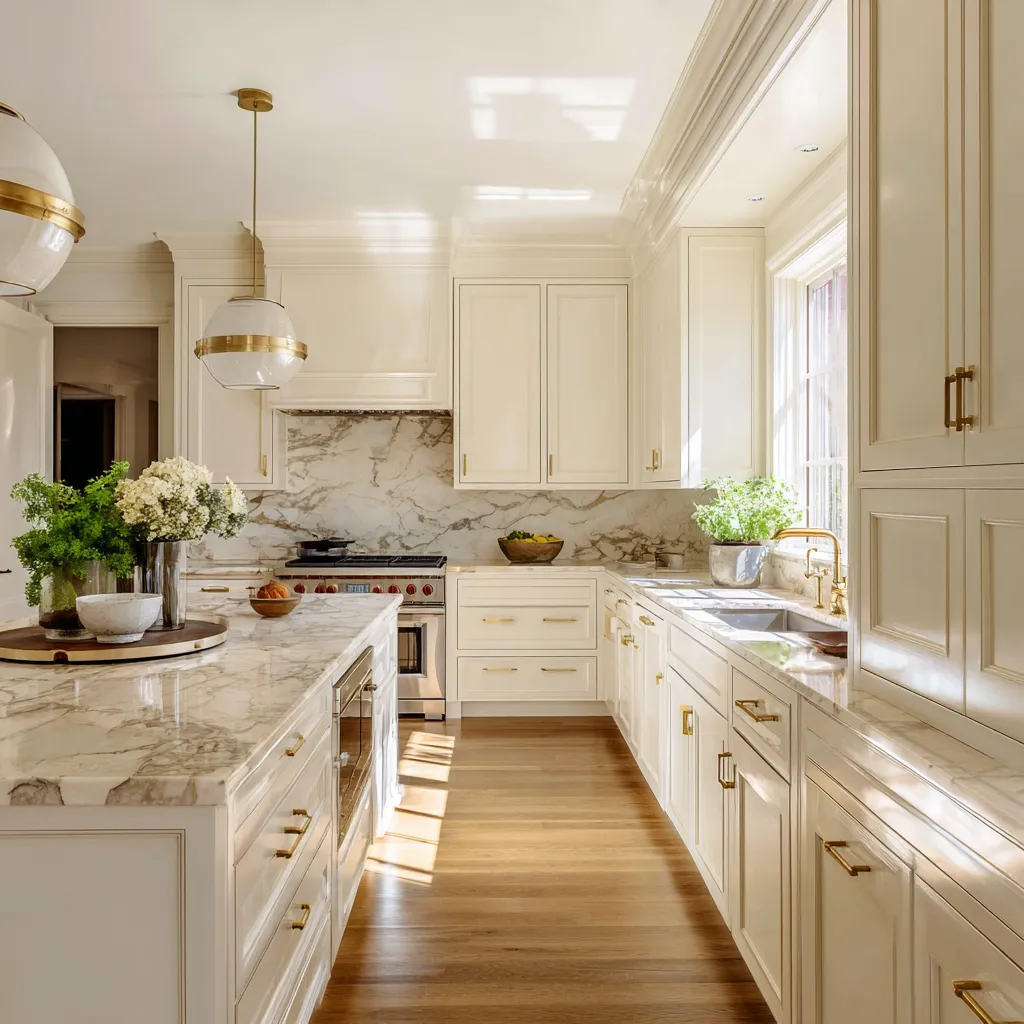
For over a generation, the default approach to kitchen design was entirely dictated by a demand for spaces that looked as hygienic and industrially efficient as possible. This resulted in an absolute saturation of kitchens completely blanketed in glaring, unmitigated stark white—from the glossy subway tile backsplashes to the lacquered cabinets and the synthetic quartz countertops. While this aesthetic undeniably communicated cleanliness, it actively discouraged people from lingering, turning the very heart of the home into a space that felt distinctly commercial and distinctly cold. The massive design pivot towards creamy off whites completely revolutionizes the culinary space, returning it to its rightful place as the warm, welcoming, and deeply sophisticated gathering center of the household. By introducing subtle, rich pigmentation into the cabinetry and architectural details, the kitchen instantly sheds its laboratory-like exterior and adopts an atmosphere of timeless, bespoke craftsmanship.

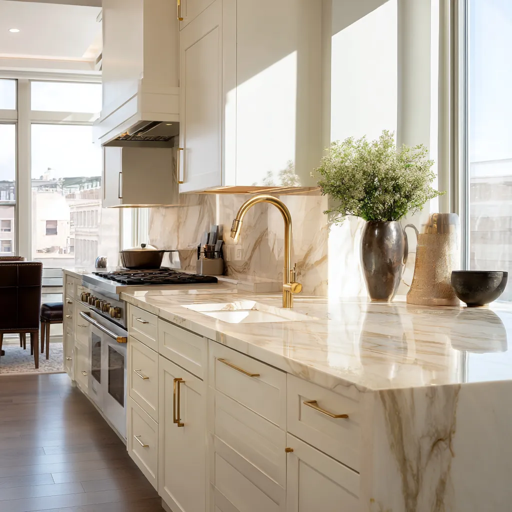
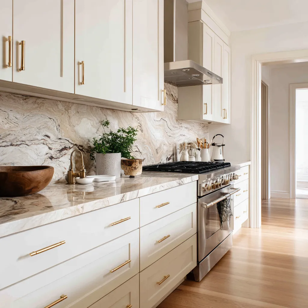
Replacing harsh, blinding tones with creamy off whites on kitchen cabinetry is perhaps the single most impactful change one can make when updating a home. Imagine a kitchen outfitted with custom, shaker-style cabinets painted in a complex, beautifully muted shade of bone or heavy cream. This subtle shift in color completely alters how the room receives and reflects light. In the morning, the cabinets emit a soft, inviting radiance, and in the evening under the glow of pendant lights, they take on a rich, historical depth that bright, flat tones simply cannot achieve. This nuanced backdrop provides the absolute perfect canvas for showcasing spectacular, naturally occurring materials. Instead of uniform, manufactured surfaces, these softer cabinets demand the introduction of heavily veined natural stones. A sweeping countertop and continuous backsplash of Calacatta marble or Taj Mahal quartzite—materials that inherently feature magnificent ribbons of gold, rust, and beige—interact flawlessly with the softer cabinet tones, elevating the entire room to a pinnacle of understated, natural luxury.
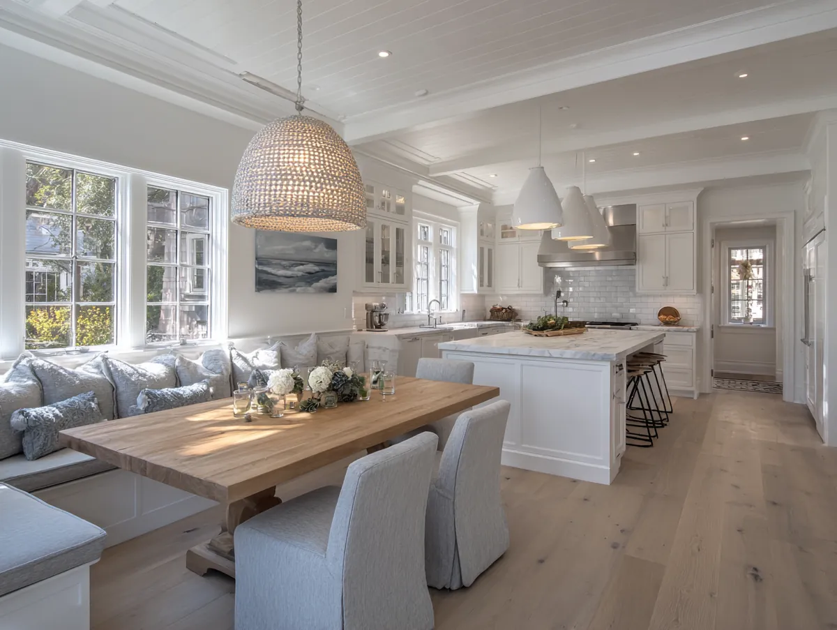
To prevent the kitchen from feeling overly formal or unapproachable, it is imperative to weave cozy warm neutrals throughout the secondary design elements. The kitchen is inherently a space of hard, unforgiving surfaces—stone, glass, and wood—so introducing softer textures is vital for creating balance and friction. A beautifully distressed, vintage runner rug strategically placed over the hardwood flooring alongside the main prep area introduces immediate visual warmth and acoustic dampening. Upholstering the seats of counter stools in a durable, wipeable performance fabric in a rich taupe or deep oatmeal shade adds another layer of approachability and comfort. Even the utilitarian items displayed on open shelving or countertops should adhere to this color philosophy. Swapping out bright, primary-colored appliances or harsh plastic cutting boards for heavy, end-grain walnut blocks, hand-thrown ceramic bowls, and copper cookware ensures that every single visible element contributes to the cohesive, refined narrative of the space.
The selection of hardware and lighting fixtures serves as the crowning jewelry of this sophisticated design approach. When set against a glaringly bright background, metallic finishes can often look jarring or excessively flashy. However, when paired with creamy off whites, metals are given the opportunity to truly shine without overwhelming the eye. Unlacquered brass, burnished bronze, and polished nickel are exceptional choices that bring a profound sense of heritage and warmth to the kitchen. An unlacquered brass faucet, for instance, will develop a unique, beautiful patina over time through daily use, perfectly complementing the organic, lived-in ethos of cozy warm neutrals. Paired with oversized, fabric-shaded pendant lights or elegantly simple brass sconces flanking the range hood, these elements draw the eye upward and cast a beautifully layered, flattering light across the workspace. This rigorous dedication to premium materials, subtle color shifts, and textural variety ensures the kitchen remains a spectacularly beautiful, functional, and deeply inviting space for decades to come.
Creating Your Ultimate Sanctuary
The transition away from highly clinical, blindingly bright interiors represents a profound evolution in how we interact with our living spaces. By consciously choosing to implement nuanced, earthy tones, you are actively prioritizing your sensory well-being and emotional comfort. These deeply sophisticated, heavily textured environments prove that a home does not need to rely on harsh contrasts or loud, trendy colors to be visually captivating. Embracing these gentle, nature-inspired palettes allows you to cultivate an enduring, elegant atmosphere that truly acts as a restorative, luxurious haven from the demands of the outside world.