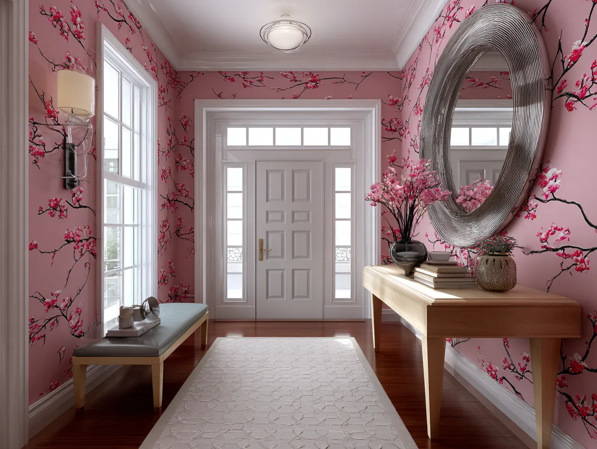
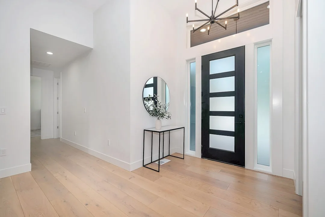
In a quiet neighborhood in Vilnius, a home rises like a calm gesture—neither shouting for attention nor retreating into invisibility. Its architecture is shaped with clarity and restraint, built for light, flow, and living. This house, although narrow in its footprint, opens generously through subtle spatial strategies. There’s a softness to its geometric assertiveness, a balance between the constructed and the natural. Materials like glass and timber are not just elements—they are decisions that sculpt experience. From the outside in, the home reveals how architecture becomes intuitive when space is not dictated by size but by intent.


Glazed corners as light wells of the interior
The use of glass in the corners of this home feels less like a luxury and more like an invitation. Instead of the traditional wall junctions that define the limits of a room, these glazed corners dissolve boundaries and let light leak in from unexpected angles. In the living area, the corner glazing erases the feeling of compression, allowing the outdoors to fold inward. Greenery, sky, and passing shadows become participants in daily life.
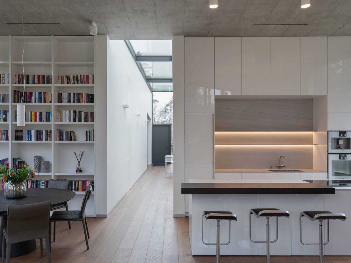
In the kitchen and dining zone, the glass corner becomes a silent performer. It catches daylight even on overcast days, illuminating wooden surfaces with a silken touch. The family table is bathed in ambient brightness from two sides, making morning routines feel gentler and evening meals more expansive. There’s something cinematic in how movement plays across these transparent edges.
Outside, the glass corners reflect trees and the slope of the sky. From the street, these details suggest a house that breathes in its surroundings rather than locking them out. The house looks out without staring. At night, the same corners become softly glowing beacons, sending warmth into the dark—a reverse gesture of welcome.
This interplay of transparency and privacy demonstrates thoughtful precision. It shows how even in constrained widths, the strategic use of glass can amplify openness. The glazed corners don’t shout their presence. Instead, they quietly transform how walls behave and how space is felt.


Vaulted ceilings as a vertical gesture of openness
Inside, the roof doesn’t just shelter—it uplifts. Vaulted ceilings carry the gaze upward and let rooms stretch in unexpected ways. In the central living space, the pitch of the ceiling introduces an airy slope that adds both volume and softness. It’s an upward draw that brings in more than just spatial relief—it brings peace.
Rather than boxing inhabitants in a horizontal plane, the verticality introduces rhythm. Shadows shift through the day, climbing and falling along the plastered surfaces. The ceiling is not ornamental; its vault is practical, poetic, and generous. It gives space to breathe, to think, to exist without pressure.
In the bedroom, the vaulted ceiling becomes more intimate. It narrows slightly, still rising but wrapping the space with a cocoon-like grace. This modulation shows architectural sensitivity—not every room needs the same kind of expansion. Sometimes, scale is personal. Here, the vault is protective, a sculpted quietness.
The ceiling’s slope also contributes to better air circulation and light dispersal. Daylight drops from high windows, bathing the interior in soft gradients. With this height, even the most compact room avoids feeling tight. Volume is no longer a luxury—it’s embedded in the design. The house proves that vertical generosity can redefine a narrow horizontal footprint.

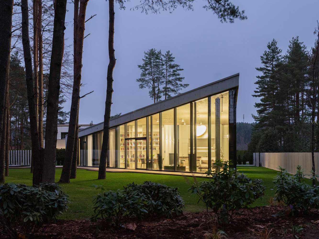

Timber cladding as warmth and rhythm on the facade
While the interior opens with glass and rises with vaults, the exterior gathers its rhythm through timber cladding. Slim vertical boards line the façade, painted in a muted earthy tone that blends with the natural palette of the surroundings. This isn’t just a finish—it’s a texture that holds memory, weather, and time.
The timber speaks with the language of forests and old carpentry. It adds a tactile honesty to the house, something the eye wants to follow. The narrow boards mirror the proportions of the house itself, reinforcing the vertical energy while softening the mass. There’s no ornamentation, no unnecessary flourish—only material integrity.
As seasons change, the wood changes too. Rain deepens its hue; sun bleaches it lightly. The timber becomes a living skin, aging gracefully with each passing year. From the sidewalk, the façade is not flat but dimensional, with shadows playing along the grooves of the cladding throughout the day.
It’s also a smart thermal envelope. Timber’s natural insulation helps the house stay warm in winter and breathable in summer. The cladding hides the complexity of construction beneath, yet its presence is what the passerby sees first. It communicates both modesty and attention to craft.

Natural light and minimal color palette inside narrow walls
Color inside is scarce but intentional. Pale timber floors stretch from room to room, amplifying every ray of daylight that filters through. Walls are painted a warm white, sometimes glowing, sometimes fading into a soft matte. Built-in furniture wears similar tones—light oak, cream, a whisper of beige. The palette is quiet, allowing space to become the main subject.
This minimalism is not austere. It’s emotionally warm. Because the house is not wide, color takes on the task of expanding it visually. Lighter surfaces bounce light deep into the layout. Even transitional spaces, like the stairwell or hallway, feel luminous and unhurried. Narrowness disappears under the effect of consistency and reflection.
Windows are large but never overwhelming. They are proportioned with care, always complementing the flow rather than dominating it. The result is a sequence of bright chambers, each connected but distinct. The light itself becomes a moving element—drawing across the timber floors, highlighting a chair, slipping onto a shelf.
Furniture and decoration follow the same principle. Each piece is functional, sculptural, but never excessive. There are no harsh contrasts, only gentle variations. The harmony between color, form, and material allows the architecture to shine. It invites the mind to rest and the body to feel rooted, even in a slender floor plan.
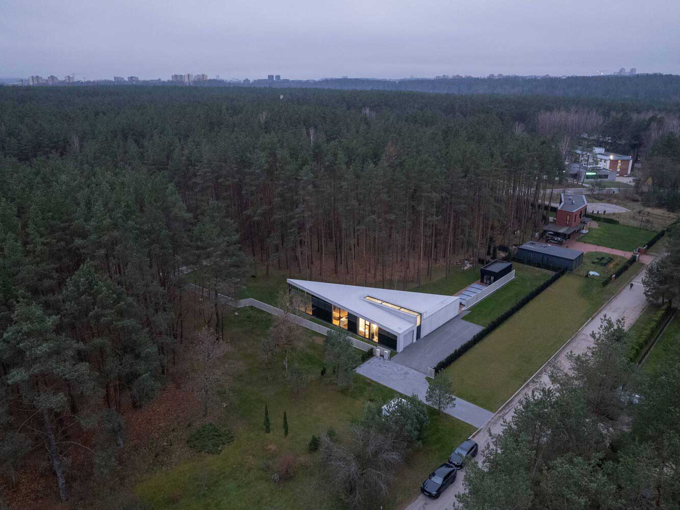
This house proves that limits can be beautiful. It’s not grand in scale, but generous in feeling. Through thoughtful decisions—glazed corners that frame life, vaulted ceilings that offer space, timber cladding that breathes with the wind, and a natural palette that nurtures—the house becomes a haven. The architecture never imposes. Instead, it listens to its context, adapts to its dimensions, and finds ways to expand without adding bulk. It reminds us that with the right materials, proportion, and light, even a narrow volume can open wide.
| Architects | https://www.natkevicius.lt/ |
| Images | Lukas Mykolaitis |
You Might Also Like


Related Topics