Spa bathroom color palettes work because they borrow from the same visual grammar as environments the body already associates with rest — still water, pale stone, forest shade. The right spa bathroom colors aren’t about decoration. They’re a physiological prompt, the same way a dim room signals sleep. I’ve repainted my own bathroom twice chasing this, and the difference between a blue that reads “cold office” and a blue that reads “thermal pool” is exactly three LRV points. Get that wrong and no amount of eucalyptus towels rescues the room.
Three palettes do this reliably: water blues with cool grey, earthy Zen greens with warm brown, and pebble whites with sand-toned beige. Each has a failure mode most people hit. Each is fixable with one paint swap.
At a glance — spa bathroom color palettes covered here:
- Water Blues + Cool Grey — calming, airy; anchors around Benjamin Moore Breath of Fresh Air 806 or Palladian Blue HC-144
- Zen Greens + Earthy Brown — grounding, forest-still; works with Sherwin-Williams Landscape 430 or BM Saybrook Sage HC-114
- Pebble White + Sand Beige — light, warm-neutral; try BM Seapearl OC-19 or Swiss Coffee OC-45 with linen accents
- Fixtures matter more than wall color — chrome reads colder, brushed nickel reads warmer, no matter the palette
- Lighting temperature (2700K vs 4000K) shifts every one of these palettes dramatically — test with actual bulbs before you commit
Water Blues and Cool Grey Pull Lower Heart Rates on Contact
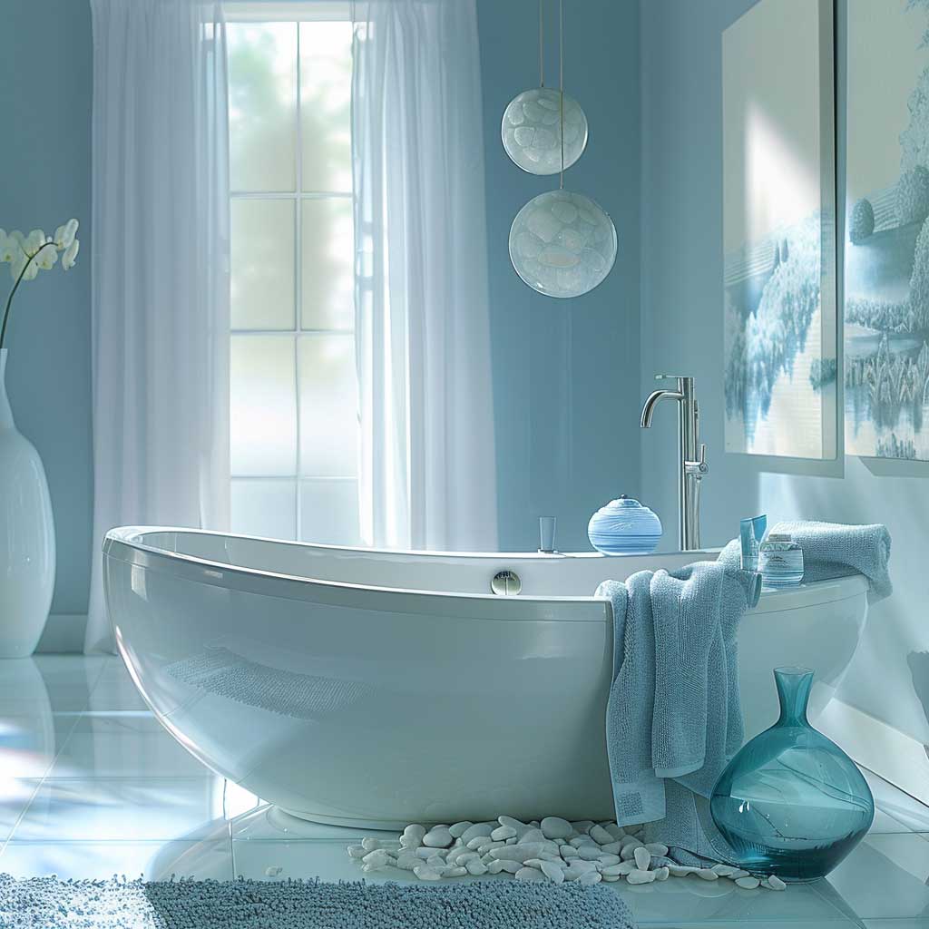
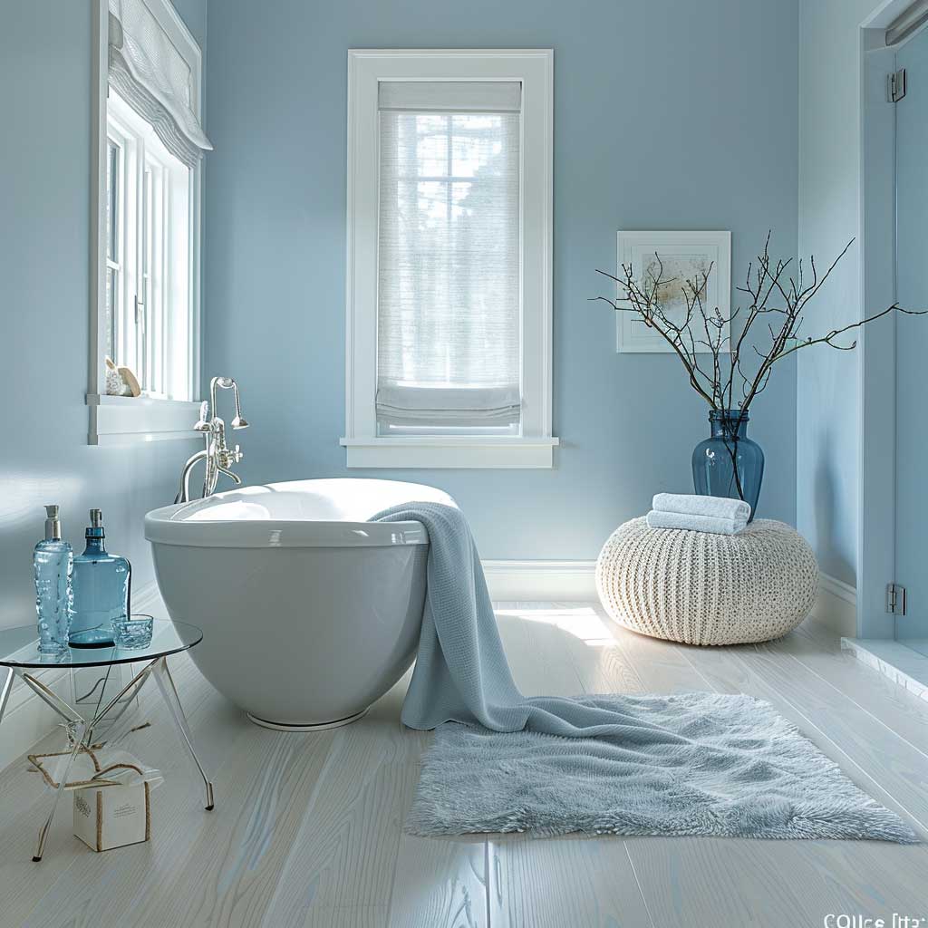
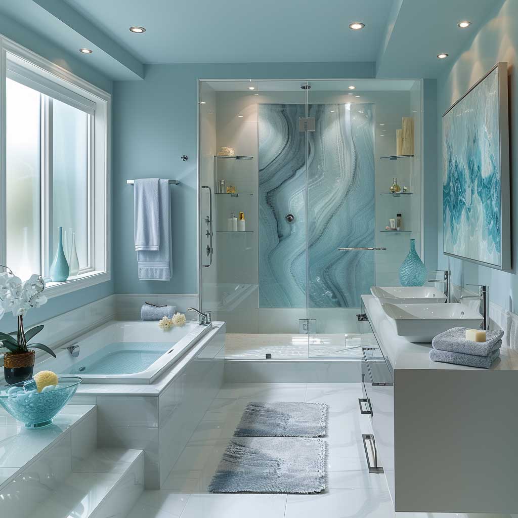
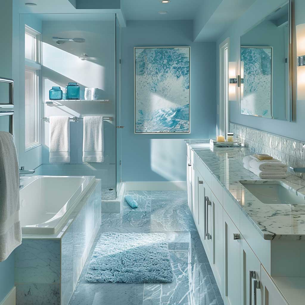
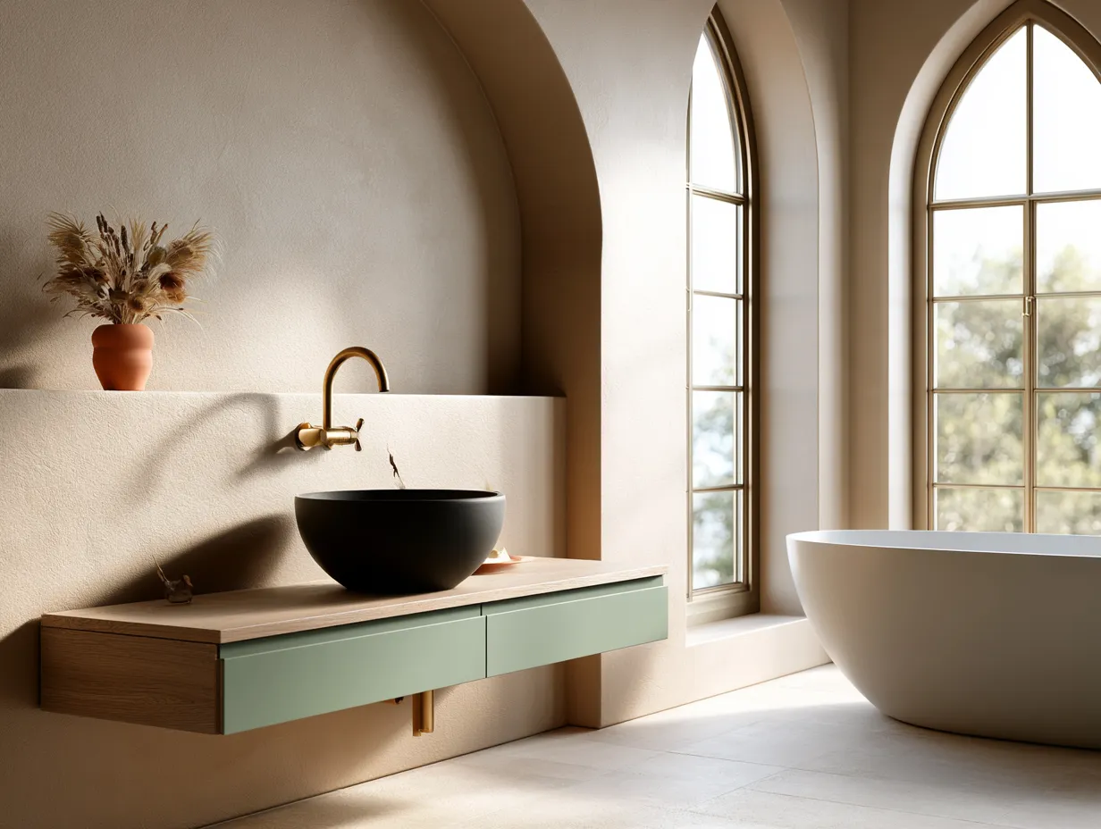
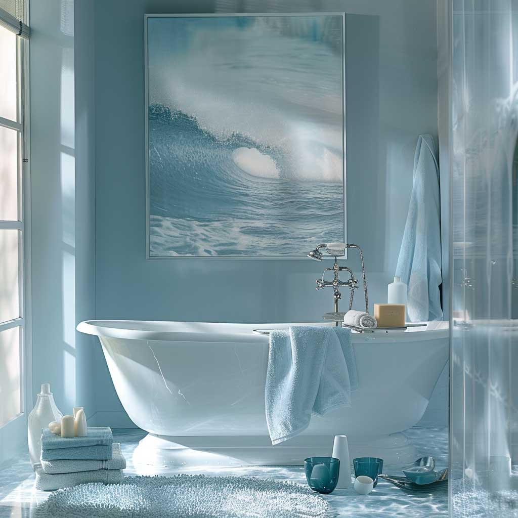
The spa bathroom color palette most people reach for first is blue-grey, and it’s the most abused one in DIY renovations. Benjamin Moore’s Breath of Fresh Air 806 is my go-to wall color here — it reads as pale sky, not baby nursery, and it holds its temperature under both natural and artificial light. Pair it with Revere Pewter HC-172 on a single accent surface: a vanity panel, the interior of a niche, the back of a freestanding tub. You get the grey anchor without painting a full wall the color of wet concrete.
The failure mode? Choosing a blue that’s too saturated. I’ve seen bathrooms painted in a fairly committed cerulean that felt more like a hotel conference center than a spa. You’ll notice the difference immediately — too much chroma and the room vibrates instead of settles. Keep LRV (light reflectance value) above 65 for walls. Palladian Blue HC-144 sits right at 67. That’s the ceiling on saturation for this palette.


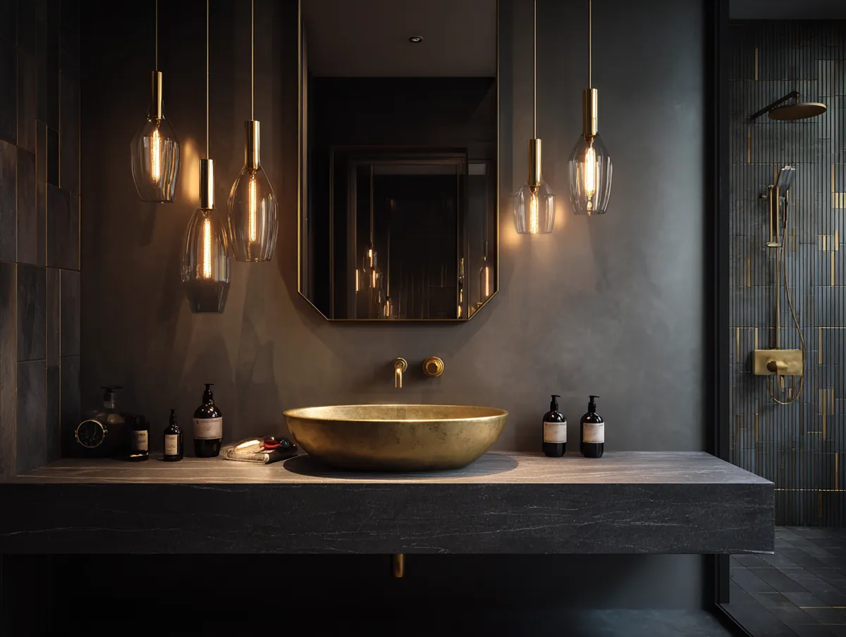
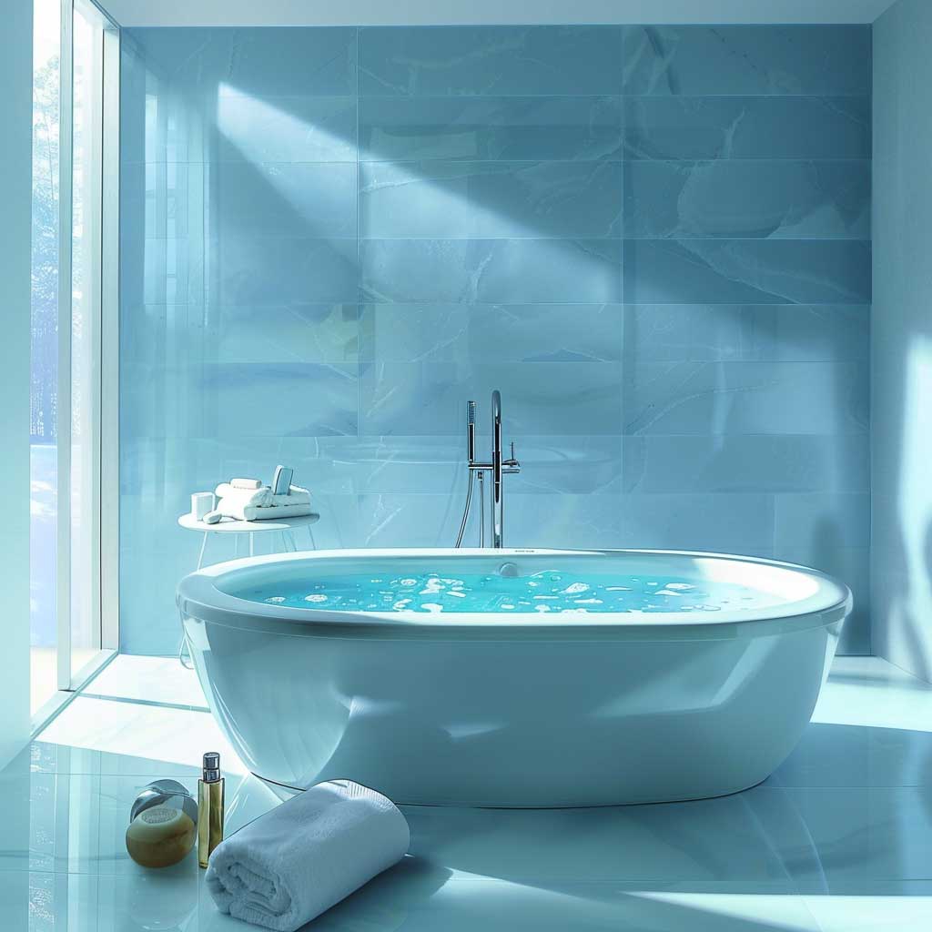
Fixtures in this palette need to be chrome or polished nickel — not matte black. Matte black reads industrial against cool blue and kills the spa reference entirely. A clear glass shower enclosure is non-negotiable; anything frosted cuts the visual depth by half and makes the blue look muddier than it is. I stole this trick from a Four Seasons bathroom renovation case study: run the tile from floor to ceiling on one wall only, keep the others in paint. The eye reads depth without the cost of a full tile job.
Frosted glass windows are the one place I recommend breaking the chrome rule. Privacy glazing softens daylight into a diffused glow that enhances every blue in this palette. It’s the same visual principle as a lightbox in photography — the source becomes indirect, and indirect light removes shadows that would otherwise make cool colors look clinical. Install dimmable warm-white bulbs at 2700K overhead and cooler 3500K at the mirror. The combination means you get spa light for soaking and accurate light for skincare. That’s the one upgrade I’d spend money on before anything else in this color scheme.
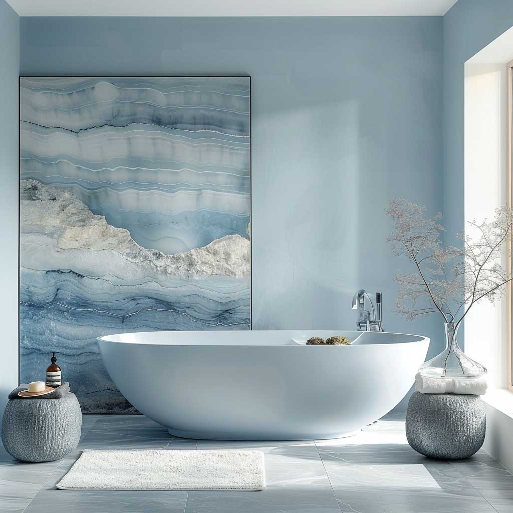


For accessories, skip the blue glass vases — they fight the wall color instead of extending it. My go-to move is a single tall white ceramic vessel with dried pampas or a few eucalyptus stems. It introduces a neutral contrast that lets the blue breathe. Grey towels from Brooklinen’s Luxe line (~$109 for a bath set) hit the exact warm-grey tone that makes this palette feel intentional rather than color-coordinated by accident. Avoid fluffy white cotton — it reads too “hotel corridor” and loses the thermal bath association completely.
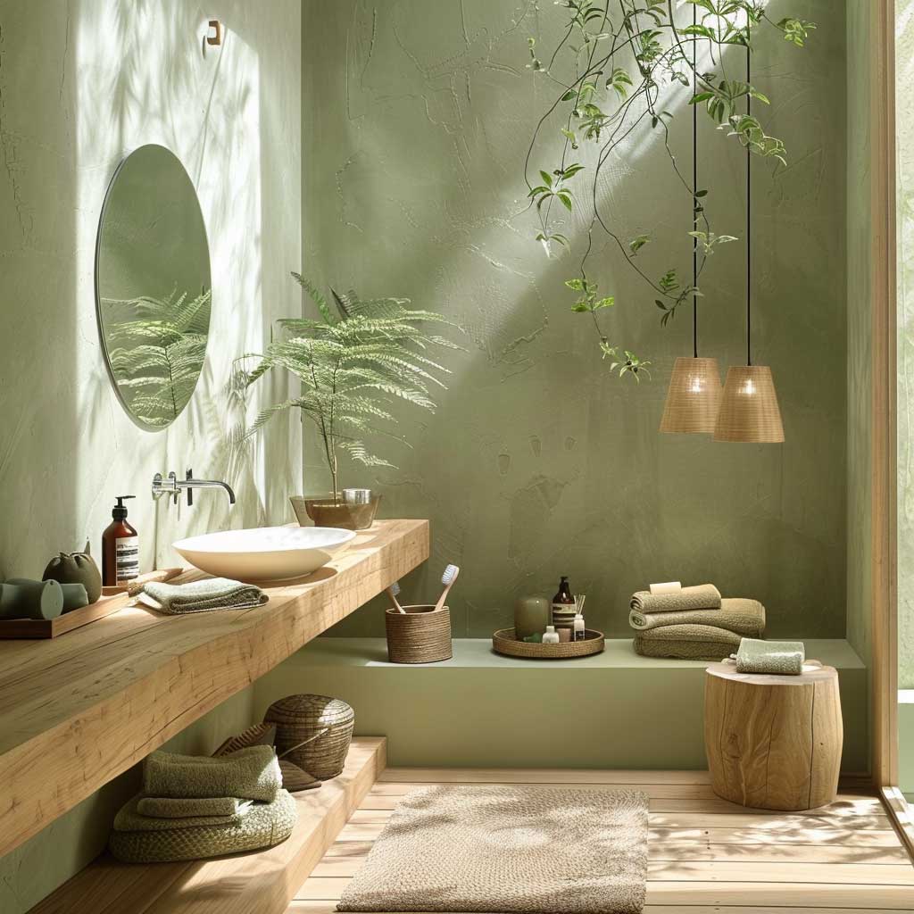
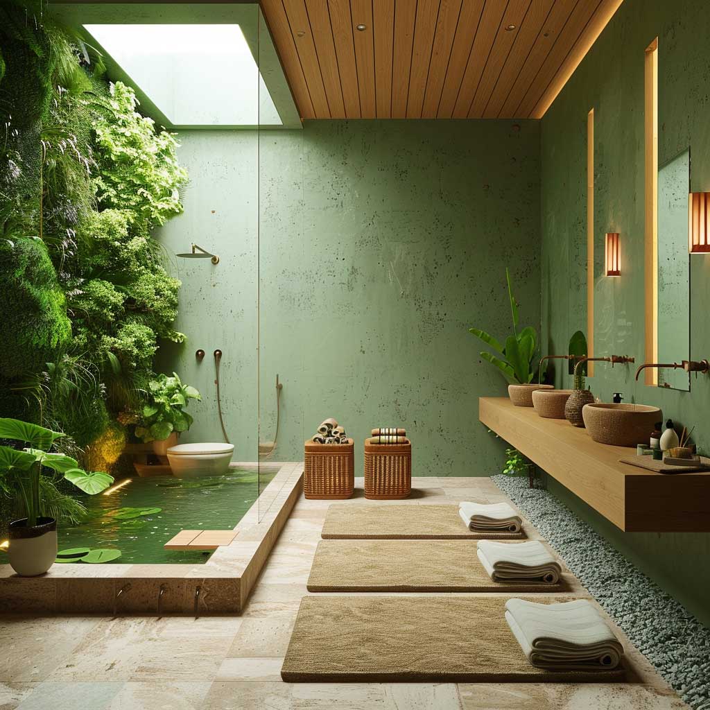
Zen Greens Grounded in Brown Work Because Soil Is Already Neutral

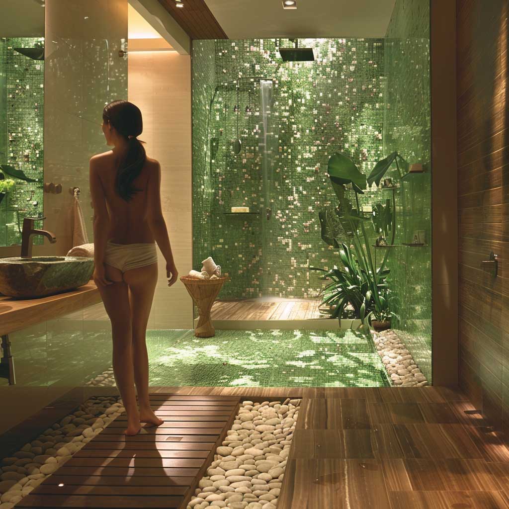

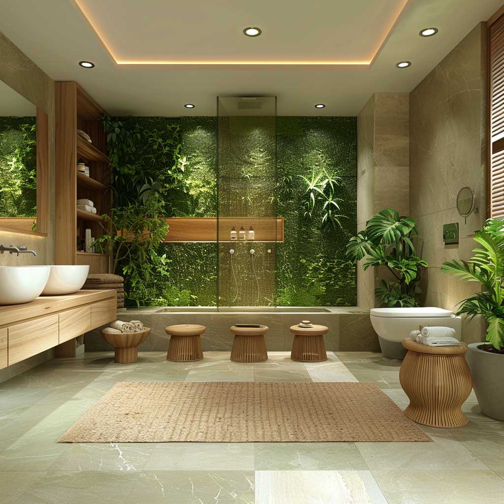
Earthy green is the palette that converts the most skeptics. You walk into a bathroom painted in Sherwin-Williams Landscape 430 or Benjamin Moore’s Saybrook Sage HC-114 and something settles — the same thing that happens when you sit under a tree. It’s not poetic. It’s pattern recognition. The human visual cortex processes low-saturation green as vegetation, and vegetation has meant safety and resource proximity for 200,000 years. That’s why it reads immediately as calm. No other color in this palette group has the same built-in biological shortcut.
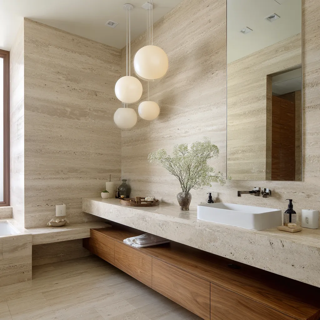
Bamboo and teak are the right material partners here. I own two teak bath stools — one from Teakcraft (~$85) and one I picked up at a Restoration Hardware outlet — and both have held up without any sealing for three years in a humid bathroom. What you don’t want is dark walnut. It pulls too warm and makes the green look yellowish under incandescent light. Stick to medium-toned teak or raw bamboo. Natural stone countertops in a honed travertine or light limestone keep the organic logic going without adding a shiny surface that reads as synthetic in this palette.
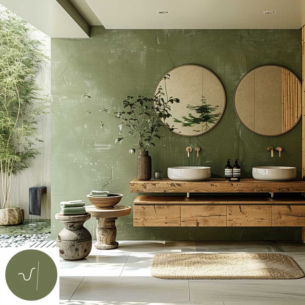
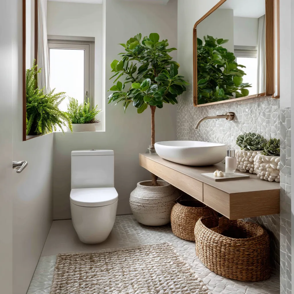
Live plants are load-bearing in this palette, not decorative. A pothos on a corner shelf or a small fiddle-leaf fig near the window amplifies the green-and-brown logic in a way no amount of paint or tile can replace. Ferns do the most work for the least maintenance — Boston ferns specifically thrive in bathroom humidity without supplemental watering more than once a week. Skip air plants. They look great in Instagram renders and look sad and curled in actual bathrooms within two months. Learned that the expensive way.
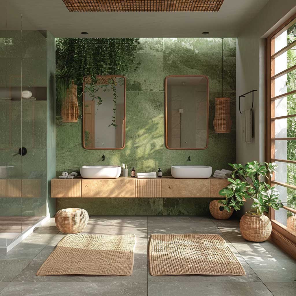
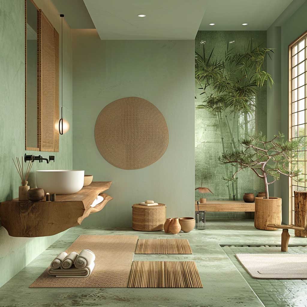
Don’t Do This with Zen Green Palettes
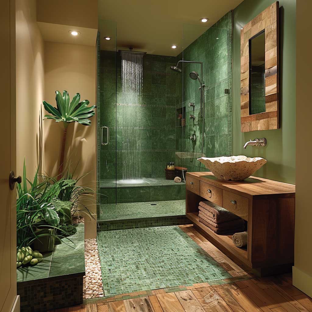
- Don’t add a second accent color. Terracotta “pops,” mustard cushions, or rust-orange towels turn a spa bathroom into a boho kitchen. Zen green needs one wood tone and one stone tone — that’s the whole palette.
- Don’t use high-gloss paint. Gloss amplifies the yellow undertone in most sage greens and makes the room feel like a 1970s avocado appliance. Matte or eggshell only.
- Don’t skip the rug. Stone or tile floor without a natural fiber mat breaks the warmth the wood elements are working to create. A jute or sisal bath mat runs $30–60 and does more for this palette than a $200 diffuser.
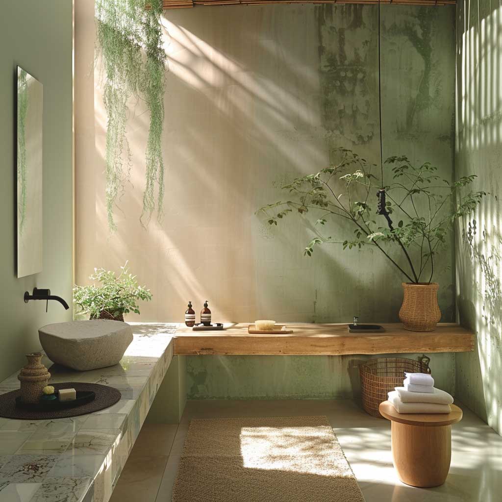
Natural light is the multiplier for this palette in a way it isn’t for the others. Under a skylight, a sage green wall reads like a moss-covered stone — rich and grounded. Under a north-facing window with cold light, the same green reads grey-green and slightly unwell. If your bathroom lacks direct or southern light, compensate with Edison-style warm bulbs at 2400K in an exposed-fixture fitting. It mimics afternoon light and activates the warmth in the brown materials. Avoid can lighting pointed directly at the green wall — the concentrated beam creates shadows that read muddy, not earthy. Minimalist Zen interiors follow the same light principle across every room in the house — bath included.
Evening ambiance is where this palette earns its spa reputation. Dimmable sconces at 2400K, a handful of unscented beeswax candles on the ledge of the tub — and the room looks exactly like a high-end ryokan. The brown materials absorb and re-emit warmth. The green goes quieter. It’s the same principle as a campfire making green forest go dark and intimate at the edges. Skip the LED strip under the vanity; it introduces a color temperature conflict that reads like a gaming setup, not a retreat.
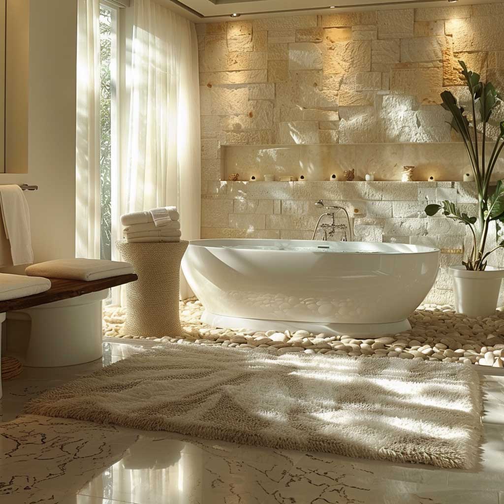
Pebble White and Sand Beige Are Not Boring — They Are Editing


Benjamin Moore Seapearl OC-19 is the white that acts like a spa. Swiss Coffee OC-45 is the beige that acts like sand. Together they form a palette that every design editor I’ve interviewed calls “quiet luxury” while still meaning something specific. The key distinction from generic white-on-white bathrooms: both of these colors have warm undertones. Stark whites like Chantilly Lace OC-65 read clinical — cold light bouncing off a hard surface, zero relaxation signal. Seapearl has a faint oyster undertone that catches warm light and glows slightly amber after sunset. That’s the entire mechanism.
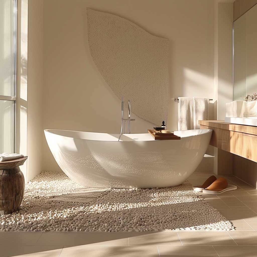
A freestanding tub is the right centerpiece for this palette. It doesn’t have to be expensive — the Woodbridge B-0034 runs around $799 and photographs identically to $4,000 options in matte white. The curved silhouette against a soft white wall creates the same visual grammar as a smooth river stone against pale sand. That’s the metaphor this palette is borrowing from, and every element in the room should reinforce it or get cut. Rectangular drop-in tubs break the logic immediately and read as contractor-grade, no matter what color the walls are.

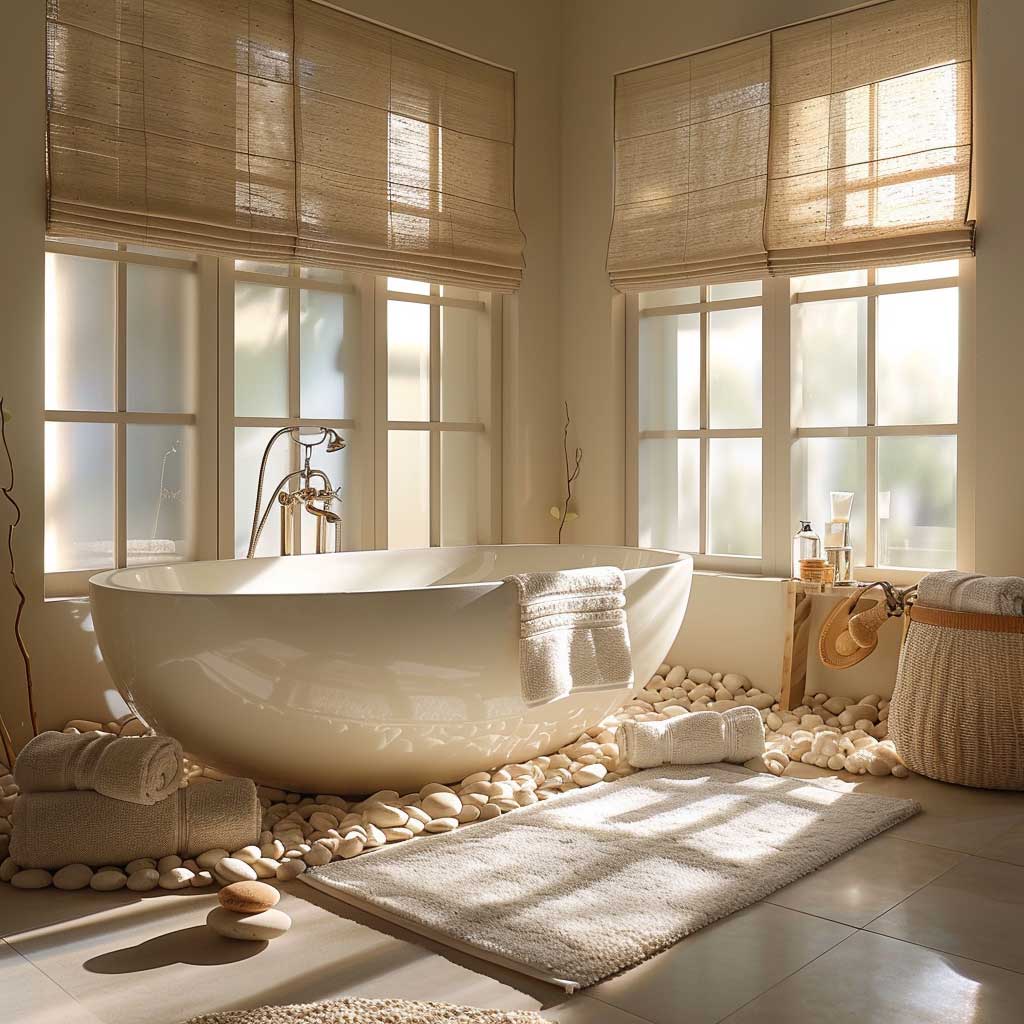
Textural contrast is where this palette gets interesting. Smooth surfaces read cold. You need three textures minimum to make a white-and-beige bathroom feel spa-level rather than builder-grade: a rough natural fiber (jute mat, woven basket), a polished smooth stone (marble soap dish, travertine tray), and a soft textile (waffle-weave towels). Parachute’s waffle towels in the “warm white” colorway (~$49 each) hit the Swiss Coffee register precisely — not too bright, not too grey. Avoid terry cloth in stark white. It’s a color temperature problem, same as the walls.
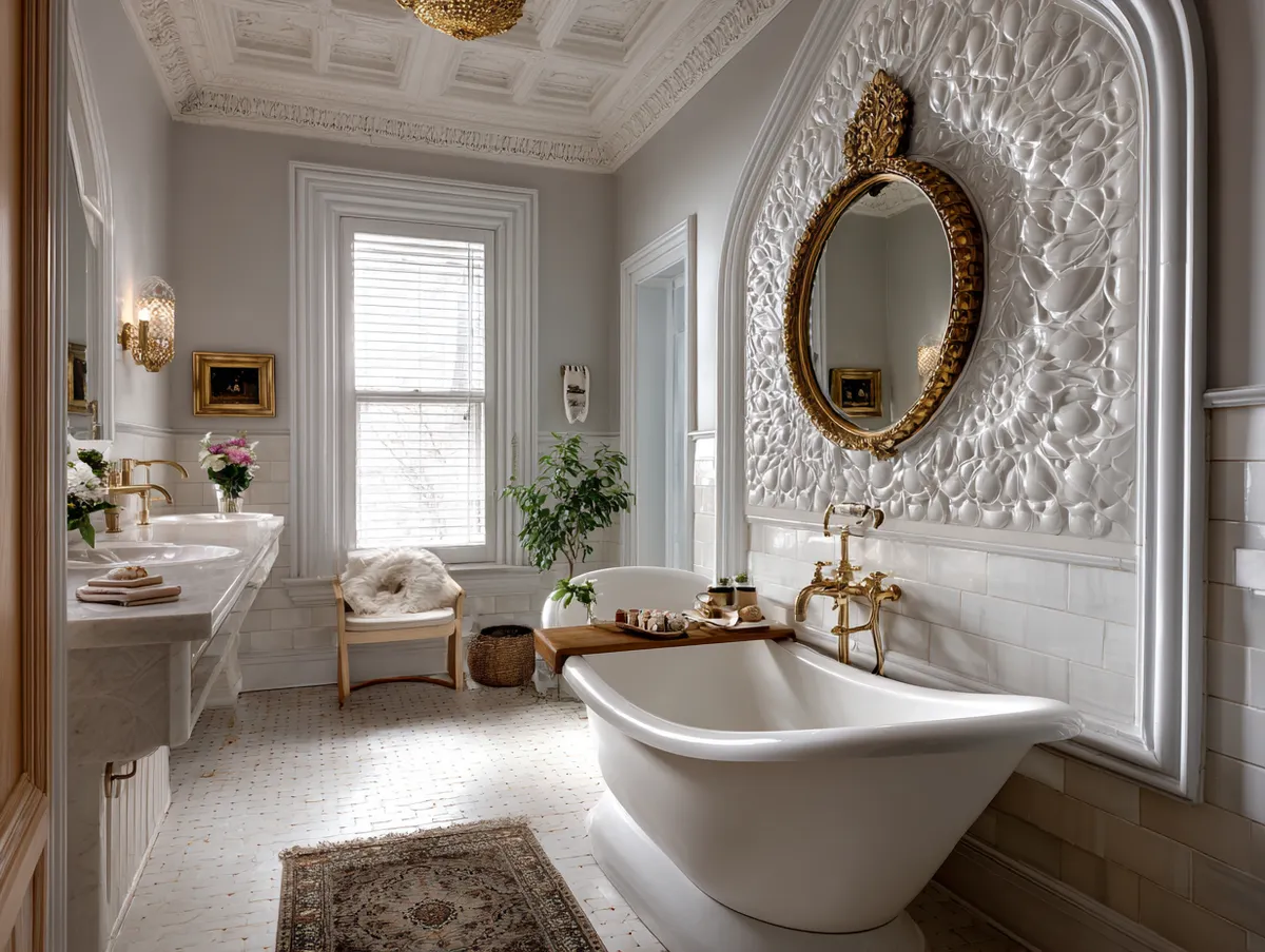
Mirrors earn their square footage in this palette. A simple frameless mirror or one in natural oak reads correctly. Ornate gold frames compete with the deliberate quietness of the color scheme and pull the room toward “vintage” instead of “spa.” I’d rather have a frameless Kohler Verdera (around $180) than a $600 decorative piece that fights the rest of the room. What works surprisingly well as a focal point: a single flat stone, palm-sized, placed on the vanity ledge. It costs nothing. It does everything the expensive ceramic accessories promise and fail to deliver. Modern minimalist bathrooms use the same principle of restraint to create serene, spa-like spaces without overcrowding the neutral palette.
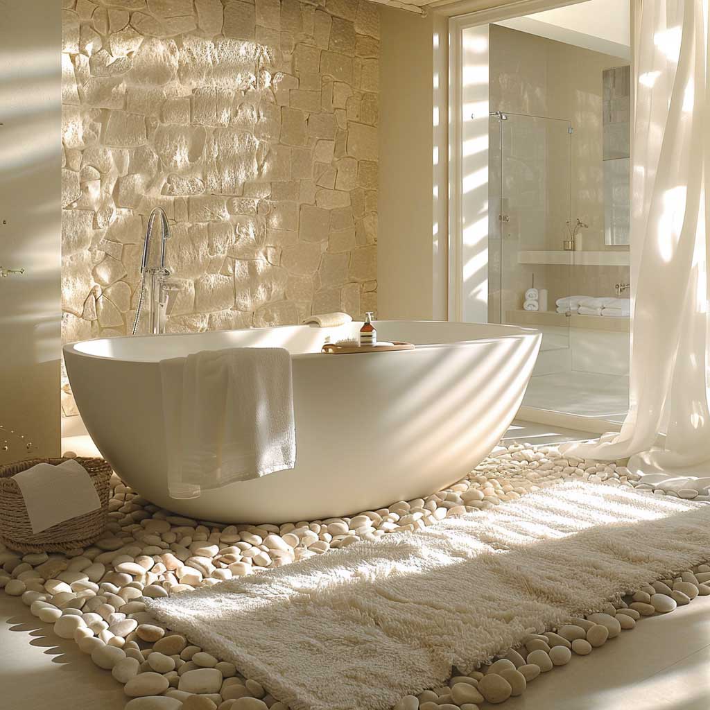

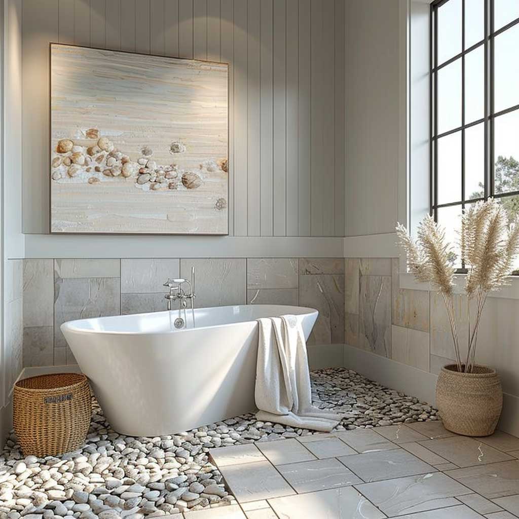

Dried botanicals pull more weight here than fresh flowers. A small bundle of dried lunaria or bleached cotton stems reads exactly as “pebble and shoreline” without needing to be replaced every five days. Fresh flowers bring saturated color — which is precisely what this palette has been carefully avoiding. Resist the peonies. They’re beautiful elsewhere. Here, they’re the wrong frequency. The palette is doing one thing: convincing your nervous system the room is made of quiet natural materials. One hot-pink peony undoes about $400 of paint investment. That’s not a metaphor. It’s a color physics problem.
For the most direct comparison of these three palettes against spa references you can shop right now, Benjamin Moore’s bathroom color tool lets you filter by tone family and LRV range — which is the fastest way to narrow to the specific whites, blues, and greens that won’t shift under bathroom lighting conditions.
ArtFasad — Spa Bathroom Color
The palette that works is the one you stop noticing because the room already feels like rest.
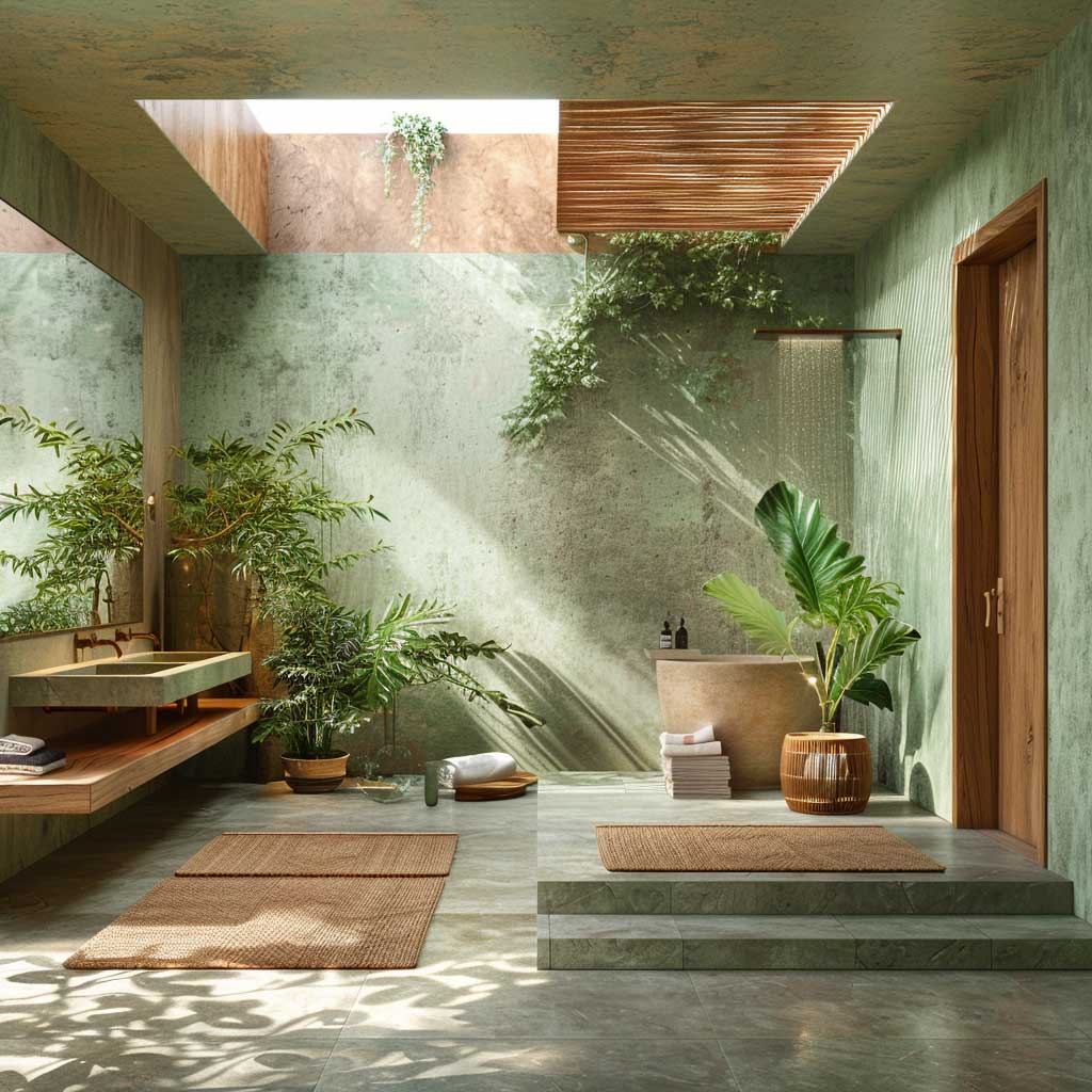
All three of these color schemes succeed for the same reason: they reference materials the body associates with stillness. Water, stone, soil. None of them require an expensive renovation — just the right paint and the discipline to remove everything that contradicts it.
Pick the palette that matches your bathroom’s light direction first, your fixture finish second, and your personal preference third. In that order. Most people reverse the list and repaint twice.
Save this post before you head to the paint store — you’ll want the LRV numbers and brand codes when you’re standing in front of 40 very similar swatches.
FAQ
What is the best paint color for a spa-like bathroom?
Do calming bathroom colors work in a small bathroom?
What is the difference between a spa color and just a neutral bathroom color?
Can I do a zen bathroom with green walls if I have white tiles?
What colors do spas actually use on their walls?
How do I make a beige bathroom look like a spa and not look dated?
You Might Also Like