Room renovation ideas built around color are the fastest way to make a home feel genuinely new — and I’ve tested that claim in three apartments and one farmhouse. Paint, cabinetry color, and a single statement textile can shift how a space reads more than a $2,000 sofa ever will. The projects in this post cover living rooms, bedrooms, and kitchens, all using color as the primary tool.
You’ll notice that every renovation here starts with a palette decision before a single piece of furniture gets moved. That sequencing matters. Choosing a sofa first and then trying to paint around it is how you end up with a room that looks assembled rather than designed. Pick the wall color first, then build the layers.
Renovation colour schemes work differently in each room type — what reads as energizing in a living room will feel exhausting in a bedroom. The sections below break down the logic for each space so you can borrow the approach, not just the aesthetic.
- Living rooms: how to use electric blue, warm red, and vintage furniture together without chaos
- Bedrooms: the specific soft-blue and green combinations that actually lower cortisol (and the brands that sell them)
- Kitchens: pastel cabinet colors, open shelving, and the backsplash trick that ties it all together
- A renovation colour scheme framework you can apply before buying a single thing
- The one mistake that makes colorful rooms look cheap instead of editorial
Living Room Renovations That Actually Use Color
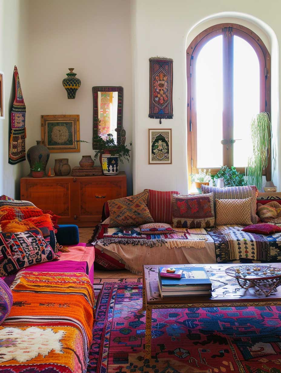


Room renovation ideas for living spaces almost always start with the wrong question. Most people ask “what color should I paint?” when the real question is “what mood do I want to walk into?” I’ve redone two living rooms using electric blue (Benjamin Moore Sapphire #2067-10, about $90 a gallon) and warm terracotta, and the difference in energy is immediate — one reads like a gallery, the other like a Tuscan trattoria. Neither is wrong; they just have completely different effects on the people in them.
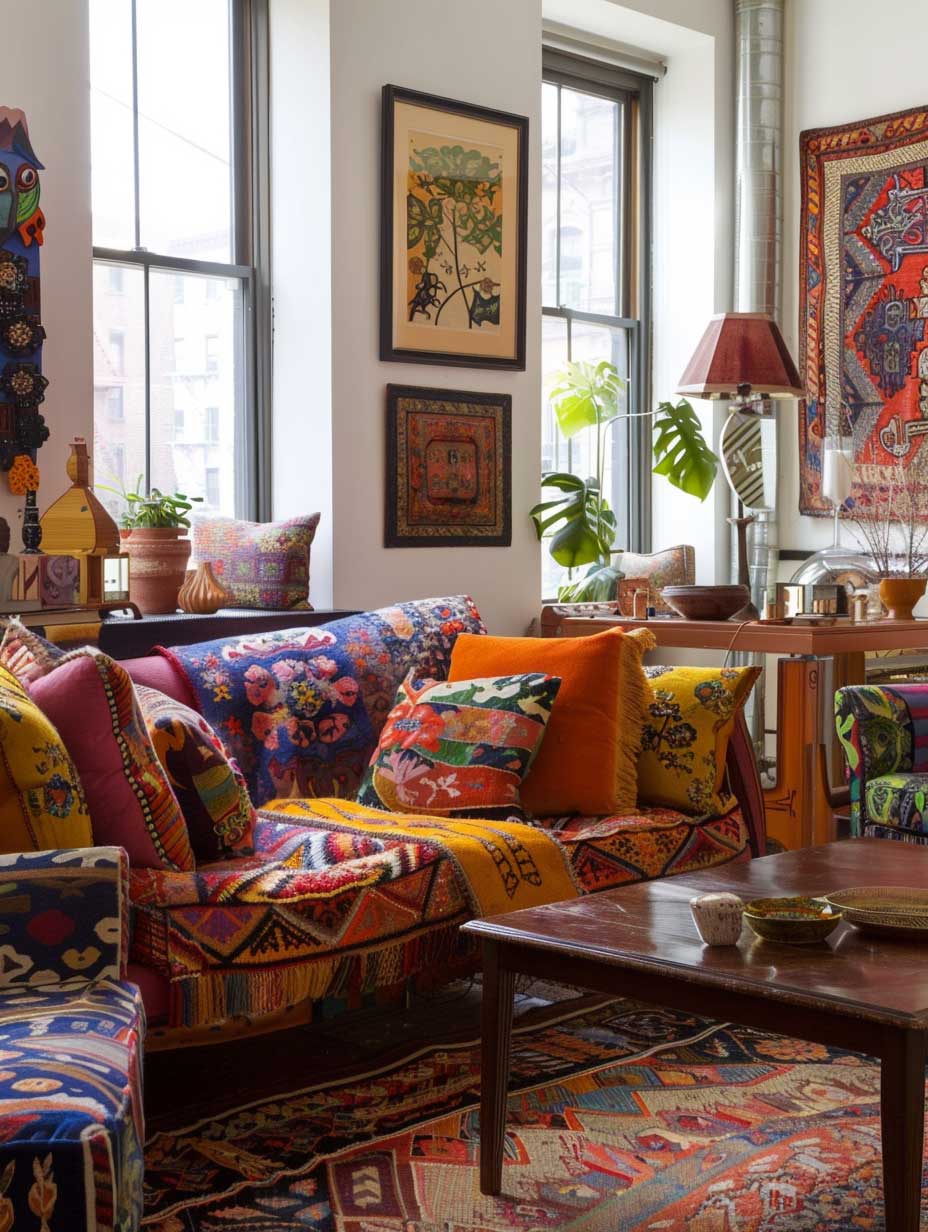
The eclectic furniture mix — pairing a mid-century Eames-style lounge with a brutalist coffee table and a contemporary sectional — is what gives bold rooms their depth. Without furniture from different eras fighting pleasantly against each other, a brightly colored wall just looks like a mistake. Think of it the way a sommelier thinks about wine and food: contrast creates complexity, matching creates monotony. A $400 vintage credenza from Facebook Marketplace does more for a bold living room than a $1,500 matching set from a big-box retailer.
Lighting is where most room renovations quietly fail. You can spend $600 on a statement pendant and still have a dim, flat room if you haven’t addressed the ambient layer. I stole this trick from a set designer: position floor lamps at 45-degree angles behind seating, not beside it. This eliminates the flat-front lighting that makes colors look muddy and instead lets the paint color do what it was chosen for. Ikea’s HEKTAR floor lamp at $70 works just as well as a designer equivalent for this purpose.
One plant in the corner does not make a living room feel alive — that’s a myth. A cluster of three plants at varying heights (a 6-foot fiddle leaf fig, a trailing pothos at mid-height, and a low-growing snake plant) creates a corner that reads as intentional. You’ll notice this grouping trick in every editorial living room shoot. Doing it alone with one small succulent is the design equivalent of a single Christmas ornament on a bare tree.


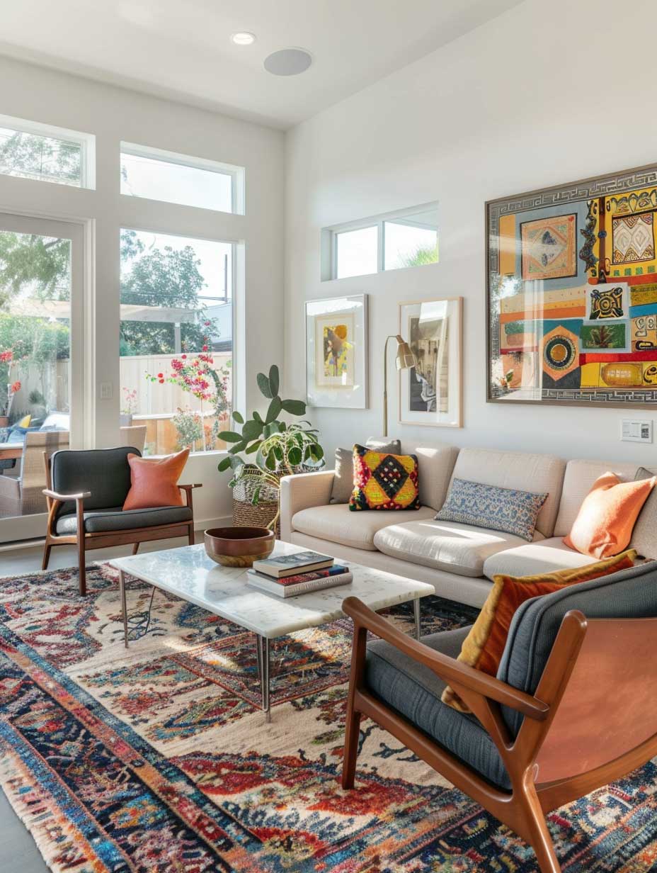

Rugs anchor the room the way a plot anchors a film — pull the rug and everything floats. A 9×12 Moroccan-style rug from Ruggable (around $350, machine washable) grounds the seating arrangement and defines the room’s color story in one move. What doesn’t work: choosing a rug that “matches” the sofa. Matching kills the eclectic tension that makes bold rooms feel alive. You want contrast, not coordination. For more on pairing paint colors with your living room renovation, see our green paint color guide for modern living rooms.
Wall art is the last 10% that makes the first 90% look deliberate. A large-format print (at least 24×36 inches) over a sofa prevents the wall from swallowing the furniture. I’ve seen rooms where every furniture piece was excellent but the wall above the sofa was empty — the effect was a staging photo, not a home. Prints from Society6 start at $40 for large formats and ship framed.
Renovation Colour Schemes for Bedrooms That Slow You Down

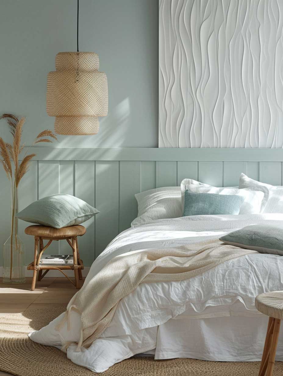
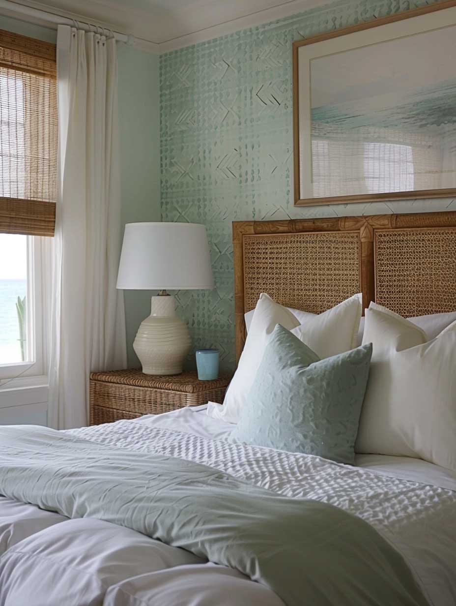
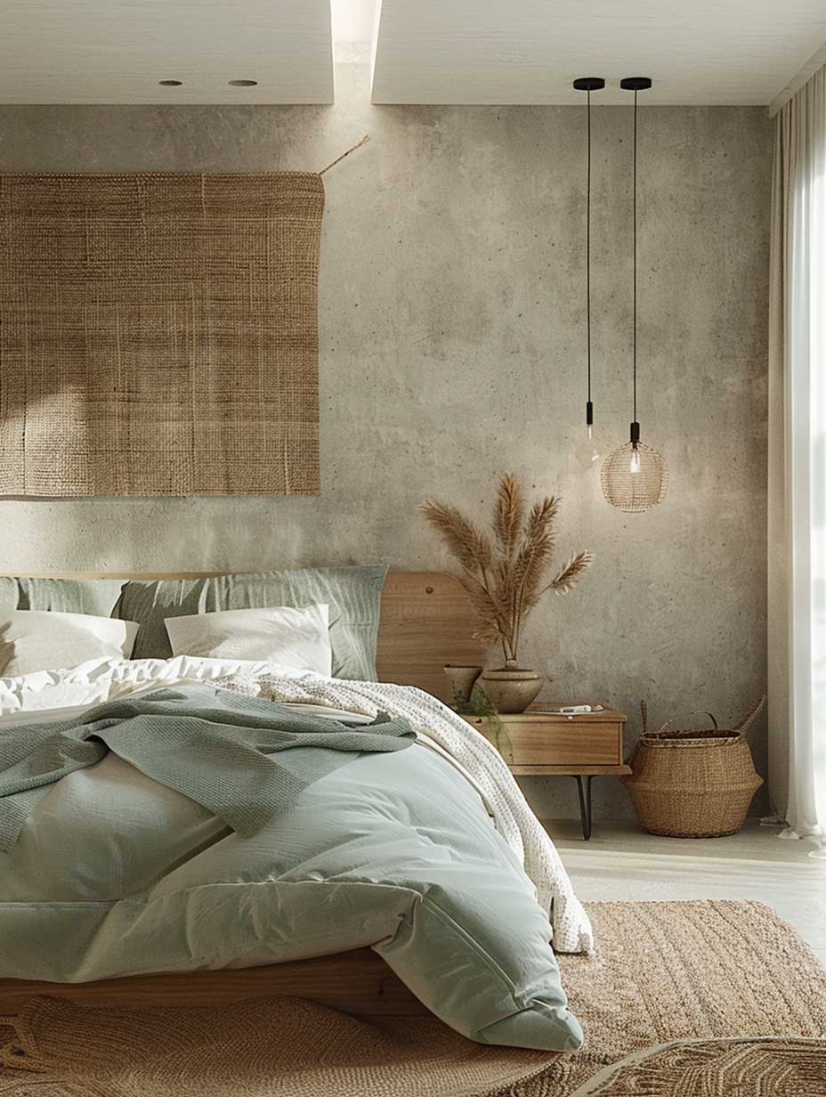
Renovation colour schemes for bedrooms operate on a completely different logic than living rooms — you’re designing for the nervous system, not the eye. Soft blues and muted greens have documented effects on cortisol levels; Benjamin Moore’s Quiet Moments (HC-112, around $90/gallon) is my go-to recommendation for north-facing bedrooms because its cool undertone reads warmer than it should under evening lamplight. That counterintuitive behavior is exactly what you need in a sleeping space.
Natural wood furniture does the work that no paint color can do alone — it introduces warmth, grain, and the subtle irregularity that makes a room feel inhabited rather than decorated. An IKEA HEMNES bed frame in white stain paired with a live-edge walnut nightstand from Etsy (around $180) creates the kind of nature-meets-modern tension that editorial bedrooms are built on. What fails: all-matching bedroom sets from Ashley Furniture or similar. They look assembled, not designed. Mixing a $300 IKEA frame with one quality artisan piece costs less and looks better.
Textiles are where budget bedroom renovations either succeed or collapse. Linen sheets from Cultiver ($200 for a queen set) hold their shape and color after 50 washes in a way that polyester blends don’t — after six months of daily use, cheap sheets look like a motel, while quality linen looks like a boutique hotel. Layer a chunky wool throw from H&M Home ($60) over the foot of the bed and you’ve added the tactile depth that makes a bedroom feel finished at a glance.
Dimmer switches cost $15 at Home Depot and change a bedroom renovation more than a new light fixture ever will. Is there a faster $15 upgrade in interior design? I doubt it. The ability to drop from 100% to 20% brightness in the evening is the difference between a room that prepares you for sleep and one that keeps you wired until midnight. Pair dimmers with warm-toned bulbs (2700K or lower) from GE or Philips — not the default 4000K “daylight” bulbs that read like a hospital corridor after 9pm. For a detailed look at bedroom colour psychology, the bedroom colour schemes guide on ArtFasad covers the science behind each palette choice.
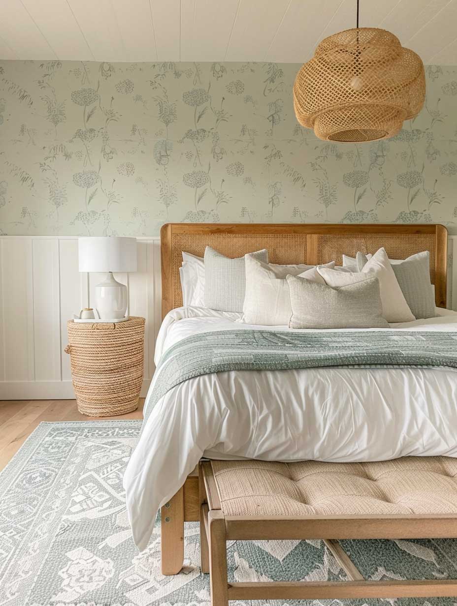


A statement wall in a bedroom should add depth, not drama. A subtle geometric wallpaper from Spoonflower ($22/yard, peel-and-stick option available) behind the headboard creates a focal point that pulls the eye to the bed — exactly where it belongs. Avoid busy floral patterns at scale; what looks editorial in a magazine reads as overwhelming at 7am when you just want to find your socks. The rule I use: if the pattern reads clearly from across the room, it’s too large for a bedroom.
Renovation colour schemes that work in bedrooms share one quality — they recede. The color should be something you stop noticing after five minutes in the room, which means it’s doing its job. If you’re still looking at the wall color when you’re trying to fall asleep, it’s competing with you instead of supporting you.
Don’t paint all four bedroom walls in a bold color and then add a fifth accent wall in a second bold color. I’ve seen this in dozens of renovation photos and it always reads as indecision rather than design. The two colors fight each other under changing light throughout the day and the room ends up feeling unresolved. If you want an accent wall, keep the other three walls in a strict neutral — Sherwin-Williams Alabaster (SW 7008) or Benjamin Moore Chantilly Lace (OC-65) — and let one wall carry the color story alone.
Same applies to kitchens: don’t choose colorful cabinets AND a bold backsplash AND a patterned countertop. One statement surface per room. Everything else supports it.
Kitchen Cabinet Colors That Make the Whole Room Land
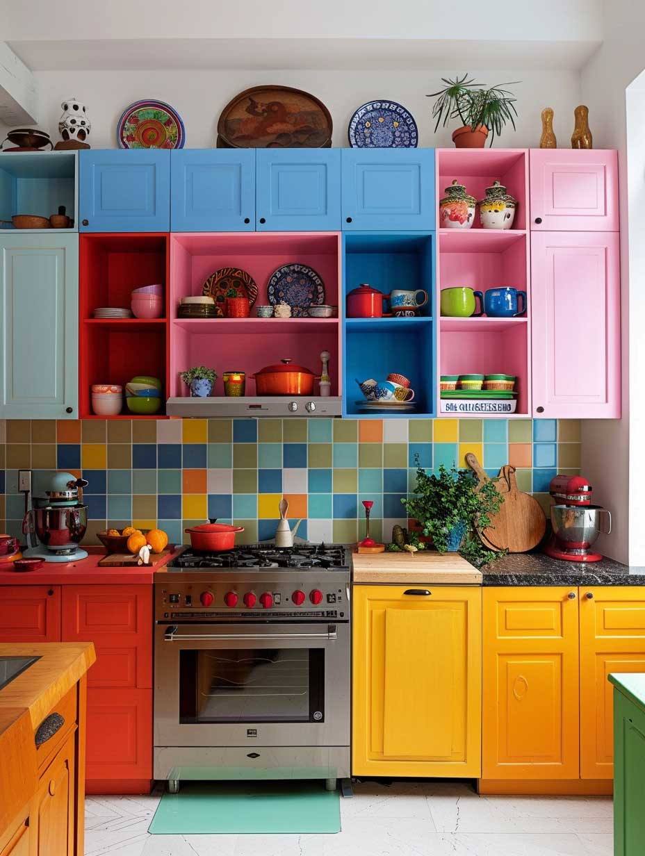


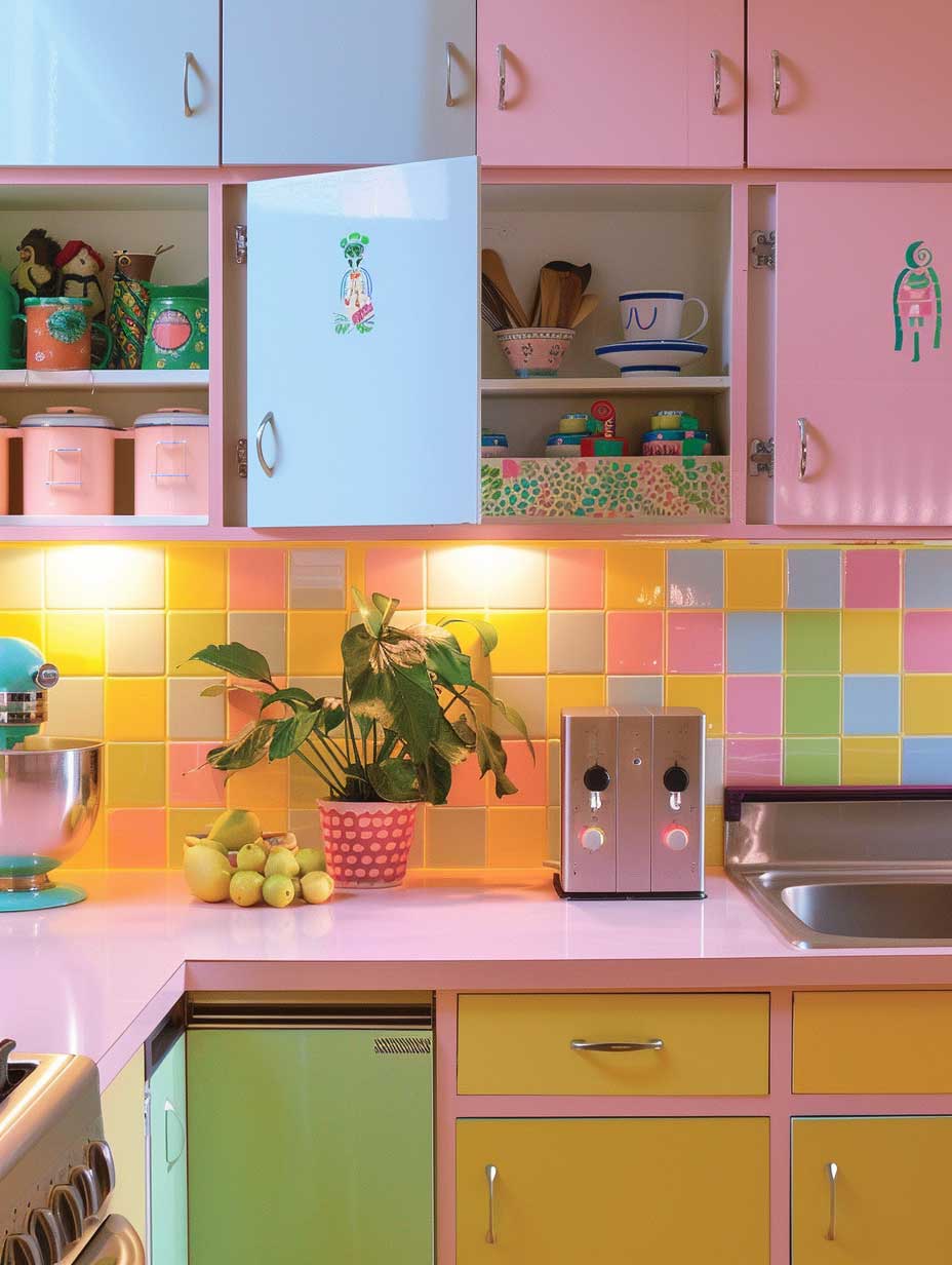
Room renovation ideas for kitchens live or die on the cabinet decision. Painting existing cabinets is a $200–$400 project if you do it yourself with the right prep; hiring a cabinet painter runs $1,200–$2,500 for a full kitchen. Benjamin Moore Advance (Interior Alkyd, $75/quart) is what professional cabinet painters use — it levels beautifully and hardens to a factory finish within two weeks. I’ve used it in sage green (color: Herb Garden 461) and it held up through two years of daily cooking without chipping at the edges, which is where cheap paint always fails first.
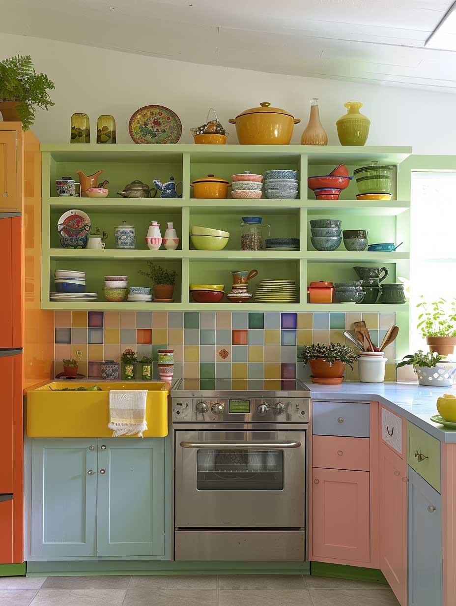
Pastel cabinet colors — mint, soft butter yellow, powder blue — work because they introduce color without overwhelming the room. Your kitchen is a working space and you spend hours in it; saturated colors that look great in photos become fatiguing at 6am when you’re making coffee. What color works best for your kitchen? That depends on light direction: north-facing kitchens need warm pastels (butter, blush, sage); south-facing kitchens can handle cooler ones (sky blue, seafoam) without reading as cold.
Backsplash tiles are the fastest room renovation move in a kitchen. Subway tile in a colored grout ($3–$8/square foot at Home Depot) costs almost nothing but reads as deliberate and considered. Alternatively, hand-painted Spanish-style tiles from Etsy sellers run $4–$12 per tile and add the kind of artisan detail that justifies the entire renovation. The mistake to avoid: choosing a backsplash pattern that fights the cabinet color rather than supporting it. If your cabinets are patterned, go solid on the backsplash. If your cabinets are solid, the backsplash can carry the pattern.
Open shelving is either the best decision you’ll make in a kitchen renovation or a constant source of low-level anxiety — it depends entirely on whether you own things worth displaying. Floating white oak shelves from a local millworker (typically $80–$150 per shelf installed) look genuinely editorial when loaded with matte ceramic dishes, a few cookbooks, and trailing pothos. They look chaotic when loaded with mismatched Tupperware and expired spices. Be honest with yourself about which camp you’re in before removing those upper cabinet doors. Benjamin Moore’s most popular interior colors include several kitchen-ready options like Wythe Blue HC-143 and Icicle OC-33 that pair well with natural wood shelving.


Appliances in stainless steel are the safe choice — timeless, resale-friendly, and they disappear visually against most color schemes. But if you’re fully committed to a color story, SMEG’s pastel refrigerators ($1,500–$2,200) make a kitchen renovation feel like an editorial decision rather than a functional upgrade. I own the cream version and it’s been photographed by every person who’s visited my kitchen since I got it three years ago. Is that a design win? I think so.
Bar stools are the last piece of the kitchen renovation puzzle and the most frequently bungled. A set of Tolix A-chairs in colored powder coat ($250–$350 each) brings French industrial energy to almost any kitchen color scheme. What you should not do: buy matching stools in the same color as your cabinets. That’s coordination, not design — and the result looks like a furniture showroom rather than a kitchen someone actually lives in.
Final Take
Room Renovation Starts With Color, Not Furniture
Every project here — living room, bedroom, kitchen — followed the same sequence: palette first, furniture second, accessories last. Reversing that order is why most room renovations look assembled rather than designed.
Budget matters less than sequence. A $90 gallon of Benjamin Moore Advance on existing cabinets outperforms a $3,000 cabinet replacement if the color is right. A $15 dimmer switch transforms a bedroom renovation more visibly than a new light fixture.
Save this post before your next renovation starts — the color decisions come up faster than you expect.
Related Topics