Vintage office wall decor turns a bland workspace into a room with actual character — and the difference between a dull shelf and a well-placed antique poster is smaller than you think. I’ve spent years sourcing pieces from estate sales and Etsy shops, and the retro office look is one of the most satisfying interiors to build. It rewards specificity. Buy the wrong clock or frame the poster without a mat and the whole wall reads like a thrift store, not a curated home office.
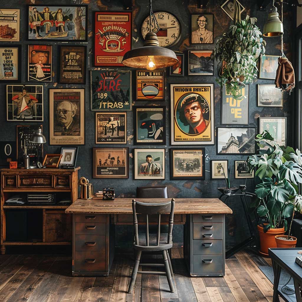
Retro office decor works because layering is forgiving. A vintage oil painting next to an antique shelf clock and a stack of leather-bound books hits differently than any flat gallery wall. You’ll notice the eye keeps moving — there’s always something new to land on. That’s the point.
- Classic vintage posters — how to frame and arrange them without looking cluttered
- Antique wall clocks — what to look for and what to avoid
- Vintage art prints — botanical illustrations vs. retro graphic prints
- Retro shelves — the right accessories and the ones that kill the vibe
- FAQ covering antique vs. vintage, budget-friendly sourcing, and wall layout tips
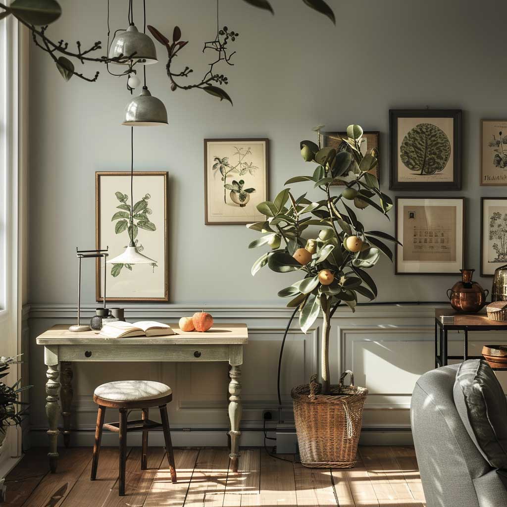
Classic Vintage Posters Change the Whole Mood of a Retro Office
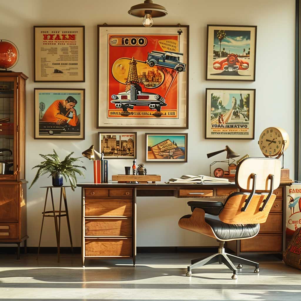
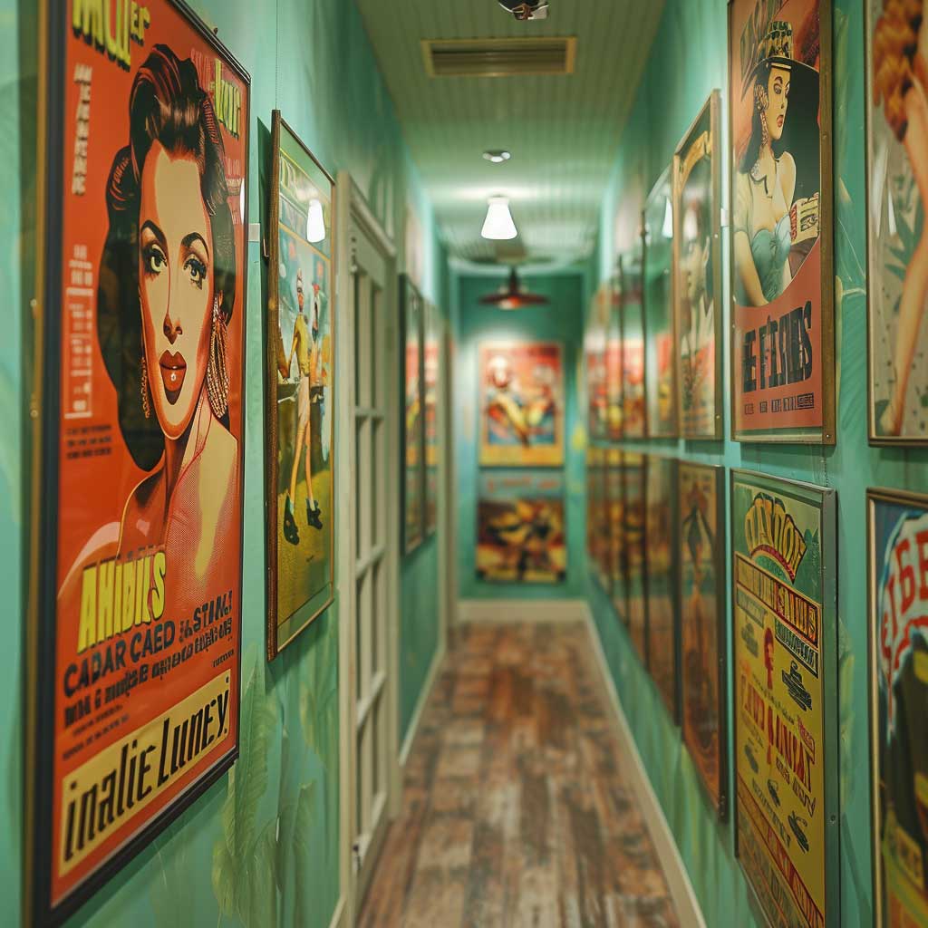
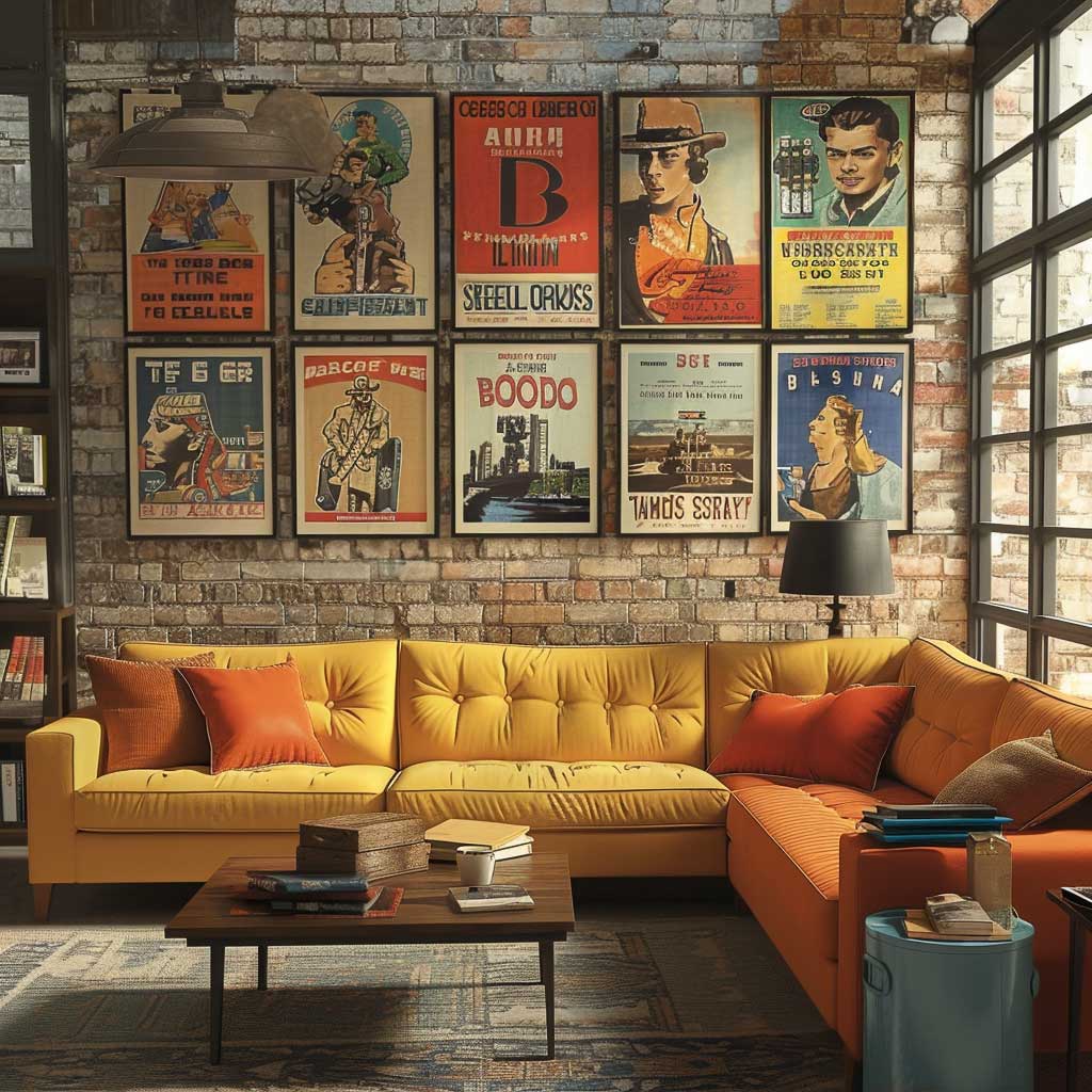
The 1950s travel poster is my go-to anchor piece for a retro office wall. Pan Am prints from that era run $35–$80 on Etsy depending on the destination — I paid $52 for a Paris one, and it’s still the first thing people comment on. The bold color blocking reads well from across the room, which is exactly what you want over a desk. Avoid the unframed rolls; they look cheap no matter how good the print is.
Frame selection matters more than the poster itself. Black oak or walnut frames with a 2-inch cream mat add weight and stop the poster from floating on the wall. You’ll notice that matching frames across a grid arrangement — say, four 18×24 posters in identical black frames — creates a tight, magazine-ready look. Mixing frames works too, but only if you’re mixing intentionally: one gold, one black, one raw wood, and then you stop.
Here’s the mistake I see constantly: pairing a vintage travel poster with a modern minimalist print in the same row. The color language is completely different. Stick to the same era, or at least the same palette. My rule is that every poster on the wall should feel like it came from the same estate sale, even if it didn’t. That coherence is what makes the wall look intentional rather than random.
Old maps work brilliantly alongside the posters. A hand-drawn city map — think 1920s Paris or a Victorian-era botanical survey — adds texture that printed travel art can’t match. Retro wall arrangements in other rooms follow the same logic: anchor with one large statement piece, then build around it.
Antique Wall Clocks Earn Their Place When You Pick the Right Size
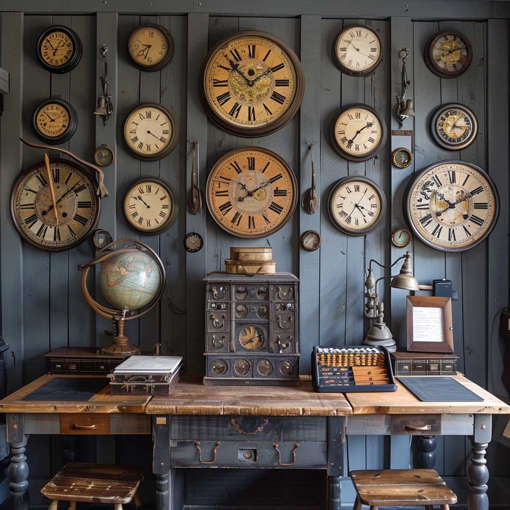

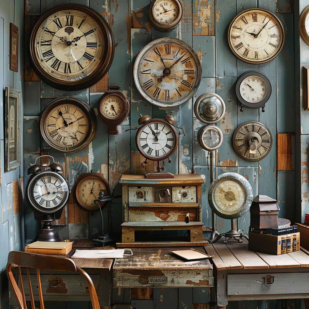
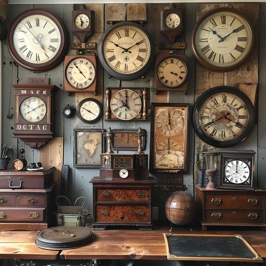
I own two antique wall clocks and the size difference between them was the best styling decision I made. The large one — a 24-inch Victorian schoolhouse clock in dark walnut — anchors the main wall above my desk. It cost $140 at an estate sale in Ohio. The smaller brass one, maybe 10 inches, hangs to its right and slightly lower, and the asymmetry keeps it from looking like a showroom display. Same era, different scale. That’s the whole formula.
What doesn’t work: buying a reproduction clock from a big-box store and hanging it next to genuine antiques. The difference in finish quality is immediately obvious — reproduction brass has a plasticky sheen, while aged brass develops a patina that’s warm and irregular. Stick to real pieces or commit fully to reproductions and treat them as a separate aesthetic. You need to pick a lane.
Roman numeral faces read as more formally vintage than Arabic number dials. For a home office interior design that leans old-school rather than industrial, go Roman every time. Pair the clocks with other flat objects — a vintage key hook rack, a small framed daguerreotype — so the arrangement doesn’t become too sculptural and heavy. The wall should breathe between pieces.
Don’t hang four clocks all showing different times and call it intentional. It’s confusing, not charming. Keep one working clock — ideally the largest — and treat the rest as sculpture. Also skip the “world time zone” multi-clock arrangement for a vintage office; that reads as airport terminal, not antique study.
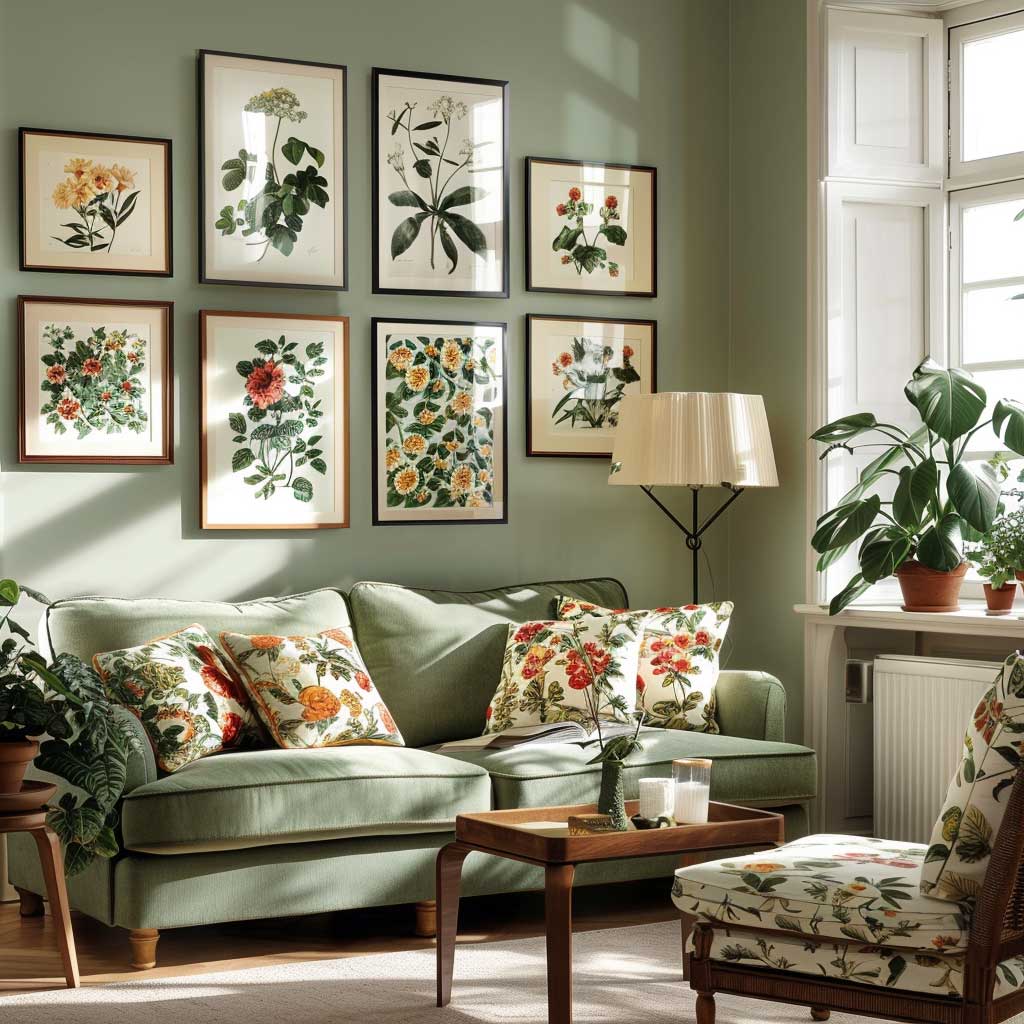
Vintage Art Prints Hit Differently When the Frame Does Half the Work
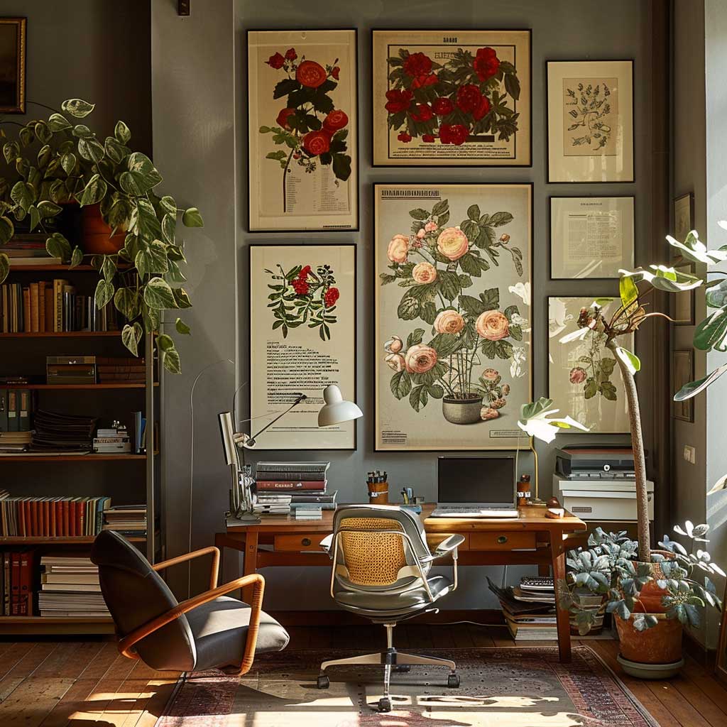
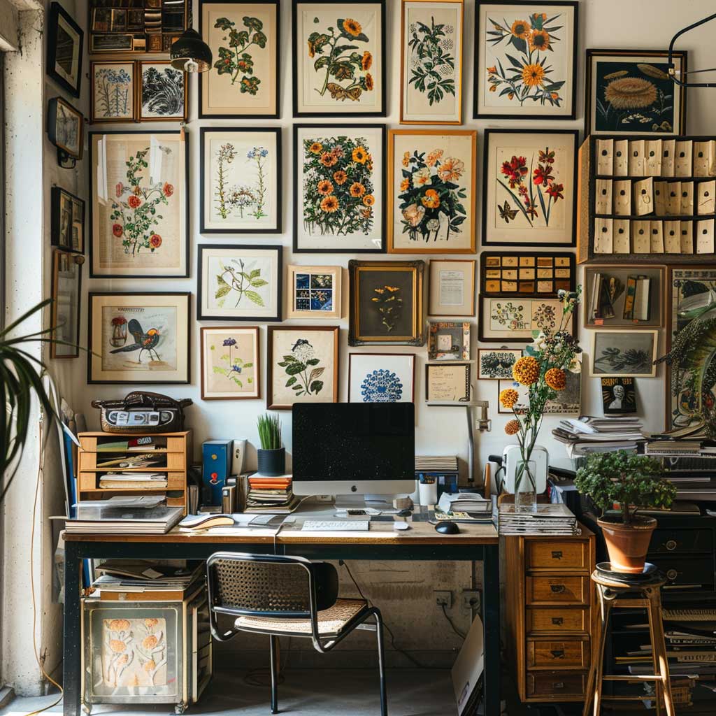
Botanical illustrations from the 1800s are the sleeper hit of vintage office decor. I stole this trick from a designer friend who frames Sowerby fern prints — you can download public domain versions from the Biodiversity Heritage Library for free and print them at 16×20 for about $12 at a local print shop. Gold frames, wide cream mat, and suddenly you have something that looks like it cost $400 from an antique dealer. Nobody will know.
Retro graphic prints — think 1960s typography posters or Bauhaus-adjacent geometric designs — work in a completely different register. They’re bolder and push the office toward mid-century modern rather than Victorian study. Choose one direction and stick to it within a single wall arrangement. Mixing a Bauhaus poster with a delicate botanical illustration is the visual equivalent of serving wine in a paper cup. The container ruins the content.
Gallery walls with vintage prints benefit from a paper template system before you commit to nails. Trace each frame on kraft paper, cut it out, and tape the templates to the wall. Rearrange until the spacing feels right. I’ve done it both ways — templating saves about three rounds of spackle and repainting. The standard spacing is 2–3 inches between frames; go tighter and it reads cluttered, go wider and the grouping falls apart.
For vintage home office design, the most overlooked detail is the wall color behind the prints. A warm off-white — Benjamin Moore White Dove OC-17 or Sherwin-Williams Antique White SW 6119 — adds depth that bright white completely kills. Vintage interior design across every room relies on that same warm backdrop principle.
Retro Shelves Work as Vintage Office Wall Decor Only When You Curate, Not Collect
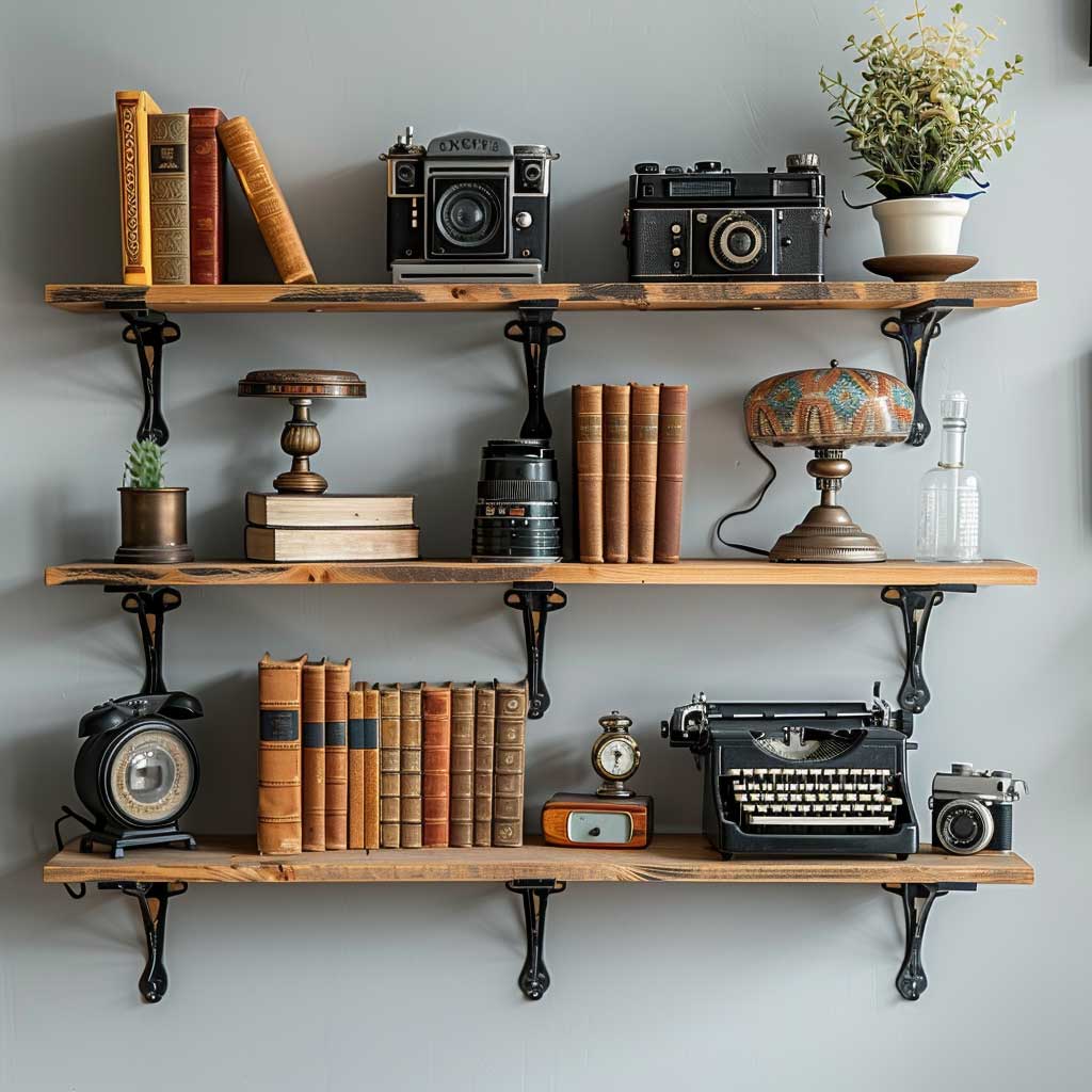
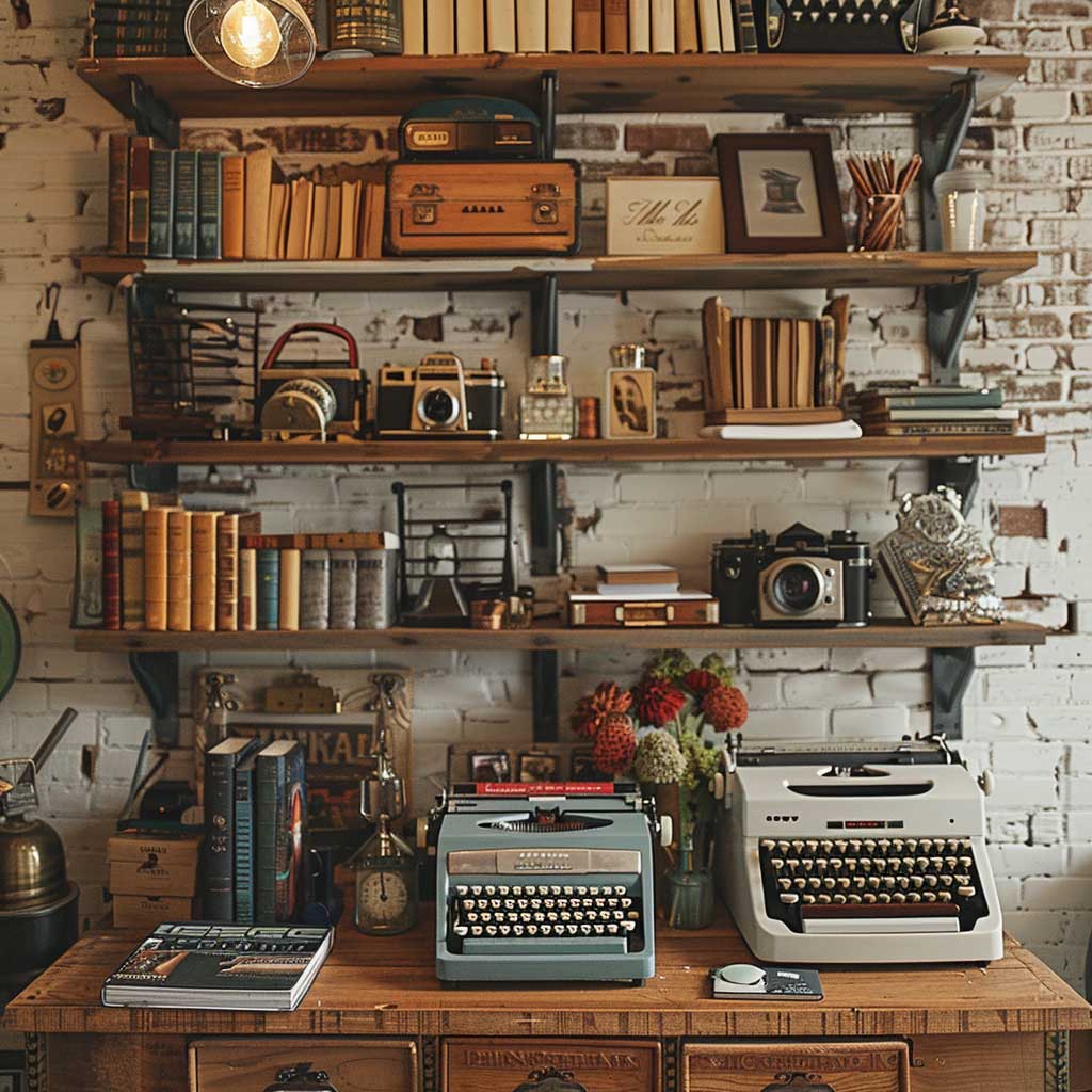


The shelf itself sets the tone before you put a single item on it. Reclaimed wood with visible grain and knots costs $40–$80 for a 36-inch shelf from most lumber yards, and it reads as genuinely old rather than Pottery Barn adjacent. Pair it with raw iron brackets — the kind with visible bolt holes — and the whole assembly has a weight and honesty that melamine floating shelves never achieve. Function and material first, accessories second.
What goes on the shelf is where most people overload and undercut the whole look. My rule of three applies here: one tall item, one medium, one small, then a gap. An Underwood typewriter (you can find working ones for $80–$120 on eBay), a stack of three leather-bound books, and a small brass magnifying glass — that’s a complete shelf vignette. Stop there. Adding a fifth and sixth item turns a curated display into visual noise.
Old cameras are another excellent shelf piece, but pick one camera per shelf and make it the hero. A 1950s Argus C3 runs about $25–$40 and has the right visual weight. Flanking it with identical small objects — two matching bud vases, two candlesticks — creates a formal symmetry that echoes cabinet display cases from the Victorian era. Is it fussy? Slightly. Does it read as intentional? Completely.
DigsDigs has 45 charming vintage home office examples that show exactly how shelf arrangement translates across different room sizes and styles — worth browsing before you commit to a layout.
Final Thought
Vintage office wall decor rewards restraint more than accumulation.
The rooms that look best aren’t the ones with the most pieces — they’re the ones where every single item has room to be seen. Pick three to four wall elements per room and stop adding before you think you’re done.
Scale and material quality carry the weight. A single well-framed Victorian botanical print on the right wall color beats thirty posters tacked to bare white drywall every time.
Save this post to your vintage home decor board before you head to your next estate sale.