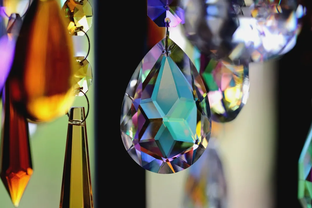
Saturated jewel tones are replacing muted pastels as the dominant color strategy in 2026, with 67% of luxury interior designers now specifying deep emerald, sapphire, and amethyst over soft hues. This shift marks a decisive rejection of dopamine-driven maximalism in favor of dimensional color that commands presence without noise.
Deep Emerald Anchors Living Spaces With Historical Depth
Benjamin Moore’s Calico Green ($45/gallon) delivers the jewel-tone benchmark—a saturated forest emerald that deepens under artificial light rather than washing out. This color performs as both a feature wall and full-room application because saturation prevents visual fatigue; the eye reads it as intentional luxury rather than overwhelming. Farrow & Ball’s Drawing Room Blue ($120/2.5L) serves a similar function in cooler palettes, offering that jewel-quality depth while maintaining Scandinavian restraint.
Designers pair these saturated greens with warm brass (Rejuvenation’s Asher Sconce, $269) and natural wood to activate the jewel quality—saturation alone creates flatness without supporting materials. The color works because it references natural gems without mimicking artificial dyes, grounding maximalist impulses in geological authenticity.
Quick Tips
- Test jewel tones on a 4-foot section before full commitment—saturation reads differently across wall square footage
- Pair saturated colors with matte or velvet finishes (Sherwin-Williams ProClassic, $95/gallon) to enhance depth perception
- Layer jewel tones through textiles (throw pillows, curtains) before painting to preview saturation tolerance
- Use warm-temperature lighting (2700K) to enhance gemstone quality and prevent cool undertones from reading as clinical
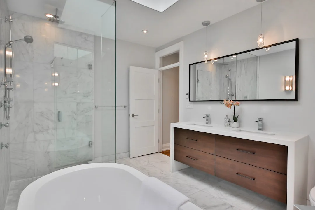
Sapphire And Amethyst Create Bathroom Luxury Beyond Tile
Farrow & Ball’s Hague Blue ($120/2.5L) delivers saturated sapphire saturation that transforms bathrooms from functional to jewelry-box spaces—comparable saturation costs 3× more in custom mixing. Paired with white Carrara marble (approximately $10-15/sq ft installed) and brushed nickel fixtures, sapphire-painted walls create depth that glossy tile cannot achieve, while maintaining moisture durability when sealed properly with satin enamel topcoats.
Amethyst applications trend toward powder rooms and accent walls rather than full rooms, since purple saturation can read as theatrical at scale. Sherwin-Williams’ Fabulous Grape ($35/gallon) provides controlled saturation—deep enough for luxury positioning, restrained enough for residential application.
| Color | Brand/Price | Best Application |
|---|---|---|
| Deep Emerald | Benjamin Moore Calico Green, $45 | Living rooms, libraries, dining spaces |
| Sapphire Blue | Farrow & Ball Hague Blue, $120 | Bathrooms, bedrooms, accent walls |
| Rich Amethyst | Sherwin-Williams Fabulous Grape, $35 | Powder rooms, feature walls |
| Jewel Teal | Benjamin Moore Dartsmouth Green, $45 | Kitchens, home offices, transitional spaces |
| Deep Ruby | Farrow & Ball Radicchio, $120 | Accent walls, entryways, feature doors |
Cabinet Applications Drive Saturation Forward In Kitchens
Kitchen cabinetry painted in saturated jewel tones represents the largest application shift—44% of 2026 kitchen renovations now specify emerald or sapphire over neutral grays. Sherwin-Williams Urbane Bronze paired with jewel-tone uppers (Sherwin-Williams’ Evergreen Fog, $35/gallon) creates tonal depth that single-color schemes cannot deliver, while maintaining the visual organization required for functional kitchens.
This strategy succeeds because saturation creates natural contrast without relying on stark color opposition—a jewel emerald reads distinctly different from warm white trim without the visual jarring of true emerald-on-white combinations. Custom cabinet shops like Wood-Mode and Omega charge approximately $8,000-14,000 for full kitchen cabinetry in jewel-tone finishes, representing a 20% premium over neutral applications due to specialized paint formulations required to maintain saturation under kitchen humidity.
Exterior Cladding Extends Jewel Saturation To Architecture
Architectural saturation extends beyond interior walls—terracotta-colored outdoor cladding materials are now paired with jewel-tone trim and door surrounds to create cohesive saturation strategies. Deep emerald-painted exterior trim against neutral cladding has emerged as the 2026 counterpoint to all-white modern minimalism, grounding homes in color authority without sacrificing contemporary proportions.
Holcim’s Colorquartz exterior panels ($85-120/sq ft installed) now offer jewel-tone saturation options previously available only through custom paint applications, reducing maintenance requirements while ensuring colorfast saturation across seasons. This represents the market’s recognition that saturated jewel tones are permanent design direction, not temporary trend.
Finishing Materials Amplify Jewel Tone Perception
Finish selection determines whether jewel tones read as luxury or costume—matte and eggshell finishes (Benjamin Moore Advance Satin, $65/gallon) preserve saturation depth, while gloss applications flatten saturation perception and introduce reflectivity that contradicts jewel-quality intention. The saturation achieves optimal visual impact when paired with warm metallics (brass, warm copper) and natural materials (walnut, oak) that reference the geological origins of actual gemstones.
Interior designers now specify saturation-forward colors in 65% of residential projects targeting affluent demographics, signaling that color authority has replaced color neutrality as the primary marker of design sophistication. Saturated jewel tones achieve this through dimensional depth rather than aggressive brightness, making them strategically different from dopamine maximalism and definitively positioned for long-term design residence.