A blue scandi kitchen done right reads quieter than white — and that’s the trick most renovations miss. The muted, grey-shifted blues that define Scandinavian-inspired cabinetry are not decorating moves. They’re structural: they carve out depth in flat spaces, hold warmth from light oak without competing with it, and keep the room feeling orderly without looking sterile. Benjamin Moore’s Advance cabinet paint in Scandinavian Blue 2068-30 ($88.99/gallon, covering 400–500 sq ft per coat) is one of the most referenced starting points precisely because its grey undertone does the heavy lifting light cannot.
Scandinavian minimalism borrowed the blue from the landscape — the overcast fjords, the pale winter sky at noon, the colour of lake water on a calm day. Applied to cabinetry, those same tones shift a kitchen from merely clean to genuinely calm. The three variations most commonly executed in Nordic-inspired spaces — deep sapphire, saturated nordic blue, and hazy pastel — each serve a different spatial logic, and confusing one for another is exactly how a kitchen ends up looking overdone.
Stock cabinets in painted finishes run $100–$300 per linear foot installed; semi-custom — where most Scandi-look builds land — cost $150–$650 per linear foot. That puts a 20-linear-foot kitchen in the $3,000–$13,000 range before countertops. Knowing that number before choosing a shade matters: deeper, richer blues tend to demand upgraded hardware and stone surfaces to carry their weight, and the proportional cost difference is real.
- Sapphire blue cabinets work against white walls and natural wood — the contrast is the point, not a mistake.
- Nordic blue reads warmest when paired with light oak; avoid grey flooring, which pulls the colour cold.
- Pastel cabinets are unforgiving under warm-toned lighting — use cool white (4000–4500K) task lighting or the hue reads muddy.
- Benjamin Moore Advance in Scandinavian Blue 2068-30: $88.99/gallon, 400–500 sq ft coverage per coat.
- Semi-custom cabinet installs average $150–$650 per linear foot — budget for stone or composite countertops to anchor deeper blues.
- Matte finish outperforms semi-gloss on blue Scandi builds: it absorbs rather than reflects light, preventing harsh contrast shifts through the day.
Sapphire Blue Cabinets Earn Their Depth by Getting the Contrast Right
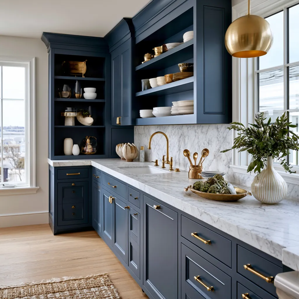
Sapphire blue cabinets work the way a strong argument works — they need a counter-position to make sense. The most effective Scandinavian kitchens built around rich, dark blue run white walls and natural oak together: the white provides the high-contrast backdrop, and the wood prevents the blue from reading as cold or corporate. Drop both, and sapphire starts to dominate uncomfortably. Stylists working in this palette frequently recommend limiting the deep blue to lower cabinets only, leaving upper storage in white or open shelving in oak — a move that keeps the room from feeling enclosed while preserving the colour’s full visual weight at counter level.

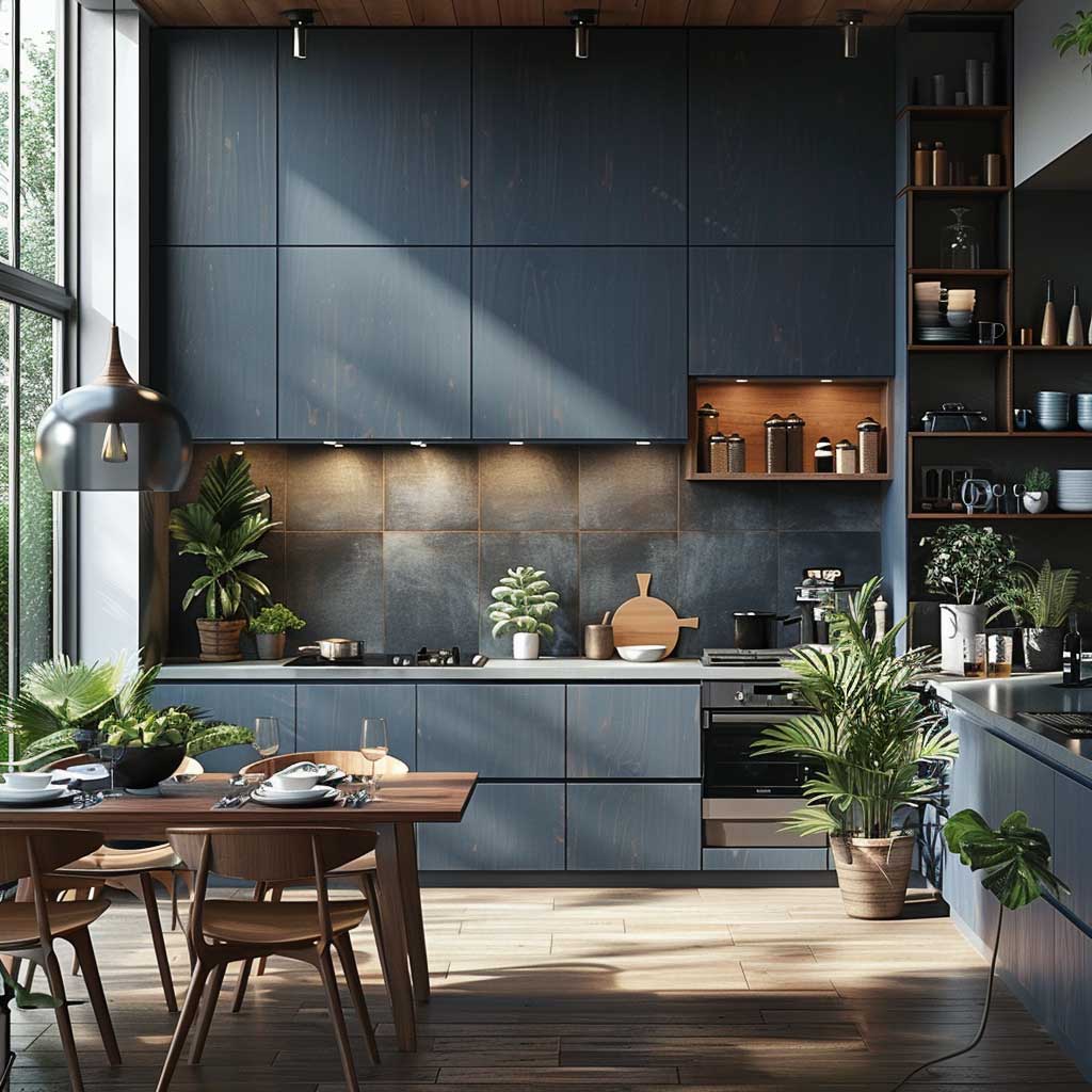
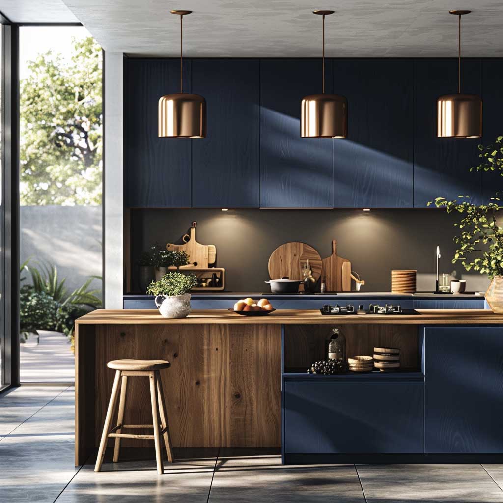
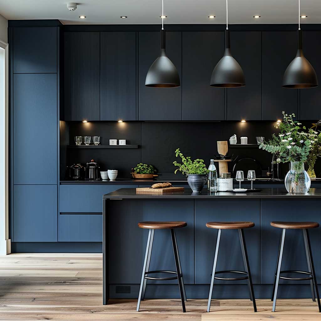
What doesn’t work: grey flooring paired with sapphire cabinetry. The two cool tones amplify each other rather than balance, pulling the room toward clinical. The same principle applies to silver hardware — it reads as an extension of the coolness rather than a counterpoint. Matte black or brushed brass handles are the consistent recommendation across Scandinavian kitchen renovations because both introduce warmth without warmth-coloured surfaces. Think of the cabinet colour as an undertow: whatever materials touch it get pulled in its direction, so every neutral nearby must be warm-shifted to compensate.
Light performance changes everything with sapphire. A gallon of Benjamin Moore Advance in Scandinavian Blue 2068-30 (LRV of 12, which is very low-reflectance) will look dramatically different at 9am under east-facing natural light versus at 7pm under incandescent pendant bulbs. The colour shifts from vivid blue-grey toward near-violet in warm-toned artificial light — which is either stunning or unsettling, depending on the room’s orientation. Before committing, test with a peel-and-stick sample under both conditions. Kitchens that receive fewer than four hours of direct daylight should reconsider this depth and move one register lighter.
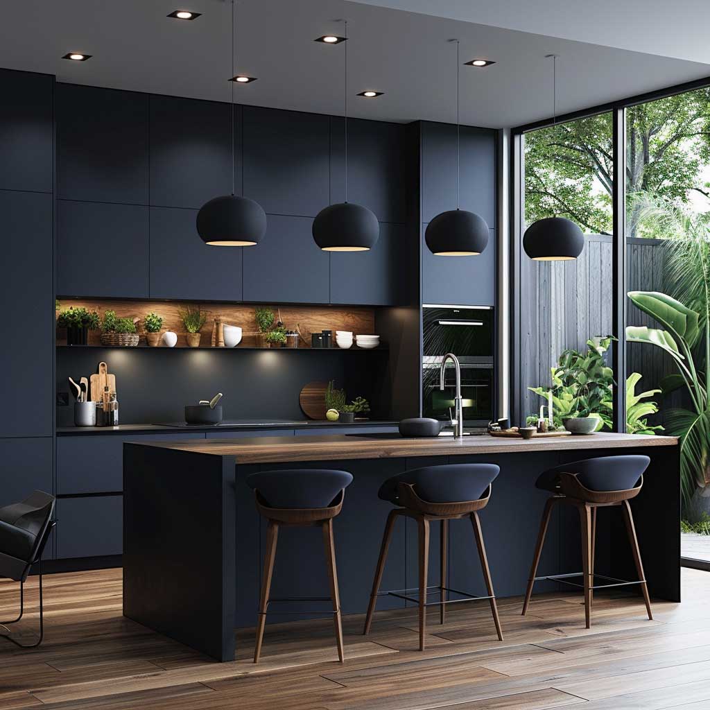
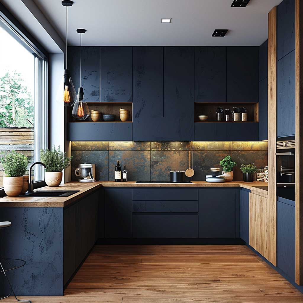
Storage discipline becomes more visible with sapphire than with any neutral finish. A cluttered countertop in front of deep blue cabinets reads as visual chaos because the colour creates such a strong, ordered plane that disorder registers immediately against it. Flat-front, handleless doors compound this effect — they work like a canvas, and anything disrupting the surface breaks the spell. The practical upside: this colour selection operates as built-in motivation to keep surfaces clear. A common approach is to run continuous base cabinet runs without breaks for small appliances, using a dedicated appliance garage at one end to absorb the toaster-and-coffee-maker cluster.
Don’t mix sapphire blue cabinets with warm grey countertops hoping they’ll “neutralise” each other — they won’t. Cool blue plus warm grey produces an unresolved muddy tension that both colours look worse for. Commit to one temperature camp: either warm (white walls, oak, brass, warm stone) or cool (pale grey, concrete, black metal). Trying to split the difference is the most common reason a blue scandi kitchen ends up feeling neither calm nor bold, just confused.
Nordic Blue and Light Wood Make Contrast Feel Warm Rather Than Harsh
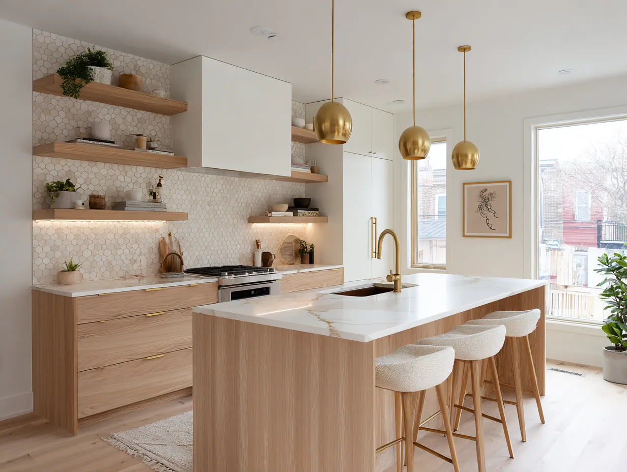
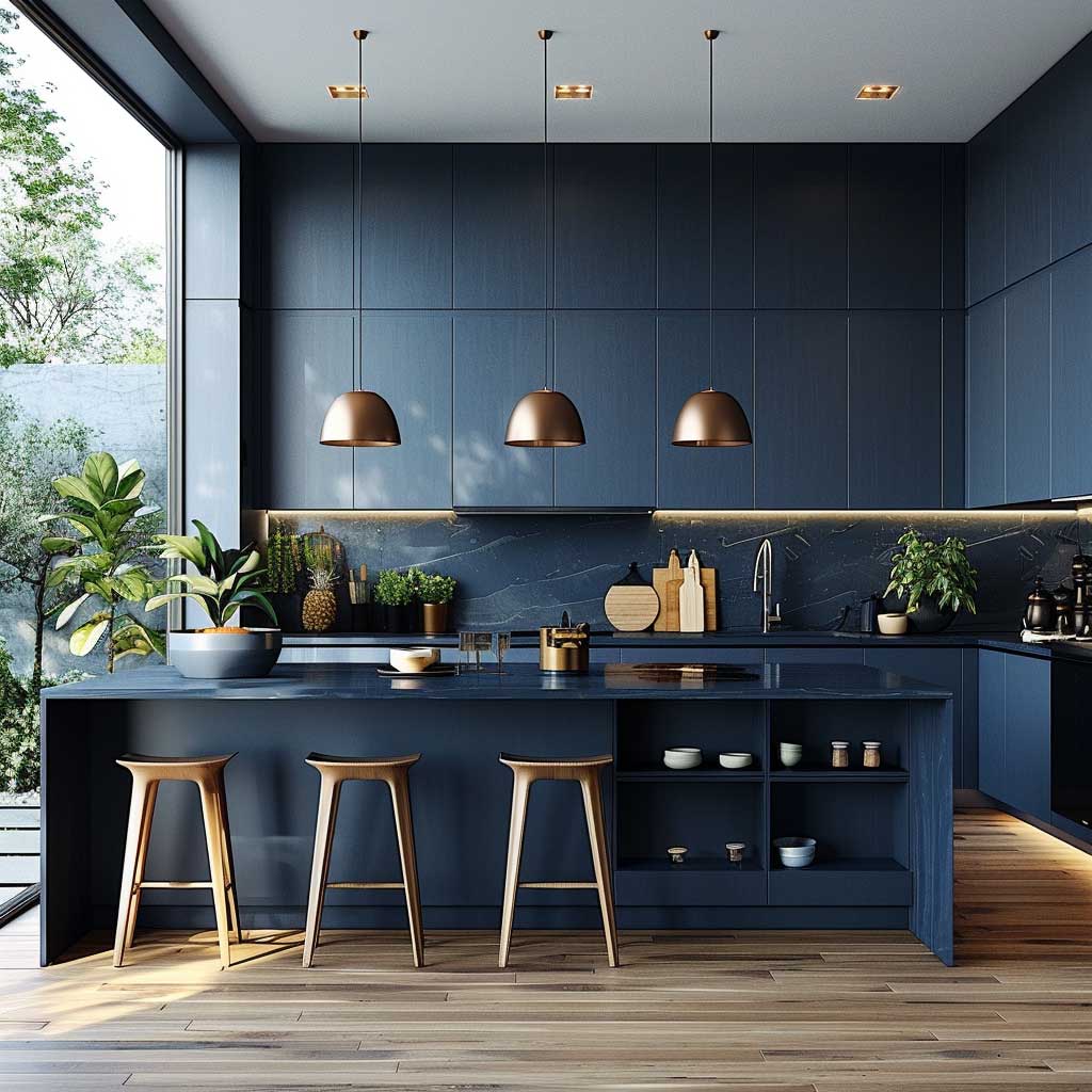
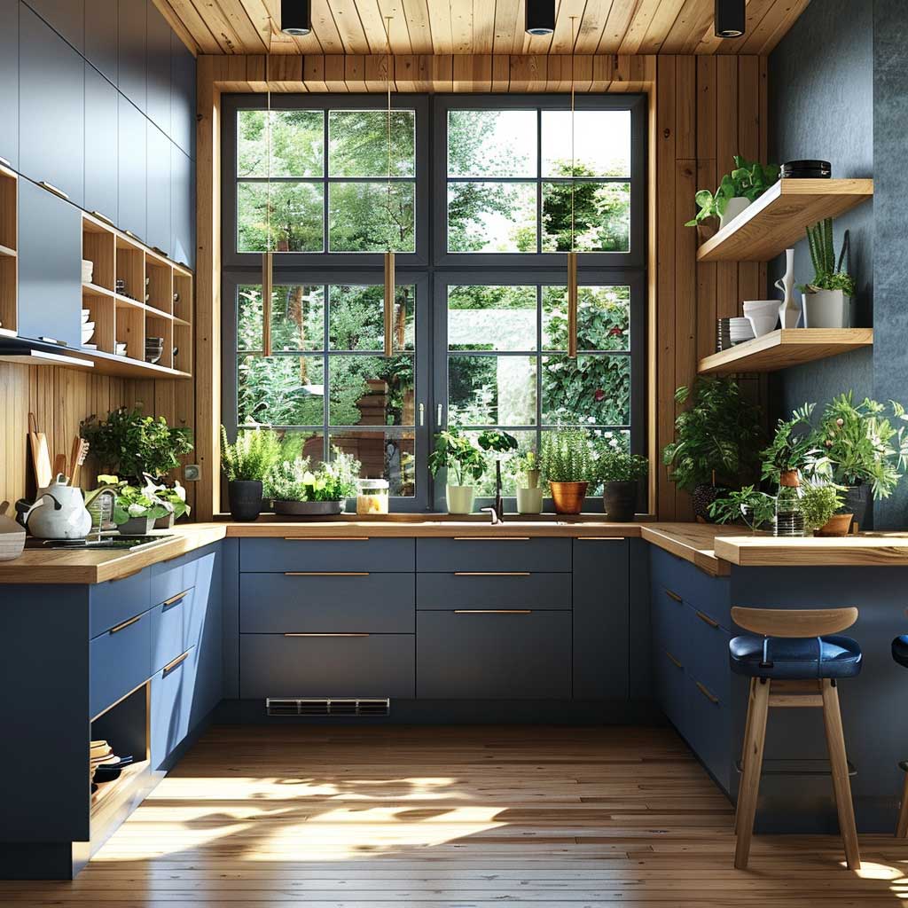
Nordic blue — the saturated, mid-range shade that reads clearly blue without tipping into navy — creates its best version of contrast when light wood does the warmth work. The pairing operates like a thermostat: the oak or birch pulls the room’s temperature up just enough to prevent the blue from reading as institutional. This is also why the wood’s finish matters as much as its tone. Oiled or wax-finished oak (matte, with visible grain) softens the blue better than lacquered wood, which introduces a reflective layer that puts both materials in competition rather than conversation. Designers working in this pairing consistently place the wood where movement happens — countertops, open shelving, the top of an island — and let the blue hold the structural wall-cabinet positions.
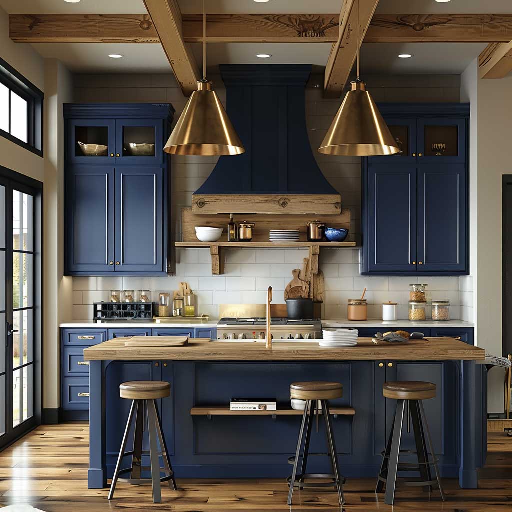
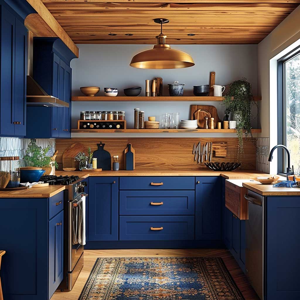
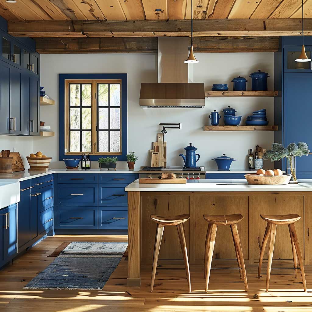
The practical question worth asking: where does the blue go? A full run of nordic blue across all cabinet fronts (upper and lower) produces a dramatically different result from blue only on the lowers or only on a single island. Full coverage reads as a deliberate interior architecture choice; it requires high ceilings (at least 9 feet) and white walls extending to the ceiling to avoid feeling compressed. Partial coverage — typically the lower run only — keeps the room readable and is more forgiving of modest room heights. Modern Scandinavian kitchen design consistently validates this structural approach: the colour anchors the base plane while light and wood manage the upper half.
Hardware selection in a nordic blue and light wood kitchen often defaults to matte black — and that’s the safe, reliable choice. But brushed stainless steel is the underused alternative worth considering. Unlike polished chrome, which highlights the cool registers, brushed steel carries a warm-grey undertone that bridges the blue and wood without pulling either colour off-course. The trick here is consistency: mixing matte black and brushed steel across the same kitchen almost always reads as an error rather than a choice, so commit to one throughout the space, including faucets and appliance trim.
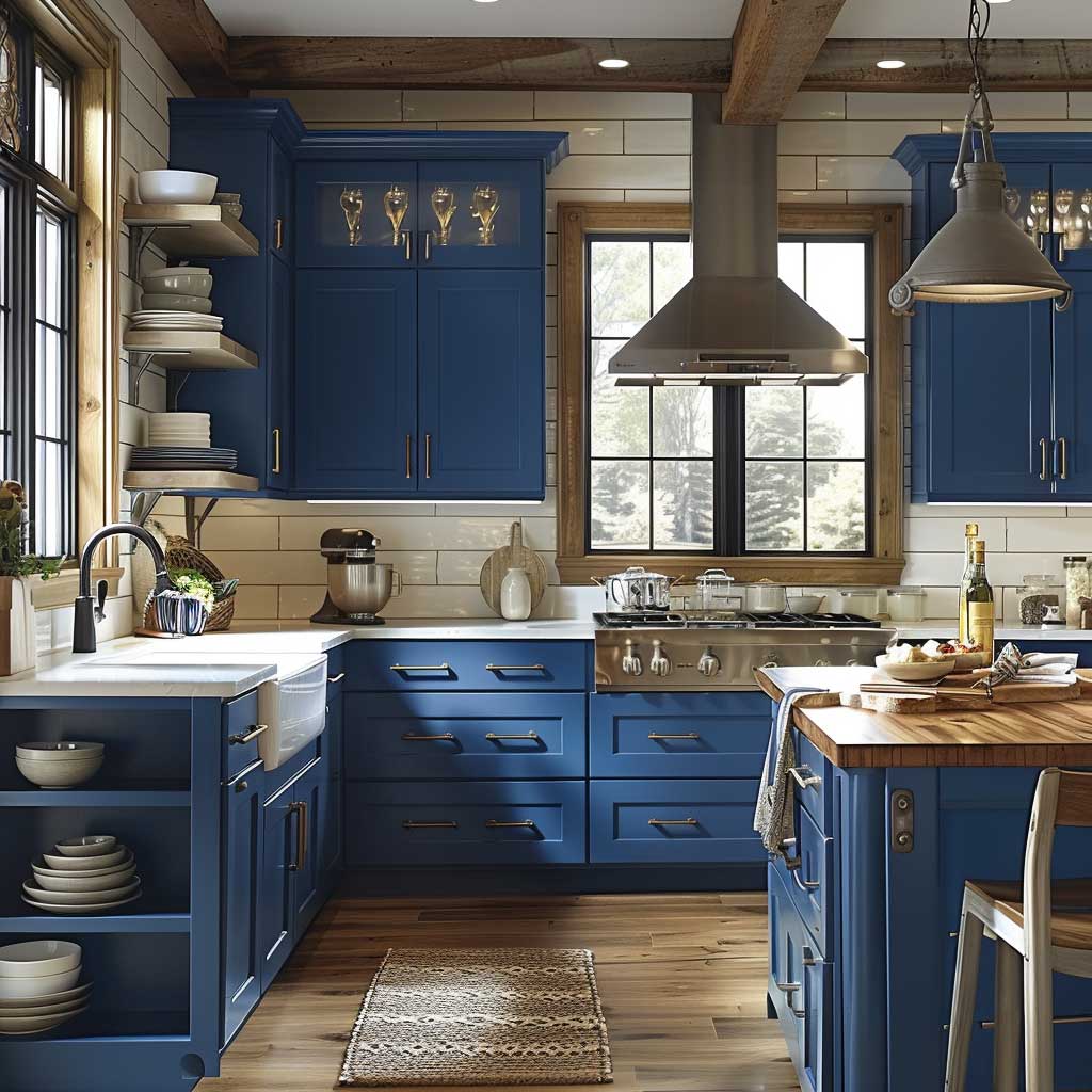

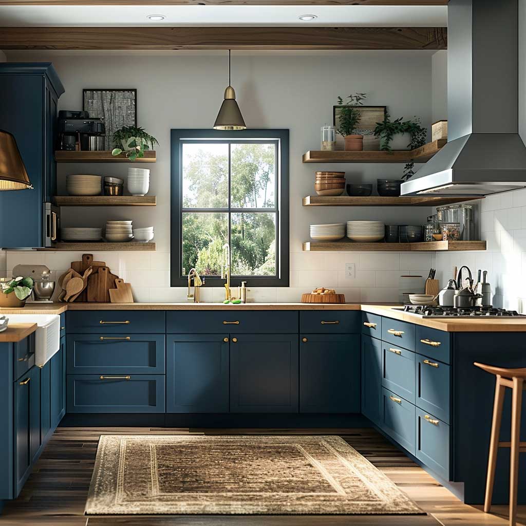
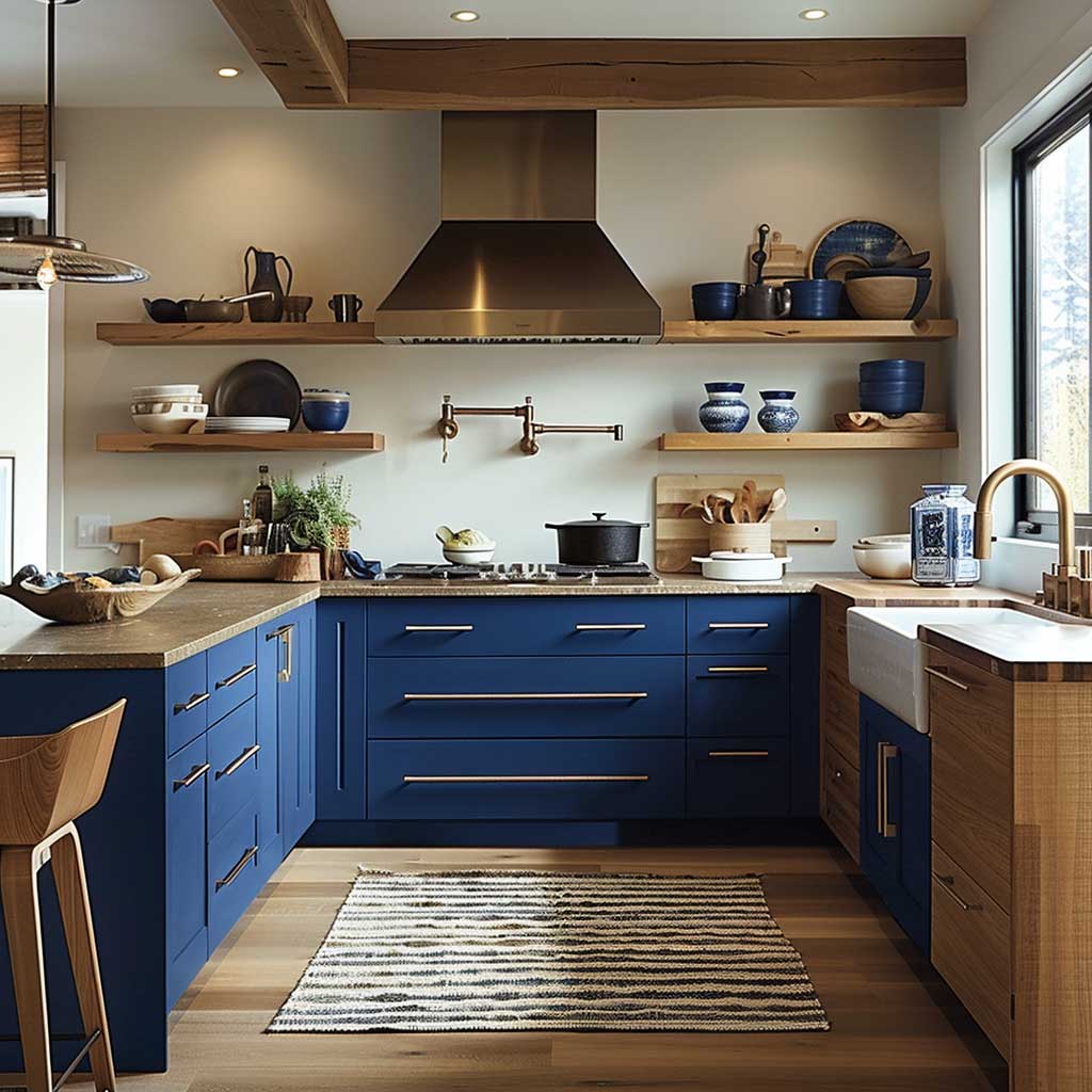
Soft lighting is doing more structural work in a nordic blue kitchen than most people realize. The blue absorbs ambient light rather than reflecting it, which means pendant fixtures hanging at counter height — rather than recessed ceiling fixtures — are genuinely necessary, not decorative. Without counter-level light sources, a nordic blue kitchen reads darker after sundown than any photo suggested. LED strip lighting under upper cabinets, aimed at the countertop, is the functional baseline; pendant lights over an island add the visual anchoring. You’ll notice the room’s entire character shifts by about 30% based on whether this lighting layer exists.
One question worth raising before ordering: is your nordic blue a saturated true blue, or has it drifted into green-blue territory? Certain popular Nordic shades — particularly Fenix-brand laminate matte finishes used in Scandinavian flat-pack systems — read blue-teal in certain lights. Against light oak, which itself has golden-green undertones, a blue-teal cabinet can create an unexpected green cast across the room. Test a physical sample against your actual wood before committing. This is the detail most specification errors come from.
Pastel Blue Kitchen Cabinets Fail When the Lighting Gets Warm
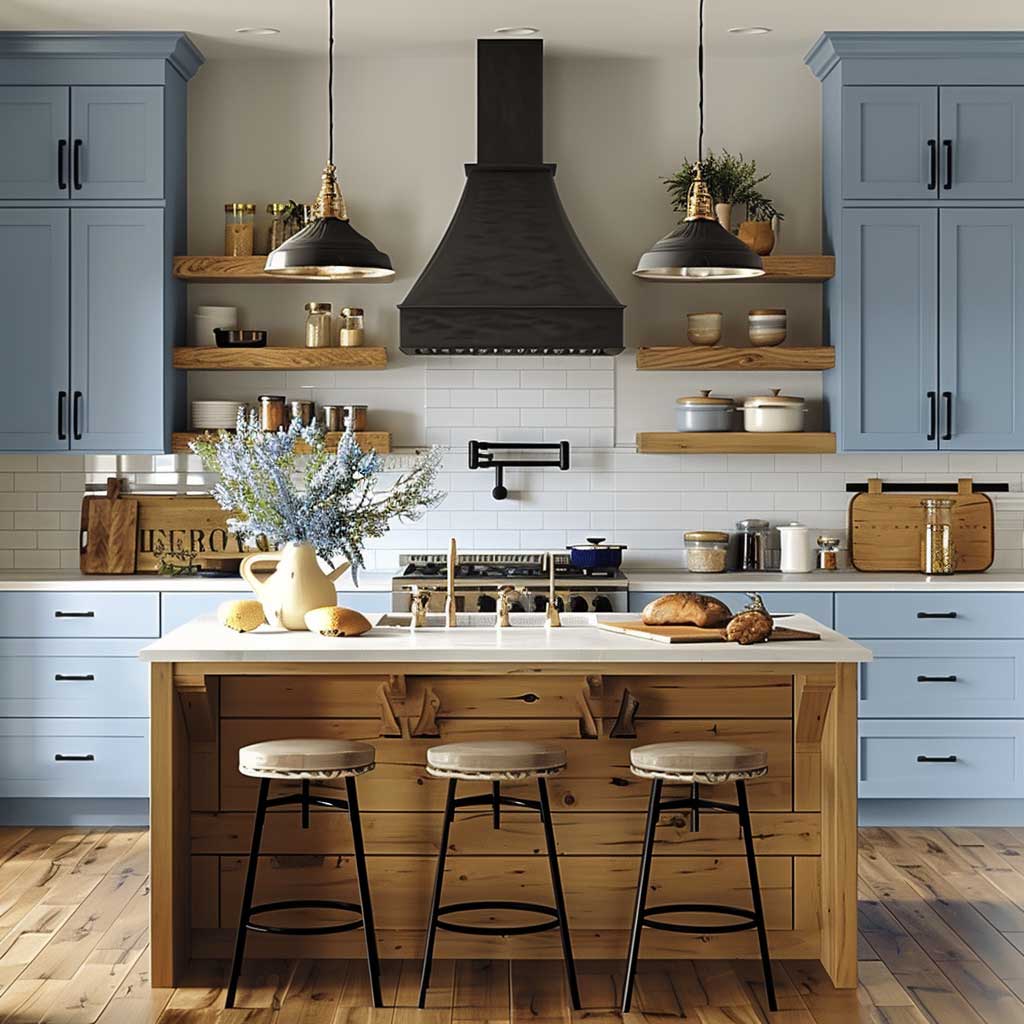
Pastel blue cabinets — the sky blues and dusty ice tones that register as almost-but-not-quite-grey — have a specific fragility that neither sapphire nor nordic blue shares. Their entire visual identity depends on cool, balanced light. Drop into warm-toned incandescent or 2700K LED territory, and the pastel blue absorbs the warmth and shifts toward grey-green or dusty purple depending on the paint’s undertone. The version of this colour you fell for in a magazine was photographed under controlled daylight or 4000K neutral-white studio lighting. What you install will behave according to your actual windows and your actual fixtures.
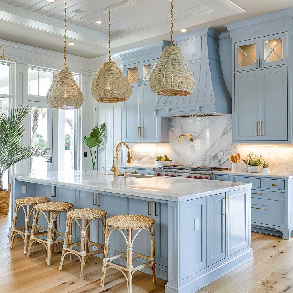
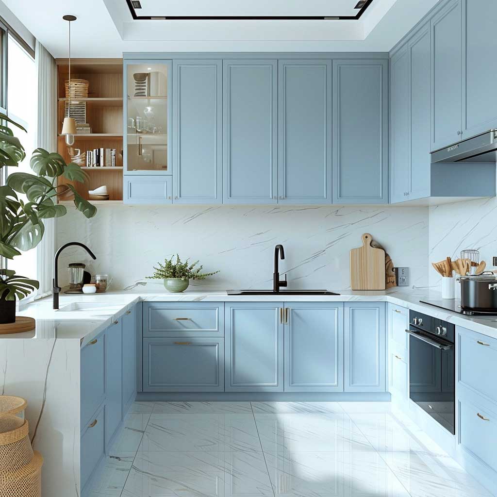
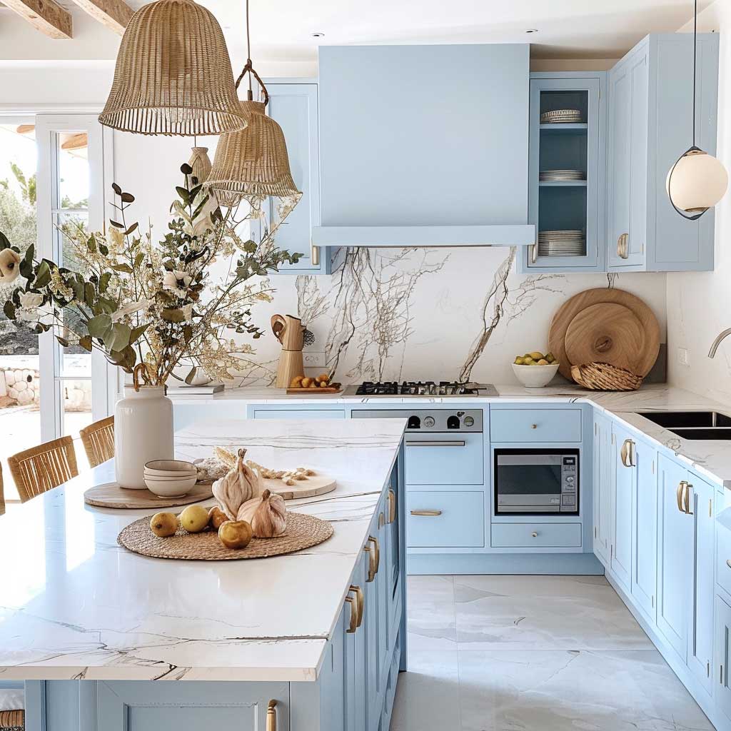
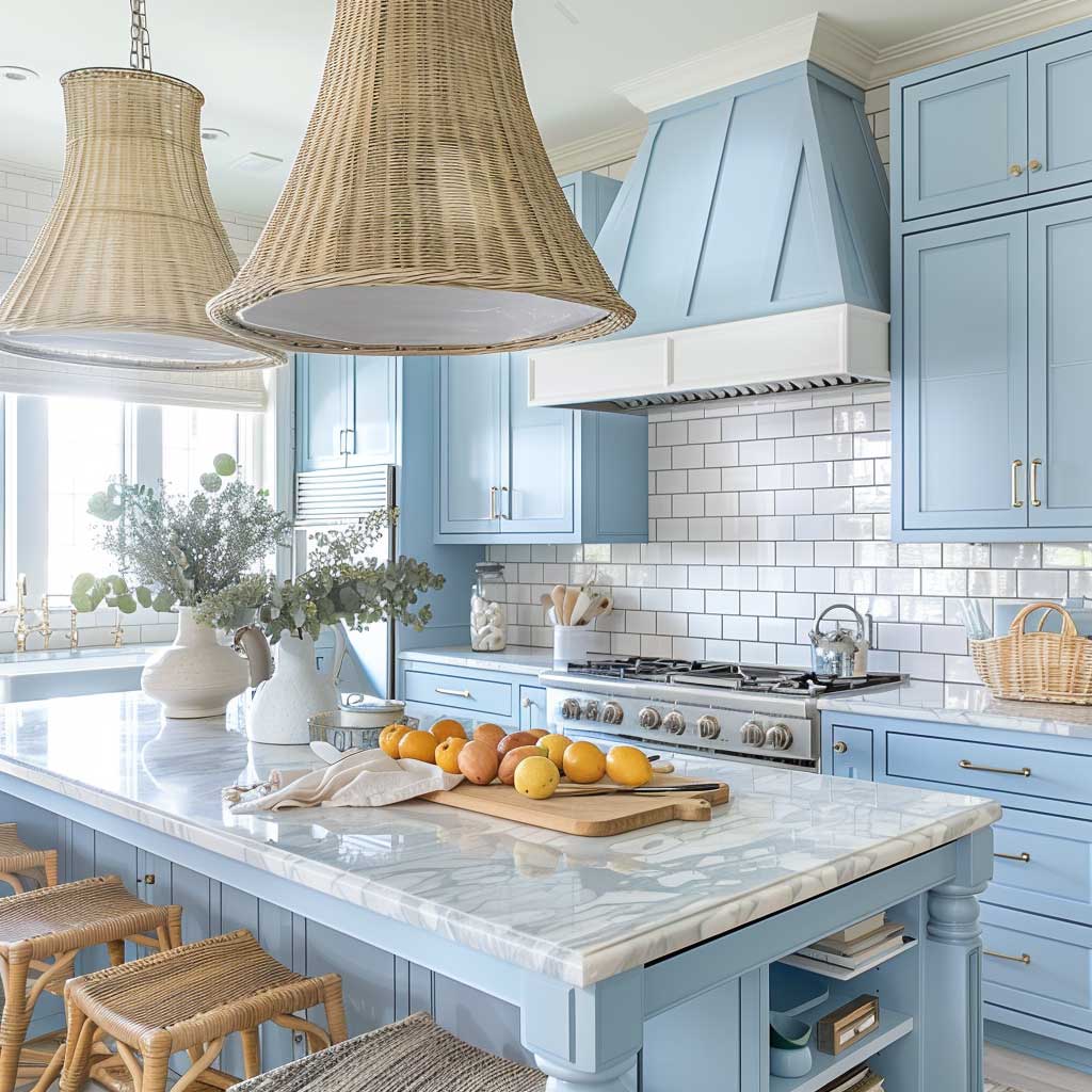
Sky blue modular kitchens and sky blue kitchen arrangements built on pastel tones work best in one specific spatial configuration: white above, white around, and marble or pale stone underfoot. The pastel needs to float within a much larger field of bright neutral — think of it as a watercolour wash that only reads correctly on white paper. Introduce a beige wall, a warm wood floor, or a greige subway tile backsplash, and the pastel recedes entirely or shifts colour in a way that looks like an error rather than a decision. Marble is the high-performance countertop pairing here: its cool grey veining holds the room’s temperature and prevents the pastel from reading as tired.
Natural materials work in this palette when they’re light enough to stay in the same temperature register. Rattan pendant shades, light linen Roman blinds, and pale cane furniture introduce texture without pulling the room warm. The failure mode here is dark wood: a walnut dining table adjacent to pastel blue cabinets introduces such a strong warm contrast that the blue reads as a mistake rather than a colour decision. Keep anything wooden in the natural-light oak range — around 1700K Janka hardness in hard maple if you’re specifying floors — and the pastel reads as intentional coastal minimalism rather than accidental pallor.
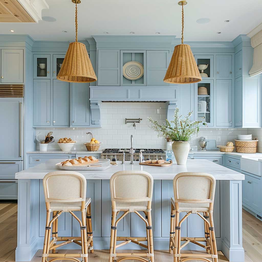
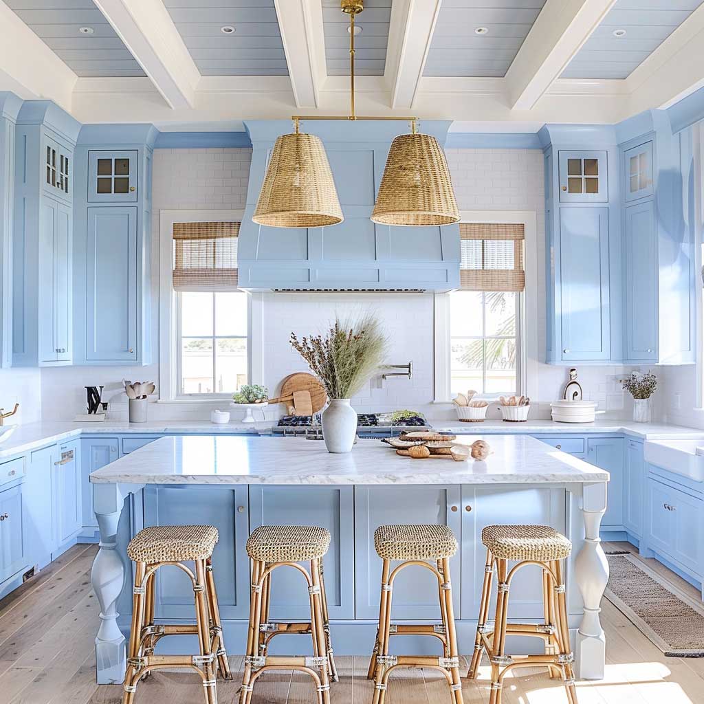
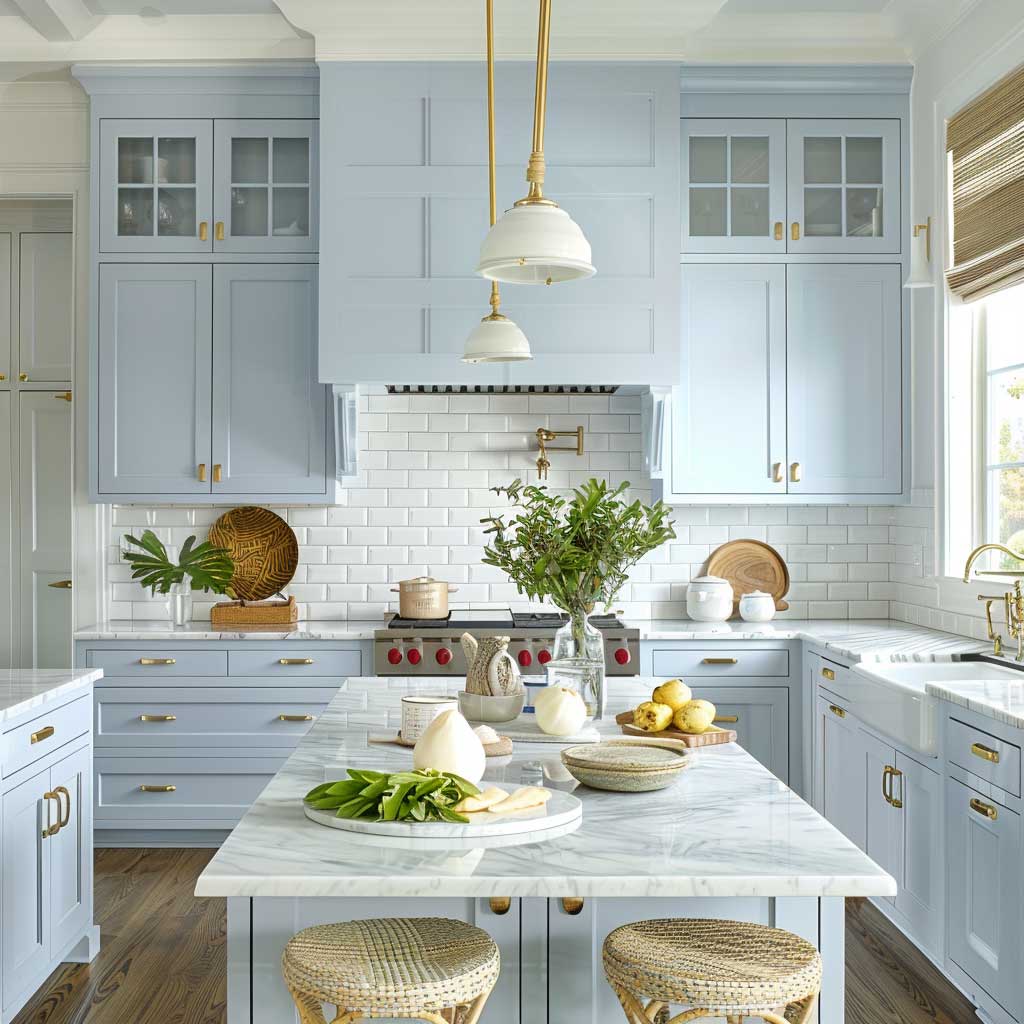
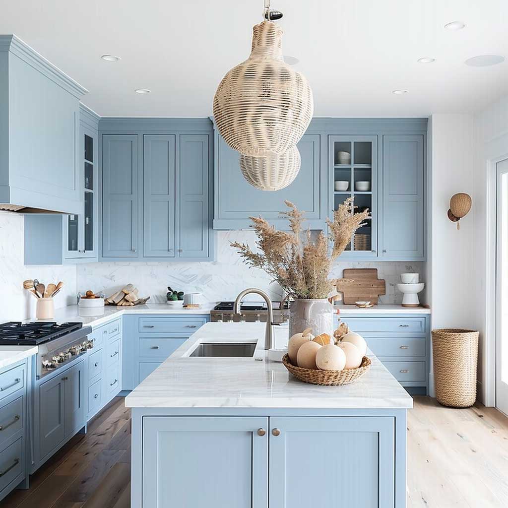
Lighting for a pastel blue kitchen is less about volume and more about temperature. The difference between 2700K (warm white) and 4000K (neutral white) task lighting shifts the colour by roughly one full hue step in perception. Try this: hold a grey-blue paint chip under a warm-white incandescent bulb, then under a cool-white LED. That shift is exactly what happens to your cabinet fronts every evening. Specifying 4000–4500K LED strips under upper cabinets and in pendant fixtures specifically for a pastel blue kitchen is not optional — it’s the mechanism by which the colour remains itself after dark.
Clutter reads differently here than in the sapphire section. Pastel blue lacks the authoritative depth that makes sapphire look deliberately austere — so a cluttered counter in front of pastel cabinets reads as messy rather than lived-in. Navy blue kitchen cabinets can absorb more visual chaos before looking disorganized; pastel cannot. The practical implication is that pastel-blue Scandi kitchens require the same storage discipline as the deeper blues — full-extension drawers replacing doors wherever possible, integrated appliance garages, and no countertop storage beyond what’s actively in use.
| Variant | Best Pairing | Lighting Requirement | Key Risk |
|---|---|---|---|
| Sapphire blue | White walls, natural oak, brass hardware | Any — LRV 12 handles low light | Reads violet under warm-toned bulbs |
| Nordic blue | Light oak, white or off-white walls, matte black or brushed steel | Counter-level pendants essential | Can drift blue-teal against golden oak |
| Pastel / sky blue | White above, marble or pale stone, rattan or linen accents | 4000–4500K neutral-white only | Turns grey-green under warm bulbs |
Cabinet durability is worth a brief note regardless of which blue you choose. Blue paint on kitchen cabinets — especially in flat or matte sheens — will show grease transfer at handle zones faster than white or grey. Benjamin Moore Advance in semi-gloss ($88.99/gallon) is specifically engineered for cabinetry and cures to a washable, hard film. Matte alternatives look better photographed but require spot cleaning with a microfibre cloth weekly near cooking zones. Plan that maintenance interval in before selecting the finish, not after.
For a broader view of how blue cabinet shades interact with different kitchen layouts, shapes, and storage systems, the design team at Corner Renovation provides a detailed breakdown of blue Scandinavian kitchen planning by shade and spatial logic — including specific projects built in Fenix matte finishes and deep navy with Japandi-influenced islands.
Bottom line
Blue scandi kitchen cabinets work when the temperature logic is consistent — not just when the shade looks good on a chip.
Sapphire does its best work against white walls and warm wood. Nordic blue needs counter-level lighting and matte hardware. Pastel blue requires neutral-white (4000–4500K) fixtures or it shifts colour by end of day.
Benjamin Moore Advance at $88.99/gallon gives you a washable, hard-cure finish in any of these registers. Semi-custom cabinet installs in painted finishes average $150–$650 per linear foot — budget the lighting separately or the colour will disappoint.
Save this post before you order samples.