Living room wallpaper ideas fail most people not because the pattern is wrong, but because scale gets ignored in favor of vibes. I’ve watched otherwise sharp decorators spend $400 on Farrow & Ball grasscloth and hang it in a room with nine-foot ceilings and mid-scale furniture — the result looked like a holding room, not a living space. The pattern ate the furniture. The furniture disappeared. Nobody planned the scale. This article covers three directions that consistently deliver: bold-patterned paper for rooms that want drama, textured wallpaper for rooms that want depth without commitment, and mural wallpaper for rooms that want a full narrative on a single wall.
You’ll also notice I’m not listing thirty options and calling it a round-up. Three directions, done properly, with real observations from rooms I’ve either seen or styled. If you need the full inspiration board first, start with feature wall approaches for the living room — that piece covers stone, wood, and mural options in detail. Then come back here for the wallpaper-specific logic.
What This Article Covers
✦ Why bold-patterned wallpaper requires furniture restraint, not just pattern bravery
✦ How to choose living room wallpaper texture that actually reads in different lighting
✦ Mural wallpaper for living rooms — what scenes work, what scenes overwhelm
✦ The one-wall vs. all-walls question, answered practically
✦ FAQ covering classy wallpaper designs, feature walls, and pattern choices for front rooms
Bold Living Room Wallpaper Needs Furniture That Knows When to Shut Up


Bold-patterned living room wallpaper is the interior equivalent of wearing a printed coat: if the rest of you is loud, nobody knows where to look. My go-to for rooms that want drama is Graham & Brown’s Julien MacDonald range — geometric prints starting at around $38 per roll — placed on exactly one wall, behind the sofa or the media unit. The other three walls stay in the wallpaper’s background color. Flat. Quiet. Letting the paper breathe. Don’t pull in patterned cushions that compete. One pattern leads. Everything else follows.
Pattern scale is the variable most people skip. Here’s the problem: large-repeat bold wallpaper in a room with eight-foot ceilings cuts the repeat off mid-motif at the top — you see three-quarters of a flower or two-thirds of a geometric unit, and the room looks like a misprint. You need at least nine-foot ceilings to run a pattern with a repeat over twenty inches without losing it at the cornice. Smaller repeat patterns — Hygge & West’s smaller-scale prints at around $95 for a double roll — work cleanly in tighter ceiling heights and still deliver the color hit you’re after.
What doesn’t work: abstract multicolor patterns behind a sofa that’s already patterned. I’ve seen this in three different rooms and it always reads as noise, not design. Also skip high-gloss bold wallpaper in rooms that face north — the gloss picks up the cool grey light and the pattern color shifts. What looked copper-warm in the showroom goes greenish by 3pm in a north-facing room. Matte finishes on bold patterns hold color more reliably across light conditions.
Ask yourself this before ordering: would my sofa look interesting in an empty white room? If yes, bold wallpaper behind it will create conversation. If the sofa is already doing a lot of work — heavy texture, printed fabric, nail-head trim — pick a quieter paper. The best bold wallpaper rooms I’ve been in have the most boring furniture. That’s not an accident.
Don’t Do This
Don’t paper all four walls in a large-repeat bold pattern. One wall gets the paper. The other three get the paper’s background color in paint. Covering all four walls with a loud repeat is not courageous — it’s physics. The room will feel smaller and the pattern will compete with itself from multiple angles simultaneously. I’ve seen this go wrong every single time, including in a client’s $12,000 renovation that required repainting within six months.
Don’t skip the sample step. Screen color and real-room color are never the same. Order a sample from any brand — Farrow & Ball charges around $8, most brands are free — pin it to the wall, live with it across three different lighting conditions (morning sun, afternoon grey, artificial evening light), then decide.
Don’t match wallpaper to curtain fabric from the same pattern family. Two items from the same print read as an accident, not coordination. Let the wallpaper lead. Pick curtains in the paper’s dominant background color, not its pattern color.
Textured Wallpaper in the Living Room Gives You Depth Without Picking a Side


Textured living room wallpaper is the format I recommend to anyone who keeps changing their mind about color — because texture in a neutral tone works with everything and never dates. Real grasscloth from Philip Jeffries runs $180–$220 per yard and has a warm, organic quality that photographs beautifully and holds up to about a decade of normal use before showing wear at seams. If that price point isn’t realistic, Brewster Home Fashions does a faux grasscloth vinyl at around $40 per double roll that reads well at conversational distance. You won’t mistake it for the real thing at six inches, but across a room, the depth reads correctly.
The key behavior of textured wallpaper is that it catches raking light. Morning sun at a low angle will throw the texture into sharp relief — which looks dramatic and lovely. Overhead fluorescent light flattens it completely. This is why you need to test texture in artificial evening light, not just in the afternoon. I own two rooms with grasscloth walls and the difference between what they look like at 10am and 9pm is significant enough that I always tell clients to see the texture sample under their actual interior lighting before committing.
What fails with textured wallpaper: choosing a very rough, open-weave grasscloth for a room with small children. Grasscloth is not wipeable. It holds dust in the weave and doesn’t respond well to spot cleaning. A damask-embossed vinyl from a brand like Graham & Brown ($40–$55 per roll) gives you the raised texture you want in a surface that handles a damp cloth without damage. The texture looks intentional. The maintenance is realistic. That’s the trade-off worth making in a lived-in family room. Read more on how to match wallpaper type to your room’s conditions before buying a full order.
Textured wallpaper also has the useful side effect of hiding wall imperfections — hairline cracks, uneven plaster, the ghost of a picture hook — that paint would only make more visible. Flat paint on an imperfect wall is unforgiving. Textured wallpaper on an imperfect wall is called “character.” That’s the real reason I reach for this category first in older homes with plaster walls that have lived a full life.
Mural Wallpaper Transforms One Living Room Wall Into Something With a Point of View
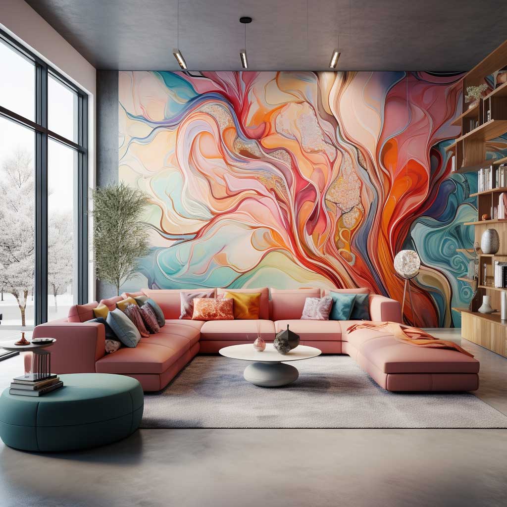


Mural wallpaper works in living rooms because it solves the focal point problem permanently. Every room needs one focal point — a fireplace, a great window, a piece of art — and mural wallpaper functions as all three simultaneously. I stole this logic from a client who had a terminally boring living room: no fireplace, mediocre windows, bare drywall. We hung a Bobbi Beck panoramic forest mural (around $280 for the panel set covering a standard 12-foot wall) behind her sofa and the room went from nonexistent to the best room in the house in an afternoon. Nothing else changed. One decision, full transformation.
The scenes that consistently work: botanical and jungle prints in deep greens with a light ground, Chinoiserie-style designs with birds and blossoms on cream or pale grey, abstract painterly murals in warm earth tones, and urban cityscape murals in black-and-white for rooms with mid-century or industrial furniture. What doesn’t work: photorealistic beach scenes in cold blue tones in north-facing rooms — the photo’s blue reads grey under grey light and makes the room feel like a cruise ship corridor. Also avoid extremely dark or saturated murals in rooms under nine feet — the scale reads oppressive rather than dramatic.
Mural wallpaper is the one wallpaper category where covering all four walls can actually work, provided the scene wraps coherently. Panoramic landscape murals — the kind that show an unbroken horizon from one corner to another — were designed to wrap walls. Bobbi Beck and Rebel Walls both sell panel sets calibrated for full-wrap application. The effect is genuinely immersive and doesn’t feel like overkill because the image has a logic to it. A repeating bold pattern on all four walls has no such logic — it just multiplies. A panorama on all four walls is a room inside a painting. That’s a different thing entirely. For more on living room wall treatments that work this way, the elegant wall decor options for modern living rooms article covers the textured and art-forward alternatives alongside wallpaper.
Furniture placement matters more with murals than with any other wallpaper type. Place your sofa so the mural’s focal element — the tree trunk, the skyline anchor, the central blossom — lands approximately behind where a seated person’s head would be. This frames every conversation in the room as if it’s happening inside the scene. You’ll notice this effect in showrooms that do it right. It’s not accidental.
Interior designer Holly Walsh from Ideal Home notes that panoramic landscape murals wrapping multiple walls have become one of the fastest-growing wallpaper trends in recent years, with stylistic roots in late 19th-century landscape painting and Chinoiserie themes — precisely the visual references that translate well to modern living rooms without reading as costume.
Mural vs. Patterned vs. Textured — Quick Comparison
| Type | Best Room Condition | Price Range (per roll/panel) | Maintenance |
|---|---|---|---|
| Bold Patterned | 9ft+ ceilings, neutral furniture | $35–$120/roll | Low (vinyl) to moderate (paper) |
| Textured Neutral | Any ceiling height, any furniture style | $40–$220/roll | High (real grasscloth) to low (faux vinyl) |
| Mural | Focal-wall rooms, no fireplace | $100–$400/panel set | Low (non-woven substrate) |
Final Thought
Living Room Wallpaper Only Works If You Decide What the Room Is Doing First
Pattern, texture, or mural — all three deliver in the right room. All three fail in the wrong one. The common thread across every wallpaper disaster I’ve seen is that someone fell in love with a paper before they understood their room’s ceiling height, light direction, and furniture weight. Reverse that order. Room first. Paper second.
Farrow & Ball, Graham & Brown, and Bobbi Beck all offer sample programs. Use them. The $8–$15 you spend on samples is the cheapest design insurance you’ll ever buy.
Save this post before you head to the wallpaper showroom — you’ll want to reference the scale and lighting notes when you’re standing in front of the sample books.
Related Topics