Kitchen wall paint ideas sit at the intersection of mood and practicality — get the colour wrong and even expensive cabinets look cheap. I’ve repainted my own kitchen twice in three years chasing the right shade, and the lesson was always the same: the wall colour is doing more heavy lifting than any appliance or fixture in the room. You’ll notice it in the first ten seconds after rolling on the second coat. This post breaks down three approaches that hold up across different cabinet finishes, light conditions, and budgets, with specific paint names so you’re not guessing at the hardware store.
None of these ideas require a contractor. A litre of Benjamin Moore Chantilly Lace OC-65 runs around $60 in the US, and a weekend is all you need to change a room that used to feel wrong into one that feels right.
Quick Scan
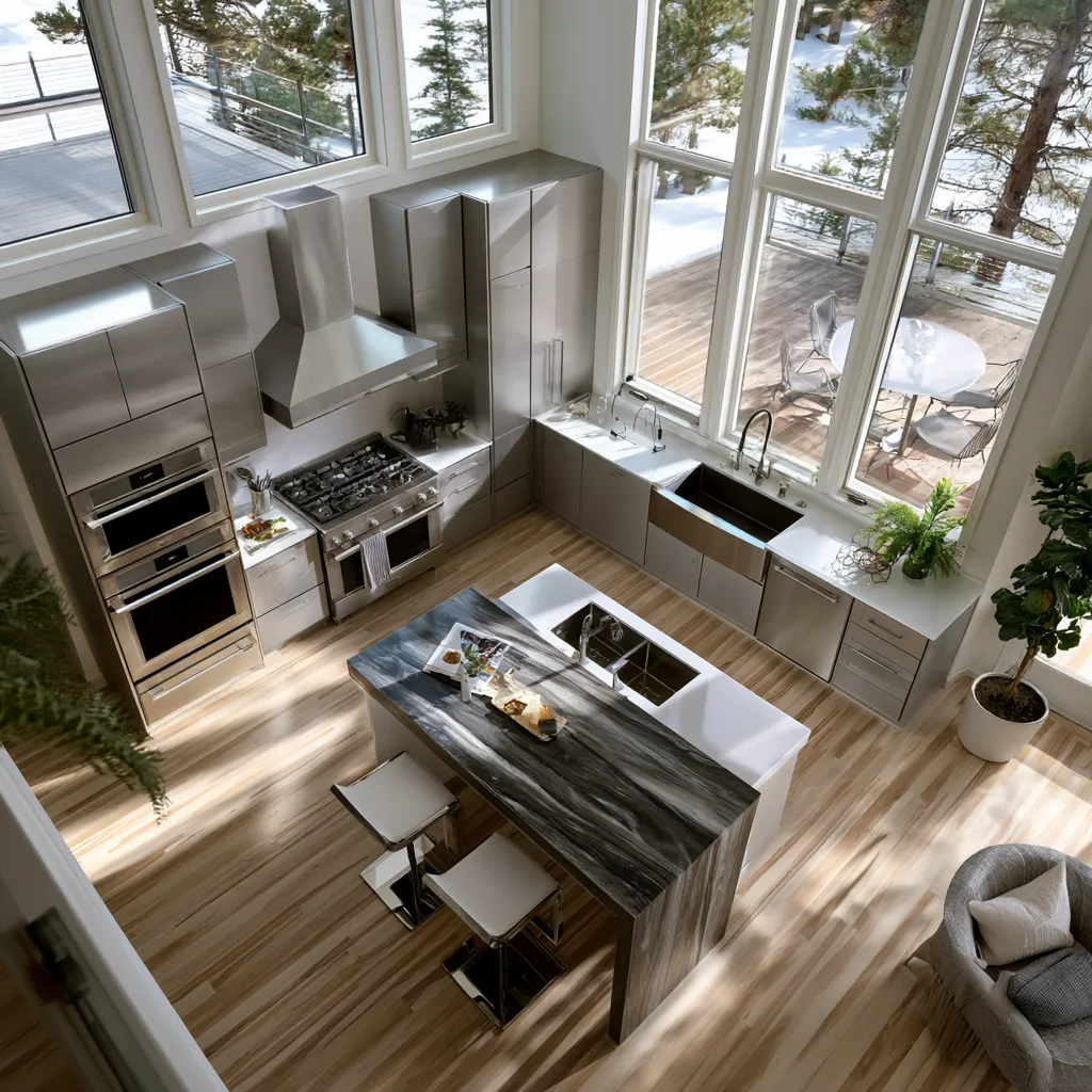
- Pastels (soft blue, blush pink): Best with white cabinets and natural wood. Adds space without cold undertones.
- Bold colour (electric blue, warm yellow): Works against stainless steel and minimal furniture. Light fixtures decide how it reads.
- Neutrals (greige, warm beige, Benjamin Moore Hush AF-95): Goes with everything. Looks expensive next to marble or brass hardware.
- Simple rule: Match wall undertone to your countertop, not your cabinets.
- Mistake to avoid: Cool grey next to warm wood floors — they fight each other all day.
Pastel Kitchen Walls Earn Their Airiness When the Undertone Is Right
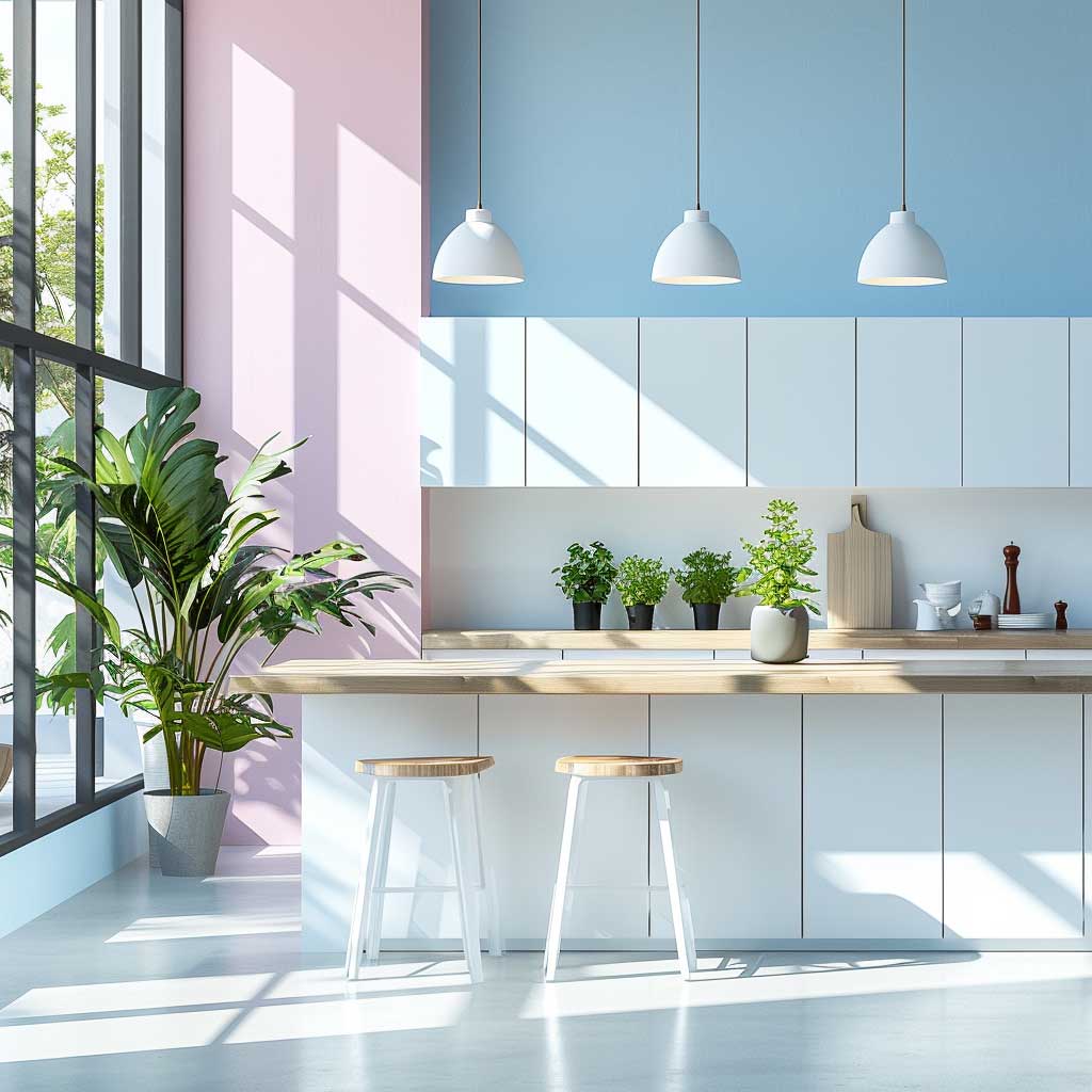


Pastel kitchen walls have a reputation for being soft and safe — and that reputation gets them dismissed too fast. The ones that actually work aren’t soft at all. They’re specific. Benjamin Moore’s Pale Sky 2165-60 and Farrow & Ball’s Borrowed Light No.235 ($110–$120 per gallon) both carry a blue undertone that reads almost neutral in shadow and intensifies in direct sun. That shift is the whole point. My own kitchen had a blush pink wall for eight months before I understood why it kept looking muddy — the pink had a grey base, not a warm one, and it was fighting my cream-coloured lower cabinets all day long.
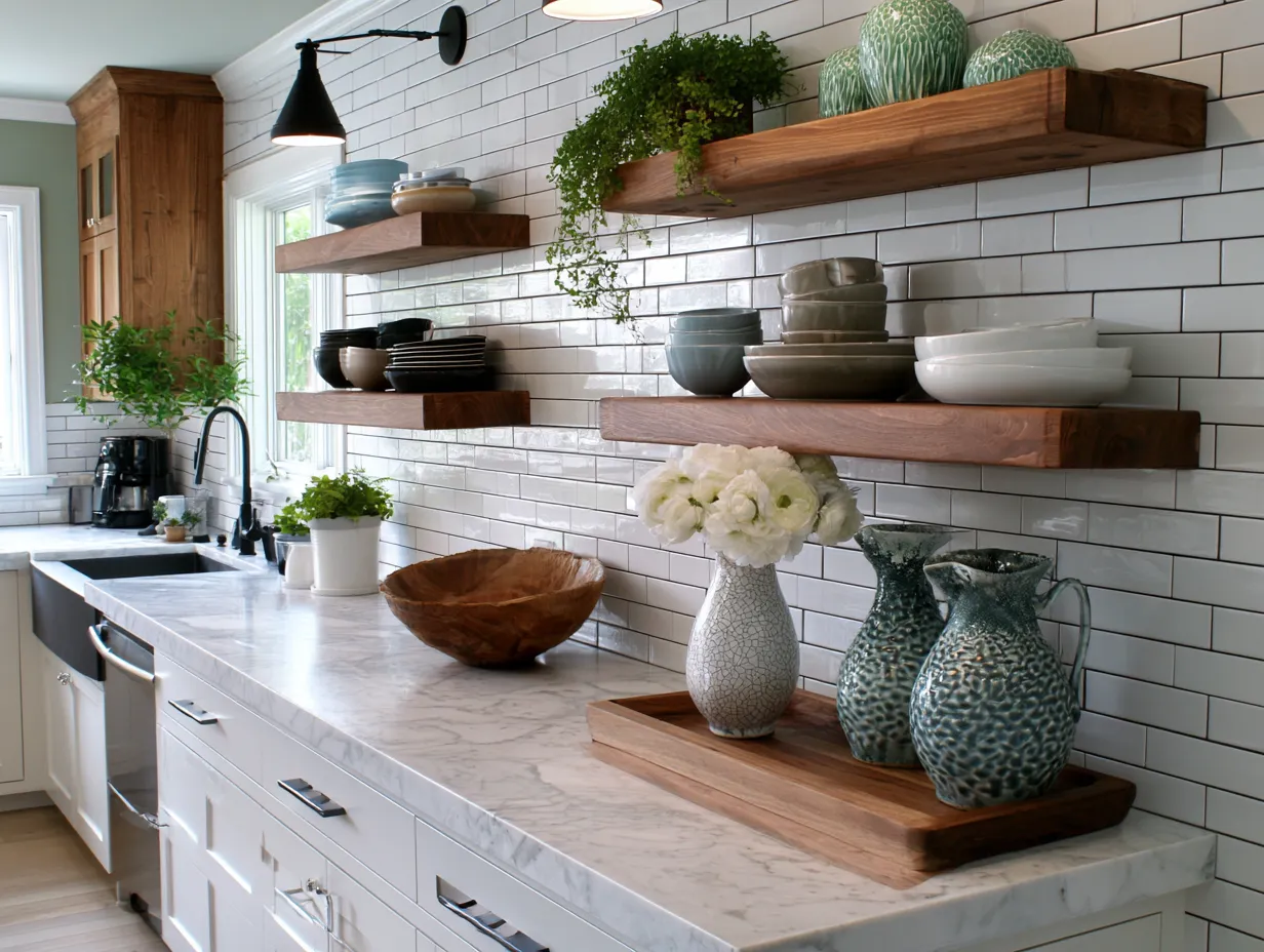
Pair pastels with wooden open shelving, not painted shelving. Wood introduces warmth that stops the room from reading like a hospital corridor. You’ll notice that greenery — even a single trailing pothos — does more visual work against a pale blue wall than any decorative object. It’s the same reason florists always use neutral tissue paper: contrast lands harder when the background is quiet.


Natural light is the deciding factor. North-facing kitchens strip warmth from pastel colours — what looks like a barely-there lavender on the swatch turns grey-blue by noon and grey-purple by evening. If your kitchen faces north, go one shade warmer than you think you need. A south-facing room can handle the cooler, purer pastels because the light is doing the warming for you. I stole this trick from a colour consultant who charges $300 an hour, and it works every time.
Don’t choose a pastel just because it photographed well in someone else’s feed. Screen-brightness lies. Paint a test patch at least 30cm x 30cm and look at it at 7am, noon, and after dark under your actual kitchen lights. Three different times, three different readings. That’s the real colour you’re choosing.
Don’t Do This
Don’t choose a pastel with a grey base for kitchens with warm wood floors or cream cabinets. The grey undertone fights the warmth all day and makes the room feel unfinished rather than calm. Farrow & Ball’s Mizzle No.266 is a beautiful colour in a showroom — in a north-facing kitchen with oak floors, it reads swamp green by 4pm. Stick to pinks and blues with a clear warm or clean base, not a greyed-out one. The room will thank you.
Bold Wall Colour in a Modern Kitchen Needs One Rule to Survive
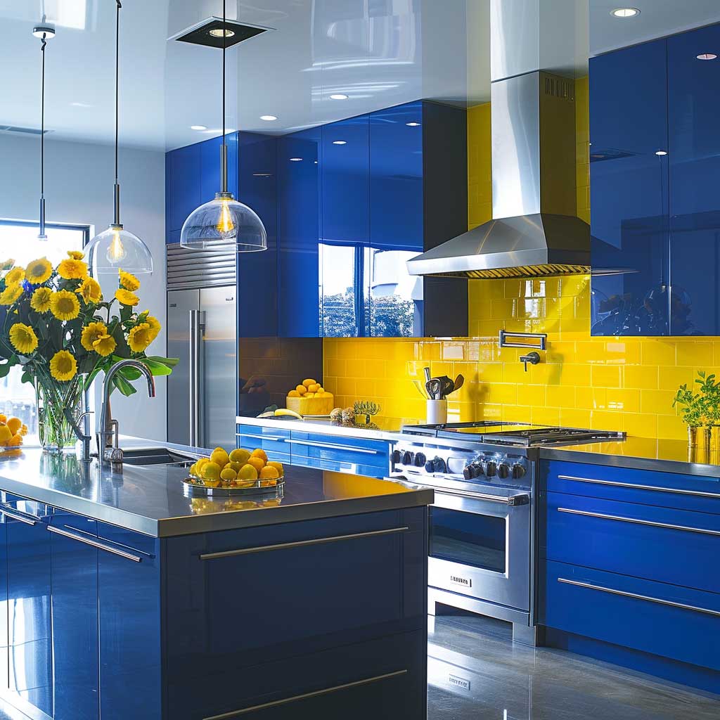


Bold kitchen wall paint ideas get a bad reputation for dating fast, and usually that’s because they break the one rule that saves them: keep everything else quiet. Electric blue walls — try Benjamin Moore’s Hale Navy HC-154 at around $65 per gallon — work against white lower cabinets and stainless steel appliances because the other surfaces have nothing to fight back with. Add patterned tile, a coloured backsplash, and decorative hardware all at once, and you’ve turned a bold statement into a shouting match. Your eye doesn’t know where to rest. It’s exhausting.
Sunny yellows like Sherwin-Williams Confident Yellow SW 6364 (~$58/gallon) need the same discipline. The yellow has to be the only warm element with saturation. Brass hardware? Fine. Warm wood floating shelf? Fine. Patterned Roman blind? No. I’ve seen three kitchens with yellow walls and busy window treatments, and all three felt like a children’s TV set rather than a room an adult wanted to cook in. Restraint is the design decision.


Lighting shifts bold colours more dramatically than any other shade family. A 2700K warm bulb pulls the green out of a navy wall and makes it read cobalt — beautiful. The same wall under 4000K daylight-temperature lighting reads cold and institutional. If you’re going bold, buy the bulbs before you commit to the paint. What’s the point of spending four hours painting if the light you live under doesn’t match the sample card you approved in a showroom? Test both together.
For open-plan kitchens, bold wall paint on a single feature wall — behind the island, or the run behind the hob — is smarter than painting all four walls. You get the energy and the personality without the room feeling closed in. Blue wall paint pairings and specific shade combinations are worth studying before committing to a full kitchen.
Warm Neutrals Outperform Grey in Almost Every Kitchen Condition


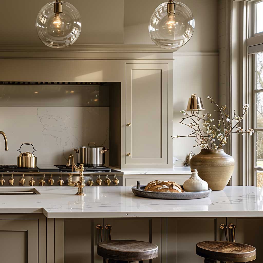

Cool grey had a decade-long run as the default kitchen neutral — and it earned its retirement. The problem was never grey itself. It was cool grey paired with warm wood floors, warm oak cabinets, or honey-toned countertops. That combination reads like a colour clash at arm’s length. Warm neutrals fix this because they share undertones with the materials that already exist in most kitchens. Benjamin Moore’s Hush AF-95 (~$65/gallon) is my go-to recommendation: it’s a warm greige that reads neither beige nor grey, shifts beautifully in different light, and makes brass hardware look intentional rather than trendy.
Farrow & Ball’s Elephant’s Breath No.229 (~$115/gallon) is the more expensive route to the same result. You need it if your kitchen has dark walnut cabinets — the slight purple undertone in Elephant’s Breath harmonises with dark wood in a way that a pure beige can’t. Standard beige next to dark walnut? Muddy. Full stop. Warm greige? Suddenly the cabinets look like a deliberate choice and not a leftover from the previous owner.


The finish matters as much as the colour. Eggshell on kitchen walls gives you light reflection without the plastic look of semi-gloss, and it wipes down cleanly after cooking splatter. Flat paint in a kitchen is a decision you’ll regret by the third pasta night. I own two paint finish samplers and have tested this across six different neutral shades — eggshell wins every single time in a kitchen context. Matte looks incredible in the photos and terrible after six months of real use.
If you want a frame of reference for how warm neutrals behave against a full range of natural and artificial kitchen lighting, neutral kitchen colour ideas with real room photography shows the same palette across different conditions. That’s how you avoid committing to a shade you only ever saw on a screen.
Wrap-Up
Kitchen Wall Colour Fixes the Room Before You Buy a Single New Thing
Pastels work when the undertone matches your materials, not when they’re the palest shade in the store. Bold colours survive when everything else steps back. Warm neutrals beat cool grey in almost every real-world condition, especially with wood floors and brass fixtures.
Pick the finish — eggshell, always — before you pick the brand. The sheen level changes how the colour reads more than the price point does.
Save this post before your next hardware store visit — you’ll want the specific shade names at hand.