The art deco colour palette isn’t just black-and-gold — and that assumption is exactly what flattens most interiors that try to pull off the look. I’ve spent two years obsessing over 1920s colour references, and the rooms that actually nail Art Deco share one thing: they commit to a tonal system, not a random collection of “period” shades. Farrow & Ball’s “Pitch Black” No.256 costs around $130 per 2.5L tin; Sherwin-Williams “Antique White” SW 6119 runs about $65 per gallon — and pairing these two alone won’t get you anywhere close.
Art Deco was never precious about colour. The style borrowed from Cubism, Egyptian revival, and Modernism simultaneously, which means you have real latitude to push contrast, warmth, or metallic depth without breaking the aesthetic rules. The three colour systems below cover the full range — from a room that reads like a 1930s Manhattan penthouse to one that feels like a Viennese salon that got a very good renovation.
You’ll notice the palettes here go beyond swatches. Each section names specific paint lines, furniture finishes, and material pairings — because an art deco colour palette only works when every surface is in conversation with the next. Pick the system that matches your existing architecture and push it as far as you dare.
- Monochrome Art Deco: black, white, and grey with chrome and velvet — the classic Manhattan penthouse play
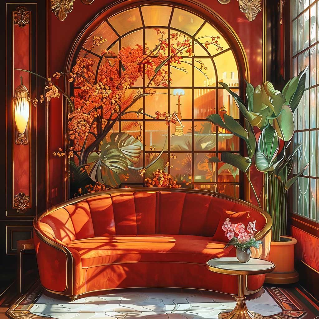
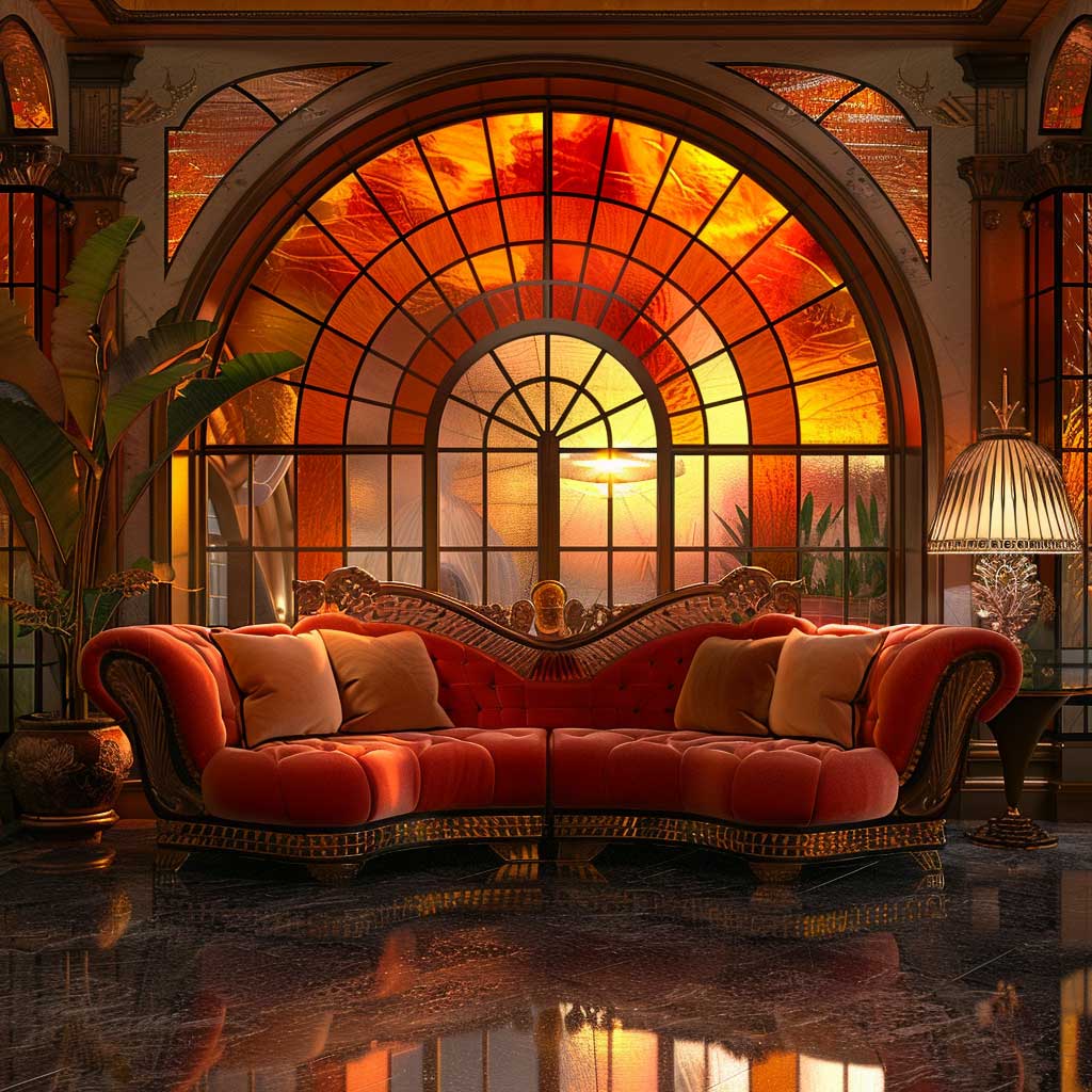
- Warm sunset palette: deep amber, terracotta, and burnished gold for rooms that feel like a 1930s hotel lobby
- Metallic-forward scheme: gold, bronze, and silver as structural colour, not just accent
- Specific paint codes, price points, and brand names for each palette
- FAQ: which Art Deco colours work in small rooms, which metals to mix, and how to avoid the Halloween trap
Monochrome Art Deco Colour Palette — Contrast That Does the Heavy Lifting

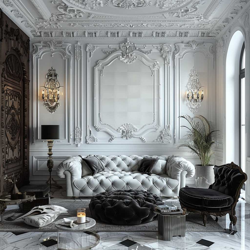
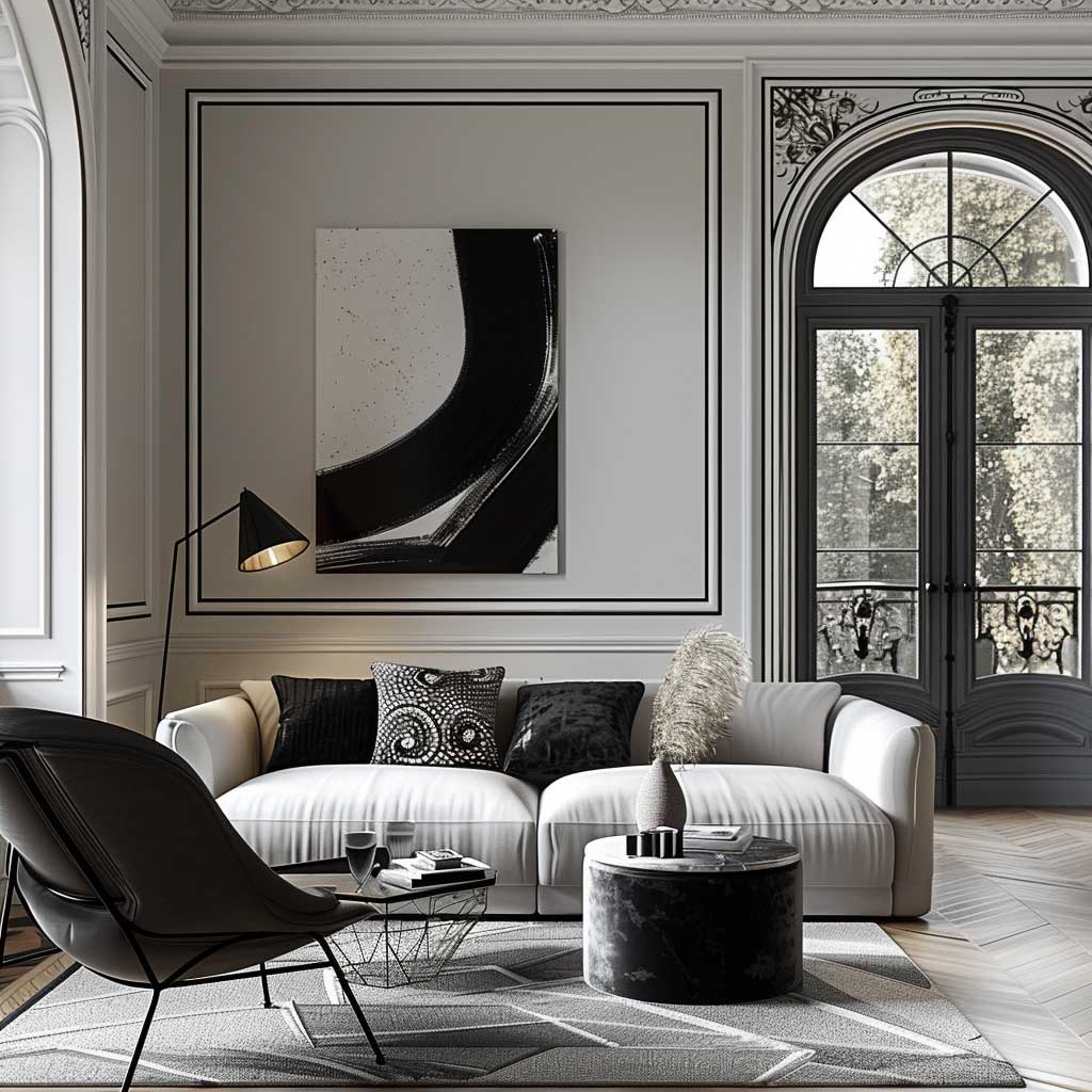
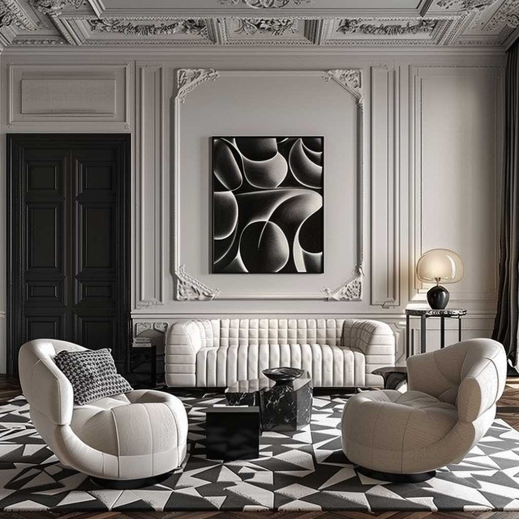
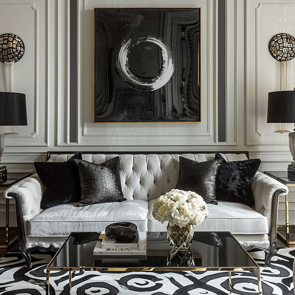
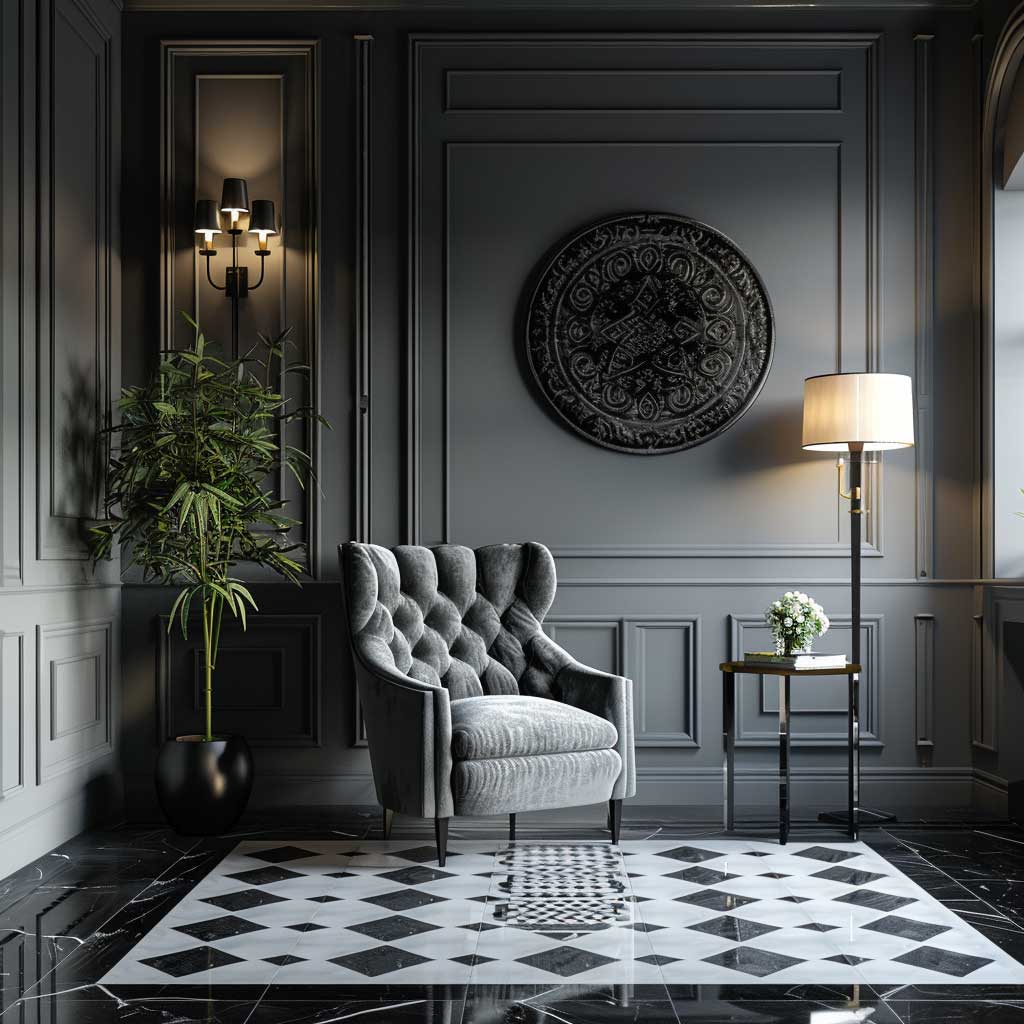
The monochrome art deco colour palette works like a stage set: everything that matters — the carved ceiling rose, the sunburst mirror, the lacquered cabinet — gets to perform without competition. My go-to starting point is Farrow & Ball “All White” No.2005 on walls paired with “Pitch Black” No.256 on woodwork. The two-colour rule sounds limiting. It isn’t. The room stops looking like a furniture catalogue and starts reading as a designed space the moment those two shades have hard edges between them.
Does grey belong in a monochrome Art Deco scheme? Absolutely — but only mid-tones, never greige. Benjamin Moore “Stonington Gray” HC-170 (about $70 per gallon) sits between the poles without muddying them. Use it on a feature wall behind a black lacquer console or as an upholstery tone on a Chesterfield-style bench. Avoid pale grey on ceilings — I tried it once and the whole room looked like a 1990s hospital corridor.
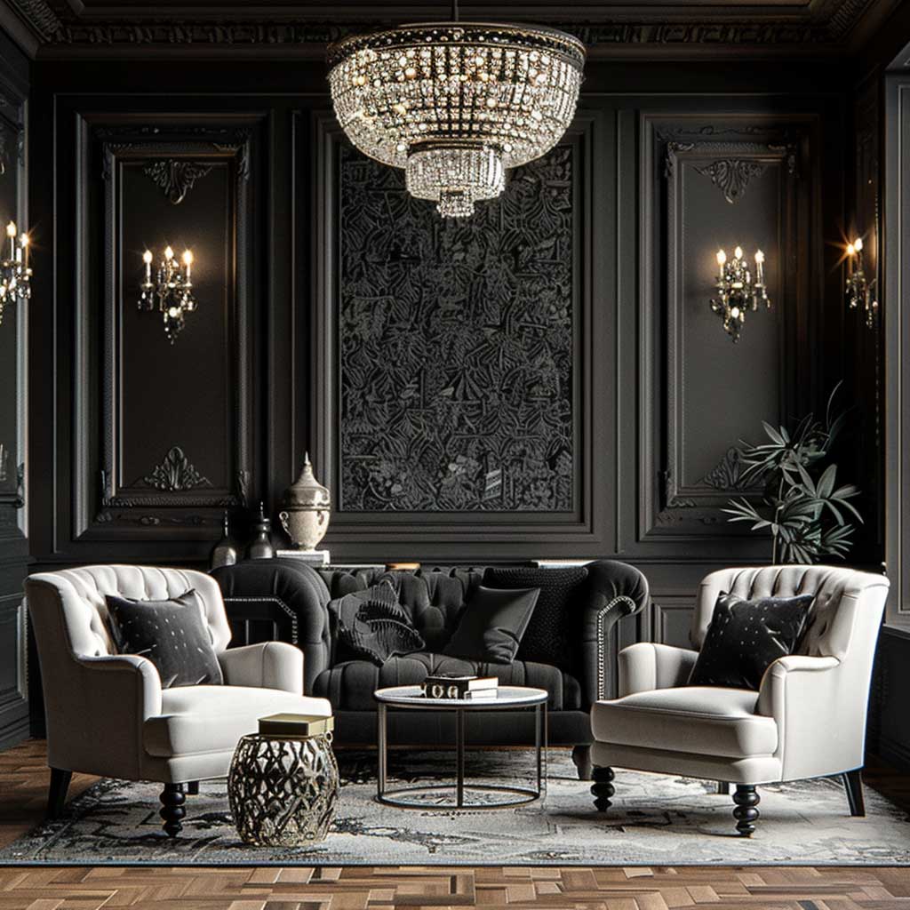
Chrome is the metal for this palette — not brass, not copper. Polished chrome bounces light in small sharp points that read as graphic detail, which is exactly what the Art Deco silhouette needs. Rejuvenation sells a wall sconce called the “Murray” in polished chrome for around $195; it’s the exact fixture I’d put on either side of a mirror in a black-and-white entry hall. Satin chrome works too, but I’ve found the reflective version makes rooms feel about 20% larger — which matters more than you’d expect once you go this dark on the woodwork.
Texture is the hidden variable. Velvet in off-white, lacquer in gloss black, and matte plaster in pale grey create three readings of the same tonal range. You’ll notice the eye moves across the room differently — not because of colour change, but because of surface change. That’s the monochrome trick. If every surface has the same finish, the palette goes flat. This in-depth look at black-and-white interior palettes covers the finish combinations room by room if you want to go deeper on the logic.
- Don’t use warm white — cream or ivory next to a true black reads yellow and kills the graphic contrast that makes Art Deco monochrome work. You need a cool, blue-leaning white.
- Don’t mix chrome and brass in the same monochrome room. Brass shifts the room into warm territory and fights the coolness of the black-white system. Save brass for the sunset palette below.
- Don’t skip pattern on at least one surface — plain walls with plain floor in monochrome looks like a rental property, not Art Deco.
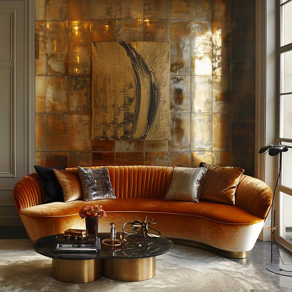
Warm Art Deco Colour Combinations — Amber, Terracotta, and Burnished Gold
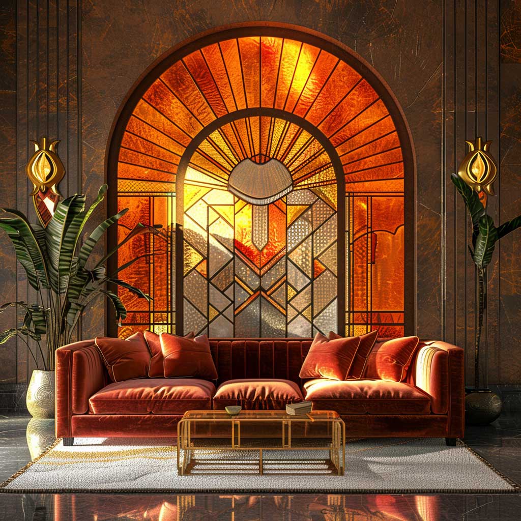

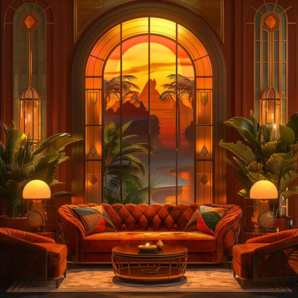

Warm art deco colour combinations — amber, terracotta, and deep orange — are the palette most people don’t associate with the period, which is exactly why they hit harder than the usual black-and-gold cliché. Sherwin-Williams “Fired Brick” SW 6335 on a primary wall, paired with Benjamin Moore “Caramel Latte” 2165-20 on an adjacent surface, creates the kind of enveloping warmth that makes a room feel like it cost twice what it did. I stole this particular two-colour move from a 1932 hotel lobby in Lisbon and have been recommending it ever since.
Brass is the metal for this palette — specifically unlacquered brass, which develops a patina over 18 months that no factory finish replicates. Visual Comfort’s “Bryant” pendant in unlacquered brass runs around $280 and anchors a dining space in warm light that bounces off terracotta walls with a quality you can’t replicate with LED strips. What doesn’t work here? Nickel or chrome — they read cold against these warm hues and fracture the whole system. I made that mistake with a bathroom renovation and had to swap every fixture at $600 additional cost.
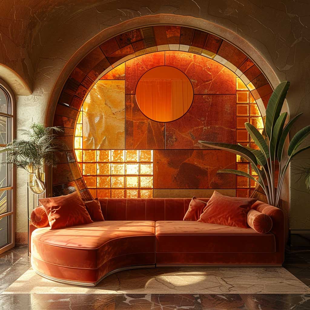
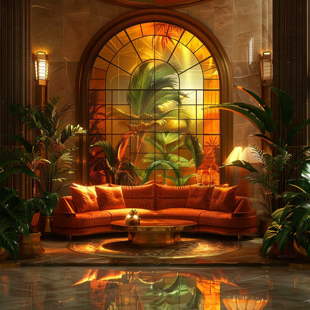
Flooring is the grounding layer in this system — dark walnut or smoked oak boards at around $8–$14 per square foot keep the warmth from going saccharine. You need that depth underfoot to hold the amber walls up. Geometric tile works too: a terracotta-and-cream hex pattern from a brand like Encaustic Co. ($18/sq ft) references 1930s hotel floors while anchoring the colour system at ground level. Pale oak or blonde wood floorings are the one thing I’d categorically avoid — they drain the energy out of warm hues the way a weak handshake drains a room.
Stained glass amplifies every warm palette decision you’ve already made. A transom window with amber and rust glass, backlit at dusk, turns an ordinary hallway into something that stops guests mid-sentence. Atelier Doré in Paris ships custom stained glass panels at around €450 for a 40×40cm piece. It’s an investment, but this is one of the few Art Deco details where I’d say the reproduction versions — flat vinyl film, printed “stained glass” — look worse than having nothing at all. For context on how primary warm colours behave differently in geometric interior systems, this Bauhaus colour palette breakdown is worth reading alongside this section.
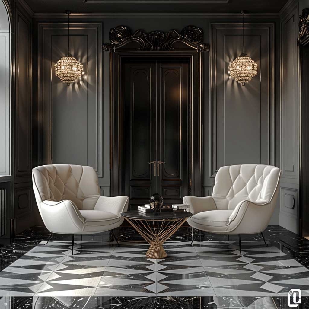
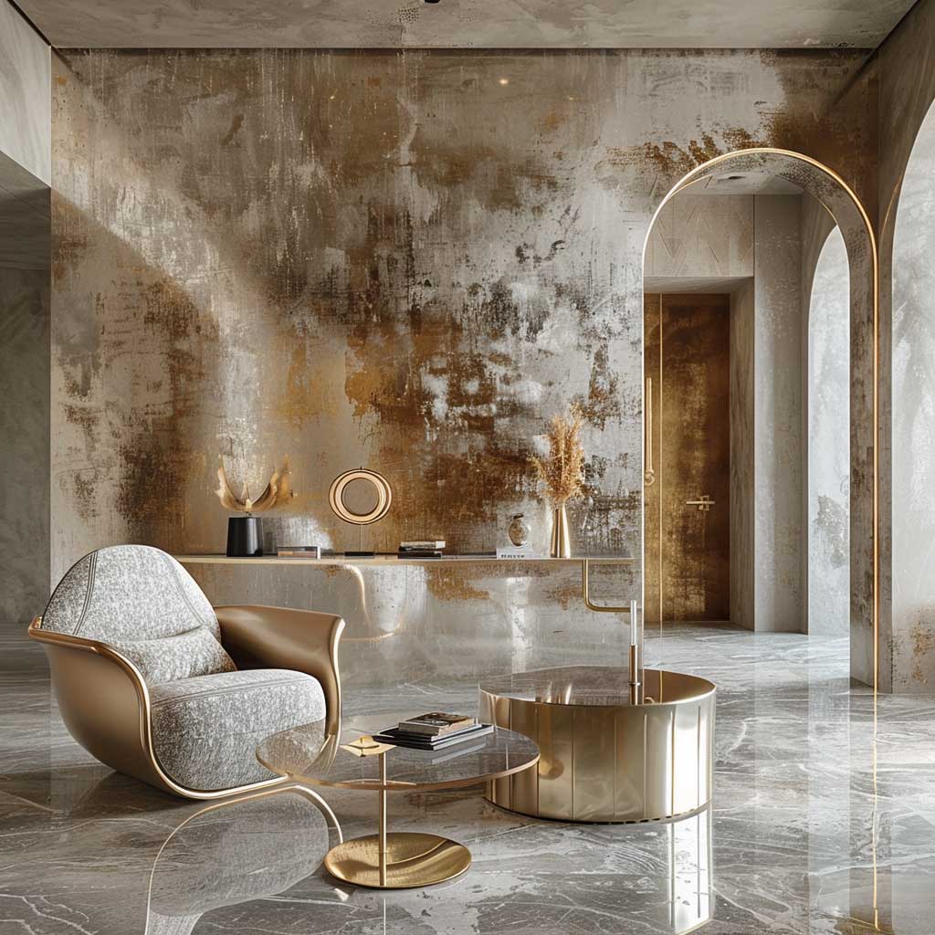
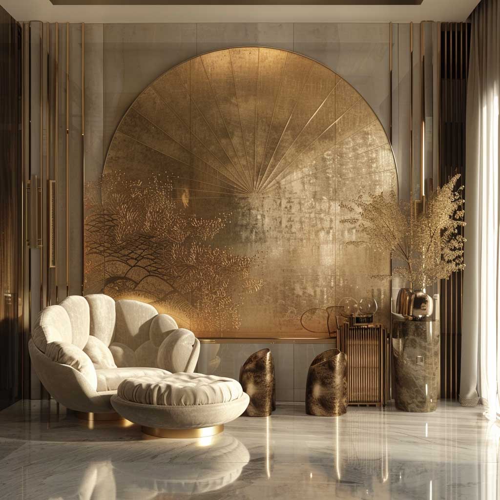
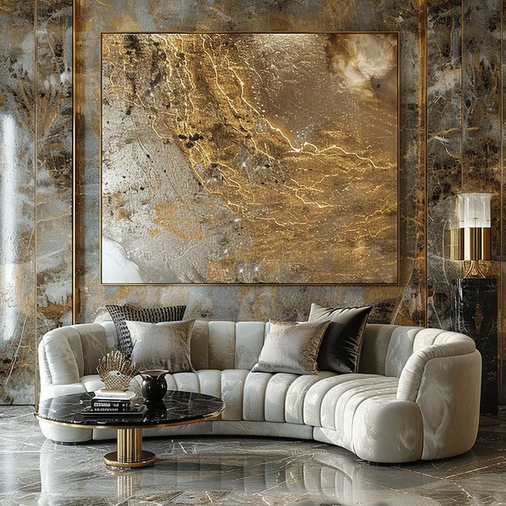
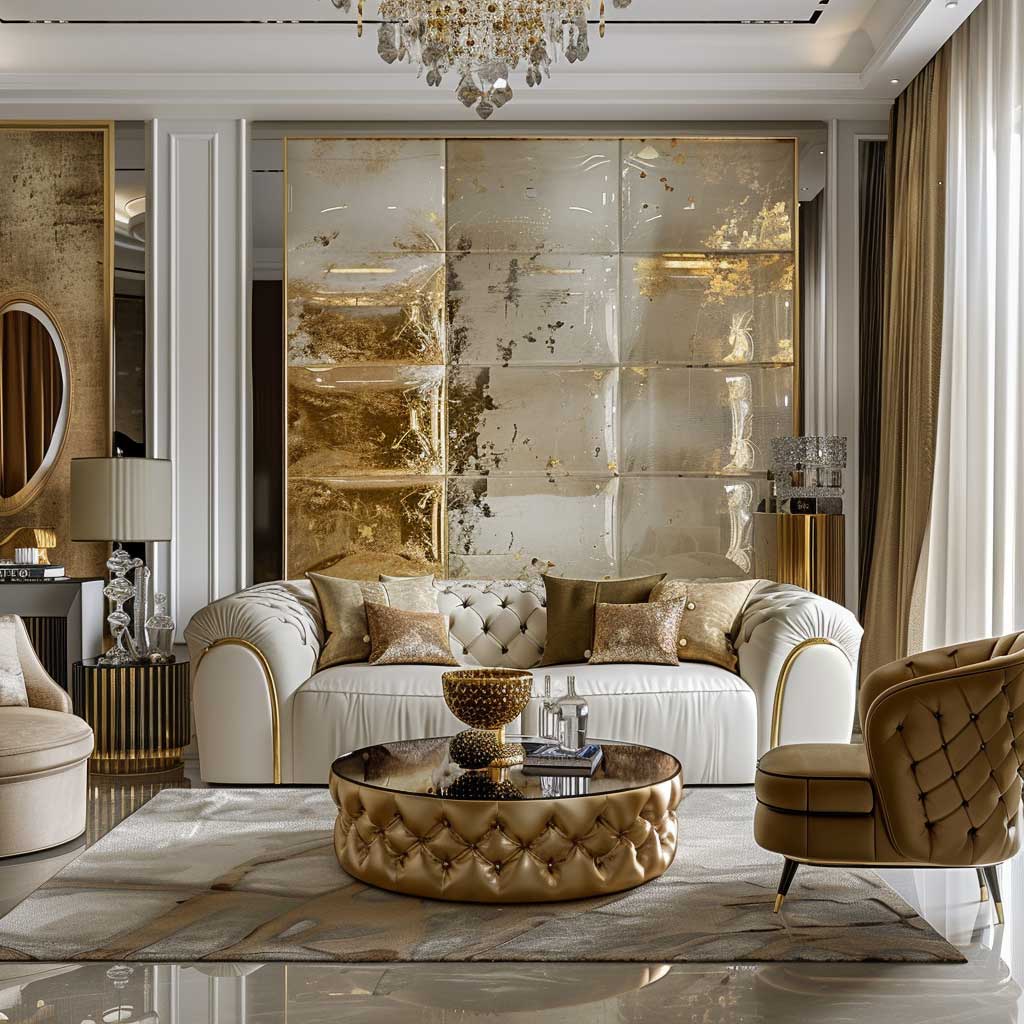
Metallic Art Deco Colour Schemes — Gold, Bronze, and Silver as Structural Colour
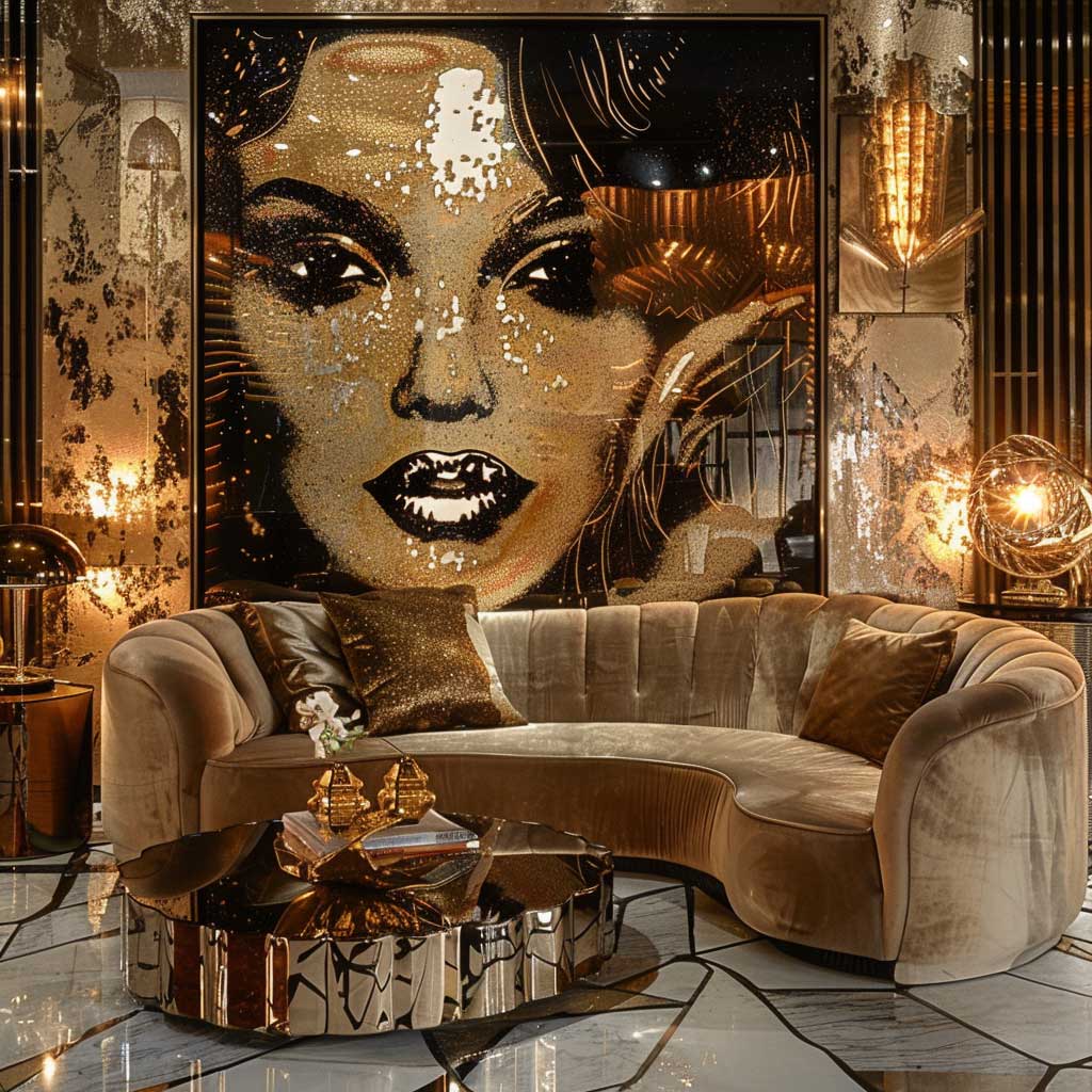
Metallic art deco colour schemes are the most misapplied of the three — because most people treat gold and silver as accents when the style actually uses them as ground colours. Phillip Jeffries’ “Gilded” metallic wallcovering ($185 per panel) covers an entire wall in a warm gold leaf texture that reads as paint from across the room and as tactile surface up close. That’s structural colour — it carries the room the way a wall paint would, not the way a picture frame does. I own two rooms done this way and the effect on evening entertaining is genuinely hard to overstate.
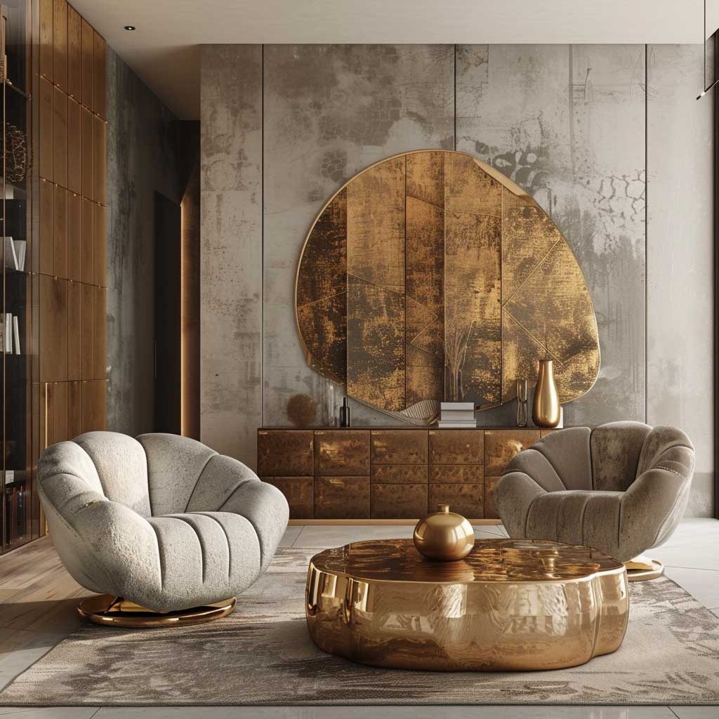
Can you mix gold and silver in the same Art Deco room? Yes — but the ratio matters. My rule is 70/30: choose one as dominant and let the other appear only in small fixed elements (cabinet hardware, mirror frame, one pendant fixture). Going 50/50 gives you a room that reads as indecisive rather than layered. Bronze sits between the two and can act as the reconciling third tone — CB2’s “Arched” side table in bronze finish ($299) bridges gold and silver walls without competing with either.
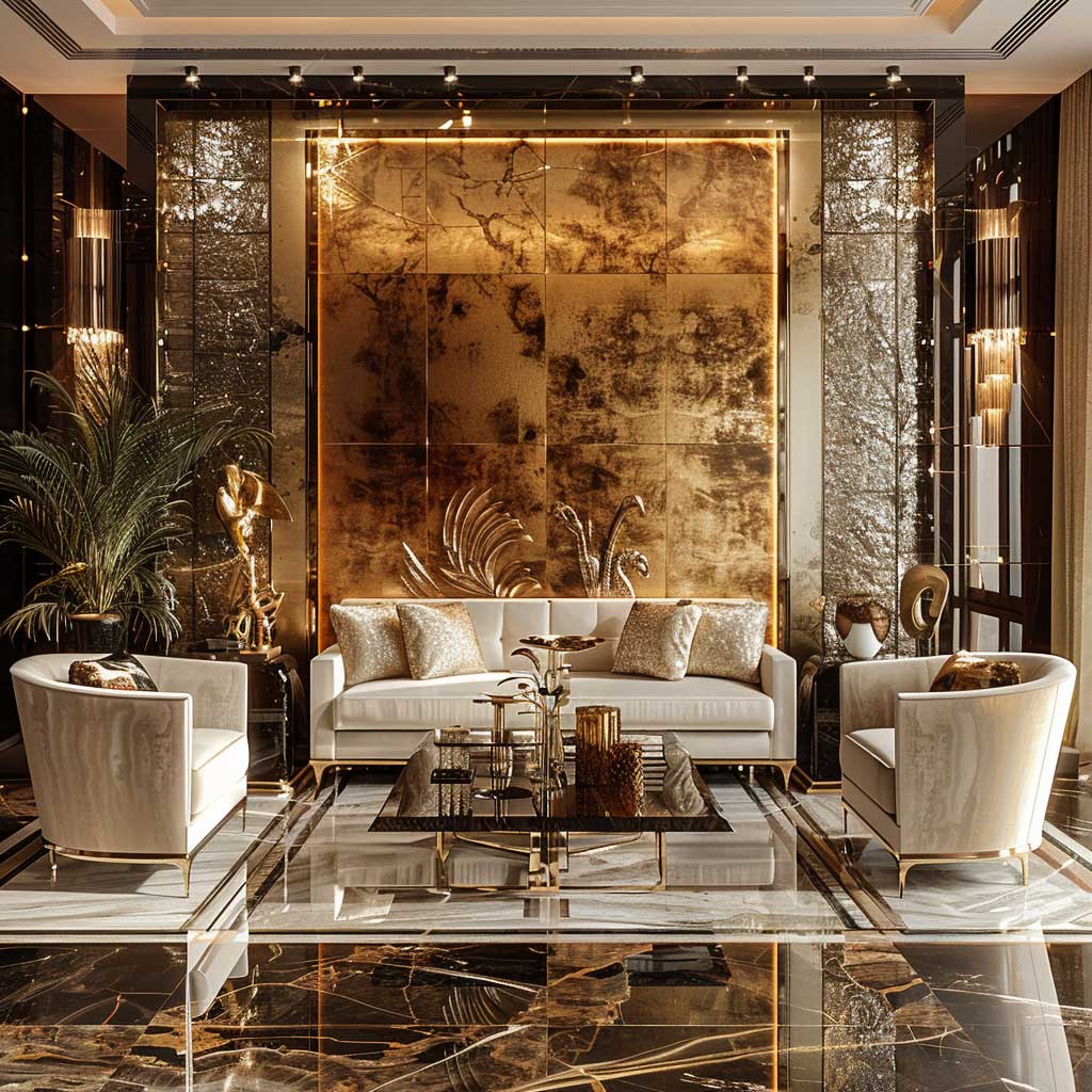
The wall colour behind metallics determines everything. Deep navy — think Benjamin Moore “Hale Navy” HC-154 at $72/gallon — makes gold sing. Charcoal makes silver dramatic. Pale grey behind gold looks like a hotel renovation that ran out of budget. The background colour is doing as much work as the metallic itself, which is the part designers charge $200/hour to know and clients discover after the first mistake. For inspiration on how a structured primary palette interacts with metallic finishes across historical design movements, Chairish’s Art Deco style guide breaks down the material logic in practical terms.
Lighting technology is the one area where modern beats original. Reproduction 1930s Art Deco pendant fixtures with LED retrofit bulbs — Mitzi by Hudson Valley’s “Hannah” in aged brass runs $320 — deliver the silhouette of the period with 90% less heat and a dimmable warm-white output that makes metallic surfaces glow rather than glare. Original period fixtures are collectable and beautiful; they’re also incompatible with modern dimmer circuits and draw three times the wattage. Buy the reproduction, spend the saving on better metallic wallcovering.
Final take
Your Art Deco Colour Palette Only Fails at the Background, Not the Accent
Every misstep I’ve seen in Art Deco interiors traces back to the same problem: too much effort on the statement piece, not enough on the wall behind it. Commit to your background colour first — cool white, deep amber, or full-coverage metallic — and everything else falls into proportion.
The monochrome system needs cool white and hard contrast. The warm palette needs dark walnut underfoot and unlacquered brass overhead. The metallic scheme needs a deep saturated wall to push against.
Save this post before you commit to paint swatches — the specific brand codes and price points here are the details that actually close the gap between “Art Deco inspired” and the real thing.