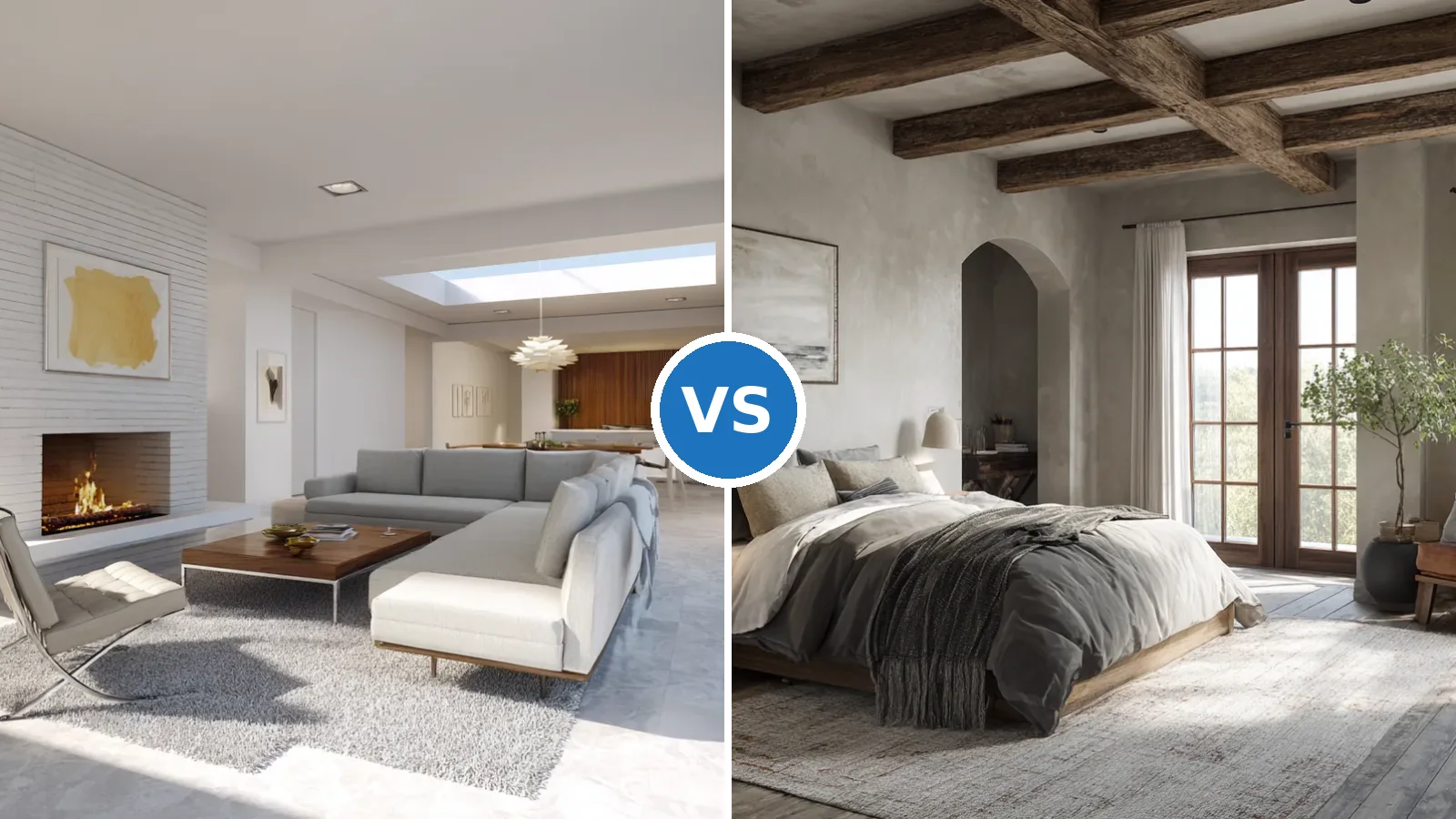
Mid century modern color schemes work when one natural material, one saturated accent and one quiet neutral share a room in fixed proportions. The style ran from the mid-1940s to the late 1960s, and its palettes still look fresh because they lean on wood, earth and a few confident brights rather than passing trend shades. Does the look need a full repaint? No, most rooms get there with one wall color, one wood tone and two or three accent pieces. Start with the wood you already own and build the color around it.
Three palettes cover almost every room: earth tones with walnut, bold retro teal with mustard, and soft neutrals with pops of melon or cobalt. Each one follows the 60-30-10 split, roughly 60% base wall, 30% supporting tone and 10% accent. A gallon of interior paint covers about 350–400 sq ft per coat, so a typical 12×12 room needs around 2.2 gallons for two coats. Pick the scheme by how the room is used, then budget paint by the square foot.
Quick Scan
- Split every scheme 60-30-10: base wall, supporting wood or textile tone, then a 10% accent.
- Earth-tone walls around LRV 50–55, such as greige or warm taupe, keep walnut and teak from looking muddy.
- Muted teal near LRV 18 vs mustard near LRV 36 gives strong contrast, since the two sit opposite on the color wheel.
- Crisp whites at LRV 91–93 bounce more light than creamy whites around LRV 82–85.
- One gallon of paint covers 350–400 sq ft per coat; primer covers only 200–300 sq ft.
- Walnut rates harder than teak, 4,493 N vs 4,137 N Janka, so it suits high-use tables.
- Keep bulbs at 2700K so wood, mustard and terracotta stay warm instead of flat.
Earth Tones and Walnut Set the Warmest Mid Century Palette
An authentic mid century modern color palette for a living room begins with earth tones and real wood, because the era borrowed its colors from the landscape outside large glass walls. Terracotta, olive, ochre and umber fill the supporting 30%, while a greige wall around LRV 55 or a warm taupe near LRV 50 carries the base. Think of the wall as soil and the furniture as the trees growing out of it. Choose the wall color only after holding a wood sample against the swatch.


Which wood fits the scheme, teak or walnut? Danish pieces lean on teak with a golden, honey-brown tone, while most American mid-century furniture was built in black walnut, which ranges from chocolate brown to a reddish cast. Walnut is slightly harder at 4,493 N on the Janka scale vs 4,137 N for teak, so it resists dents on a coffee table. Teak is denser, about 655 kg/m³ vs 609 kg/m³, and darkens with sun over the years. Pair amber teak with olive and mustard, and darker walnut with terracotta and cream.
Proportion matters more than the exact shade, and the same split explained in these red and gray living room ratios built on the 60-30-10 rule works for an earthy room too. Give about 60% of the visible surface to a warm neutral, 30% to wood and earthy upholstery, and 10% to a terracotta pillow, an olive throw or a geometric rug. Don’t paint all four walls terracotta, because a full drench can make a living room feel like the inside of a flowerpot. Keep the strongest earth tone on fabric first and commit to paint later.


Lighting decides whether this mid century interior color palette glows or turns brown. Warm 2700K bulbs keep wood, ochre and terracotta rich, whereas 4000K cool white flattens them and can make walnut look grayish. Two table lamps at different heights do more than one bright ceiling fixture, since low light rakes across the wood grain and shows its depth. Swap every bulb in the room to the same 2700K before buying a single new pillow.
Bold Retro Hues Turn a Dining Room Into a Modernist Color Palette


A bold modernist color palette gives a dining room the energy of a 1950s diner without copying one, and teal with mustard is the pairing designers reach for first. The two sit opposite each other on the color wheel, so each makes the other look richer. A muted teal around LRV 18 (hex #4F7D7B) works as a full wall color, while mustard near LRV 36 (#C99B3A) belongs on chairs, a pendant or a sideboard. Treat mustard like hot sauce, where a few drops wake up the plate and a full bottle ruins dinner. Keep it to two or three pieces.
Does a black and white checkerboard floor still suit mid century modern color schemes? Yes, because black sits at the bottom of the 0–100 LRV scale and bright white above 90, so the floor supplies all the contrast and lets the walls stay mid-tone. The comparison is simple: checkerboard plus teal reads graphic and lively, whereas plain oak plus teal reads calmer and closer to Scandinavian. Use checkerboard only in a room with at least one large window, since a dark floor and a dark wall together swallow light.


Period accents keep the room grounded in its era. Frank Lloyd Wright’s favorite shade was Cherokee Red, and a single red-orange glass vase or print nods to that history without fighting the teal. Colorful glassware on open shelves fills the 10% accent layer cheaply, often for less than a gallon of paint at $15–60. Don’t add a fourth saturated color such as purple, because three loud hues is the ceiling for a dining room.
Paint finish matters more in a dining room than anywhere else in the house. Eggshell or satin on teal walls survives chair scuffs and wipes clean, while flat paint shows marks quickly. Satin and semi-gloss latex typically cover 350–400 sq ft per gallon on drywall, compared with 300–350 sq ft for high gloss, so a glossy teal costs a little more per wall. Choose satin for the walls and save gloss for trim and doors.
Soft Neutrals With Melon and Cobalt Pops Calm a Mid Century Bedroom


Soothing neutrals with pops of color are the mid century interior colors that suit a bedroom best, because the base stays quiet while one or two accents carry the personality. A creamy white near LRV 82 on walls and ceiling keeps the room soft, compared with a crisp white above LRV 90, which can feel stark under lamplight. Is cream too warm next to white bedding? Rarely, since a gap of about 8–10 LRV points reads as gentle layering rather than a mismatch. Test both whites on the wall behind the bed, not on the brightest wall.
Accents behave like punctuation in a sentence, where an orange vintage armchair is the exclamation mark and a blue vase is the comma. Melon, the soft orange-pink that 1950s homes wore as coral, sits comfortably beside walnut, while a medium cobalt such as #3366CC adds a cooler counterweight. Keep the two accents at different strengths, one bright and one muted, so they never compete. Limit the pops to about 10% of the room, roughly one chair, one vase and one print.
- Base, about 60%: cream or warm white walls in the LRV 80–85 range.
- Wood, about 30%: a walnut or teak bed frame and nightstands with tapered legs.
- Accent, about 10%: one melon armchair, one cobalt vase and one abstract print.


Window orientation changes the whole plan in a bedroom. Whites such as Chantilly Lace at LRV 92.2 and Simply White at 91.7 bounce the most light, while softer whites near LRV 85 hold warmth, the same trade-off covered in this look at white kitchen corner cabinets with high-LRV whites. In a dim room a crisp white can look gray, like printer paper in shadow. Choose the warmer white when the window faces north.
Furniture shape finishes the job that color starts. Tapered legs lift a dresser off the floor so the cream wall runs behind it, which makes a small bedroom feel larger. A room with three wood pieces and two accents looks deliberate, whereas six or seven colorful objects start to look like a yard sale. Don’t hang more than one large abstract print above the bed, and let the rest of the wall breathe.
Authentic Mid Century Modern Color Schemes Compared Side by Side
Comparing each mid century colour scheme on numbers makes the choice faster than any mood board. All four below run on the same 60-30-10 split, but base LRV, wood, accent strength and best room differ. Paint makers have documented the era closely, and one historic collection built from archival houses lists 23 colors for 1940s–1950s homes and 32 for 1960s–1970s homes, according to this report on a historically documented mid-century paint palette. Use the table to shortlist one scheme per room before buying sample pots.
| Scheme | Base wall (LRV) | Wood, about 30% | Accent, about 10% | Best room | Bulb temperature |
|---|---|---|---|---|---|
| Earth tones and wood | Greige or warm taupe, LRV 50–55 | Walnut or teak | Terracotta, olive, ochre | Living room | 2700K |
| Bold retro | Muted teal, LRV about 18 | Oak or walnut sideboard | Mustard at LRV about 36, red-orange glass | Dining room | 2700–3000K |
| Soft neutrals with pops | Cream, LRV about 82 | Walnut bed and nightstands | Melon, cobalt #3366CC | Bedroom | 2700K |
| Scandi mid-century | Warm white, LRV 82–85 | Light oak | Pale sage | Bedroom or home office | 2700–3000K |
Which scheme is easiest to live with long term? The neutral one, because swapping a melon cushion costs a fraction of repainting a teal room. The retro scheme asks for the most commitment, since a dark teal near LRV 18 usually needs a tinted primer, and primer covers only 200–300 sq ft per gallon vs 350–400 for finish paint. The earth-tone scheme sits in between, warm like a wool coat without being loud. Don’t mix all three palettes in one open-plan space; pick one and repeat it.
Paint Math Behind a Mid Century Modern Interior Color Palette
A mid century modern interior color palette depends on buying enough paint, and most shoppers underbuy the dark shades. One gallon covers about 350–400 sq ft per coat on a smooth primed wall, and two coats on a 12×12 room with 8-foot ceilings come to roughly 2.2 gallons. Dark mid-tones behave like a thin sweater over a white shirt, letting the old color glow through until the second coat. Buy all the teal or terracotta from one batch so every can matches.
Should you hire a painter or roll it yourself? Professional interior painting averages about $2–6 per sq ft, and labor makes up 75–95% of that bill, so a DIY weekend saves most of the cost on a single feature wall. Paint alone runs about $15–60 or more per gallon and primer $20–60, compared with a pro quote that can reach several hundred dollars for one room. Hire out the dark teal dining room and paint the cream bedroom yourself.
Don’t Do This
- Don’t pair 4000K cool bulbs with walnut and mustard; 2700K keeps both warm.
- Don’t roll dark teal straight over white; a tinted primer typically cuts three finish coats to two.
- Don’t push accents past about 10% of the room or past three saturated hues.
- Don’t stain vintage teak dark, since it hides the honey-brown grain and can lower the piece’s value.
Where Each Palette Wins
Earth tones with walnut win in living rooms, teal and mustard win in dining rooms, and cream with melon or cobalt wins in bedrooms, all on the same 60-30-10 split.
Keep base walls at LRV 50–55 for earth tones, near 18 for a teal statement and around 82 for a calm cream. That single number predicts how bright the room will feel better than any swatch name.
Budget about 2.2 gallons for two coats in a 12×12 room, and add primer for any dark shade, since primer covers only 200–300 sq ft per gallon.
Choose walnut for heavy-use tables at 4,493 N Janka, teak for sideboards where its honey tone shows, and 2700K bulbs everywhere so the wood stays warm.