Mens bedroom colors are the single decision that separates a room that looks assembled from a room that feels intentional. I’ve painted four bedrooms in the last decade, and every time I skipped the color research and went with whatever looked neutral at the hardware store, I regretted it by month two. The paint doesn’t just cover the walls — it sets the emotional register of the entire space, from how alert you feel at 7 a.m. to how quickly you wind down after midnight.
You’ll notice the difference most at night. Warm-toned rooms pull you toward rest. Cool-toned rooms stay energized longer than you want them to. Getting this right isn’t complicated, but it requires choosing a direction before you pick a single piece of furniture.
Quick Scan
- Bold Blues — navy or slate on the walls with brass or matte black hardware; Benjamin Moore Hale Navy HC-154 around $70/gallon
- Earthy Tones — deep browns, warm taupes, and terracotta; Sherwin-Williams Clove SW 9605 runs about $68/gallon
- Monochrome Black & White — high contrast done right; Benjamin Moore Silhouette AF-655 anchors the dark side
- Rich Greens — forest to sage; Sherwin-Williams Secret Garden SW 6181 works across multiple wall treatments
- Each scheme includes a “what not to do” note from real room failures
Bold Blues Turn a Bedroom From Forgettable to Architectural
Mens bedroom colors centered on blue work because blue is the one hue that reads masculine without trying. I’ve used Benjamin Moore Hale Navy HC-154 on a full accent wall, and the room went from looking like a dorm rental to something out of a boutique hotel — without changing a single piece of furniture. The depth of navy absorbs light differently than any other dark color; it doesn’t feel heavy, it feels deliberate.
The shade you pick changes everything. Deep navy blues — think Sherwin-Williams Naval SW 6244 at around $68/gallon — create a cocooning effect that’s almost theatrical after 9 p.m. Lighter options like Benjamin Moore Van Courtland Blue HC-145 keep the room feeling open during the day without losing the masculine register. My go-to move is pairing the dark wall with white linen bedding and matte black hardware; you get the contrast without the room feeling like a design exercise.


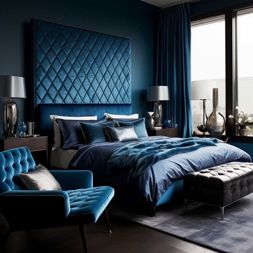
Texture matters more with blue than with any neutral. I stole this trick from an interior photographer: put velvet on the headboard if your walls are navy, because the pile catches the wall color and makes both elements look richer. Linen drapes in ivory or oatmeal keep the window from competing with the wall. What doesn’t work — and I’ve tried it — is pairing a dark blue wall with dark wood furniture and dark bedding simultaneously. The room stops reading as intentional and starts reading as a cave.
Metallic accents are the fastest upgrade for a blue bedroom. Brass pulls on a charcoal nightstand, a brushed nickel floor lamp — any warm metal against cool blue creates the kind of contrast that shows up sharp in photos. Abstract artwork with navy-adjacent tones ties it together. Skip the ocean prints; they feel themed rather than designed.
You’ll find specific navy and charcoal bedroom layouts worth studying at artfasad.com/7-mens-bedroom-ideas-with-bold-navy-and-charcoal-shades/ — the furniture pairings there are more specific than anything a paint brand’s website will show you.
Earthy Tones Perform Better When Soil Is Already the Reference Point
Warm browns, taupes, and terracotta are having a moment — Sherwin-Williams named Clove SW 9605 as their 2025 Color of the Year, and Benjamin Moore followed with Cinnamon Slate for similar reasons. Both sit in that bronzy-brown zone that reads warm without going orange. For male bedroom color ideas, these earthy tones are particularly effective because they do something most colors don’t: they make a room feel inhabited rather than staged.
Deep brown walls pair with almost everything you already own. Green plants against a brown wall look like they belong there — think of it as soil already being a neutral. Wooden bed frames in walnut or oak read as part of the color story rather than clashing with it. My go-to combination is a warm brown wall with beige linen bedding and two terracotta-toned throw pillows at around $30–$45 each from West Elm or CB2. The result is layered without being fussy.


Jute, rattan, and raw wood are the materials that make earthy tones land correctly. I own two rattan pendants from IKEA’s SINNERLIG line — around $60 each — and they transform warm brown walls in a way that any standard metal shade never does. The grain and texture in natural materials echo the warmth of the wall color rather than fighting it. Flat cotton curtains in brown or taupe, on the other hand, flatten the whole scheme; go for linen weaves that have visible texture in the fabric.
Warm lighting is non-negotiable in an earthy bedroom. Cool white bulbs — anything above 4000K — strip the richness out of brown and taupe paint and leave it looking muddy. Swap to 2700K warm white and the same paint reads richer by about 30%. Floor lamps with natural fiber shades double as functional lighting and texture; I’ve never seen a terracotta bedroom look bad with a woven rattan floor lamp in the corner.
Don’t Do This
The most common mistake with earthy tones is pairing warm brown walls with cool gray furniture. Gray reads blue-toned against warm brown and the two colors fight each other instead of building a palette. I repainted an entire room because of this combination — it looked unfinished for eight months before I swapped the gray side tables for walnut ones. If you already own cool gray furniture and want earthy walls, go for a lighter warm taupe like Benjamin Moore Pale Oak OC-20 instead of a deep brown. That shade bridges the gap without requiring new furniture.
Black and White Schemes Fail Without the Third Element Nobody Mentions
Monochrome is the bedroom color scheme most men attempt and most men get wrong. The failure mode is always the same: white walls, black furniture, white bedding — and a room that looks like a showroom floor rather than somewhere a person lives. What monochrome actually requires is a third element that prevents the contrast from feeling clinical. That element is texture, and you need a lot more of it than you’d expect.
Soft gray or off-white as the wall base — Benjamin Moore Silhouette AF-655 is the 2026 Color of the Year and sits in that sophisticated charcoal-espresso zone for anyone who wants to push darker — gives you more visual range than stark white. You’ll notice that off-white walls make black furniture look intentional rather than severe. The gap between near-white and near-black is where the room lives.
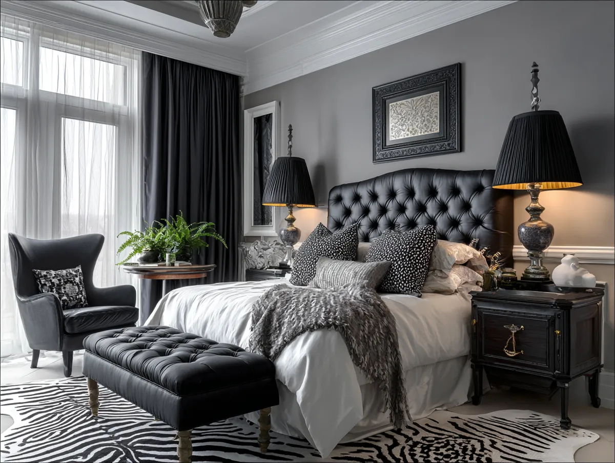


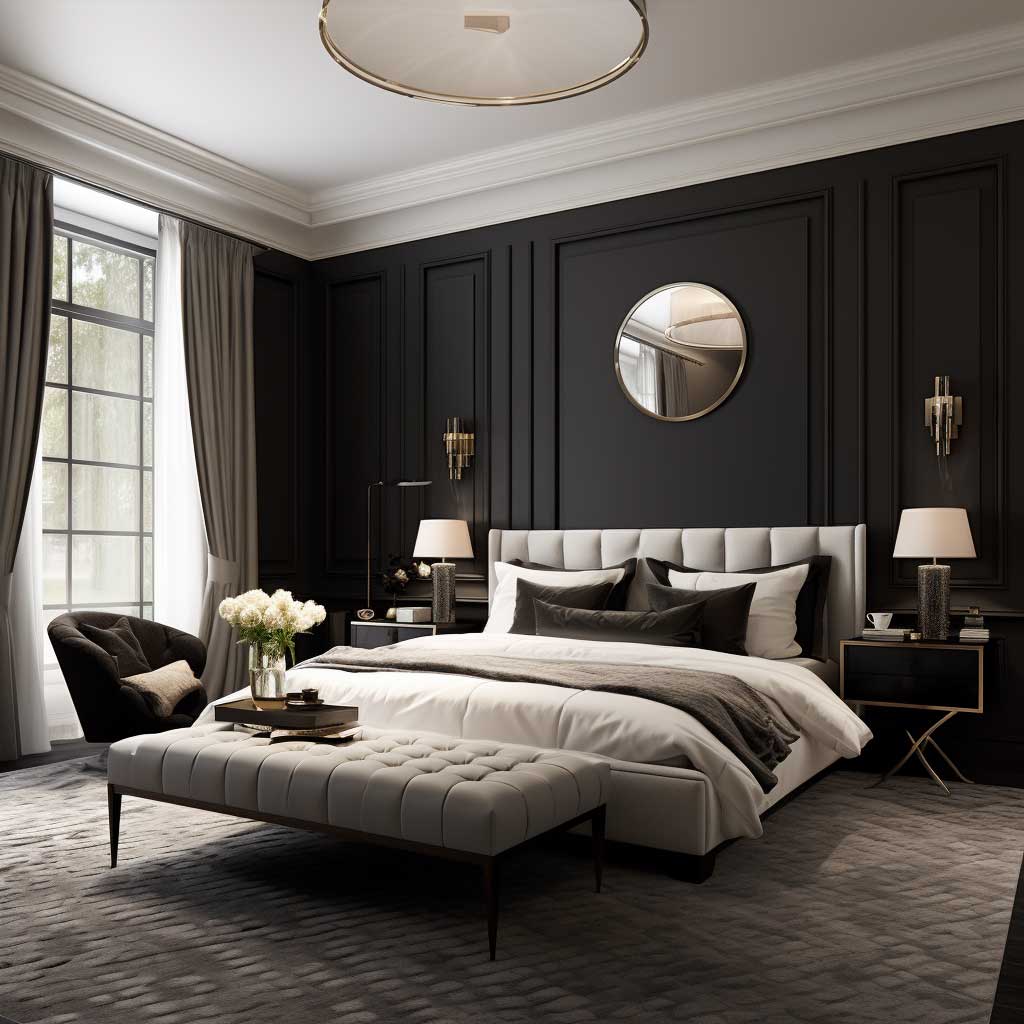


A plush white rug, a black leather reading chair, a gray upholstered headboard — these are the texture carriers. Without at least three different material surfaces in a monochrome room, the whole scheme reads flat in photographs and in person. I’ve seen people spend $2,000 on furniture for a black and white bedroom and it still looked empty because every surface was smooth. Geometric bedding from Parachute ($180–$260 for a duvet set) breaks the monotony faster than any accent piece.
Lighting in a monochrome room should be directional rather than ambient. Black pendant lights with Edison bulbs do two things: they add warmth that keeps the scheme from feeling sterile, and they function as visual anchors above the bed. Table lamps in white ceramic with black shades work the same way at a lower price point — CB2’s Arched Floor Lamp in matte black runs about $299 and works in nearly any monochrome layout.
Accessories close the loop. Black-framed mirrors — oversized ones, not the small hardware store version — and monochrome photography in matching frames create cohesion without requiring you to repaint. The room should feel like a decision was made. Every element pointing the same direction is what separates a monochrome bedroom from a room that simply lacks color.
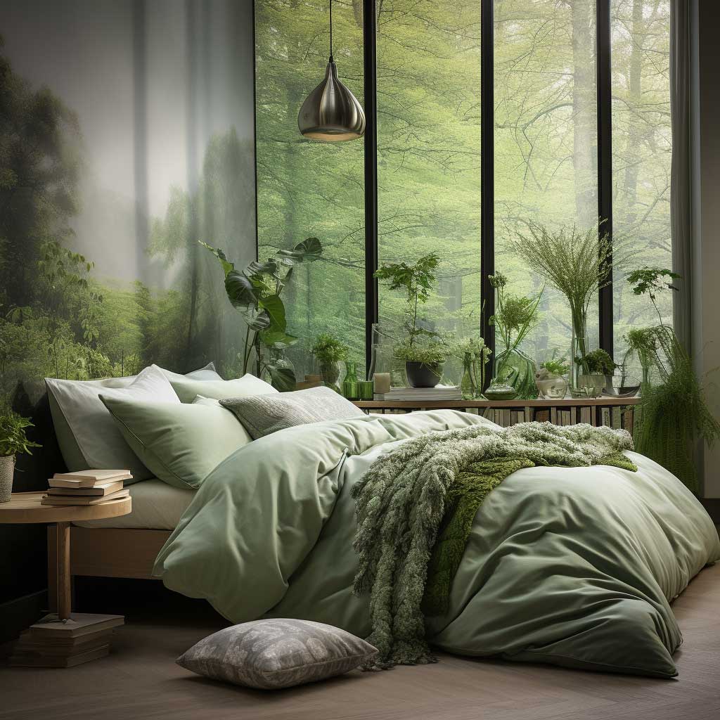
Forest Green Walls Read Loud in the Store and Quiet in the Room
Rich greens are the mens bedroom color idea that surprises people most after the paint dries. Sherwin-Williams Secret Garden SW 6181 looks intense on the chip but settles into something much more grounded on a full wall — especially in rooms with north or west-facing windows. Forest green has the same anchoring quality as navy without the coldness; it’s warm enough to feel welcoming at 10 p.m. but structured enough to not feel like a plant nursery.
The shade decision determines the entire room’s mood. Darker shades like forest green or hunter create intimacy — a 12×12 room painted in Sherwin-Williams Cascades SW 0078 feels closer to a library reading room than a bedroom, and that’s the appeal for a lot of men. Lighter shades like sage or Benjamin Moore October Mist 1495 — around $70/gallon — keep the space feeling open while still delivering a color statement. I’ve bought both and prefer darker greens for bedrooms specifically; lighter greens work better in offices or reading nooks.


Natural wood tones are the obvious pairing for green walls, and obvious here means correct. A walnut bed frame against forest green does the same work as soil beneath grass — the relationship is so established that it reads as logic rather than taste. Gold and brass hardware amplify the warmth; I stole this trick from a hotel room in Copenhagen and haven’t looked back. What doesn’t work: white lacquer furniture against dark green. It looks like a greenhouse, not a bedroom.
Texture layering matters in a green room. Velvet cushions in rust or ochre against green walls create the contrast that stops the room from looking monochromatic in the wrong way. Linen drapes in cream or natural white prevent the green from overpowering small windows. Plants are the obvious addition — but use them sparingly; two large plants look intentional, seven plants look like you lost the thread of what you were designing.
For anyone planning a blue-leaning approach rather than green, the blue and neutral combinations covered at artfasad.com/9-mens-bedroom-ideas-with-vibrant-blue-and-neutral-accents/ show nine specific setups with exact furniture pairings — useful if you’re deciding between navy and a deep teal or emerald green.
Bob Vila’s design team confirmed in their 2026 paint color trends report that deep greens and charcoals are dominating bedroom choices this year, with full color drenching — ceiling, walls, and trim in the same shade — emerging as the most requested technique for creating a moody, cocoon-like masculine bedroom feel.
THE TAKEAWAY
Mens bedroom colors work when the shade matches how you use the room after 9 p.m.
Navy and forest green close the room down and make it easier to sleep. Monochrome keeps it energized. Earthy tones land somewhere in between — warm, grounded, and forgiving with furniture you already own.
Whatever scheme you choose, the first mistake to avoid is picking a paint color before you’ve committed to a lighting temperature. Warm bulbs (2700K) and cool bulbs (4000K+) will make the same paint chip look like two different colors on your wall.
Pick the mood first, the color second, the furniture third. Save this post before you go to the hardware store.
Related Topics