Discover the magic of color and how it can transform any room from ordinary to extraordinary. In the world of interior design, the right colour combination not only enhances the aesthetic appeal of a space but also influences its ambiance and energy. This guide dives into six stunning colour schemes that promise to bring harmony and style to your home, showcasing the power of thoughtfully chosen hues in interior decoration.
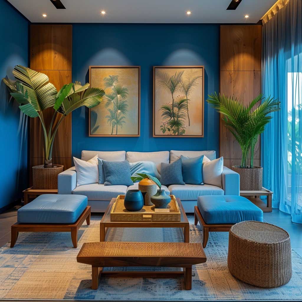
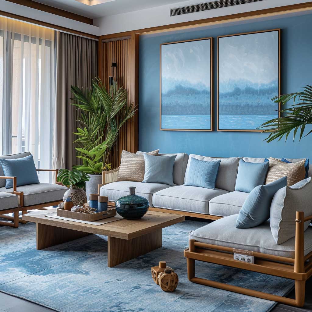
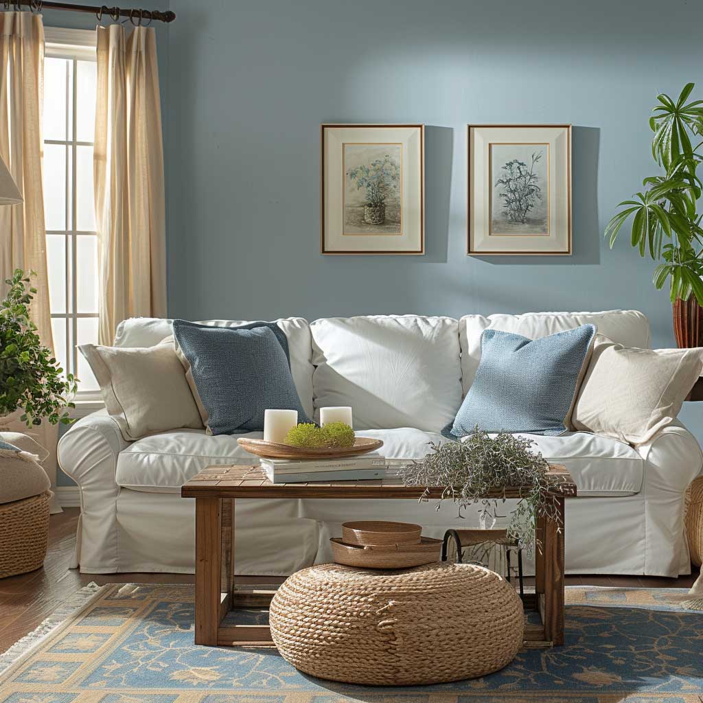
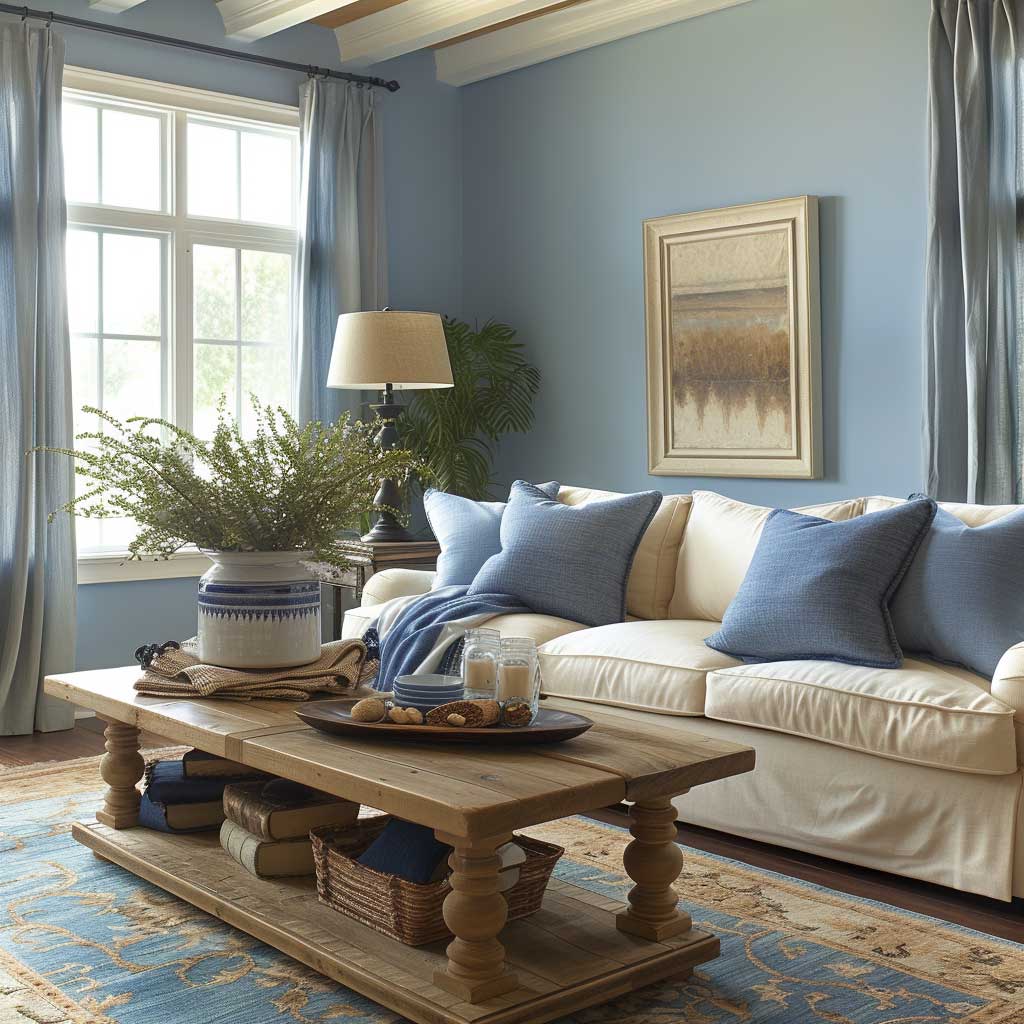
Soothing Blues and Earthy Browns in a Living Room Retreat
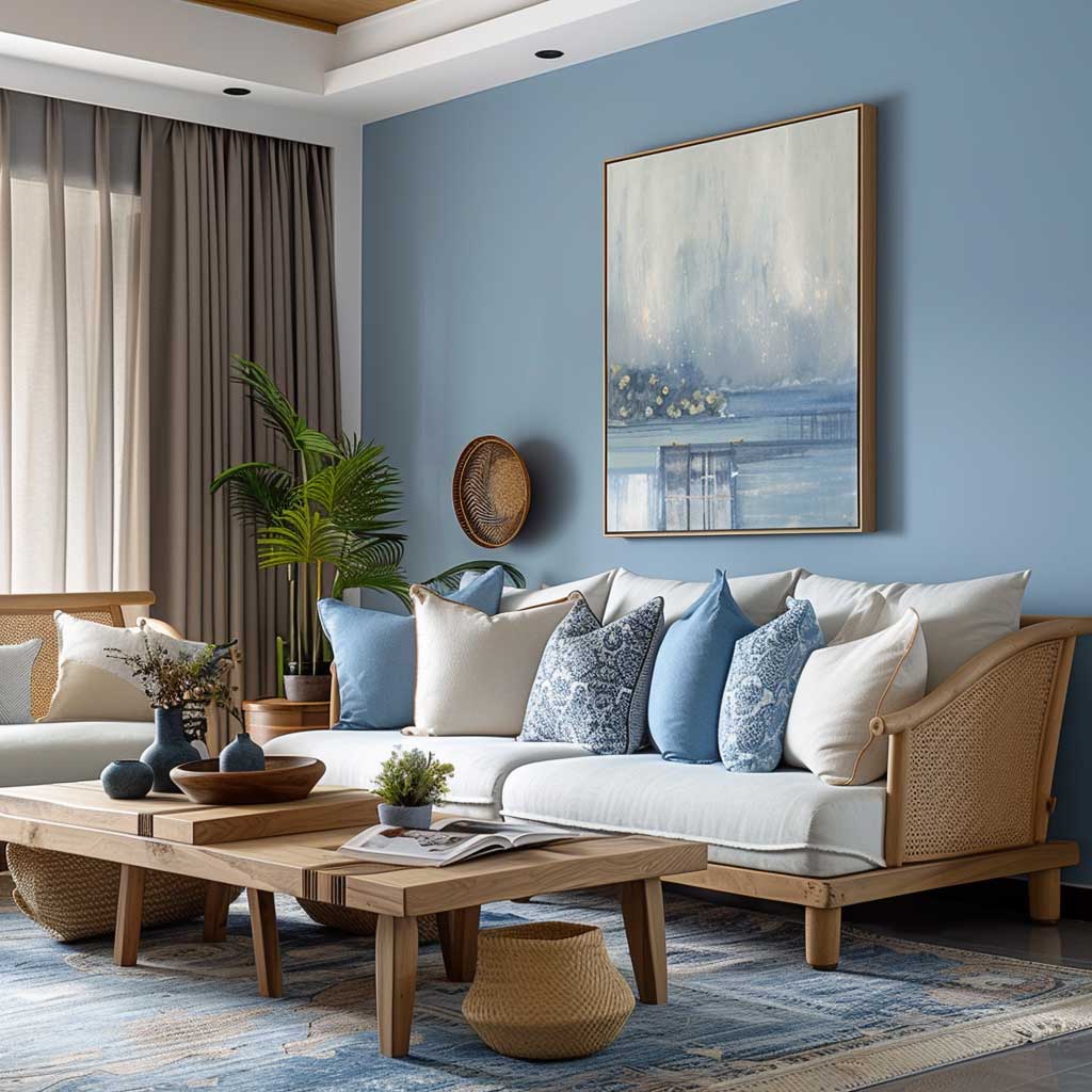
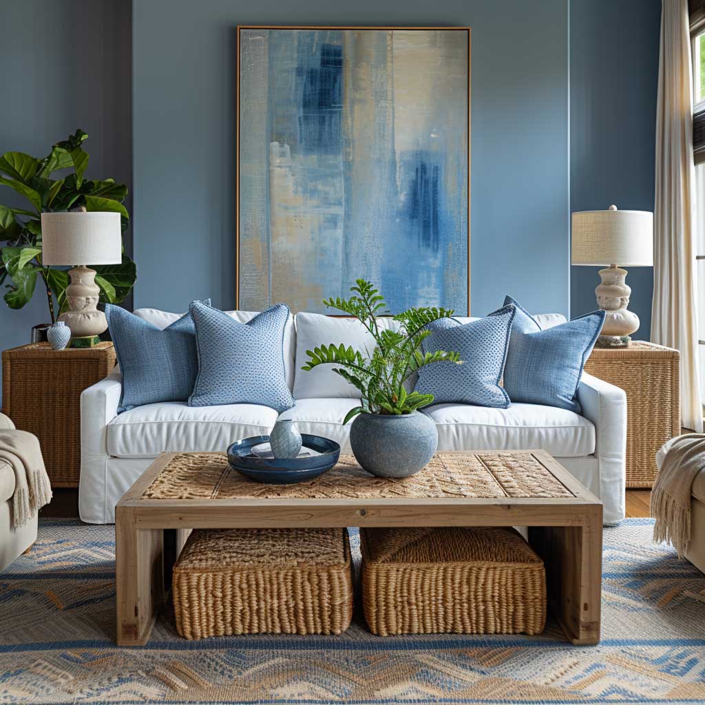
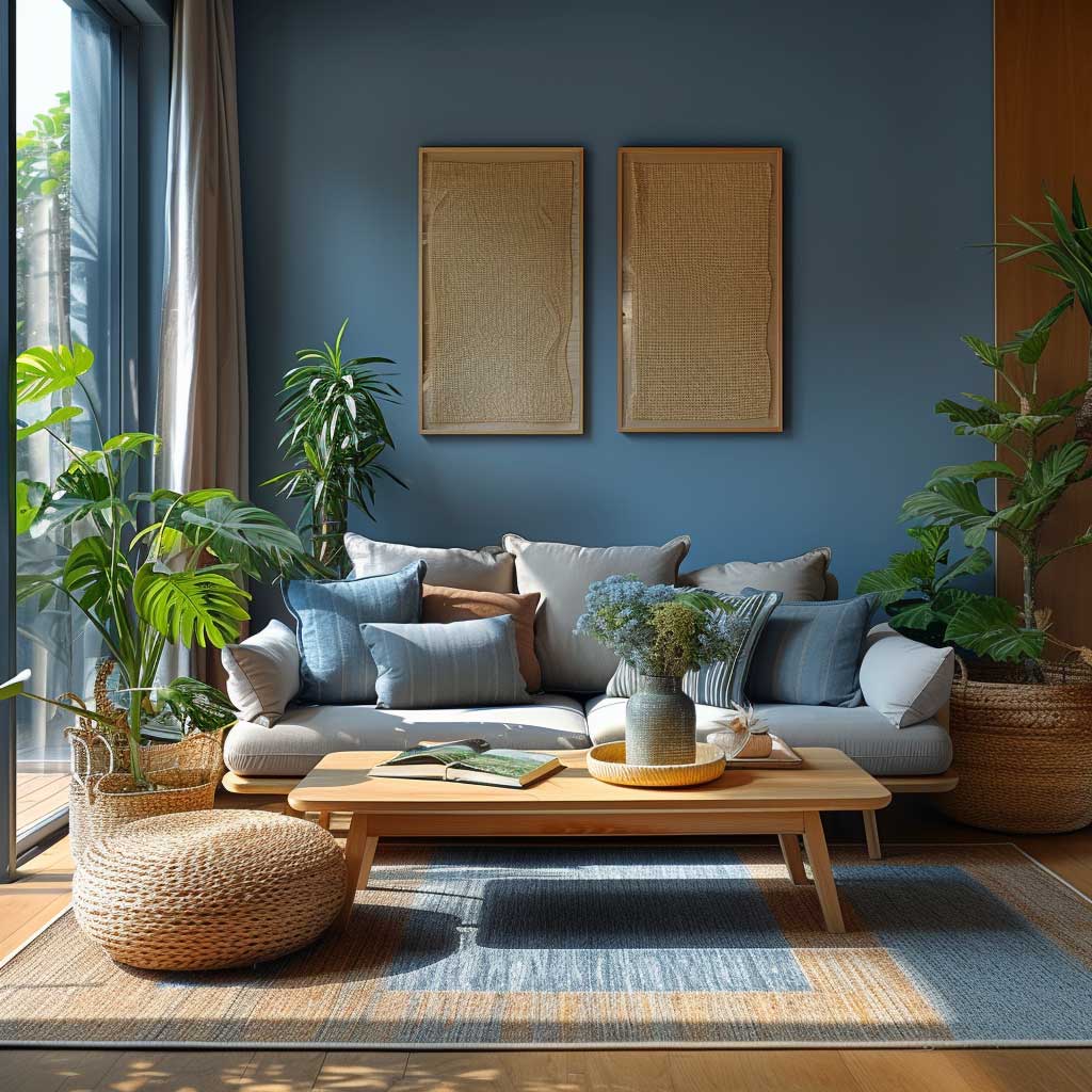
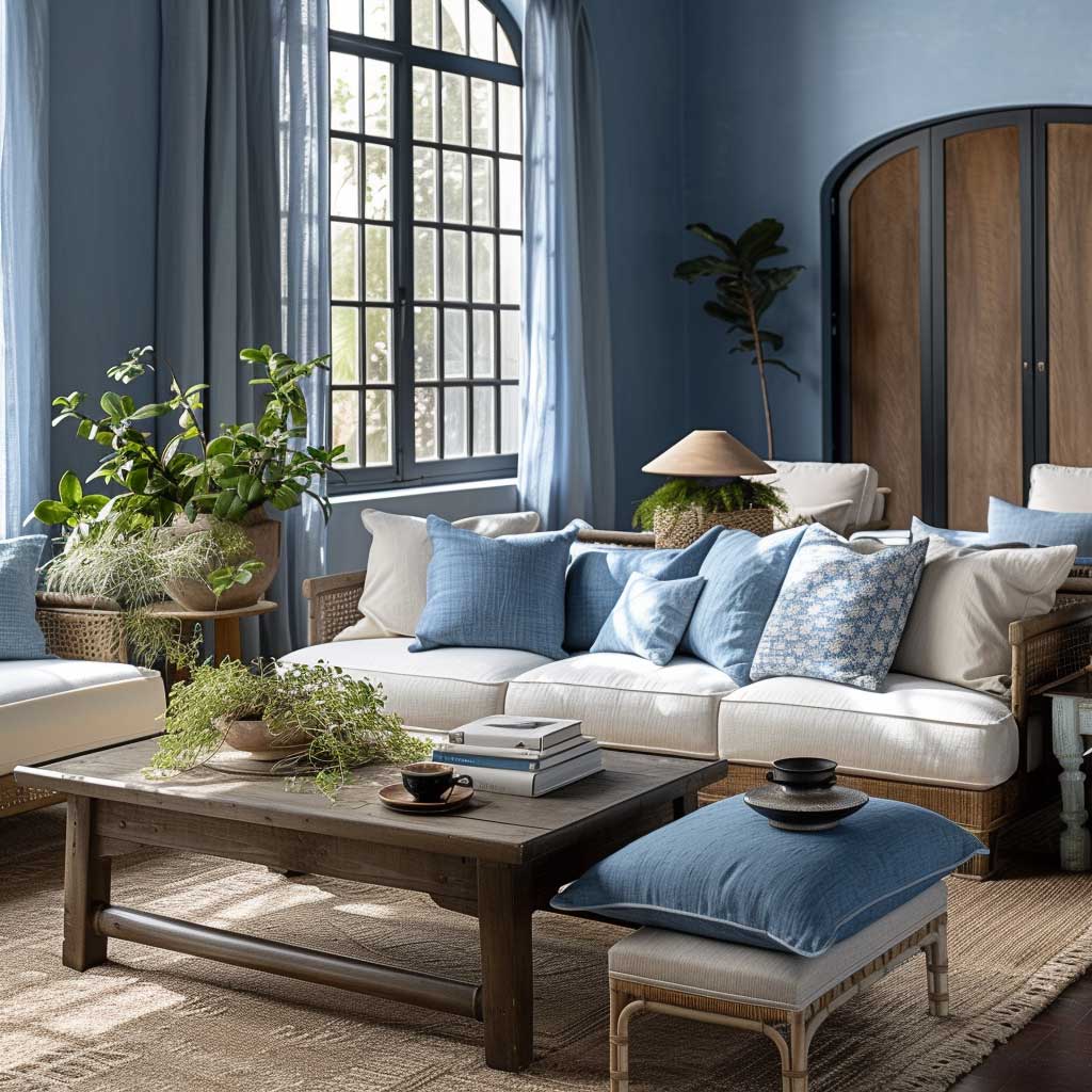
The interweaving of soothing blues and earthy browns within the confines of a living room invites an atmosphere that is at once calming and grounded, embodying a retreat where relaxation and connection take precedence. This interior decoration colour combination draws inspiration from the natural world, marrying the tranquility of the sky and water with the stability and warmth of the earth. The result is a living space that fosters comfort, harmony, and a sense of belonging.
Soothing blues, when applied to the living room walls or featured in key furnishings, evoke a sense of calm and serenity reminiscent of the ocean or the vastness of the sky. This colour’s inherent coolness has the power to lower blood pressure and slow down the heartbeat, fostering a tranquil environment conducive to relaxation and thoughtful conversation. Blue’s versatility allows it to be paired with a wide range of hues, but when combined with earthy browns, it creates a palette that is both sophisticated and nurturing.
Earthy browns bring a sense of stability and warmth to the living room, grounding the ethereal quality of blue with their robustness. Whether in the form of wooden furniture, textured rugs, or leather accents, browns embody the solidity of the ground beneath our feet, offering comfort and support. This colour promotes a feeling of security and resilience, making the living room a safe haven where one can unwind and recharge.
The art of blending soothing blues with earthy browns lies in balancing the cool and warm tones to achieve a harmonious space that welcomes inhabitants and guests alike. The juxtaposition of soft, plush textures in blue with the natural, rugged textures of wooden or leather elements in brown enhances the sensory experience of the living room, making it a tactile as well as a visual haven.
Incorporating this colour combination into a living room design not only appeals to the aesthetic sensibilities but also caters to the emotional and psychological well-being of its occupants. The choice of calming blues helps to foster an atmosphere of peace and serenity, ideal for de-stressing after a long day, while the warm browns offer a comforting embrace, encouraging relaxation and a sense of grounding.
The versatility of this colour scheme allows for various interpretations, from coastal chic to rustic elegance, depending on the shades and textures chosen. It can adapt to seasonal changes through the introduction of different accents and accessories, ensuring the living room remains a dynamic yet comforting space throughout the year.
Moreover, the combination of soothing blues and earthy browns in a living room supports various design elements, from minimalist and contemporary to traditional and eclectic. This versatility ensures that the living space can evolve with the inhabitants’ tastes and needs without losing its core essence of tranquility and warmth.
Creating a living room that embodies the harmony and balance of soothing blues and earthy browns is a testament to the power of interior decoration colour combinations in transforming a house into a home. It showcases the ability of colours to influence mood, create atmosphere, and dictate the functionality of a space, proving that thoughtful design can indeed enhance the quality of life for those who dwell within it.
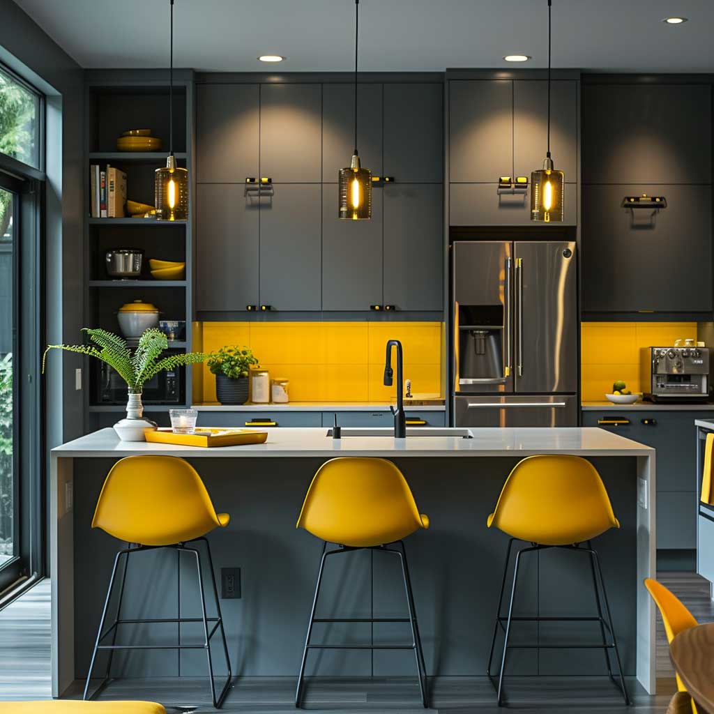
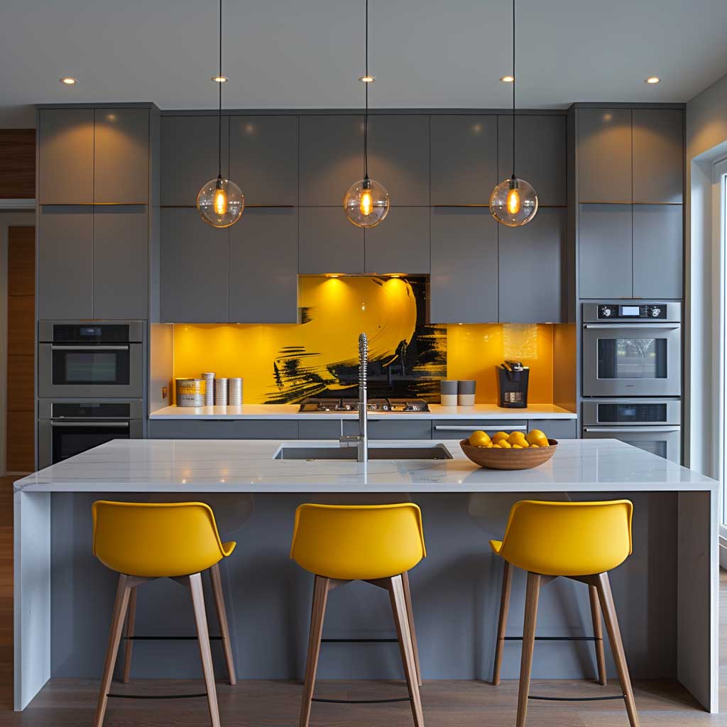
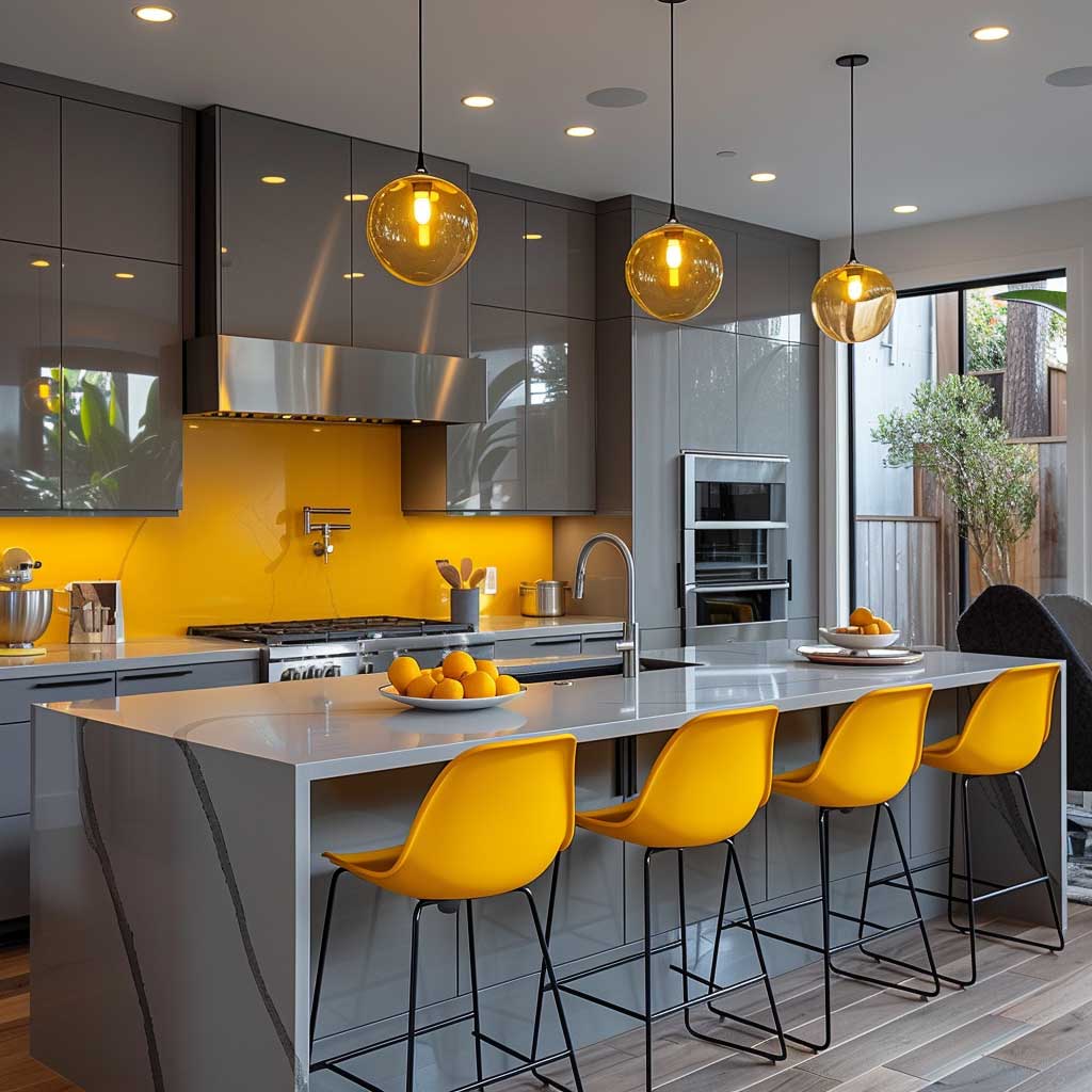
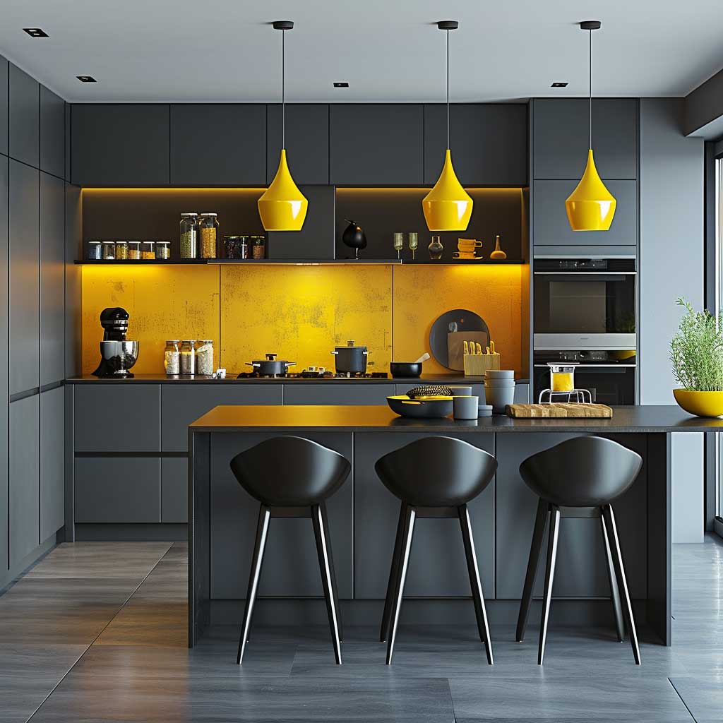
Elegant Greys and Pops of Mustard in a Modern Kitchen
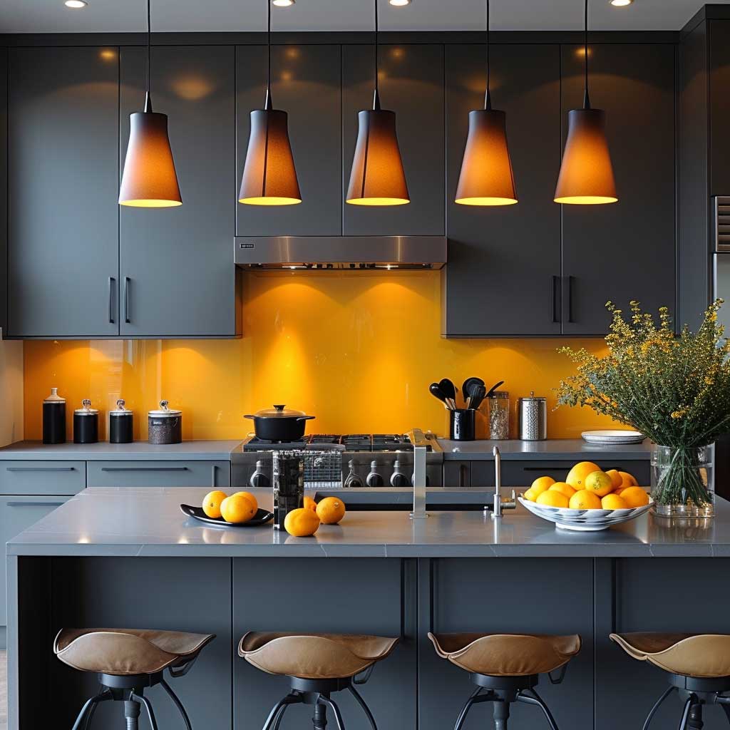
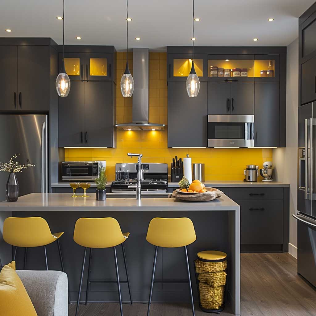
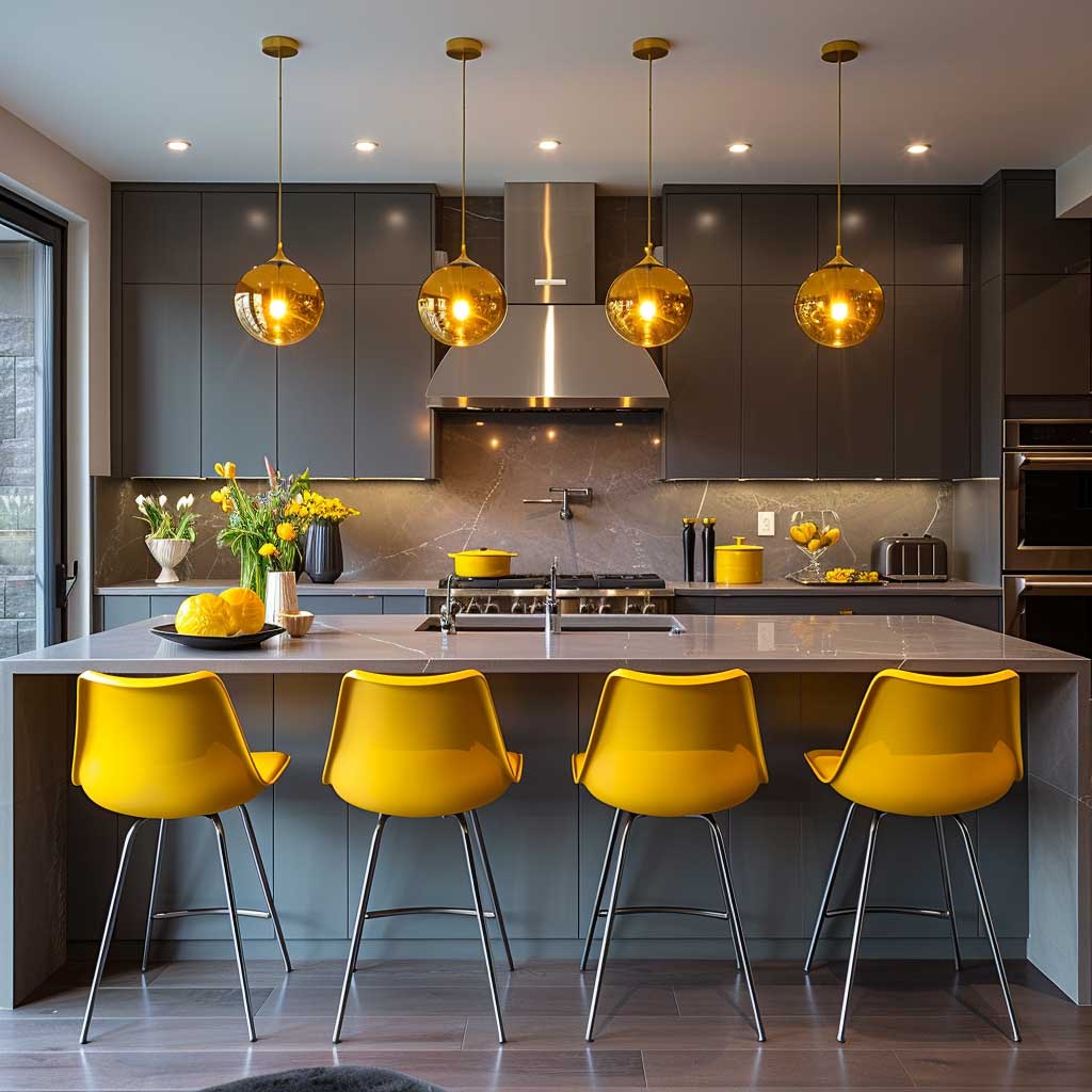
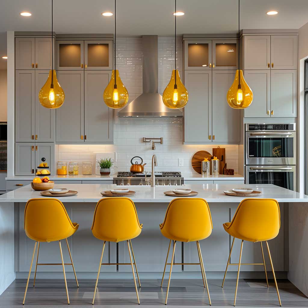
The juxtaposition of elegant greys and vibrant pops of mustard in a modern kitchen embodies the fusion of sophistication with a burst of energy, offering a space that is not only functional but also a joy to inhabit. This interior decoration colour combination leverages the strength and neutrality of grey as a foundation, allowing the vivacity of mustard yellow to shine through as a beacon of warmth and creativity. It’s a testament to how colour can dramatically influence the mood and utility of one of the most central spaces in any home.
Grey, in its myriad shades, brings to the kitchen a sense of balance and understated elegance. It serves as a versatile backdrop that can adapt to both minimalist and elaborate design aesthetics. Whether it’s the sleek charcoal of cabinetry or the soft dove on the walls, grey provides a calming, cohesive look that enhances the sense of spaciousness and order. It’s a colour that resonates with the modern penchant for clean lines and uncluttered spaces, promoting a sense of tranquillity amidst the daily routines of cooking and dining.
Mustard yellow, when introduced into this monochromatic scheme, acts as a striking contrast that infuses life and character into the kitchen. This choice of accent, whether in the form of bar stools, decorative accessories, or even a feature wall, injects a dose of optimism and energy. Mustard, with its golden hues, evokes the warmth of sunlight, bringing a cozy, inviting atmosphere to the space. It’s a colour that stimulates appetite and conversation, making the kitchen not just a place for meal preparation but a central hub for gathering and socializing.
Incorporating this colour combination into a kitchen design involves thoughtful consideration of balance and proportion. The aim is to achieve a harmonious blend where neither colour overpowers the other. Grey, as the base, ensures that the space remains grounded and sophisticated, while strategic splashes of mustard serve as focal points that draw the eye and evoke warmth. This can be achieved through the choice of textiles, such as rugs and towels, lighting fixtures, and even small appliances, which can all serve as mediums for introducing mustard into the kitchen.
The beauty of the elegant greys and pops of mustard lies in their ability to create a dynamic space that is both contemporary and welcoming. This colour combination allows for flexibility in adapting to seasonal changes or evolving design trends by simply swapping out accent pieces or updating decorative elements. It’s a palette that supports the functional aspects of a kitchen while also catering to the aesthetic and emotional needs of those who use it.
Furthermore, the psychological impact of this colour scheme cannot be understated. Grey, often associated with stability and serenity, provides a calm backdrop that can help reduce stress and anxiety, particularly important in the often hectic environment of a kitchen. Mustard yellow, known for its ability to evoke happiness and stimulate mental activity, can inspire culinary creativity and foster a positive atmosphere for family interactions.
The integration of elegant greys with pops of mustard in a modern kitchen is a shining example of how interior decoration colour combinations can transform a utilitarian space into a personal statement. It reflects a balance between functionality and style, offering a space that delights the senses and supports the well-being of its inhabitants. This approach to kitchen design highlights the power of colour in creating environments that are not only beautiful to look at but also enhance the quality of daily life.
Whimsical Pastels in a Playful Child’s Bedroom
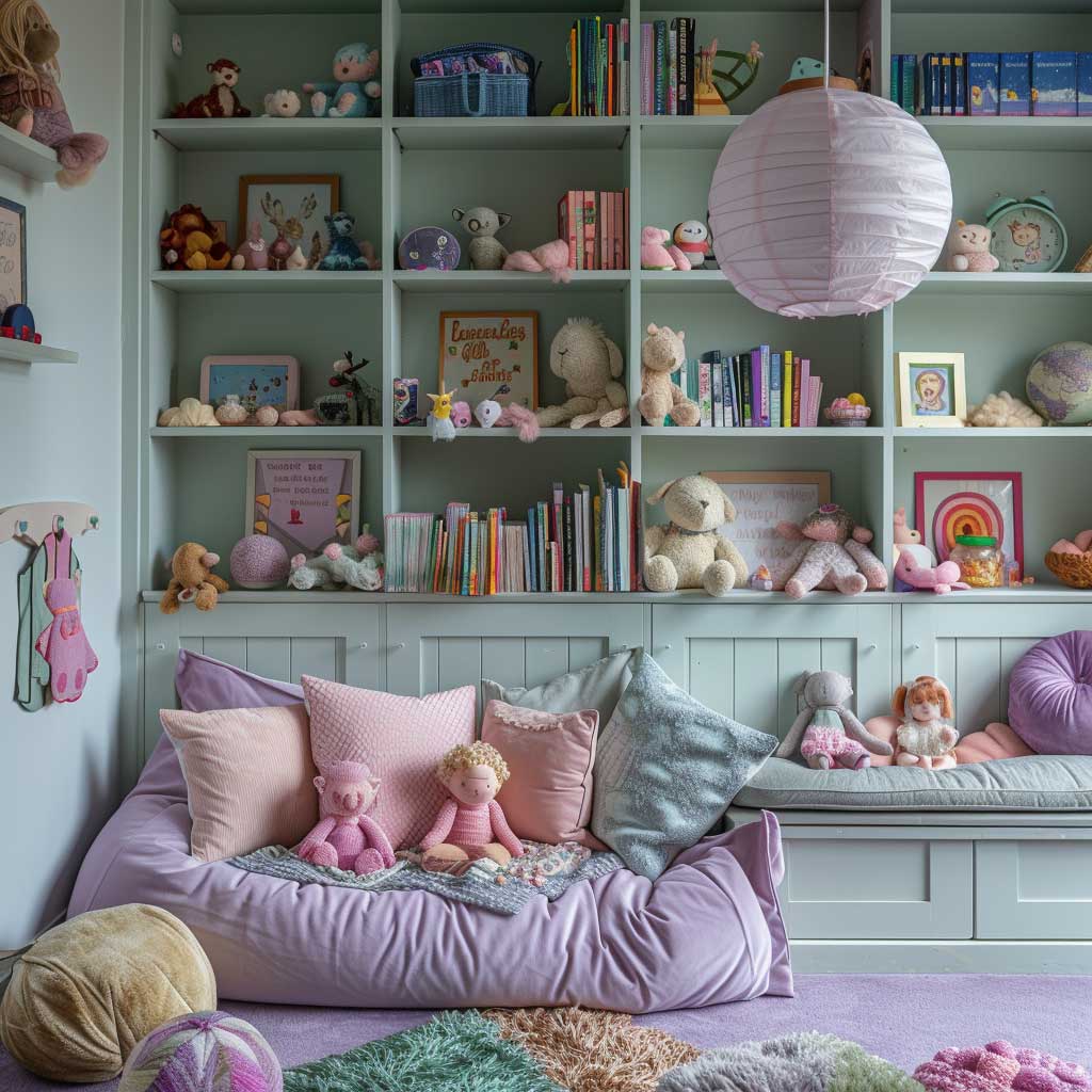
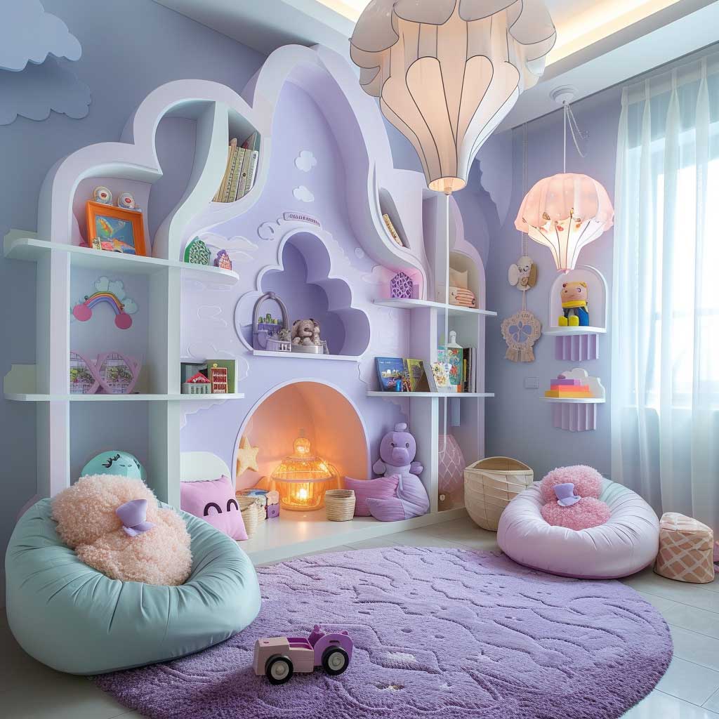
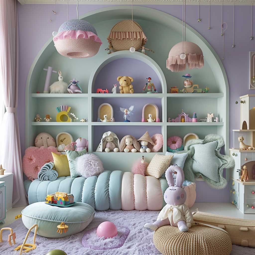
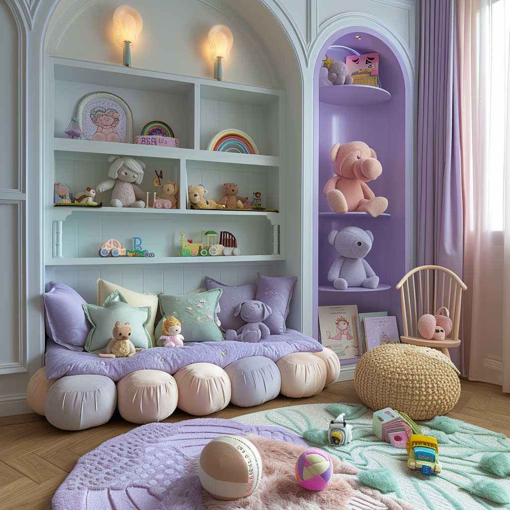
Venturing into the whimsical world of pastels within a child’s bedroom unveils a canvas where imagination and playfulness converge, manifesting a space that not only caters to rest but also to the stimulation of creativity and joy. The strategic use of interior decoration colour combination, especially the integration of soft lavenders, mint greens, and pale pinks, crafts an environment that transcends the traditional boundaries of a sleeping area, inviting the magic of dreams even during waking hours.
The choice of pastels is deliberate, aiming to infuse the room with a sense of lightness and serenity. Lavender, with its gentle nod to creativity and calm, offers a backdrop that encourages peaceful slumber and imaginative daydreams. It’s a hue that resonates with the softness of twilight skies, a constant reminder of the transition from the hustle and bustle of the day to the quiet of the night.
Mint green adds a refreshing touch to the palette, echoing the newness of spring and the rejuvenating quality of nature. This colour, when applied to furniture or textiles, brings a burst of freshness that stimulates the senses while maintaining a soothing ambiance. It’s a balance of stimulation and calm, perfect for a space that’s meant to support both active play and restful sleep.
Pale pink complements the ensemble, introducing a warmth and tenderness that envelops the room in a soft embrace. This colour, often associated with affection and nurturing, creates an atmosphere of comfort and security, essential qualities in a child’s sanctuary. It’s the subtle brushstroke that completes the picture, tying the other colours together in a harmonious blend that speaks of gentle joy and quiet comfort.
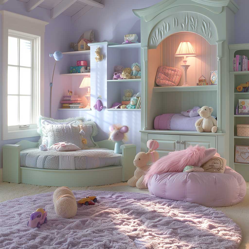
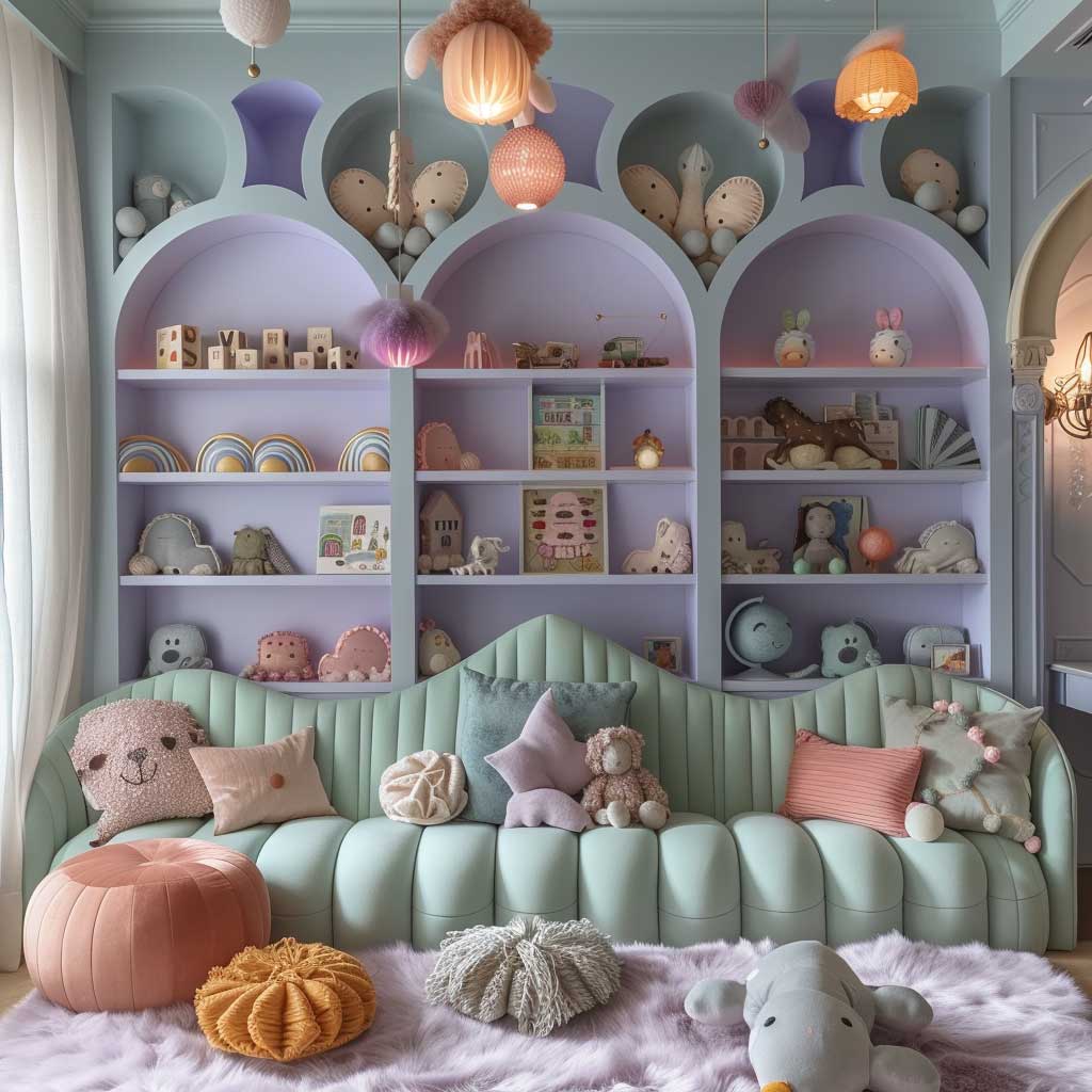
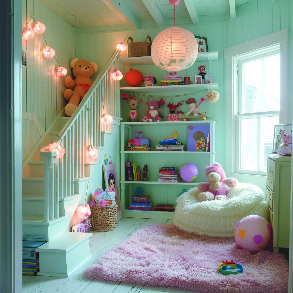
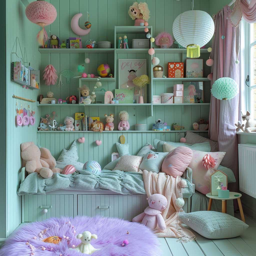
Integrating these pastel hues into a child’s bedroom requires a playful approach to decoration. The walls, serving as the canvas, can be adorned with imaginative motifs or patterns that reflect the room’s overall theme, whether it be a fairy tale, a space adventure, or a natural wonderland. Furniture in mint green or pale pink can act as focal points, while lavender accents in bedding, curtains, or rugs can tie the room together, creating a cohesive look that’s both inviting and inspiring.
The beauty of this colour combination lies not only in its visual appeal but also in its ability to adapt to the changing tastes and needs of a growing child. Pastels offer the flexibility to incorporate evolving interests, from dinosaurs to ballet, through accessories and artwork, without the need for a complete overhaul of the base colour scheme. This makes the pastel palette a wise choice for parents looking to create a space that grows with their child.
Moreover, the choice of soft, soothing pastels in a child’s bedroom can have a positive impact on mood and emotional well-being. These colours are known for their calming effects, reducing stress and anxiety, which is particularly beneficial in creating an environment conducive to restful sleep and peaceful play.
The whimsical pastels in a child’s bedroom showcase how a thoughtful interior decoration colour combination can transform a space into a nurturing haven that supports a child’s development. It’s a testament to the power of colour in creating environments that cater not just to the physical needs of rest and play but also to the emotional and psychological well-being of the room’s inhabitant. This approach to interior decoration not only beautifies the space but also enriches the lives of those who dwell within it, making every moment spent in the room a cherished memory in the making.
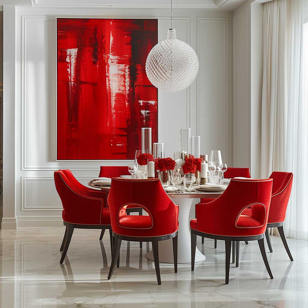
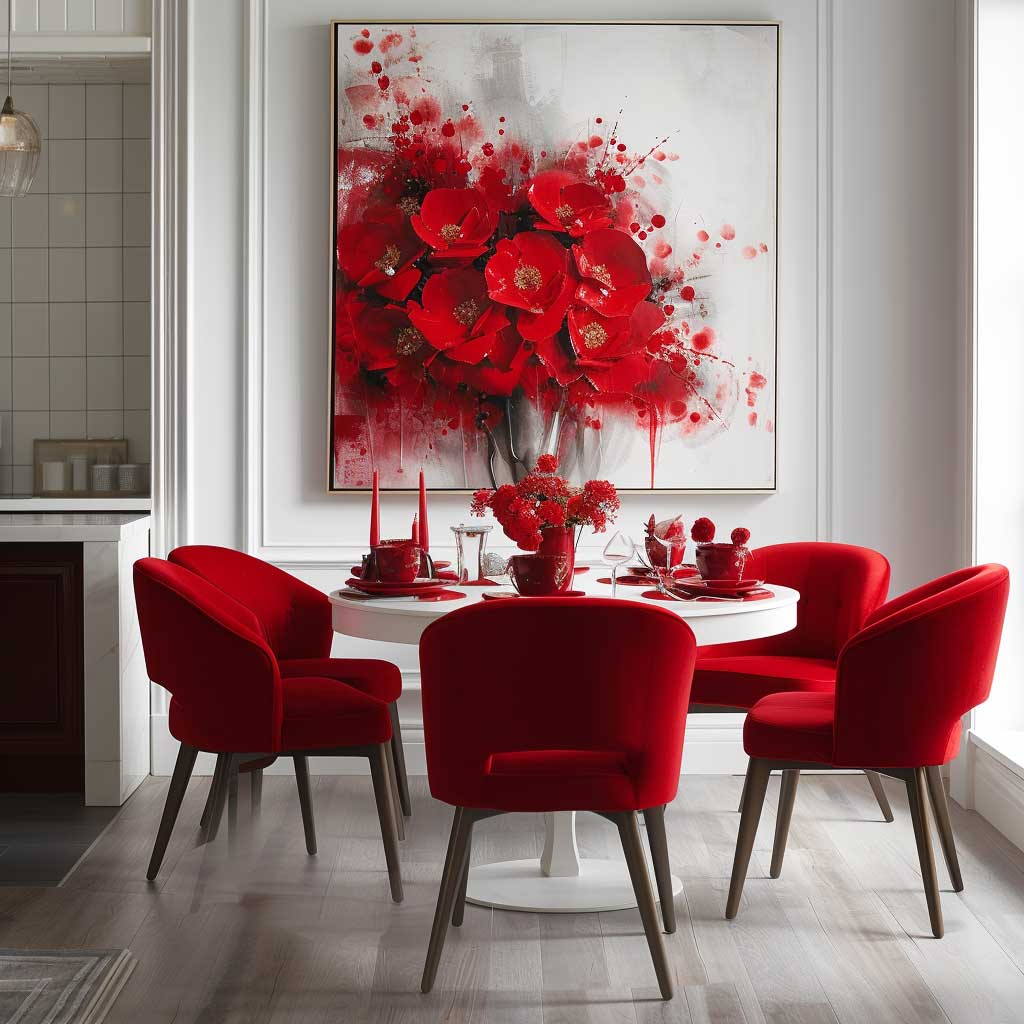
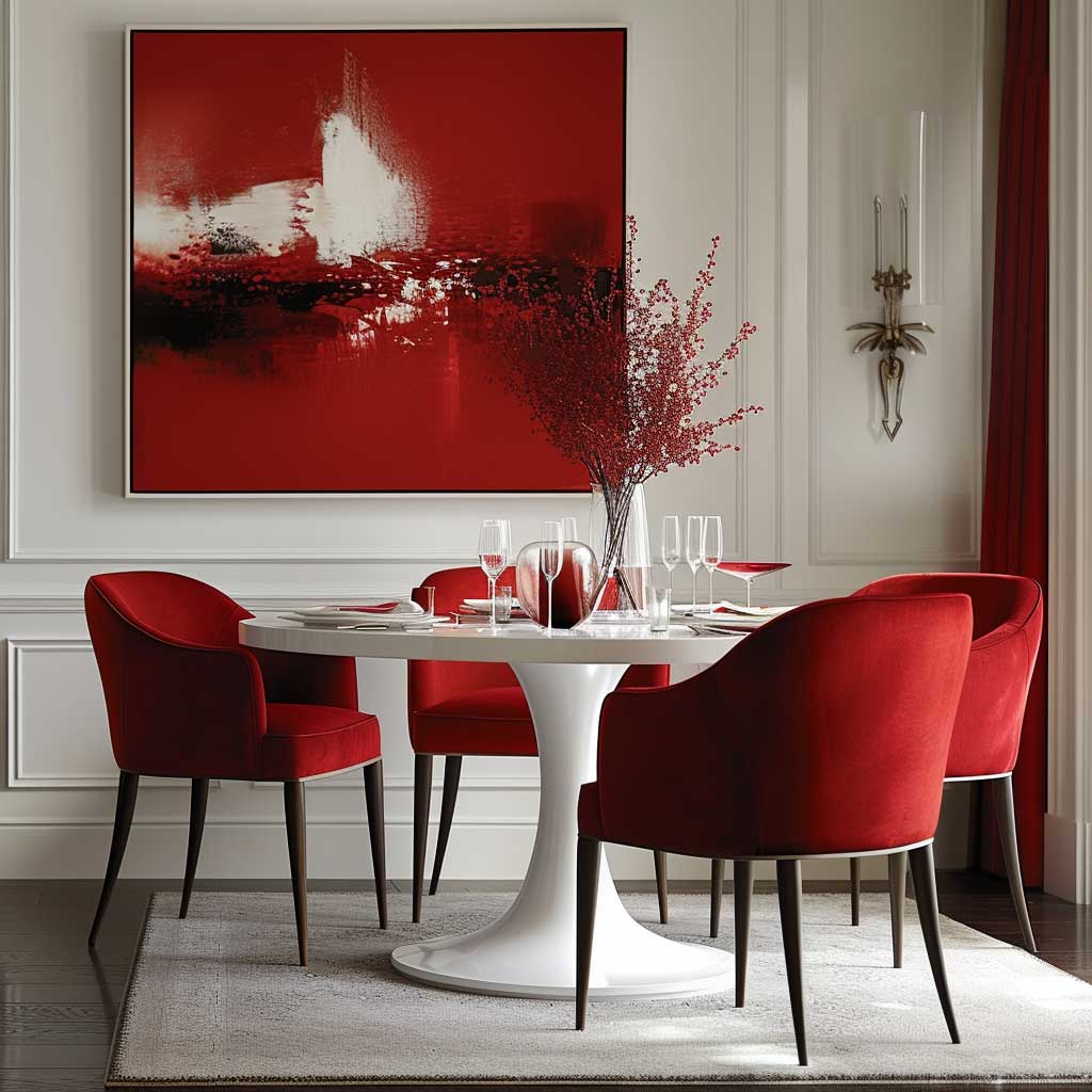
Bold Reds and Tranquil Whites in a Dynamic Dining Area
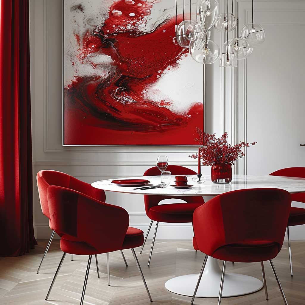
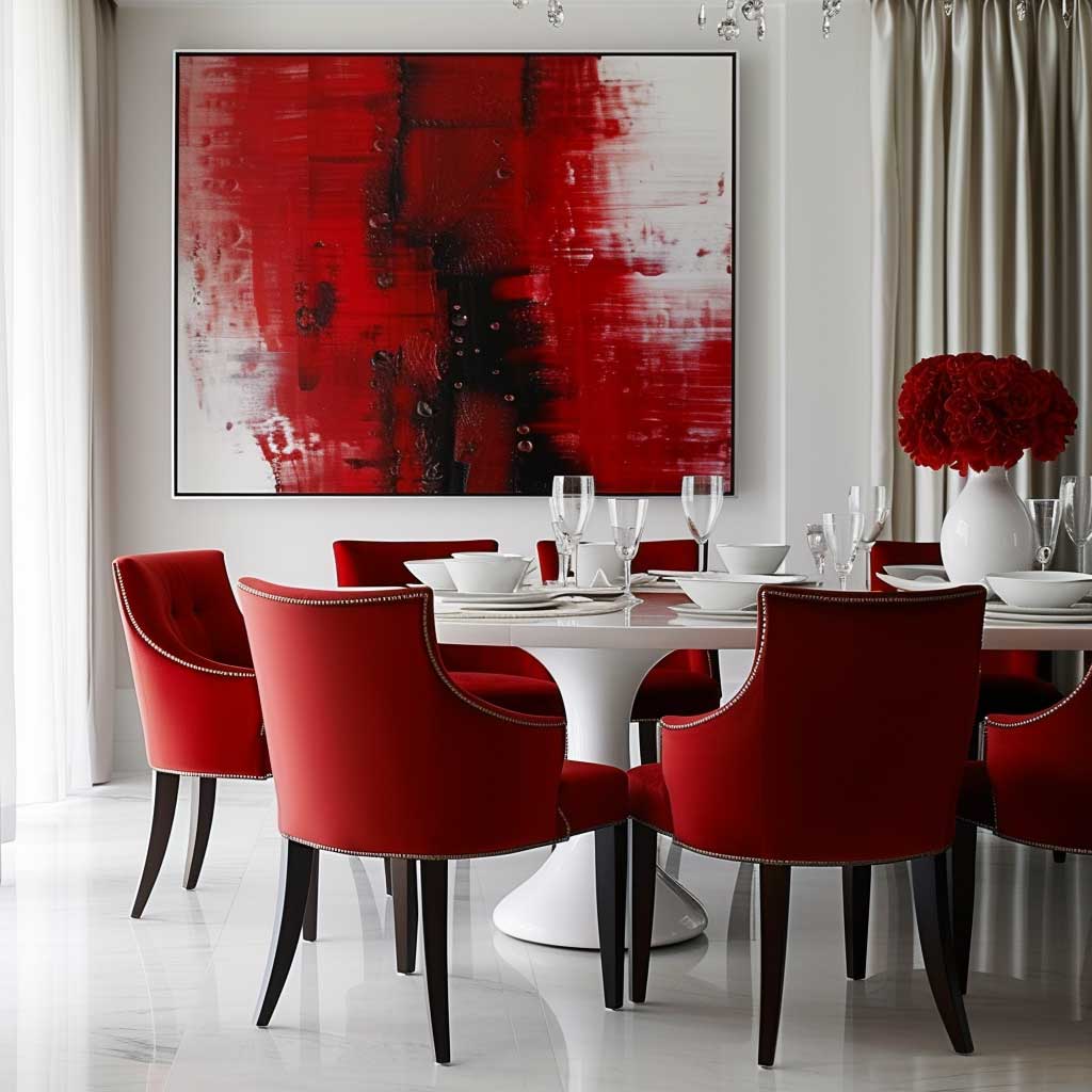
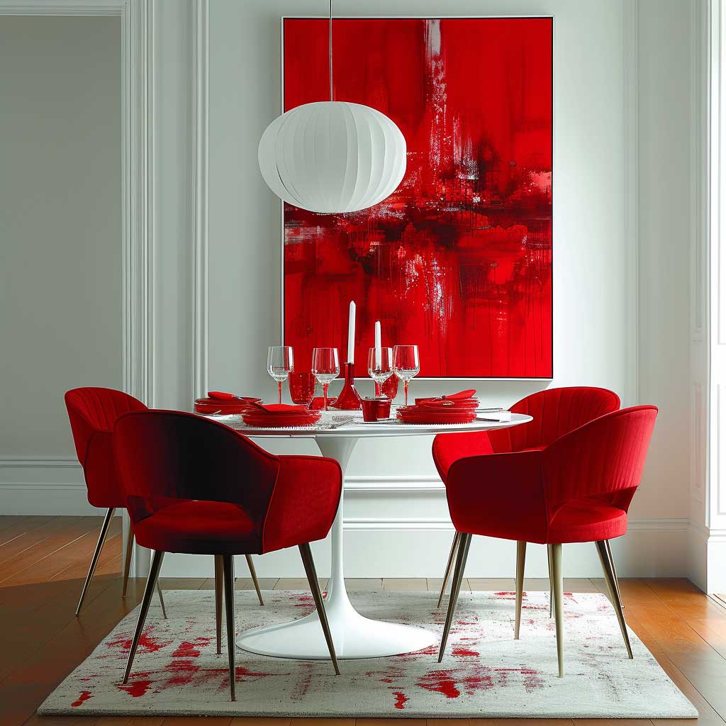
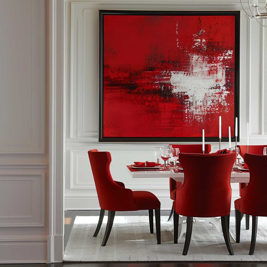
The bold interplay of reds and tranquil whites within a dining area sets the stage for a space that is both dynamic and harmonious, embodying a unique blend of energy and purity. This interior decoration colour combination taps into the deep psychological influences of colour, leveraging the passion and appetite-stimulating properties of red against the backdrop of white’s simplicity and serenity. The outcome is a dining environment that not only captivates visually but also enhances the dining experience, making meals more engaging and memorable.
Bold reds, when introduced into the dining area, serve as a powerful stimulant, invoking feelings of warmth, excitement, and appetite enhancement. This vibrant hue, known for its ability to raise energy levels and stimulate conversation, is perfect for a space dedicated to communal dining and lively discussions. Whether it’s through upholstered dining chairs, a statement wall, or decorative accents, red infuses the dining room with a zest that can transform even the most mundane meals into occasions.
In contrast, tranquil whites provide a clean, serene canvas that amplifies the intensity of red while bringing balance and light to the space. White walls or table settings offer a sense of purity and openness, making the dining area feel more spacious and inviting. The colour white is associated with cleanliness and simplicity, qualities that complement the dining experience by focusing attention on the food and the company.
The dynamic between bold reds and tranquil whites in a dining area is not just about creating visual impact; it’s about curating an atmosphere that enhances the social and sensory aspects of dining. The strategic use of red can energize the space and stimulate the senses, making flavors seem more robust and conversations more spirited. Meanwhile, the presence of white calms and soothes, ensuring that the vibrancy of red does not overwhelm but rather invites a balanced interaction.
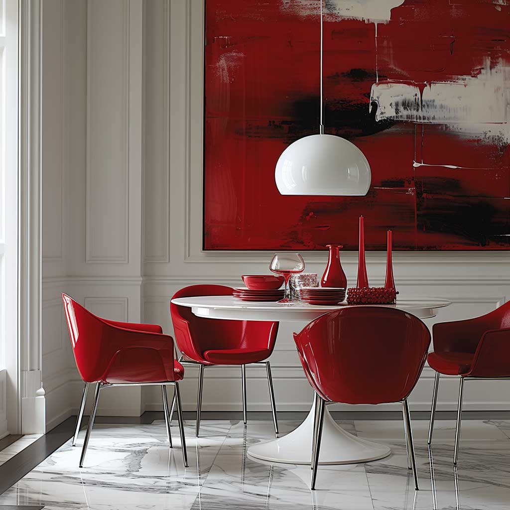
Incorporating this colour combination into the dining area requires a thoughtful approach to ensure that the boldness of red is neither overpowering nor intimidating. It involves playing with textures, lighting, and material finishes to create a space that feels cohesive and intentionally designed. For example, a glossy red pendant light over a white dining table can become a focal point, drawing the eye and warming the room without dominating it.
The beauty of this colour scheme lies in its versatility and adaptability. It can be tailored to fit various design aesthetics, from modern minimalist to traditional elegance, depending on the shades of red and white chosen and the design elements introduced. This adaptability makes it possible to refresh the look over time, simply by updating accessories or introducing new textures and patterns.
Moreover, the psychological effects of this colour combination on the dining experience are profound. The boldness of red encourages a lively atmosphere conducive to sharing and enjoyment, while the tranquility of white ensures that the space remains relaxed and welcoming. This balance is key to creating a dining area that not only looks beautiful but also feels comfortable and inviting.
In conclusion, the integration of bold reds and tranquil whites in a dining area exemplifies how interior decoration colour combinations can profoundly influence the ambiance of a space. This dynamic duo offers a compelling blend of energy and calm, creating a dining environment that is both stimulating and soothing. It’s a testament to the power of colour in shaping our environments and enhancing our daily experiences, inviting us to see the dining area not just as a place to eat but as a vibrant stage for life’s little celebrations.
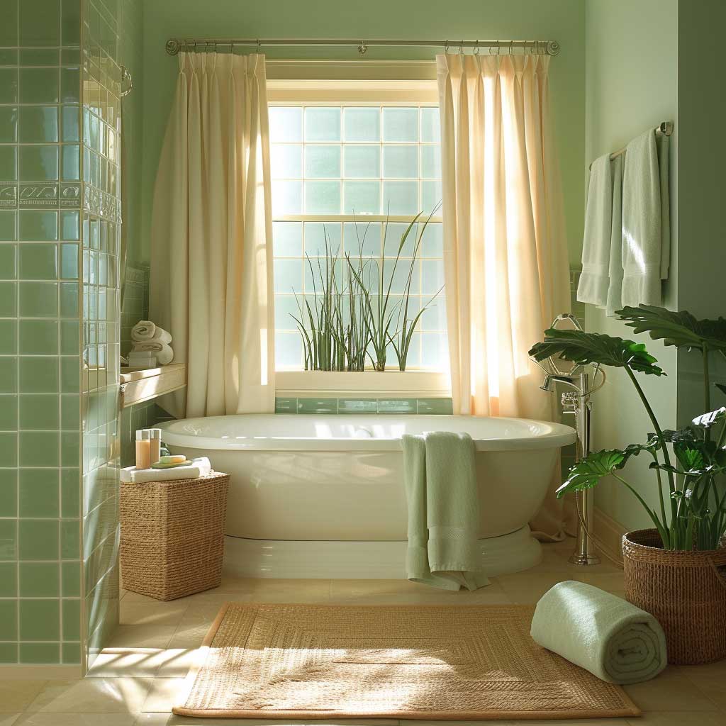
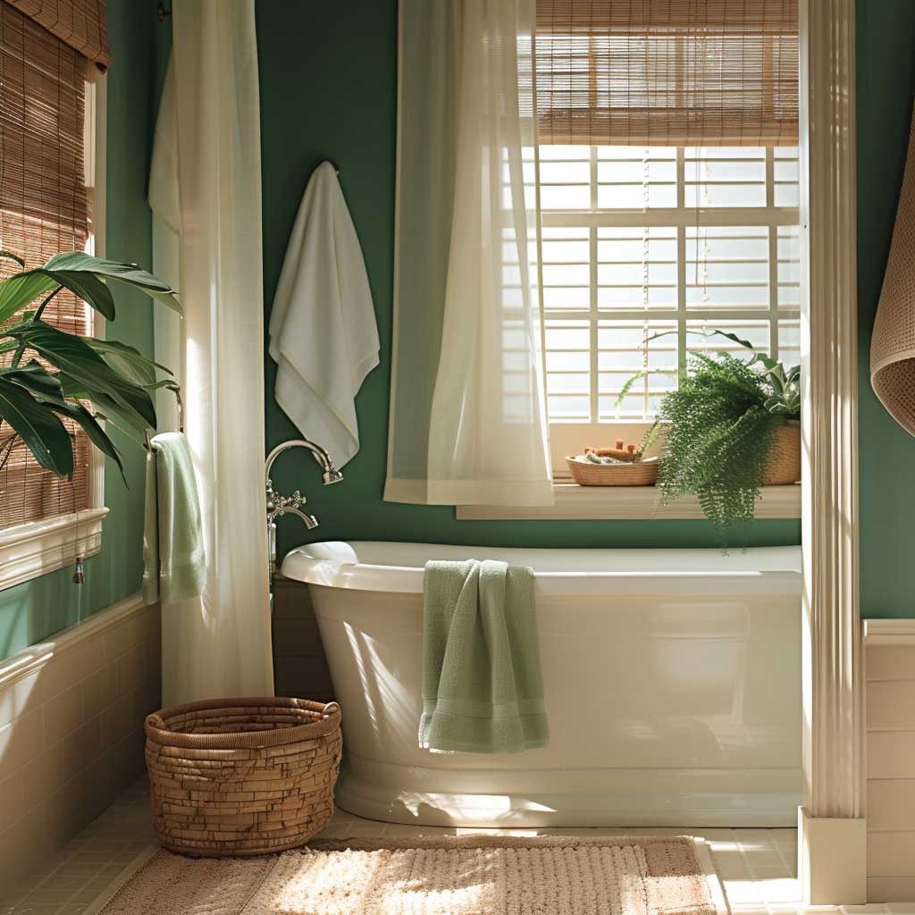
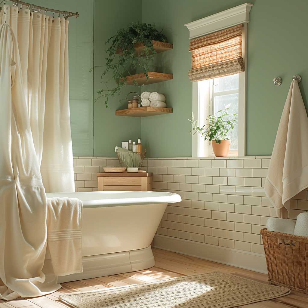
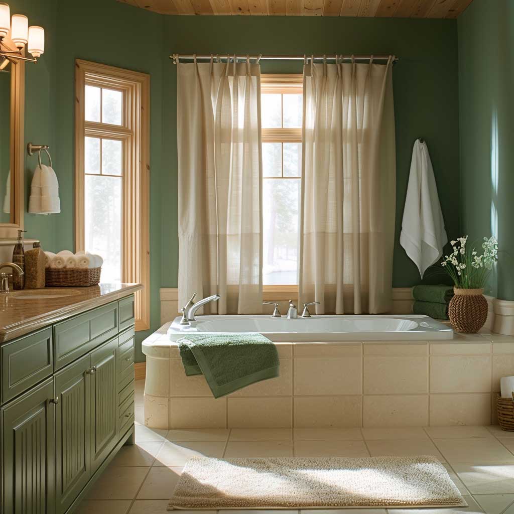
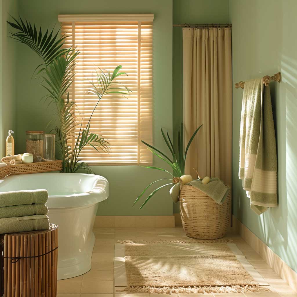
Serene Greens and Soft Beiges in a Relaxing Bathroom Oasis
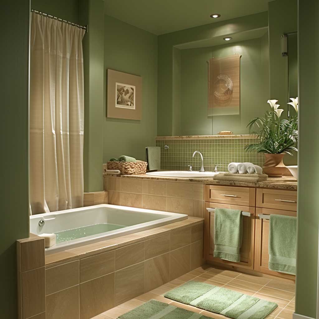
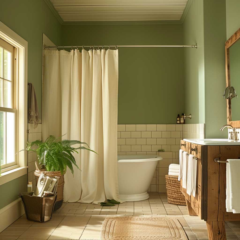
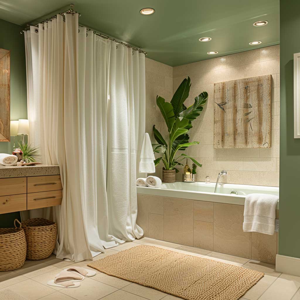
mbarking on the serene greens and soft beiges in a bathroom designed as a relaxing oasis, we uncover how these hues contribute to creating a space that transcends ordinary functionality, transforming a mere bathroom into a sanctuary of calm and rejuvenation. The selection of this interior decoration colour combination is a testament to the understanding that colour is not just a visual element but a vital component in shaping the atmosphere and emotional response of a space.
Serene greens, reminiscent of nature’s vast palette, evoke a sense of tranquility and freshness. This colour, when applied to walls or as accent features in a bathroom, mirrors the restorative qualities of a lush forest or a tranquil meadow. It’s about bringing the outside in, allowing those who enter to breathe deeply and release the stresses of the day. The psychological benefits of green are well-documented, associated with healing, relaxation, and well-being. This makes it an ideal choice for a space dedicated to personal care and relaxation.
Soft beiges complement the green, grounding the space with their earthy, neutral tones. Beige, often underestimated in its versatility, plays a crucial role in this colour combination. It offers a subtle warmth and sophistication, creating a backdrop that allows the green elements to shine while maintaining a sense of balance and lightness. The combination of green and beige in a bathroom fosters an environment that is not only visually appealing but also emotionally supportive, offering a retreat from the sensory overload of daily life.
Incorporating these colours into a bathroom involves a careful consideration of textures and materials. Matte finishes on walls, combined with natural stone or wood elements, can enhance the connection to nature that green evokes. Soft beige towels, bath mats, and window treatments add layers of texture and comfort, inviting touch and promoting relaxation. The choice of fixtures and accessories in complementary tones or with hints of metallics can add a touch of elegance without disturbing the overall serene vibe.
The true sophistication of this colour combination lies in its ability to transform a bathroom from a functional space into a personal oasis. It’s about creating a spa-like experience at home, where every detail contributes to a sense of well-being and luxury. This approach to interior decoration recognizes the bathroom as not just a place for grooming but as a valuable space for relaxation and self-care.
The serene green and soft beige colour palette also offers flexibility, allowing for variations in shade and intensity that can adapt to different light conditions and personal preferences. Whether aiming for a bright and airy feel or a more subdued and cozy atmosphere, these colours can be adjusted to achieve the desired effect. This adaptability makes the colour combination a versatile choice for bathrooms of all sizes and styles, from minimalist modern to rustic chic.
In crafting a bathroom that serves as a personal retreat, the choice of colour is crucial. The serene greens and soft beiges offer a perfect blend of tranquility and warmth, creating a space where one can unwind and rejuvenate in comfort and style. This interior decoration colour combination not only enhances the aesthetic appeal of the bathroom but also enriches the user’s emotional and psychological experience, making every moment spent in the space a restorative one.
This exploration of serene greens and soft beiges in bathroom design reveals the profound impact of interior decoration colour combinations on the creation of spaces that nurture the mind, body, and soul. It underscores the importance of thoughtful colour selection in transforming everyday spaces into sanctuaries of peace and relaxation.
Dramatic Black and Luxurious Gold in a Sophisticated Home Office
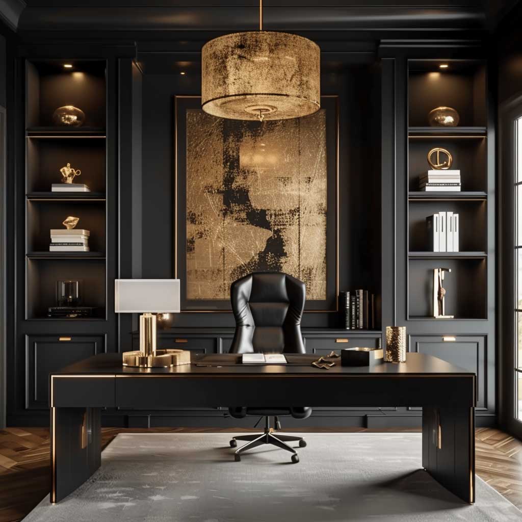
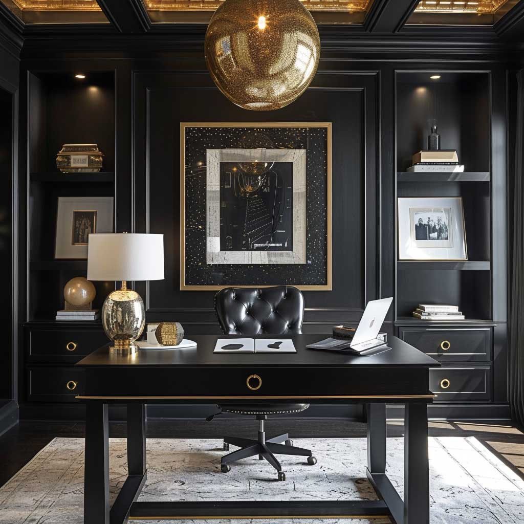
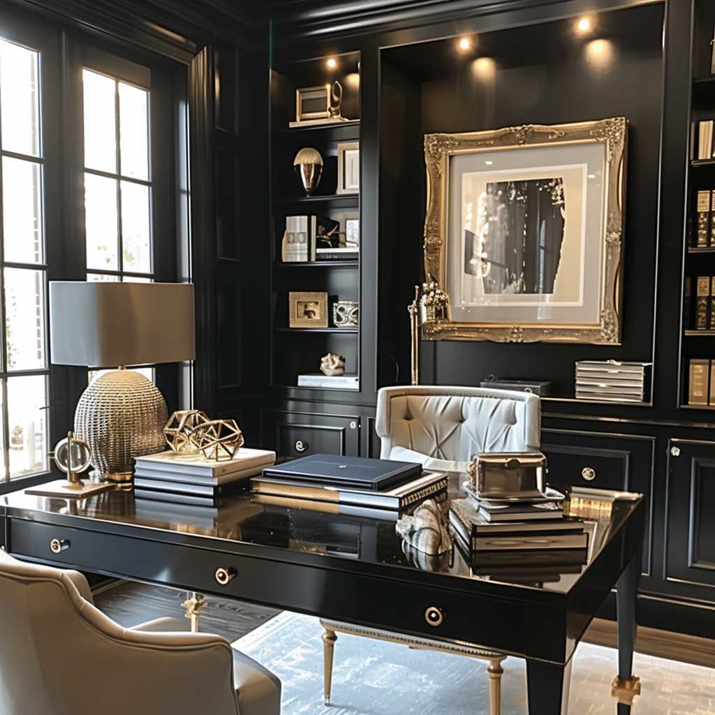
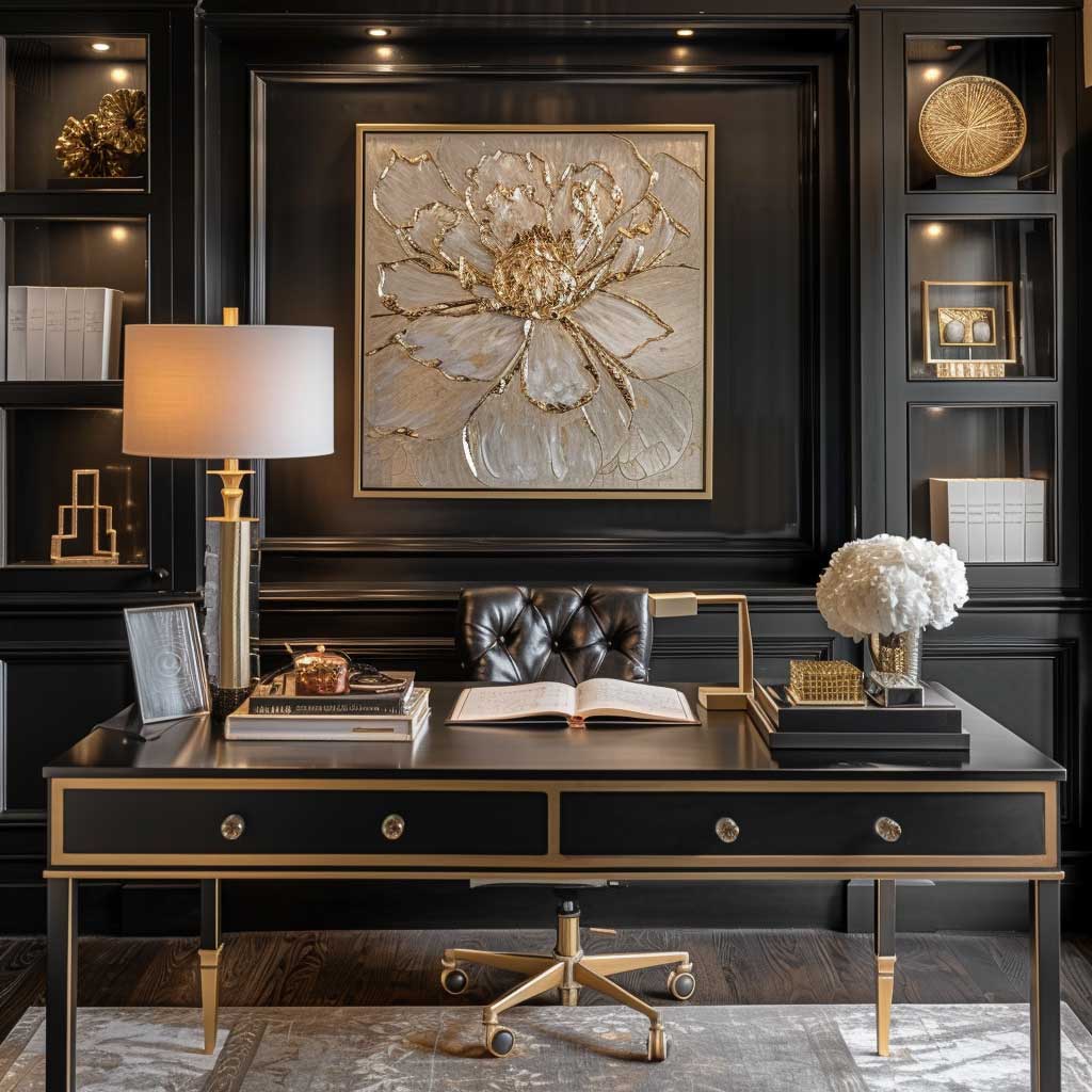
The interplay of dramatic black and luxurious gold within a home office space is not just about creating a visually striking environment; it’s a profound exploration into the psychology of color and its impact on productivity and creativity. This interior decoration colour combination transcends mere aesthetics, delving into the realm where functionality meets sophistication.
Black, often associated with elegance, power, and strength, serves as a formidable base in this scheme. It has the unique ability to anchor a room, providing a backdrop that makes gold accents not just pop but sizzle with a vivacity that can inspire and energize. The choice of black for walls or main furniture pieces in a home office can seem bold, even daring. However, it’s this boldness that carves out a space where focus is honed, and distractions are minimized. In the realm of interior decoration, black is not just a color; it’s a statement of ambition and determination.
Gold, on the other hand, brings its luxurious warmth, a perfect foil to black’s cool dominance. Gold doesn’t just accentuate; it elevates. It’s a color of success, prosperity, and achievement. When used in accessories, lighting, or decor elements, gold infuses the space with a sense of luxury and prestige. It’s a reminder of the rewards of hard work and creativity, acting as a subtle motivational boost throughout the workday. The psychological impact of gold in an interior decoration colour combination is profound. It stimulates, it encourages, and most importantly, it inspires.
The sophistication of this colour combination lies not just in its visual impact but in its ability to create a workspace that feels both personal and powerful. A black and gold office doesn’t just say something about the space; it speaks volumes about the person who works within it. It’s a declaration of ambition, a workspace designed not just for work, but for the art of achievement.
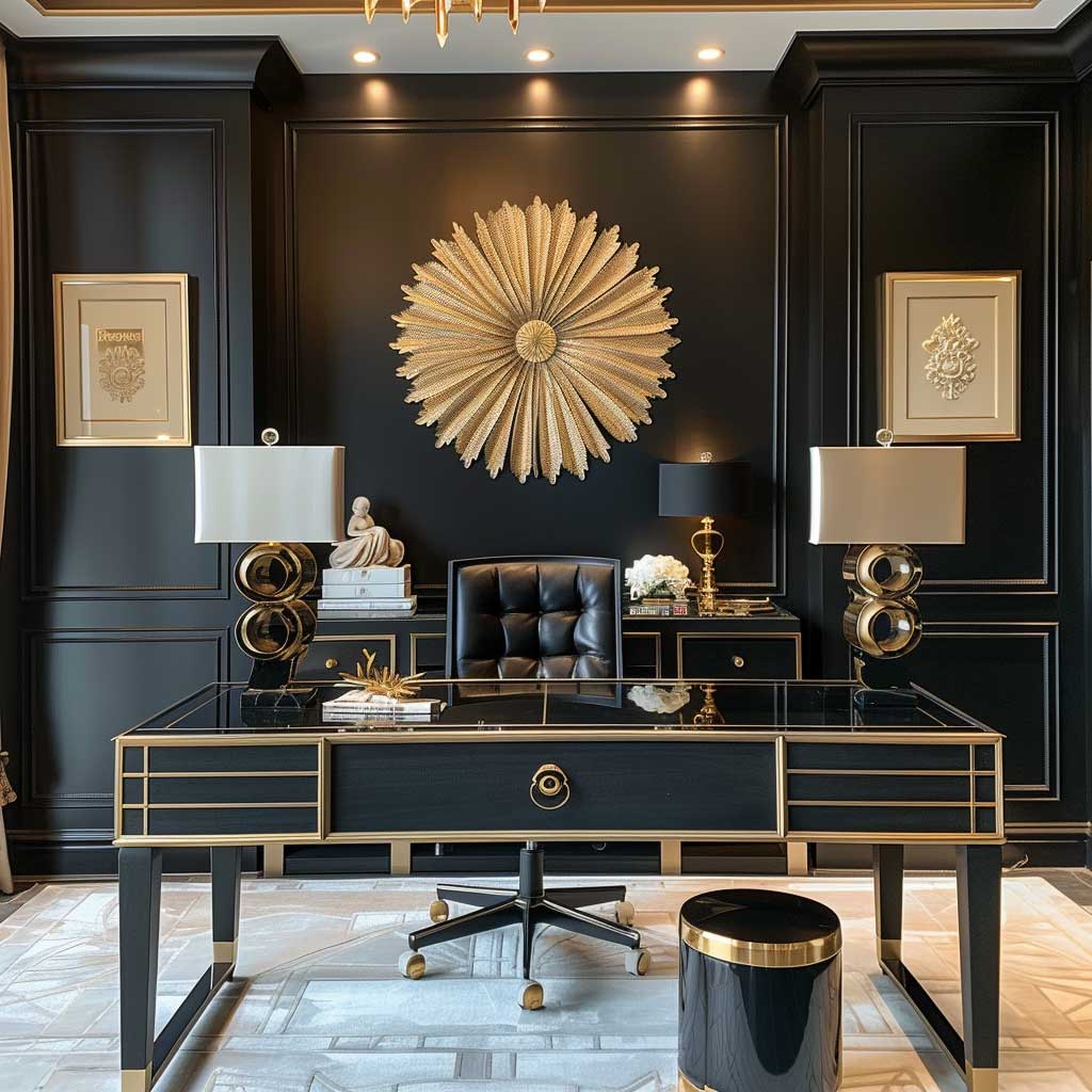
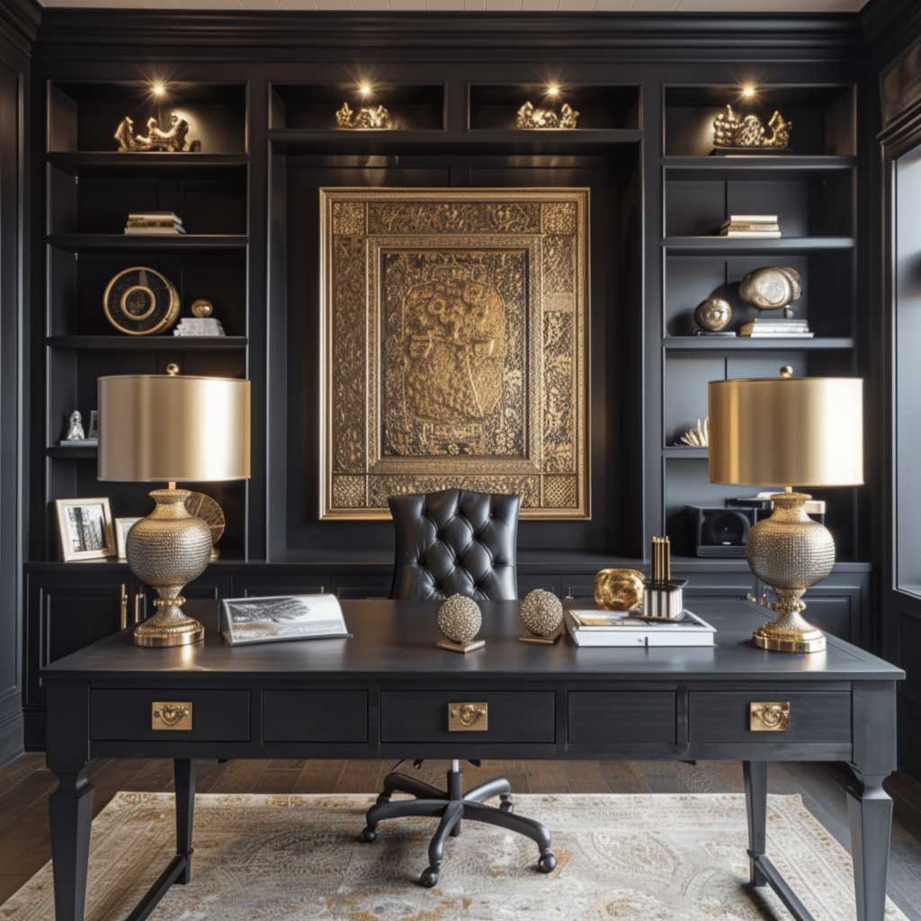
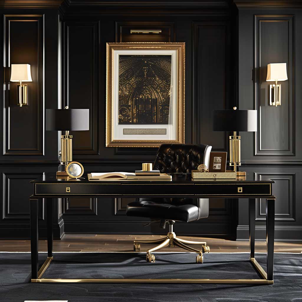
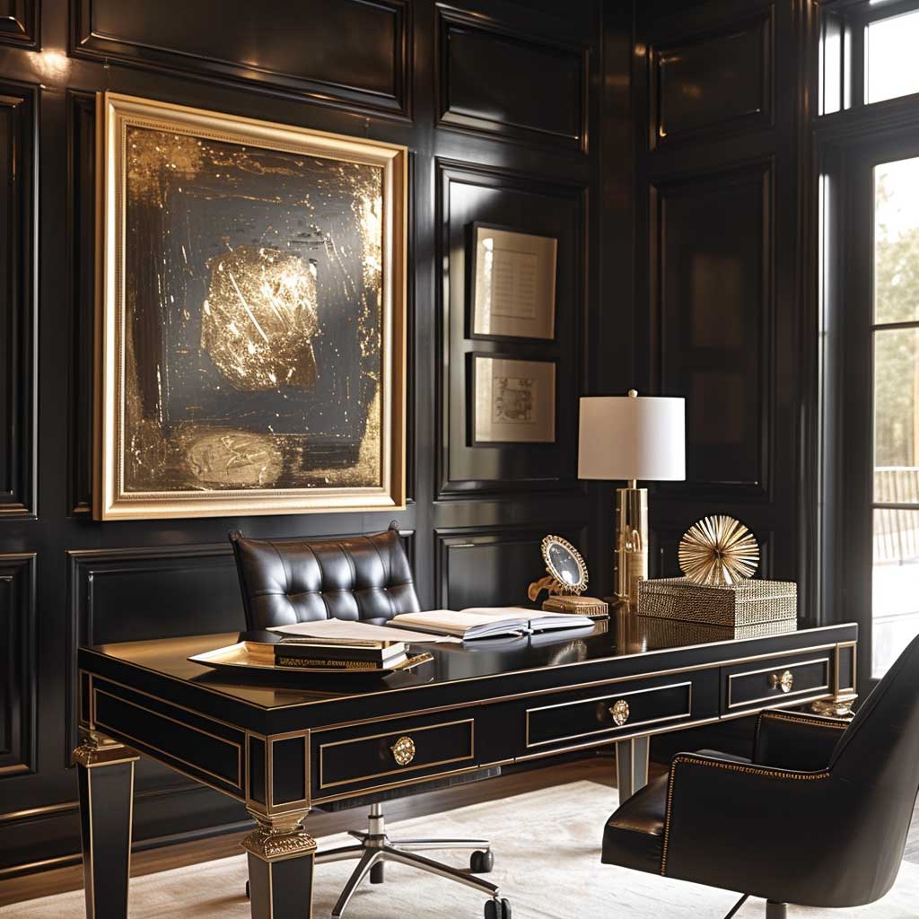
Integrating this colour combination into a home office involves more than just painting walls and choosing accessories; it’s about creating balance. Too much black, and the space can feel overwhelming, even claustrophobic. An overabundance of gold, and the office risks losing its sophisticated edge, tipping into ostentation. The magic is in the moderation, the dance between dark and light, power and luxury. It’s about finding the perfect desk to act as the centerpiece, selecting lighting that casts a warm glow, and choosing accessories that reflect not just the room’s elegance but the inhabitant’s personal style.
This colour combination also offers versatility in terms of material selection. Black leather, matte finishes, or even textured wallpapers can add depth and interest, while gold can be introduced through brushed metals, glossy finishes, or even soft textiles for a tactile experience. Each element, carefully chosen and thoughtfully placed, contributes to the overall ambiance of sophistication and style.
In essence, the dramatic black and luxurious gold colour combination in a home office is more than just a design choice; it’s a lifestyle choice. It reflects a commitment to excellence, a love for luxury, and an understanding of the power of interior decoration to influence mood and productivity. In crafting such a space, one does not just decorate; they curate an environment where every day is an opportunity to be inspired, to create, and to achieve.
Embracing the right colour combinations in your home can dramatically alter its look and feel, turning everyday spaces into sources of comfort, inspiration, and joy. Whether you prefer calming, serene hues or bold, dynamic contrasts, the key to achieving harmony and style lies in balancing colors that speak to your personal aesthetic and lifestyle needs.


Related Topics