Crafting a visually stunning and cohesive home begins with selecting the ideal colour scheme. This choice sets the tone for your entire living space, influencing mood, aesthetics, and even the perceived size of your rooms. With an array of colours to choose from, the task can seem daunting. However, this guide is designed to navigate you through the process of picking home decor colour schemes that not only reflect your unique style but also create a harmonious and inviting environment for all who enter.
Inviting Warmth in Entryways
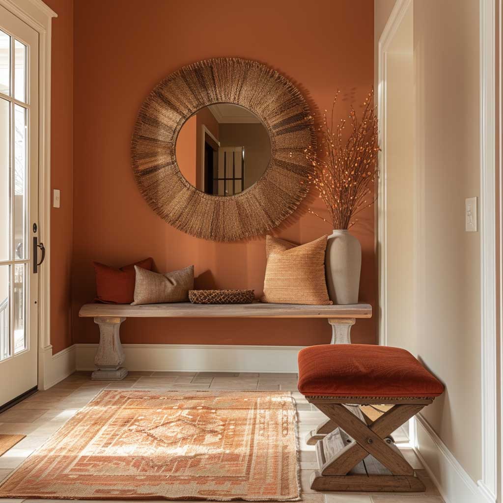

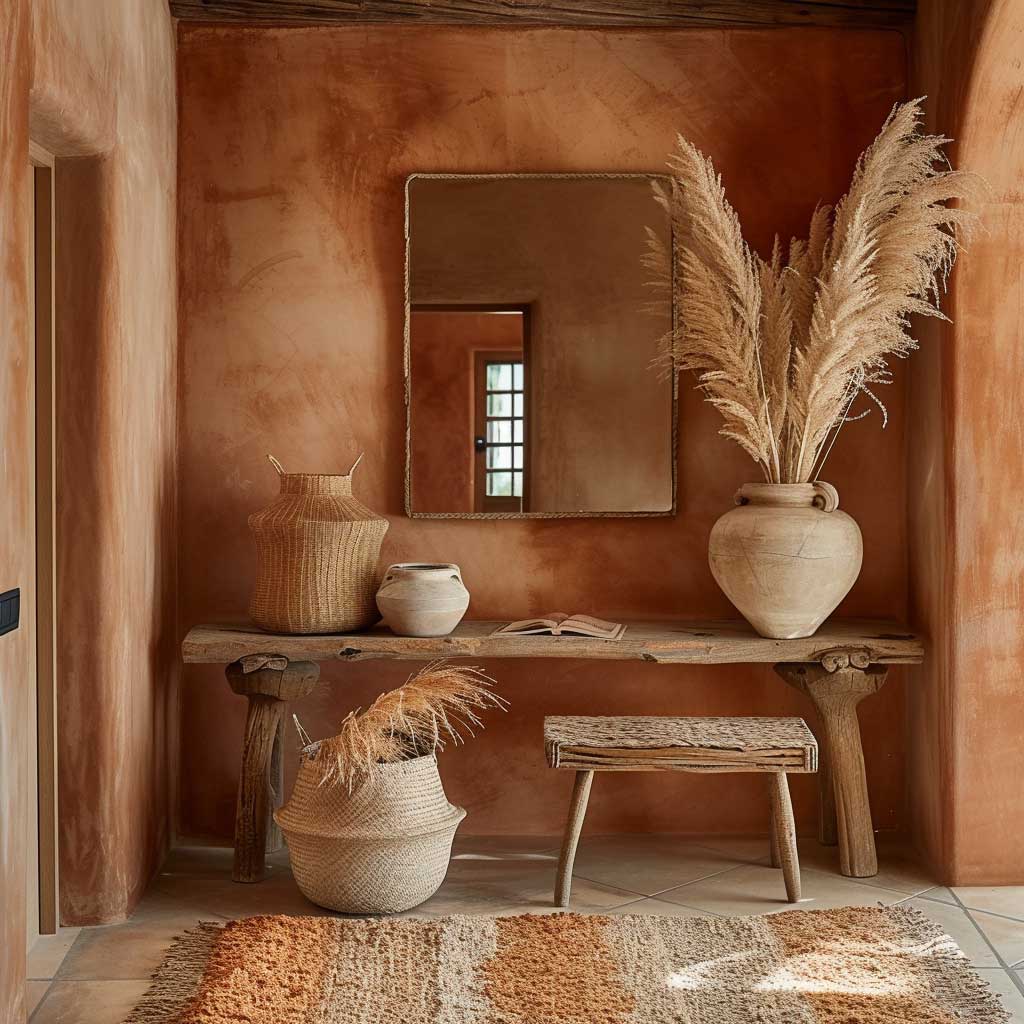
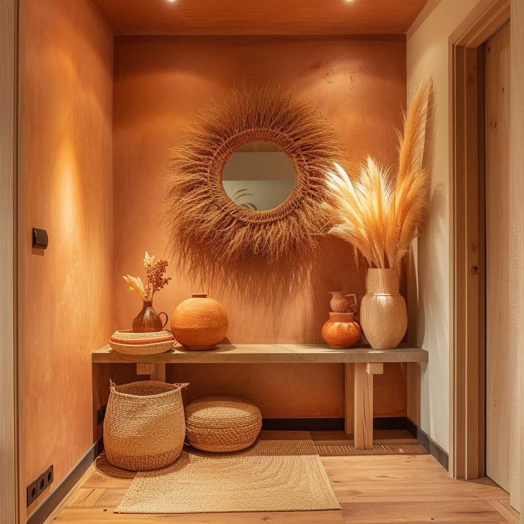
The first impression of a home is often its entryway, setting the tone for the rest of the house. When considering home decor colour schemes, the choice of hues for this initial space is crucial. It’s not just about picking colors that are in vogue; it’s about creating an ambiance that warmly welcomes everyone who steps through the door. The palette of terracotta, soft peach, and rich browns does just that, offering an inviting warmth that is both comforting and stylish.
Terracotta, with its earthy red and orange tones, brings a sense of groundedness and warmth. This color can act as a bold statement wall or be incorporated through floor tiles, offering a durable and timeless base for the entryway. Its natural hue resonates with a sense of welcome, akin to the warm embrace of the earth.
Soft peach complements terracotta by adding a lighter, airier feel. This softer shade can be used on adjacent walls, decor items, or textiles like rugs and cushions. It serves to brighten the space, making it feel more spacious and open. The gentle nature of peach offers a soothing transition from the outdoor world into the sanctuary of home.
Rich browns anchor the scheme, providing depth and warmth. Wooden furniture pieces, picture frames, or even a statement door in this hue can add a touch of elegance and cohesion. The dark tones of brown create a contrast with the lighter peach and vivid terracotta, balancing the overall look of the entryway.
The addition of natural textures and elements enhances the warm color scheme. A statement mirror with a wooden or bronze frame can reflect light, making the space appear larger and more welcoming. Decorative elements like pottery, baskets, and textiles in natural fibers add layers of texture and interest, making the entryway not just a passage but a preview of the home’s character.


Lighting plays a significant role in bringing the color scheme to life. Ambient lighting, such as a warm-toned pendant light or wall sconces, can highlight the rich colors and textures, creating an inviting glow. During the day, ensuring the entryway receives ample natural light can make the colors appear more vibrant and natural.
Incorporating plants is another way to enhance the warmth of the entryway. Greenery can breathe life into the space, complementing the earthy tones of the color scheme. A potted plant or a small indoor tree can add a touch of nature, making the transition from outdoors to indoors feel seamless.
When creating an inviting entryway with this warm color scheme, the key is balance. The boldness of terracotta, the softness of peach, and the depth of rich browns need to be harmonized with careful consideration of space, texture, and light. The goal is to craft an entryway that not only looks beautiful but also feels welcoming and comforting.
This approach to selecting home decor colour schemes for entryways goes beyond mere aesthetics. It’s about creating an emotional experience, a sense of belonging and calmness as one enters the home. By thoughtfully combining these colors, textures, and elements, the entryway becomes more than just a part of the house; it becomes a warm welcome, a prelude to the sanctuary that lies beyond.
Calm and Collected Living Areas


In the heart of the home, living areas serve as sanctuaries for relaxation, gathering, and recreation. The selection of home decor colour schemes in these spaces significantly impacts the ambiance, influencing not just the aesthetic appeal but also the emotional well-being of its inhabitants. A palette centered around soft greys, beige, and muted blues and greens fosters an environment of calmness and collection, essential for creating a serene living space.
Soft grey, a versatile and sophisticated hue, offers a neutral backdrop that soothes the senses. It’s a color that reflects the minimalist trend, bringing a clean and calm atmosphere to the living area. Grey walls can serve as a canvas for art, furniture, and decorative items, allowing for flexibility in design choices. The neutrality of grey ensures that the living space remains timeless, adapting easily to changing styles and preferences.
Beige sofas anchor the living area, adding warmth and inviting comfort. Beige, with its soft, earthy tones, complements the grey palette, introducing a sense of natural harmony. This color encourages relaxation and serves as a neutral foundation for the living space, allowing for splashes of color through accessories without overwhelming the senses. The choice of beige for sofas also highlights practicality, offering a forgiving color for everyday use.
Touches of muted blues and greens through cushions and decor bring a subtle vibrancy to the living area. These colors, inspired by nature, evoke a sense of tranquility and freshness. Muted blues recall the sky and the sea, promoting calm and focus, while soft greens remind us of nature, enhancing feelings of balance and renewal. Incorporating these hues through textiles and decorative items allows for an easy refresh of the living space, adapting to seasons or moods.
The harmonious blend of these colors creates a collected and serene atmosphere, conducive to unwinding after a long day or hosting intimate gatherings. The key to achieving this calm and collected ambiance lies in the balance and distribution of colors. Rather than overwhelming the space with bold hues, the use of soft, neutral tones with strategic pops of color fosters a sense of spaciousness and light.
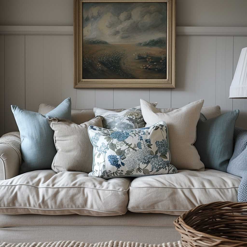

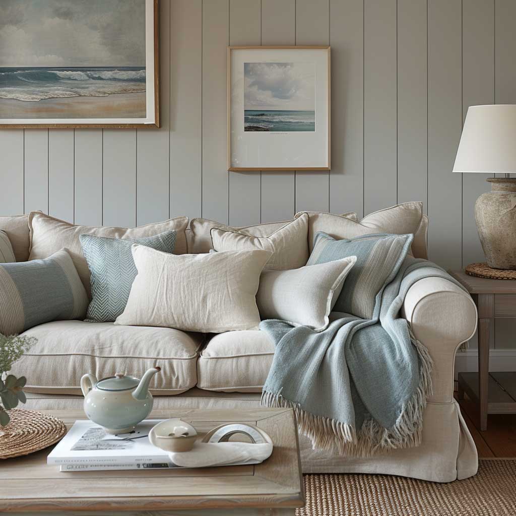
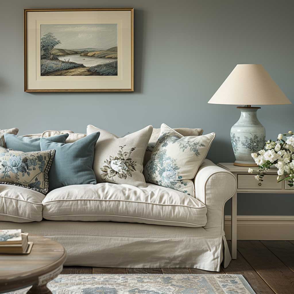
Texture plays a crucial role in adding depth and interest to the living area. Combining different materials, such as soft wool throws, silk cushions, and textured rugs, can introduce contrast and warmth, enhancing the tactile experience of the space. Textured elements in natural materials complement the color scheme, bringing an added layer of comfort and coziness.
Natural light enhances the serene color palette, bringing to life the subtle nuances of each hue. The interplay of light and color can transform the atmosphere throughout the day, from the soft morning light accentuating the freshness of blues and greens to the golden hues of sunset warming the greys and beiges. Ensuring ample natural light through windows, complemented by thoughtful artificial lighting solutions, can amplify the calming effect of the color scheme.
Creating a calm and collected living area is about more than just aesthetics; it’s about crafting a space that nurtures well-being and tranquility. The chosen color scheme of soft greys, beige, and muted blues and greens, supported by thoughtful consideration of texture and light, transforms the living area into a peaceful retreat. This approach to home decor not only enhances the visual appeal of the space but also promotes a lifestyle centered around relaxation and mindfulness.
By integrating these elements, homeowners can achieve a living space that not only looks harmonious and inviting but also serves as a haven of calm in the bustling world outside. The living area becomes a testament to the power of color in creating an atmosphere of serenity and collection, a place where moments of quietude and joy are equally cherished.
Bold Statements in Home Offices


In today’s era, where the concept of home offices has transcended traditional boundaries, creating a space that stimulates creativity and productivity is paramount. The integration of dynamic home decor colour schemes plays a crucial role in energizing these workspaces. Among such palettes, deep teal or charcoal, accented with metallics like gold or copper, and interspersed with bright color splashes through artwork or accessories, stand out as particularly effective in crafting an environment that fosters inspiration and vigor.
Deep teal, a rich and sophisticated hue, offers a bold backdrop that can transform any home office into a statement space. This color, with its depth and intensity, stimulates focus and thought, making it an ideal choice for walls or accent pieces. It bridges the gap between the tranquility necessary for concentration and the vibrancy needed for creative endeavors. When applied thoughtfully, deep teal can make the home office feel like a personal sanctuary of productivity.
Charcoal adds a layer of seriousness and elegance to the home office. As a strong, grounding color, it serves as an excellent choice for furniture or as a contrasting wall color. Charcoal’s versatility allows it to act as a canvas for brighter colors and metallic accents, providing a sophisticated yet dynamic aesthetic. Its ability to absorb light and create depth makes the space more intimate, enhancing the focus required for work.
Metallic accents in gold or copper introduce a touch of luxury and warmth, elevating the home office’s overall design. These accents, whether in the form of frames, lamp bases, or decorative objects, add a layer of sophistication and reflect light, contributing to an atmosphere of refined creativity. The reflective qualities of metallics can also help to brighten the space, balancing the deeper tones of teal and charcoal.

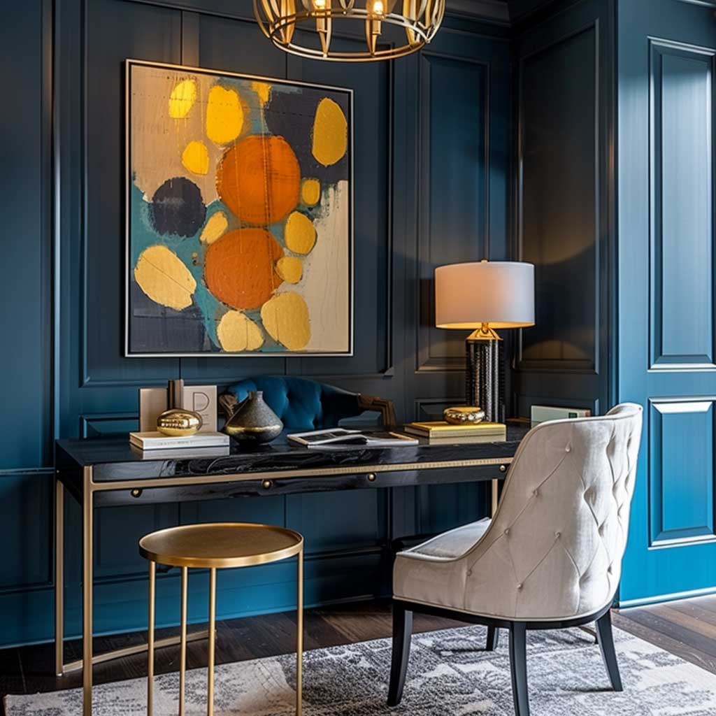

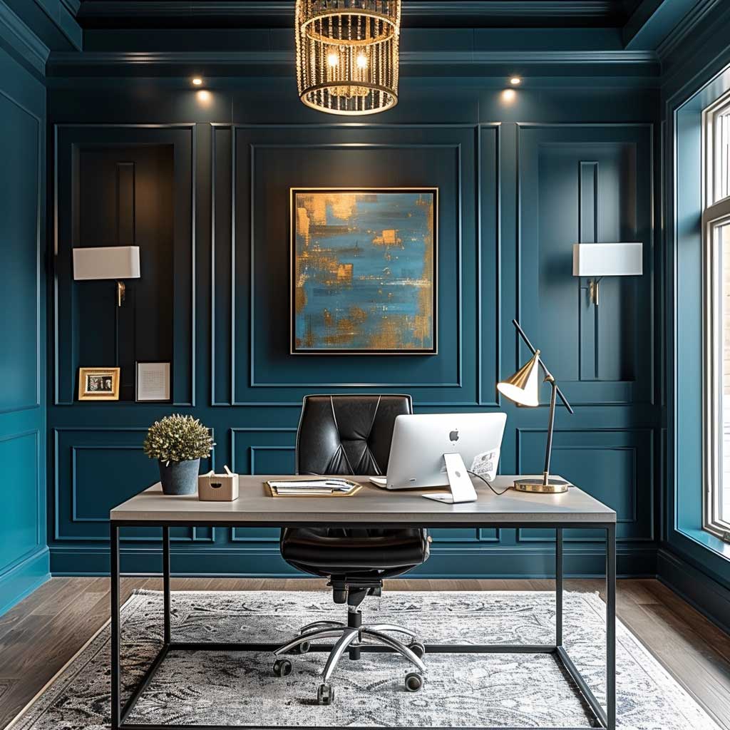
The inclusion of bright colors through artwork or office accessories is pivotal in injecting personality and energy into the home office. These pops of color not only break the monotony but also serve as visual stimuli, encouraging creative thinking. The strategic placement of colorful elements against the backdrop of deep teal or charcoal can transform the workspace into an area that feels both personal and invigorating.
Creating a bold statement in home offices requires a careful balance between the calming and stimulating effects of color. The palette of deep teal or charcoal, complemented by metallics and bright colors, must be harmonized to avoid overwhelming the senses. The goal is to inspire without distracting, to energize without causing restlessness. This balance can be achieved through the strategic distribution of color, ensuring that the bold hues serve as a foundation, while the accents and splashes of color act as highlights.
Ergonomics and functionality should also be considered alongside aesthetics. The choice of furniture, storage solutions, and layout plays a significant role in the usability of the home office. The color scheme should enhance these elements, creating a cohesive space that is both beautiful and practical. The use of color can define different zones within the office, such as a reading nook or brainstorming area, further enhancing productivity and creativity.
In conclusion, the bold use of color in home offices is not merely a design choice but a strategic tool to enhance work efficiency and creativity. The dynamic interplay of deep teal or charcoal with metallics and bright colors creates a workspace that is stimulating, luxurious, and personalized. Such environments not only support professional endeavors but also contribute to well-being, proving that the right home decor colour schemes can transform work from a task into a passion.
Refreshing Vibe in Outdoor Spaces
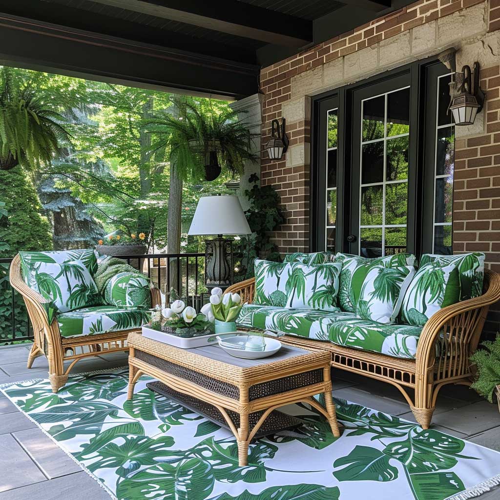
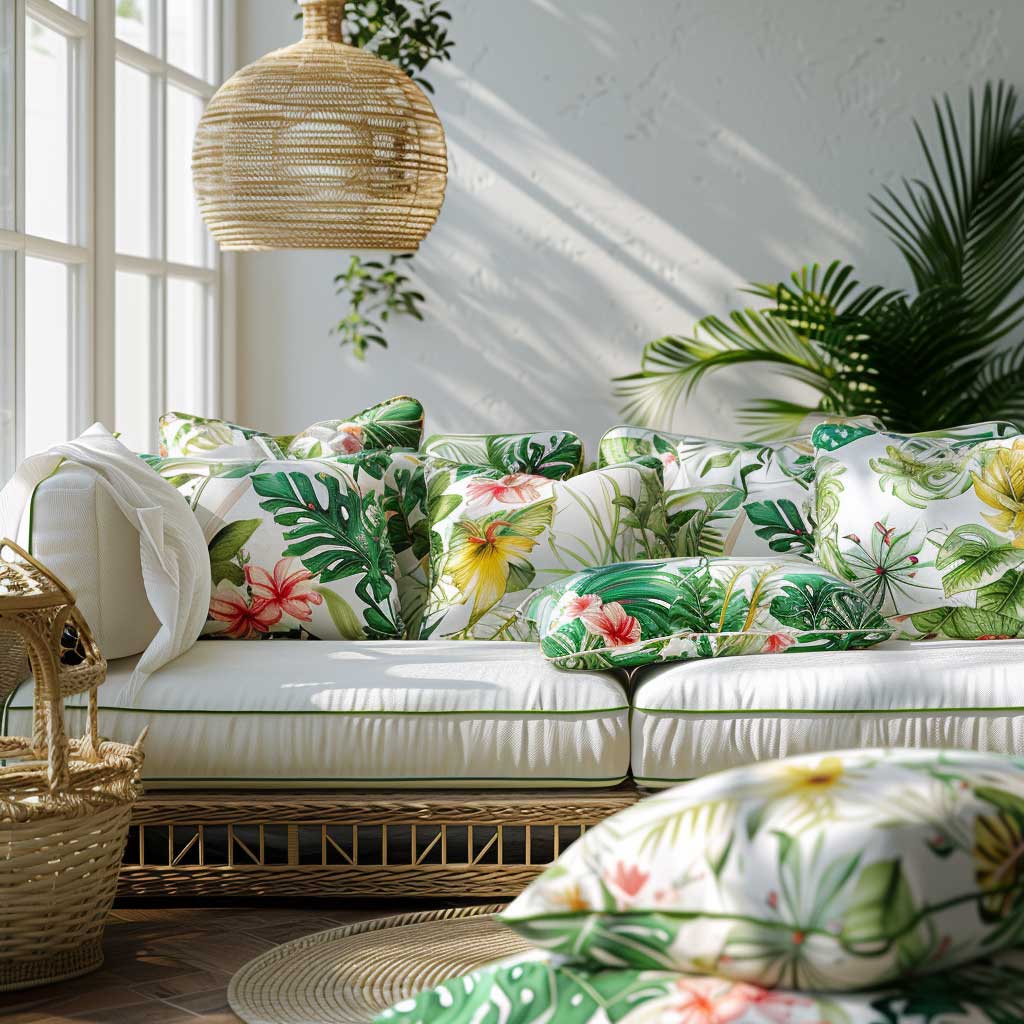

The extension of living spaces to the outdoors has become an integral part of home design, reflecting a desire to blend indoor comfort with the beauty of nature. Creating a refreshing vibe in these areas through thoughtful home decor colour schemes is essential for crafting inviting, vibrant outdoor living spaces. A palette that combines bright whites with lush greens and floral patterns can transform any outdoor area into a rejuvenating retreat perfect for relaxation and entertainment.
Bright white serves as the foundation of this refreshing outdoor palette. It reflects sunlight, enhancing the natural light of the area and making the space appear larger and more open. White outdoor furniture, whether sleek and modern or intricately patterned, introduces a sense of freshness and cleanliness. This color’s versatility allows it to act as a backdrop for more vibrant colors and patterns, ensuring that the space remains airy and uplifting.
Lush greens, from the foliage surrounding the area to decorative accents, reinforce the connection to nature. Incorporating various shades of green through planters, outdoor rugs, or cushions can mimic the diversity found in nature, enhancing the serene and organic feel of the outdoor space. Green symbolizes growth and renewal, qualities that are particularly desirable in a setting meant for relaxation and rejuvenation.
Floral patterns add a dynamic and vibrant element to the outdoor decor. Whether through upholstery, throw pillows, or ceramic pots, floral designs introduce color and life, making the space feel inviting and lively. These patterns can range from subtle to bold, depending on the desired level of impact. Incorporating floral patterns against the bright white and green backdrop creates a balanced and harmonious look that is both elegant and playful.


The integration of these elements—bright whites, lush greens, and floral patterns—creates an outdoor space that feels like an extension of the home’s interior while also offering a unique escape. The color scheme promotes a light and airy atmosphere, perfect for daytime gatherings, and can easily transition into a cozy and intimate setting for evening entertainment with the right lighting and accessories.
Creating a refreshing vibe in outdoor spaces is not just about aesthetics; it’s about fostering an environment that encourages relaxation and connection. The choice of colors and patterns should reflect the natural beauty of the outdoors while providing comfort and style. The inclusion of comfortable seating, adequate shade, and thoughtful lighting ensures that the space is functional and welcoming at any time of the day.
Sustainability and durability are also key considerations when selecting materials and fabrics for outdoor spaces. Choosing items that are designed to withstand the elements while maintaining their color and integrity ensures that the refreshing vibe of the outdoor area is preserved over time. This approach not only contributes to the space’s aesthetic appeal but also promotes environmental responsibility and long-term enjoyment.
In conclusion, crafting a refreshing vibe in outdoor living spaces through the use of bright whites, lush greens, and floral patterns creates a harmonious and vibrant setting that invites relaxation and enjoyment. This colour scheme, carefully balanced with functional design elements and sustainable practices, transforms outdoor areas into cherished extensions of the home. The result is a space that not only looks beautiful but also serves as a sanctuary for rejuvenation amidst the hustle and bustle of daily life.
Sophisticated Simplicity in Bedrooms
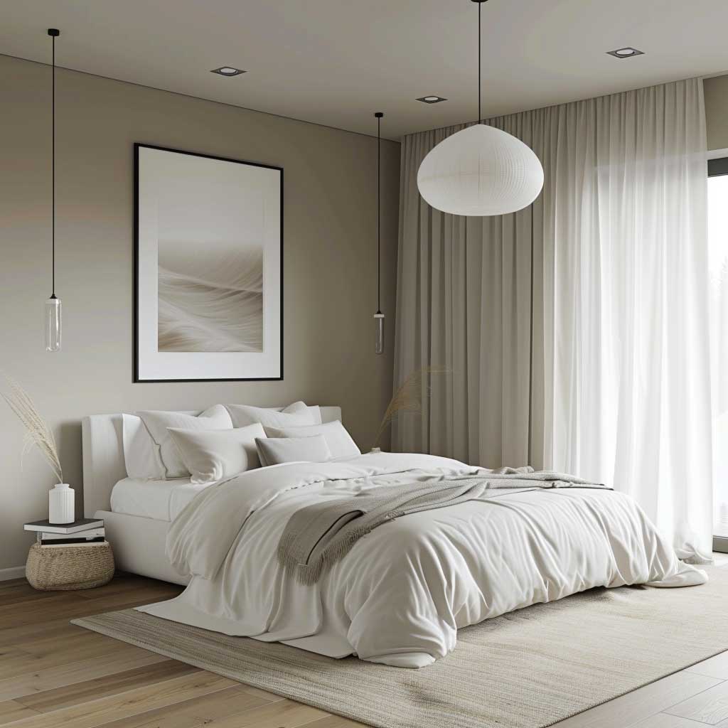


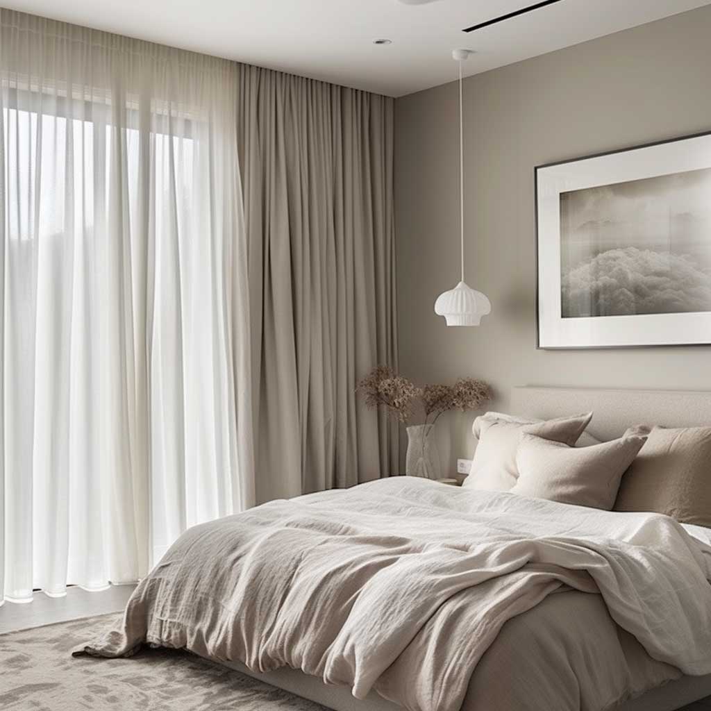
In the realm of interior design, bedrooms serve as personal sanctuaries where comfort meets style. Achieving a look of sophisticated simplicity requires a careful selection of home decor colour schemes that evoke tranquility while exuding elegance. A monochromatic palette of white, off-white, and light grey stands out as a timeless choice, fostering an atmosphere of peacefulness and refined simplicity that transforms the bedroom into a serene retreat.
White, the epitome of simplicity and purity, serves as the primary hue in this sophisticated scheme. It reflects light, enhancing the natural brightness of the room and creating a sense of spaciousness. White walls and bedding not only offer a clean and crisp background but also serve as a canvas for texture and subtle color variations brought in through decor and textiles. This color’s versatility allows for easy updates to the room’s accent features without disrupting the cohesive aesthetic.
Off-white shades introduce a soft warmth, preventing the space from feeling too stark or clinical. These subtle variations in the white spectrum add depth and complexity to the monochromatic scheme. Off-white can be incorporated through textured linens, plush rugs, or wall treatments, providing a gentle contrast that enhances the room’s cozy and inviting feel. The nuanced differences between white and off-white elements in the bedroom create a layered look that is both sophisticated and comforting.
Light grey adds a modern touch to the bedroom, offering a slightly cooler tone that complements the warmth of off-white. This color can be used for accent walls, furniture, or bedding, providing a subtle shift in the palette that brings balance and visual interest. Light grey’s neutrality makes it an ideal choice for larger pieces, such as upholstered headboards or area rugs, grounding the room’s decor without overwhelming the senses. It bridges the gap between the starkness of white and the warmth of off-white, completing the sophisticated simplicity of the colour scheme.


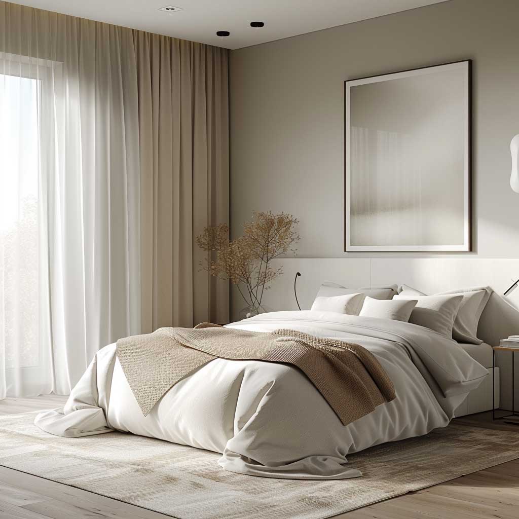

The success of this monochromatic approach lies in the interplay of textures and materials. To prevent the space from appearing flat or monotonous, incorporating a variety of textures is key. Soft knits, crisp linens, smooth metals, and woven fabrics add tactile diversity, enriching the visual and sensory experience of the bedroom. These elements, while subtle in color variation, play a significant role in creating depth and interest within the monochromatic theme.
Lighting, both natural and artificial, is a critical component in enhancing the sophisticated simplicity of the bedroom. Layered lighting solutions, from ambient ceiling lights to focused task lighting and soft accent lamps, can highlight the room’s textures and subtle color differences. The interplay of light and shadow adds dimension to the space, emphasizing the serene and elegant atmosphere.
In conclusion, achieving sophisticated simplicity in bedrooms through a monochromatic colour scheme of white, off-white, and light grey offers a timeless aesthetic that promotes tranquility and elegance. This approach, centered on balance and restraint, transforms the bedroom into a peaceful retreat where simplicity is celebrated, and comfort is paramount. By carefully selecting hues, textures, and lighting, the bedroom becomes a testament to the beauty of simplicity, a place where one can unwind and rejuvenate in an environment of refined elegance.
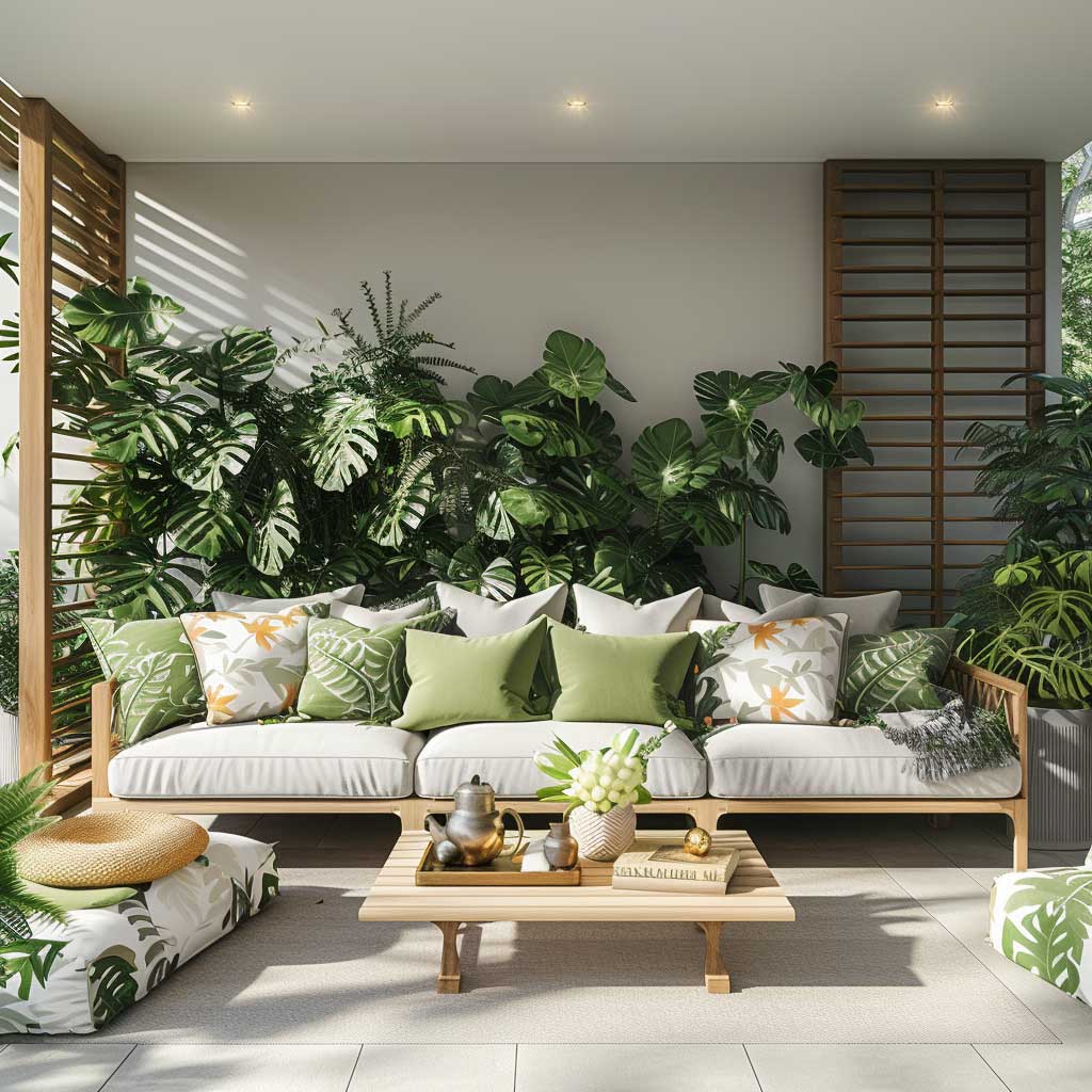
Family Fun in Playful Living Spaces


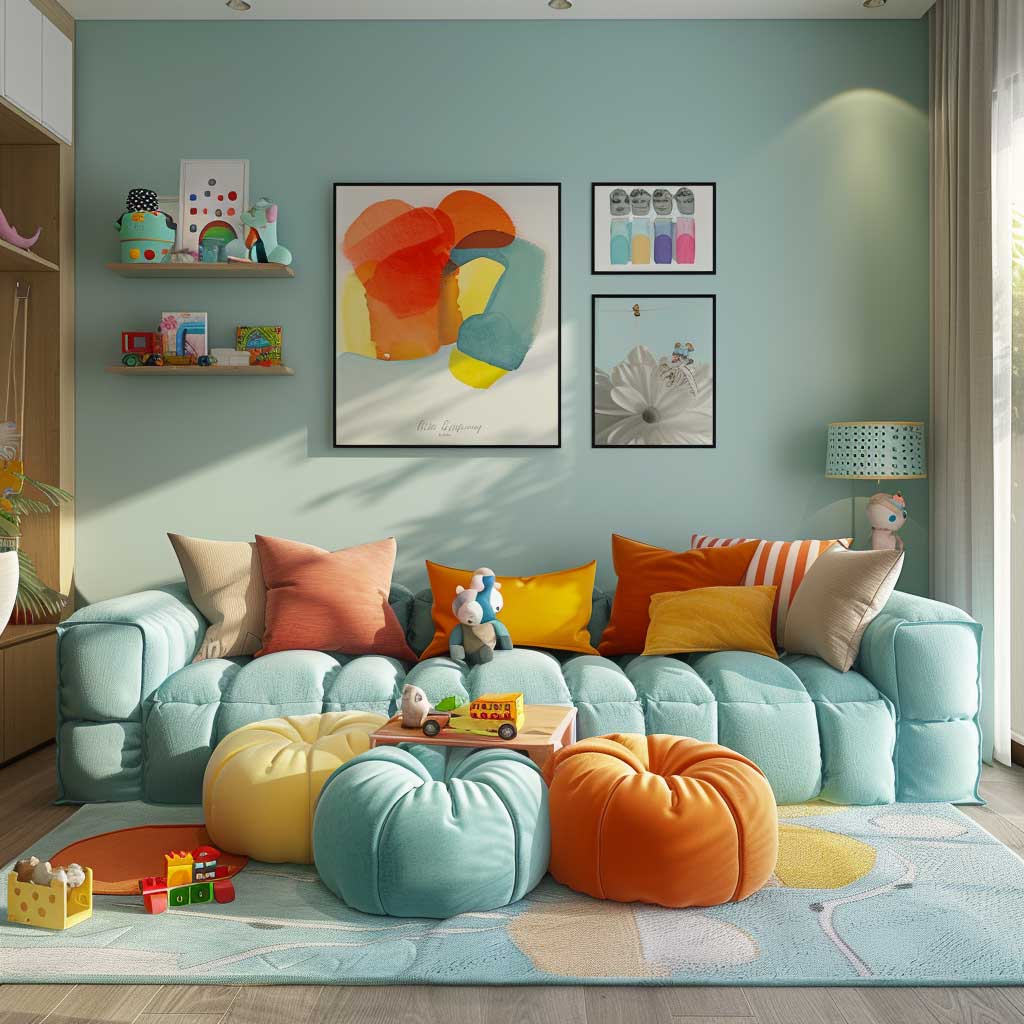

Designing a living space that caters to the joy and energy of family life requires an imaginative approach to home decor colour schemes. A palette that incorporates soft pastels like mint green or baby blue, complemented by vibrant furniture and playful accessories, creates an environment where both children and adults can thrive. This blend of whimsy and functionality transforms living areas into hubs of family fun, where creativity and comfort coexist harmoniously.
Mint green, with its fresh and soothing qualities, introduces a sense of calm and restoration to the family living space. This hue, reminiscent of spring and new beginnings, serves as an ideal backdrop for areas dedicated to relaxation and play. Whether applied to walls or infused through textiles and decor, mint green encourages a serene yet playful atmosphere, making it conducive to activities that require both concentration and imagination.
Baby blue adds another layer of tranquility and softness to the palette, evoking the clear skies of a perfect day. This color can be especially effective in creating a sense of spaciousness and airiness, making the living area feel more open and inviting. When paired with mint green, baby blue enhances the overall sense of harmony and balance, providing a visually soothing environment for family interactions.
The introduction of colorful furniture serves as a dynamic counterpoint to the softness of the pastel walls. Brightly colored sofas, chairs, or storage units can act as focal points, injecting energy and personality into the space. These vibrant elements not only stimulate visual interest but also encourage creativity and playfulness among family members, making the living area a place of inspiration and joy.
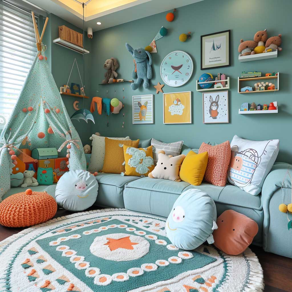

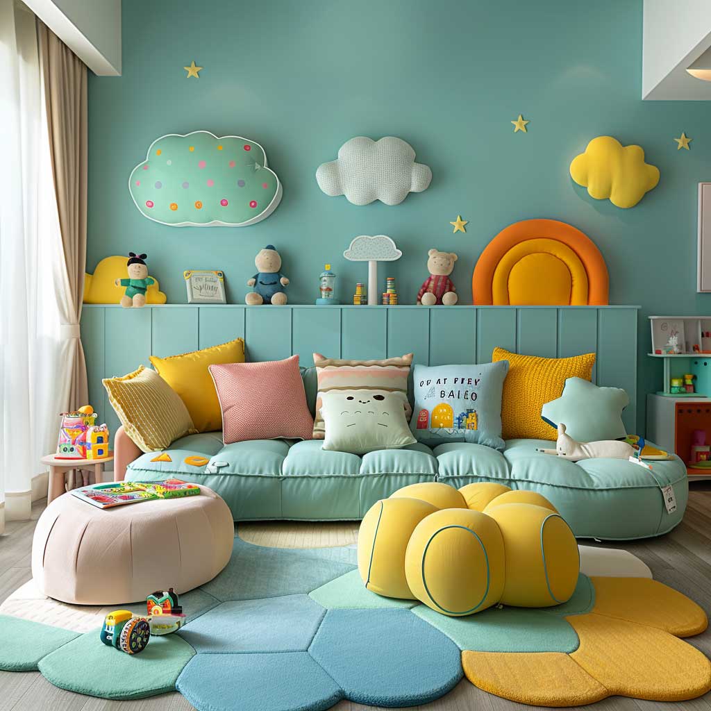

Playful accessories and toys, thoughtfully chosen and displayed, add the final touches to a family-friendly living space. Interactive elements like wall-mounted chalkboards, colorful rugs with interesting patterns, and modular storage that doubles as play structures support a variety of activities, from art projects to imaginative play. These accessories not only serve functional purposes but also contribute to the aesthetic appeal of the room, reinforcing the playful and welcoming vibe.
Creating a family fun living space is about more than just choosing the right colours; it’s about designing an environment that supports growth, creativity, and togetherness. The choice of soft pastels for the background, combined with strategic pops of brighter colours and interactive elements, facilitates a space that is both visually stimulating and emotionally comforting. This approach ensures that the living area is adaptable, able to evolve with the family’s changing needs and interests.
Sustainability and durability are also crucial considerations in family living spaces. Materials and finishes should be chosen for their ability to withstand the rigors of daily life while maintaining their appearance and functionality. Easy-to-clean surfaces, washable textiles, and sturdy construction ensure that the living area remains a vibrant and inviting space for family activities over the years.
In conclusion, designing playful living spaces that foster family fun involves a careful blend of colour, functionality, and creativity. A palette of soft pastels complemented by vibrant furniture and playful accessories creates an environment that encourages family members of all ages to engage, relax, and enjoy their time together. This approach to home decor not only enhances the aesthetic appeal of the living area but also enriches the quality of family life, making every moment spent together a cherished memory.
The essence of a beautifully decorated home lies in the harmony of its colour scheme. By thoughtfully selecting your palette, you can craft spaces that reflect your personality while ensuring comfort and style. Let these examples inspire you to explore the potential of colour in your home decor, leading to a space that you and your loved ones will adore.
You Might Also Like


Related Topics