Color serves purposes beyond merely enhancing aesthetics. In commercial spaces, it’s a powerful tool that can influence everything from customer behavior to employee productivity. After helping hundreds of businesses nail their color schemes, I’ve seen firsthand how the right colors can transform a space from “meh” to “memorable.”
Let me walk you through how to pick colors that work for your specific business, not just what’s trending on Instagram.
Color Psychology in Business
Many people overlook the significant impact that color has on us. In a commercial space, the wrong color can literally drive customers away. I once saw a restaurant switch from harsh, bright red walls to warm terracotta, and their average customer stay time jumped by 40 minutes.
Different colors trigger different responses:
- Blues build trust (perfect for banks and medical offices)
- Yellows energize (great for creative spaces)
- Greens relax (ideal for spas and wellness centers)
- Reds stimulate appetite (restaurant owners, take note)
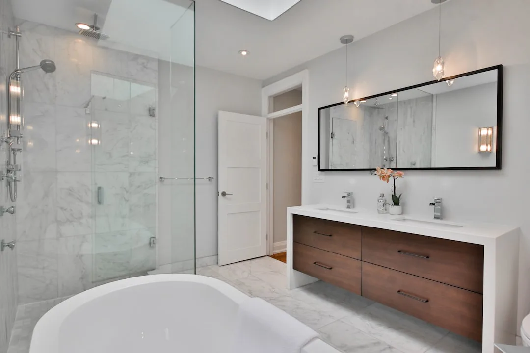
Choosing the right colors for your commercial space can significantly impact the overall ambiance and functionality of the environment. The aesthetic appeal of the colors and the quality of the commercial painting services you select are both important factors when choosing colors for your commercial space.
Consider Your Brand Identity
The colors of your space should complement your brand, yet they don’t necessarily need to match it exactly. Instead of plastering your walls with your logo’s bright orange, think about colors that complement your brand while serving your space’s purpose.
I worked with a tech startup that loved its electric blue logo but wisely chose softer blues and grays for their office space. The result? A professional environment that felt on-brand without giving everyone a headache.
Think About Your Clientele
Who’s spending time in your space? A pediatric dental office needs different colors than a luxury boutique. Consider your target audience’s:
- Age range
- Cultural background
- Time spent in your space
- Purpose for being there
Balance Function with Aesthetics
Every commercial space has different functional needs. Conference rooms need to encourage focus, break rooms should energize, and patient waiting areas should calm anxiety. One law firm I worked with painted their negotiation room in subtle earth tones instead of power-red. Their reasoning? They wanted clients to feel comfortable, not confrontational. Smart thinking.
Lighting Changes Everything
Natural light, fluorescent light, LED – they all affect how colors look. That perfect gray in the paint store might look like dirty dishwater under your office lighting. Always test colors:
- During different times of day
- Under all your lighting types
- In different areas of your space
- On multiple walls
Zone Your Space with Color
Different areas can have different colors, but they need to flow seamlessly. Consider entry spaces that welcome, work areas that foster productivity, client areas that align with your brand, and transition spaces that guide movement.
By thoughtfully selecting colors for each area, you can create a cohesive and harmonious environment that enhances the overall experience.
The 60-30-10 Rule
This is your secret weapon for balanced color schemes:
- 60% dominant color (usually neutral)
- 30% secondary color
- 10% accent color
This formula works whether you’re designing a retail store or a corporate office.
Don’t Forget About White Space
Not every wall needs color. Sometimes, white space is exactly what you need to:
- Make small spaces feel larger
- Highlight product displays
- Create visual breathing room
- Focus attention where you want it
Consider Maintenance
That dark navy might look stunning, but how will it hold up to daily wear? Keep in mind that lighter colors tend to show scuffs more easily, while darker colors reveal dust. Some finishes are easier to clean, which can be a significant advantage in maintaining the look of your home. Additionally, high-traffic areas require durable paint to withstand the wear and tear of daily use, making services like amms armidale essential.
Taking these factors into account will help you select a paint that not only appears attractive but also endures over time.
Future-Proof Your Choices
Trends come and go, but repainting a commercial space is expensive and disruptive. Choose colors that:
- Have staying power
- Can adapt to changing needs
- Work with multiple decor styles
- Support your long-term business goals
Testing Before Committing
Never skip testing colors in your actual space. I recommend applying large paint samples on multiple walls and living with them for at least a week. This allows you to see how the colors look at different times of the day. Check the colors during all business hours to understand how they appear under various lighting conditions.
Additionally, gather feedback from staff and clients to ensure the chosen colors create the desired atmosphere and appeal to everyone who uses the space.
Don’t Forget the Fifth Wall
The ceiling affects how everything else looks. While white is standard, sometimes a different ceiling color can:
- Make spaces feel more intimate
- Hide ductwork and pipes
- Create visual interest
- Improve acoustics when done right
Make It Work Together
Finally, remember that colors need to work as a team. One stunning color isn’t enough – it’s about creating a cohesive environment that supports your business goals while looking great.
The right colors in your commercial space can be a game-changer. They can make spaces feel bigger, people feel calmer, and even influence purchasing decisions. But the key is choosing colors that work for your specific situation, not just following trends.
Take your time with this decision. Get samples. Test different combinations. Consider your brand, your clients, and your space’s purpose. Because the right colors don’t just look good – they work hard for your business every single day.
Frequently Asked Questions
How often should I update the colors in my commercial space?
A well-chosen commercial color scheme should last 5-7 years, assuming regular maintenance. However, you might want to update sooner if your brand identity changes significantly or if your space starts looking dated. Rather than repainting everything, consider updating accent walls or adding new design elements to refresh the space cost-effectively.
Should I use the exact same colors as my company logo in my commercial space?
Not necessarily. While your space should complement your branding, using exact logo colors on your walls can be overwhelming and counterproductive. Instead, consider using your brand colors as accents or choosing complementary colors that create the right atmosphere for your business. Your space should feel connected to your brand without being a literal translation of your logo.
These questions tackle common concerns that I hear from business owners all the time. The key is balancing brand identity with practicality and the psychological impact of colors in commercial spaces.
Wrapping Up
When selecting colors, consider more than just their visual appeal; think about how they create an atmosphere that aligns with your business goals and evokes the desired emotions. Your business’s success is greatly influenced by a professionally presented, well-organized space.
You Might Also Like


Related Topics