Quick Scan
- Zillow recorded a 149% rise in colour drenching listing mentions in spring 2026 — the largest statistical jump of any colour technique this year.
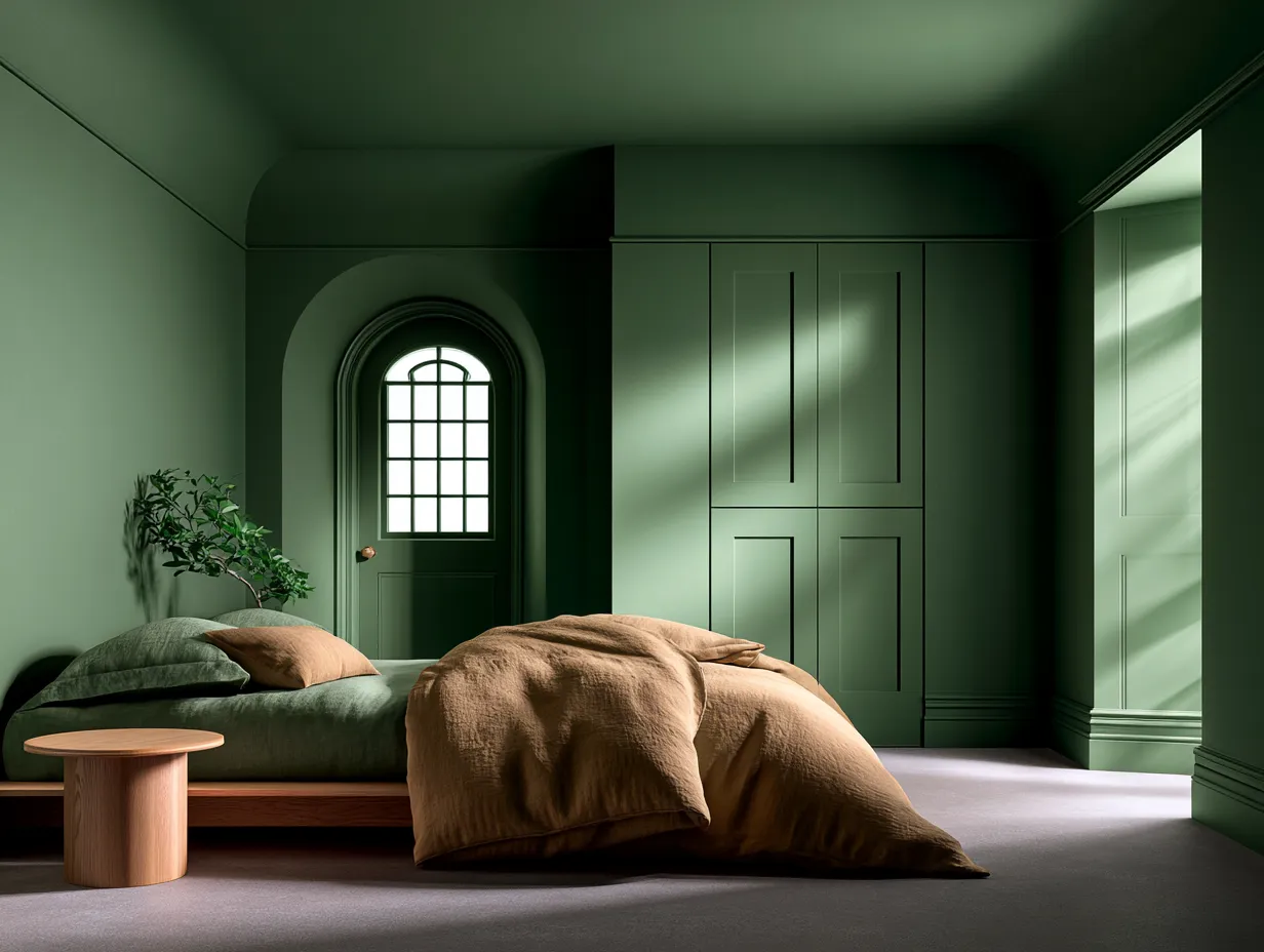
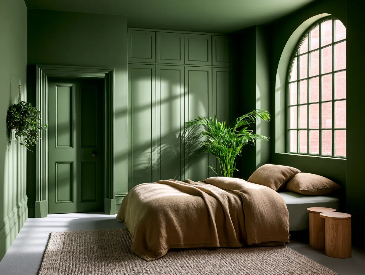
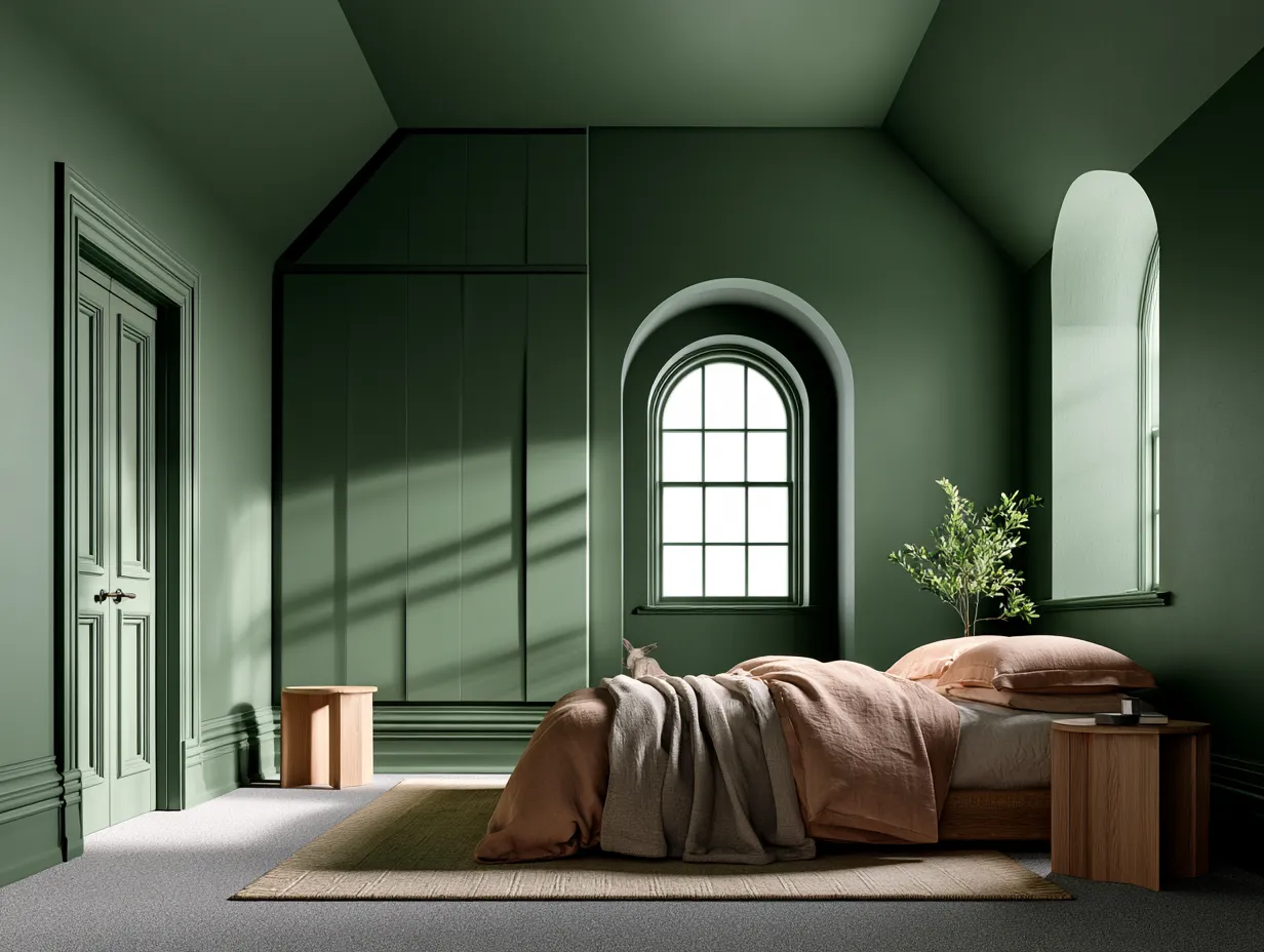
- Paint walls, ceiling, trim, skirting, doors, and built-ins in one hue. The architecture reads louder, not flatter.
- Tonal drenching uses a 10–20% deeper ceiling tone from the same colour family to add depth without introducing a second colour.
- Test drenching shades on large card samples inside the actual room — paint chips surrounded by white will always read darker than the room result.
- Benjamin Moore Silhouette ($72–$80/gallon), Mylands Burlington Arcade No. 216 (£68/2.5L), PPG Champagne Wishes, and Farrow & Ball's updated Dead Salmon are the key 2026 drenching shades.
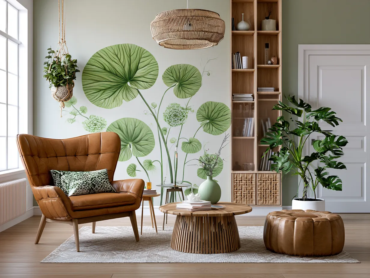
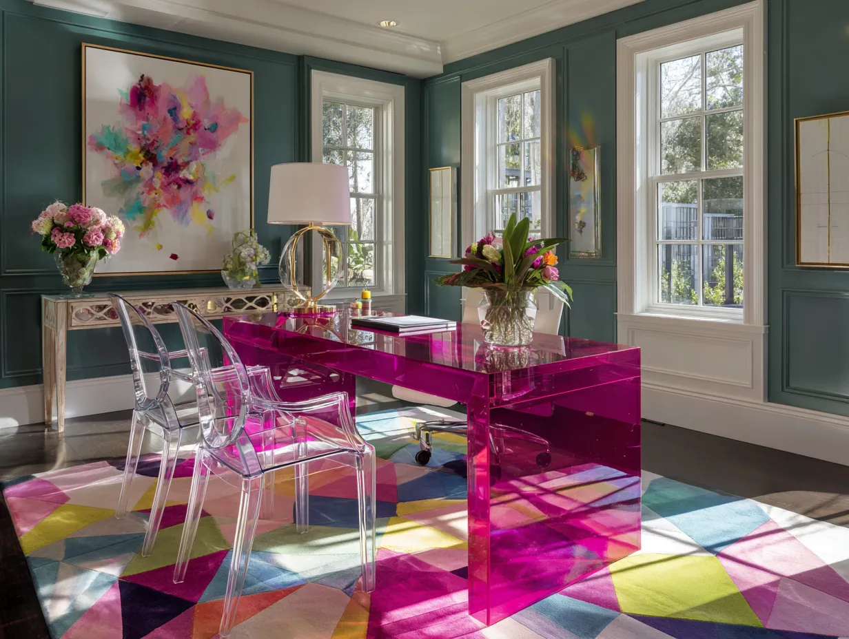
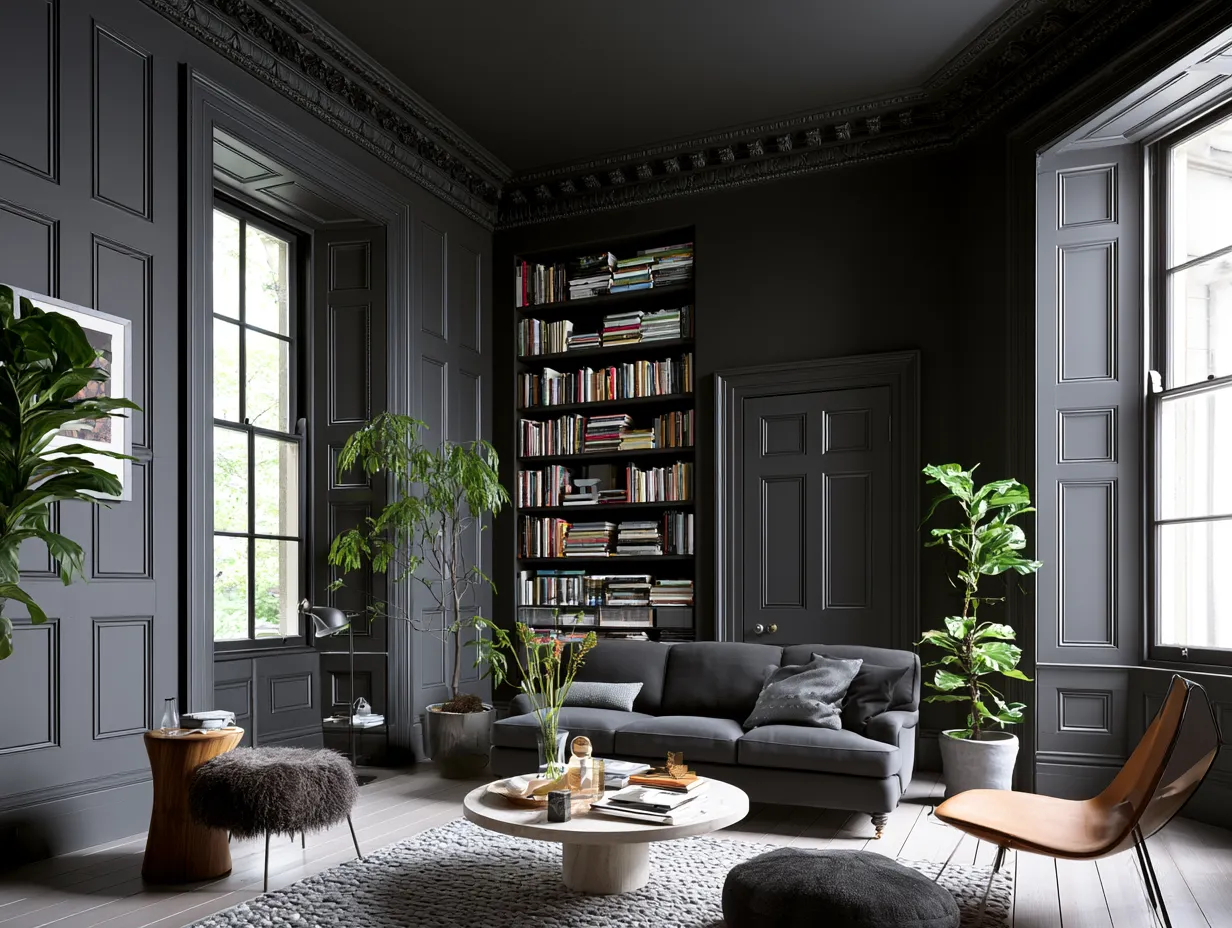
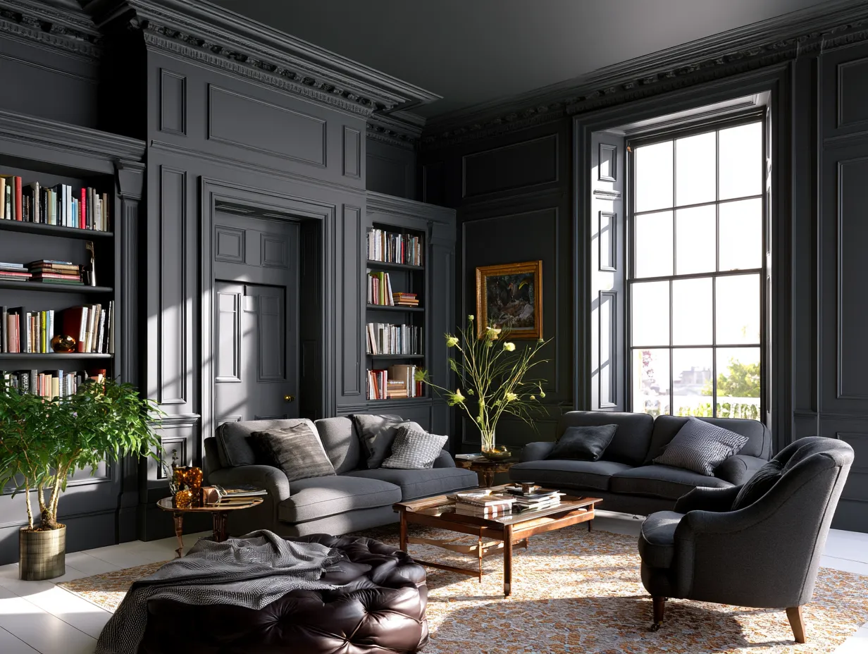
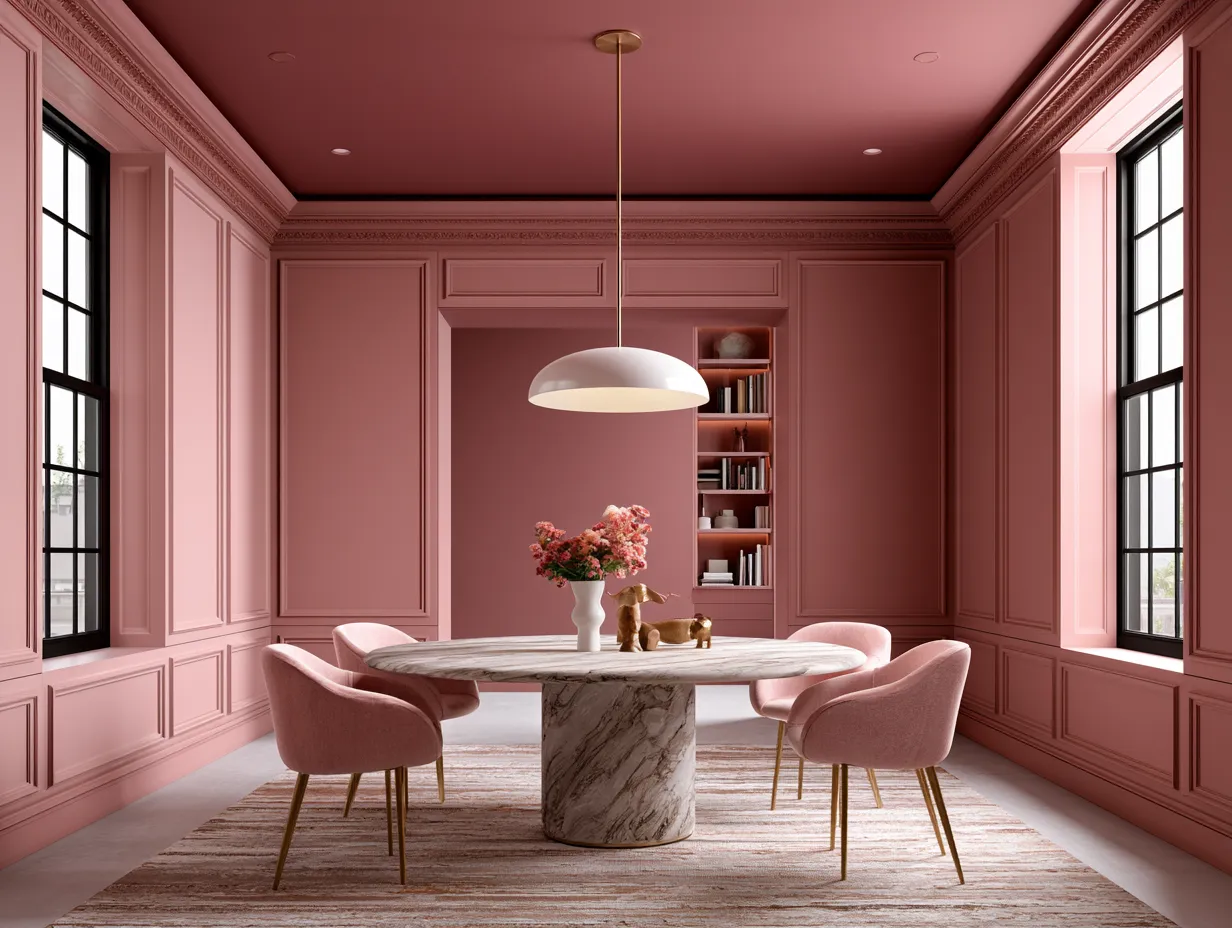
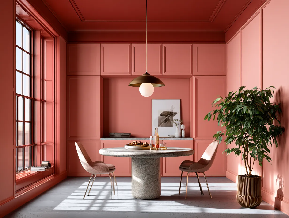
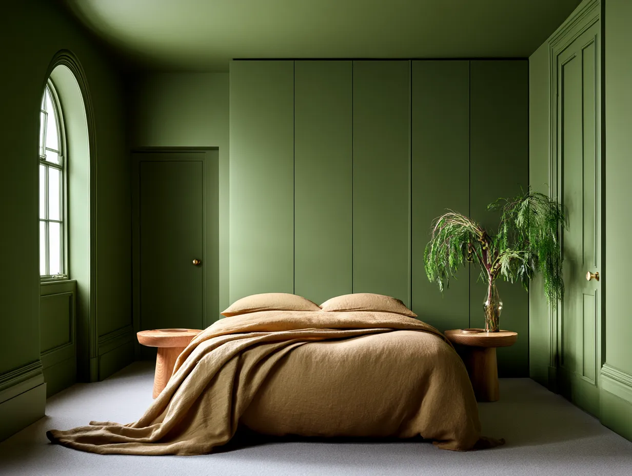
Colour drenching — painting walls, ceiling, trim, doors, skirting boards, and built-ins in exactly the same hue — has crossed from specialist design territory into mainstream architecture faster than almost any technique in recent memory. Zillow’s 2026 Home Trends Report recorded a 149% spike in listing mentions of the phrase, making it the single most statistically verified colour trend of the year. Pinterest saves on drenched-room images have climbed sharply over the last three to four weeks as homeowners begin planning summer projects. The rooms landing in everyone’s saved folders share one quality: they feel complete in a way that painted-only-the-walls rooms simply do not.
Why Colour Drenching Changes the Architecture of a Room, Not Just Its Mood
Paint a room’s walls one colour and leave the trim white and something structural happens — the eye reads every corner, every door frame, every cornice as a separate object. The architecture fragments. Colour drenching removes that visual interruption entirely, which is why New York renovation duo Barry Bordelon and Jordan Slocum of The Brownstone Boys describe the effect as one that ‘simplifies the room in a really elegant way and lets architectural elements speak more clearly.’ The trim does not disappear. It reads louder precisely because it stops competing.
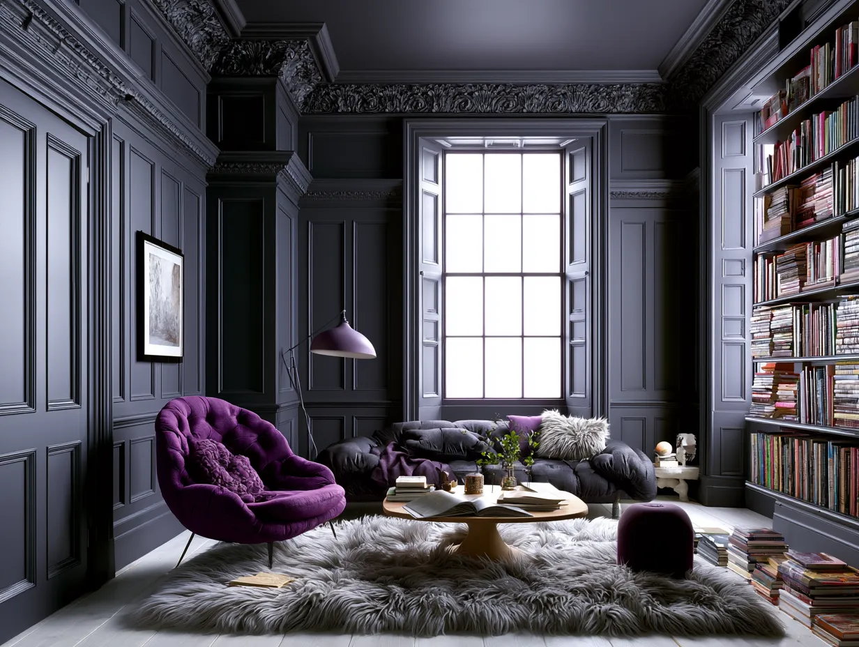
This is why the technique performs so well in period homes with original moulding, panelling, or built-in cabinetry. Coat everything in one deep hue and a Victorian cornice that was previously bleached into invisibility by white paint suddenly reads as sculpture. The ceiling drops — or rises — depending entirely on the shade chosen. How To Match Stucco Paint Color For House Facade? 50+ Exterior Ideas explores how unified colour application shifts proportion at the building scale, and the interior logic is identical.
What colour should you drench with? Benjamin Moore’s 2026 Colour of the Year, Silhouette — a burnt umber darkened with charcoal — was selected by the brand’s colour directors specifically for its drenching versatility across walls, trim, ceilings, and built-ins. At USD $72–$80 per gallon at Benjamin Moore stockists, it is a premium spend, but one gallon covers approximately 400 square feet, meaning a full drench of a mid-sized room runs to two or three gallons total. Mylands’ Burlington Arcade No. 216, a complex blue-green and the brand’s 2026 Colour of the Year, retails at £68 for 2.5 litres in Marble Matt Emulsion — CEO Dominic Myland stated publicly that it was chosen for ‘depth that works for colour drenching, cabinetry, and cocooning rooms.’
What should you not do? Do not drench with a flat-finish paint on woodwork and trim. Trim takes contact and wear — doors, skirting boards, and window frames need at minimum an eggshell or satin finish in the same colour, not the same product. Using a dead-flat emulsion on every surface looks chalky on joinery within months and reads as an oversight rather than a decision.
Does the paint brand matter as much as the finish choice? Yes — but not for the reasons most people assume. The difference between a cheap and a high-quality paint in drenching projects is coverage depth, particularly on the ceiling, where a single-coat formula will show lap marks under raking light. Farrow & Ball’s new Spring 2026 palette includes a lighter reinterpretation of Dead Salmon described by the brand as ‘ideal for colour drenching or pairing with a bolder, richer colour,’ retailing at approximately £59–£65 per 2.5-litre tin. Their full-coverage formulation matters when ceilings and shadowed corners need to read as the same depth as a lit wall.
Don’t Do This
- Do not use a dead-flat emulsion on trim and woodwork — doors and skirting boards need at minimum eggshell finish in the same colour or the surface will show wear within months.
- Do not mix tonal drenching shades from two different paint brands — metamerism will make your ceiling and walls read as different colours under artificial evening light.
- Do not select a drenching colour based on a paint chip viewed against a white wall in a shop — always test on a large sample inside the actual room at morning and evening light.
- Do not drench with a saturated dark colour before planning artificial lighting — deep colours absorb light significantly and a poorly lit drenched room reads as gloomy rather than architectural.
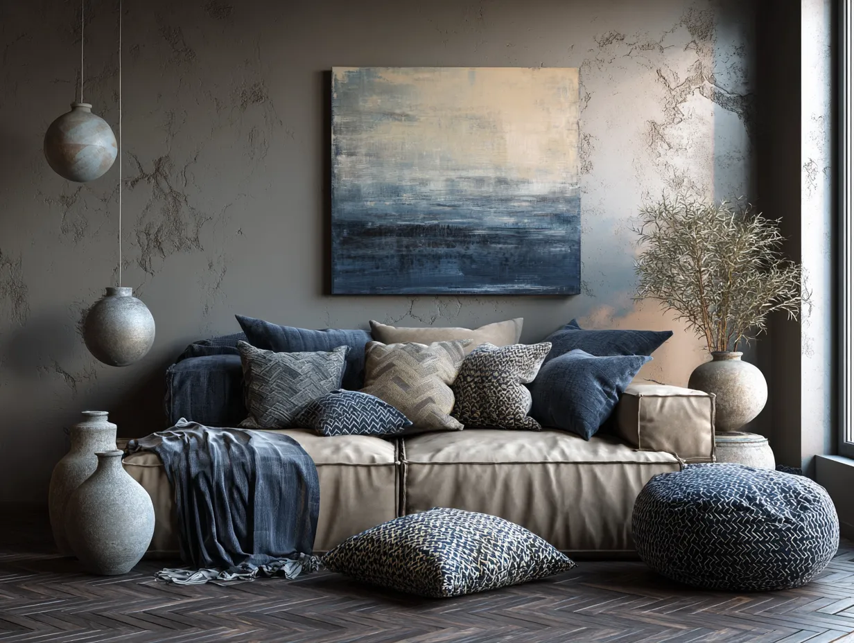
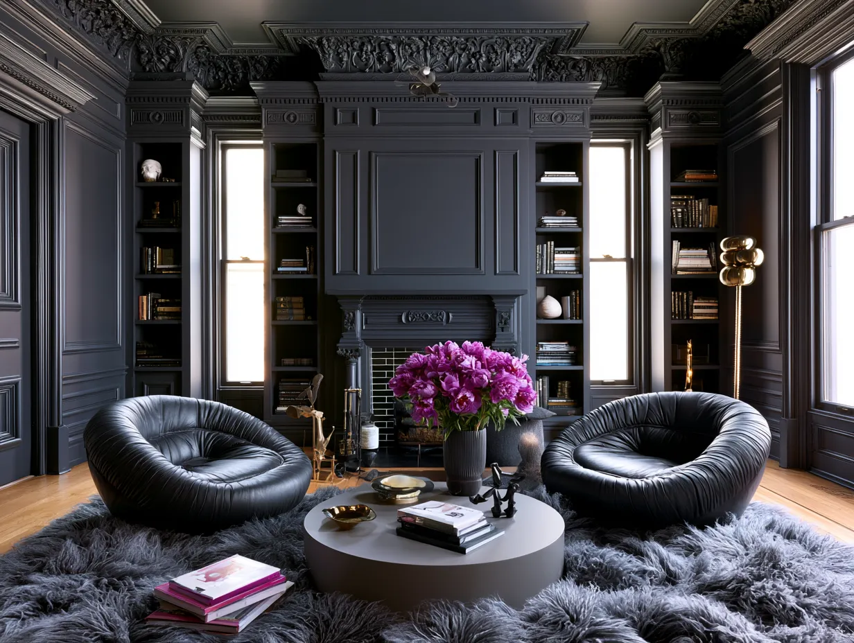
Tonal Drenching and Double Drenching Add Architectural Depth Without Contrast
The technique has already evolved a sub-category. Pure & Original identifies what it calls ‘tonal drenching’ — also described as ‘double drenching’ — as one of the defining refinements of 2026: painting walls and ceiling in two shades from the same colour family, typically a 10–20% darker ceiling value against lighter walls. The result is not contrast in the conventional sense. It is depth. The ceiling recedes or advances in a way that shifts the perceived proportion of the room without introducing a second colour story.
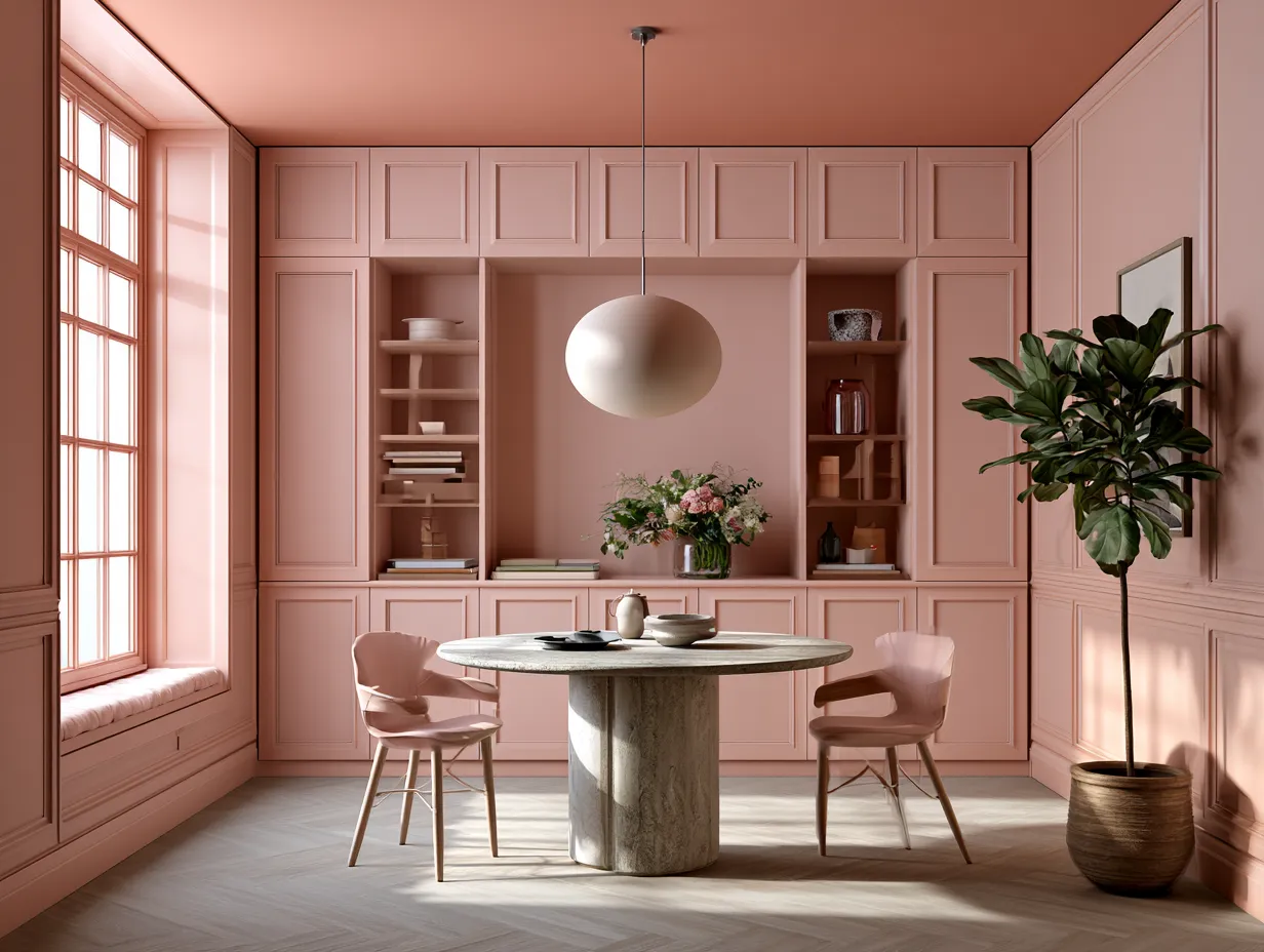
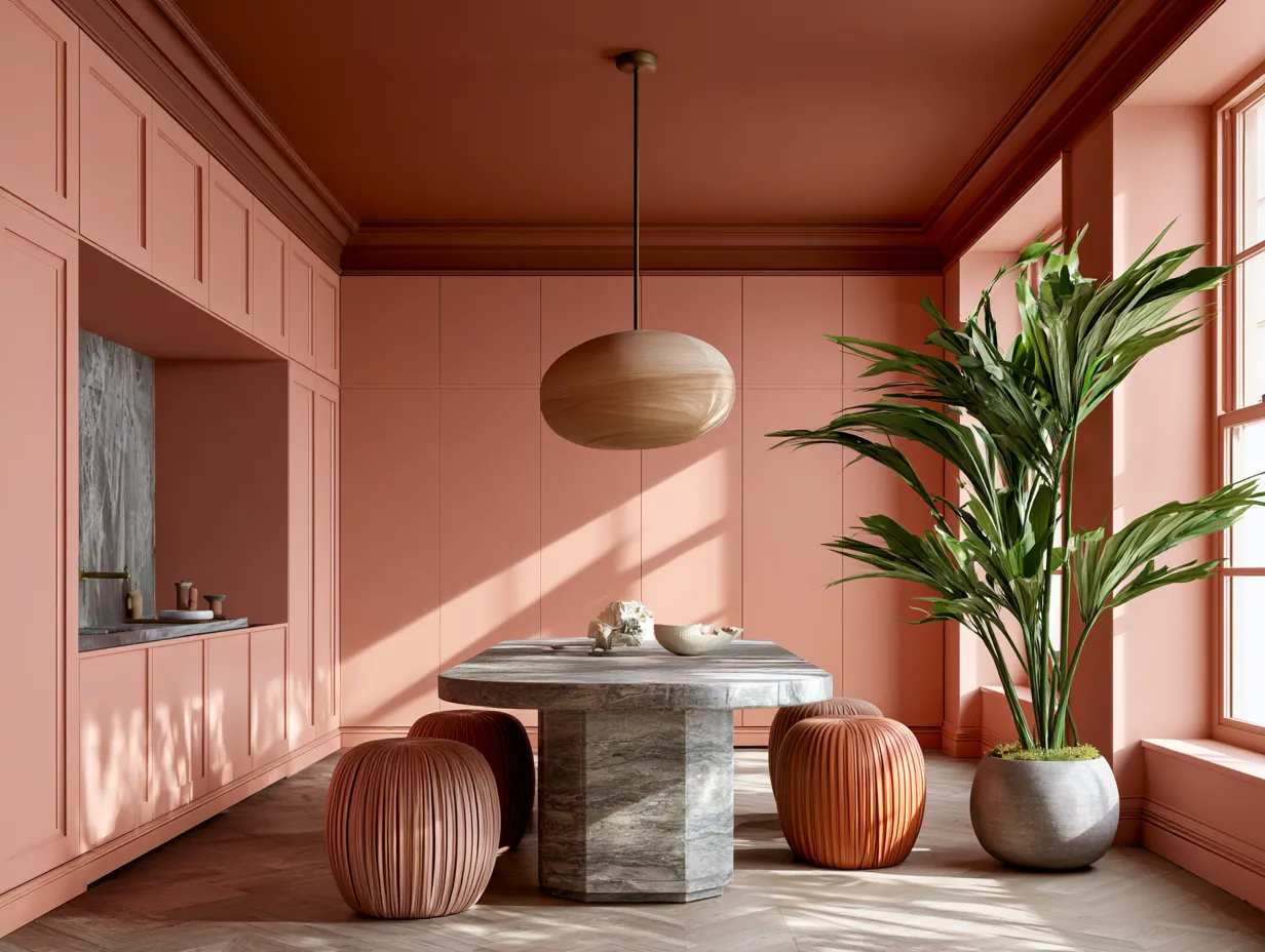
Why does a slightly darker ceiling work better than a lighter one in most rooms? Because light in a real room enters from windows positioned in walls, not ceilings — the ceiling is naturally the least-lit plane in the space. A ceiling painted exactly the same value as a well-lit wall reads as slightly too pale under natural conditions. Nudging it 10–20% darker brings the actual visual experience back into alignment with the intended one. PPG Paints’ Champagne Wishes, a warm peachy-pink that has become one of the most documented DIY drenching shades of spring 2026, works well in tonal drenching precisely because its warm base allows a darker ceiling version to read as shadow rather than contrast. Terracotta Color Outdoor Cladding Material shows how tonal layering in warm ochre and terracotta families operates at facade scale — the interior principle translates directly.
Built-ins deserve particular attention within a tonal drenching scheme. A wall of cabinetry painted two shades darker than the walls around it reads as furniture rather than architecture, which defeats the purpose. Paint cabinetry at the same tone as the walls — or at most the ceiling tone — and it merges with the room envelope. The effect is the architectural equivalent of dissolving the furniture into the building.
Do not attempt tonal drenching with two paint brands’ approximations of the same colour. Metamerism — the phenomenon where two colours that look identical under one light source diverge under another — will make your ceiling appear a different hue entirely under evening artificial light than it did under afternoon daylight during application. Mix your dark and light tones from the same brand’s base system, ideally the same base colour in different depths.
Farrow & Ball’s updated Dead Salmon iteration and Benjamin Moore’s Silhouette are both single-brand systems deep enough to support tonal drenching variants. Mylands’ Burlington Arcade No. 216 in Marble Matt can be stepped with a custom deeper mix through their trade desk, though this requires advance ordering. The investment in staying within one brand’s tonal family pays back in every evening the room is lit artificially.
| Paint & Shade | Colour Character | Price & Format |
|---|---|---|
| Benjamin Moore Silhouette | Burnt umber deepened with charcoal — rich warm dark | USD $72–$80 per gallon |
| Mylands Burlington Arcade No. 216 | Complex blue-green — deep and cocooning | £68 per 2.5L Marble Matt |
| Farrow & Ball Dead Salmon (2026 update) | Lighter warm blush-pink — soft drenching entry point | £59–£65 per 2.5L tin |
| PPG Champagne Wishes | Warm peachy-pink — accessible DIY drenching shade | Available at PPG stockists |
Common Colour Drenching Mistakes That Flatten a Room Instead of Defining It
The technique looks effortless in every saved Pinterest image. The execution has consistent failure points that do not show up in those photographs because they were caught before the camera arrived. The most common is shade selection based on a paint chip held against a white wall in a paint shop. That chip is surrounded by white. White makes any colour appear darker, richer, and more saturated than it will read when that colour is covering every surface around you. Always test a drenching colour on a large sample — at minimum A3 card, ideally a metre-square section of wall — and view it in the actual room at both morning and evening light before committing.
Does the sheen level matter for ceiling paint in a drench? Dramatically. Ceiling paint sold as ‘ceiling white’ is formulated matte to suppress the texture of plaster and hide roller marks. A standard wall emulsion applied to a ceiling in eggshell finish will catch every imperfection and every roller track under raking light. For drenching projects, use a flat or dead-matte finish on ceilings and transition to eggshell only on woodwork and trim. Benjamin Moore’s Aura and Farrow & Ball’s Modern Emulsion both offer the flat finish density that ceilings require without switching product lines.
Lighting is the variable most homeowners calculate last and should calculate first. A deep drenched room — Mylands’ Burlington Arcade, Benjamin Moore’s Silhouette, or any shade in the forest-green or inky-blue family — will absorb significant light. At USD $72–$80 per gallon for Benjamin Moore’s premium lines, the paint budget is real, but if the room has one north-facing window and two ceiling downlights on a dimmer, no colour will rescue inadequate light. Plan artificial lighting placement before the first coat goes on. Recessed lighting positioned at 45-degree angles to the walls will graze the painted surface and reveal texture — in a drenched room this reads as richness, not imperfection.
Do not drench a room with a bold saturated colour before assessing the furniture scale. Colour drenching is an architectural technique — it works by making the room envelope continuous. Large, heavy furniture in a contrasting colour breaks that envelope and creates a competition the room cannot win. Either choose furniture in related tones — wood, rattan, linen, stone — or use upholstery in the drench colour itself. The rooms appearing on Zillow’s trending listings and in the Pinterest saves currently climbing are not bold colour against neutral furniture. They are bold colour inside bold colour.
PPG’s Champagne Wishes has succeeded as a mainstream DIY drenching colour partly because its warm blush-peach tone sits in a mid-value range that reads sophisticated in natural light and warm under artificial light, making the furniture problem easier to solve — almost any wood tone, any natural textile, and any metal finish works against it. The more saturated or dark the drench colour, the more precisely the furniture selection needs to support it. Silhouette and Burlington Arcade are designer-level commitments. Champagne Wishes is the accessible entry point that explains why it is appearing in more creator content this spring than any other single shade.
FAQ
does colour drenching make a small room look smaller
A small room drenched in a mid-value or warm tone actually reads as more intentional than a small room with mismatched white trim and coloured walls. The unified surface removes the visual fragmentation that makes a small room feel cluttered. Deep saturated shades can compress a small space — if that is a concern, tonal drenching with a lighter wall value and a marginally darker ceiling is the better approach.
how many coats of paint does colour drenching require
On walls, two coats of a quality full-coverage emulsion like Benjamin Moore Aura or Farrow & Ball Modern Emulsion is standard. Ceilings typically need three coats if the previous ceiling was white, as white plaster and old white paint resist dark coverage. Woodwork and trim painted in eggshell will also need two to three coats for consistent depth, particularly on surfaces that were previously gloss white.
can you colour drench a rental apartment without losing your deposit
Technically yes, with landlord permission — but the repainting cost at the end of tenancy is a real calculation. A fully drenched room in a deep colour like Benjamin Moore's Silhouette will require a primer coat before any return to white, adding labour and material cost. PPG Champagne Wishes in a lighter warm blush is a lower-risk drenching choice for renters because its mid-value peachy tone is easier to cover at the end of a tenancy.
what sheen level should I use for colour drenching ceilings
Dead-flat or flat matte is the correct finish for drenching ceilings — it suppresses plaster texture, hides roller marks under raking light, and reads as continuous with matte-finish walls. Eggshell on a ceiling in a drenched room will catch every imperfection and look unfinished. Reserve eggshell or satin finish strictly for woodwork, doors, and trim.
which 2026 paint colours are best for colour drenching a dark north-facing room
Warm mid-value tones perform better than deep cool ones in north-facing rooms. PPG Champagne Wishes and Farrow & Ball's lighter Dead Salmon reinterpretation both have warm undertones that read as luminous rather than flat when natural light is limited. Mylands Burlington Arcade No. 216 and Benjamin Moore Silhouette are both beautiful but require strong artificial light planning in a north-facing room or they will feel absorptive rather than architectural.
does colour drenching work for an open-plan space
Yes, but the transition between zones needs a deliberate decision. Drenching an entire open-plan floor in one colour creates a powerful continuous envelope but removes any spatial differentiation between cooking, dining, and living areas. A considered approach is to drench a defined zone — a dining alcove or a reading corner — and use a related neutral in adjacent open areas, so the drenched space reads as a room-within-a-room rather than a paint project that ran out of logic.
Save this
Colour Drenching Interior Architecture Turns Every Surface Into One Intention
The 149% spike in Zillow listing mentions is not a marketing number — it reflects homeowners and agents noticing that drenched rooms photograph differently, sell differently, and feel different to stand inside. When every surface reads as a single decision, the room stops being a collection of objects and starts being architecture.
The technique works at every budget level, from PPG's Champagne Wishes at accessible DIY price points to Mylands' Burlington Arcade at £68 per 2.5 litres for rooms where depth is the entire point. Start with a large test sample, plan your lighting before your first coat, keep your finish choices consistent, and let the room envelope close around you. Save this post.
📌 Save to Pinterest