The colour combination for hall walls decides the mood of your entire home before anyone takes a second step inside. My own hallway sat in a flat, builder-grade beige for three years because I kept overthinking it. The moment I committed to a warm terracotta paired with off-white trim, the whole entry felt intentional. You’ll notice the difference immediately — not just visually, but in how quickly guests relax when they walk in.
Halls are narrow, often underlit, and connected to every room in the house — which is exactly why colour choices here are harder than anywhere else. The wrong shade turns a passageway into a tunnel. The right one makes the whole floor plan feel considered.
Quick Scan
🎨 Warm earth tones — terracotta, sandy beige, amber — make narrow halls feel cozy and grounded
🌸 Soft pastels — pale pink, dusty lavender, mint — open up darker entries and bounce natural light
⚡ Vibrant contrasts — blue-orange, navy-yellow — work only if you follow the 70/30 rule
🖤 Monochrome schemes — layered greys, tonal navies — are the cleanest backdrop for art and mirrors
💥 Bold saturated hues — deep burgundy, forest green, inky blue — demand good lighting and reflective surfaces
Which colour is best for hall walls? Benjamin Moore Revere Pewter (HC-172) and Farrow & Ball Setting Plaster are the two shades designers reach for most in 2025.
Warm Earth Tones Make a Narrow Hall Feel Grounded


I’ve repainted my own hallway twice in four years and earth tones won both rounds. Farrow & Ball’s Dead Salmon at around $130 per 2.5L tin, Benjamin Moore’s Pale Straw HC-28 at $75/gallon — both disappear into the architecture in the best way. The colour combination for hall walls using earth tones works because terracotta and sandy beige borrow their palette from fired clay, worn stone, and sun-bleached timber. Your eye reads them as familiar before your brain processes why.
Pair terracotta walls with an off-white ceiling — not stark white, which creates a harsh ceiling-to-wall contrast. Trim in Benjamin Moore Cloud White OC-17 is my go-to here. Add a stone-tile floor and a slim oak console from IKEA’s Hemnes line (around $180) and the hall looks like it cost twice what it did. Wood, linen, and jute accessories reinforce the palette without adding visual noise.
Psychologically, warm earth tones reduce the sense of urgency people feel in transitional spaces. Halls are high-traffic and often stressful — coats being grabbed, keys being hunted. A sandy amber wall turns that moment calmer, like arriving at a hotel lobby rather than a locker room. Sherwin-Williams Toasted Marshmallow SW 6114 at about $72 per gallon does exactly this.


Avoid going too dark with your earth tones — raw umber or dark chocolate on hall walls reads as a cave, not a home. I tested Farrow & Ball Brinjal in my friend’s hallway and we both immediately agreed it was too heavy. Save saturated deep tones for powder rooms where you control exposure time. In the hall, stay in the medium-to-light range of the earth palette.
Ask yourself: does the warmth I’m adding fight with my flooring? Terracotta walls over cool grey slate tiles creates a tension that no rug can resolve. The earth tone family works best when the floor contributes warmth too — think honey oak, warm beige tile, or worn timber. That floor-to-wall continuity is the whole point of the scheme.
Pastels Lift a Dark Entry Without Making It Feel Clinical


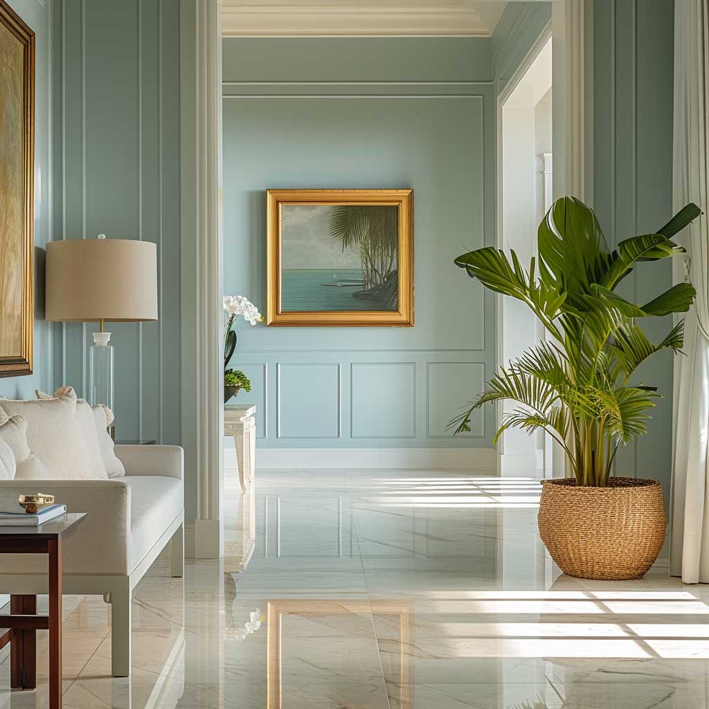

Farrow & Ball’s Setting Plaster ($130/2.5L tin) is the pastel that I stole from a designer friend’s mood board and have recommended to at least six people since. It reads as dusty blush in morning light and almost nude by evening — the colour changes hourly, which means your hall never looks the same twice. That quality is rare and worth every penny of the premium. For a more budget-friendly option, Benjamin Moore’s Pink Cloud 2173-60 at $75/gallon gets surprisingly close.
Pastels do something structural that bolder colours can’t — they amplify whatever natural light exists in a space. Pale mint, soft lavender, and dusty sky blue all have high LRV (light reflective value) scores, which means they scatter light rather than absorbing it. Halls without windows — the most common layout complaint I hear — transform under a pastel scheme because the wall itself starts doing the work of a window.
The anti-advice nobody gives you about pastels: avoid the straight-from-the-strip versions. Fresh pastel pink looks pretty in the tin but chalky and flat on a 3-metre wall. You want a pastel with depth — a complex undertone of grey, ochre, or green that stops it reading like a nursery. Farrow & Ball Mizzle, Bone, and Elephant’s Breath all qualify. Standard paint-brand versions in primary-diluted pastels do not.


Pastels pair naturally with Scandinavian and contemporary decor — a thin-legged white console from Menu, a convex brass mirror from H&M Home at around $65, and a single oversized artwork in a black frame give the wall something to anchor against. The pastel serves as the canvas. Bold accessories pop harder against a soft background than they ever would against a strong one.
You’ll notice the calming effect immediately. Pastels sit on the cool-to-neutral part of the spectrum, which reduces visual stimulation at exactly the moment you enter the home from outside. That transition — from street noise to indoor calm — is accelerated when the first wall you see isn’t competing for your attention. Soft hues let you exhale before you’ve put your bag down.
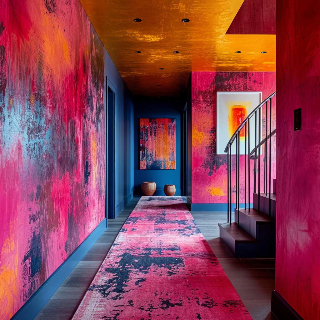
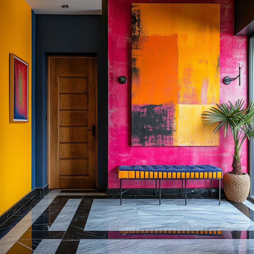
Vibrant Contrast Colours Reward Commitment, Punish Hesitation


Benjamin Moore Blue Nova 825 paired with ochre accessories is the contrast combination I keep seeing in halls that stop visitors mid-stride. Blue Nova is a violet-leaning medium blue — not too saturated, not too muted — that deepens toward navy as daylight fades. At $75/gallon in Aura Interior, it has the pigment depth to carry a contrast scheme without looking like a feature wall from 2009. The secret is the 70/30 rule: 70% dominant colour on the walls, 30% contrast delivered through a rug, hooks, and one piece of art.
Vibrant contrast is the most punishing colour approach for halls because it exposes every mistake. A slightly off-centre art print, a rug that’s the wrong shade of orange, a coat hook that’s chrome instead of brass — all of these read louder against a high-contrast background than they would against a neutral. You need to be decisive about every accessory in the space before you commit to the paint. Think of it like a stage set: the backdrop has been done; now the props matter.
What doesn’t work: blue walls paired with pink-toned wood flooring. I’ve seen this combination in three different renovation blogs and it looks unfinished every time. The undertones fight. Navy and warm honey oak work. Navy and cherry-toned laminate do not. Your flooring’s undertone is the non-negotiable factor — contrast the walls against the floor’s dominant hue, not its opposite.
Dont Do This
50/50 contrast splits — equal portions of two bold colours on opposing walls creates a hall that feels like a competition, not a welcome. One wall does not count as a compromise.
Bright red or orange as wall colours — designers at Katie Hillburn Interiors and Peltier Interiors both flag these as too stimulating for transition spaces. They’re fine in dining rooms where energy is the point.
Cool concrete grey in a north-facing hall — without warm natural light, cool grey reads as a parking garage. Ellie Stein of Stein Studio says it makes halls feel closed-in and lifeless.
Stark white in any hall — it registers as primer, not paint. Without natural light softening it, white walls in a hall feel sterile. Warm white like Benjamin Moore Revere Pewter HC-172 is the minimum.


Contrast colour halls read as playful and modern — they signal personality from the moment the front door opens. That signal only works if the rest of the hall decor backs it up. Mismatched prints, too many storage items on show, or a worn mat undercut the boldness of the scheme. Contrast demands editing everywhere else. Strip the space down to three intentional objects and let the colour do the personality work.
A word on paint finish: vibrant colours in a flat or matte finish absorb light and can look chalky. Use eggshell for hall walls — it gives a slight sheen that lets the colour’s true saturation show. Sherwin-Williams Interesting Aqua SW 6220 in their Emerald Eggshell line at around $75/gallon hits the contrast brief without the flat-finish problem.
Monochrome Hall Walls Pull Off Sophistication Without Any Extra Effort


I own two monochrome rooms in my current flat and the hall is both of them — by which I mean: I painted the walls, skirting, and door frame in the same shade of Farrow & Ball Pavilion Gray and haven’t regretted it for a second. The technique is called colour-drenching, and it adds visible height to a space by removing the visual interruption where wall meets trim. It works like an optical illusion — the eye travels up without stopping. Tall halls suddenly feel like they have ceilings worth noticing.
The monochrome approach solves the colour combination problem by eliminating it. Pick one hue, layer three shades of it — darkest at the floor, lightest at the ceiling — and the room reads as designed without any further decisions. Benjamin Moore’s Stonington Gray HC-170 on the lower third, Coventry Gray HC-169 at mid-height, and Pale Gray OC-21 at the top is a combination I stole from an interior designer’s Instagram and have seen work in at least four different hall widths since.
Monochrome with a warm hue — dusty greens, muted sage, warm taupes — reads friendlier than cool monochrome in the same space. Farrow & Ball Mizzle layered with Vert de Terre and Pale Powder costs around $260 for three tins to cover a standard 8-metre hall and is worth every cent. Cool-toned monochrome — all-grey or blue-grey — requires a warm light source to stay inviting. Warm-toned monochrome forgives average lighting. Choose accordingly.


Monochrome walls become the best gallery backdrop you can build. Artwork in black frames, a brass-rimmed convex mirror, family photos in uniform mounts — all of these stand out harder against a tonal wall than against a busy contrasting one. The uniformity of the colour scheme becomes the backdrop the art needs. Think of it as a museum wall that also happens to be someone’s home.
The one failure mode of monochrome halls: choosing a hue with strong purple or pink undertones that only become visible once it’s on all four walls. Swatch at least 30cm x 30cm in your actual hall and look at it in the evening under your existing lighting before committing. What reads grey in the tin can read lilac at 8pm with warm bulbs. Check it at night. Every time.
Deep Saturated Colours Demand One Rule — Get the Lighting Right First


Farrow & Ball Stiffkey Blue ($130/2.5L tin) in a hall is the kind of design decision that guests comment on before they’ve put their coat down. It’s inky, verging on teal, with enough depth to make a 2.5-metre ceiling feel deliberate rather than average. My go-to pairing is warm brass wall sconces at 150cm height on each side — two Ikea NYMÖNE sconces at $45 each give adequate light while the brass reads intentional against the blue. The whole combination costs under $250 and looks like a hotel designed by someone who reads Apartamento magazine.
Deep, saturated colours absorb more light than they reflect — that’s the physics of them. A hall painted in deep navy or forest green needs supplementary lighting that whites and pastels don’t. Install at least two wall-mounted light sources in addition to any ceiling fixture. Position them at eye height, not crown-moulding height, so they illuminate the wall surface rather than casting down-shadows. Reflective surfaces amplify this — a large round mirror at 80cm diameter bounces wall-mounted light back into the room and effectively doubles the perceived luminosity.
The combination of deep colour with lighter ceiling paint — keep the ceiling in the pastel or off-white family — frames the hall like a frame around a painting. Pale Powder or Wimbourne White from Farrow & Ball used as ceiling colour above Stiffkey Blue or Hague Blue walls creates a lightness at the top of the visual field that prevents the space from collapsing. Don’t paint the ceiling the same dark colour unless your hall is wide enough to be dramatic — most residential halls are not.

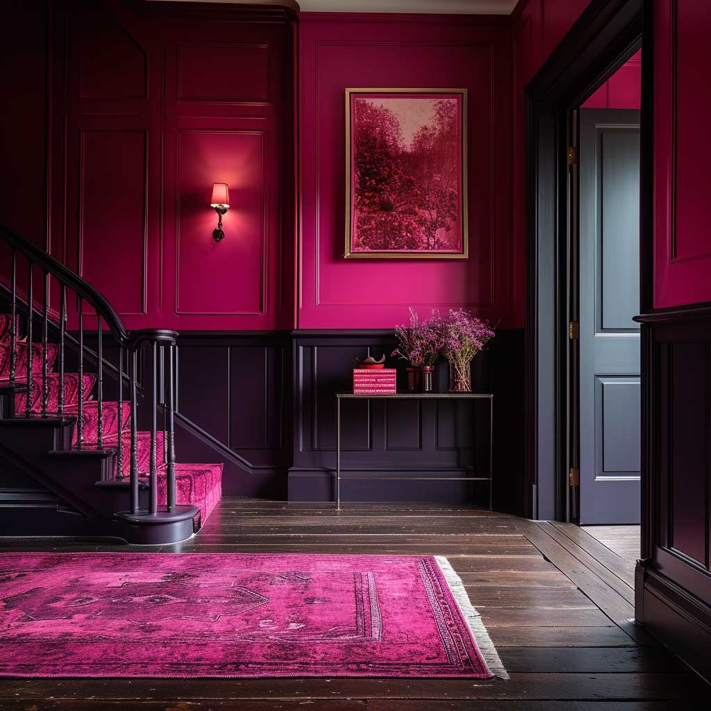

Bold, saturated hues have a psychological role that softer colours can’t match — they tell whoever enters that this home belongs to someone who made deliberate choices. That signal is architectural confidence done in paint. Deep colour in a hall functions exactly the way a firm handshake does: you register it instantly, you don’t forget it, and you make a judgment about the person behind it in under two seconds.
The common failure I see with dark hall walls is pairing them with cold-white ceiling light. LED downlights at 5000K colour temperature against a deep navy wall read clinical, not luxurious. Switch to 2700K warm-white bulbs — same fitting, $3 more per bulb — and the same deep wall colour suddenly reads like a boutique hotel. Lighting temperature is not a minor detail here. It is the entire difference between drama and depression.
Blue-Green Combinations Age Better Than Any Other Hall Palette


Farrow & Ball Cromarty — a soft grey-green — is the closest thing to a guaranteed hall wall colour I know. I’ve seen it in a 1970s semi-detached, a Victorian terrace, and a new-build flat, and it worked in all three. Designer Jenny Wolf calls it her favourite calming colour precisely because its grey component prevents it from reading as overly green or overly blue, which means it doesn’t fight with flooring or furniture the way a more committed hue would. At $130/2.5L tin, it’s expensive; Benjamin Moore Quiet Moments HC-169 at $75/gallon is the closest affordable match.
Blue-green combinations work in halls because they mimic the natural colour range of outdoor spaces — sky, foliage, water, stone — and the brain processes them as familiar and calming before any conscious aesthetic judgment is made. That’s not a design theory; it’s evolutionary. Humans spent considerably longer in landscapes than in buildings. A hall painted in Farrow & Ball Mizzle or Benjamin Moore Wythe Blue reads as “outside” just enough to dissolve the transition stress of arriving home.
Pair blue-green walls with natural materials: stone-effect porcelain tile underfoot, a solid oak hook rail rather than an injection-moulded plastic one, wicker baskets for shoe storage rather than plastic bins. The palette invites these textures in and elevates them. You’ll notice that IKEA’s Brusali storage in white actually reads slightly clinical against a blue-green wall — swap it for their Hemnes range in grey-brown and the difference is significant. The wood undertone in the Hemnes exactly matches the warmth built into most blue-greens. Read more about hall colour combination secrets for balanced decor.


Lighting is the variable that most people underestimate with cool-leaning palettes. Blue-green walls in a north-facing hall need a warm light source — 2700K bulbs or lower — or the colour reads cold and slightly clinical rather than calming. A warm-toned lampshade on a floor lamp at the hall’s far end adds incandescent warmth that corrects the cool bias without touching the paint. This trick costs $30 at most and takes four minutes to implement.
Blue-green as a colour family is arguably the most forgiving in halls because it bridges both the warm and cool spectrum — warm greens sit comfortable next to terracotta floors, cool blues work with grey stone and white marble. No other colour family has that range. If you are genuinely unsure which direction to take your hall colour combination, start here and work outward. You can read more about how hall textures and colour combinations work together to amplify each scheme’s impact.
From the Editor
The colour combination that actually makes your hall welcoming is not the one you saw on Pinterest — it’s the one that survives your flooring, your lighting, and your daily routine.
Warm earth tones carry narrow halls. Pastels rescue dark entries. Monochrome does the work of an interior designer without requiring one. Bold saturated colours deliver personality on demand — if you fix the lighting first.
The biggest mistake I see: choosing the wall colour before deciding on the lighting temperature. Get the bulbs right first, then pick the paint. The bulbs cost $8. Repainting costs a weekend.
Save this post — next time you’re standing in the paint aisle holding sixteen swatches and understanding none of them, come back to this page.