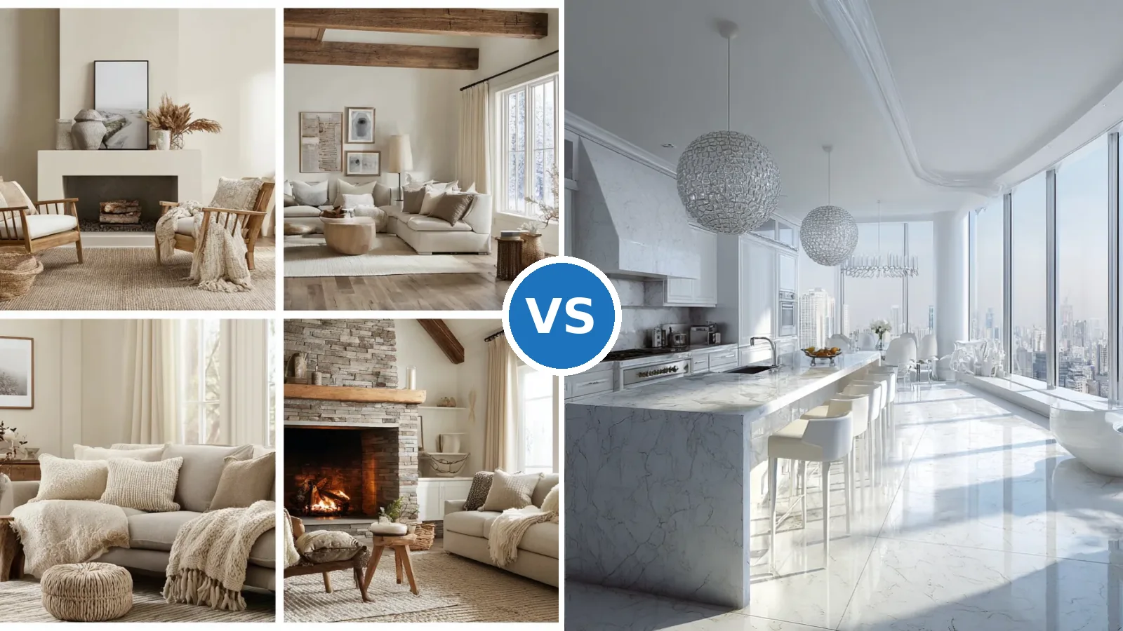
Gray and white interior design makes a home look larger and brighter because both colors sit in the upper half of the light reflectance scale, which runs from 0 for black to 100 for pure white. Crisp whites land around LRV 82–94, so they send back more than four-fifths of the light that hits them, while popular light grays such as Agreeable Gray sit near LRV 60. Does the pairing really change how big a room feels? Yes, as long as white covers the largest reflective surfaces and gray adds the depth that keeps edges readable. Start with white on the ceiling and trim, then choose the wall gray.
The palette works in kitchens, living rooms and bedrooms, but each room needs a different balance. A room with weak northern light usually needs walls at LRV 74 or higher, while a sunny room can carry a gray in the 40–55 range without feeling dim. Bulbs finish the job, with 2700K keeping gray warm in a bedroom and 3000–4000K suiting kitchen counters. Match the gray to the window, not to the paint chip under store lights.
The sections below move from paint numbers to the kitchen, living room, bedroom and whole-house plan, with two comparison tables near the end. Each one names specific shades, bulb temperatures and paint quantities rather than vague moods. Read the LRV section first, since every later choice depends on it.
Quick Scan
- Whites for ceilings and trim sit at LRV 82–94: Chantilly Lace is about 90–92, Pure White is 84.
- Light grays for walls sit at LRV 55–72; Agreeable Gray (60) reads warmer than Repose Gray (58).
- Dim or north-facing rooms need walls at LRV 74+, while very sunny rooms can take a 40–55 gray.
- Use 2700K bulbs in bedrooms vs 3000–4000K over kitchen counters.
- One gallon covers roughly 350–400 sq ft, and most rooms under 150 sq ft need about one gallon.
- Each step up in sheen adds about $2 per gallon and more glare, so keep walls matte or eggshell.
- Save charcoal (LRV 10–20) for islands, coffee tables or a single accent wall.
Choosing Light Gray and White Shades by the LRV Number
Light gray and white work as a pair because their light reflectance values sit close enough to blend yet far enough apart to show depth. LRV measures the share of visible light a dry paint film sends back into the room, so a wall at LRV 60 returns roughly 60% of the light it receives. White trim at LRV 84–92 returns 24–32 points more, and that gap is what outlines doors, windows and moldings. Think of it like a pencil drawing, where the gray is the shading and the white is the paper. Keep at least 20 LRV points between the wall gray and the trim white so the outline stays visible.
A widely used breakdown of paint colors by LRV range groups whites at 82–94, off-whites at 73–81, light colors at 55–72 and light-medium shades at 40–55. Most grays sold as “light” fall into the 55–72 band, which is why they look soft on a sunny wall and flat in a dim hallway. Is a higher number always better? No, because a dark room painted in a grayish white can look dull rather than bright when there is little light to bounce. Check the LRV on the back of the chip before judging the color by eye.
- LRV 82–94: whites for ceilings, trim and cabinets
- LRV 73–81: off-whites for whole-house walls with soft contrast
- LRV 55–72: light grays such as Agreeable Gray (60) and Repose Gray (58)
- LRV 40–55: light-medium grays such as Mindful Gray (48) for sunny rooms
- LRV 10–20: charcoal accents for islands and feature walls
Undertone decides whether white and grey interior design feels warm or cold. Agreeable Gray at LRV 60 leans beige and warm, while Repose Gray at LRV 58 leans cooler and reads as a truer gray, even though the two differ by only 2 points. Pair a warm gray with a softly warm white like Pure White at LRV 84, and a cool gray with a clean white like Chantilly Lace at roughly 90–92. Don’t pair a blue-leaning gray with a creamy white, because the cream will look dirty beside it. Test 2-by-3-foot swatches on two opposite walls before buying full gallons.
Kitchens Where Gray and White Interior Design Bounces Daylight


A gray and white kitchen interior gets its brightness from the biggest surfaces first, and in most kitchens those are the cabinet fronts. Cabinet whites usually sit at LRV 82–94, so a run of white uppers acts like a large reflector beside the window. Light gray counters or a gray island add contrast without dragging the room down, the way a gray matboard frames a photograph. Should the island be gray too? It can be, and medium-dark shades in the LRV 10–20 range are far more common on islands than on full cabinet runs. Keep the darkest gray below counter height so the upper half of the room stays reflective.
Finish matters as much as color in a kitchen. Glossier paint costs roughly $2 more per gallon for each step up in sheen, and it throws light back at one angle, which can read as glare on a sunny afternoon. Satin or semi-gloss on cabinet doors wipes clean, while matte or eggshell walls spread light more softly around the room. Don’t put high gloss on every surface, because a kitchen full of shine looks like a showroom under 4000K bulbs. Reserve the sheen for cabinet doors and backsplash tile.
Daylight is the raw material for this palette, so the window side of the kitchen deserves the lightest finishes. Where a remodel is on the table, floor-to-ceiling glass walls that pull daylight deep into a room give white cabinets far more light to work with, though exterior full-height glazing runs about $150–$300 per square foot installed. A cheaper step is clearing the sill and swapping heavy blinds for a light roller shade. Pale wood or light stone floors finish the effect, much like a snowfield throwing sun back upward. Put the palest material on the wall that faces the window.


Metal finishes and lighting tie the kitchen together after dark. Stainless or brushed nickel hardware repeats the gray in small doses and catches light at every handle. Lighting guides recommend 3000K to 4000K for counters and prep zones, while pendants over the island usually drop to 2700K or 3000K for a warmer glow. Is mixing color temperatures in one kitchen a mistake? Not when each zone has one job, so use the cooler light for tasks and the warmer one where people sit.
Bar stools, textiles and small appliances either support the palette or break it. White or light gray stools keep the floor area visually open, while a row of black stools reads like a fence across the island. Two gray tones are enough for most kitchens, one light for the walls and one deeper for the island or counters. Don’t add a third gray in the backsplash, since three similar shades start to look like leftover paint. Choose white tile with gray grout when the backsplash needs texture.
Living Rooms That Feel Wider in White and Gray Interior Design


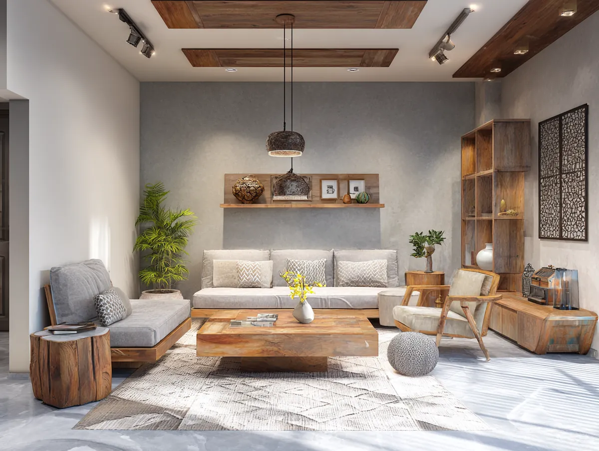
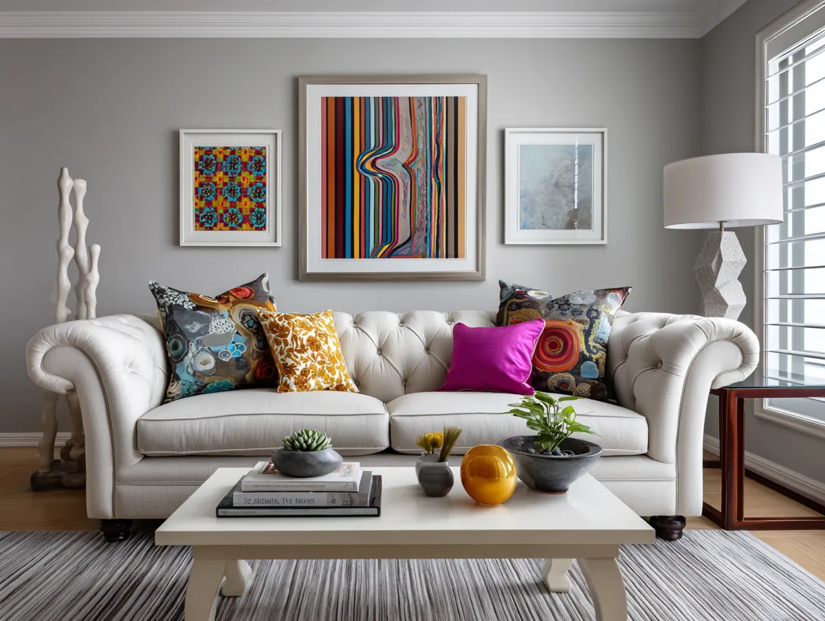
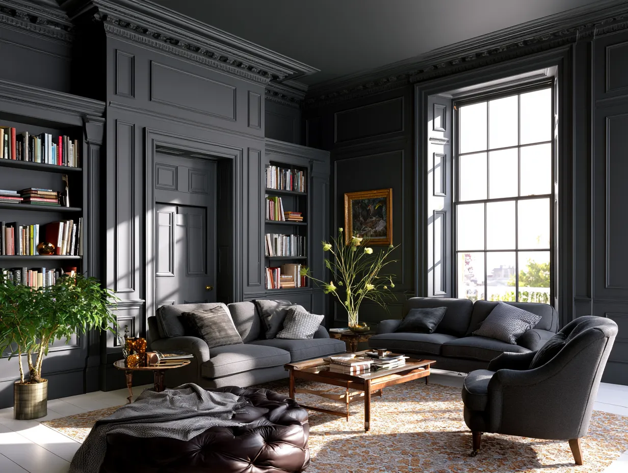
White and gray interior design in a living room works best when the walls stay light and the furniture carries the gray. Light-filled living rooms usually land between LRV 55 and 75 on the walls, which is bright enough to bounce daylight without glare. A soft gray sectional then works like the keel of a boat, low and heavy so everything above it can stay light. Paint the walls first and choose the sofa fabric against the dried color, not against the chip.
In open plans, a two-step gray can mark zones without building a wall. One common approach puts a deeper shade such as Mindful Gray at LRV 48 in the living area and the lighter Agreeable Gray at LRV 60 in the spaces next to it. The 12-point drop reads as a separate room, while the shared undertone keeps the house connected. Don’t switch undertones between zones, since a cool gray beside a warm one looks like two houses glued together. Use the same white on every ceiling and trim to stitch the zones into one plan.
Lighting decides whether a gray sofa looks cozy or cold in the evening. Lighting guides put living rooms at 2700K or 3000K, which warms gray fabric and keeps white walls from turning blue. Cooler 4000K bulbs make whites crisper but can push a gray room toward an office feel. Is 3000K too yellow for a gray scheme? Usually not, since it sits closer to halogen light than to candlelight. Keep every lamp in the seating area at one color temperature.


Built-in storage painted the wall color disappears into the room, which is why white bookcases on white walls make a living area feel bigger. A bookcase in a contrasting gray reads as furniture, while the same unit in white reads as architecture. Group objects in small clusters and leave open shelf space so the white backdrop shows through. Don’t fill every shelf, because a packed bookcase reads as a dark block whatever its paint color. Paint built-ins in the same white as the trim for one unbroken surface.
Floors and rugs set the base tone for the whole room. Light wood floors pair naturally with gray because their warmth offsets cool undertones, and a light gray area rug marks the seating zone without a physical divider. A rug works like a picture frame laid flat, showing where the center of the room sits. Size it so at least the front legs of every seat rest on it.
Gray and White Bedrooms Built for Calm and Space


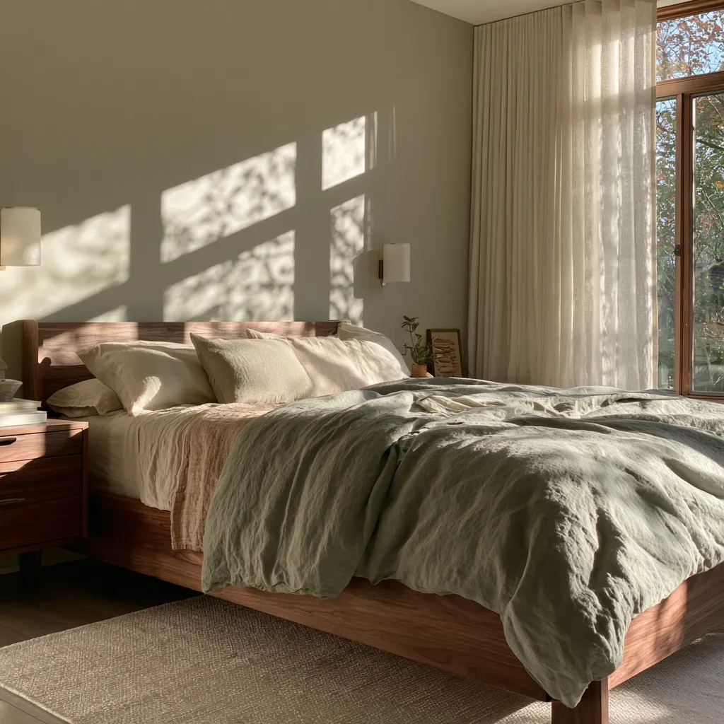
Gray and white bedrooms usually flip the living room formula, putting gray on the walls and white on the bed. A wall gray a few points deeper than the living room shade creates a more enveloping, restful feel, and Repose Gray at LRV 58 is a frequent bedroom pick for that reason. White bedding then becomes the brightest object in the room, like a lampshade glowing against a dim wall. Judge the wall color from the bed, since that is the view you see most.
Bulb temperature matters more in a bedroom than anywhere else in the house. Lighting manufacturers rate 2700K as the most popular bedroom choice, because the soft yellow glow keeps gray walls warm at night. A 4000K bulb in the same room makes gray read cold and white bedding look clinical. Why does the same paint look bluer after sunset? Cooler bulbs push cool-toned colors like grays and whites toward a crisp, stark look. Fit 2700K bulbs in both bedside lamps and the ceiling fixture.
Furniture finishes add depth without adding bulk. Gray nightstands beside a white upholstered bed create a two-tone frame around the sleeping zone, while white nightstands on gray walls do the reverse. Silver or crystal accents catch lamplight in small points, the way frost catches morning sun. Don’t stack two heavy charcoal pieces in a small bedroom, since a dark dresser plus a dark headboard shrinks the room. Place the darkest piece on the wall opposite the window.


Window treatments decide how much daylight the gray walls receive. Sheer white curtains soften light while letting most of it through, and blackout-lined panels can block up to 99% of daylight when sleep matters more than brightness. Layering both on a double rod gives two settings in the same window, like a dimmer switch made of fabric. Hang the rod close to the ceiling and wider than the frame so the window reads larger.
A white rug under the bed brightens the floor plane and softens footsteps on wood. Wool or a washable synthetic handles daily traffic better than a pure white shag, which shows marks quickly. Is bright white practical in a bedroom shared with pets? Rarely, so an off-white or pale gray rug is the safer pick. Choose a rug large enough to extend past both sides of the bed.
Carrying Gray and White Through a Whole House Interior
A gray and white house interior reads as one calm space when every room shares the same white and the grays step up or down by a few LRV points. Colors chosen for an entire home tend to land between LRV 65 and 75, light enough for hallways that never see direct sun, compared with 62–75 for a single room. Think of it like a musical key, where each room plays a different note but none clashes. Pick one trim white for the whole house before choosing any wall gray.
Budget is easier to plan than most people expect. One gallon of interior paint covers roughly 350–400 square feet, and an average home needs about six gallons per coat. Interior paint generally costs $25–$50 per gallon, while professional interior painting averages $2–$6 per square foot. Is premium paint worth it for a whole-house refresh? Often yes, since better hiding power can save a coat when white goes over gray. Buy all the trim white in one batch so the tint stays consistent from room to room.
Ceilings are the surface most people forget to plan. A white ceiling in the LRV 82–94 range pushes light back down into rooms with gray walls, which is why it remains the default. Some homes now flip that rule with painted ceilings that turn the fifth wall into a color feature, but in a gray and white scheme a deep ceiling only suits tall rooms with strong light. Don’t paint a standard-height ceiling darker than the walls, since it presses down like a heavy lid. Keep ceilings white in hallways, kitchens and small bedrooms.
- Choose one ceiling and trim white at LRV 82–94.
- Pick the main wall gray from the 55–72 band.
- Add one deeper gray at LRV 40–55 for a zone or a very sunny room.
- Limit charcoal at LRV 10–20 to an island, a door or one accent wall.
- Match bulbs to the room: 2700K for living and sleeping, 3000–4000K for tasks.
Paint Shades Compared for a Grey and White Interior
A grey and white interior usually draws on a short list of proven shades, and the numbers below make side-by-side comparison easier than squinting at swatches under store lighting. Agreeable Gray and Repose Gray differ by just 2 LRV points but read warm versus cool, while Chantilly Lace sits about 6–8 points brighter than Pure White. Brand names matter far less than LRV and undertone. Compare the LRV first, the undertone second and the price last.
| Shade | Brand and code | LRV | Undertone | Best role |
|---|---|---|---|---|
| Chantilly Lace | Benjamin Moore OC-65 | About 90–92 | Near-neutral | Trim, ceilings, white cabinets |
| Simply White | Benjamin Moore OC-117 | About 90 | Warm yellow | Walls next to warm wood |
| Pure White | Sherwin-Williams SW 7005 | 84 | Soft warm | Trim with warm grays |
| White Dove | Benjamin Moore OC-17 | 83 | Soft warm | Whole-house white in bright homes |
| Edgecomb Gray | Benjamin Moore HC-173 | 63 | Warm greige | Whole-house walls |
| Agreeable Gray | Sherwin-Williams SW 7029 | 60 | Warm, beige-leaning | Living rooms, warm exposures |
| Repose Gray | Sherwin-Williams SW 7015 | 58 | Cooler, truer gray | Bedrooms, cool furniture |
| Revere Pewter | Benjamin Moore HC-172 | 55 | Taupe-gray | Traditional rooms |
| Mindful Gray | Sherwin-Williams SW 7016 | 48 | Slightly cooler greige | Open-plan zones, sunny rooms |
| Gauntlet Gray | Sherwin-Williams SW 7019 | 17 | Warm charcoal | Islands, accent walls |
Is the brightest white always the right trim? Not next to warm grays, where a stark white can make Agreeable Gray look muddy, much like a new white sneaker beside a well-worn one. Pure White at LRV 84 is the gentler partner for warm walls, while Chantilly Lace at about 90–92 suits cool grays and modern kitchens. Don’t pick a trim white from a fan deck alone, because the deck hides how it reacts to the dried wall color. Buy a quart of the trim white first and test it on one door frame.
| Room | Wall LRV | White and accent | Bulb temperature | Paint planning note |
|---|---|---|---|---|
| Kitchen | 55–72 | Cabinets 82–94, island 10–20 | 3000–4000K counters, 2700–3000K island | About 1 gallon for rooms under 150 sq ft |
| Living room | 55–75 | Trim 84–92, zone gray 40–55 | 2700–3000K | About 2 gallons for rooms over 300 sq ft |
| Bedroom | About 58–60 | White bedding, trim 82+ | 2700K | 1 gallon covers roughly 350–400 sq ft |
| Dim north-facing room | 74+ | Warm white trim at 84 | 2700–3000K | Pick a white with some color, not a grayish one |
| Whole house | 65–75 | One trim white everywhere | By room function | About 6 gallons per coat for an average home |
Don’t do this
- Don’t paint a dim north-facing room in a grayish white and expect brightness; walls at LRV 74+ with a bit more color work better.
- Don’t put a cool gray (Repose, LRV 58) and a warm one (Agreeable, LRV 60) in rooms that open onto each other.
- Don’t use 4000K bulbs in a gray bedroom; 2700K keeps the walls warm.
- Don’t cover every surface in gloss; each sheen step adds about $2 per gallon and more glare.
- Don’t paint full cabinet runs in charcoal (LRV 10–20) in a small kitchen; keep it to the island.
Where the Palette Pays Off
Gray and white pays off most when white covers the surfaces that catch light and gray covers the surfaces that need depth, with roughly 20–30 LRV points between them. A light gray at LRV 58–63 against trim at 84–92 gives the outline and brightness that make rooms look larger. Start every project from that gap rather than from a mood board.
Light decides the rest of the plan. Dim or north-facing rooms need walls at LRV 74 or higher, while very sunny rooms can carry a 40–55 gray without feeling dark. Check which way the window faces before buying paint.
Bulbs finish the scheme. Use 2700K in bedrooms, 2700–3000K in living rooms and 3000–4000K over kitchen counters. One temperature per zone keeps the grays from shifting between warm and cold.
Quantities are simple to plan early. A gallon covers about 350–400 square feet, and a room under 150 square feet takes roughly one gallon per coat. Buy all the trim white in one batch so every room matches.