A Kelly Wearstler bedroom doesn’t borrow from a single school of design — it raids several at once, and the result feels like nothing else. I’ve spent a lot of time reverse-engineering her rooms, and the pattern that emerges is relentless: every surface does something. Bold pattern on the wall. Sculptural brass on the nightstand. Velvet where you’d normally find linen. You can’t lift one element out without the whole thing losing tension. That’s the hard part to copy, and the rewarding part to understand.
Wearstler’s AD100 rooms run anywhere from $80,000 to $400,000 in full execution, but the principles underneath don’t require a hotel budget. They require understanding why she makes the choices she makes — not just copying the surface layer. This piece breaks down each pillar of her bedroom aesthetic and shows you where the real leverage is.
What You’ll Find in This Article
- Why bold patterns anchor a Kelly Wearstler bedroom — and which ones fail
- Statement furniture: the pieces she returns to again and again
- Lighting choices that do the heavy lifting in a glamorous bedroom
- Her actual color palette logic — jewel tones, metallics, and neutrals
- How she layers bedding, rugs, and materials without visual chaos
- Art and sculpture as structural elements, not afterthoughts
- Fusing vintage and contemporary the way Wearstler actually does it
- The relaxing-oasis version of this aesthetic — calmer but still hers
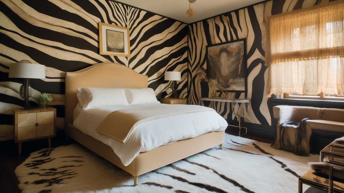
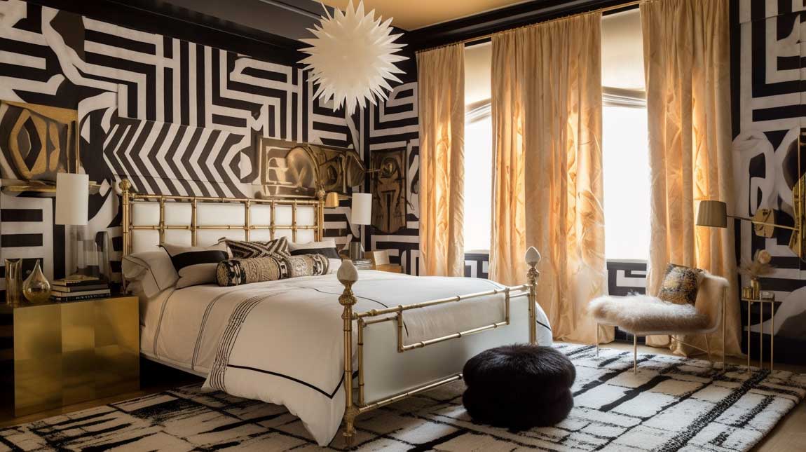
Bold Patterns in a Kelly Wearstler Bedroom Pull the Room Into Focus
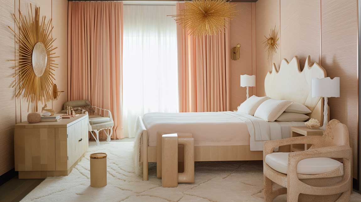
Wearstler’s go-to move is graphic patterning pulled from mid-century geometry — think David Hicks-style repeating diamonds or oversized 1970s-era chevrons that cover an entire wall in one hit. I’ve tried the half-measure version of this: a small-scale geometric on a single accent pillow. It reads as fussy, not bold. You need scale. A Schumacher “Zimba” or “Peacock” wallpaper at $95–$140 per roll, applied floor to ceiling on one wall, does what three smaller interventions never will.
The texture mixing matters as much as the pattern itself. Her rooms pair lacquered walls against shagreen side tables against silk bedding — materials that catch light differently at every hour. You’ll notice in her Viceroy Hotel suites that no two adjacent surfaces have the same finish. That contrast is what creates depth. A room where everything is matte reads flat, regardless of how bold the pattern is.
Don’t mix more than two large-scale patterns in the same room. That’s the anti-advice nobody gives you, but I’ve seen it go wrong: a geometric wallpaper plus a large floral duvet plus a striped rug produces noise, not drama. Wearstler actually holds back — the second pattern is usually smaller-scale or quieter in palette. Pick one pattern to be the room’s statement. Everything else defers to it.
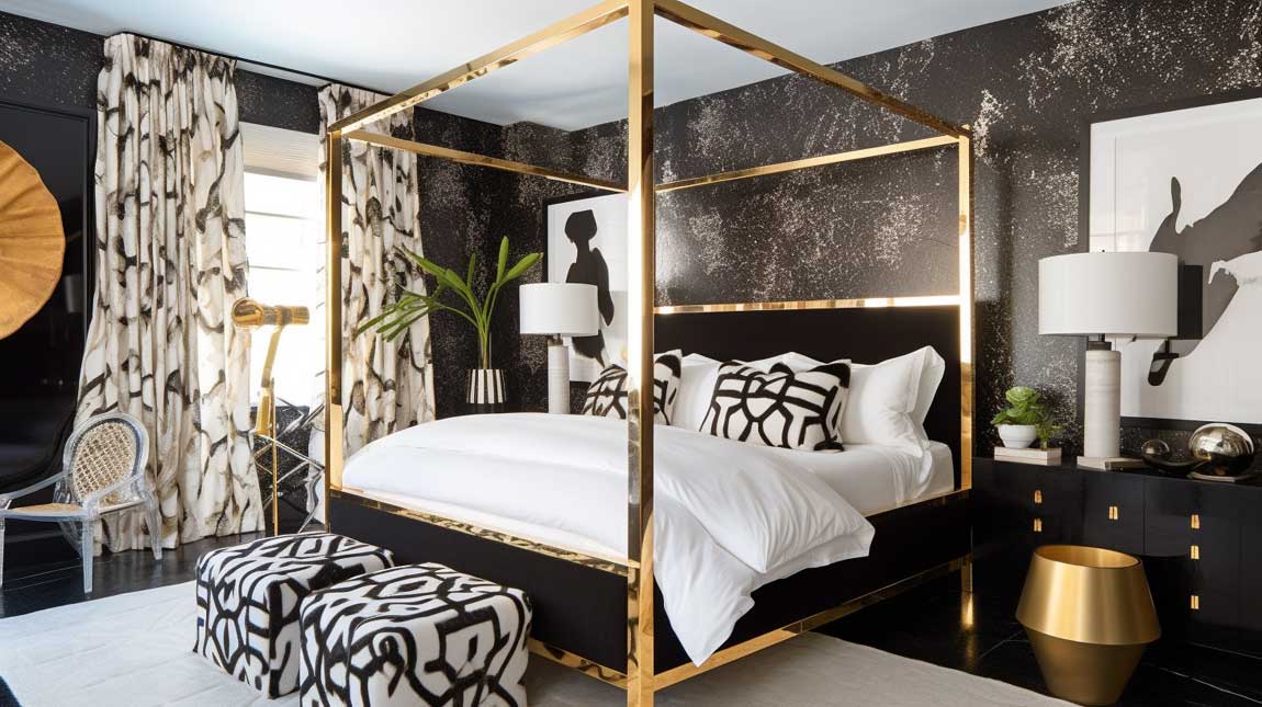

Statement Furniture Wearstler Chooses for Its Sculptural Weight
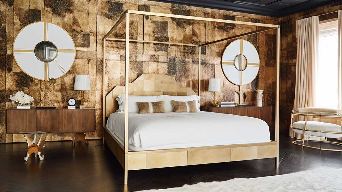
The bed frame in a Wearstler room is never background furniture. Her projects regularly feature upholstered platform beds with architectural headboards — not the tufted-button version you’ll find at every big-box retailer, but headboards that read like low-relief sculpture. Profiles by Restoration Hardware’s Modena line (~$3,200) or custom upholstery through Mitchell Gold + Bob Williams get close. The shape matters more than the fabric. Waterfall edges, curved corners, or a stark geometric outline — any of these announce intention.
My go-to move stolen from her hospitality work: a velvet accent chair with contrasting metal legs placed in the corner, angled slightly toward the bed. It creates a conversation area that doesn’t require a full sitting room. A brass-legged chair in Dedar Milano’s “Opera” velvet (~$180/meter) runs about $1,400 total reupholstered — that’s the version I’d actually buy. Skip chairs with tapered wooden legs in this context; they read mid-century modern, not Wearstler’s Hollywood Regency-inflected maximalism.
Storage pieces deserve the same scrutiny. A lacquered dresser with recessed hardware or a mirrored nightstand with unlacquered brass pulls are the details that hold up at close range. If the hardware looks generic, the whole piece does. The fundamentals of luxury bedroom interior design always come back to quality at contact points — handles, hinges, and legs — because those are the things you touch every day.


Lighting in Wearstler Rooms Earns Its Place or Gets Cut
Wearstler will use 20 chandeliers on a hotel ceiling without hesitation — that quote from Elle Decor’s 2005 profile has stayed with me because it describes the logic precisely. Light fixtures are sculpture first, illumination second. In a bedroom, that translates to a single pendant or chandelier that operates as the room’s most visible art object. Her Proper Hotel rooms favor sculptural resin or plaster pieces over traditional crystal; a Visual Comfort “Liaison” pendant (~$1,100) in aged brass hits the right register without the chandelier-in-a-box look.
Layer below that with bedside lamps that have an object-like presence. Marble bases, ceramic vessels, or unlacquered brass columns — the lamp should look like it belongs on a shelf in a design museum. Avoid anything with a plain turned wood base; it immediately reads budget regardless of the shade. I own two of the Kelly Wearstler x Visual Comfort “Coil” sconces ($320 each) and the difference between those and the generic version is legible from across the room.
Don’t Do This
Don’t install recessed can lighting as your primary bedroom light source and call it done. Cans flatten every shadow, kill the drama of any textured surface, and make even a $15,000 wallpaper look like a hotel corridor. Wearstler uses recessed lighting only as a tertiary layer — accent spots for art or architectural details. Your primary and secondary sources need to be fixtures with physical presence. A bare ceiling grid of cans is the single fastest way to make a glamorous room feel like an airport gate lounge.
Wall sconces flanking the headboard handle functional bedside reading without requiring table lamps to do double duty. This frees up nightstand space for a single sculptural object — a carved stone vessel, a small Kaws figure, a chunk of raw quartz — rather than a lamp crowding everything else out. That’s the Wearstler edit: every surface gets one strong thing, not three mediocre ones.

Color Palette Logic — Why Jewel Tones Hold in Her Rooms
Wearstler’s book Hue (2010) states it plainly: color is everything. Her bedroom palettes lean toward unexpected combinations — jade against chocolate brown, deep teal against warm terracotta, navy with mustard — rather than the safe neutral-plus-one-accent formula. What makes them work is saturation balance. The bold color usually occupies one surface: a wall, a headboard fabric, or a large rug. The remaining surfaces hold neutral or metallic tones that amplify rather than compete.
Metallic integration is where most people get it wrong. Gold works with warm palettes (ochre, terracotta, chocolate) and silver with cool ones (slate, navy, grey). You can break that rule once — a silver object in a warm room reads as a deliberate surprise — but if you mix metals randomly across every surface, the room looks indecisive rather than layered. I’ve made that mistake. Brass hardware on every piece of furniture in an otherwise cool-palette room killed the intentionality completely.
What color fails in a Wearstler-inspired bedroom? Anything greige used as the primary wall tone. Greige reads corporate-neutral, not sophisticated-neutral. If you want a quiet base, go warm white (Benjamin Moore “White Dove” or “Chantilly Lace”) or a proper deep tone. The half-committed beige-grey is the beige that swallowed the ambition of the room. Pick a side. Bold bedroom wall treatments commit fully to their direction — and that’s exactly what makes them land.


Layering Materials Without the Room Falling Apart
Bedding is the easiest place to start layering because it’s reversible and relatively affordable. Wearstler’s hotel rooms stack a fitted sheet (cotton percale, 400-thread-count minimum), a linen duvet, and a faux fur or velvet throw at the foot in a contrasting color. That’s three textures in one zone. The key is that each layer is doing something different: the sheet is cool and smooth, the duvet is light and textured, the throw is tactile and visually heavy. Stack three identical-weight fabrics and you lose the point entirely.
Pillows get their own architecture. She typically runs a standard stack of two king euros in a patterned fabric, two standard pillows in a solid, and one or two decorative lumbar cushions across the front. The pattern-solid-pattern-solid rhythm gives the bed a composed look without requiring all the pillows to match. Matching everything on a bed is the interior design equivalent of wearing all one brand head to toe — technically fine, technically dull.
Furniture layering follows the same logic. A glass-top nightstand against a marble-base lamp against a linen-upholstered chair against a brass floor lamp — you’re cycling through transparency, stone, textile, and metal in one corner. That’s the material vocabulary Wearstler draws from. What breaks the system: all wood, or all upholstered, or all metal. Mono-material rooms read like a showroom, not a lived-in space with a point of view.

Art and Sculpture as Load-Bearing Walls for the Design
Wearstler’s description of her interiors as sculptures is literal, not metaphor. Her vignettes feature colossal wooden heads, metal spiked spheres, and life-sized anatomical casts. In a bedroom context, this doesn’t mean you need a two-foot carved skull on your dresser — but it does mean the art and sculptural objects need to be able to hold their own visually. A gallery of small framed prints grouped over the bed works when the prints have real graphic weight individually. Weak pieces in a tight grid don’t compound into a strong statement; they just become visual static.
Large-scale artwork functions as an architectural element in her rooms — anchoring a wall the way a fireplace would. If the piece is under 24 inches on its longest dimension in a standard bedroom, it will look like an afterthought. You’ll notice her own Malibu home features oversized abstract canvases placed low and close to furniture, which creates a ground-level dialogue between the art and the room rather than sending it up to float above eye level. That placement logic is worth stealing.
Directional lighting for art matters more than the art itself in a dark or moody room. A picture light mounted on the frame or a $200 directional track spotlight aimed at the piece can make a $300 print read like something museum-worthy. I stole this trick from a photo shoot I studied of Wearstler’s private residence: every piece of art had its own dedicated light source. Without that, even genuinely good art disappears into a dim wall.

Personalizing a Wearstler-Inflected Bedroom Without Losing the Thread
Wearstler has said in multiple interviews that she designs for the person, not for a style. Her residential projects incorporate the client’s collected objects, travel finds, and heirlooms as primary design material — not as decorative afterthoughts. That’s actually a useful framework: start with what you already own that has real visual presence, and build the room around those anchors rather than starting with a mood board and shopping to fill it.
The functional layer matters too. Do you need a reading corner? A small writing surface? Blackout capacity for shift work? These constraints should drive the furniture plan before the aesthetic decisions happen. You can have a Wearstler-quality bedroom with a budget workspace corner — but only if the workspace corner was designed intentionally, not crammed in as an afterthought between the wardrobe and the door.
Where personalization goes wrong in this aesthetic: using sentimental objects that lack visual weight as primary display pieces. A collection of small framed family snapshots read differently than a single large portrait print in a striking frame. You need objects that can stand on their own as images before they carry personal meaning. The story they tell should come second to the presence they command. That’s a cold calculus, but it’s the one Wearstler applies.

The Calmer Version — Wearstler’s Bedroom Aesthetic Without Maximum Volume
Not every room wants full-throttle Hollywood Regency maximalism. Wearstler’s own Malibu surf shack — documented in Architectural Digest — dialed back the drama in favor of raw, tactile materials and a coastal palette of bleached wood, sandy linen, and salt-washed cotton. The principles remain: layered textures, sculptural objects, bold lighting choices. The palette and scale are simply quieter. Soft blue-grey or warm sand tones can still hold a Wearstler-style composition if the material quality and layering are there.
For a bedroom that needs to function as a genuine sleep environment, invest in the bedding quality first. Natural linen from Cultiver (~$299 for a queen set) or Parachute’s linen duvet (~$229) gives you the tactile richness without the visual noise. Layer with a single high-contrast throw — a deep indigo or a warm terracotta — and let the bedding be the room’s statement rather than the wallpaper. It’s a more restrained move, and it works.
Candles and scent belong here, too. Wearstler’s hospitality projects are known for custom fragrance programs — Aesop’s “Hwyl” or Boy Smells “Copal” ($36–$52) in a bedroom does something lighting alone can’t: it makes the room feel inhabited and intentional. That’s the whole goal. Wearstler told Homes & Gardens that she believes real personal style doesn’t date — and scent is part of that equation in any room that aspires to her aesthetic.
Vintage Meets New — Where Wearstler Finds the Real Energy in a Bedroom
Wearstler’s sourcing logic is precise: she starts early on each project and looks for vintage pieces first, because new pieces will always be available later. A 1960s Milo Baughman brass-frame chair found at a Los Angeles estate sale ($400–$800 at auction) does something a new reproduction at $2,000 cannot — it carries the physical evidence of a different era. The slight wear, the original patina, the proportions of an older era’s scale: these things read as authentic in a way that new deliberately-distressed pieces never do.
The formula she’s described publicly: if you buy a new sofa, find a vintage coffee table. New bed frame, vintage side table. The pairing offsets both pieces — each one makes the other more interesting. A room full of new furniture, however good the individual pieces, reads as a package deal. A room where half the pieces have their own history reads as assembled with intention over time, which is the fiction that great interior design creates even when it happened in six weeks.
What doesn’t work in this pairing: mixing pieces that are vintage in style but new in manufacture — the “distressed” finish dresser from a chain store positioned next to a genuinely old piece. The fake patina versus real patina contrast is immediately legible. Spend the money on one real vintage piece per room rather than three faux-vintage ones. The 1970s geometric rug you actually find at an estate sale for $600 will carry more weight than three $200 “vintage-inspired” pieces from a big-box retailer combined.

Final Word
A Kelly Wearstler Bedroom Doesn’t Whisper. It Commits.
The common thread across every element of her approach is conviction. Bold pattern means actually bold. Statement furniture means furniture with a recognizable silhouette. Vintage means actually vintage. The aesthetic collapses when you hedge — when the pattern is bold-ish, the furniture is interesting-ish, the art is sort-of-large.
Pick the three or four elements that genuinely excite you in her work and execute those fully. Leave the rest quiet. A bedroom doesn’t need every Wearstler principle at maximum volume — it needs a few of them treated as non-negotiable.
Save this post and come back to it when you’re making decisions room by room.