Most living room wallpaper looks great in a showroom. Paste it yourself and suddenly it reads flat, slightly off, or like a hotel corridor from 2009. Classy wallpaper designs for living room spaces fail not because the pattern is wrong — it’s because the pattern gets chosen without understanding what’s already in the room.
I’ve watched three different clients go full Art Deco on a single feature wall only to realize their sofa was fighting the geometry for attention. Not a vibe. The wallpaper won. The sofa lost. Nobody was happy.
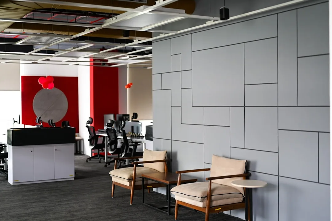
Classy living room wallpaper works when you pick it against your ceiling height, not your Pinterest board. Low ceilings and large-repeat patterns are a disaster. High ceilings and tiny geometric prints look nervous and small. Scale matters more than color. Don’t forget that.
This article covers three directions that consistently deliver: monochrome for modern edge, Art Deco for maximalist glamour, and pastel hues for rooms that need to breathe. Each approach has a version that costs $40 per roll and a version that costs $400. The results are not as different as the price tags suggest.
QUICK SCAN
Classy Wallpaper Designs for Living Room — What’s in This Article
- Monochrome — one-wall rule, Graham & Brown vs Farrow & Ball, what kills it
- Art Deco — why it makes ceilings look taller, Zoffany gold vs budget vinyl
- Pastel hues — the dark trim fix, Grandeco vs Harlequin, timeless vs trendy
- Don’t-do-this mistakes for all three styles
- FAQ — luxury wallpaper, elegant classy combos, classic vs modern picks
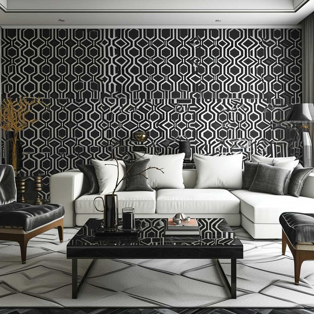
Monochrome Wallpaper Makes a Living Room Look Twice as Considered
Black monochrome wallpaper in a living room is the most misused option on the market. People buy it thinking drama, install it on all four walls, then spend two years wondering why the room feels like a bunker. One wall. That’s the rule. Behind the sofa or the media unit — that’s where monochrome earns its money.
My go-to for this is Graham & Brown’s Superfresco Easy range, around $35–$45 per roll. The texture is subtle enough to read as sophisticated, not as budget. Farrow & Ball does a comparable option at $120 per roll that genuinely looks different under natural light — the paint-like finish catches morning sun in a way vinyl never does. Worth it if the room faces east.
Pale grey monochrome is the safe play. It works with warm wood tones, cold marble, linen sofas. It doesn’t commit to anything. That’s its weakness too — rooms that need personality won’t get it from pale grey monochrome alone. You need a statement piece of furniture or the whole thing reads like a rental staging job.
Don’t go for patterned monochrome on a wall with a fireplace surround that’s already ornate. The patterns compete. I tried this once. Two busy things in one focal zone is just noise. Pick the fireplace or pick the wallpaper. Not both.


In the world of interior design, the living room is often the centerpiece of a home, a place where style meets comfort. One of the most impactful ways to infuse sophistication and a modern edge into this space is through the use of monochrome wallpaper. This design choice is not just about simplicity; it’s about creating a statement that resonates with elegance and contemporary flair.
Monochrome wallpaper, characterized by its single-color scheme, is a testament to the saying “less is more.” This design approach strips away the unnecessary, focusing on texture, pattern, and tone to bring a room to life. In a living room, monochrome wallpaper can create a backdrop that is both understated and bold, allowing other elements of the room to shine while still holding its own.
The beauty of monochrome lies in its versatility. Whether it’s a sleek black, a crisp white, or any shade in between, this color scheme can adapt to various styles and preferences. For a minimalist look, a wallpaper with a subtle pattern in a light shade can add depth to the room without overwhelming it. For those who prefer a bolder approach, a darker shade with a more pronounced pattern can make a dramatic statement.
Texture plays a crucial role in monochrome wallpaper. It adds dimension and interest to the walls, preventing the space from feeling flat or monotonous. Textured wallpaper can mimic materials like fabric, stone, or wood, providing a tactile quality that enhances the room’s overall aesthetic. In a living room, a textured monochrome wallpaper can serve as a focal point or as a sophisticated backdrop for artwork and furniture.


Pattern is another element that can elevate monochrome wallpaper. From geometric shapes to abstract designs, the pattern can introduce movement and rhythm into the living room. It’s important to consider the scale of the pattern in relation to the room’s size. Larger patterns can make a bold statement in spacious rooms, while smaller patterns can add delicacy and detail to smaller spaces.
Lighting also plays a significant role in how monochrome wallpaper is perceived. Natural light can bring out the subtleties of the wallpaper, highlighting its texture and pattern. In the evening, artificial lighting can create a cozy and inviting atmosphere, with shadows and highlights playing across the wallpaper’s surface.
Incorporating monochrome wallpaper into a living room also involves considering the room’s overall color palette. While monochrome implies a single color, it doesn’t mean the room should lack contrast. Using different shades and tints of the same color can create depth and interest. Adding accents in complementary or contrasting colors can also bring vibrancy to the space.
In conclusion, sophisticated monochrome wallpaper offers a way to bring a modern edge to living rooms. It’s a design choice that speaks of elegance and refinement, offering endless possibilities for creating a space that is both stylish and inviting. Whether through texture, pattern, or the interplay of light and shadow, monochrome wallpaper can transform a living room into a testament to contemporary design.
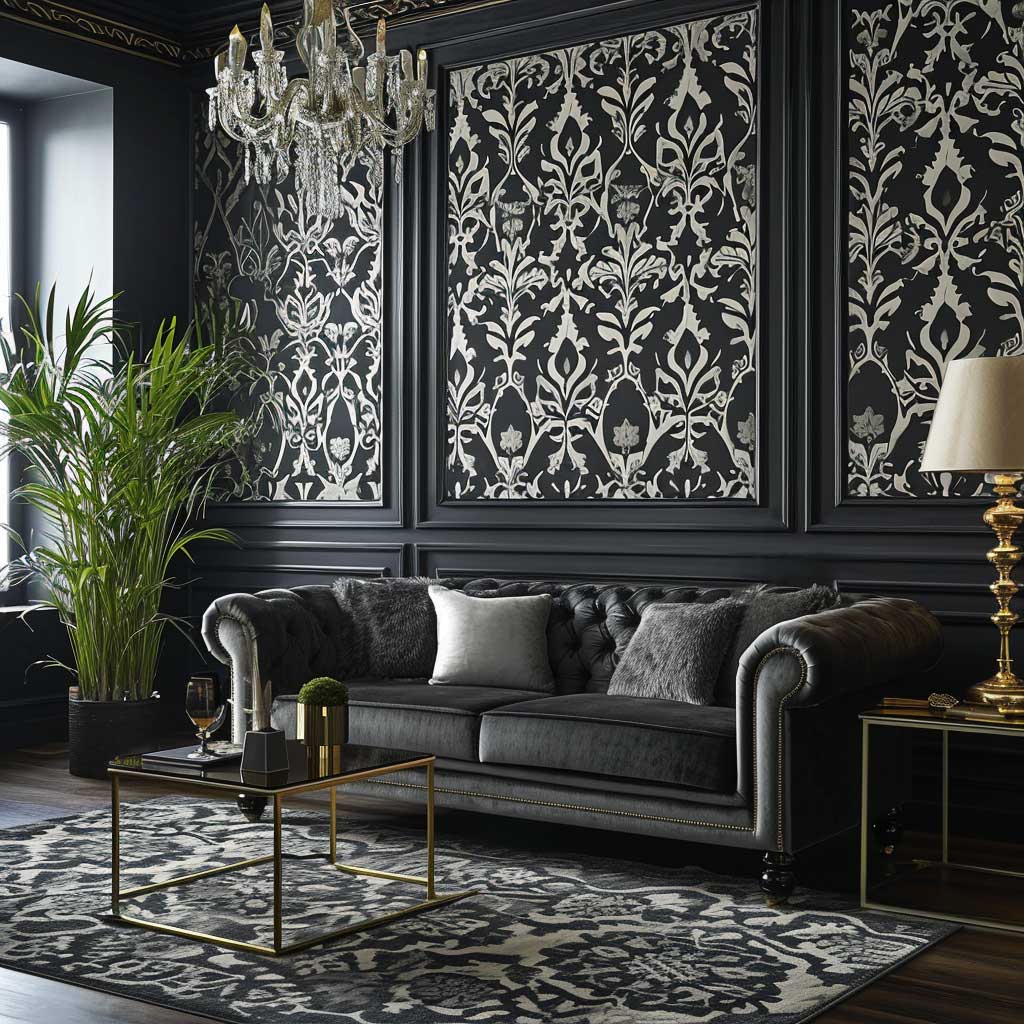
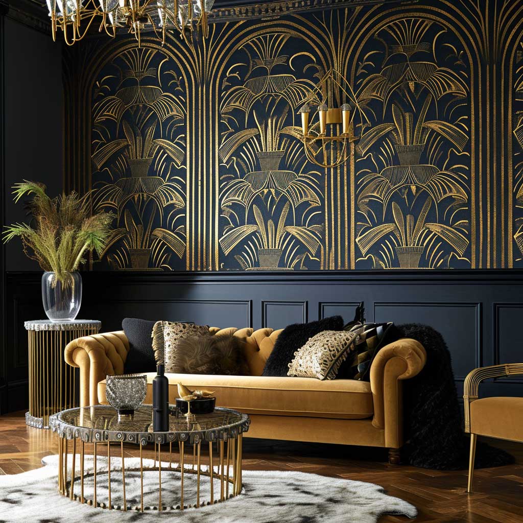
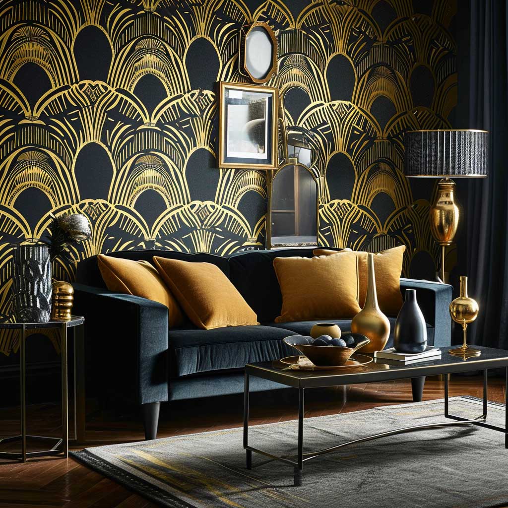
Art Deco Pattern on One Wall Changes the Entire Weight of the Room
Art Deco wallpaper does something specific to ceiling perception. The vertical geometry of most Art Deco repeats draws the eye upward, which makes standard 8-foot ceilings feel taller than they are. That’s not a styling trick — it’s geometry. Buy it for that effect specifically and you’ll never be disappointed.
The Brewster Home Fashions “Luxe Retreat” line runs $55–$75 per roll and hits the classic Art Deco notes without going full theatrical. If you want the real thing — metallic ink on a textured ground — Zoffany’s geometric range starts at $180 per roll and the gold sits completely differently under lamplight than anything printed on flat vinyl. It almost glows. Worth every dollar in a room with evening use.
Avoid Art Deco wallpaper in rooms where you already have a lot of pattern in the textiles. A geometric wallpaper next to a heavily patterned rug creates visual competition that nobody wins. Neutral rug, neutral sofa, let the wall do the talking. That’s the only version of this that actually photographs well.
Elegant classy wallpaper in the Art Deco category usually means navy or emerald with gold. That combination works. What doesn’t work: trying to do Art Deco with a pale palette. Pale gold on cream looks like a reception area. Commit to the dark background or don’t do Art Deco at all.

The allure of Art Deco design lies in its timeless glamour and distinctive style, characterized by bold geometric patterns, rich colors, and luxurious materials. In the realm of living room decor, incorporating Art Deco elements through bold wallpaper patterns can transform a space into an epitome of sophistication and elegance. This design style, which originated in the 1920s and 1930s, continues to influence modern interior design, offering a unique blend of opulence and modernity.
| Style | Best Room Size | Price Range / Roll | Works With | Avoid |
|---|---|---|---|---|
| Monochrome | Any | $35–$120 | Linen sofas, warm wood, marble | Ornate fireplace surrounds |
| Art Deco | Medium–Large | $55–$180 | Velvet, mirrored surfaces, geometric rugs | Pale palette, patterned textiles |
| Pastel | Small–Medium | $28–$95 | Dark trim, neutral furniture, plants | White trim, north wall without warm lighting |
| Classic / Luxury | Large | $120–$400+ | High ceilings, formal furniture, gilded frames | Low ceilings, casual Scandi furniture |
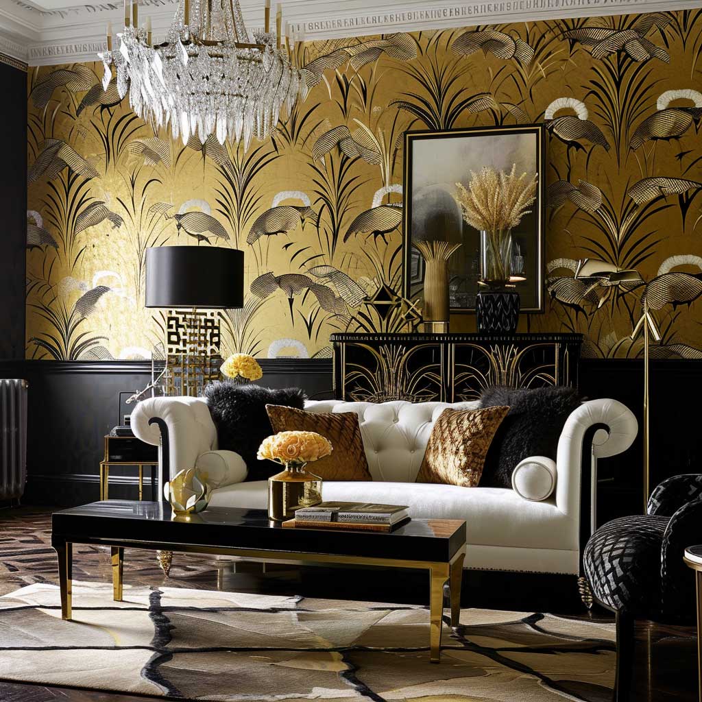
Art Deco wallpapers typically feature strong, symmetrical patterns with a nod to the glamour of the early 20th century. These patterns often include stepped forms, sweeping curves, and angular shapes, creating a sense of movement and rhythm on the walls. The use of metallic colors like gold, silver, and bronze, along with deep hues such as navy, emerald green, and black, adds to the luxurious feel of the design. Art Deco as a style has roots tracing back to the 1920s — Britannica’s history of wallpaper notes how machine printing and the Arts and Crafts Movement reshaped decorative wall covering in the same era that spawned Art Deco’s geometric vocabulary.
In a living room, an Art Deco wallpaper can serve as a stunning focal point. It can be used on a feature wall to create a dramatic backdrop for furniture and art pieces. Alternatively, wallpapering the entire room can immerse the space in the full Art Deco experience, enveloping it in a cocoon of style and luxury. The key is to balance the boldness of the wallpaper with the rest of the room’s decor.
Furniture and accessories play a crucial role in complementing Art Deco wallpaper. Streamlined furniture with glossy finishes, mirrored surfaces, and plush fabrics like velvet and leather can enhance the room’s overall aesthetic. Geometric patterns in rugs, cushions, and art deco-inspired lighting fixtures can echo the wallpaper’s design, creating a cohesive look.


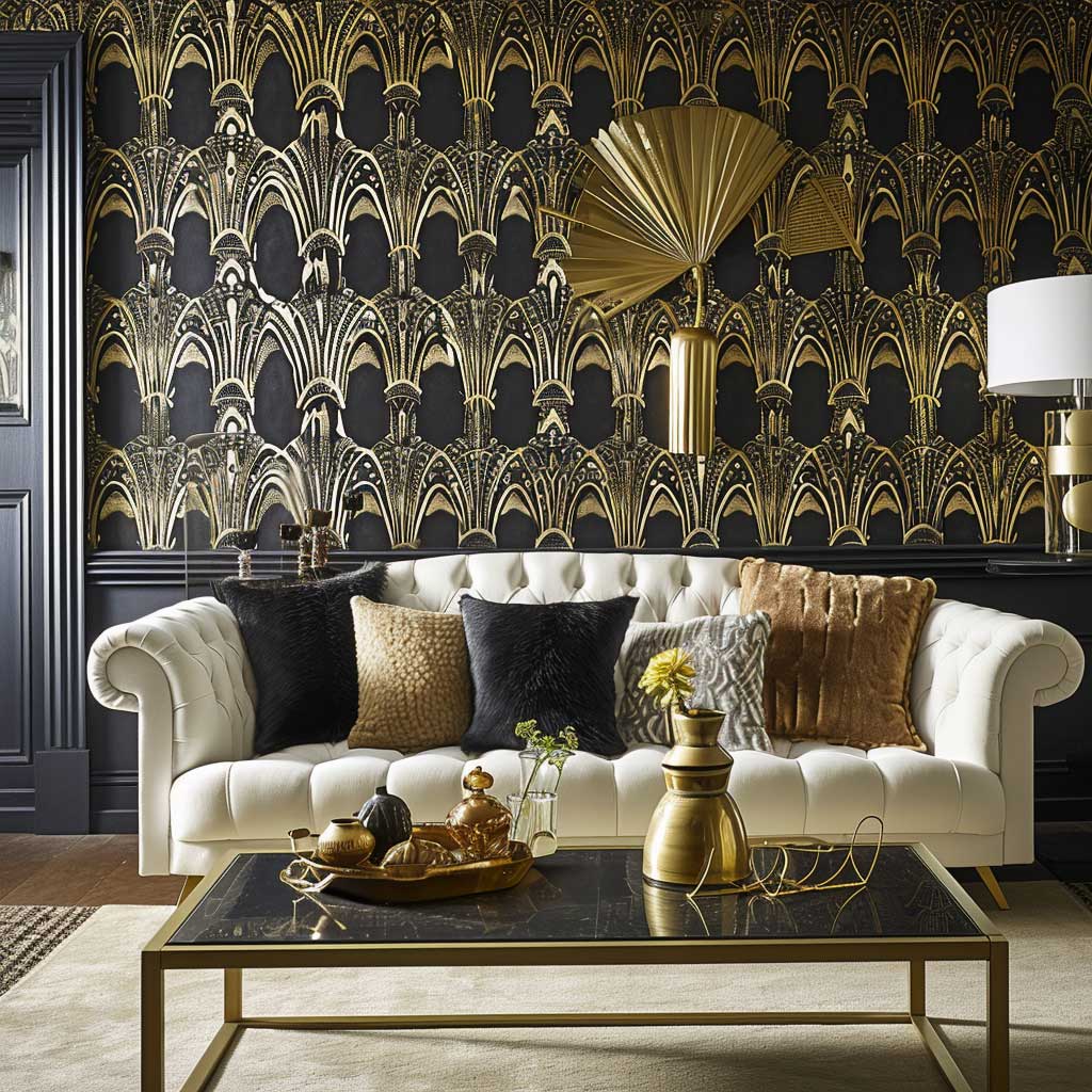
Color coordination is essential when working with bold Art Deco wallpaper. While the wallpaper itself may be the star of the show, the color palette of the room should harmonize with it. Metallic accents in gold or silver can highlight the wallpaper’s elegance, while a monochromatic color scheme in the furniture and accessories can provide a modern twist to the classic Art Deco style.
Texture is another element that can elevate the impact of Art Deco wallpaper. Wallpapers with a slight texture or a glossy finish can add depth and interest to the walls. In a living room, this can create a dynamic interplay of light and shadow, enhancing the room’s ambiance and adding to its luxurious feel.
Incorporating Art Deco wallpaper into a living room also involves considering the room’s architecture. The high ceilings and spacious layouts typical of the Art Deco era are ideal for showcasing bold wallpaper patterns. However, in smaller or more modern spaces, careful selection of wallpaper patterns and colors can still capture the essence of Art Deco without overwhelming the room.
In conclusion, Art Deco glamour, with its bold wallpaper patterns, offers a timeless yet modern approach to living room decor. It’s a style that exudes luxury and sophistication, inviting homeowners to make a bold statement in their living spaces. Whether through geometric patterns, rich colors, or luxurious textures, Art Deco wallpaper can transform a living room into a space that is both a nod to the past and a celebration of contemporary design.
DON’T DO THIS
Classy Living Room Wallpaper Mistakes That Are Very Easy to Make
- All four walls in a bold pattern. One feature wall. The other three stay neutral. This is not a creative choice — it’s physics.
- Matching wallpaper to curtain fabric. Two patterns from the same design family read as an accident, not coordination. Pick one to lead.
- Cheap paste on premium wallpaper. Farrow & Ball wallpaper hung with the wrong adhesive bubbles within six months. Use the brand’s own paste. Non-negotiable.
- Skipping the sample. Screen colour and real colour are never the same. Order a sample, pin it up, live with it for three days in different light. Then decide.
- Pastel on a north-facing wall without warm lighting. Cold light turns soft pink grey and mint green yellow. You will hate it by January.
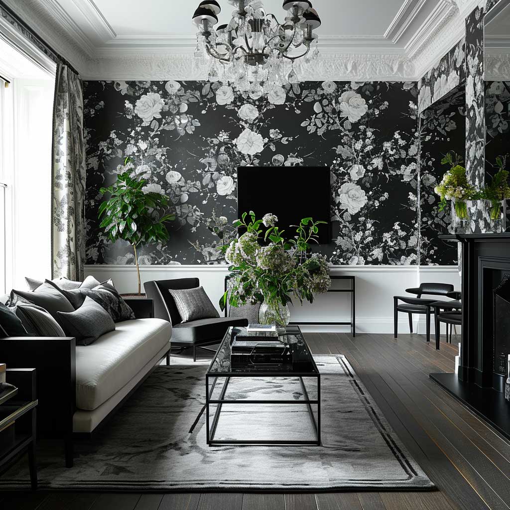
Pastel Wallpaper Looks Washed Out Until You Pair It With This
Pastel wallpaper fails in living rooms for one reason: people pair it with white trim and light wood and call it done. The whole room dissolves into a soft blur with no anchor. Pastel needs contrast or it has no walls — it just has a tinted atmosphere.
The fix is simple. Dark trim — navy, charcoal, even a deep forest green on the skirting and architrave — gives pastel wallpaper something to push against. Suddenly the soft blue reads as intentional instead of accidental. This is the version you see in proper interior shoots and never quite understand why your own attempt looked flat. That’s why.
For actual products: Grandeco’s Life range in “Powder Blue Floral” retails around $28 per roll and behaves well in north-facing rooms where cold light could kill a warmer pastel. Harlequin’s “Anthology” in blush pink is $95 per roll and the texture alone justifies the price — it photographs with depth that flat pastel vinyl never achieves.
Timeless wallpaper designs in the pastel category age well precisely because they don’t shout. Mint green from 2018 still looks fresh in 2026. Millennial pink, done with restraint and good trim, same story. Simple elegant wallpaper doesn’t need to be trendy to earn its place on a living room wall. It just needs to be committed.

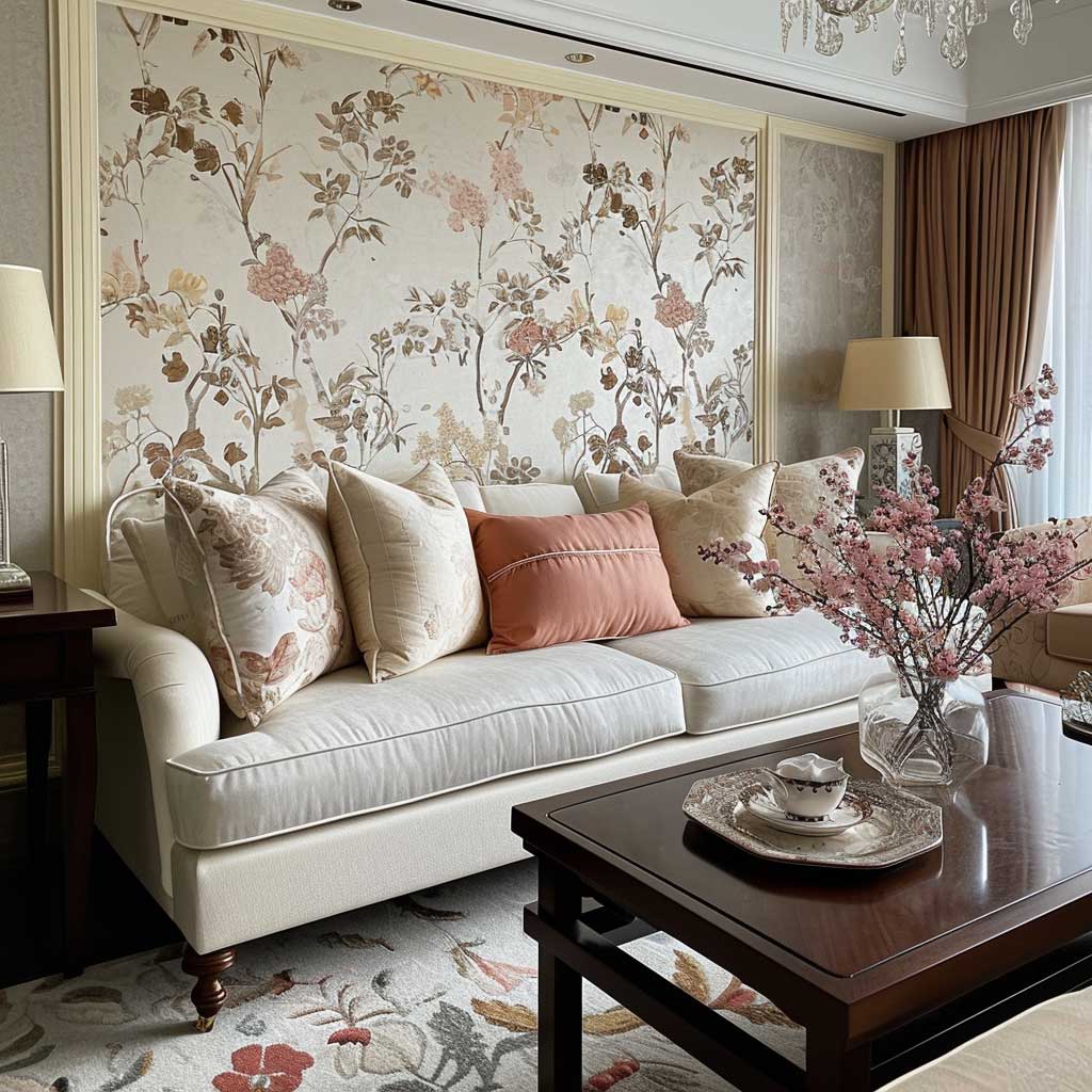


The living room, often considered the heart of the home, is a space where tranquility and beauty should coexist harmoniously. One of the most effective ways to achieve this balance is through the use of pastel wallpaper hues. These soft, muted colors can transform a living room into a serene sanctuary, offering a peaceful retreat from the hustle and bustle of daily life.
Pastel wallpapers, with their gentle and soothing tones, bring a sense of calm and lightness to a living room. Colors such as pale pink, soft blue, mint green, and lavender have a subtle charm that can make the space feel more open and airy. These hues are often associated with spring and renewal, evoking a sense of freshness and serenity in the home.
The choice of pastel wallpaper can significantly influence the mood and atmosphere of a living room. Light blue hues, for example, can create a feeling of tranquility and relaxation, reminiscent of the sky on a clear day. Soft pinks can add a touch of warmth and coziness, while mint greens can bring a sense of freshness and vitality. Lavender and lilac tones can introduce a subtle, romantic ambiance to the space.
When incorporating pastel wallpaper into a living room, it’s important to consider the overall design and decor. Pastel wallpapers work well with a variety of interior styles, from minimalist and Scandinavian to shabby chic and vintage. They can serve as a backdrop for bolder colors and patterns in furniture and accessories, or they can be the main focus of a more subdued, monochromatic design.


Texture is another element that can enhance the impact of pastel wallpaper. Wallpapers with a slight texture or a pattern can add depth and interest to the walls. In a living room, this can create a dynamic interplay of light and shadow, enhancing the room’s ambiance and adding to its tranquil beauty.
Lighting plays a crucial role in how pastel wallpaper is perceived. Natural light can bring out the true colors of the wallpaper, highlighting its softness and subtlety. In the evening, artificial lighting can create a cozy and inviting atmosphere, with warm tones complementing the pastel hues.
Accessorizing a living room with pastel wallpaper involves careful selection of complementary elements. Soft furnishings in neutral or coordinating pastel shades can create a cohesive look. Adding pops of brighter colors or metallic accents can provide contrast and interest without overwhelming the tranquil vibe. Plants and natural elements can also complement the pastel tones, bringing a touch of the outdoors inside.
In conclusion, pastel wallpaper hues offer a way to infuse a living room with tranquil beauty. They provide a backdrop that is both soothing and stylish, inviting homeowners to create a space that is not only aesthetically pleasing but also a haven of calm and relaxation. Whether through soft tones, subtle textures, or thoughtful accessorizing, pastel wallpapers can transform a living room into a serene and beautiful retreat.
FINAL THOUGHT
Classy Wallpaper Designs for Living Room Work When the Room Stops Fighting Them
Monochrome, Art Deco, pastel — three completely different personalities, one shared requirement. The wallpaper needs space to exist. One wall, correct scale, proper contrast. That’s the whole formula.
Elegant classy wallpaper isn’t about spending more. A $35 roll from Graham & Brown, hung correctly on the right wall with dark trim and intentional lighting, outperforms a $200 roll installed as an afterthought. The decision happens before the paste, not at the checkout.
Save this post. When you’re standing in a wallpaper showroom trying to remember which style works in a low-ceiling north-facing living room — you’ll want this open.
Related Topics
FAQ
What is the most classy wallpaper design for a living room?
What is the difference between elegant classy wallpaper and luxury wallpaper for living room?
Can pastel wallpaper look sophisticated in a living room?
Is Art Deco wallpaper still relevant as a modern classy wallpaper design for living rooms?
What is a simple elegant wallpaper choice for a small living room?
Classic wallpaper designs for living room — do they date?
How do I choose between sophisticated wallpaper and a paint finish for my living room?
You Might Also Like