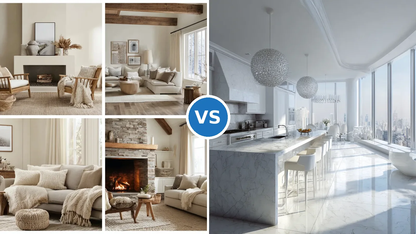
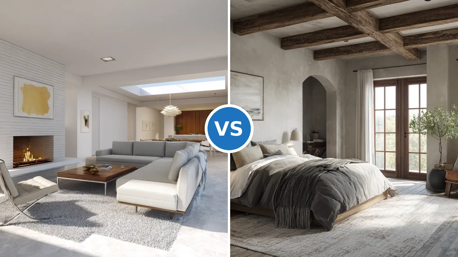
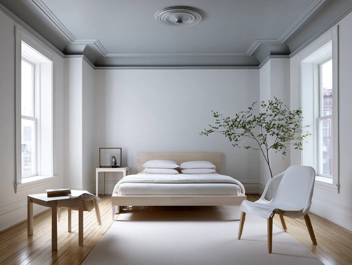
Neutral interior design works especially well in modern minimalist homes because it reduces visual noise without making a room feel unfinished. Soft white, beige, taupe, greige and restrained gray create a flexible base for furniture, natural materials and carefully chosen accents. The approach works best when neutral color is supported by differences in texture, light and scale, rather than by filling the room with more decoration.
For a calm result, start with the largest surfaces, then build contrast through furniture, textiles and lighting. A useful starting point is the 60/30/10 color distribution: roughly 60% dominant tone, 30% secondary tone and 10% accent, with the ratio treated as visual weight rather than a rigid formula. Fenalor’s current guide to combining colors and materials uses the same framework and recommends mixing at least three material types.
- Use warm and cool neutrals together only when their undertones support each other.
- Let texture provide depth when color contrast stays restrained.
- Keep the largest surfaces calm and reserve stronger accents for smaller elements.
- Natural wood, stone, linen and wool can prevent a minimalist room from looking flat.
- Use daylight and layered evening lighting to change how neutral tones read throughout the day.
How Neutral Interior Design Shapes a Calm Living Room
Neutral interior design in a living room begins with a quiet foundation of beige, warm white, greige or pale gray across the largest surfaces. The room becomes more contemporary when the same family is repeated through upholstery, rugs and curtains while wood or stone introduces a tactile counterpoint. What makes a neutral living room feel finished rather than empty? Usually it is the relationship between tone, texture and negative space, so establish those three elements before adding accessories.
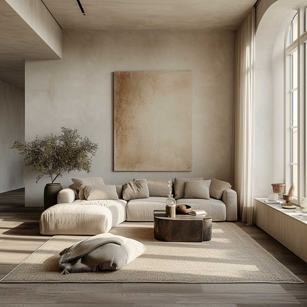

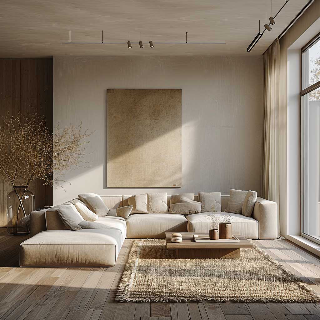

A sofa in a mid-neutral tone can anchor the room while pale walls keep the visual field open. Add one darker element, such as a charcoal frame or walnut table, to give the eye a resting point without breaking the restrained palette. Around 60% of the visible color can remain the dominant base, with approximately 30% supporting it and 10% reserved for accents, a proportion that functions like a visual map rather than a strict decorating law. Warm minimalist living room strategies can be useful when the neutral scheme needs more material depth.

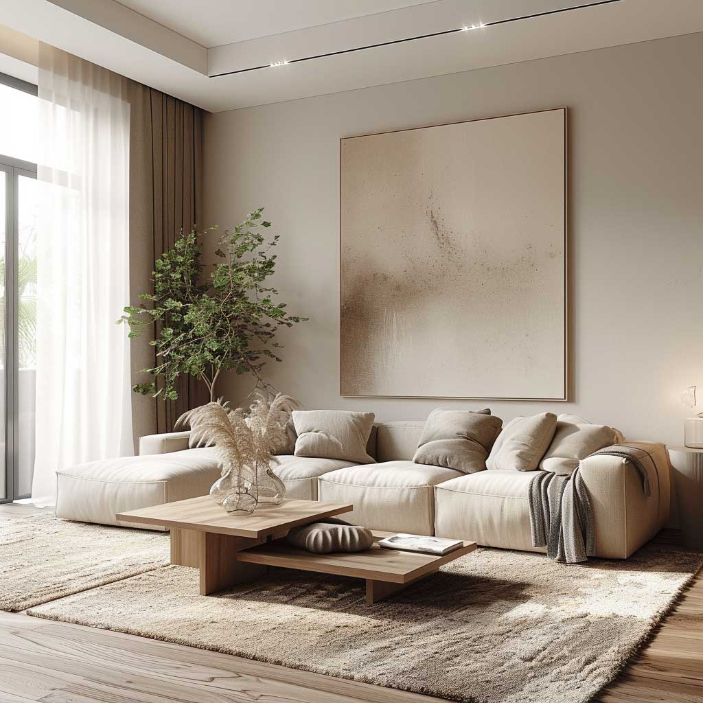


Natural light changes a neutral palette almost like a clock hand moving across a wall. Morning daylight can make gray-beige surfaces appear cooler, while warmer afternoon light can bring out sand and cream undertones, so sample paint where the room receives its strongest light. Don’t Do This: avoid selecting every finish from the same beige family with identical texture, because the result can resemble a blank sheet of paper rather than a layered room. Keep at least one noticeable difference in sheen, material or depth.
Why Neutral Interior Design Works in Minimalist Kitchens
Neutral interior design gives a minimalist kitchen a strong architectural base because cabinetry, counters and walls can share related tones without competing for attention. Soft gray cabinetry paired with warm white surfaces creates definition while keeping the room visually quiet. If the kitchen already has prominent stone or wood, should another major color be introduced? Usually not; repeat one existing undertone instead and let material variation create the contrast.


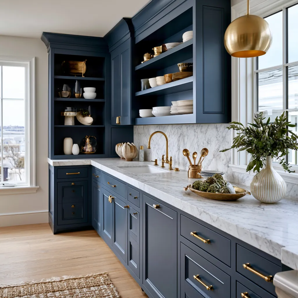
Cabinet fronts can carry the dominant color while counters, backsplash and flooring provide the secondary layer. A darker faucet, pendant or stool can supply the final accent without turning the kitchen into a collection of unrelated objects. The 60/30/10 framework is useful here because cabinetry occupies substantial visual area, while hardware and small accessories occupy far less. Think of the palette as a three-level staircase: each step should support the next rather than compete with it.


For a modern neutral kitchen, texture is often more important than adding another hue. Matte cabinet fronts beside polished stone, brushed metal and natural wood give the eye enough information to stay interested while the palette remains restrained. A practical test is to view the kitchen in daylight and again after dark, because artificial light can shift the perceived warmth of beige and gray surfaces. Keep decorative objects limited when the architecture already provides strong lines.
Don’t Do This: avoid making every kitchen surface the same temperature of white, especially when the flooring or cabinetry has warm undertones. The room can become visually sterile even when the materials are expensive. A neutral minimalist kitchen needs at least one layer of contrast, whether that comes from wood grain, darker hardware or a change in surface finish.
Building a Neutral Minimalist Color Palette for Bedrooms
A neutral minimalist color palette in the bedroom should make the largest surfaces recede while giving bedding, wood and textiles enough tonal variation to feel dimensional. Warm white walls with ivory bedding and sand-colored upholstery create a quiet base, while taupe or muted brown can establish a deeper visual anchor. What makes minimalist neutrals feel comfortable rather than clinical? The answer is usually texture and controlled contrast, not a larger number of decorative pieces.


Keep the bed as the largest visual mass and let the surrounding tones support it rather than compete with it. Linen, wool, cotton and light timber can provide several textures without introducing additional colors, much like layers of paper creating depth in a simple collage. Interior design guidance commonly uses a 60/30/10 proportion as a starting point, so a bedroom might place the dominant neutral across walls and large textiles, the secondary tone through furniture and curtains, and the accent in one or two smaller elements. Use the ratio as a diagnostic rather than a rulebook.

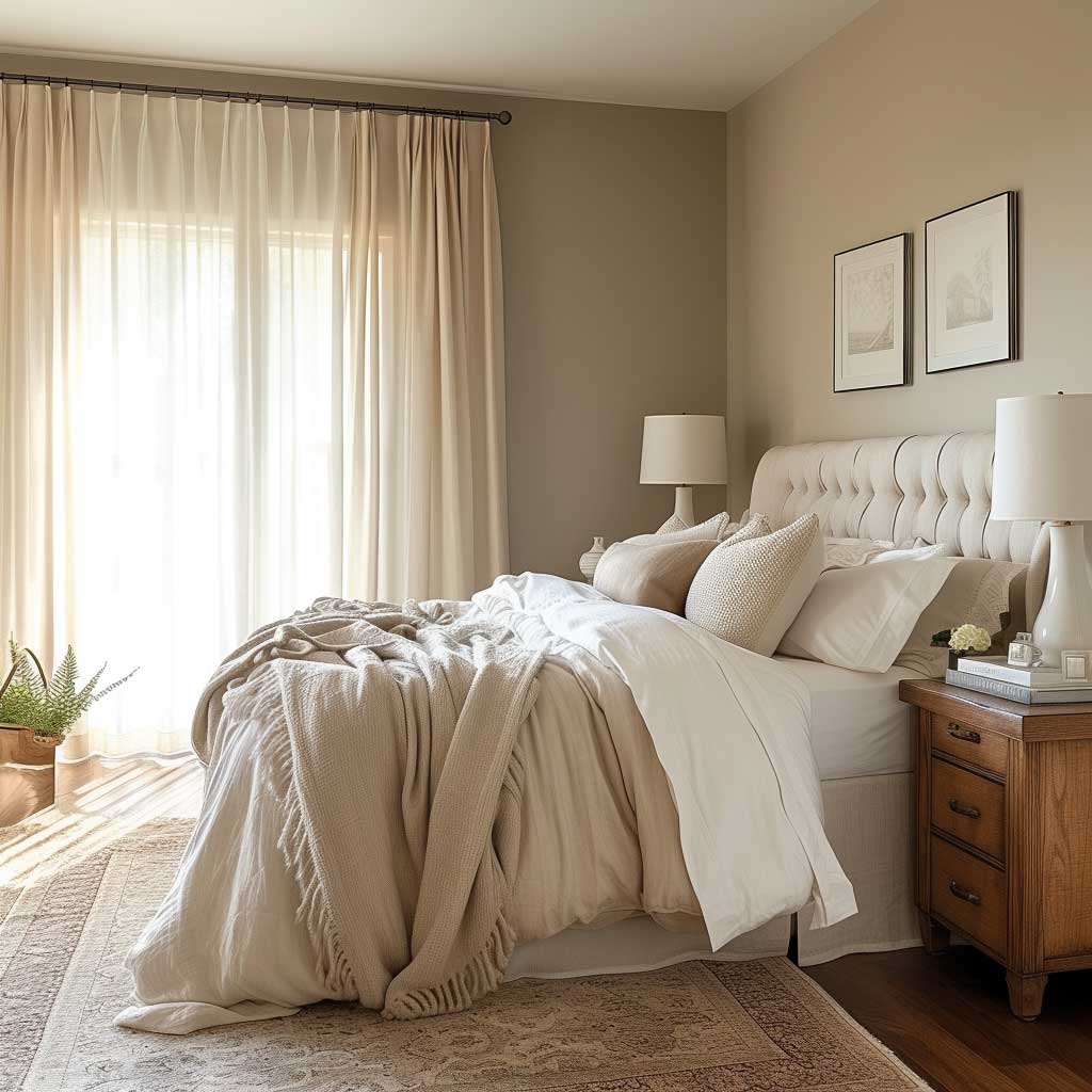

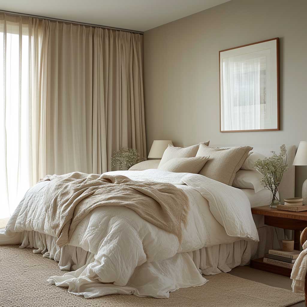
Lighting deserves the same attention as color because neutral surfaces reflect every change in illumination. Sheer curtains can soften daylight, while lower-level lamps create a warmer evening layer without forcing the entire room into one tone. Don’t Do This: avoid matching the wall, bed, curtains, rug and furniture in nearly identical beige, because the bedroom can lose its sense of depth. Keep one element visibly darker or more tactile so the palette has an anchor.
Modern Neutral Home Design Gains Depth Through Texture
Modern neutral home design becomes convincing when texture carries the visual interest that brighter color would normally provide. Wood grain, woven fabric, stone, plaster, metal and soft textiles can stay within one restrained color family while still creating clear differences between surfaces. How many materials are enough? Three distinct materials can establish a useful starting point, while additional textures should earn their place through function or scale rather than being added simply to fill empty areas.
Natural materials are especially effective because their surfaces change as light moves across them. A pale oak floor can show grain, a linen curtain can soften a window, and honed stone can absorb highlights without introducing another strong color. Current decorating guidance also treats the 60/30/10 formula as a proportion of visual weight, not a demand for exactly three colors, which leaves room for several materials inside the same tonal family. Use material contrast before adding another paint color.
There is also a practical reason to keep the palette narrow: large furniture changes become easier when the background remains adaptable. A neutral sofa, wood table or simple upholstered bed can support new accent colors without forcing a complete redesign. Think of the base palette as a stage rather than the performance; it should give every important object enough room to register. For a long-lasting scheme, choose finishes that still look convincing when the room is viewed from a distance.
Neutral Aesthetics Stay Fresh When Contrast Has a Job
Neutral aesthetics work best when every contrast has a clear purpose, whether it defines architecture, highlights furniture or improves the way a room is used. A dark frame can sharpen pale walls, a textured rug can separate furniture from the floor, and a warm timber surface can prevent cool neutrals from feeling distant. The target is not maximum emptiness but visual order, with each element easy to understand at a glance. Keep the strongest contrast where you want the eye to land first.
For a restrained modern neutral scheme, repeat an accent at least twice when it is small, so the detail feels intentional rather than accidental. A black metal finish might appear on a lamp and cabinet pull, while a warm wood tone can recur through flooring and furniture. Don’t Do This: scatter many unrelated accents across the room simply because the base palette feels quiet. Silence in music gives a single note more power, and the same principle applies to a neutral interior.
A final audit can be surprisingly simple: identify the dominant tone, the supporting tone, the strongest accent and the materials that separate them. If the room contains several colors but no clear hierarchy, reduce the weakest accents before buying anything else. A 60/30/10 framework gives the eye a readable structure, while texture prevents that structure from becoming monotonous. Make the final edit by removing one unnecessary object rather than automatically adding another.
Neutral interior design succeeds when simplicity is supported by hierarchy, texture and useful contrast. Keep the broad palette restrained, give each material a reason to appear and let natural light reveal differences that color alone cannot provide. A living room, kitchen or bedroom can follow the same logic while still having its own character. Start with the largest surface, establish the 60/30/10 visual structure, then stop adding when the room already feels resolved.
THE TAKEAWAY
Neutral rooms feel sophisticated when restraint creates depth rather than emptiness.
- Build the palette from the largest surfaces first.
- Use texture, material and lighting to create contrast.
- Reserve stronger accents for a small number of deliberate focal points.