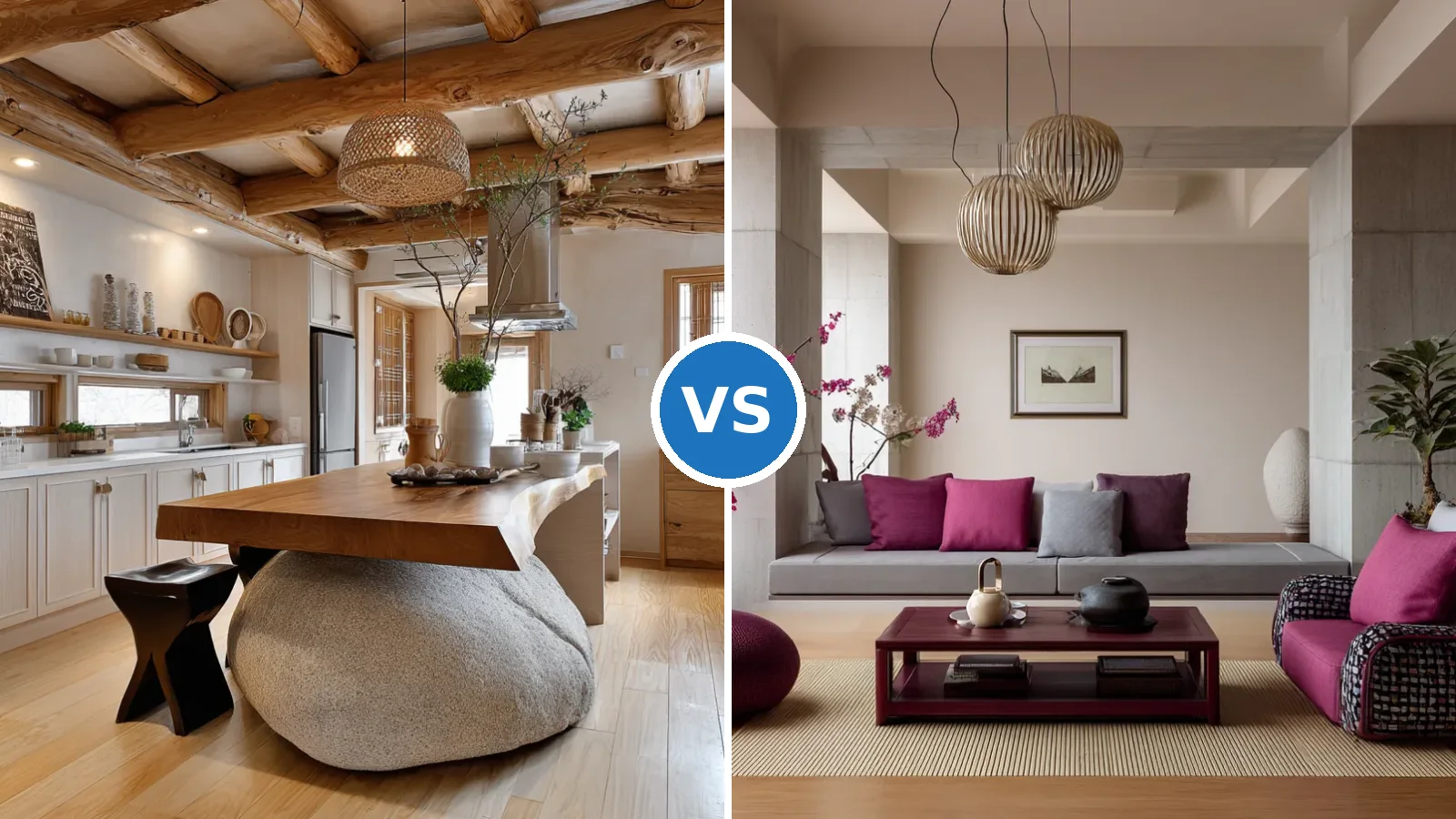
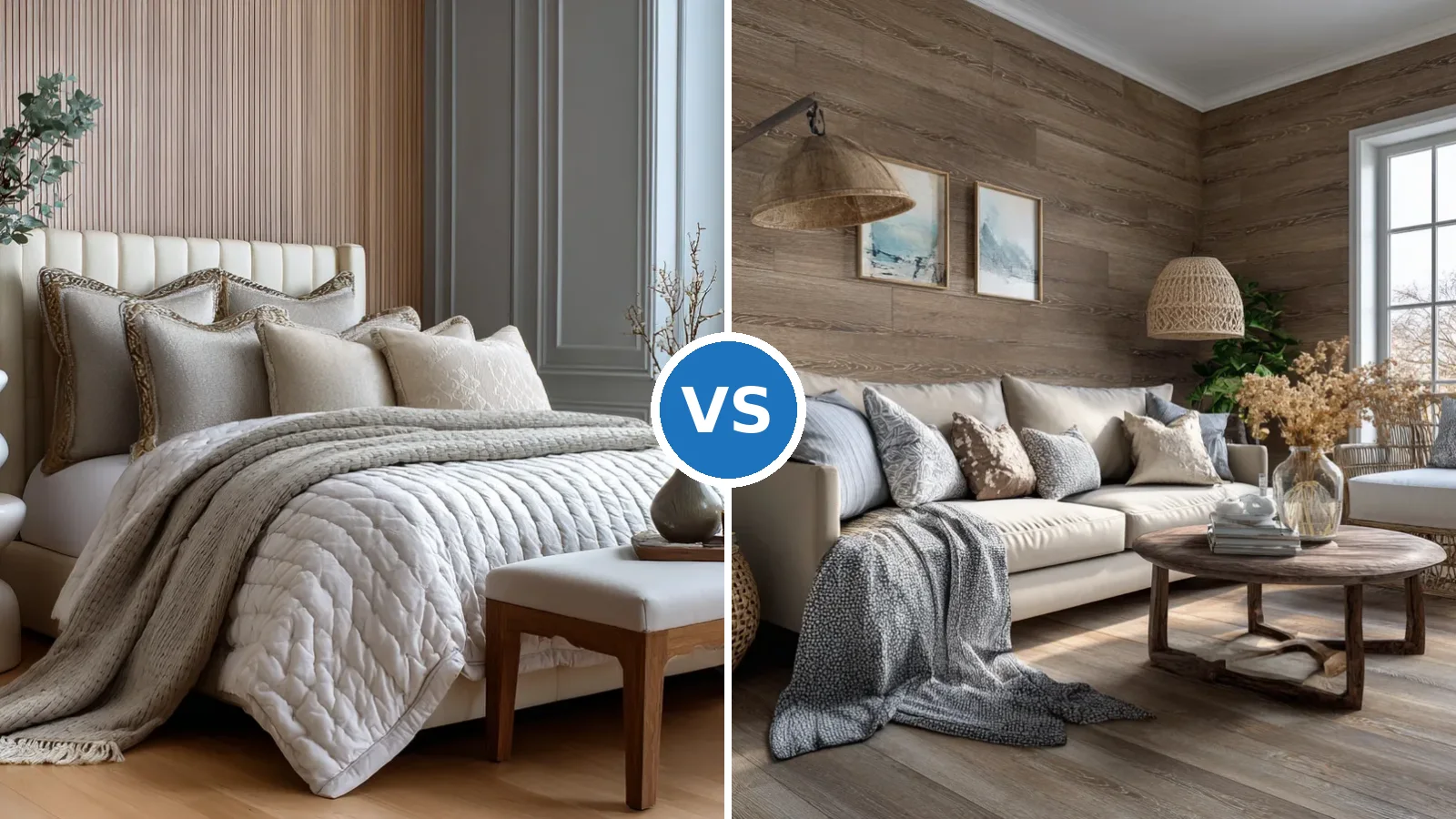
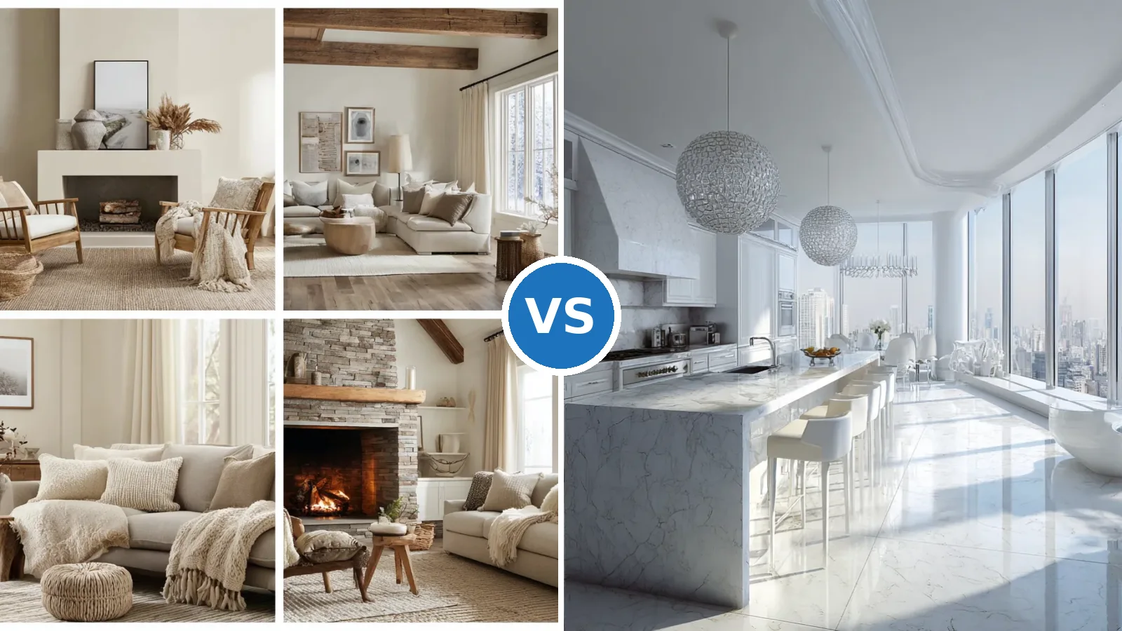
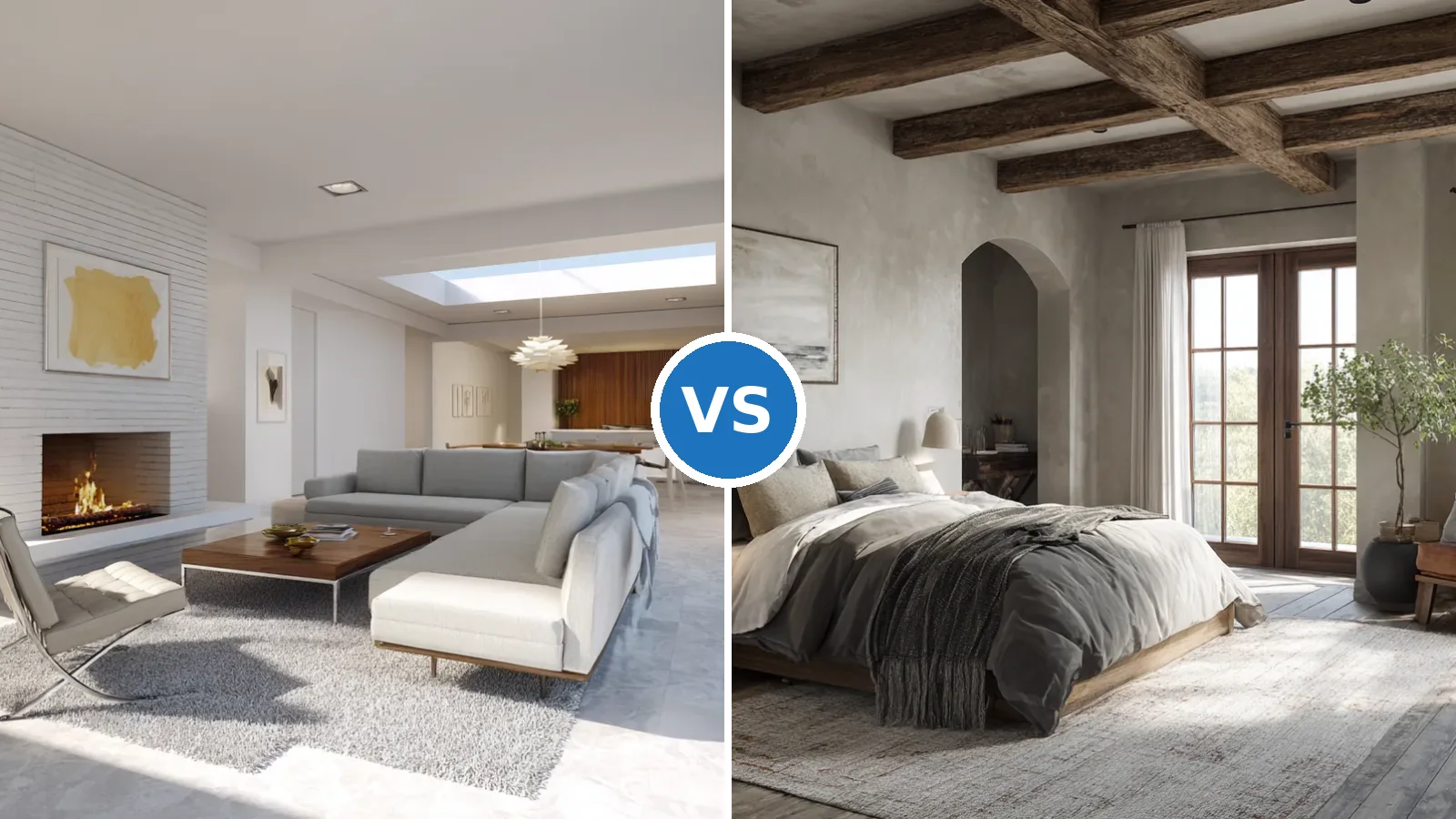
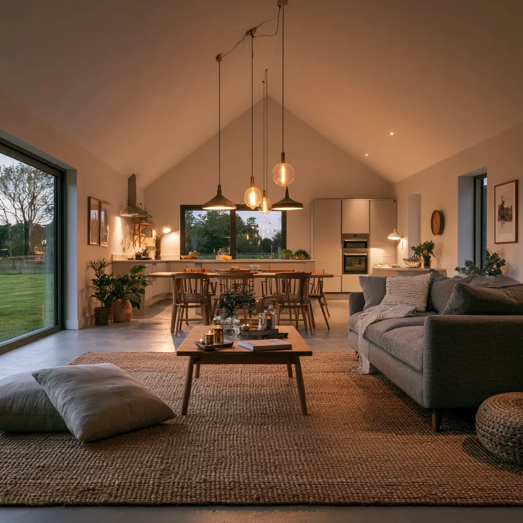
Neutral living room ideas have one thing in common: the rooms that hold up over time are never flat. They rely on contrasting textures — boucle against oak, jute against plaster — to make a palette of beige, cream, and warm gray feel rich instead of safe. The color is almost beside the point.
Sherwin-Williams Agreeable Gray (SW 7029) has held its position as one of the brand’s most popular neutrals for a reason: its LRV of 60.4 means it reflects enough light to stay open without reading washed-out under low evening bulbs. That balance between reflective and grounded is exactly what makes neutral living rooms function across different lighting conditions — morning sun, overcast afternoon, lamplight at 9 p.m.
The three rooms below each take a different structural approach: layered elegance with warm wood, stripped-back minimalism, and rustic texture-forward warmth. All three start from the same neutral base and arrive at completely different results. The variable isn’t the color — it’s what sits in front of it.
– Sherwin-Williams Agreeable Gray (SW 7029, LRV 60.4) works in both north- and south-facing rooms — one of the few neutrals that does.
– Texture contrast is mandatory: one smooth surface, one woven, one soft pile, one hard material — minimum per room.
– A jute rug 8×10 from $190 (Home Depot/Nourison) is the fastest way to add warmth without buying new furniture.
– Minimalist neutral rooms fail not from too little decor, but from too little material contrast.
– Pops of color in a neutral room land best as throw pillows and blankets — swappable without repainting or rebuying furniture.
– LRV 50–60 is the sweet spot for neutral living room walls: bright enough to feel open, deep enough to feel deliberate.
Warm Wood and Layered Texture Make a Neutral Living Room Work
Decorating with neutrals in the living room isn’t a color decision — it’s a material stacking exercise. A soft beige sofa reads completely differently against a raw oak coffee table than it does against a lacquered surface. The wood introduces warmth at a wavelength no paint can replicate, and the eye registers the combination as intentional rather than accidental. Stylists consistently recommend anchoring neutral upholstery with at least one unfinished wood surface in the same sightline.
Texture is what prevents a neutral palette from collapsing into uniformity. A plush rug adds a soft plane at floor level; patterned cushions introduce surface movement without color disruption; a woven throw draped over an arm adds the dimensional contrast that flat fabric alone can’t provide. Think of it the way a composer layers instruments: each texture occupies its own frequency, and the combination is richer than any single element. An 8×10 jute rug runs around $190–$215 at Home Depot (Nourison or Kas models) and holds up better than synthetic alternatives in high-traffic living areas — the natural fiber actually improves in appearance as it softens with use.
What doesn’t work: matching the rug tone exactly to the sofa. A same-value beige rug under a same-value beige sofa erases both — you end up with an egg rather than a room. Go two shades darker on the floor, always. Also avoid glossy finish accessories in a texture-forward scheme; a shiny ceramic vase reads as an interruption rather than an accent when everything else in the room is matte or woven.
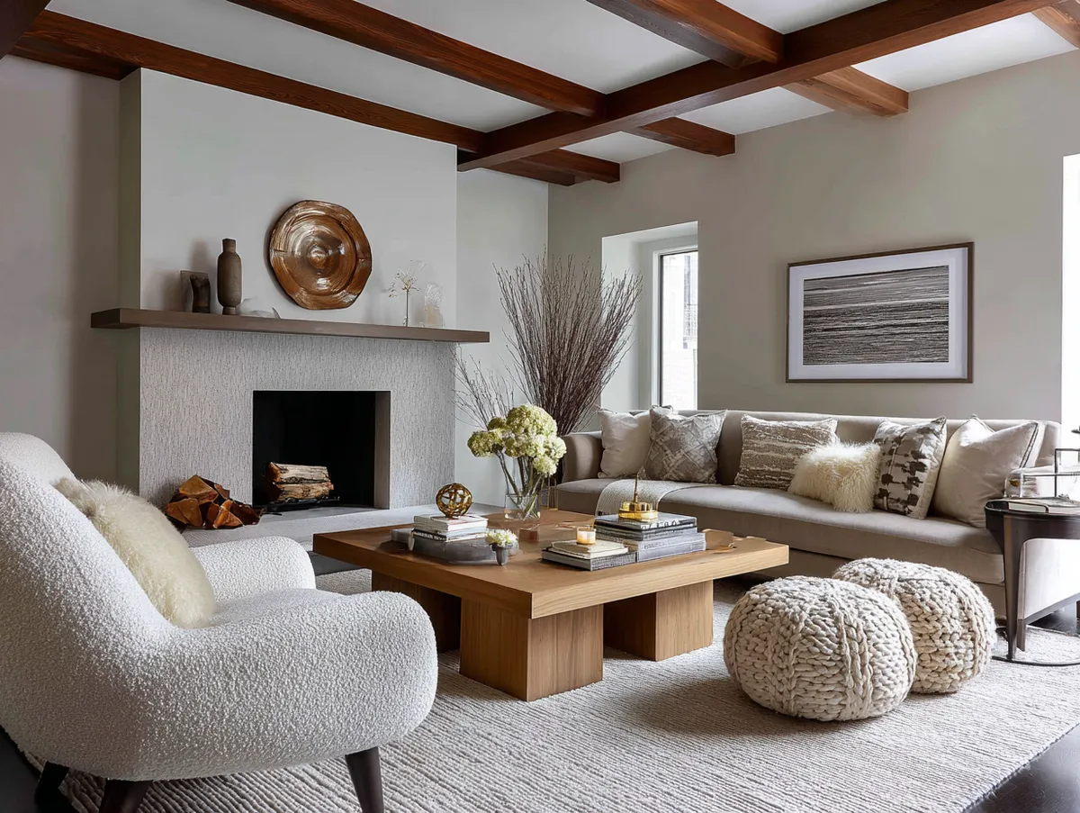
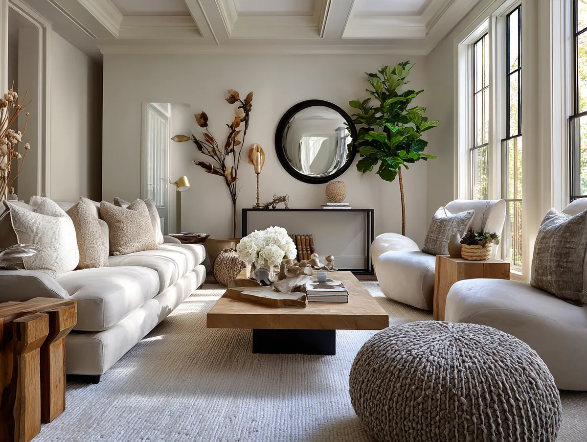
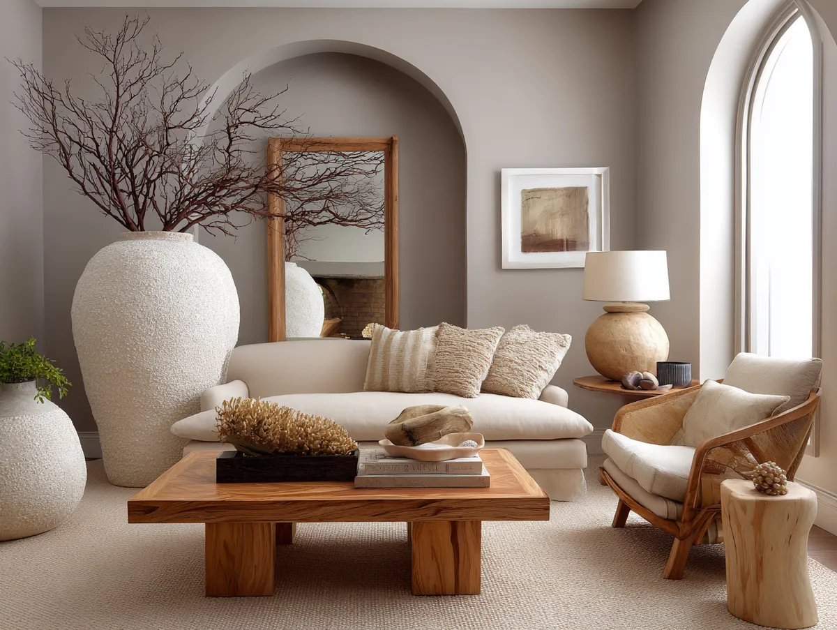
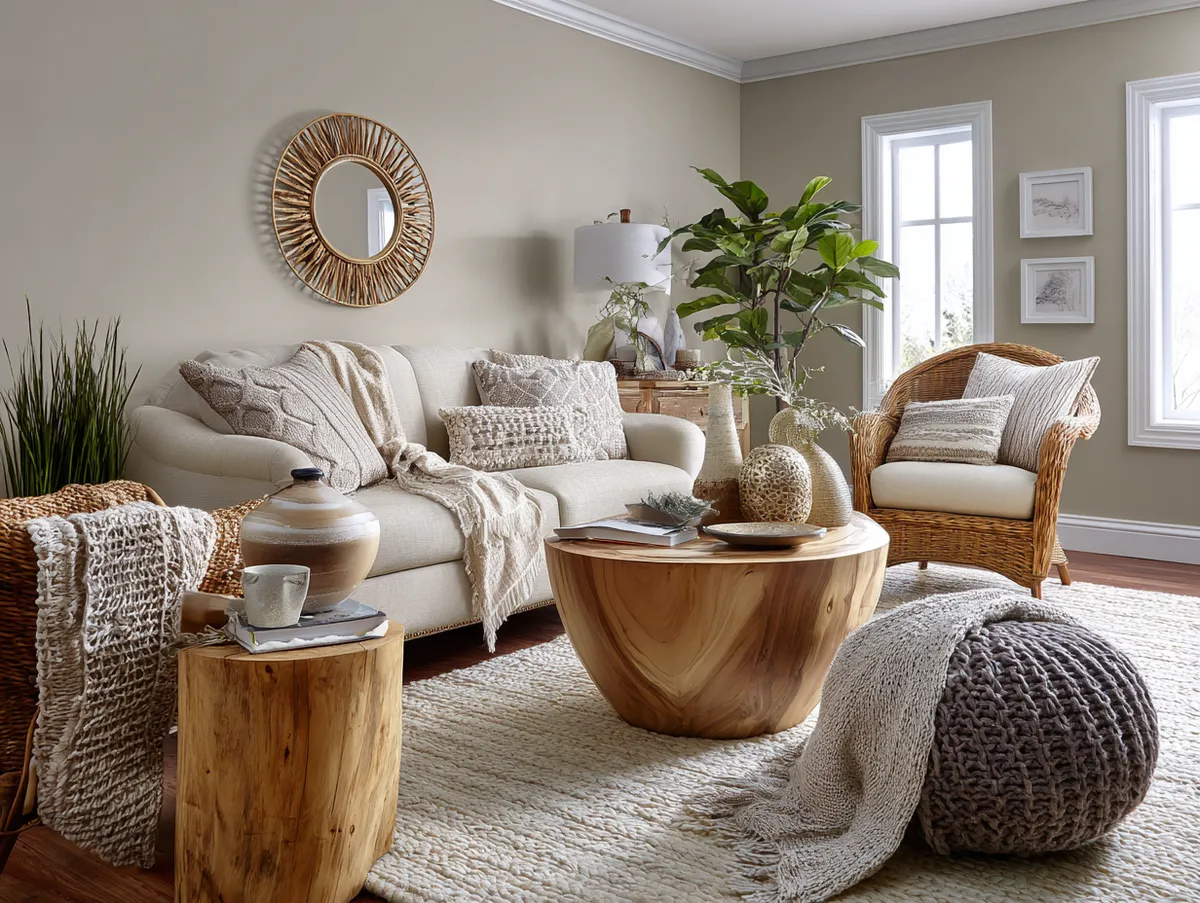

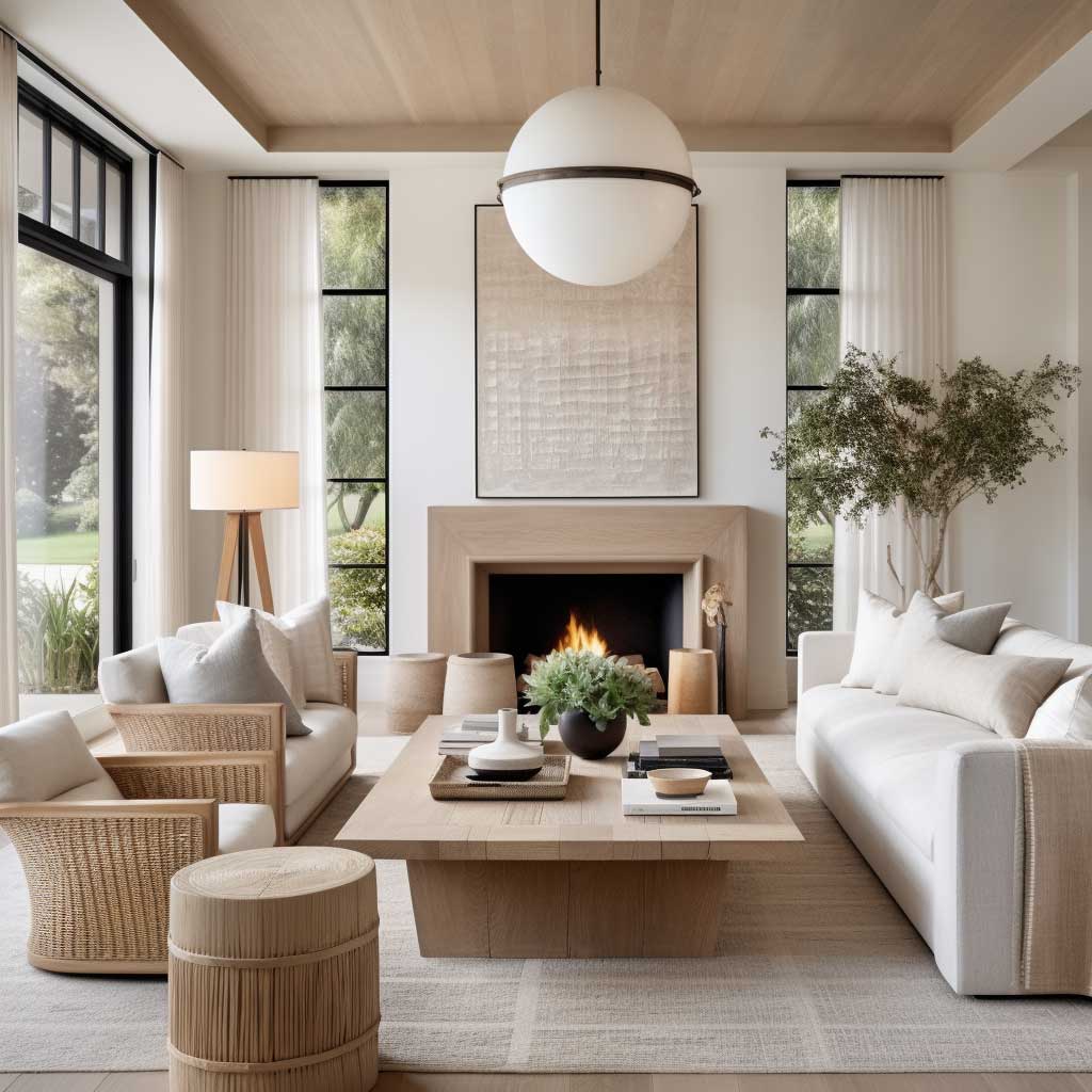

Wall art in a neutral living room does something specific: it confirms the palette without extending it. Muted-tone prints or monochromatic photography in the same warm or cool register as the walls hold the room together at eye level, while the furniture and rug work at lower planes. Does the art need to match the wall color exactly? No — but it shouldn’t fight it. A print with a single warm taupe ground will unify a beige-dominant room faster than three colorful statement pieces ever could.
Natural light reveals neutral tones differently at each hour, which is precisely what makes them interesting to live with. Morning light emphasizes the cooler undertones in cream; afternoon sun shifts the same room toward warm amber. A neutral palette with a good LRV — Sherwin-Williams recommends 50–60 for a crisp, airy living room feel — is engineered to handle that shift without becoming unpredictable. The result is a room that feels genuinely alive without any changes to the decor. For a deeper look at how beige layers work across a full space, the beige interior design ideas that prove neutral isn’t boring covers the three-shade rule and texture must-haves in detail.
Minimalist Neutral Living Room Ideas Depend on Material Honesty
Minimalist neutral living room ideas fail most often not from lack of furniture, but from lack of material contrast. A gray linen sofa next to gray linen curtains on a gray linen rug is three pieces of the same instrument — and the room reads as flat even when the quality of each piece is high. The global minimalist furniture market was valued at $52.6 billion in 2024 (Grand View Research), which suggests the demand for this aesthetic is genuine — but the rooms that photograph well and feel good to sit in for three hours are the ones where someone got the material mix right.
IKEA’s Söderhamn sofa at around $700 sits at 16.5 inches seat height — below the standard 20–22 inch residential sofa — and that lower profile keeps sightlines open, making the ceiling read higher without a single change to the wall or floor. Pair it with a raw oak coffee table and a chunky-knit throw in a slightly deeper sand tone, and the room already has three distinct surface registers working together. Low-profile sleek furniture is one of the few cases where buying from a non-premium brand is actually structurally correct: the proportions matter more than the price tag.
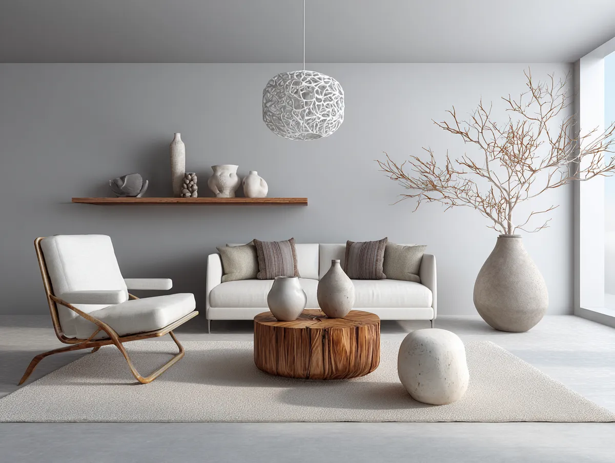
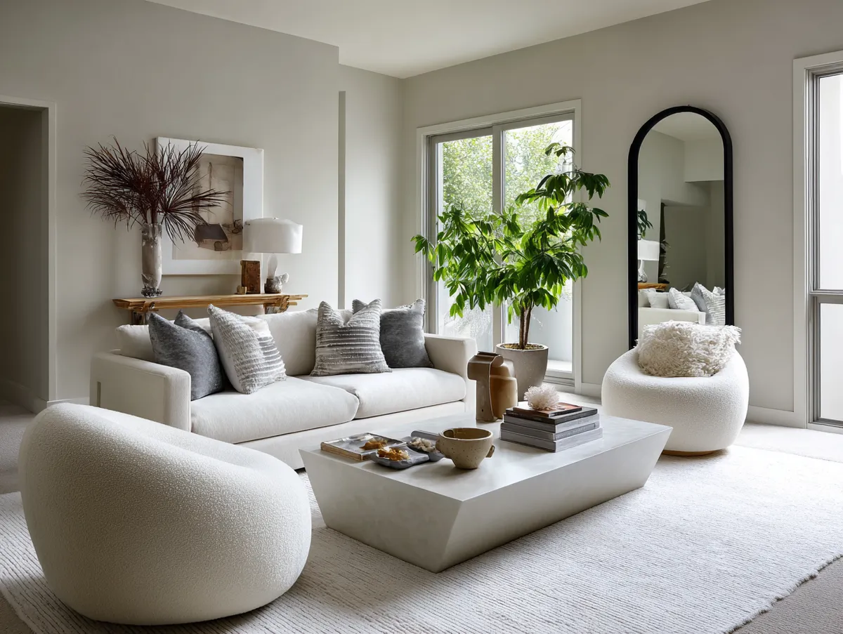
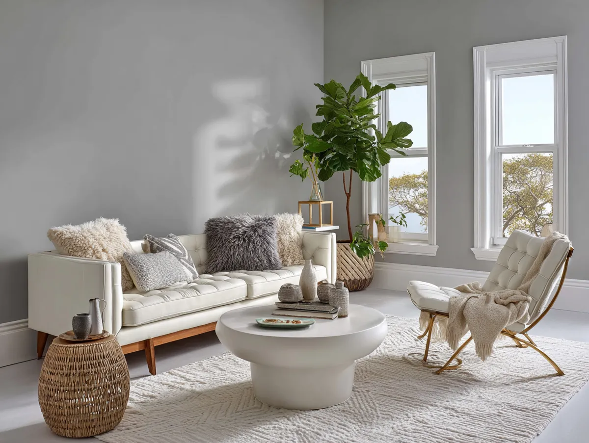
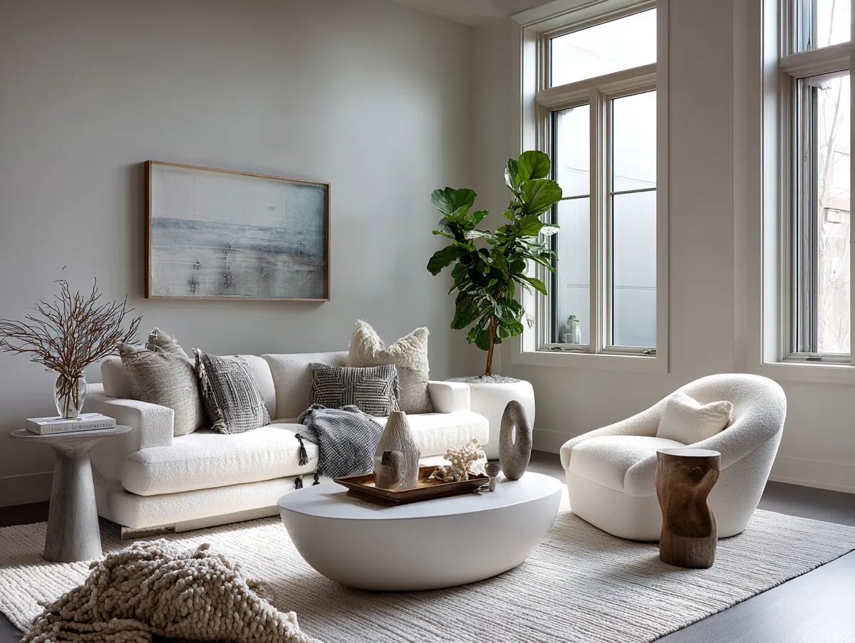
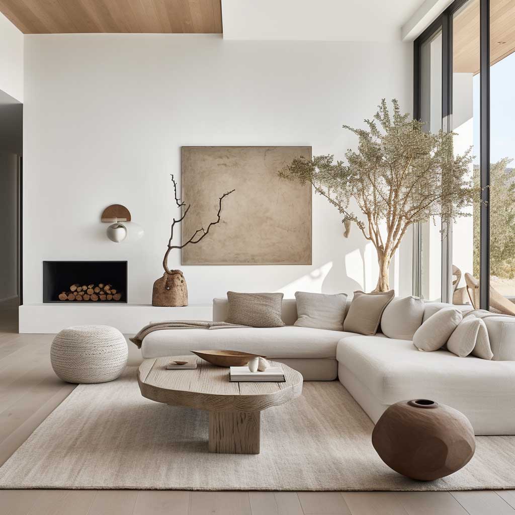
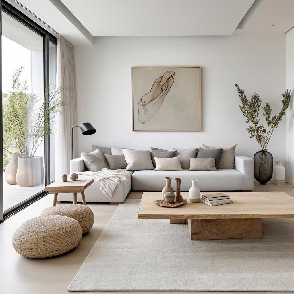
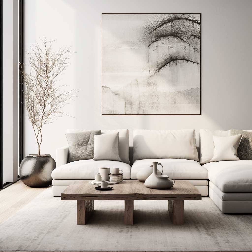
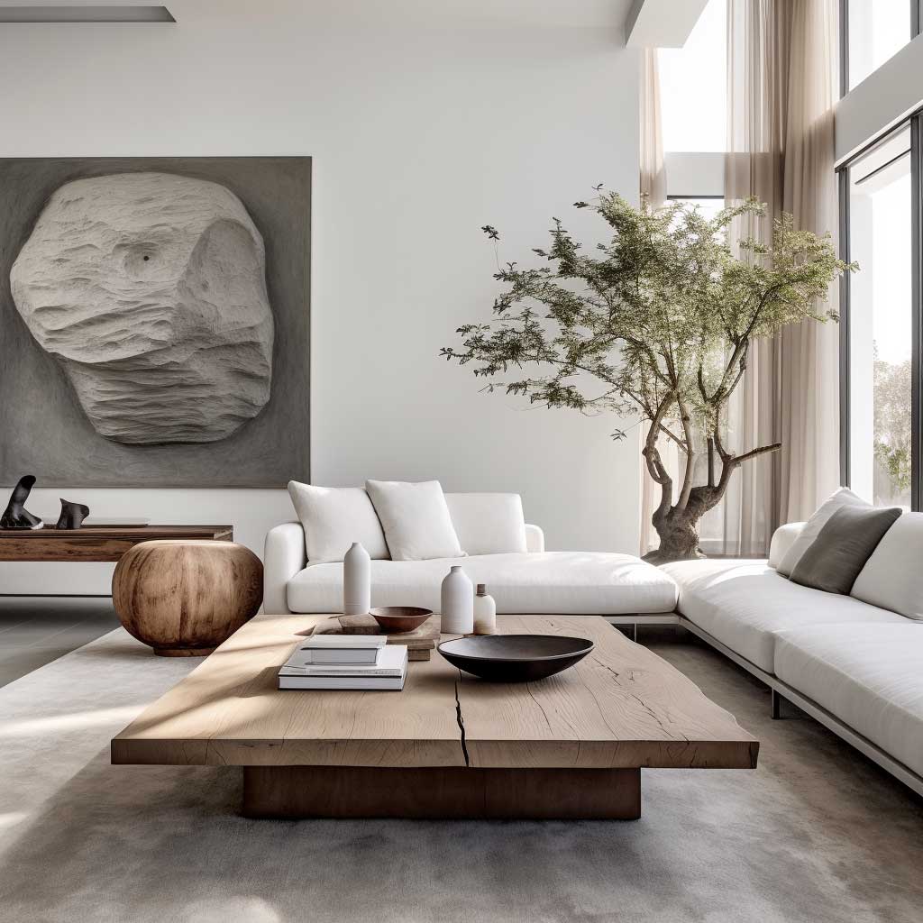
Light is the second structural element in a minimalist neutral room. Large windows doing all the work during the day — but what happens at 8 p.m. is where most minimalist rooms break. Switch the overhead ceiling fixture off and replace it with two or three lower-level sources: a floor lamp in a corner, a table lamp on a side surface, and ideally a pendant over the coffee table zone. Bulb temperature matters: anything above 2700K reads clinical in a neutral room and undoes the warmth the palette spent all day building.
What keeps a minimalist neutral room from feeling like a showroom is personal scale at exactly one point: a stack of two books on the coffee table, a single ceramic object, one large floor plant. Three to five objects maximum across the entire room — that’s the count that reads collected rather than styled. Can art have a place in a minimalist neutral room? Yes — one piece, at least 24 by 32 inches, hung at actual eye height rather than gallery-wall position. Below that size, it reads as an afterthought in a room with this much open space.
The flexibility of this layout is also its risk. A neutral base with no strong texture anchor will absorb any change and make it look arbitrary rather than intentional. For the full framework on how to keep warm minimalist living rooms from reading staged, the warm minimalist living room design guide covers the seven material decisions that separate a calm, livable room from a cold one.
Don’t match every neutral surface to the same finish. Linen sofa, linen curtains, linen cushions — all in the same sand tone and same weave texture — produces a room that looks like it was shipped in a single box. Contrast between material finishes is what makes neutral rooms feel intentional.
Don’t buy a cool gray for a south-facing room and then blame the furniture. Cool grays above LRV 65 read almost white in bright afternoon sun and lose all their grounding character. Sherwin-Williams Agreeable Gray (SW 7029, LRV 60.4) sits in the zone where color has enough body to stay visible under direct light.
Don’t float throw pillows in a matching set of four. All four in the same fabric and the same tone, arranged symmetrically — it looks like a hotel bed, not a home. Use two sizes, two fabric types, and let one sit slightly off-center.
Don’t use 4000K+ bulbs in any room you’ve painted a warm neutral. Cold LED light turns beige to gray and gray to lavender. Every living room lamp: 2700K warm white, no exceptions.
Rustic Neutral Living Room Color Schemes Hold More Warmth Than Any Paint
Natural colour living room ideas in a rustic register start from a different premise than minimal or contemporary approaches: imperfection is the material. A weathered oak coffee table with visible grain variation, slightly mismatched cushions that arrived at different times, a knitted throw that shows the process of its making — these aren’t design flaws to correct, they’re the reason the room reads as lived-in rather than curated. The neutral color scheme in this context isn’t the feature; it’s the quiet backdrop that lets aged and organic materials do their work.
Dried botanicals, driftwood, and linen in off-white or oat tones reinforce the connection to natural materials without introducing new colors. The trick here is that these organic elements don’t need to be arranged carefully — a slight randomness in how they’re placed actually makes them more effective. A bouquet of dried grasses sitting slightly too far to the left of center reads as real; a perfectly centered arrangement of the same materials reads as staged. Rustic neutral rooms gain authority from the sense that objects arrived there over time rather than in an afternoon.
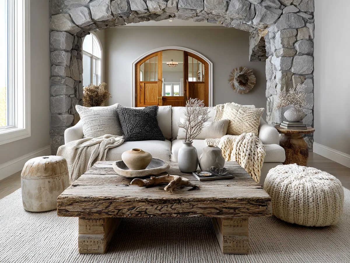
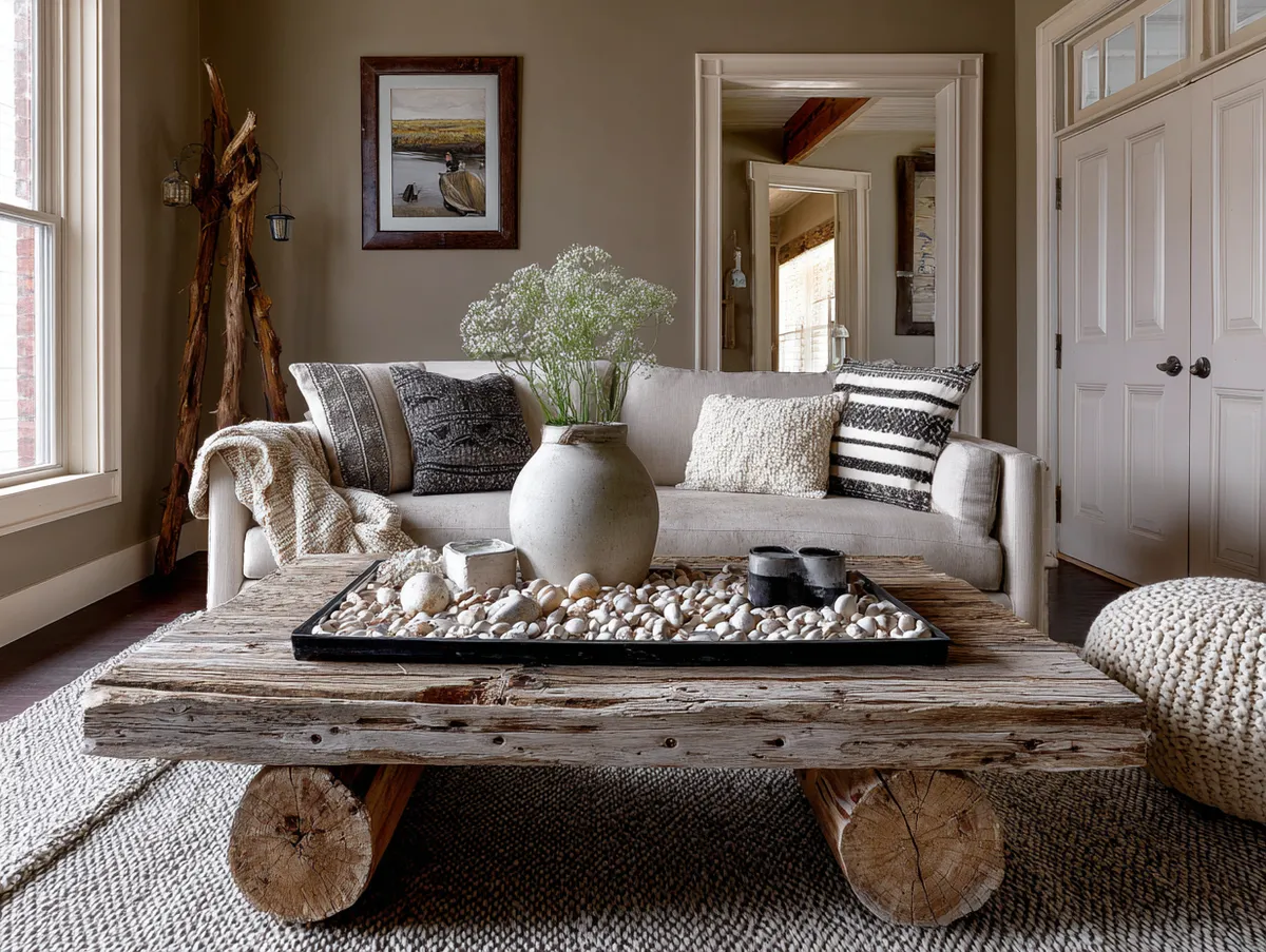
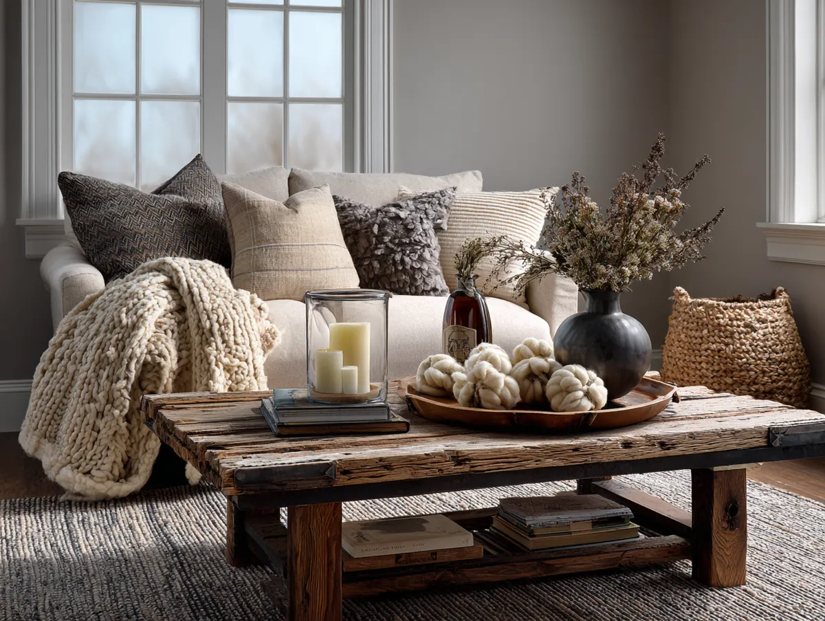
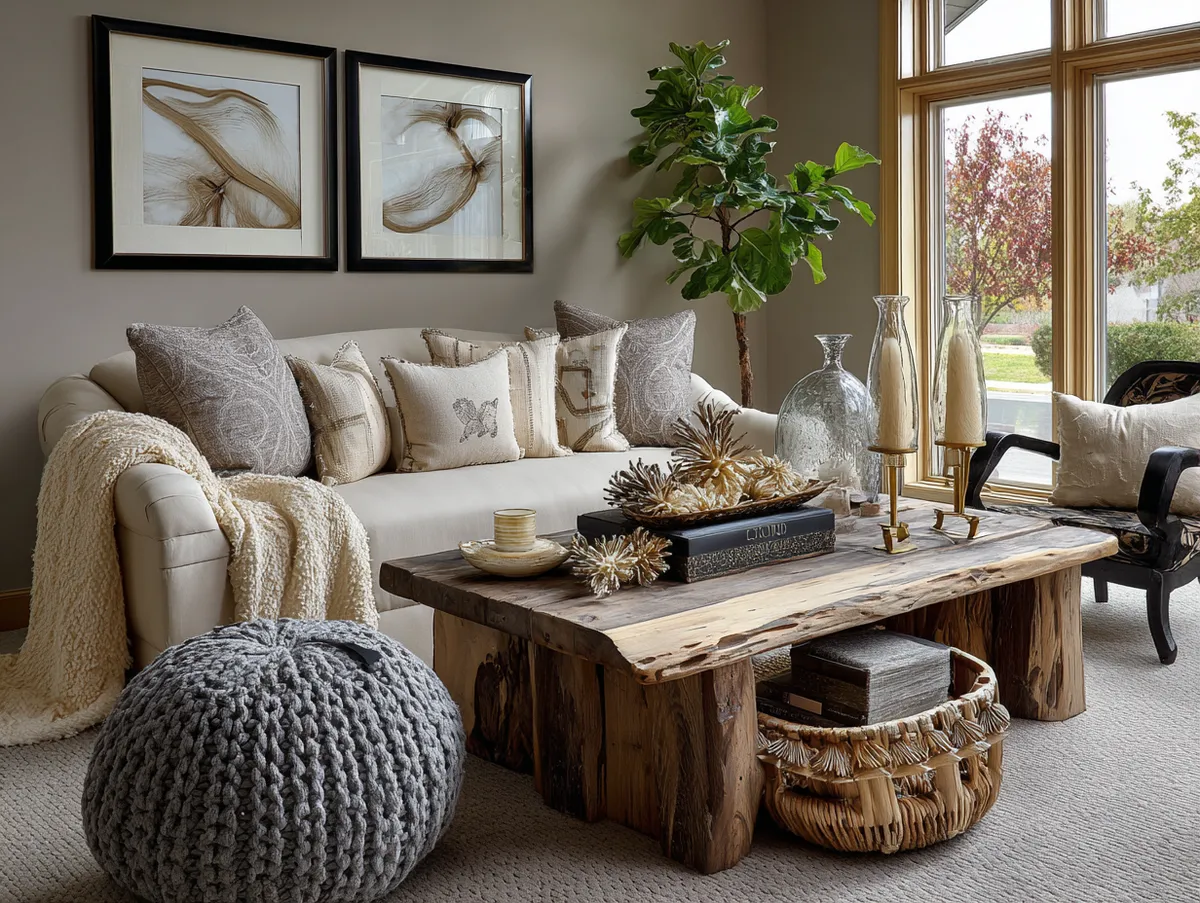
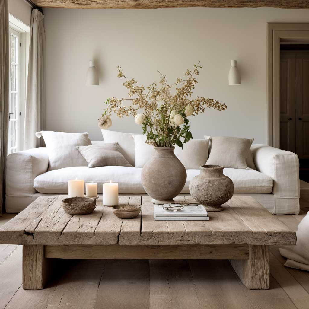


Light walls in a neutral palette — painted or plastered — counterintuitively make a rustic room feel larger despite the density of its decor. The ceiling can hold a lot of warmth when the walls stay pale. Sherwin-Williams recommends an LRV of 50–60 for walls that need to feel airy without washing out — and in a rustic-style room where curtains are heavy and furniture is bulky, landing in that range keeps the space from collapsing visually under its own weight. Does this mean every rustic neutral room needs white walls? No — but pale walls are almost always the quieter choice, and quiet is the point.
What’s worth resisting in this style: overcrowding the horizontal surfaces. A single driftwood piece on the coffee table reads as an object with presence. Five objects in the same category — three candles, two small ceramics, and a bowl — read as clutter wearing a neutral costume. The discipline of editing down to one statement piece per surface is what lets the aged and imperfect quality of each individual object actually land.
| Style | Best For | Key Material | Watch Out For |
|---|---|---|---|
| Layered Elegant Neutral | Rooms with good natural light and wood floors | Oak + boucle + bronze | Matching rug and sofa tone exactly |
| Minimalist Neutral | Smaller rooms, open-plan layouts | Linen + marble + raw wood | All surfaces in same material finish |
| Rustic Neutral | Family rooms, high-traffic spaces | Jute + distressed oak + knit | Overcrowding horizontal surfaces |
Sherwin-Williams Agreeable Gray (SW 7029) works across all three approaches because its LRV of 60.4 sits at the boundary between reflective and grounded — bright enough to stay open in a densely furnished rustic room, warm enough to support oak and linen without shifting green or lavender under different light temperatures. For neutral living room wall color specifically, the Agreeable Gray color detail page lets you visualize the color against real room photos before buying a sample.
Before You Pin
Three styles, one palette, zero safe choices.
Texture contrast is the architecture of a neutral living room — not the color. One smooth surface, one woven, one soft pile, one hard material per room. Sherwin-Williams Agreeable Gray (SW 7029) at LRV 60.4 handles both direct and low light without shifting undertone. An 8×10 jute rug from $190 anchors any of these three looks.
The rustic approach is the most forgiving for real-life use: natural materials improve with age, imperfections read as character, and nothing needs to be kept pristine. Save this post and come back to it when you’re deciding which direction to take.