
Pink color room design works when the shade matches the room’s light, materials, and purpose rather than simply covering every surface in pink. Soft blush and pale pink can make a bedroom feel quieter, while stronger pink tones can give an office or living room a sharper visual identity. The practical rule is simple: choose the pink first, then control its intensity with neutrals, wood, metal, textiles, and lighting.
For a relaxing bedroom, start with a muted pastel and warm white; for a home office, use brighter pink as an accent against a restrained base; for a living room, dusty or muted pink can sit comfortably beside beige, gray, cream, brass, or dark wood. The question is not whether pink works, but how much visual weight the room can carry. Think of pink as a volume dial rather than an on-off switch, and test the shade in the actual daylight before committing to all four walls.
Quick Scan
- Soft pink suits bedrooms when paired with warm whites and restrained textures.
- Brighter pink works more reliably as an accent in workspaces and social rooms.
- Benjamin Moore lists roughly 400–450 sq. ft. of coverage per gallon for several interior pink paints.
- Pink becomes easier to control when neutral furniture occupies the larger visual areas.
- Natural light can change how warm, pale, or saturated a pink wall appears.
Soft Pastel Pink Color Room Design for a Restful Bedroom

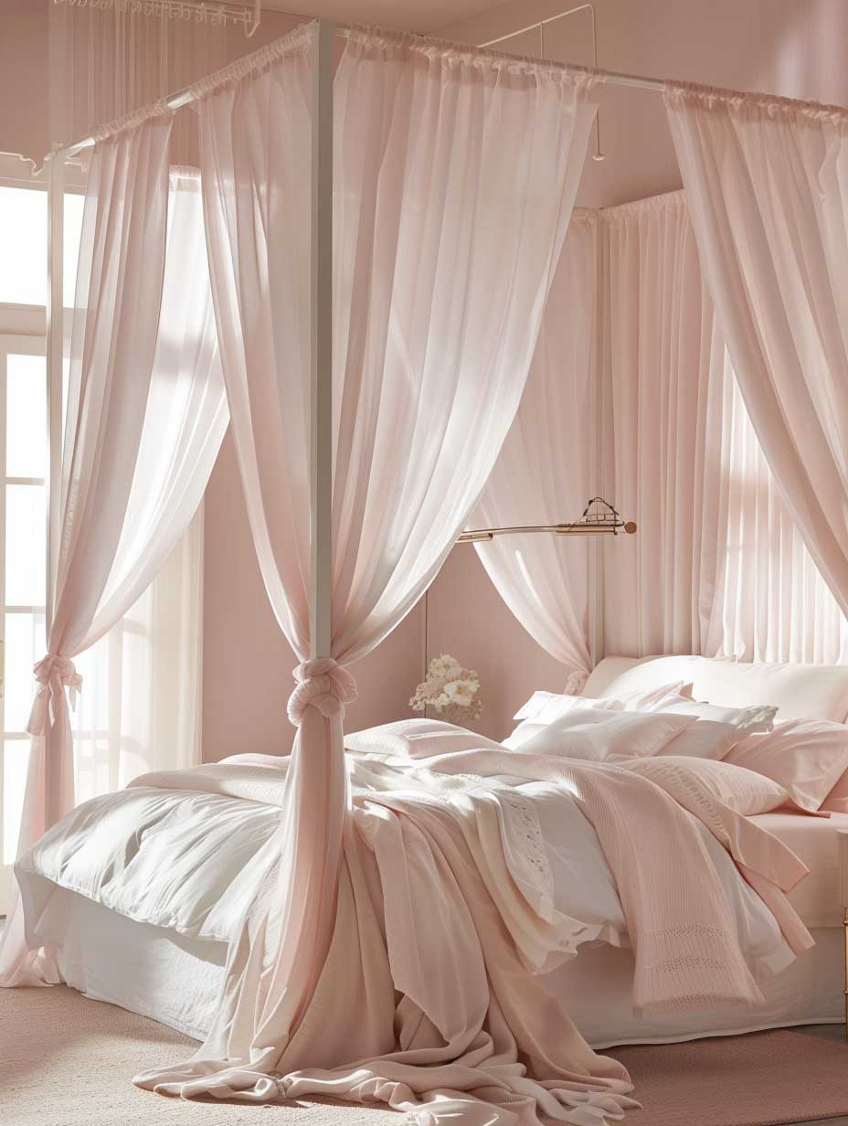


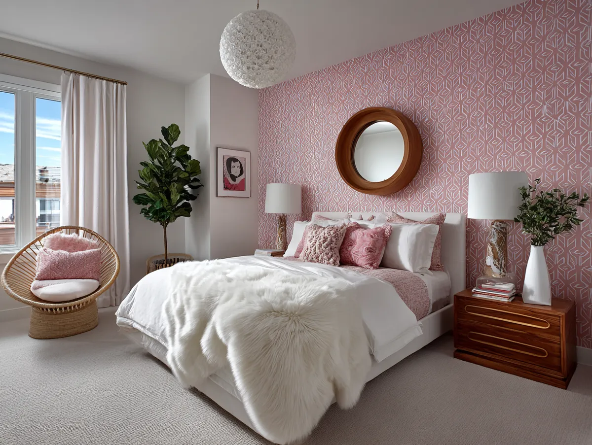
Soft pastel pink color room design creates its calmest effect in a bedroom when the shade has a warm, slightly muted undertone. The pink should support the bed, curtains, rug, and artwork rather than compete with them. What makes the palette feel restful is usually the restraint around it, much like a quiet background behind a piece of music; keep the larger furniture pieces neutral and let the pink establish the atmosphere.
Warm white, cream, pale beige, light oak, and soft gray all give pastel pink room color combinations enough contrast without turning the bedroom cold. A useful question is whether the pink still looks comfortable after the lights go on at night; if it becomes noticeably sharper, reduce the saturation or repeat the shade in smaller textiles instead. As a practical paint reference, Benjamin Moore lists 400–450 sq. ft. of coverage per gallon for several interior pink products, with one or two coats recommended depending on the surface. :contentReference[oaicite:0]{index=0}
Furniture should keep the composition grounded: a white bed, pale wood nightstand, upholstered headboard, or simple dresser gives the color somewhere to breathe. An easy anti-tip is to avoid matching every piece of furniture to the wall, because an all-pink bedroom can lose depth when the materials and values are too similar. For a related look at furniture choices, see these soft pink bedroom furniture design ideas, then select only the pieces that solve a real function in the room.
Lighting changes a pale pink room more dramatically than many people expect. Sheer curtains can spread daylight across the walls, while warm bedside lamps can make the same paint read deeper and creamier after sunset. How do you know whether the shade is right? Check a large sample beside the window and again in artificial light before painting, because the wall color should behave like a reliable filter rather than a surprise at night.
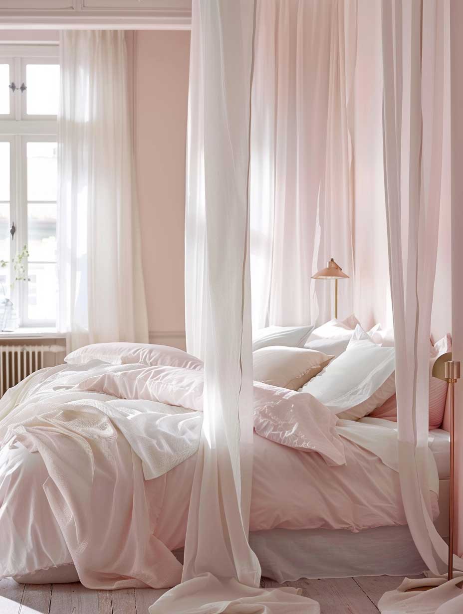


Textiles are where a pastel palette can gain depth without adding visual noise. Linen, cotton, wool, and velvet each catch light differently, so even two nearby pink shades can look distinct when their textures change. The practical target is two or three related pink values rather than a room filled with unrelated pink accessories, and one strong neutral should remain visible throughout the scheme.
Don’t Do This
Do not choose a very cool pastel pink from a tiny screen sample and apply it across the entire bedroom without testing it in daylight and evening light. The safer move is to sample the wall first and repeat the chosen shade through bedding, art, or a small upholstered piece.
Vibrant Pink Color Room Design for a Focused Home Office


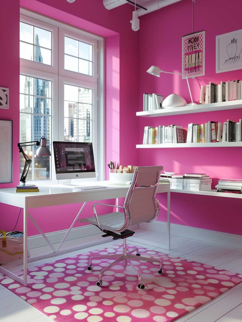
Vibrant pink color room design gives a home office a clear visual identity, but it works better when the strongest pink occupies a controlled area. A feature wall, shelving backdrop, chair, or artwork can provide the color hit while white, gray, cream, or natural wood carries the larger surfaces. The effect is closer to a highlighter on a clean page than paint poured over every line, so reserve saturation for the places you want the eye to notice.
Modern pink interior design benefits from simple furniture because strong color already supplies visual information. A streamlined desk and closed storage can keep the room readable, while one contrasting accent adds depth. If the question is whether a bright pink wall needs equally bright accessories, the answer is usually no; repeat the pink in two or three smaller elements and let the rest of the palette stay quiet.
Lighting deserves a practical check because vibrant pink can shift substantially between daylight and artificial light. A desk near a bright window may handle a deeper tone, while a darker workspace often needs a softer pink or lighter surrounding surfaces. Paint quantities can also be estimated before shopping: Benjamin Moore lists approximately 400–450 sq. ft. of coverage per gallon for several interior products, with one or two coats depending on the project, so measure the actual wall area instead of guessing from room size.
Storage should remain visually calm even when the wall color is not. White shelving, pale wood cabinets, or matte neutral organizers can stop a bold workspace from becoming a stack of competing accents, and a small amount of pink stationery can tie the scheme together. A useful rule is to keep the strongest color away from every storage surface, because repetition without hierarchy makes the room feel busier than it is; give the desk a clear visual zone instead.


For a workspace that must stay flexible, use saturated pink in removable elements such as a rug, task chair, pinboard, or artwork. This approach lets the room change without repainting, which is useful when the office also serves another household function. Think of the color as a punctuation mark: one strong accent can define the sentence, while several equally loud accents can obscure it.
- Keep the desk and primary storage in neutral or natural finishes.
- Repeat the chosen pink in two or three smaller details.
- Use daylight to judge the wall color before final painting.
- Keep the background simpler as pink saturation increases.
When a hot pink room aesthetic feels too intense, lower the saturation before changing the entire concept. Dusty rose, raspberry, muted coral, or pale pink can preserve the same color family with less visual pressure. The best test is simple: work in the room for a normal hour and notice whether the color remains a backdrop for concentration, then adjust the largest pink surface if it keeps demanding attention.
Elegant Pink Color Room Design for a Sophisticated Living Area


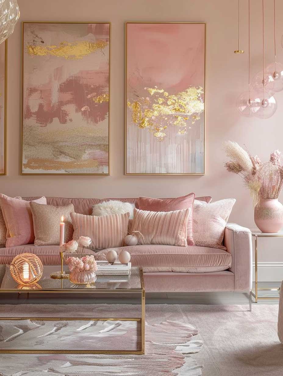
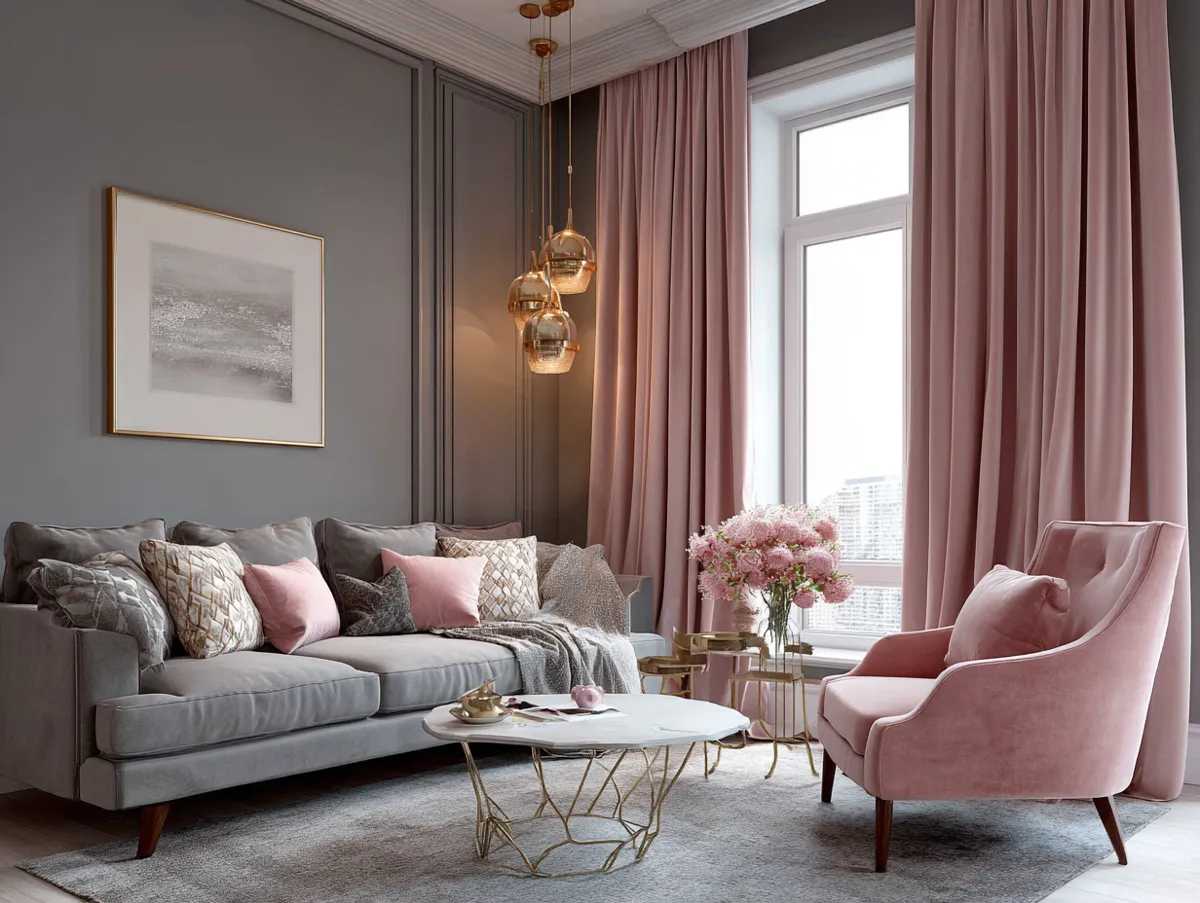
Elegant pink color room design works especially well in a living room when the shade is muted enough to support conversation, furniture, and artwork. Dusty rose, warm blush, clay pink, and subdued mauve can all create depth without turning the room into a single-color box. For additional living-room references, these pink living room ideas with neutral accents show how the same color family can move from pale walls to stronger decorative details.
The most dependable pink colour room combinations usually include at least one quiet neutral and one material with natural variation. Cream upholstery, warm gray, walnut, oak, stone, linen, and aged brass prevent the pink from feeling flat, while a darker accent can give the room a visual anchor. The composition behaves like a well-built frame: pink sets the mood, but the surrounding materials determine how polished that mood feels.
Furniture scale matters as much as color. A large sofa in saturated pink can dominate a compact room, while a neutral sofa with pink cushions or an occasional chair gives the same palette a lighter footprint. If the room receives limited daylight, ask whether the pink still looks warm beside the flooring and upholstery; if it does not, shift toward a lighter or warmer shade before adding more lamps.
Lighting should create layers rather than one bright source. Combine general illumination with a floor lamp, table lamp, wall light, or focused fixture so the pink surfaces receive different levels of reflection throughout the room. As a practical planning figure, interior paint products in this color family can cover about 400–450 sq. ft. per gallon according to Benjamin Moore specifications, but the final quantity depends on wall dimensions, surface condition, and the number of coats.


Artwork is a useful bridge between pink walls and the rest of the living room. Look for pieces that repeat one pink value while introducing cream, charcoal, green, brown, or metallic notes already present in the furniture. The anti-advice is to buy a matching pink set for every visible surface; instead, repeat color through different materials so the palette feels assembled rather than stamped.
How much pink is enough in a living room? There is no fixed percentage, but a strong wall color usually needs more breathing room around it than a small accent does. A practical starting point is to let the walls, sofa, or major rug carry the main visual weight while smaller objects echo the shade, then remove one pink accessory if the room begins to look repetitive.
| Pink direction | Useful pairing | Where it fits |
|---|---|---|
| Pale pastel | Warm white and light wood | Bedrooms and quiet corners |
| Dusty or muted pink | Cream, taupe and brass | Living rooms and dining areas |
| Vibrant pink | White, gray and natural wood | Offices and focused accents |
Pink works across a wide range of interiors when its intensity is matched to the room and balanced by materials that add contrast. Use pale pink to soften, muted pink to add sophistication, and vibrant pink to create a deliberate focal point. The strongest result comes from treating the color as one part of the composition, then letting light, furniture, texture, and proportion finish the room.
THE TAKEAWAY
Pink becomes versatile when its intensity has a clear job.
Use softer shades where calm matters, brighter tones where an accent can carry the room, and neutral materials wherever the palette needs visual rest.
Test paint in the real light, measure coverage before buying, and repeat the chosen pink selectively rather than matching every surface.
Complete guide
Pink Home Color Ideas for Every Room and Every Shade
Blush, coral, dusty rose, fuchsia — interiors, exteriors, kitchens, bedrooms — all in one place
You Might Also Like

Related Topics