Terra cotta interior design is having its most sustained moment in decades — and for reasons that go well beyond trend cycles. Sherwin-Williams named its earthy clay hue Cavern Clay (SW 7701) Color of the Year back in 2019, and the shade has barely left shelter magazines since. The palette runs from muted ochre-orange through deep brick red, and each tone behaves differently depending on the room, the light, and the materials it sits beside.
What makes terra cotta genuinely useful as a design tool is its thermal quality — visually speaking, it reads warm at any hour, in any exposure. North-facing rooms that never catch direct sun finally feel inhabited with a terra cotta wall rather than endured. South-facing rooms with abundant light get richer and more complex as the day moves, with the hue shifting between rusty amber at noon and deep copper by late afternoon.
The three rooms covered below — living room, dining room, bedroom — each call for a different application of the palette. A full wall reads dramatically in a living room but can overwhelm a bedroom; there the same color works better as a wash on a single accent wall or in the bedding. Getting the ratio right matters more than getting the color right.
- Terra cotta pairs most naturally with raw wood, aged brass, and matte black — not with chrome or glossy white
- Sherwin-Williams Cavern Clay SW 7701 (LRV 20) works for walls; at LRV 20 it’s mid-toned enough to avoid reading dark in most spaces
- Terracotta floor tile rated for 50–100 years when properly sealed; plan to reseal every 3–5 years
- The dining room tolerates the deepest, most saturated terra cotta tones — food and candlelight both look better against warm walls
- Bedroom applications work best in muted, desaturated terra cotta — high-saturation versions raise alertness rather than promote rest
Terra Cotta Interior Design Shifts the Entire Living Room Without a Single Piece of New Furniture
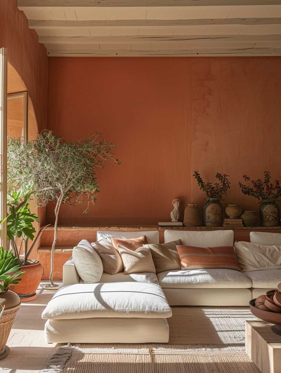
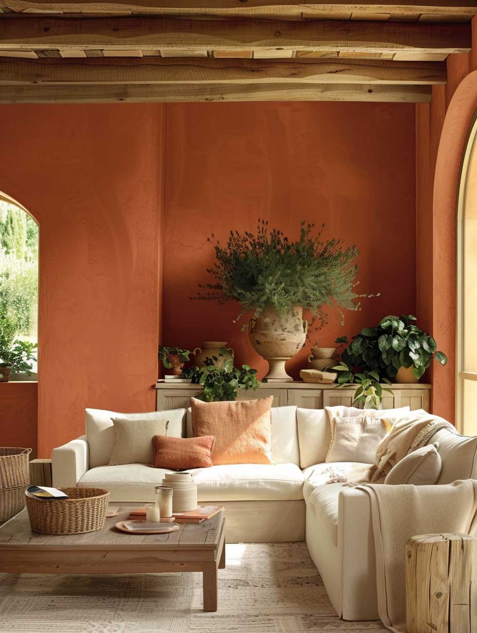
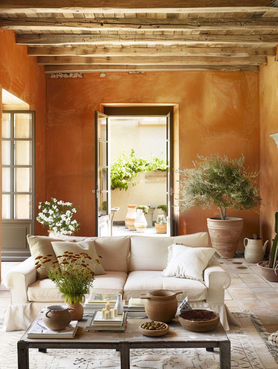
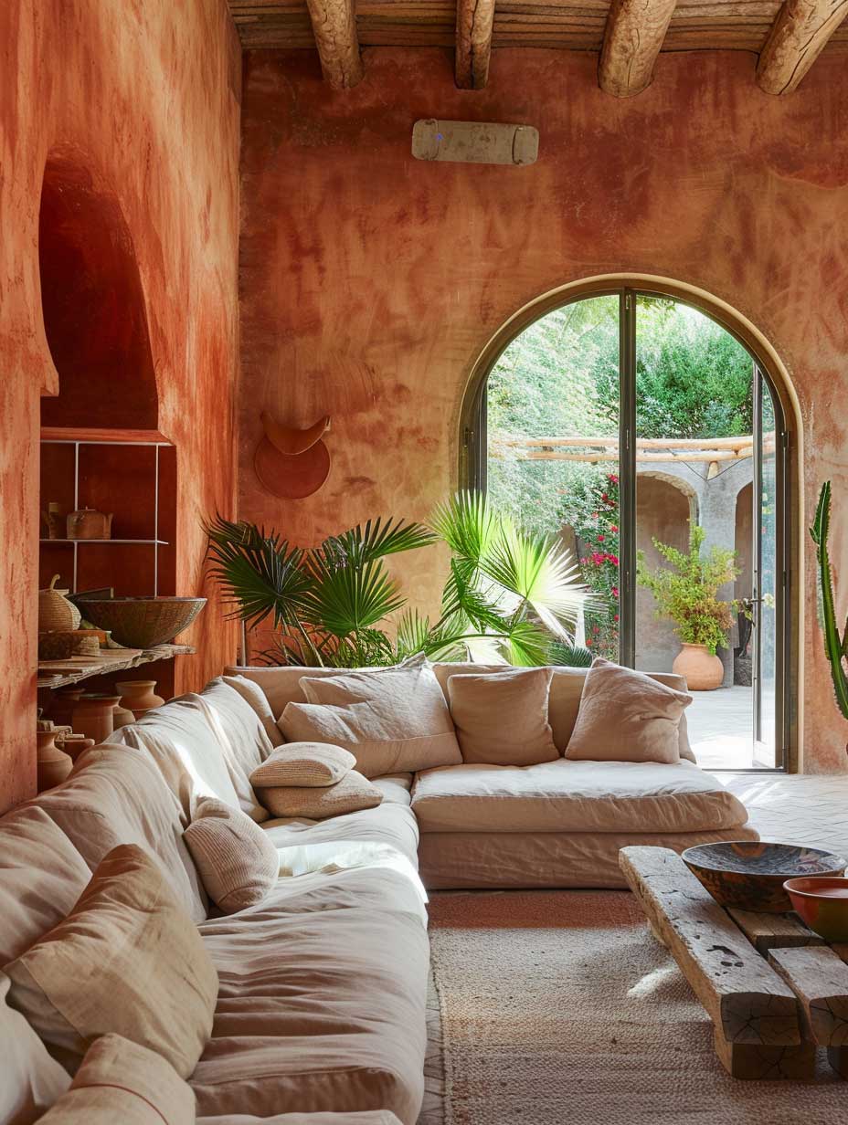
Terra cotta interior design applied to a sunlit living room works like a color multiplier — morning light turns the wall amber-gold, afternoon direct sun deepens it toward brick, and the room effectively changes character four times between 8 AM and 6 PM without anything moving. Sherwin-Williams Cavern Clay SW 7701, at an LRV of 20, sits dark enough to read as a committed color choice but light enough to avoid closing the room down. A gallon of SW SuperPaint runs $60.49, which makes experimenting with a single accent wall a low-stakes test before committing to all four.
Styists recommend keeping the sofa in a neutral — warm linen, cream, or soft sage — rather than matching the wall tone. Matching creates a monochromatic soup that flattens the room rather than grounding it. Think of the terra cotta wall as the sun and the sofa as a stone ledge catching the light: contrast is the whole point. The trick here is to anchor the floor with a natural material — unglazed terracotta floor tile rated for 50 or more years with proper sealing — and let the walls and floor do the heavy lifting while the soft furnishings stay subdued.
What doesn’t work: mixing terra cotta walls with warm yellow accents. Yellow and orange at full saturation fight each other at the same visual frequency and the room starts reading like a fast-food interior. Cool contrasts — deep teal throw pillows, a muted sage plant pot, a concrete or slate coffee table surface — give the eye somewhere to rest and make the terra cotta itself read richer by comparison. Does adding greenery help? Dramatically. A fiddle-leaf fig or large monstera set in an unglazed terracotta planter creates a visual loop between the wall color and the natural clay, making the design feel intentional rather than accidental.
For living rooms that already carry earthy interior decorating color palettes — mossy greens, warm browns, sand tones — terra cotta slots in as the warmest layer of an already grounded scheme rather than arriving as a surprise. The combination of deep brown wood floors, terracotta walls, and linen upholstery reads like three different values of the same desert landscape photograph: close enough to feel harmonious, varied enough to hold interest.


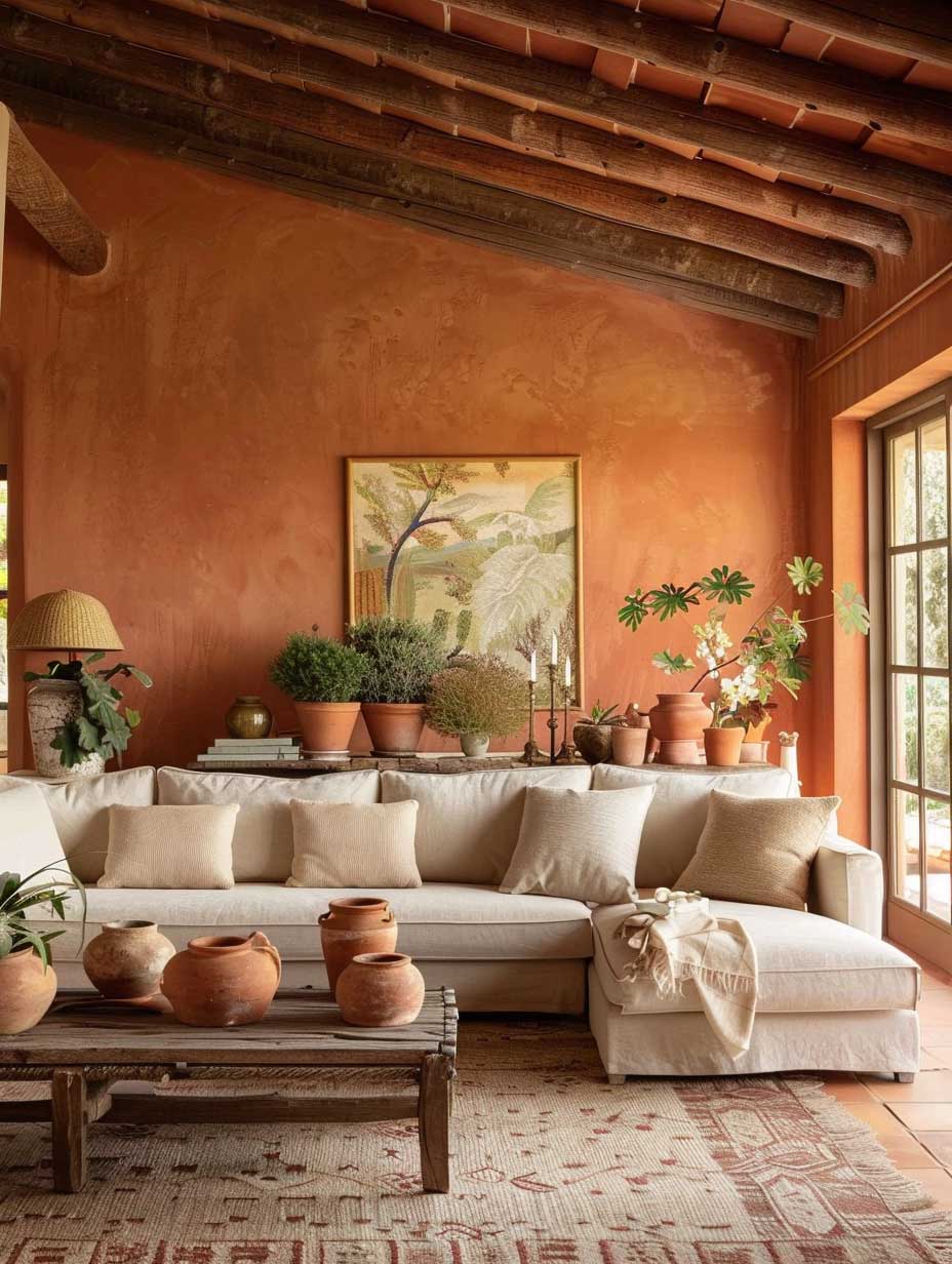
Mirrors placed opposite the primary light source amplify what terra cotta walls do naturally — they bounce warm-toned light back into the room rather than the cool, flat reflection you’d get off a white wall. A large leaning mirror in a raw-wood or aged brass frame works with the palette rather than interrupting it. Decorative terra cotta pottery — planters, vases, sculptural vessels — reinforces the palette without requiring a paint commitment, which makes it the right starting point if the idea of a terra cotta wall still feels like a leap. You’ll notice the moment even one large clay pot enters a neutral room, the entire space begins reading warmer.
Food Looks Better on a Terra Cotta Dining Room Table Than It Does on a White One


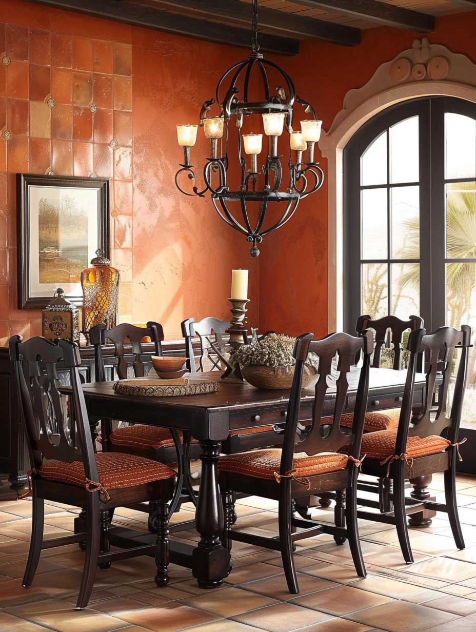
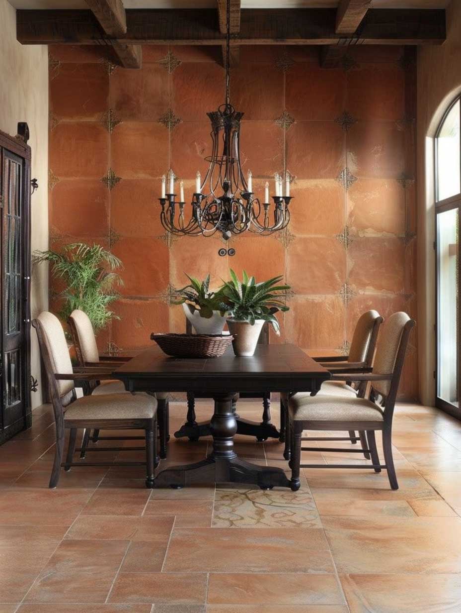
Terra cotta dining rooms make scientific sense. Warm colors in the orange-red family — and terra cotta sits squarely in that range — are documented to stimulate appetite and encourage conversation; restaurants have known this for decades. A wall painted in a saturated clay tone makes candlelight look dramatically richer, makes red wine look deeper in the glass, and makes food photography look like it was shot in natural golden hour light even at 7 PM on a Tuesday. This is the one room in the house where decorating with terracotta fully at saturation rather than muting it down pays off.
The floor is where most terra cotta dining rooms succeed or fail. Unglazed terracotta tile — the actual fired clay version, not ceramic tile sprayed in a matching color — behaves like a geological material in a room: it has depth, natural variation, and a matte surface that absorbs rather than reflects light. According to clé tile, terracotta floor tile carries a potential lifespan of 50–100 years when properly cared for, with resealing recommended every 3–5 years. That maintenance interval is the price of entry; skip the sealant and the porous surface stains from a single glass of red wine. Do it correctly and the floor will outlast three kitchen renovations.
Furniture selection here matters more than in any other room. A large, dark solid-wood dining table — walnut, oak with a dark stain, or reclaimed timber — reads like a natural extension of the terra cotta rather than an intruder against it. What kills this combination: glass-top tables. A glass table against a terra cotta wall makes the floor visible beneath the table in a way that fragments the room visually, and the cold transparency of glass fights the warmth of clay at every angle. The trick here is to keep all hard surfaces in natural or aged materials — wood, stone, raw iron — and let the terra cotta provide the color temperature.
Don’t install a wrought iron chandelier that’s actually painted black with a high-gloss finish. The gloss reads plasticky against aged clay and matte wood, and the distinction between “wrought iron” and “spray-painted fixture from a box store” is immediately obvious under dining room lighting at night. Matte black, hammered finishes, or actual aged iron with visible texture are the correct choice. A glossy black pendant hovering over a terra cotta dining room is the single fastest way to make a carefully assembled space look unfinished.
Also avoid: terra cotta-colored ceramic dinner plates on a terra cotta-colored wall. The matchy-matchy approach cancels the contrast that makes both elements legible. White or cream ceramics against the warm wall let both read clearly; matching swamps the table setting into the background.


Plants in a terra cotta dining room aren’t decorative — they’re structural. A large-leafed tropical plant in a floor planter positioned in one corner creates a visual anchor that pulls the room together without requiring another piece of furniture. The contrast between deep green foliage and clay-colored walls is the kind of obvious pairing that works because nature already works that way: green plants against red soil is the baseline of every landscape on earth. Smaller arrangements — a sprig of eucalyptus, a low bowl of succulents on the table — extend the same logic down to the tabletop level without requiring effort.
For table settings, a common approach is to mix white ceramics with natural linen napkins and a runner in an undyed fabric. This keeps the table calm against an already saturated wall and lets the food do its job as the centerpiece. The Mediterranean color palette approach of pairing terracotta with olive is particularly effective in dining rooms — olive-green upholstered chair seats or an olive linen runner carry the natural color story without competing with the wall for attention.
Muted Clay on a Bedroom Wall Reads Warmer Than a Blanket at 11 PM
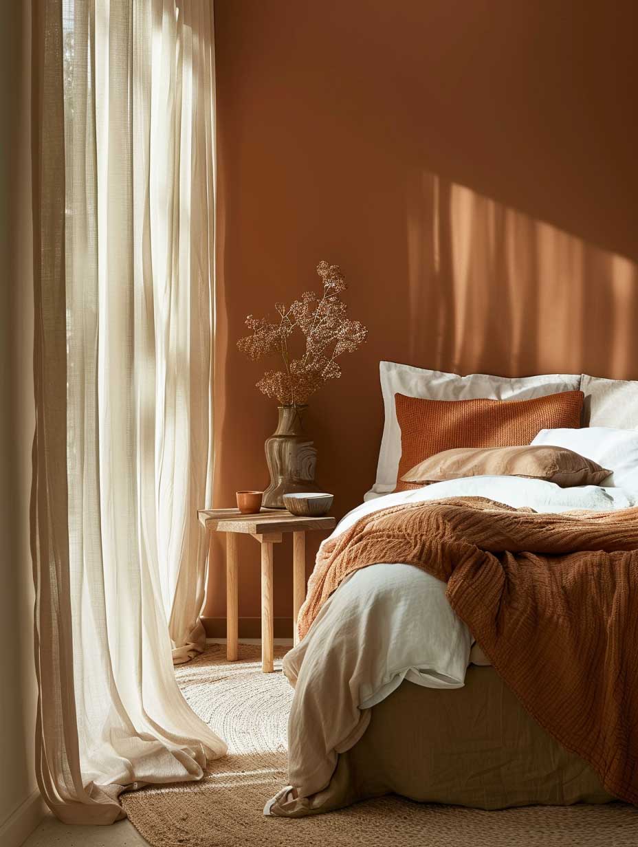


A terracotta bedroom palette calls for a different shade than what works in a dining room. High-saturation terra cotta — the kind that reads vivid in daylight — activates rather than calms, which is the opposite of what a sleep space needs. Stylists recommend pulling one value lighter and one step more muted: something in the sandy-clay range rather than full brick-orange. The practical reference point is Sherwin-Williams Cavern Clay SW 7701, which at LRV 20 sits at the warmer end of workable; for a bedroom, the safer move is to test it on a single wall first under both daylight and artificial light before committing. Warm bulbs at 2700K or lower are non-negotiable — a terra cotta wall under 4000K LED light goes flat gray-orange and loses everything.
Sheer curtains in unbleached linen or cotton diffuse morning light in a way that works for the palette rather than against it. Bright white sheers turn terra cotta walls slightly pink in direct sun — that’s typically not the effect being sought. Natural-fiber curtains in ecru or soft wheat tone filter light into gold rather than blue-white, keeping the room in its intended warmth register. Does fabric weight matter? Significantly. A heavy linen drape in the same natural shade pulls double duty — it adds acoustic softness to the room and prevents the curtain from reading as a separate design element that needs to be coordinated.
Bedding should read lighter than the walls, not match them. Earth-toned bedding in soft sand, undyed linen, or washed-cotton ivory creates enough contrast to keep the bed as the visual center of the room rather than letting it dissolve into the wall behind it. Woven rugs in cream or natural jute anchor the floor and add tactile texture that reads as intentional design layering. Macramé wall hangings, pottery, and botanical artwork are all reliable accents — but the fewer the better. A terra cotta bedroom with too many small objects starts reading as a curated boutique hotel room rather than a personal space. One good piece of art and one large plant are typically more effective than six small accessories.
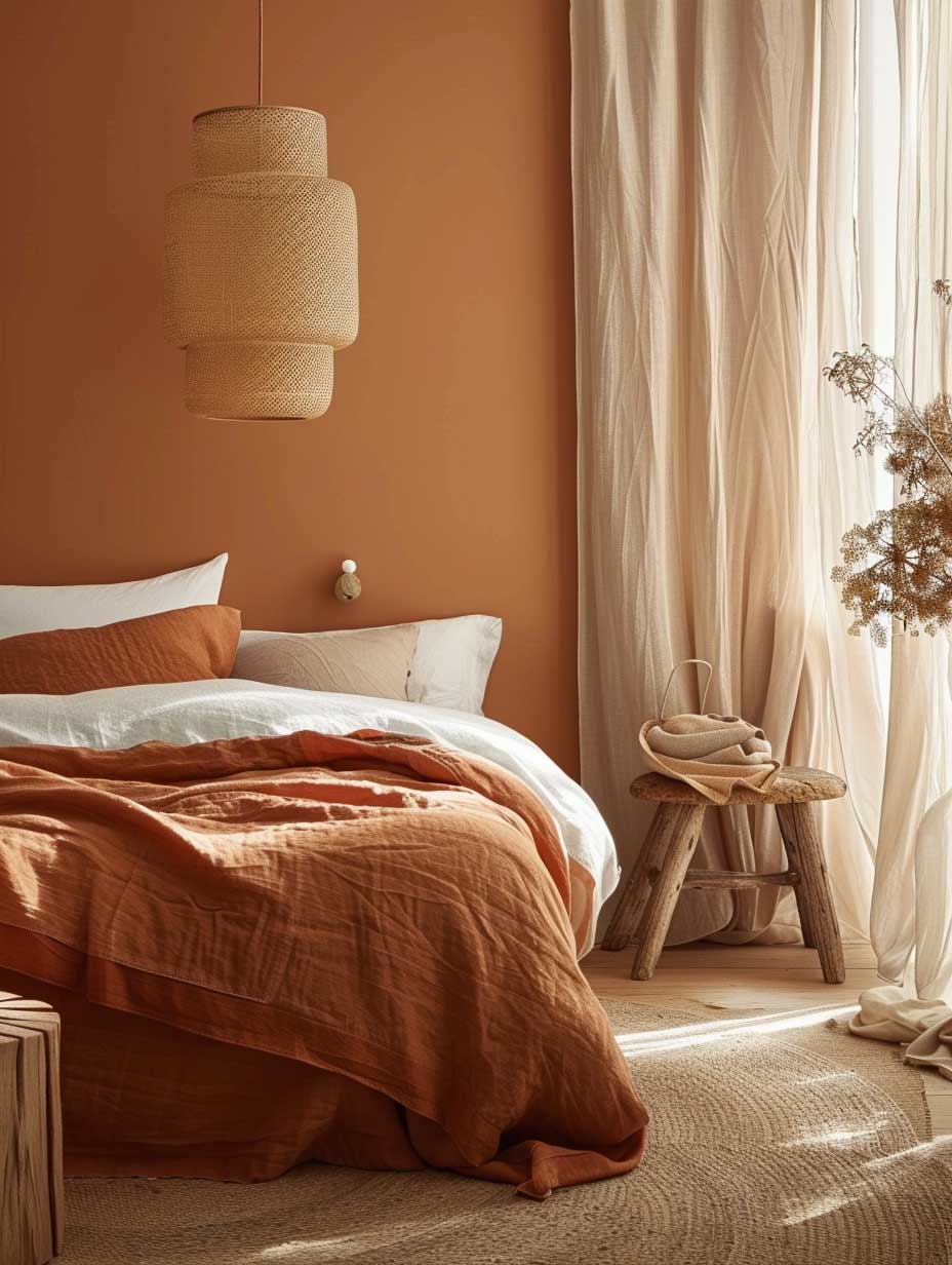


Wooden furniture in this palette needs to read warm, not orange. Walnut and reclaimed oak work well because both pull toward brown rather than yellow. Blonde or honey-toned pine reads too orange against terra cotta walls and creates a visual frequency clash — the room ends up looking like every tone is competing for the same position on the warm spectrum. A darker, cooler wood grounds the terra cotta rather than amplifying it. For bedroom lighting, dimmable sconces at bedside rather than a central overhead fixture give the most control over the warmth register after dark, which is where this palette pays off most. You’ll notice the difference immediately: in low, warm light from two flanking sconces, a muted terra cotta wall reads like sunset. Under a central ceiling fixture at full brightness, the same wall reads flat and workmanlike.
Terra cotta tiles used as flooring in a bedroom — particularly larger format squares in an unglazed finish — connect the ground plane to the wall color in a way that makes the room feel resolved rather than assembled. According to Mission Tile West, glazed ceramic, porcelain, and terra cotta floor tiles carry a lifespan of 50 years or more when properly maintained. That kind of durability makes the investment case straightforward: a bedroom floor that lasts a half-century while getting more characterful with every year of aging is a different proposition than carpet that needs replacing every decade.
| Room | Recommended Saturation | Key Material Pairing | Common Mistake |
|---|---|---|---|
| Living Room | Mid-tone (LRV 18–25) | Neutral linen sofa, dark wood | Warm yellow accents competing with clay |
| Dining Room | Deep / saturated (LRV 14–20) | Unglazed tile floor, matte iron fixtures | Glossy surfaces fighting warm clay tones |
| Bedroom | Muted / sandy (LRV 25–35) | Sheer natural-fiber curtains, walnut furniture | High-saturation shade raising alertness |
For anyone planning a full interior color scheme that includes terra cotta alongside other earthy tones, the terracotta tile collection at clé tile provides a useful reference for understanding the range of finished clay tones — from unglazed antique red to glazed white earthenware — and how each behaves in a residential interior context.
Terra Cotta Design
Clay Walls Do More Work Per Dollar Than Any Piece of Furniture You’ll Ever Buy
Terra cotta interior design earns its place in every room differently — saturated and bold in the dining room, mid-toned and dynamic in the living room, muted and steady in the bedroom. The common thread is material pairing: this palette only works against raw wood, natural stone, aged iron, and unbleached fabric. Chrome, gloss, and synthetic materials collapse its warmth immediately.
Terracotta floor tile rated at 50–100 years lifespan, Sherwin-Williams Cavern Clay at $60.49 a gallon for SuperPaint, and a resealing interval of every 3–5 years for clay flooring are the concrete numbers to plan against. None of these are approximations.
Start with one wall. Confirm the shade under both daylight and 2700K artificial light before committing to a full room. Save this post before heading to the paint store.
Related Topics