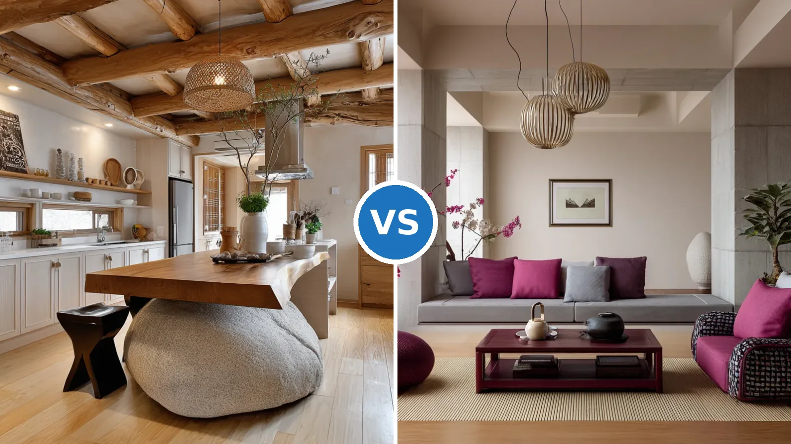
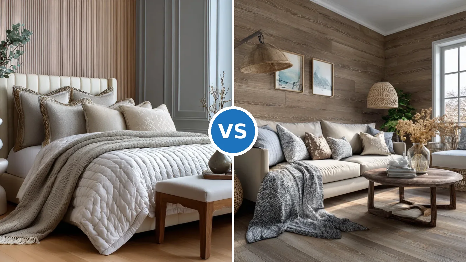
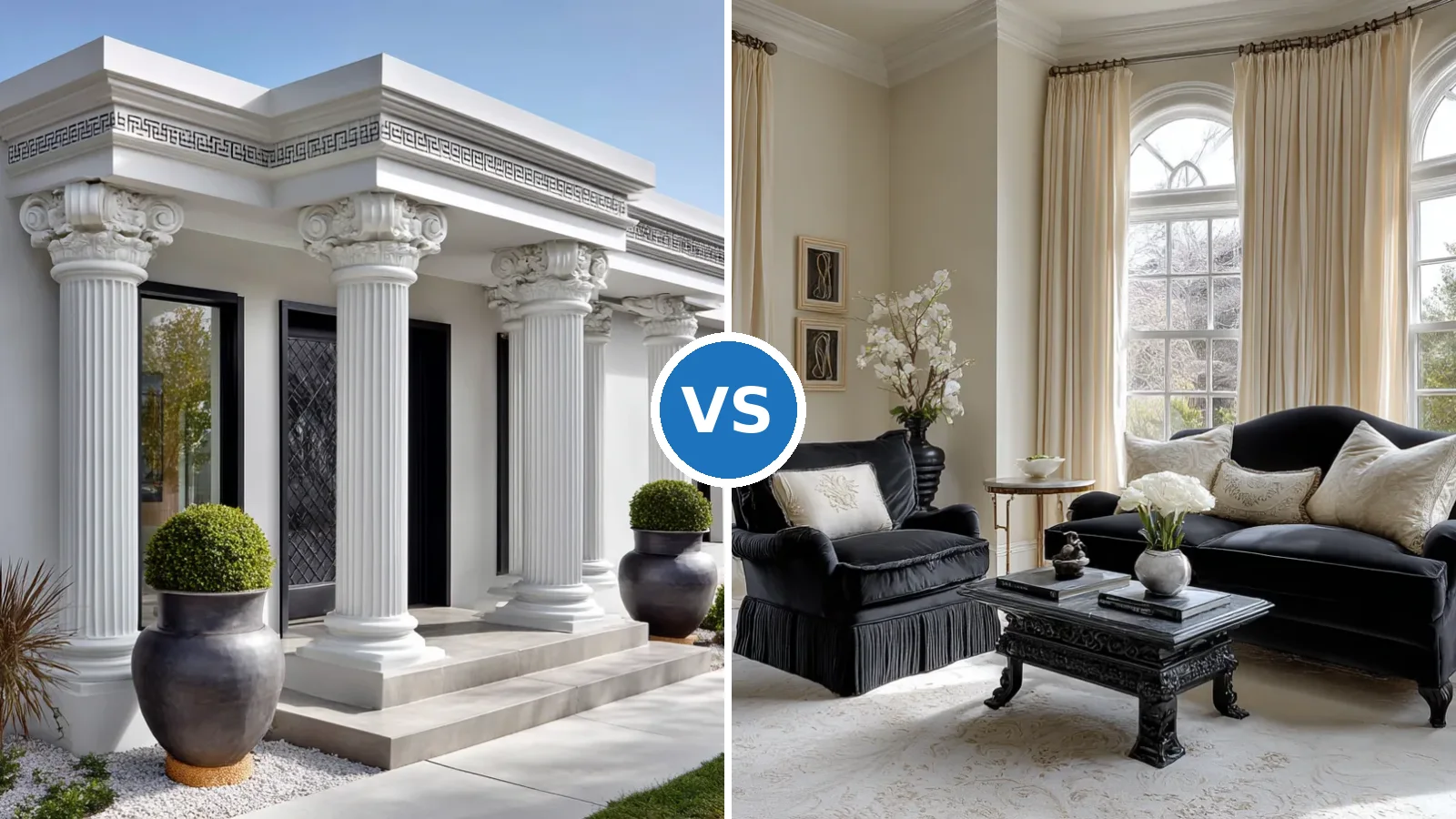
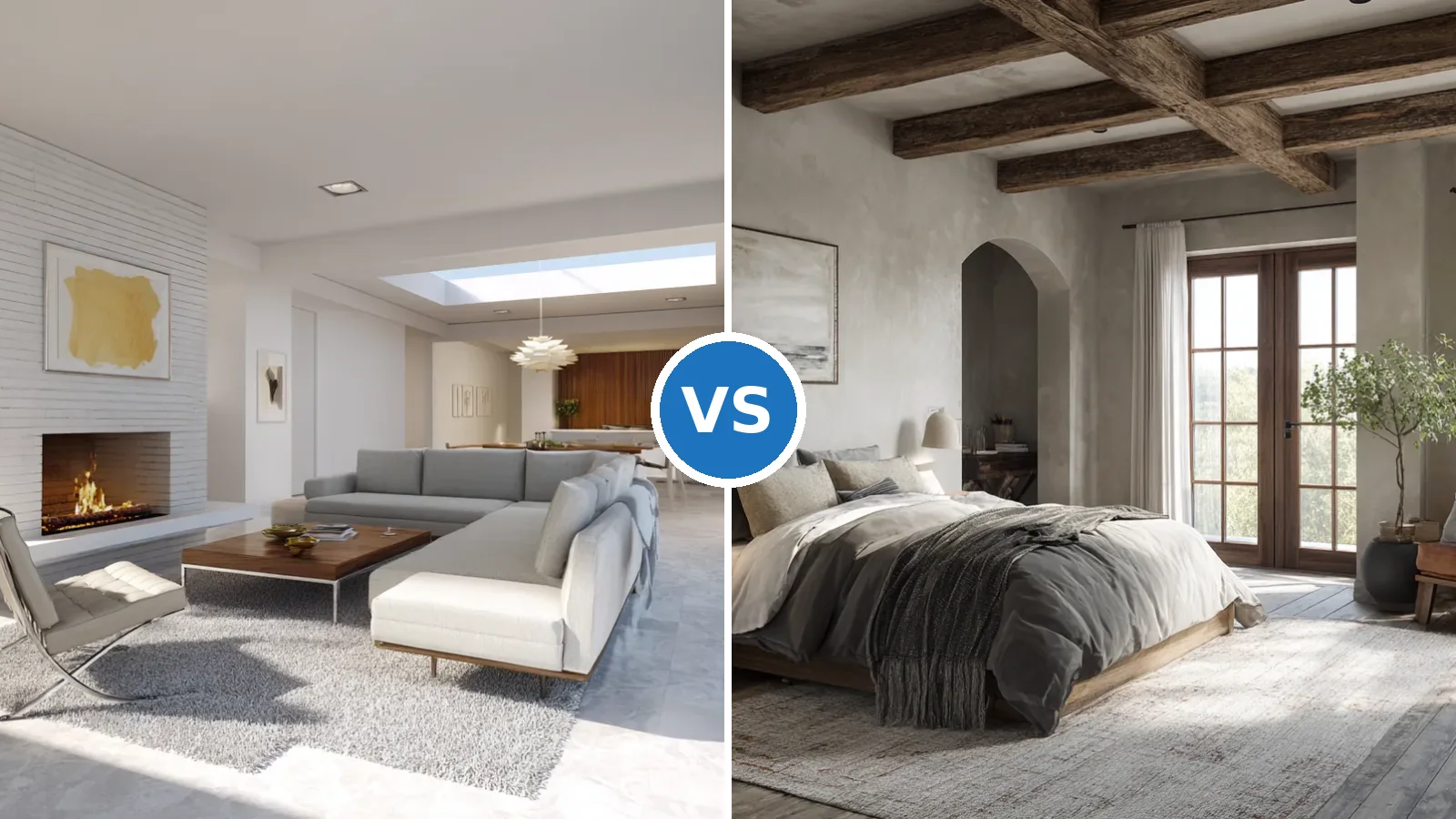
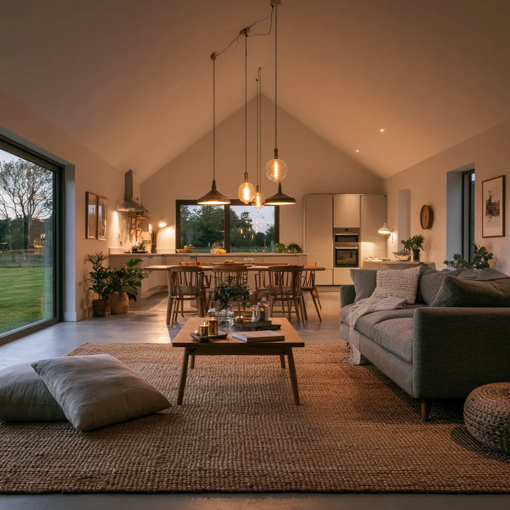
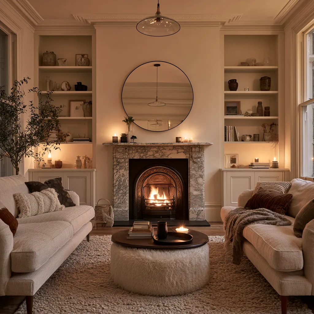
The colour combination for your drawing room is the one decision that changes every other element in the space — furniture, lighting, textiles — either working with it or fighting it. Pick the palette before you buy a sofa, not after. A gallon of Sherwin-Williams SuperPaint runs about $70, and the right shade does more structural work than a piece of furniture three times the price.
Three palettes consistently outperform the rest in drawing rooms: soft pastels that open up tight spaces, earthy tones that age without looking tired, and bold dark-and-bright contrast schemes that hold their energy across a full repaint cycle. Interior paint in living rooms lasts 7–10 years with quality preparation — which means this is a decision worth getting right rather than defaulting to whatever feels safest at the paint counter.
What most people get wrong is treating colour as a decoration layer applied on top of the room. Colour combination in a drawing room is the room’s architecture. The sections below break down exactly how each palette works, what kills it, and what to spend money on versus what to skip.
– Pastel palettes — soft lavender, sky blue, blush — expand small drawing rooms visually and reflect natural light better than any other colour family
– Earthy tones — Sherwin-Williams Cavern Clay (SW 7701, LRV ~20), terracotta, warm brown — age the best; they look intentional at year eight, not dated
– Bold contrast — deep navy or charcoal anchor wall plus one vibrant accent colour — works in well-lit rooms only; dark hues absorb 80%+ of available light
– One gallon covers 350–400 sq ft in a single coat; budget two coats for any colour darker than the existing wall
– Living room paint holds 7–10 years before showing wear; choose finish (eggshell or satin) over matte for easier cleaning
Pastel Walls Lift Drawing Rooms Other Colour Strategies Can’t


Pastel colour combinations for drawing rooms do something no saturated palette can — they reflect and amplify natural light rather than absorbing it, which means even a north-facing room with limited windows gains perceived volume. Benjamin Moore’s pastel range includes shades like Lavender Mist, Sleepy Blue, and Sea Salt, each sitting high enough in light reflectance value to keep walls from feeling heavy. Among the company’s most frequently specified pastel interiors, soft pinks and chalky blues consistently rank first for rooms under 200 square feet where a darker palette would feel enclosing.
Texture matters as much as colour in a pastel drawing room — skip this step and the result reads flat rather than serene. Stylists recommend adding a muted pink or warm grey rug, linen drapes, and a few plush throw cushions in the same tonal family. The trick here is layering at least three different fabric textures against the wall: the contrast between matte paint and tactile fabric is what creates depth. Don’t make the mistake of matching all textiles to the exact wall shade; identical tones at different scales simply flatten the room rather than building it.
Furniture selection is the point where most pastel drawing rooms go wrong. Clean-lined pieces in light wood — ash, birch, pale oak — hold the scheme together; bulky upholstered pieces in a competing warm white push the room toward beige and strip it of character. A common approach is to anchor one side of the room with a low natural-wood coffee table and keep all upholstery within the linen-to-oat range. Ask yourself what this room looks like at 7pm under warm bulbs: if the furniture choices read as one undifferentiated pale mass at that hour, scale back on light-toned upholstery and introduce one mid-toned piece.
Art and decorative objects are what pull a pastel drawing room out of nursery territory and into something editorial. Botanical prints, abstract compositions in soft blues and warm whites, or brushed-gold vases add personality without introducing a second competing colour. For sitting room colour combinations that use the same light-on-light logic across larger floor plans, the principle stays consistent — the art, not the paint, supplies the room’s visual punctuation.


Lighting is the variable that separates a successful pastel drawing room from one that looks like an unfinished project. Sheer curtains that allow daylight to diffuse across the wall are non-negotiable — block-out curtains in a pastel room kill the effect entirely. In the evening, warm-toned bulbs at 2700K or below keep lavender and blush from shifting toward cold grey, which is what happens under the cool daylight LED bulbs most homes default to. Spend fifteen dollars on bulb temperature before you spend five hundred on cushions.
Don’t attempt a pastel drawing room with two competing pastel tones on different walls — one lavender wall and one blush pink wall don’t create harmony, they create a room that looks like two different projects collided. Pastels need one dominant wall colour and maximum one supporting accent in a different hue. Also avoid pairing pastels with cold-white LED bulbs (above 4000K): the blue-cast light strips warm pastels of their softness and makes the room read as clinical rather than calm.
Earthy Drawing Room Colour Combination — What Terracotta and Deep Green Actually Require


Earthy colour combinations for drawing rooms — rich browns, deep greens, warm terracottas — perform differently from pastels because they absorb light rather than reflect it, which means they create intimacy instead of spaciousness. Sherwin-Williams Cavern Clay (SW 7701) is the reference point for mid-depth terracotta: its LRV of approximately 20 means it absorbs roughly 80% of available light, so it pairs with creamy whites, matte black, and natural wood specifically to prevent the room from reading dark rather than cosy. Behr’s Terra Cotta Clay (M200-5) covers up to 400 square feet per gallon in one coat and sits in a complementary range for rooms where you want terracotta slightly less dominant.
Material integration is what separates an earthy drawing room that works from one that looks like a mood board left half-finished. Natural wood, stone accents, leather, and raw linen are not optional extras — they are the materials that give the earthy palette its authority. Think of the wall colour as a chord that only resolves when wood enters the room as the bass note. A terracotta wall against synthetic upholstery and chrome hardware looks wrong in a way that’s hard to name but immediately visible; the same wall against teak furniture and woven cotton reads settled and composed.
Deep greens in drawing rooms work on the same logic as terracotta but play the cooler role in the palette. A muted sage — the kind with enough grey content to read as a sophisticated neutral rather than a botanical statement — applied to all four walls creates an environment that interior designers describe as quietly commanding. The depth of the colour keeps the room from feeling bare regardless of how minimal the furniture is. You’ll notice that well-photographed earthy drawing rooms almost always have one large Monstera or trailing Pothos: the plant doesn’t add nature so much as confirm that the green on the walls was deliberate.
Lighting is where earthy drawing rooms either earn their investment or underperform. Natural daylight hitting a terracotta or brown wall during afternoon hours produces the richest version of the colour — warm bulbs at 2700K extend that quality into the evening. Avoid recessed cold-white downlights in an earthy drawing room: they reduce the warmth of the palette to something that reads muddy rather than grounded. Soft, diffused floor lamps and table lamps placed in corners serve the scheme far better than overhead lighting in this colour family. For more drawing room wall paint designs in earthy tones — including colour-blocking and textured overlay techniques — the principles here apply directly.


Textiles in an earthy drawing room need to operate in layers rather than in matched sets. A jute rug, a wool throw in warm rust, cushions in undyed linen, and curtains in a heavier cotton or velvet — these materials at different textures build the tactile richness that earthy colour schemes depend on. The mistake is choosing all textiles from the same fabric family, which strips the palette of the variation it needs. Wool next to linen next to leather in the same 60-square-foot corner is a room that’s working; three linen pieces in the same tone is a room that’s stalled.
Decorative objects in an earthy drawing room are most effective when they introduce a contrasting material rather than a contrasting colour. Earthenware vases, hand-thrown ceramic bowls, raw stone bookends — these objects reinforce the connection between the wall colour and the natural world without introducing a competing hue. The one exception is plants: a single specimen with large architectural leaves placed in a corner confirms the palette’s intent and adds vertical scale that no decorative object achieves as efficiently.
Dark Walls Plus Vivid Accents — the Drawing Room Colour Combination That Demands Respect
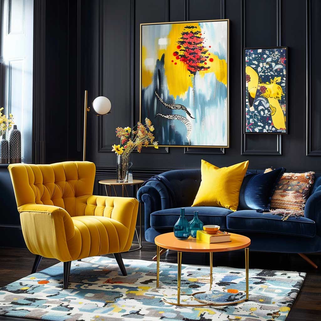


Bold colour contrast as a drawing room colour combination — a deep navy, charcoal, or forest green anchor wall paired with one vibrant accent colour — is the scheme that non-designers most frequently admire in editorial images and most frequently execute poorly at home. The failure point is almost always the same: choosing the wrong accent colour. Deep navy paired with teal reads as two blues competing; deep navy paired with a warm coral or saturated mustard reads as contrast. The accent colour needs to sit on the opposite side of the colour wheel from the anchor wall to generate genuine tension rather than tonal harmony.
Interior paint in living rooms lasts between 7 and 10 years before showing noticeable wear — which means a bold contrast drawing room is a commitment. Dark feature walls in enduring colours like Benjamin Moore Hale Navy HC-154 or Sherwin-Williams Black Magic SW-6991 consistently outlast trend colours across multiple design cycles. What dates a bold drawing room fastest is not the dark wall but the accent colour chosen to accompany it: primary yellow from the mid-2010s, millennial pink from the late 2010s — the anchor wall survives, the accent becomes the tell. A common approach is to keep the accent colour in moveable accessories — cushions, throws, vases — so it can be updated for around $80–150 without touching the walls.
Finish and material choices in a bold contrast drawing room need to earn their place rather than blend into the background. Velvet upholstery and glossy lacquered surfaces work because they reflect the accent colour back across the room and amplify the drama of the dark anchor. Matte upholstery and flat-finish furniture in a dark contrast drawing room make the room feel heavy in a way that doesn’t resolve. Metallic accents — brass hardware, a copper lamp, a gilded picture frame — introduce a third layer between the dark wall and the accent colour, and the room stops reading as two-dimensional.
Artwork placement follows a precise logic in a bold contrast drawing room. Art placed against the dark anchor wall needs to be high-contrast and brightly lit to be readable — frames in light wood or brushed brass prevent the work from disappearing into the wall. Art placed on neutral surrounding walls should draw from the accent colour, creating a circuit that connects the design elements across the room. Visitors often describe well-executed bold contrast drawing rooms as feeling like a curated gallery; that’s the effect of every object earning its position rather than filling space. Benjamin Moore’s living room colour inspiration resource shows how dark foundation colours work across different accent pairings in photographed spaces — worth consulting before committing to a specific combination.

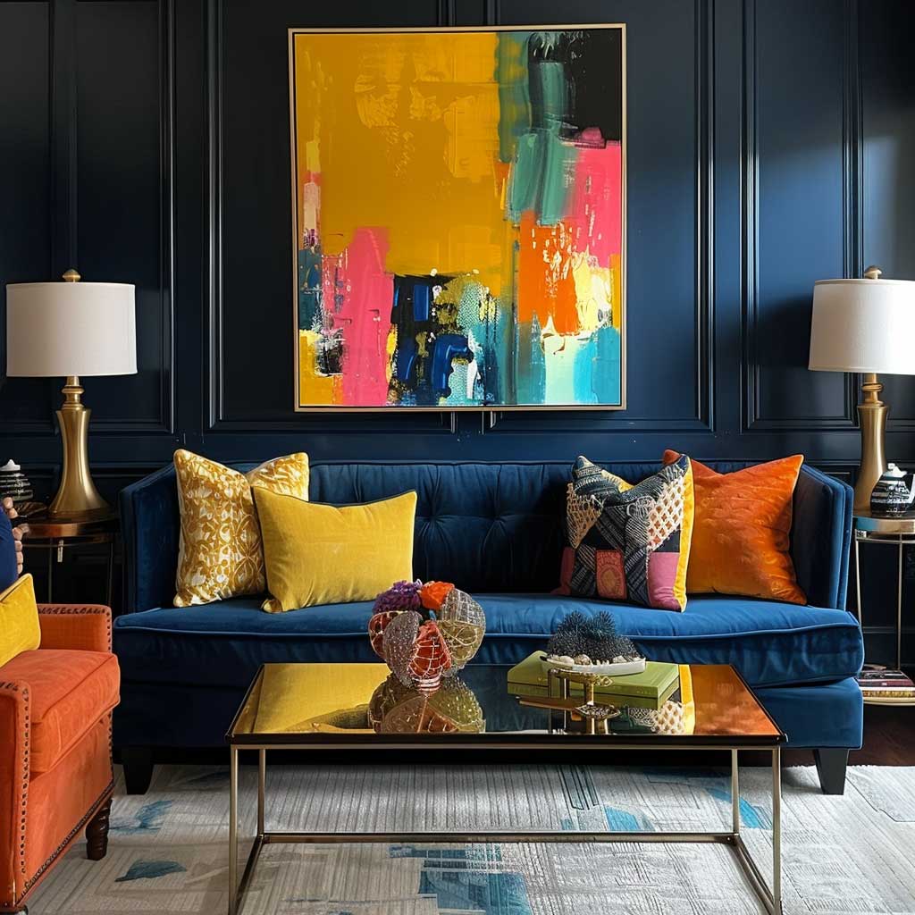


Lighting in a bold contrast drawing room is not optional — it is structural. Dark walls absorb 60–80% of available light depending on the specific shade and finish, which means artificial light has to make up what the wall takes. Spotlights or directional track lighting aimed at the anchor wall bring its depth to life; general overhead lighting without directional sources makes the room look dim and uninviting. A warm-toned floor lamp placed in the corner opposite the anchor wall creates a second focal point and prevents the dark element from dominating without relief. A room with a deep feature wall and inadequate lighting doesn’t read as dramatic — it reads as poorly lit.
Accessories in a bold contrast drawing room work best in groups of odd numbers. Three metallic objects at different heights on a shelf against the dark wall, five cushions in varying accent tones on the sofa, one oversized piece of art as a single statement — the asymmetry prevents the room from reading as staged. Even numbers at the same height create a formal symmetry that looks correct in photographs and lifeless in reality. The goal is a room that looks like someone actually lives and selects objects in it, not one that was assembled and frozen.
| Palette | Best Room Size | Maintenance Cycle | Key Risk |
|---|---|---|---|
| Pastel (lavender, sky blue, blush) | Under 200 sq ft — light reflects and expands space | 7–10 years; eggshell finish wipes cleanly | Incorrect bulb temperature strips warmth; use 2700K |
| Earthy (terracotta, deep green, warm brown) | Any size; terracotta needs adequate light in rooms under 150 sq ft | 7–10 years; matte or eggshell depending on traffic | Synthetic materials adjacent to earthy walls flatten the scheme |
| Bold Contrast (navy/charcoal anchor + vivid accent) | Best in rooms over 200 sq ft with good artificial light | 7–10 years for anchor wall; accent accessories updated independently | Dark walls absorb 80% of light — directional spotlights are non-negotiable |
Drawing Room Colour Combination
Pick the palette before you pick the sofa. Every time.
Pastel palettes expand small drawing rooms by reflecting light; earthy tones build intimacy and age without looking dated; bold contrast schemes create the most dynamic spaces but require directional lighting to work at all three tones.
A gallon of Sherwin-Williams SuperPaint covers 350–400 square feet at ~$70. Interior paint in drawing rooms holds 7–10 years with proper preparation. Test your shortlisted shade on a full A3 card and live with it on the wall for 72 hours under your actual bulbs before buying a full tin.
Save this post before you head to the paint counter — shade names vanish from memory faster than you’d expect.