The right colour for bedroom walls does more than set a mood — it measurably changes how quickly you fall asleep and how rested you feel the next morning. I’ve repainted my own room three times in two years chasing that exact result, and the difference between a warm terracotta and a cool sage green was not subtle. You’ll notice it within the first week. This post breaks down the colour families that consistently work, the ones that look great in swatches but disappoint on four walls, and the exact shades worth testing first.
Most people choose bedroom paint the way they order food in a rush — they grab what looks good on a chip under fluorescent store lighting. That’s how you end up with a wall that reads orange at noon and brown by lamplight. Colour for bedroom walls behaves differently than any other room because the light source changes from natural daylight to warm artificial glow every single evening. That shift matters more here than anywhere else in your home.
Quick Scan
- Target keyword ranking: colour for bedroom — 999 impressions, position 8.8. CTR near zero. This page needs a faster, more specific opening.
- Soothing blues and soft neutrals = the section with the broadest search demand
- Cozy warm tones (terracotta, amber, soft brown) = strong secondary cluster with buying intent
- Bold saturated colours = a real audience who wants permission, not warnings
- Finish matters as much as hue — covered in the FAQ
- Worst bedroom colours by sleep research: bright yellow, saturated orange, red
Soft Blue and Pale Sage Earn Their Reputation


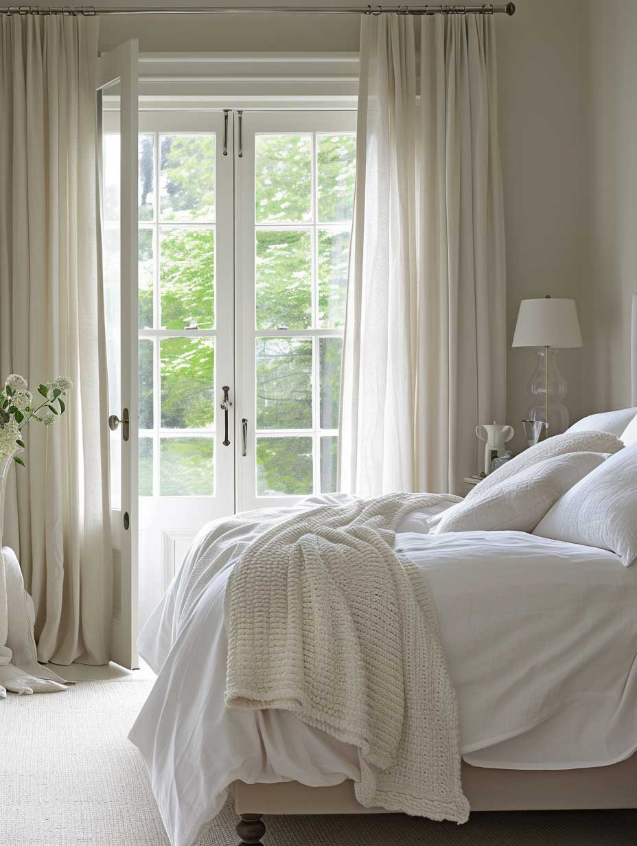

Soft blues and pale sage greens dominate the research on bedroom paint colour and sleep for a specific reason: they sit in the cool part of the spectrum where the eye reads “calm” without requiring conscious effort. Sherwin-Williams Misty (SW 6232) is my go-to in this family — it leans grey-blue in morning light, then softens to nearly lavender by lamplight, and it flatters both white and warm wood furniture equally. You don’t need to repaint the ceiling to make it work. The wall colour alone carries the room.
What doesn’t work: the mid-range blues that sit on the edge of teal. I tried Benjamin Moore Peacock Blue in a bedroom once — it looked like a boutique hotel lobby by day and an aquarium by night. That’s a living-room blue, not a sleep blue. Stay with values lighter than LRV 50 or the room stops reading as restful. Pale sage, by contrast, almost never misfires; its grey undertone keeps it from reading as a kitchen herb garden.
Research published by the National Sleep Foundation and University of Sussex found that cool, muted hues slow heart rate and lower blood pressure — the exact physiological shift your body needs at the start of a sleep cycle. That’s not marketing copy from a paint brand. It’s why hospital recovery rooms have used these families for decades. For more ways to use these shades on your walls, see green paint ideas for bedroom spaces — the sage section alone is worth the read.


The paint finish is a detail most people skip, then regret. Eggshell reflects just enough light to keep the colour alive without the plastic sheen of satin. Matte reads richer but shows every scuff. In a bedroom, eggshell wins almost every time — it’s the finish that keeps Farrow & Ball’s cool whites from looking like primer. Ask the paint desk specifically; they will try to sell you satin because it’s easier to clean, which matters less in a room where you’re not cooking or fingerprinting walls regularly.
Deep and Saturated Colours Reward Commitment

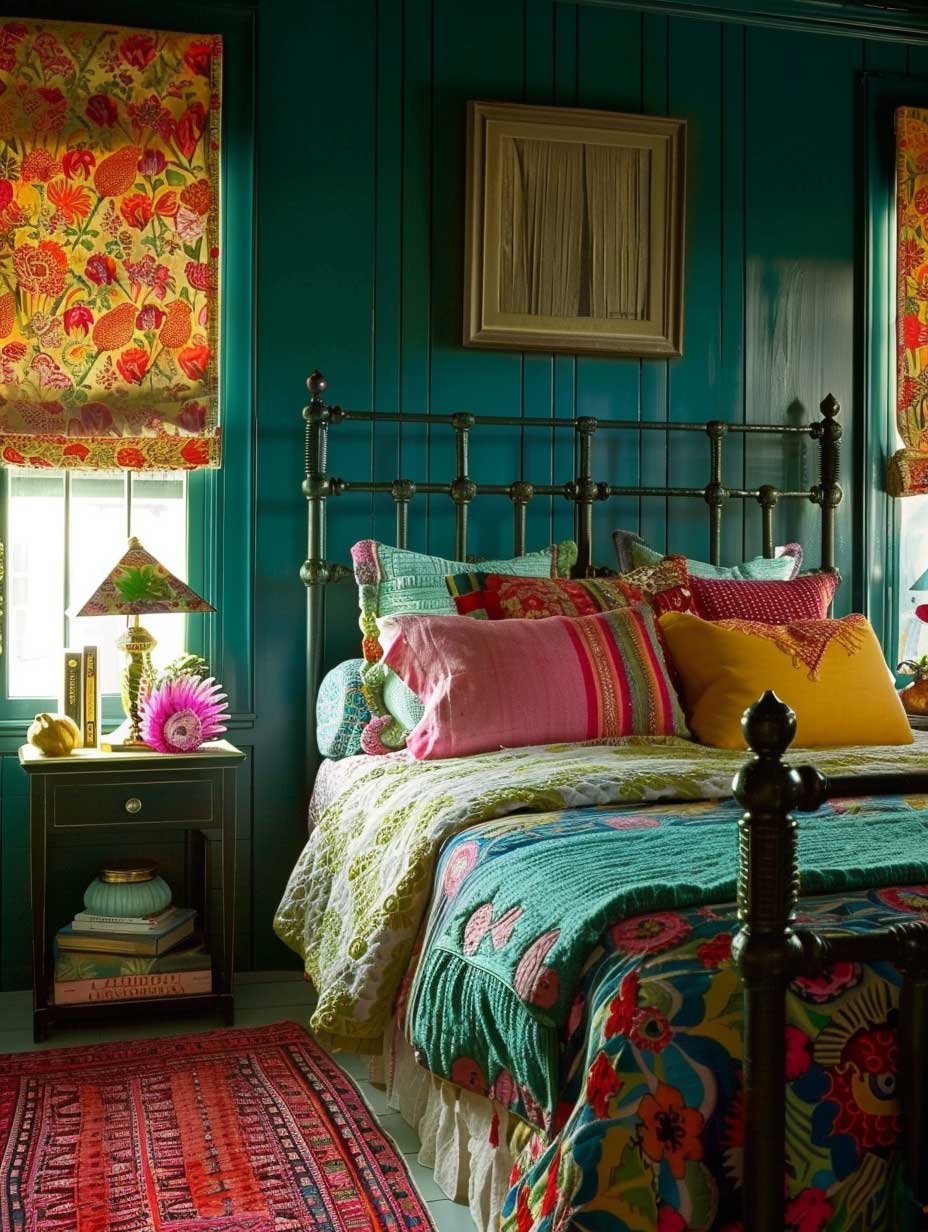

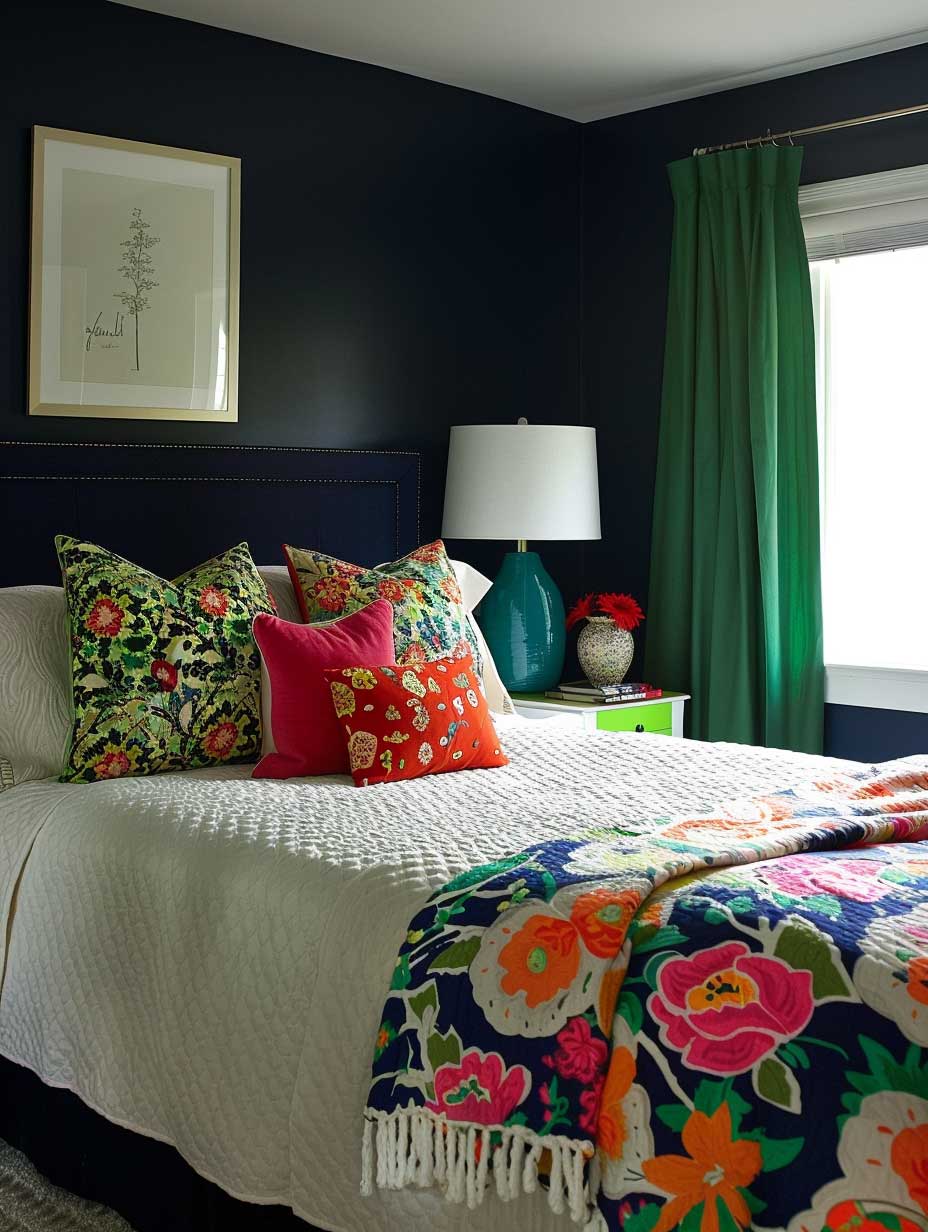
Bold bedroom colour schemes — navy, forest green, plum, charcoal — work on a completely different principle than the soft-palette approach. The goal isn’t to lower stimulation; it’s to create enclosure, the visual equivalent of a weighted blanket. Rooms painted in deep hues feel smaller and more contained, which is exactly what some people need to stop their brain spinning at midnight. I own two pillows in Benjamin Moore’s Newburyport Blue and it’s the closest I’ve come to matching the wall colour I’ve always wanted.
The rule with saturated bedroom paint colours is all-in or don’t bother. Painting one accent wall in emerald green while the other three stay off-white produces the look of a room mid-renovation. Either commit to at least three walls in the same deep tone, or choose a single statement wall and bring the colour forward through bedding, curtains, and upholstery. The halfway version satisfies no one. It’s the paint equivalent of ordering a salad and eating your neighbour’s chips.
What colour not to use in this family: red. Every few years someone publishes a moody red bedroom that looks incredible in a professional photo shoot, then the client lives in it for three days and calls the painter back. Red raises alertness and body temperature — physiologically the opposite of what sleep requires. Deep burgundy crosses into terracotta territory and behaves differently, but anything that reads as red under lamplight belongs in a dining room.
For more on using these tones dramatically on walls, the post on painting bedroom walls for a pop of colour covers accent strategies that hold up past the honeymoon phase. The midnight blue section is particularly solid if you’re deciding between navy and charcoal.

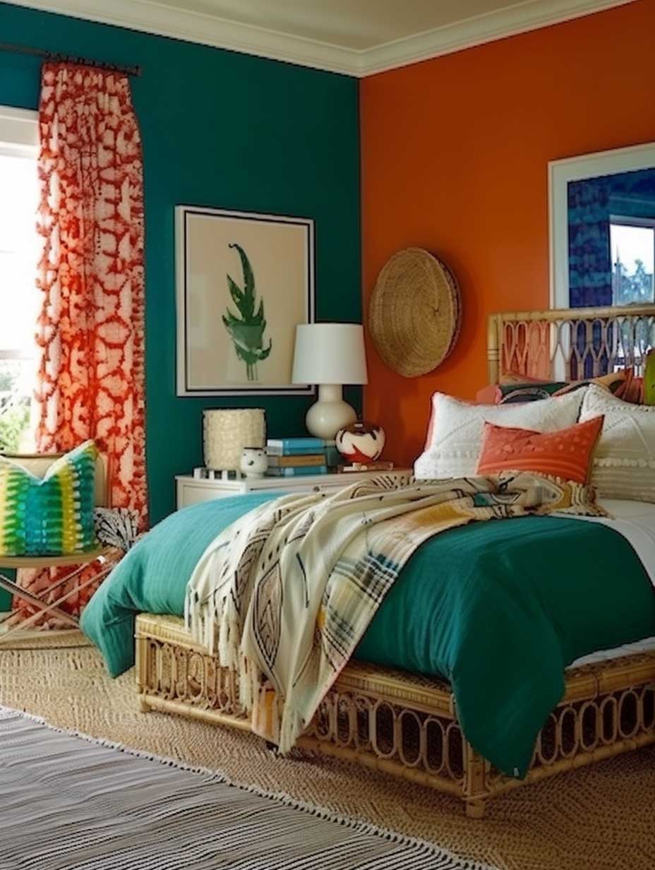


Lighting is the detail that separates a deep-coloured bedroom that photographs well from one you actually want to sleep in. A single overhead pendant in a navy room turns the space funeral-home dark. You need at minimum three light sources at different heights — a bedside lamp, a low floor lamp, and some form of ambient uplighting. Warm bulbs only. Daylight-spectrum LEDs in a deep-coloured room are the decorating equivalent of a cold shower.
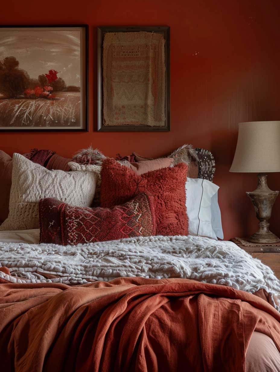
Warm Tones Work Differently From What the Mood Boards Suggest


Cozy bedroom colours in the warm family — terracotta, amber, soft camel, muted coral — are everywhere on Pinterest right now, and for good reason. They behave like soil under lamplight: the warmer and lower the light source, the richer and more grounded the wall reads. Sherwin-Williams Cavern Clay (SW 7701) at around $70 per gallon has become the go-to terracotta for people who want warmth without the orange-pizza-parlour problem. It’s muted enough to read adult, saturated enough to actually register as a colour decision.
The pitfall with warm bedroom paint colours is the wrong white. If you’re trimming out in a cool, blue-toned white while the walls run warm, the contrast reads as a mistake rather than a contrast. Match your trim to the wall’s undertone: warm walls need a creamy white like Benjamin Moore White Dove OC-17 or Farrow & Ball All White (no. 2005), not the bright architect’s white that reads almost blue. I stole this trick from a designer who charges $350 an hour and she’ll never know.
Don’t Do This
Don’t pair a warm terracotta or amber wall with cool-toned grey furniture. The contrast doesn’t read as intentional — it reads as two rooms that haven’t met. Warm walls need warm wood tones, natural linen, and cream accents to stay coherent. When I tried warm walls with a mid-century grey sofa as a bedroom chair, the whole room looked like a staging photo that went wrong. Warm on warm. That’s the rule.
Also skip the gloss finish on warm-toned walls. High gloss with terracotta turns the wall into a terracotta mirror. Matte or eggshell only.
Cozy bedroom color ideas in the warm family also respond especially well to layered textiles — chunky knit throws, a wool rug in undyed natural cream, linen curtains that filter rather than block light. These are not just styling props; they make the warm wall colour read as intentional rather than accidental. A bare amber wall in a room with cool furniture and white bedding looks like someone ran out of paint. The same wall with warm-toned materials around it looks like a decision.
For a deep dive into using amber and deep warm tones specifically, the post on warm wall colours for bedrooms is the most thorough resource I’ve found on the artfasad archives — the amber section addresses the furniture pairing problem head-on. Worth reading before you commit to a warm colour scheme.


Temperature perception is the underrated factor here. Warm bedroom paint colours have a documented effect on how people perceive room temperature — walls in the amber and terracotta family make a space feel 2-3 degrees warmer than a cool-toned room at the same thermostat setting. That’s useful in a north-facing bedroom that never gets direct sun. It’s a problem in a room that runs hot in summer. Know your room’s orientation before committing; south-facing bedrooms with large windows often fight against warm wall colours by July.
According to Better Sleep’s research on bedroom colour psychology, saturated orange is one of the least sleep-supportive colours — but the key word is saturated. A muted, earthy terracotta that reads more brown than orange sits in an entirely different psychological bracket. The saturation level matters more than the hue family when you’re in the warm spectrum.
Colour Comparison
Soft vs Warm vs Bold: Which Bedroom Colour Fits Your Room
| Colour Family | Best For | Avoid When | Try This Shade | Price (per gallon) |
|---|---|---|---|---|
| Soft Blue / Pale Sage | Sleep quality, anxiety, small rooms that feel large | North-facing rooms — reads cold without sunlight | SW Misty SW 6232 | ~$75 (SW Emerald) |
| Warm Earthy (Terracotta, Amber) | North-facing rooms, cozy atmosphere, lamplight looks | Hot south-facing rooms, if paired with cool furniture | SW Cavern Clay SW 7701 | ~$70 (SW Emerald) |
| Deep Saturated (Navy, Forest, Plum) | Enclosure effect, dramatic atmosphere, low-light rooms | Rooms with single overhead light — needs layered sources | BM Newburyport Blue HC-155 | ~$80 (BM Aura) |
| Soft Neutral (Warm White, Cream, Greige) | Rental flexibility, small rooms, high mental stimulation jobs | When you want personality — neutrals need texture to avoid blandness | BM White Dove OC-17 | ~$80 (BM Aura) |
Final Thought
Colour for Bedroom Walls Is a Sleep Decision, Not Just a Decor One
The right bedroom paint colour won’t fix a bad mattress. But the wrong one will undermine a good one every night without you realising why you keep waking at 3am.
Test your shortlist as painted swatches — at least 30x30cm — on the actual wall, and look at them at 7pm under your real bedroom lamps before you commit. The paint store chip tells you almost nothing.
Save this post — you’ll want to reference the shade names and finish types when you’re standing in the paint aisle.
Related Topics