Color schemes for house interiors decide the entire emotional register of a room before a single piece of furniture is moved in. I repainted my living room twice in eighteen months chasing the wrong palette. The problem wasn’t the color itself — it was the order in which I chose things. Most people pick a wall color and then try to build furniture around it. Professionals do it backwards: they fix the floor and light source first, then commit to a palette. Knowing which of the six distinct color families actually works in your specific room changes everything from the first coat.
The queries you land on when researching colour schemes for houses interior are almost always too broad to be actionable. “Which scheme works for home interiors” isn’t a question you can answer in the paint aisle. This post breaks it down by scheme type, room light condition, and the specific mistakes each palette punishes when you get it wrong.
What this post covers
- Why pastel colour schemes fail in low-ceiling rooms
- The one rule for using vibrant hues without visual chaos
- Neutral interiors: warm versus cool undertones and when each wins
- Bold contrast done right — specific pairings that hold up over years
- Terracotta, amber, ochre: the warm-tone palette and its limits
- Cool blues from ice to navy — which rooms they actually suit
- FAQ on colour scheme terminology and room-by-room picks
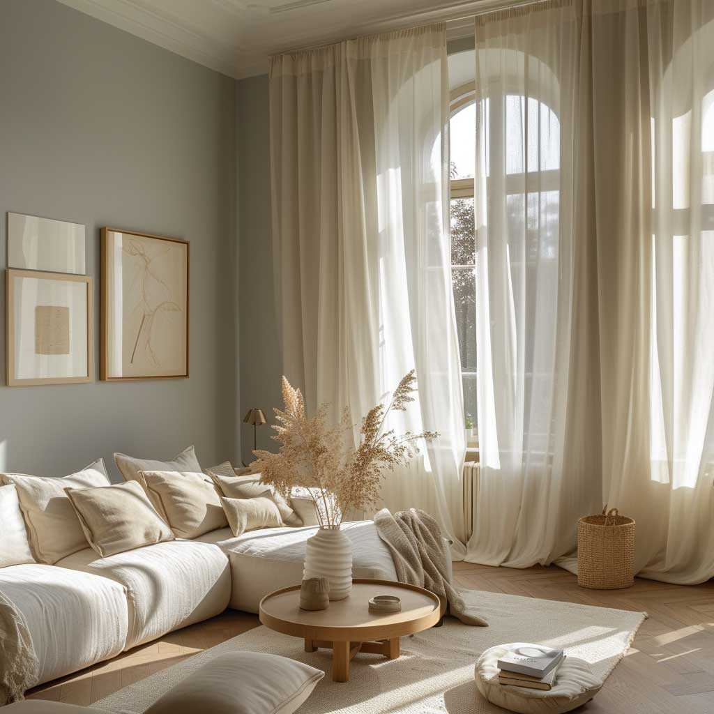
Pastel Colour Schemes Punish Rooms Without Natural Light


Pastel colour schemes for houses interior work on one condition: the room has south- or east-facing windows. I bought Benjamin Moore’s “Quiet Moments” — a pale blue with grey undertones — and painted a north-facing bedroom with it. The result looked like a dentist’s waiting room by 4 pm. Pastels reflect light beautifully when there’s enough light to reflect. Without it, they flatten and grey out in ways the colour swatch never shows you.
The palette itself — soft pinks, muted lavenders, sage greens, powder blues — genuinely delivers calm in the right setting. Pale blue walls with linen curtains and a low platform bed read as spa-level serene when morning light hits them. You’ll notice the room feels larger, too, because light pastels push walls back visually. That spatial illusion costs you nothing in a south-facing room.
Mix pastel shades across a room rather than committing one wall to one hue. I stole this trick from a Farrow & Ball colour consultant: pair “Nancy’s Blushes” (a muted pink, around $110/gallon) on the walls with a sage green linen sofa and white woodwork. The contrast keeps the room from feeling like a candy floss cloud. Single-pastel rooms look flat. Two or three pastels layered with natural textures look expensive.
What doesn’t work: pastel colour schemes applied to rooms with heavy furniture. A dark mahogany dining set against pale lilac walls looks like a mistake that nobody corrected. The furniture swallows the colour. Go pastel in rooms where the furnishings are light-toned wood, rattan, or upholstered neutrals.

Renter trick: you don’t need to paint. A pastel colour scheme comes through soft furnishings alone. Blush pink velvet cushions, a sage green throw, and a pale blue ceramic vase on a white sideboard lands the aesthetic without touching the walls. Removable wallpaper panels in soft lavender from Tempaper ($12/sq ft) do the rest.
Pastels age well in bedrooms and bathrooms. They date fast in kitchens. The moment kitchen cabinet trends shift — and they will — a pale pink Shaker kitchen looks stale within three years. Save the pastels for rooms where the palette ages quietly, not for the one room everyone photographs at resale.
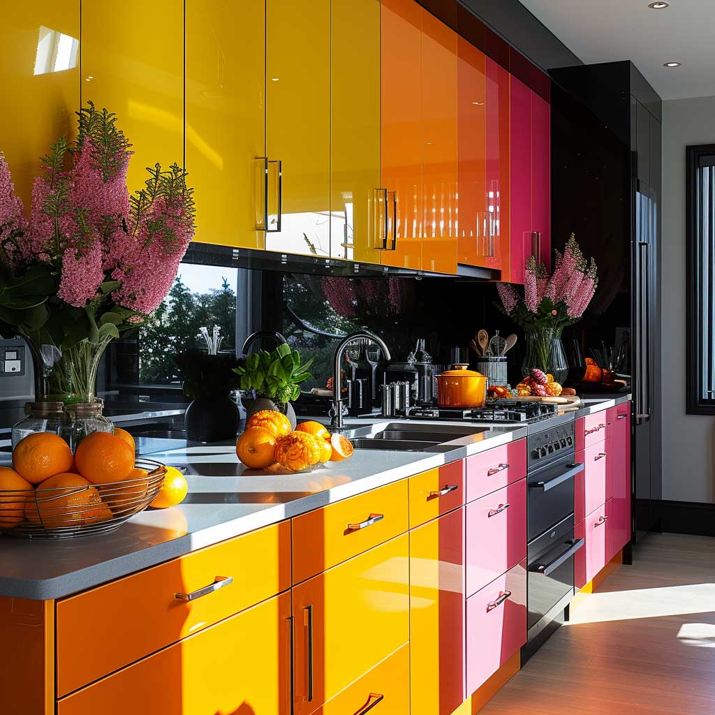
Vibrant Hues Work Room by Room, Not House by House

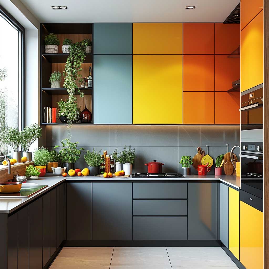

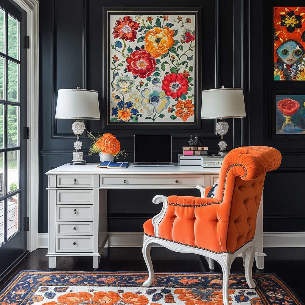
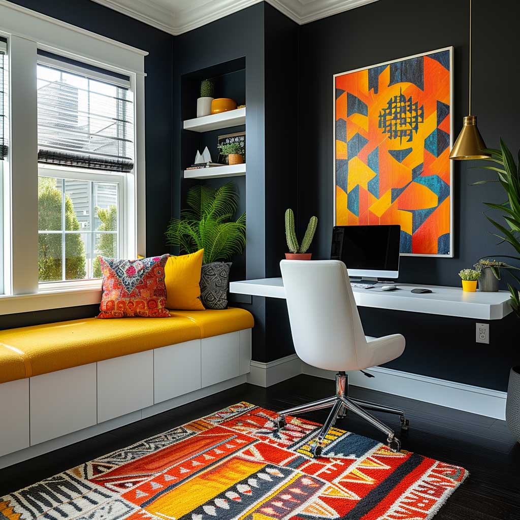
Vibrant house interior colour schemes get used wrong almost universally. People paint the whole room in an energetic hue and then wonder why it feels exhausting after twenty minutes. The rule I follow: one bold surface, three neutral surfaces, always. A single deep teal wall behind a white sofa carries the same visual impact as four teal walls — with zero of the sensory overload. My go-to is Sherwin-Williams “Oceanside” (SW 6496) on a single focal wall at around $80/gallon.
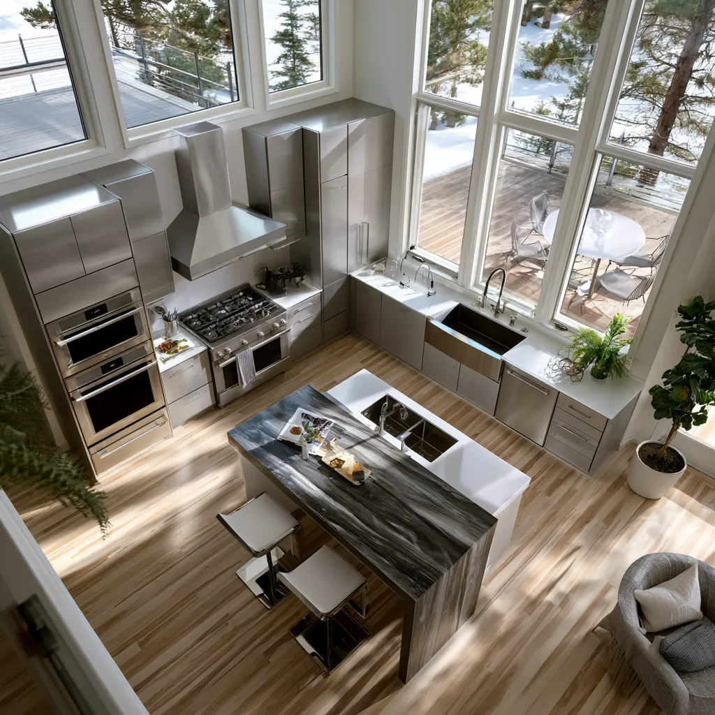
Kitchens tolerate vibrant schemes better than any other room. Why? You’re not there to relax. Cobalt blue cabinets against white subway tile and brass hardware is a colour scheme for house interior that photographs brilliantly and holds resale value if you choose a hue with mass-market appeal. Avoid niche shades like chartreuse or burnt sienna on large cabinet runs — they’re difficult to love for more than two years. Colourful living room design directions cover how to extend this logic from the kitchen into adjacent spaces without the palette feeling disjointed.
Red and orange hues in a home office increase alertness and shorten perceived task duration — which is exactly what you want at a desk. I own two orange ceramic lamps that sit on a white desk against a white wall, and the room reads as energised without a single painted surface. Fiery accents do the work; you don’t need full wall commitment. What doesn’t serve you: orange in a bedroom. I tried it once with Farrow & Ball “Charlotte’s Locks” on the headboard wall. Looked phenomenal at 7 pm. Looked like a traffic cone at 7 am.
The neutral base rule is non-negotiable with vibrant colour schemes for home interiors. Linen, warm white, light oak flooring — these are the shock absorbers that let a bold hue breathe. Skip the neutral base and you get a room that nobody wants to sit still in.

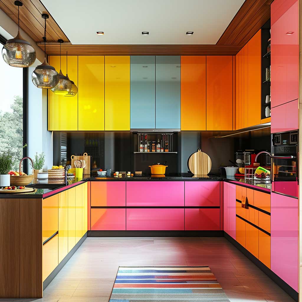
Where vibrant colour schemes for houses interior consistently fail: open-plan living and dining areas. The kitchen might handle cobalt beautifully, but cobalt bleeding into a dining nook and then into a hallway looks like a theme park. Contain the vibrant hue to zones with architectural breaks — a door frame, a half-wall, a ceiling drop. Use the transition point as the stop line.
Updating vibrant rooms is cheap and fast if you plan for it. Put the bold colour on movable elements — a sofa throw, art prints, a pendant shade — rather than on walls. You can refresh the feel of a room for under $200 without touching a paint brush. That’s my preferred strategy in rental spaces and rooms I know will need to evolve.
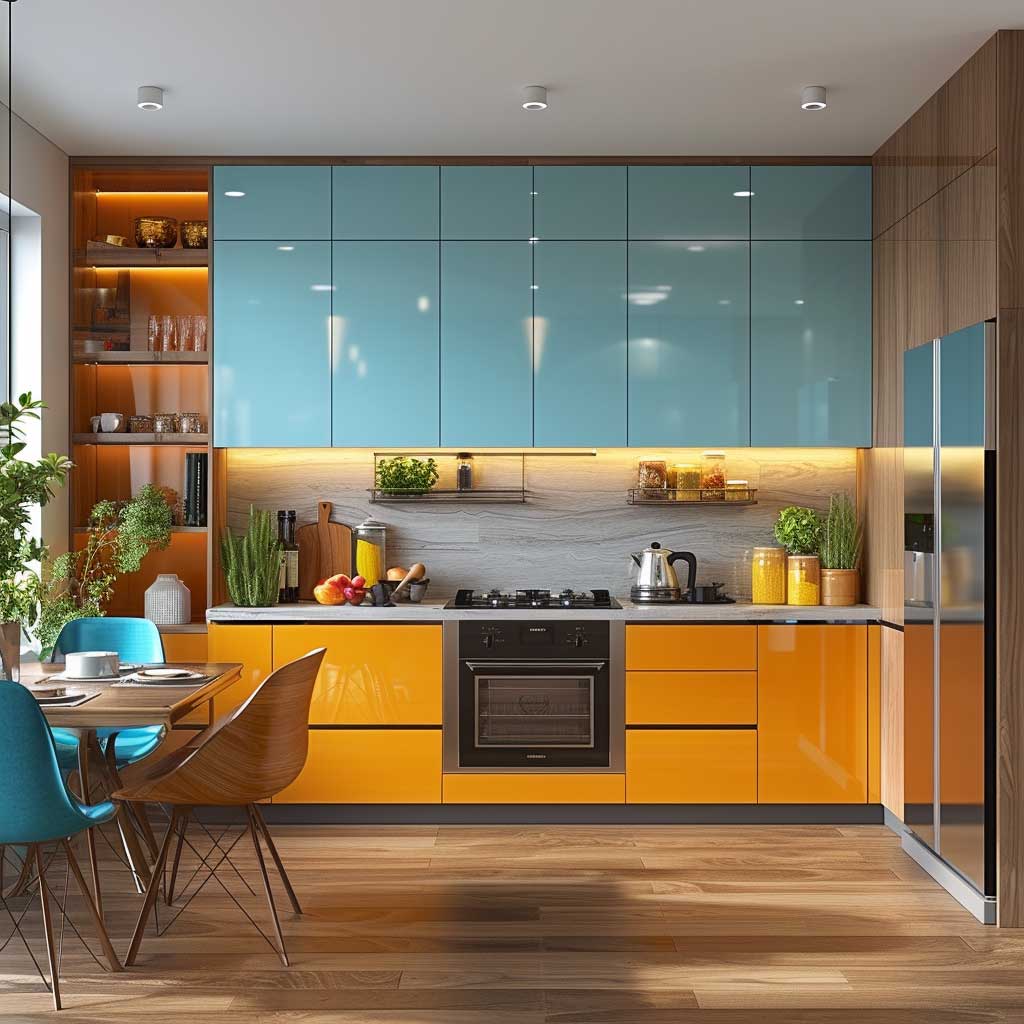
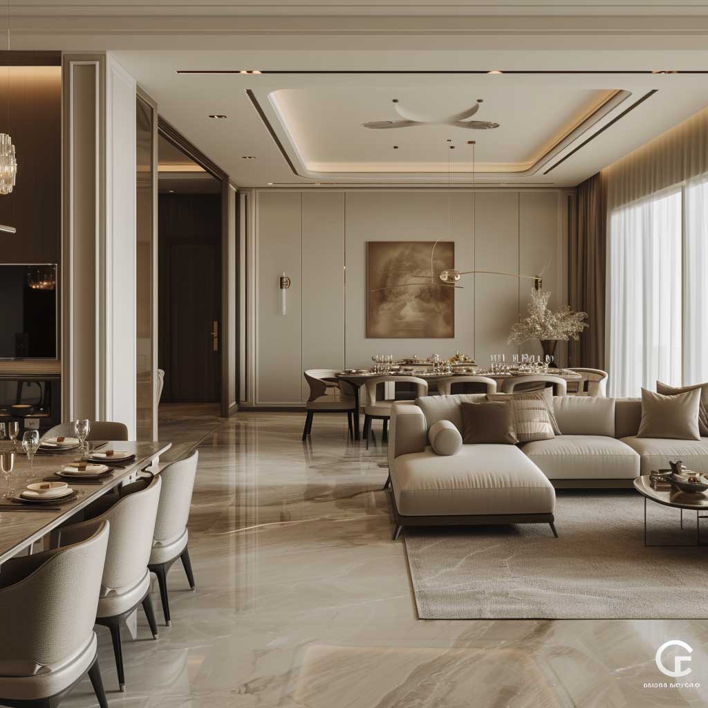
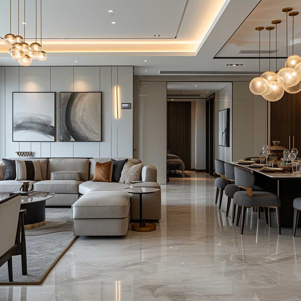
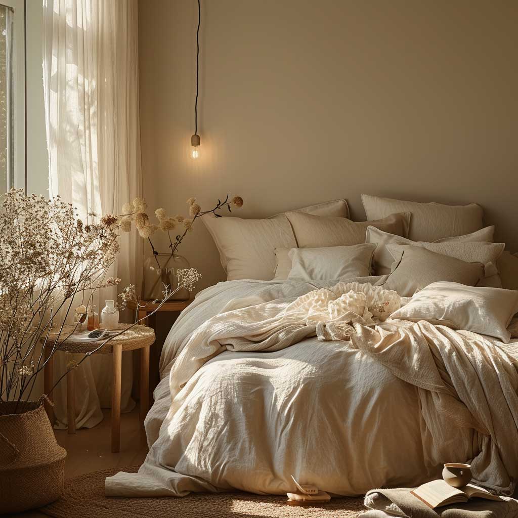
Neutral Colour Schemes Fail When You Ignore Undertones


Neutral colour schemes for home interiors are where most people spend their budget and most people get burned. The trap: buying three “neutral” paints that look warm on the swatch and discovering they fight each other on the wall because two are yellow-warm and one is pink-warm. Undertone mismatch. I’ve walked through at least a dozen houses where this exact problem made a $4,000 renovation look like an accident.
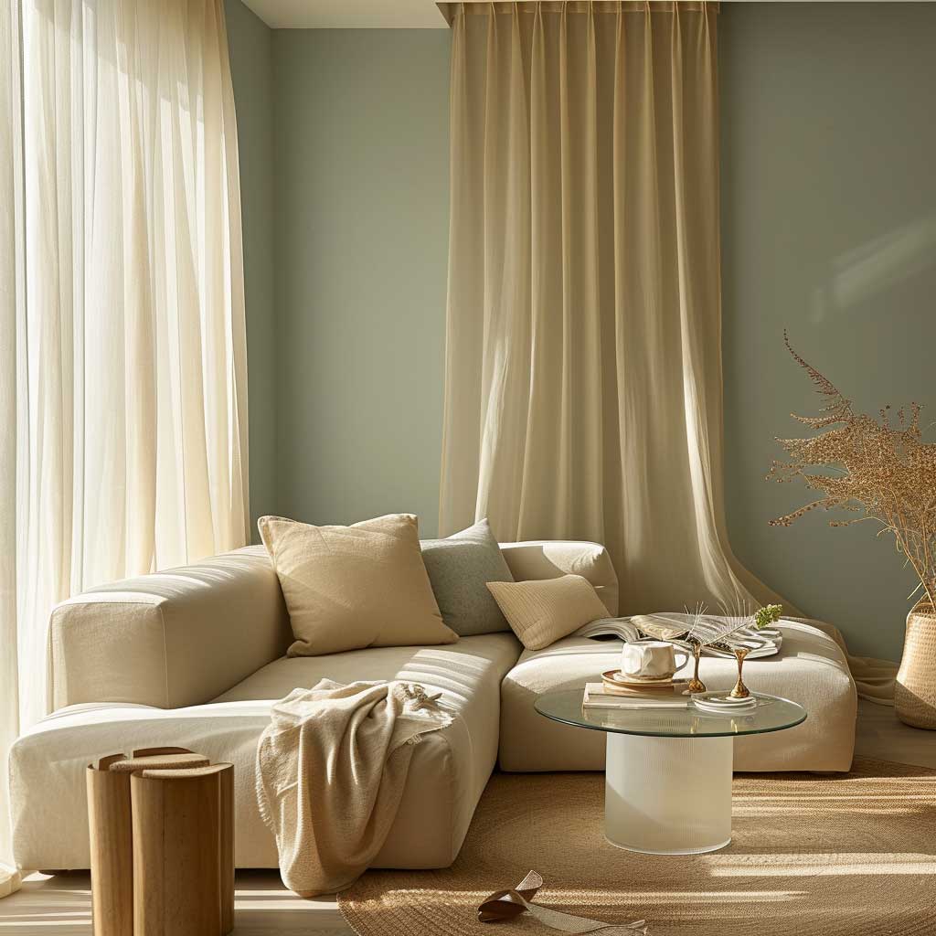
The fix is choosing your undertone family first and refusing to cross it. Warm neutrals — beige, taupe, greige — carry yellow, red, or orange undertones. They suit rooms with cool light (north-facing windows, blue-grey flooring) because the warmth compensates. Cool neutrals — crisp white, grey, greige with blue undertones — suit south-facing rooms where direct sunlight would make a warm neutral look yellowish and dated. Benjamin Moore “Pale Oak” (OC-20, warm) and “Revere Pewter” (HC-172, cool-warm) are both neutrals, but you cannot mix them in the same open-plan space without them fighting.
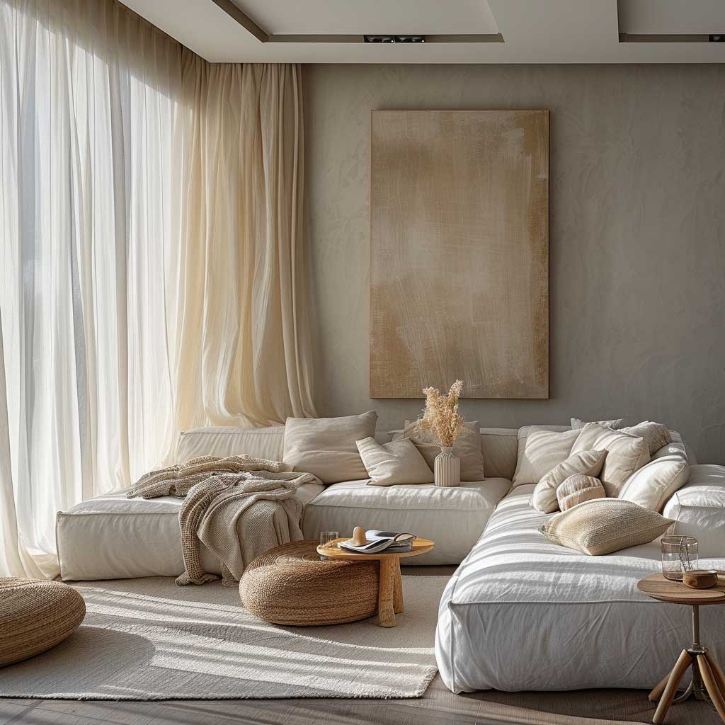
Texture does everything in a neutral house interior colour scheme. Rough linen, plush boucle, raw oak shelving, matte plaster walls — these are the variables that give a neutral room depth. Without texture contrast, a neutral interior looks like a show home nobody has moved into. My go-to combination: matte painted walls, velvet throw cushions, a stone or concrete side table, and raw wood picture frames. Four textures. Zero colour. Maximum visual interest.
What fails reliably: all-white interiors in a house with young children or pets, and warm-beige schemes in rooms with terracotta floor tiles. The terracotta fights the beige — two warm tones competing in the same key. Instead, lay cool white or grey against the terracotta floor and let the floor carry all the warmth. You’ll notice the room looks more intentional immediately. Beige interior design done right covers exactly this layering approach across living rooms and bedrooms with specific shade pairings.

Lighting shifts neutral colour schemes more radically than any other palette. The same Benjamin Moore “Simply White” (OC-117) reads as warm ivory under incandescent bulbs and stark clinic-white under cool LEDs at 5000K. My rule: always test a paint sample at dusk under your actual artificial light before committing. Twelve square inches of sample card at the hardware store tells you almost nothing about how a neutral behaves in your specific room.
Updating a neutral interior costs very little. The walls stay. You rotate accent pieces — a rug, a throw, a vase — through seasonal colours. That’s the practical advantage neutrals have over any other house interior colour scheme. The investment is upfront; the flexibility lasts a decade.
DON’T DO THIS
- Don’t layer two warm neutrals in rooms with warm-toned flooring. Beige walls plus terracotta tiles plus ochre rugs creates one dirty, muddy mass with no visual anchor.
- Don’t pick neutral paint in store lighting. Showroom lighting makes everything look better than it is. Take a physical sample home and check it at dawn, midday, and 9 pm.
- Don’t use the same neutral throughout an entire open-plan space. Varied tones in different zones — slightly warmer in the living area, slightly cooler in the kitchen — create natural-feeling transitions without obvious effort.
- Don’t pair a cool-grey neutral wall with warm-yellow furniture. The contrast looks unintentional rather than designed. Commit fully to either warm or cool undertones across large surfaces.
Bold Contrast Schemes Require an Anchor, Not Just Opposites

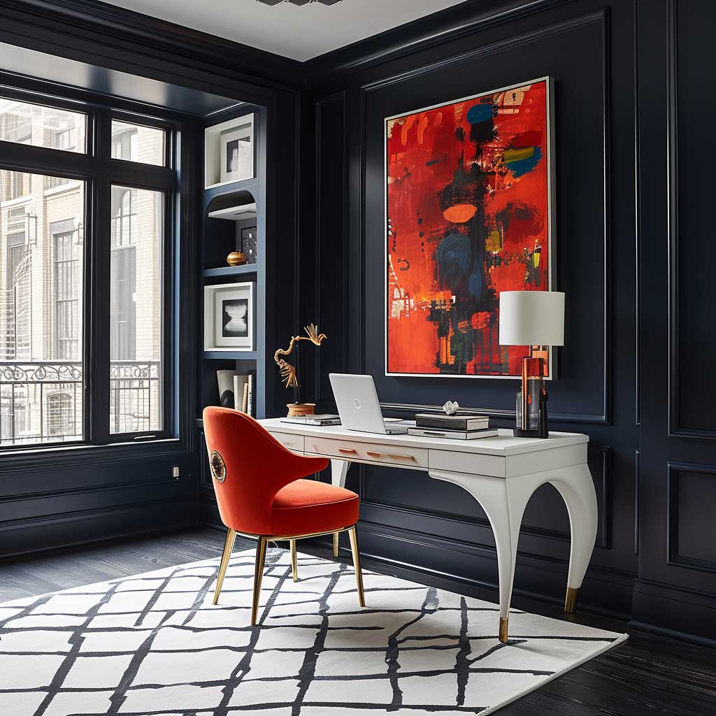
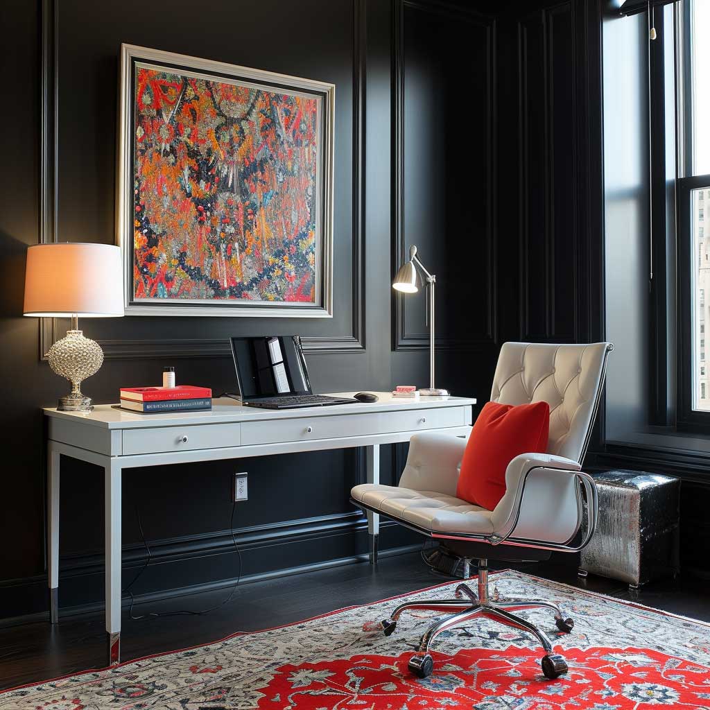
Bold contrast as a house interior colour scheme is one of the most abused ideas in home design. Slapping two opposing colours on opposite walls and calling it “contrast” produces a room that looks like a mood board exploded in the space. Real contrast needs an anchor — a third element, usually neutral or metallic, that absorbs tension between the two competing hues and makes them coexist deliberately rather than just loudly.
Black and white is the obvious play and also the one that photographers and staging professionals default to for a reason. It never fails. Dark walls, white furniture, bare concrete or light oak flooring — that’s the formula. Farrow & Ball “Off-Black” (No.57) at around $125/gallon on a single feature wall against white painted joinery is exactly where I’d spend money in a client’s living room. The proportions matter: dark on 25% of the surface, light on 75%, metal as the bridge.
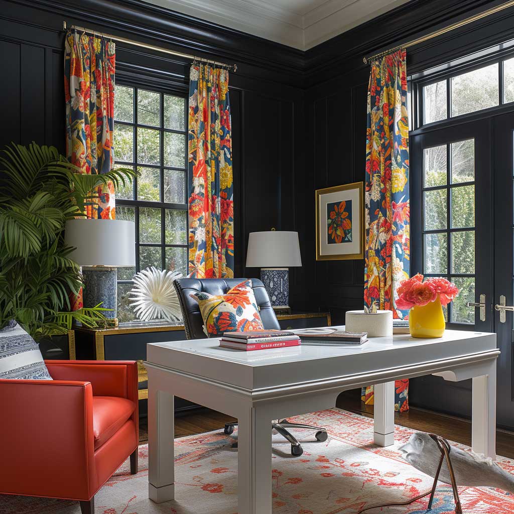
Beyond black and white, complementary colour contrasts on the colour wheel — deep blue opposite burnt orange, forest green opposite burgundy — bring more personality but require more restraint. You need one dominant, one subordinate. A deep navy blue dining room (Sherwin-Williams “Naval,” SW 6244) with burnt orange ceramic tableware and pendant shades is a contrast colour scheme for house interior that makes people stop mid-sentence. Fifty-fifty split of navy and orange across the same room looks like a sports team kitted out the space.
Texture contrast amplifies colour contrast without adding more colour. Matte dark walls against high-gloss white trim hit differently than two matte surfaces in the same colour pairing. I always push clients toward at least two finish levels in any high-contrast scheme. It reads as deliberate, not accidental. Black and white interior colour palettes go deep on how finish levels and metallics interact across different room types.


Lighting determines whether a bold contrast colour scheme reads as dramatic or oppressive. Directional accent lighting that hits the dark surface — wall washers, picture lights, architectural LEDs — makes the dark colour glow rather than absorb all the light in the room. Flat overhead lighting kills high-contrast interiors every time. This is the single most common failure point I see in high-contrast rooms.
Bold contrast ages well in living rooms and dining rooms. It ages badly in hallways — you pass through a hallway too fast to appreciate the drama, and the claustrophobic feeling of dark walls in a narrow space outweighs any aesthetic gain. Keep the contrast in rooms where people slow down.
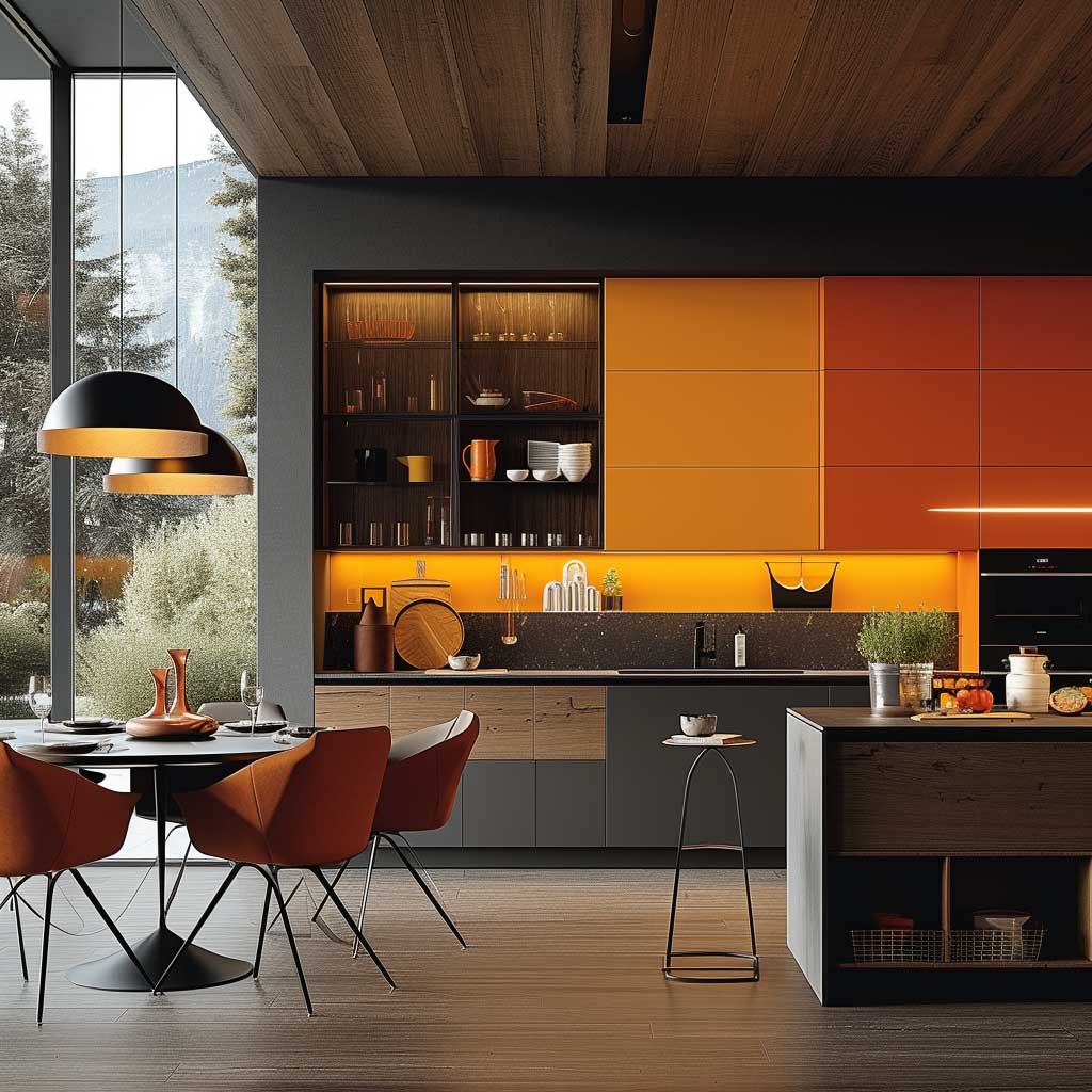
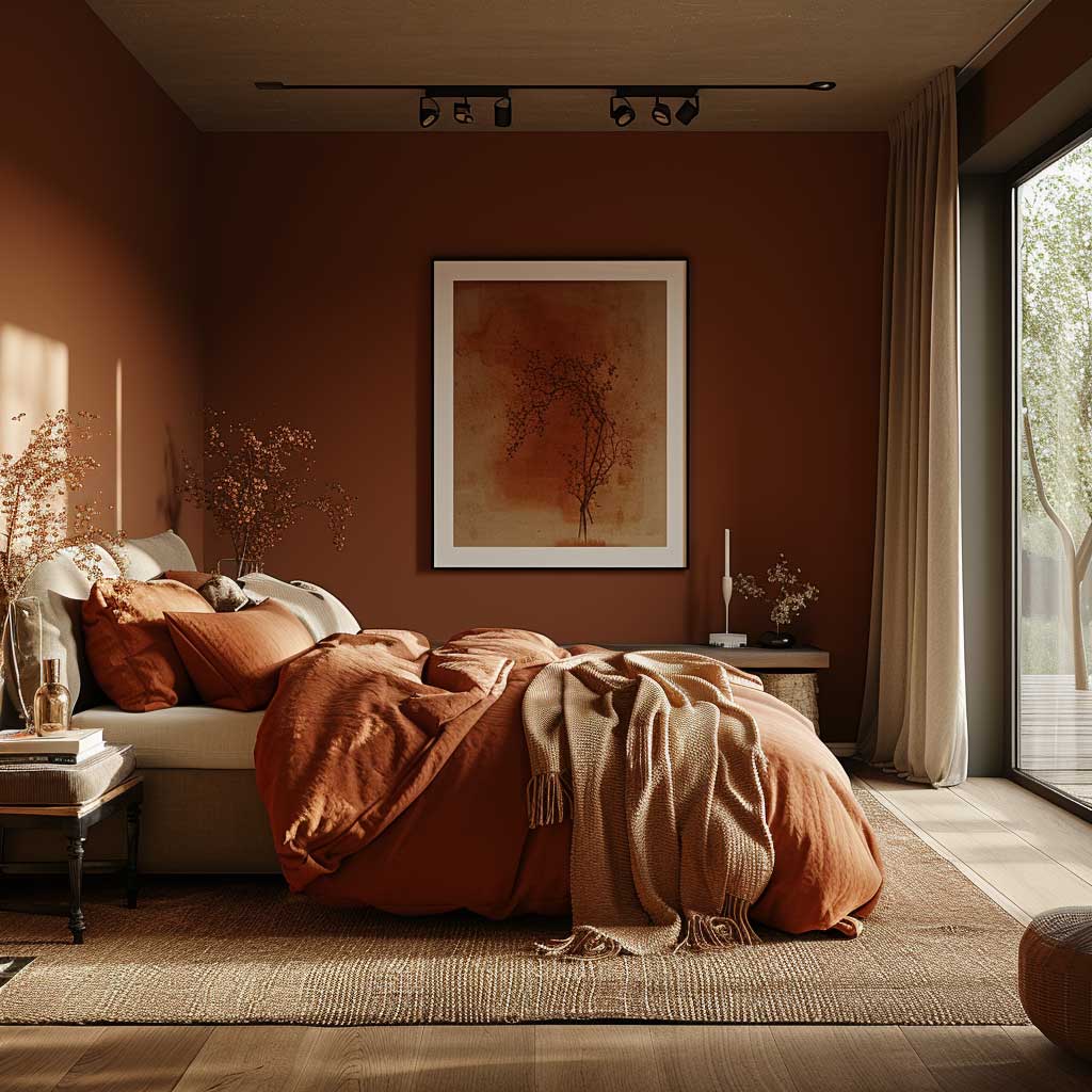
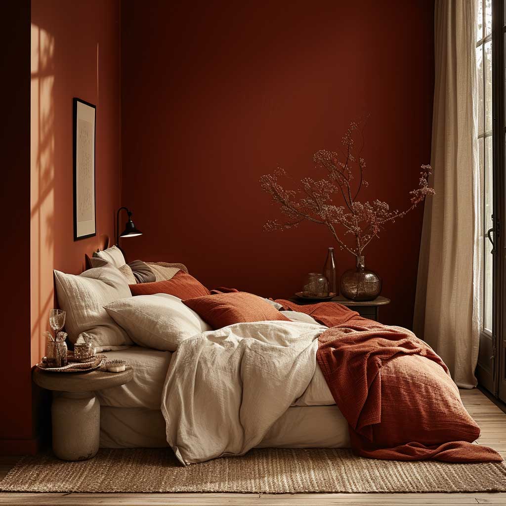
Warm Tones Become Oppressive Past a Certain Square Footage


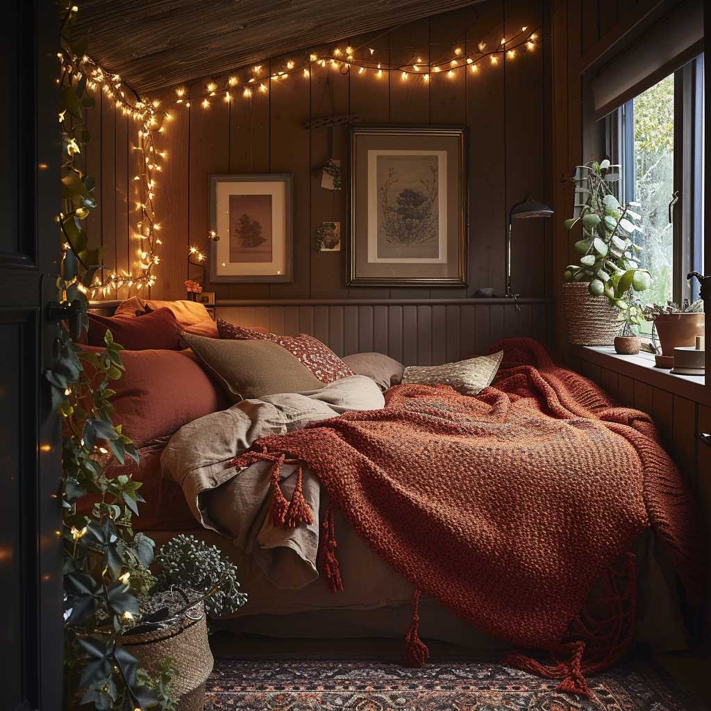
Warm colour schemes for house interiors — terracotta, amber, ochre, soft burnt red — are back in force and for good reason. They suit the human instinct for shelter. A room with warm tones feels inhabited and intentional from the first second. My go-to warm palette anchor is Benjamin Moore “Cinnamon Slate” (their 2025 colour of the year), paired with raw linen and unlacquered brass hardware. The combination reads as expensive even on a budget application.
Warm colour schemes work hardest in rooms under 200 sq ft. Wrap a small bedroom in terracotta and linen and it feels like a boutique hotel. Apply that same terracotta to a 400 sq ft open-plan living area and it starts to feel like a cave by mid-afternoon. The ceiling drops visually, the walls close in. Size is the variable that most warm-tone guides don’t address directly.
The material pairings that work reliably with warm interior colour schemes: raw walnut wood, sisal or jute rugs, boucle in cream or ivory, unglazed terracotta ceramics, and rattan. What consistently fails: chrome or silver hardware against warm walls — the cool metal fights the warmth and looks like an afterthought. Swap chrome for brass or matte black and the scheme coheres immediately. You’ll notice it costs roughly the same; it’s a choice, not an upgrade.
Warm colour schemes for homes interior need a pressure valve — usually white or very light cream on the ceiling and one adjacent wall. Without it, the colour intensity builds and the room becomes fatiguing rather than cosy. Think of the warm tone as a bass note in a song. It needs lighter elements above it to stay resonant rather than overwhelming. Earthy interior decorating colour palettes carry this idea further with room-specific applications across terracotta, moss green, and sand colour families.

Lighting for warm-toned rooms: always go below 3000K on bulb temperature. At 4000K-5000K (daylight range), warm wall colours grey out and look dull. At 2700K-3000K (warm white range), terracotta glows and ochre deepens beautifully. It costs nothing to change a bulb; it changes everything about how the colour reads after dark.
Warm colour schemes are the safest bet for rental properties if you own them. They photograph warmly on listings, they age gracefully when the paint is matte, and they suit a wide enough demographic that vacancy rates drop. I’ve used Sherwin-Williams “Dusty Miller” (SW 9138) in three rental bedrooms — every single tenant asked what the colour was within the first week.
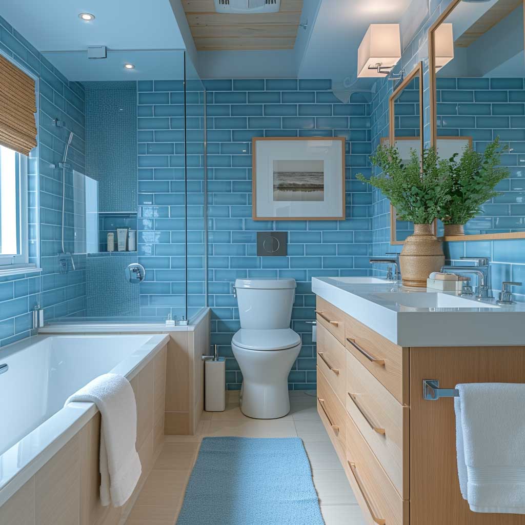
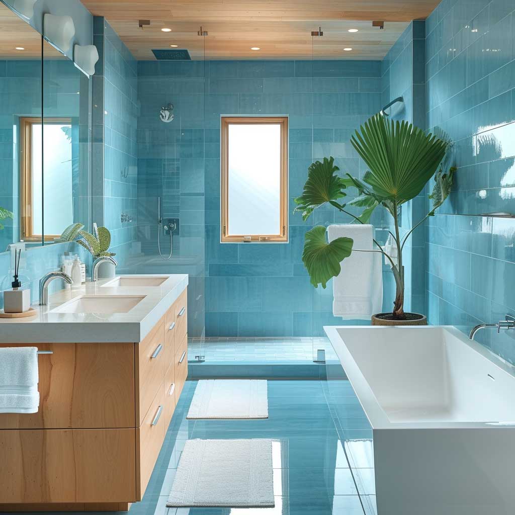
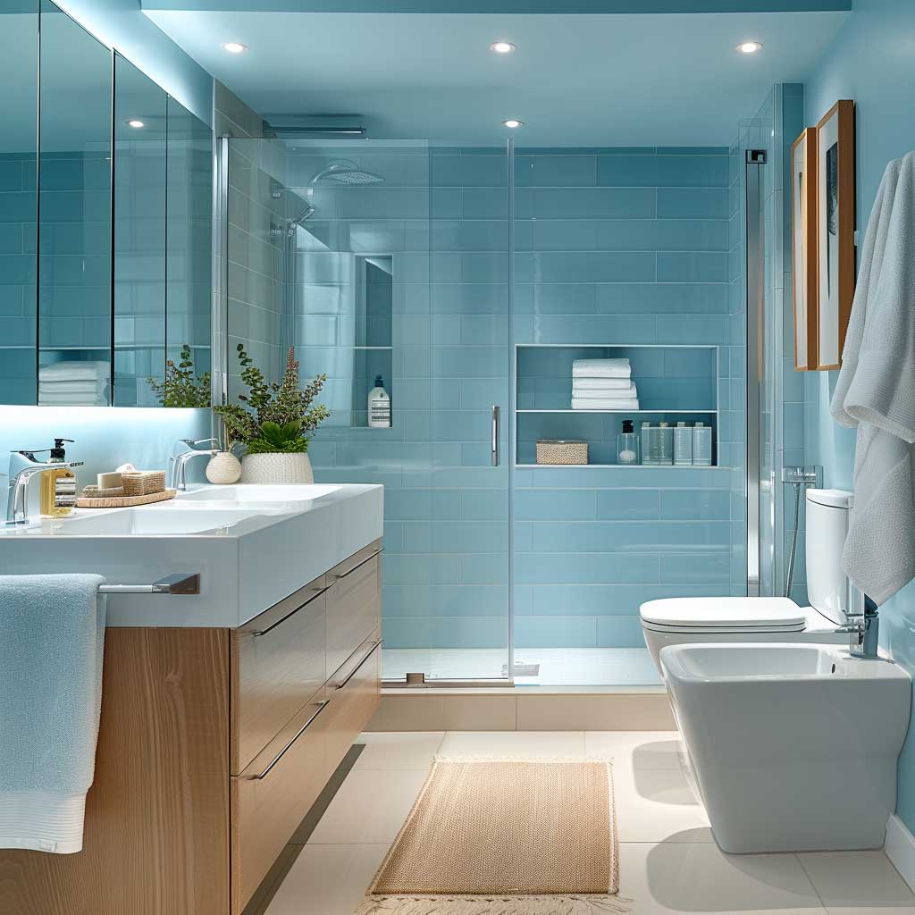
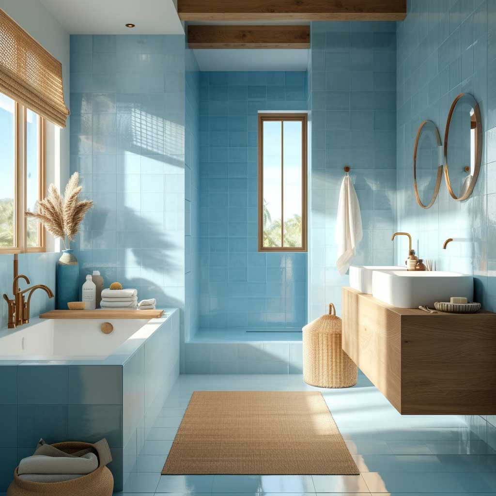
Cool Blue Colour Schemes Earn Their Place Only in Specific Conditions
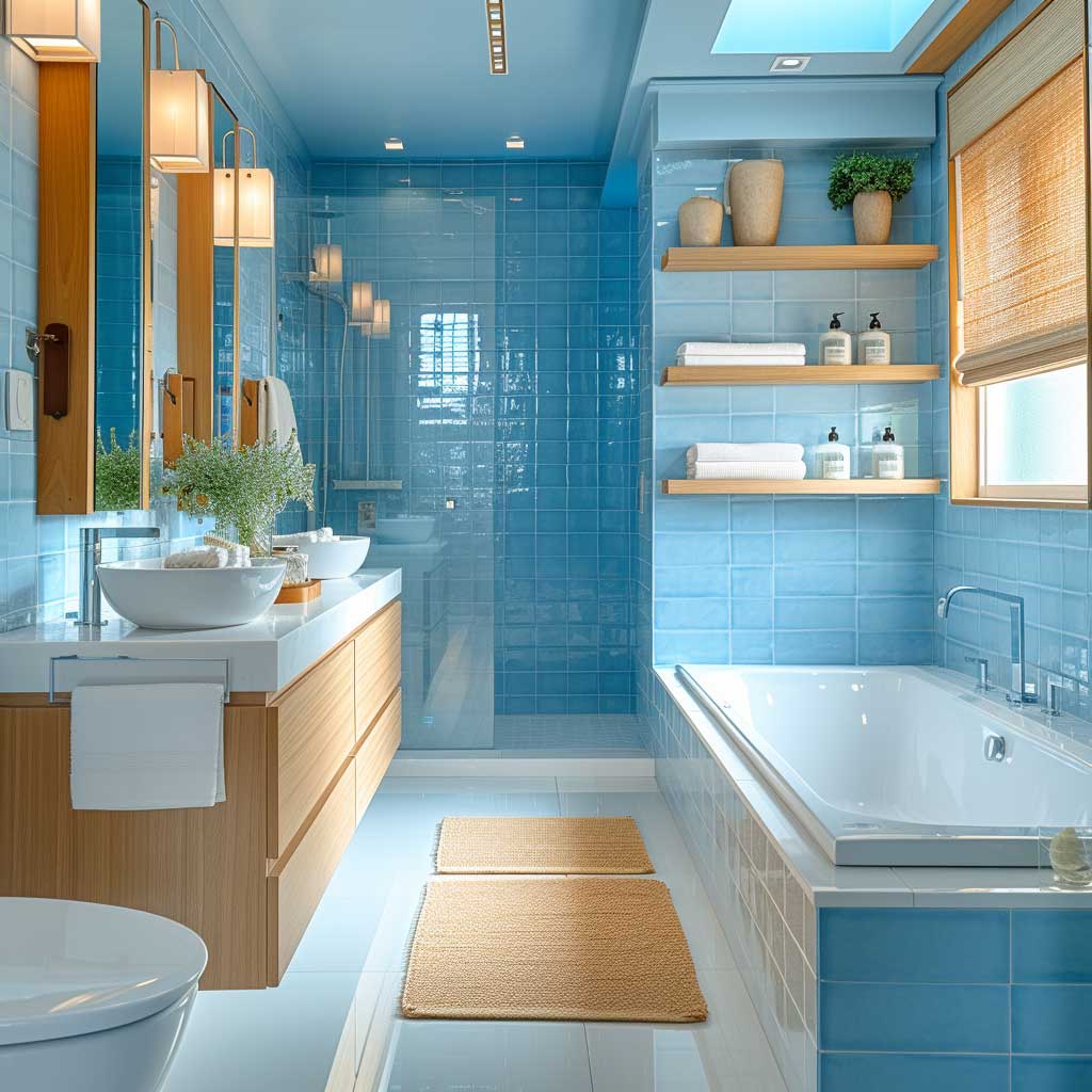
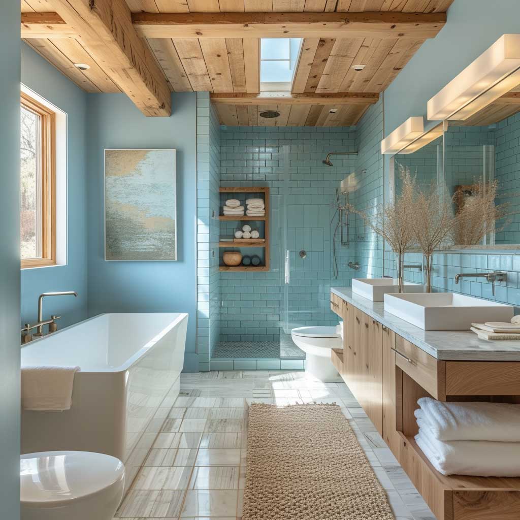
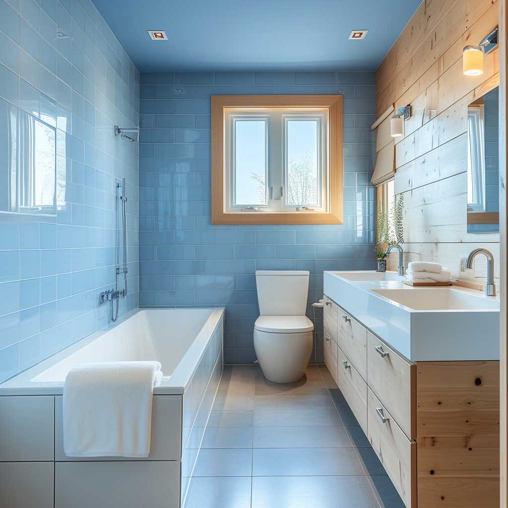
Cool blue colour schemes for house interiors dominate Pinterest for one reason: they photograph exceptionally well. In person, a cool blue room is a completely different experience depending on the room’s orientation and what warm elements ground the scheme. I’ve photographed blue rooms for reference that looked like magazine editorial on screen but were genuinely uncomfortable to be in because nobody balanced the cool palette with wood or wool. Blue can read cold. It can also read spa-like tranquil. The difference is three decisions: light direction, floor material, and textile warmth.
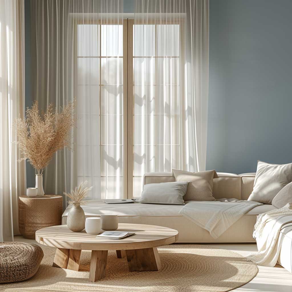
Sherwin-Williams chose “Upward” (SW 6239), a light airy blue, as their 2024 colour of the year. Benjamin Moore’s “Blue Nova 825” — a mid-tone blue with violet — is what I’d actually use in a bedroom. At around $85/gallon, it balances against warm oak flooring and ivory linen bedding in a way that genuinely slows your heart rate. Studies on colour psychology back this up: blue tones lower perceived temperature and blood pressure. In a bedroom, that’s exactly what you’re after.
Dark navy colour schemes for home interiors are the exception to “cool blues need warmth.” Navy is so deep it carries its own visual weight and acts almost as a neutral — it reads as sophisticated rather than cold, especially in dining rooms and libraries. Pair it with brass, candlelight, and a warm wood table and the room becomes the kind of place guests don’t want to leave. Pair it with chrome, glass, and grey upholstery and you’ll feel like you’re eating in a conference centre.
What cool blue interior colour schemes for houses fail at: warm climates. If you live somewhere that’s already hot and bright, a cool blue room feels clinical and uncomfortable rather than refreshing. The psychological cooling effect only works when the actual temperature creates subconscious contrast. In a cold climate or an air-conditioned space, blue is a masterclass in calm. In an unairconditioned room in a hot region, it reads as bleak. Cool-toned interior decorating colour palettes show how to layer ice blue, slate, and silver without losing habitable warmth in the process.
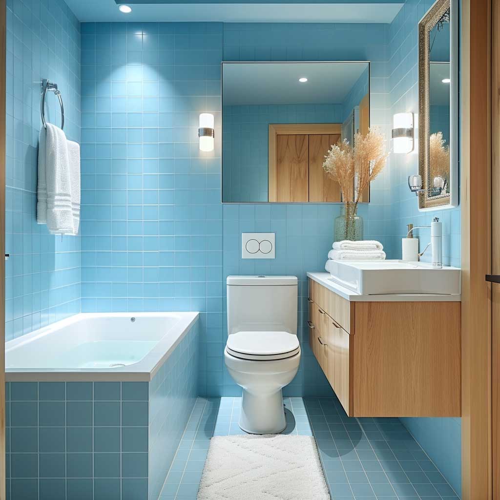
Mirrors and reflective surfaces amplify cool blue colour schemes in a way no other palette benefits from as dramatically. A large mirror opposite a blue wall doubles the perceived depth of the room and bounces light around in a way that prevents the blue from settling into shadow. Velvet upholstery in ivory or warm grey does the opposite — it absorbs the coolness and keeps the room from tipping into sterile territory. Both are useful. Use them together.
The living room colour scheme advice from Homes & Gardens backs up this read: soft blue works best when paired with at least one warm tone that grounds the palette. That’s chalky pink, burnt clay, warm wood grain, or amber glass — any of these prevents the room from feeling like a dentist’s waiting room in a different colour.
House Interior Colour Scheme Comparison
| Scheme Type | Best Room | Avoid In | Anchor Colour | Budget Entry Point |
|---|---|---|---|---|
| Pastel | South-facing bedroom | North-facing rooms, kitchens | Off-white or cream | $80–$110/gallon |
| Vibrant Hue | Kitchen, home office | Open-plan, bedrooms | Linen white | $80/gallon single wall |
| Elegant Neutral | Any room | Rooms with mismatched undertones | Warm or cool white | $75–$90/gallon |
| Bold Contrast | Living room, dining room | Hallways, narrow spaces | Metallic or true white | $120–$130/gallon feature wall |
| Warm Tones | Small bedrooms, dining | Large open-plan rooms | Cream ceiling | $80–$95/gallon |
| Cool Blues | Bathroom, bedroom, library | Hot climates without AC | Warm wood or brass | $85/gallon |
Final Word
The colour scheme you choose decides how a room feels before anyone sits down.
Room orientation, ceiling height, and floor material should determine your palette — not a trend forecast. Pick the colour family last, not first.
Test physical samples at three different times of day. What the swatch looks like in the hardware store is completely irrelevant to what it looks like on your wall at 9 pm.
Save this post — you will want it when you’re standing in the paint aisle second-guessing yourself at 11 am on a Saturday.
Related Topics