The elegant color combination of sage and ivory is the one pairing that holds its ground across every room type, every light condition, and every furniture era. I’ve painted four rooms in this palette over three years and the result is the same every time: the space feels finished without feeling decorated. Sage brings a gray-green cool that reads as neutral in north-facing rooms and almost warm in south-facing ones. Ivory trims anchor it without going cold.
Most people reach for greige or white when they want “safe.” Safe, sure — but also flat. The sage-ivory pairing does something greige can’t: it photographs warm, it reads as intentional, and it ages without looking dated. You’ll notice within a week that the room stops needing accessories to feel complete.
- Target palette: Sage walls + ivory trim — the classic elegant color combination that works in offices, entryways, and nurseries
- Benjamin Moore picks: Saybrook Sage HC-114 (walls), Swiss Coffee OC-45 (trim) — under $90/gallon each
- Sherwin-Williams alternative: Clary Sage SW 6178 paired with Alabaster SW 7008
- Wood tone that locks it in: medium walnut or white oak — avoid gray-stained oak, it muddies the sage
- Metal finish: brushed brass over chrome, always — chrome reads clinical against these tones
- What kills the palette: cool-white LED bulbs — go warm white (2700K) or the sage turns hospital green
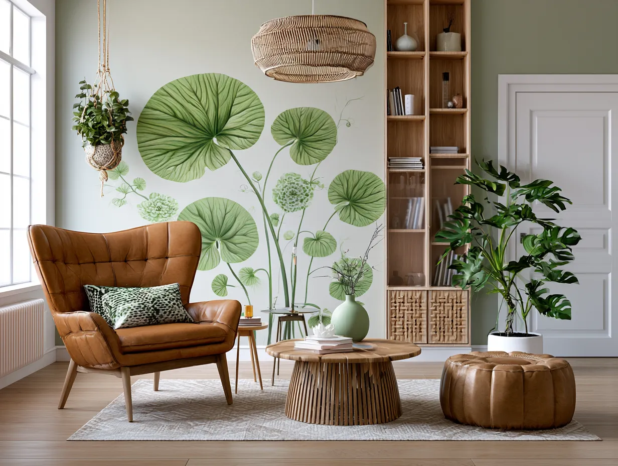
A Home Office Where Sage Does the Heavy Lifting
Sage walls in a home office are doing something white walls can’t — they absorb visual noise without making the room feel smaller. I painted my own office in Benjamin Moore Saybrook Sage HC-114 ($88/gallon) after years of staring at the flat eggshell white builders love. The difference in eye strain over a six-hour work session is measurable. Ivory trim on window frames and door casings keeps it crisp without veering clinical.
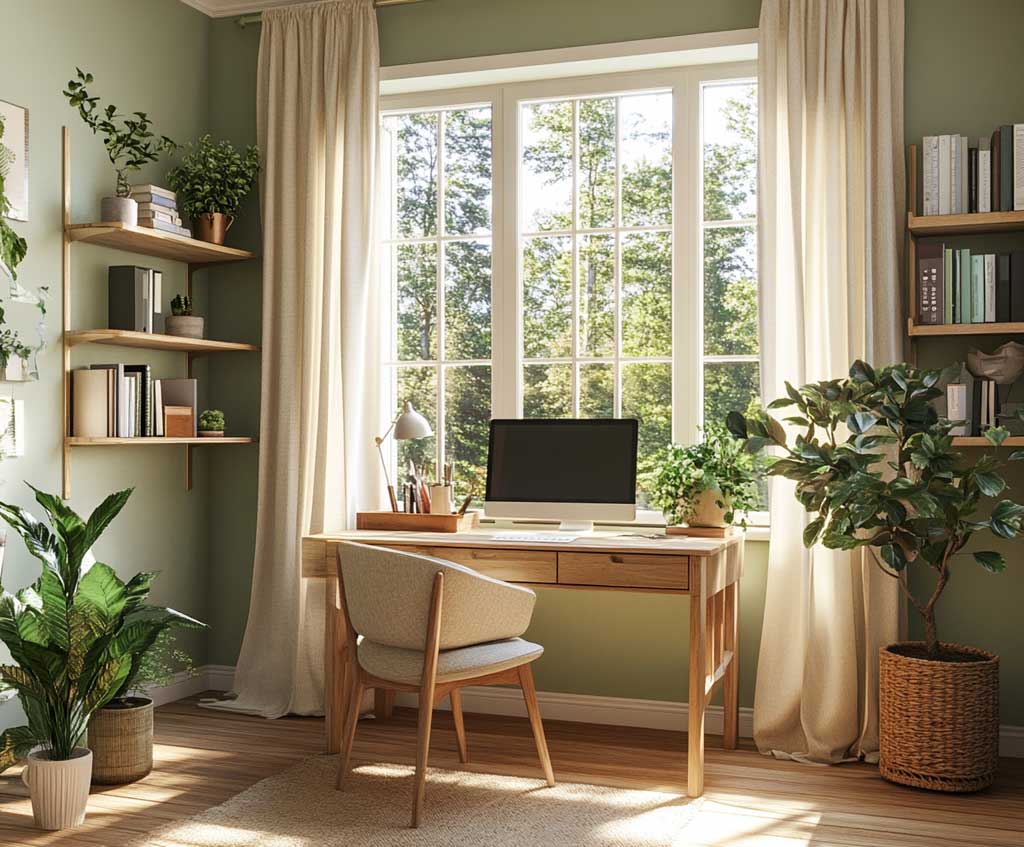
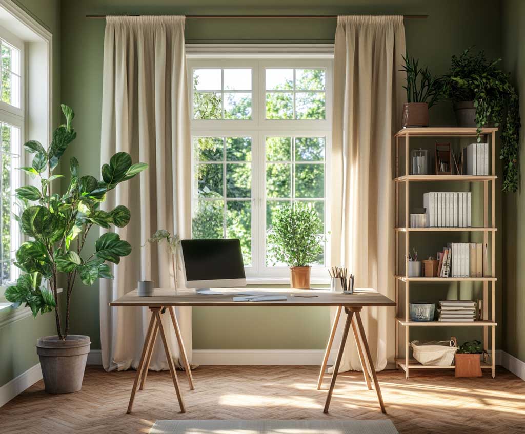
The wood question matters here. Medium walnut desks and open shelving read warm against sage and reinforce the elegance of the pairing. White oak works, too, as long as it isn’t the gray-washed variety — gray-washed oak turns the whole room cold and flat. Stay away from dark espresso furniture: it competes with the depth sage already brings to the wall.
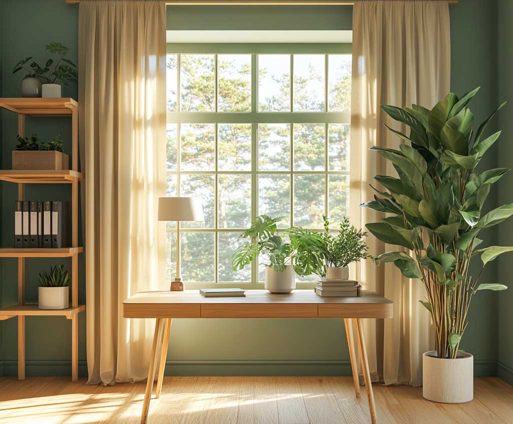
Textiles finish it. An ivory linen upholstered chair with a sage or moss green throw reads deliberately curated — it’s the textile version of the wall palette echoing back at you. Beige or cream curtains in sheer linen diffuse natural light and keep the room airy through the afternoon. Skip the blackout panels in an office: sage walls in low light look grayish-brown, not green, and you lose the whole point.
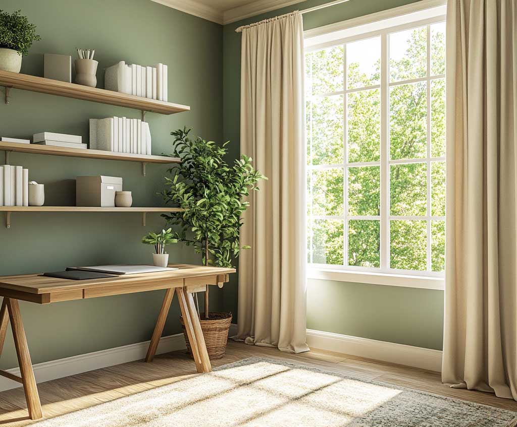
Brass is the only metal finish I’d put in this room. A $65 brass desk lamp from CB2 or a set of Rejuvenation drawer pulls in unlacquered brass both disappear into the palette in the best way — they add warmth without adding noise. Chrome reads like a dentist’s office against sage. That’s the anecdote nobody warns you about. Lighting temperature: stay at 2700K warm white or the sage turns gray-green hospital by 6 pm.
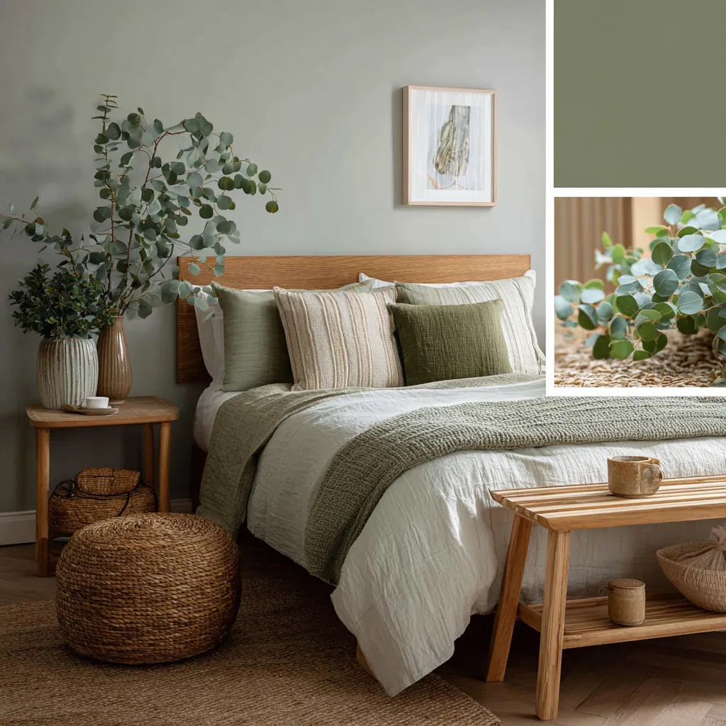
What never works here is too many plants. One fiddle-leaf fig or a trailing pothos reads like a natural extension of the palette. Four potted plants on open shelves and suddenly you’ve built a conservatory, not an office. One statement plant. Done. For more green-wall ideas in other rooms of the house, these sage green bedroom combinations show how the same palette shifts in lower-light sleeping spaces.
- Mixing sage with cool gray trim. It looks unresolved — like you started two different rooms and stopped halfway. Ivory or warm white trim only.
- Using a pure-white ceiling with sage walls. The contrast is too sharp. Go off-white: Benjamin Moore Chantilly Lace OC-17 or Swiss Coffee OC-45 on the ceiling keeps the room cohesive.
- Choosing sage that’s too blue. Sherwin-Williams Clary Sage has enough yellow undertone to stay warm. Something like Restoration Hardware’s Sage reads as teal in afternoon light. Always test on the actual wall, not the swatch card.
- Bright white LED bulbs (5000K+). They strip the warmth from both sage and ivory and make the room feel like a commercial kitchen. Warm white only.
Entryways Where Vintage Details Make Sage Land Differently
An entryway painted in sage and ivory is doing something a neutral entryway never manages: it sets a tone in four seconds before the guest even clears the threshold. That’s the whole job of an entryway — signal what kind of house this is — and this palette signals considered without trying hard. Sage walls stop the eye, ivory moldings and baseboards push the architecture forward, and the vintage detail does the rest.
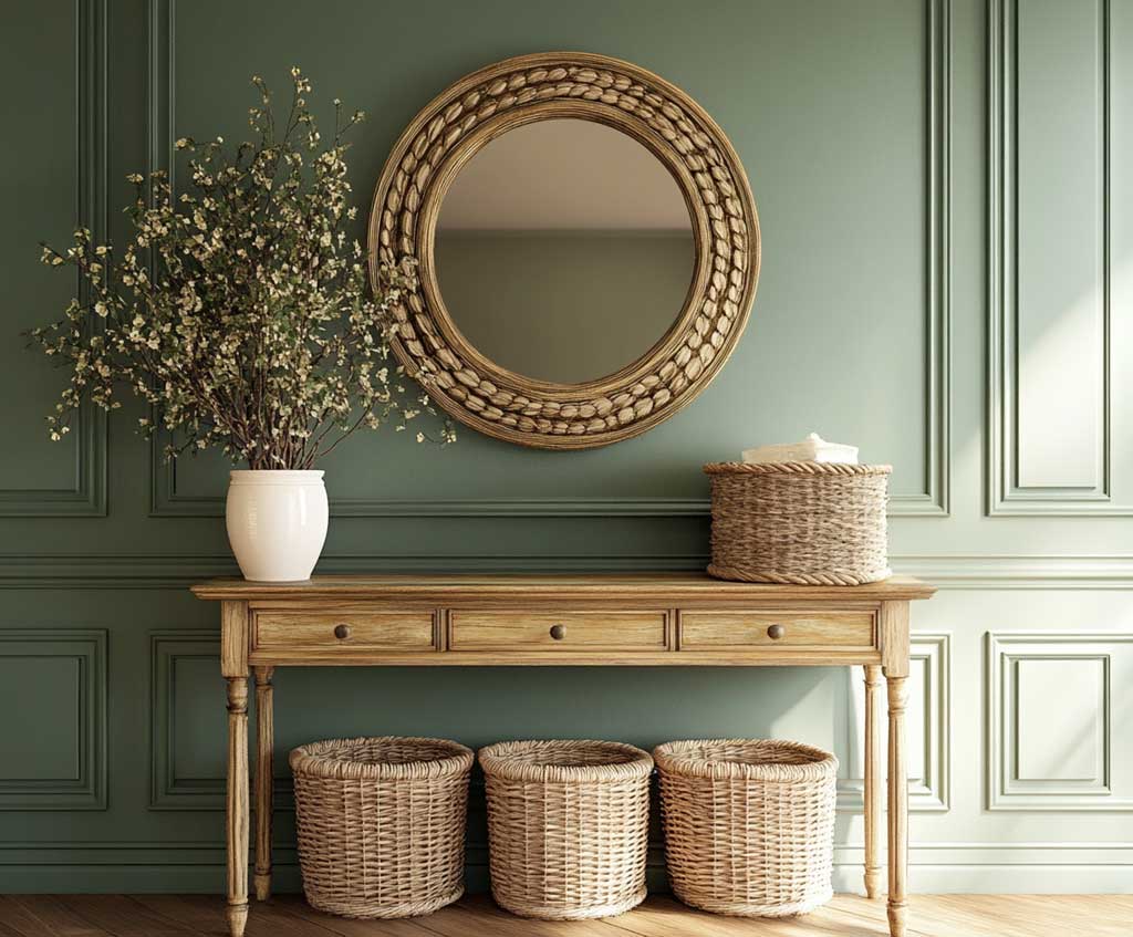
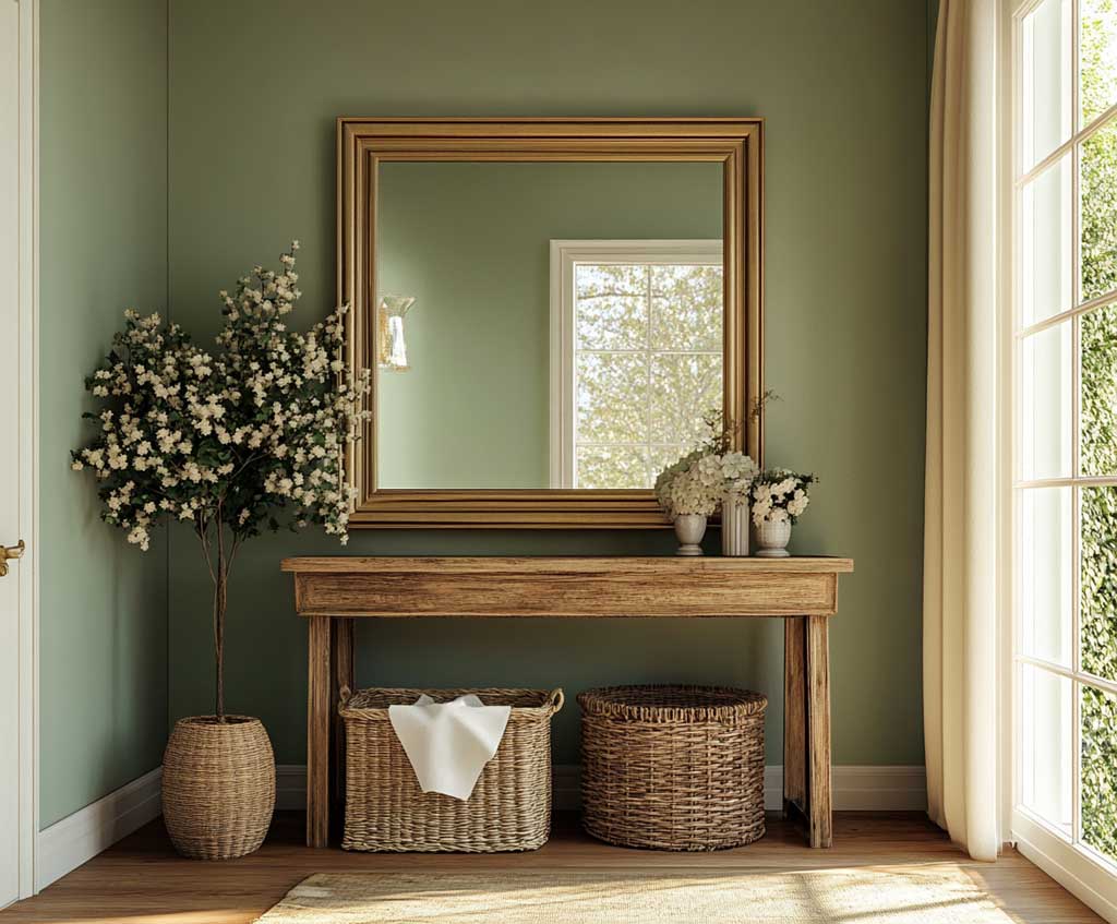
The vintage console table is not optional here — it’s the object that completes the logic of the palette. A weathered oak or painted-white antique console against sage walls reads like the room was always there, not recently renovated. A modern lacquered console in the same space makes the sage look like a trend choice, not a decision. The patina in the furniture and the earthiness of sage are speaking the same language.
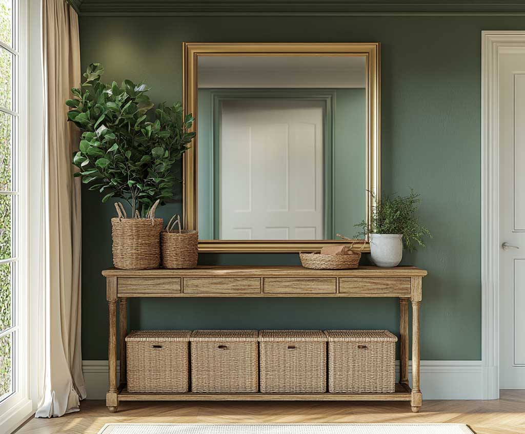
Storage should be beautiful enough to leave visible. Woven seagrass baskets in ivory or natural tones work against the sage the way a well-worn leather bag works against a linen blazer — they earn their place through texture. The gold-framed mirror over the console: yes, always. The brass reflects back a warm version of the sage, which is the effect you’re after. A chrome or silver mirror adds nothing; it just sits there, cold and disconnected.
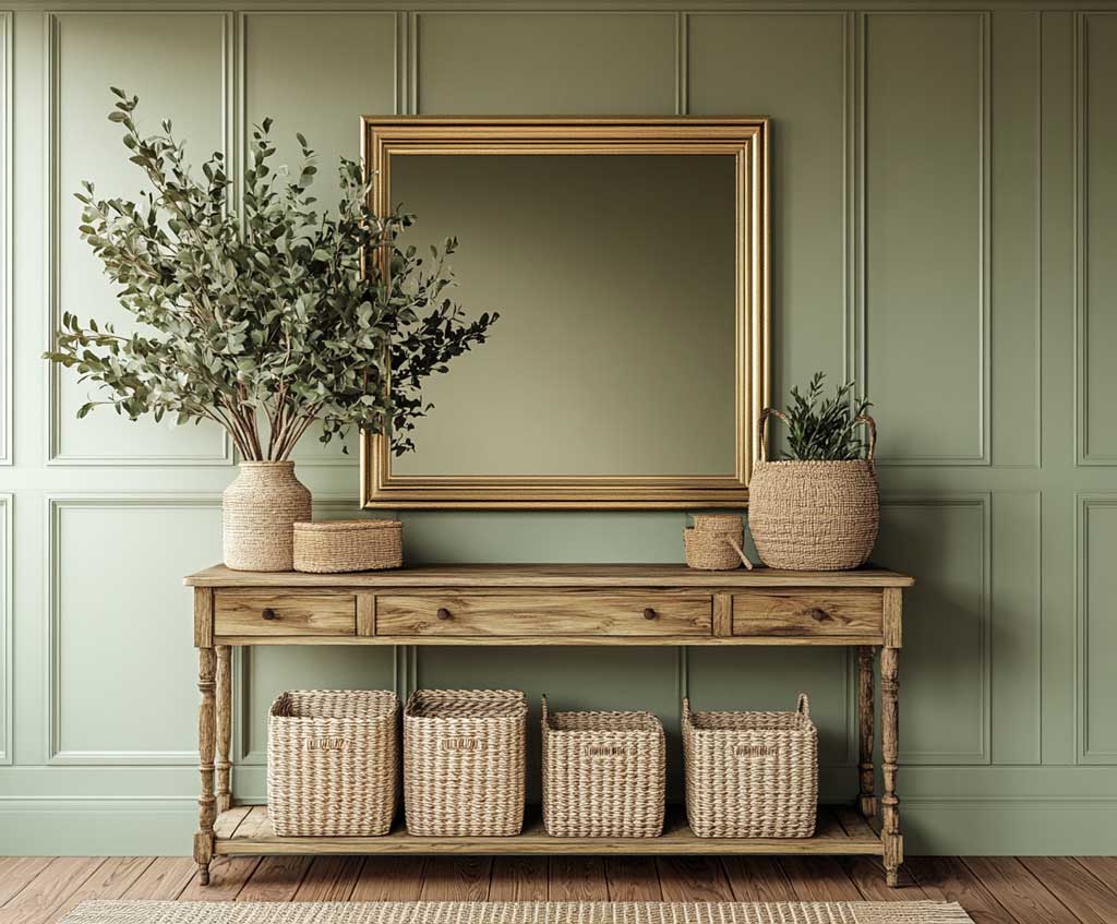
Lighting in an entryway with this palette: a brass wall sconce or a small pendant at $120–$200 (Schoolhouse Electric has good options) makes the space feel like a room, not a hallway. Recessed downlights alone drain all the warmth from sage. Fresh-cut stems in an ivory ceramic vase — eucalyptus, dried pampas, or simple white tulips — add organic texture without looking try-hard. Avoid faux flowers entirely; against sage green, fake foliage reads immediately as fake foliage. For anyone building a wider color plan across multiple rooms, these interior color scheme combinations show how sage connects into adjacent spaces.
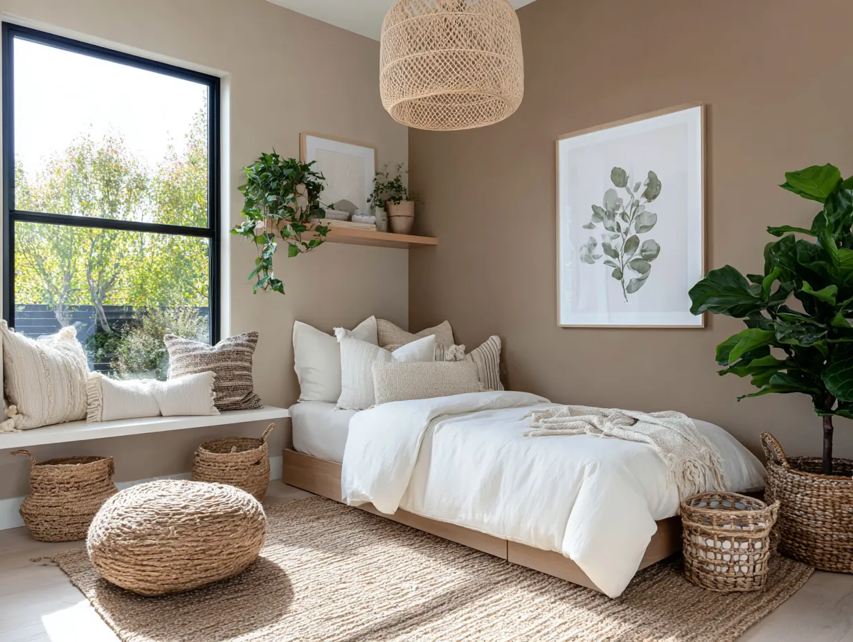
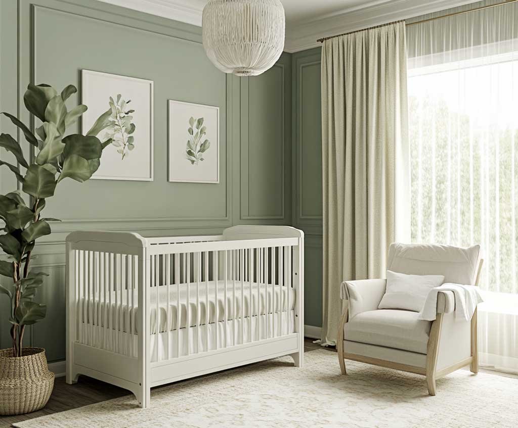
Sage and Ivory in a Nursery Outlasts the Jungle Animal Phase
Sage and ivory in a nursery is the palette that doesn’t need to be redone the moment the child decides they’re too old for it. Most nursery palettes peak at age two. This one grows. The gentle gray-green of sage reads as gender-neutral, calming, and mature enough that it transitions from crib to toddler bed to twin without the walls looking like they belong to a different kid. I’ve seen this exact palette in a nursery at ages 0, 3, and 7 — same walls, totally different room each time.
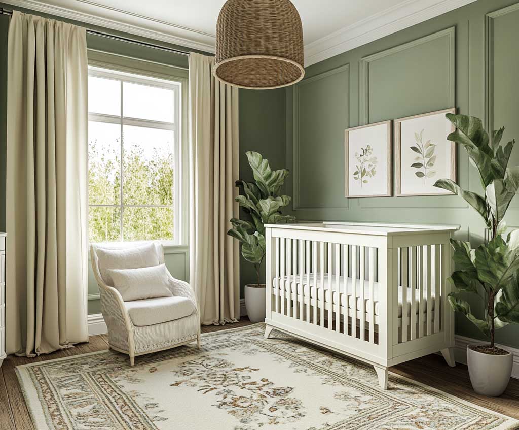
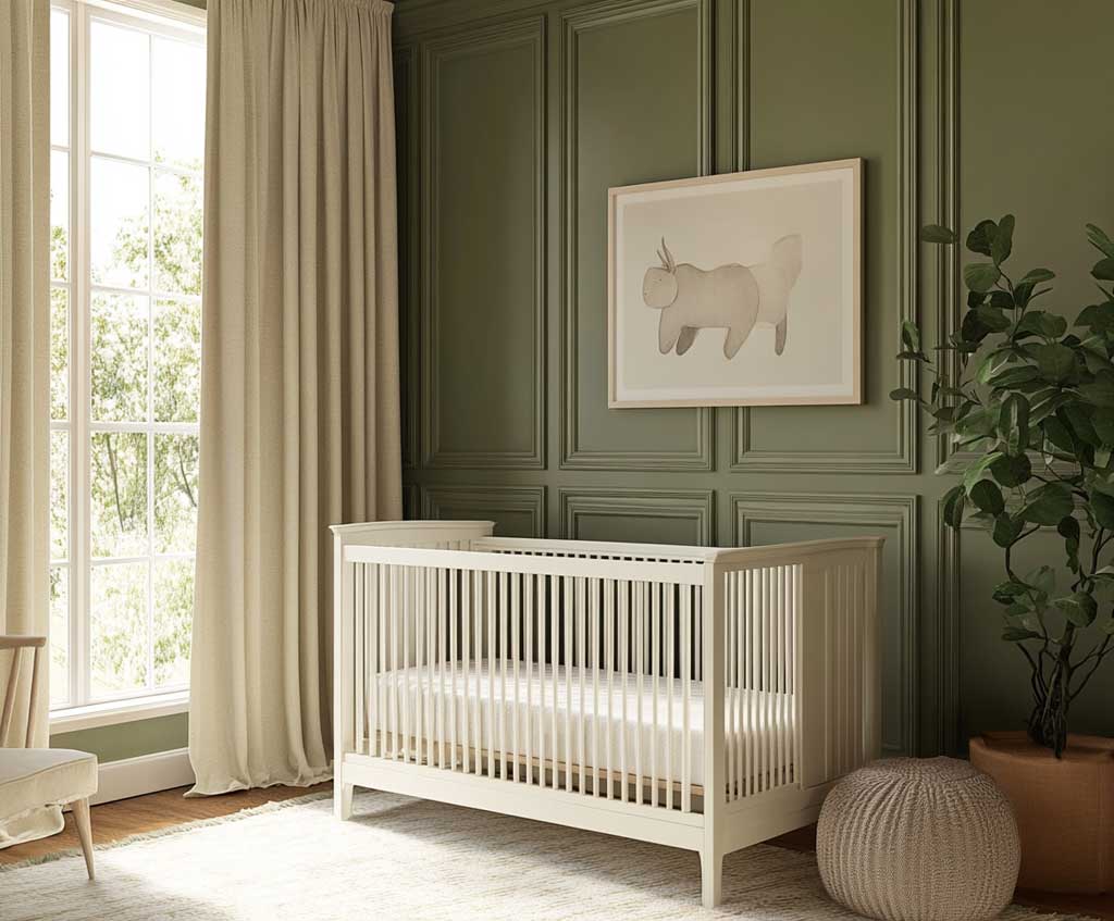
Ivory trims on crib details and window sills do the architectural work that white would do but warmer. A pure-white crib against sage walls can look stark — like the crib arrived from a different house. Ivory crib, ivory trim, one or two soft botanical prints on the wall: the room coheres immediately. The botanical prints aren’t a cliché here; they’re an extension of the palette logic — green shapes that connect the wall color to something from the real world.
Texture is what makes a nursery feel safe rather than just styled. A plush ivory or oatmeal rug underfoot — the IKEA STOENSE ($80 in the largest size) works perfectly and survives real baby chaos — softens the sage-to-floor transition. Neutral-toned curtains in sheer linen diffuse morning light; in a nursery, harsh morning sun at 6 am is the enemy and sheer linen buys you twenty extra minutes of sleep. Worth it.
The sage green rocking chair is the one furniture piece I’d spend real money on. A Pottery Barn Kids Greenguard-certified rocker in sage or dusty green runs around $350–$450 and ties the palette together at eye level when you’re sitting in it, which is most of the time. Avoid the matching sage-walled nursery from the brand’s catalogs: when the chair, the walls, and the bedding are all the same green, the room reads like a single color story, not a well-layered palette. Homes & Gardens breaks down exactly how Saybrook Sage shifts across different light conditions — worth reading before you commit to a single tin.
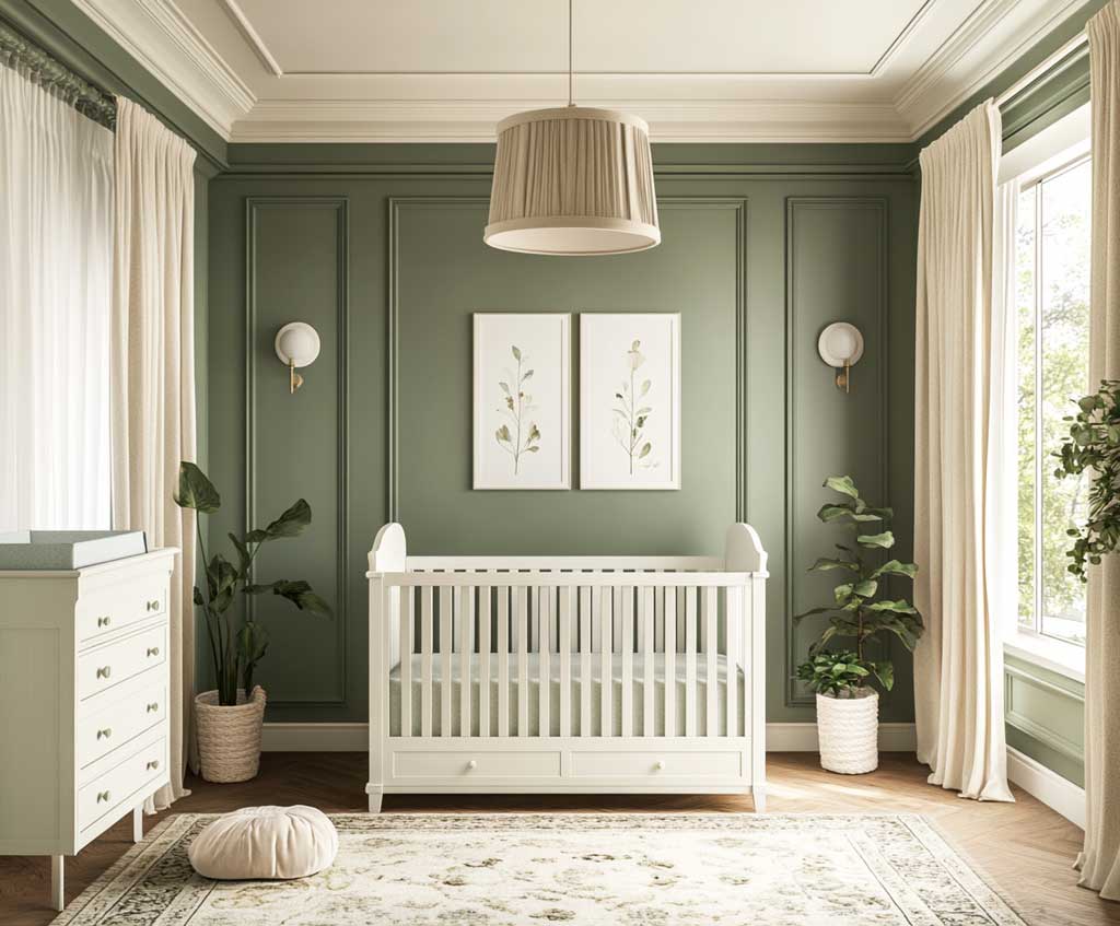
Lighting in a nursery needs two modes: daytime bright and nighttime warm. A fabric-shaded floor lamp with a warm 2700K bulb handles both if you put it on a dimmer switch. The dimmer is not optional — it’s a $15 hardware addition that changes how the palette reads at 2 am, which is when you’ll most appreciate sage feeling calming rather than stark.
BOTTOM LINE
The elegant color combination most rooms get right on the second attempt
Sage and ivory work because they’re both neutrals pretending not to be — sage gives you color without commitment, ivory gives you warmth without going yellow. The pairing reads as a design decision, not a compromise.
Benjamin Moore Saybrook Sage HC-114 on walls, Swiss Coffee OC-45 on trim, warm white bulbs at 2700K. That’s the formula. It works in offices, entryways, and nurseries with zero modification.
Save this post before your next hardware store run — the color codes matter at the paint counter.
Related Topics