Blue colour wall paint is one of those choices people agonize over and then never regret. I’ve repainted two rooms in different shades of blue and the only mistake was waiting so long. The problem isn’t picking blue — it’s knowing which blue, and what it does to your specific room.
Blue wall paint combinations fail when people grab a swatch, love it in the store, then stare at a flat dead wall for six months. The light changes everything. A navy that looks moody and rich at noon turns almost purple by 6pm in north-facing rooms. That’s the part nobody warns you about.
What actually works? Three distinct directions — oceanic blues for modern living rooms, deep navy for cozy dens, sky blue for kitchens that feel three times bigger than they are. Each one requires a completely different color combination with blue wall materials and furniture. Pick the wrong pairing and the whole thing looks like a dentist’s waiting room.
Blue Wall Paint Combinations for a Modern Living Room
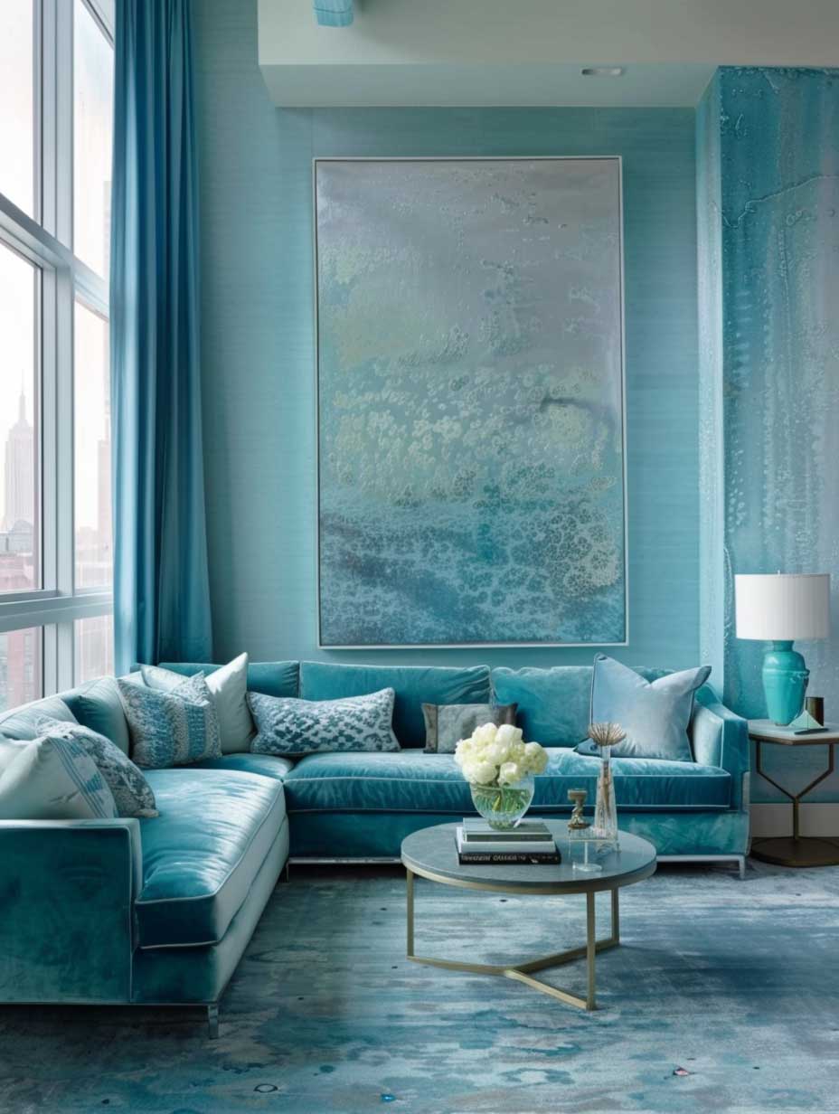
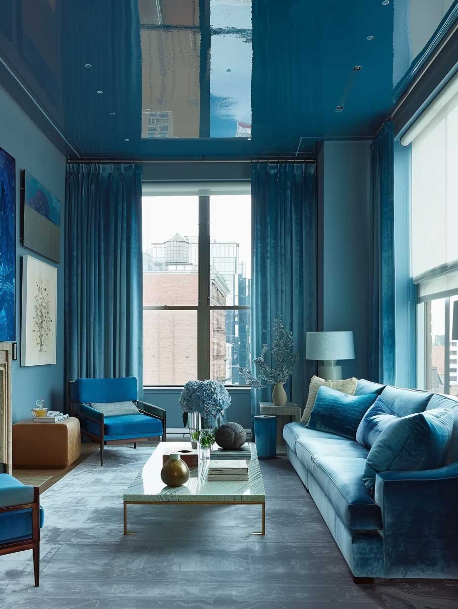
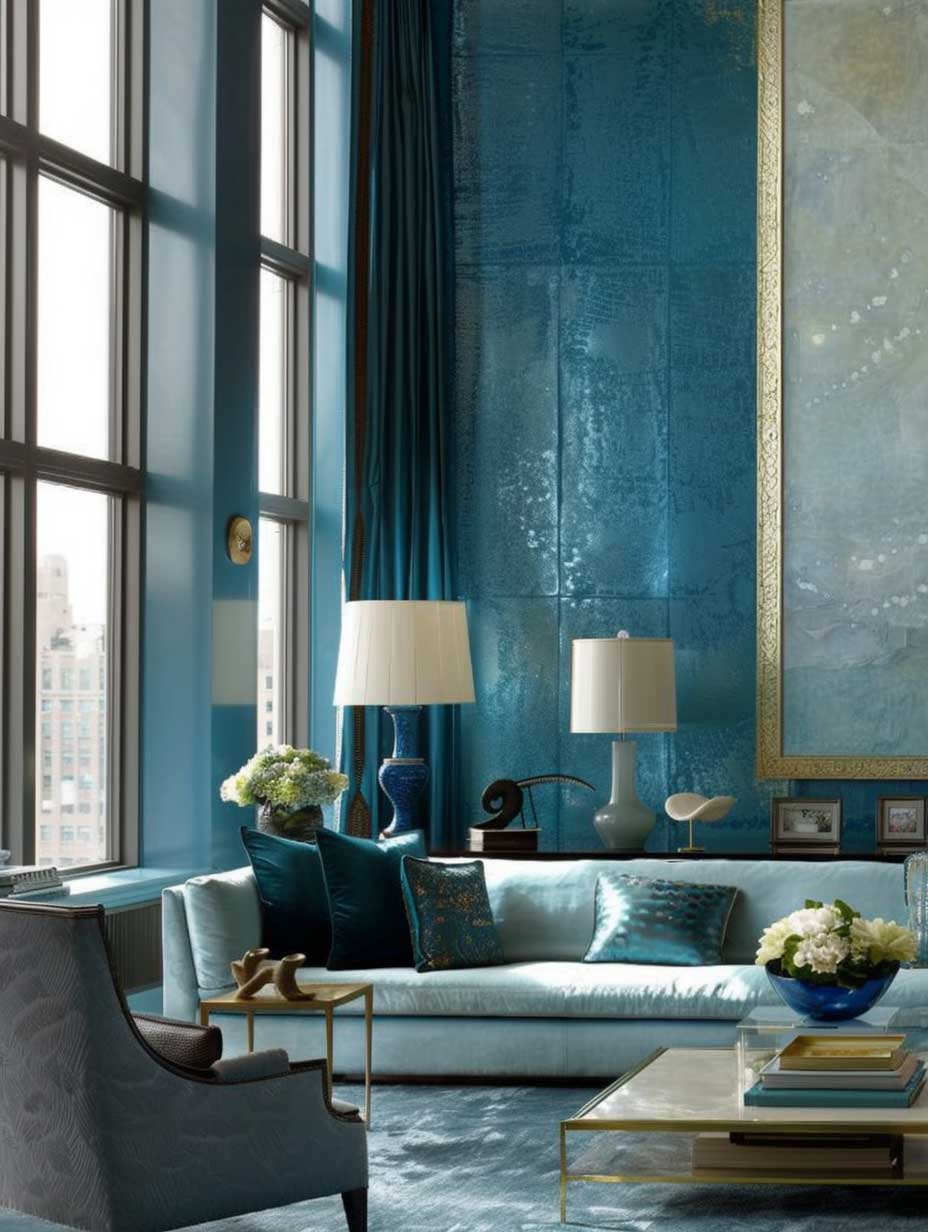
The charm of a modern living room can be significantly enhanced by the strategic application of color, particularly through the use of blue colour wall paint design. The choice of oceanic hues brings a sense of calmness and sophistication, effortlessly elevating the aesthetic appeal of the space. This design approach marries the tranquility of the sea with the sleekness of modern interiors, creating an environment that is both invigorating and inviting.
When envisioning a living room painted in elegant oceanic hues, one imagines walls that mimic the serene beauty of the ocean’s depths. These shades of blue are not just colors but are experiences in themselves, bringing the essence of the sea right into the heart of your home. The color palette ranges from the light, airy tones of seafoam to the deep, mysterious blues of the ocean’s abyss, offering a variety of moods and atmospheres to choose from.

| Room Type | Best Blue Shade | Paint Recommendation | Best Pairing | Avoid |
|---|---|---|---|---|
| Modern Living Room | Blue-green oceanic | SW Oceanside SW 6496 | Warm white trim + light oak | Cool grey trim |
| Cozy Den | Deep navy | BM Hale Navy HC-154 | Rustic wood + leather | 4 navy walls in small room |
| Kitchen | Sky blue / light blue | BM Breath of Fresh Air 806 | White cabinets + marble | Pure white tile backsplash |
| Bedroom / Den | Slate / dusty blue | BM Van Deusen Blue HC-156 | Linen + aged brass hardware | High-gloss finish |
Sherwin-Williams’ Oceanside SW 6496 is the one I see in every Pinterest board — and for good reason. It’s a blue-green hybrid that reads differently depending on your light source. Pair it with warm white trim and it looks like a $40k renovation. Pair it with cool grey trim and it looks like a hotel that hasn’t been updated since 2009. The trim decision matters more than the blue itself.
Blue wall paint combinations with natural wood furniture are safer than most people think. Light oak floors against a deep teal wall create contrast without fighting each other. I’d skip dark walnut though — the room starts to feel like the inside of a boat, and not in a good way.
Incorporating minimalist furniture into this setting allows the blue walls to truly stand out, serving as the room’s focal point. The simplicity of the furniture’s design complements the complexity of the blue hues, creating a balanced and harmonious space. The natural light that floods through the large windows illuminates the blue walls, enhancing their vibrancy and transforming the room into a dynamic canvas that changes with the time of day. Benjamin Moore’s official blue paint color library is worth bookmarking — it shows how undertones shift in different lighting conditions, which is exactly what trips most people up when choosing between similar shades.
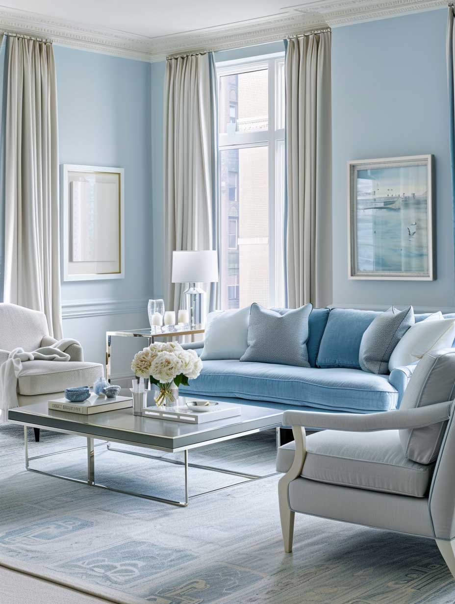
Subtle metallic accents scattered throughout the room add a touch of luxury and sophistication. Whether it’s in the form of sleek, silver photo frames, chrome lighting fixtures, or gold decorative objects, these metallic elements reflect the light in enchanting ways, adding depth and texture to the room. The interplay of light and color, combined with the reflective qualities of the metallic accents, creates a living space that feels open, airy, and luxuriously modern.
The beauty of choosing oceanic hues for a modern living room lies in the versatility of the color blue. It can be calming and soothing, making it perfect for a space where relaxation is key. At the same time, blue can be bold and energizing — see how that plays out in practice with a blue sofa living room setup where the furniture anchors the whole color combination. The ability to tailor the shade of blue to match the desired mood and function of the room is what makes blue colour wall paint design an exceptionally versatile choice for modern interiors.
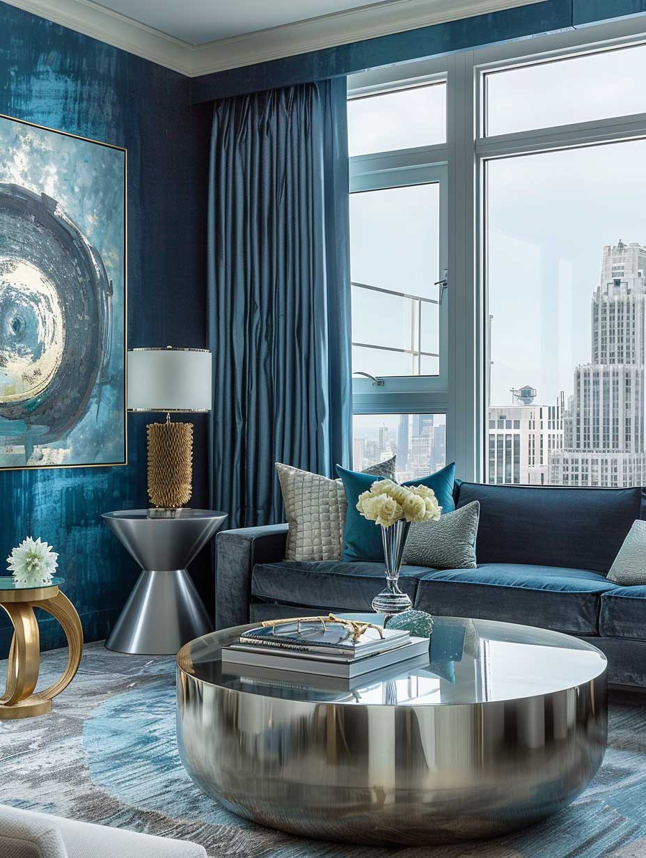
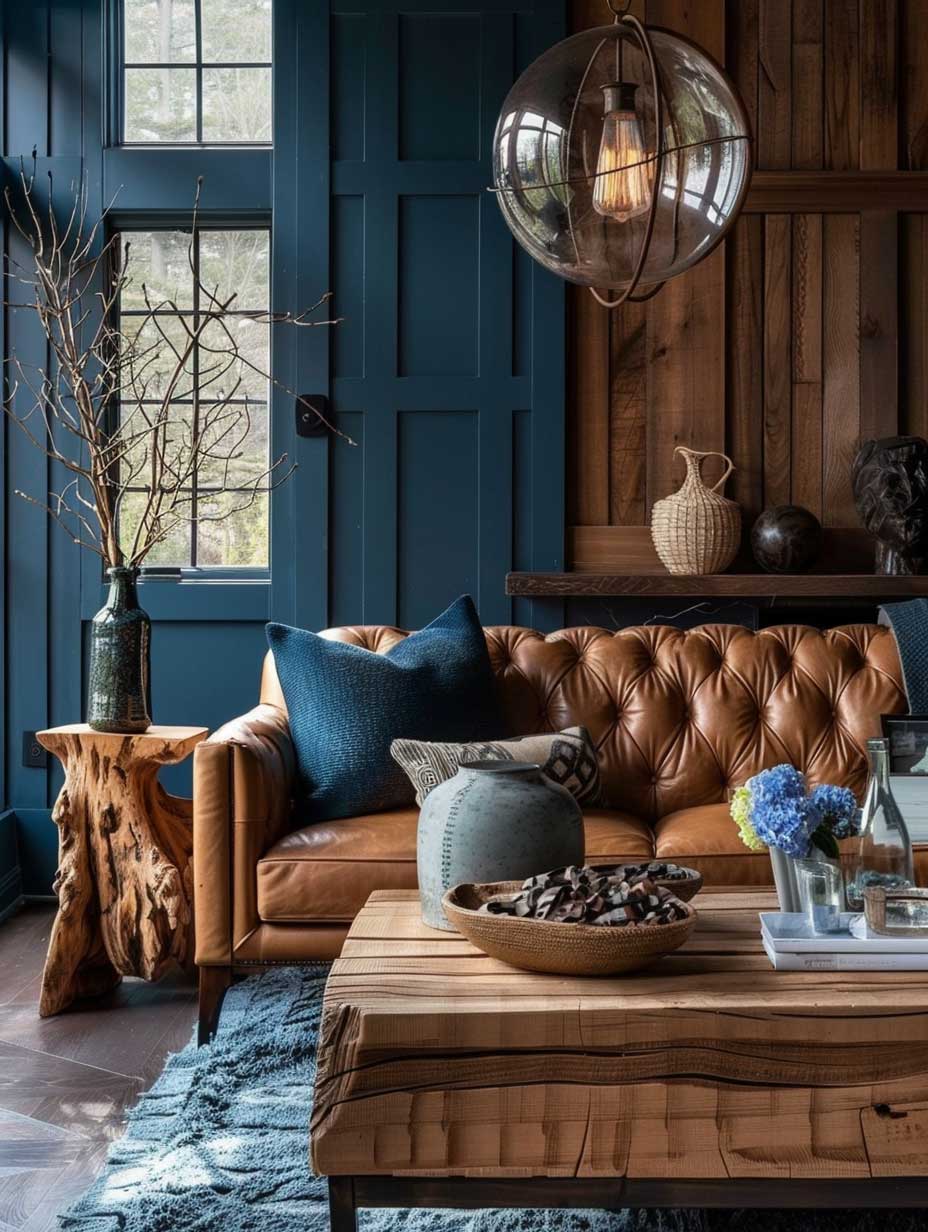
Deep Blue Colour Wall Design for a Cozy Den
The allure of a cozy den lies in its ability to offer a retreat from the world, a place where one can unwind in comfort and solitude. The introduction of deep blue colour wall paint design into such a space enhances its warmth and intimacy, creating an enclave that feels both private and inviting. The deep blue serves as a bold backdrop, against which the textures and colors of rustic elements stand out, adding layers of visual interest and tactile warmth.
Rustic wood furniture plays a crucial role in this design, bringing an element of nature and authenticity into the room. The natural grain and imperfections of the wood complement the depth of the blue walls, grounding the space in a sense of earthiness and stability. This combination evokes the feeling of a cozy cabin, where the richness of the wood and the depth of the blue together create a sheltered and snug environment.
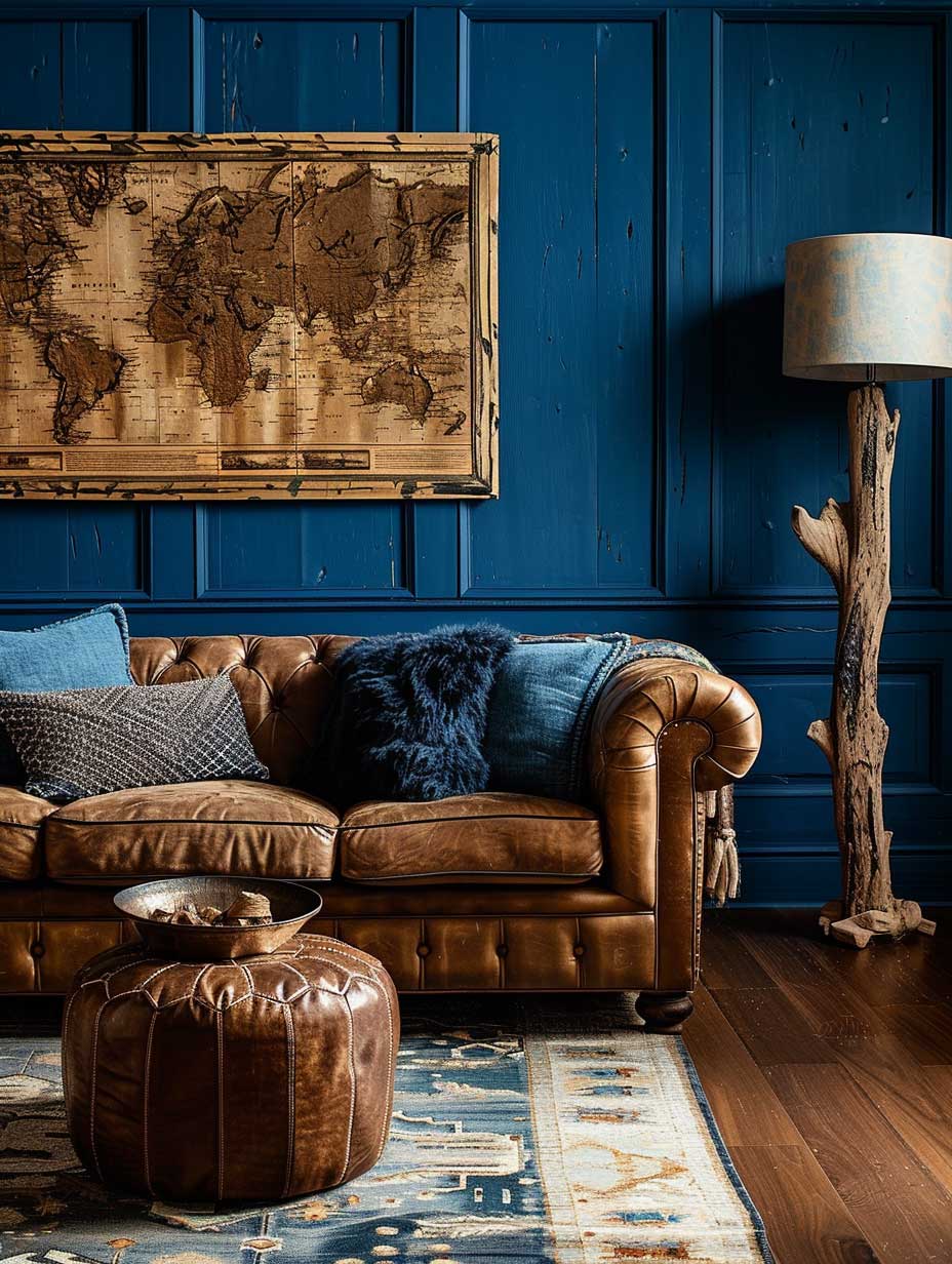
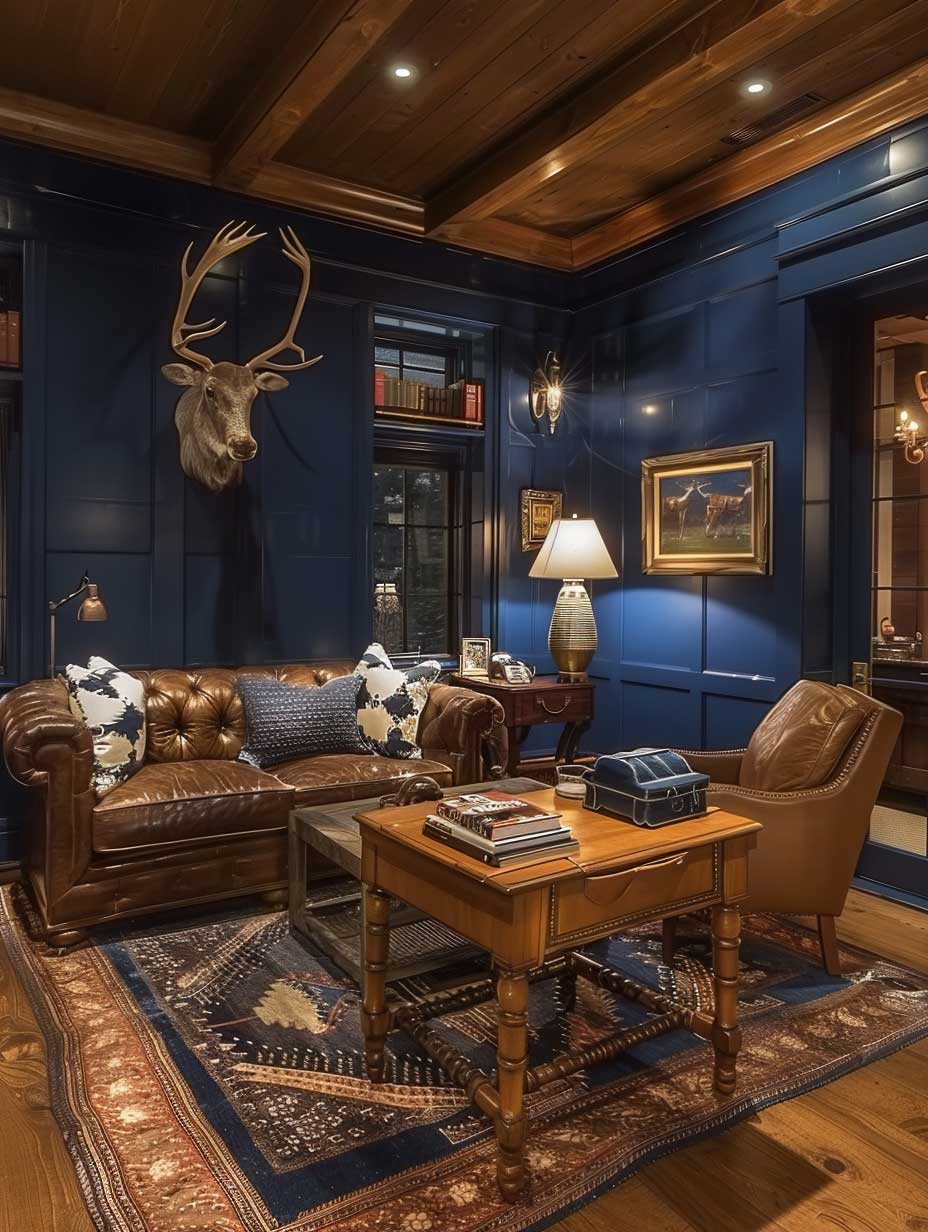

Benjamin Moore’s Hale Navy HC-154 is the gold standard for deep blue accent walls, and at around $70–$80 per gallon it’s not cheap. It’s worth it. The pigment density is noticeably richer than Behr’s version at half the price — I compared them side by side and the Behr read almost grey in low light. Don’t cheap out here.
Color combination with blue wall works differently in smaller, enclosed rooms. Deep navy in a 10×12 den doesn’t shrink the room — it defines it, like a frame around a painting. The mistake is adding too many competing textures. Pick two: wood plus leather, stone plus linen, but not all four at once.
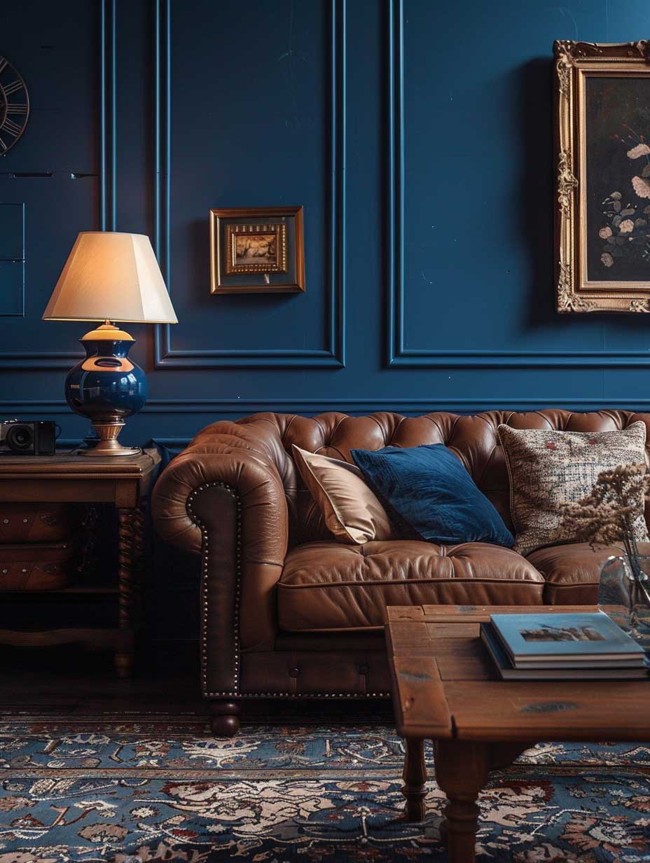


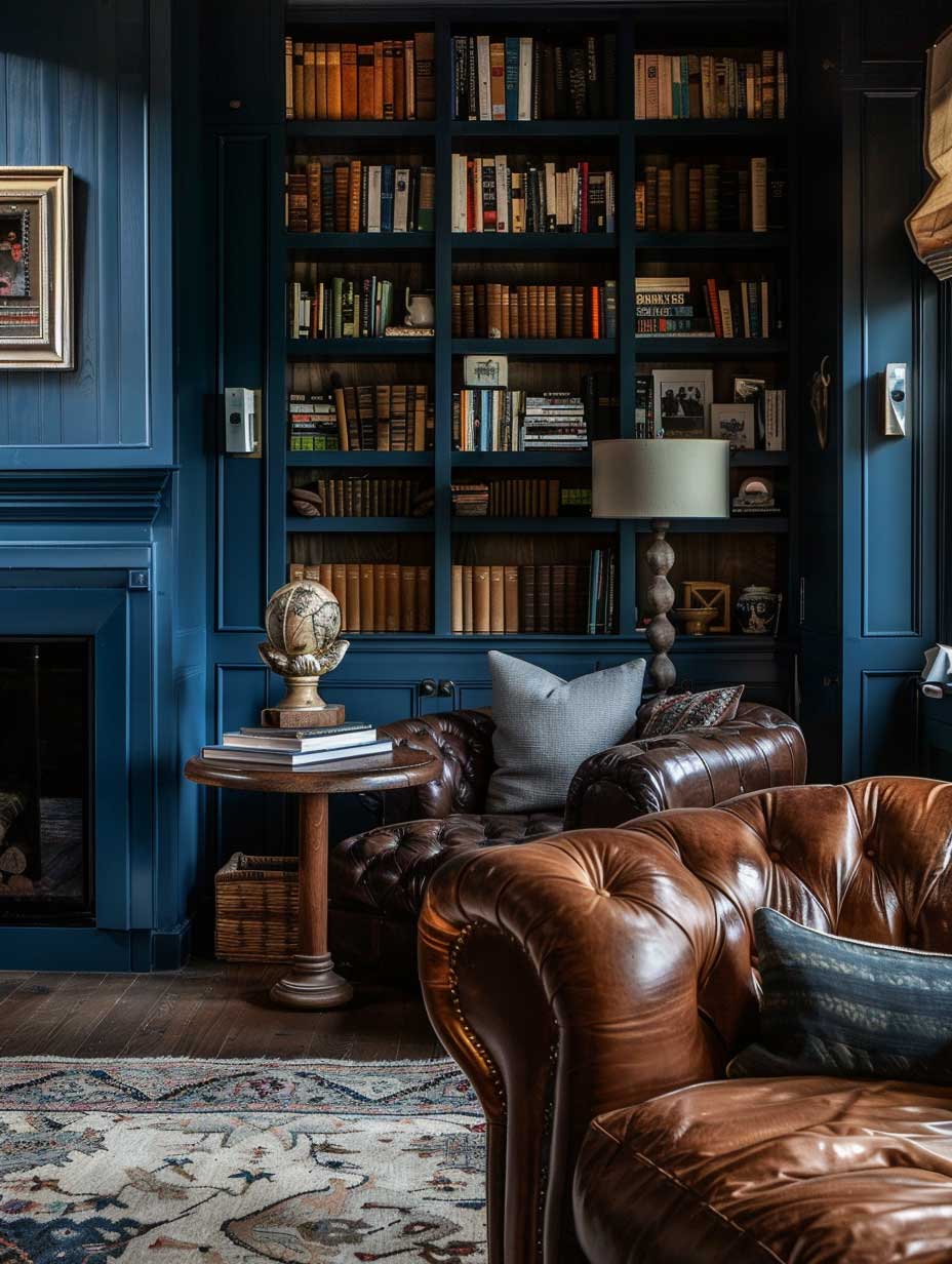
A plush leather sofa, bathed in the warm glow of soft, warm lighting, becomes the centerpiece of this den. The leather’s texture and patina add character and age to the room, suggesting a history and a lived-in feel that is both comforting and inviting. The deep blue walls, reflecting the soft light, envelop the room in a velvety embrace, enhancing the sensation of comfort and relaxation.
In this den, the design is not just about aesthetics but also about creating an atmosphere that encourages disconnection and rest. The deep blue colour wall paint design, in combination with rustic touches and soft lighting, crafts a space that is not only visually appealing but also emotionally resonant. It’s a testament to the power of interior design to influence mood and create sanctuaries within the home.
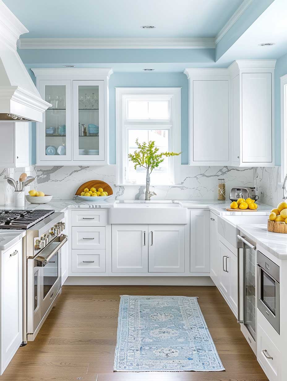
Sky Blue Colour Wall Paint in the Kitchen: What Works
The kitchen, often referred to as the heart of the home, is a space where both culinary creations and memories are made. The introduction of a sky blue colour wall paint design can transform an ordinary kitchen into a bright and airy space that inspires joy and creativity in cooking. This particular shade of blue evokes the clear, open skies of a perfect summer day, infusing the kitchen with a sense of freshness and tranquility.
Sky blue walls serve as the perfect backdrop for white cabinetry, creating a classic and timeless look that feels both open and inviting. This color combination maximizes the sense of space, making even smaller kitchens feel more expansive. The reflective surface of marble countertops complements the sky blue walls, adding a touch of elegance and luxury. The natural veining of the marble introduces subtle patterns and textures, enhancing the kitchen’s visual interest without overwhelming the serene color palette.


Stainless steel appliances integrate seamlessly into this design, offering a modern and cohesive look. The metallic finish of these appliances adds a contemporary edge, reflecting the light and contributing to the overall brightness of the space. This combination of sky blue walls, white cabinetry, marble countertops, and stainless steel appliances creates a harmonious and aesthetically pleasing environment that is both functional and beautiful.
Benjamin Moore’s Breath of Fresh Air 806 runs around $65 a gallon and it’s the closest thing to actual sky I’ve found on a paint chip. It’s lighter than it looks on the swatch. In a kitchen with south-facing windows it borders on white by midday, which is perfect — the color comes back in the evening when the warm light hits it.
Marble or quartz counters
Stainless steel appliances
Pale warm-grey tile backsplash
Light oak or whitewashed floors
Busy patterned backsplash
Pure bright white tile
Orange-toned wood floors
Grey or brown countertops
Blue color combination for wall in kitchens gets tricky with backsplash tile. White subway tile is the obvious choice, and it works, but it’s boring. Try a pale warm grey tile instead — it adds depth without competing with the blue. My go-to is any tile with a slight cream undertone, not pure white. Pure white next to sky blue makes both colors look slightly dirty.
Beyond its visual appeal, a kitchen designed with sky blue walls can have a positive impact on one’s mood and well-being. The color blue is often associated with calmness and serenity, making it an ideal choice for a space where one spends significant time preparing meals and gathering with loved ones. The brightness and airiness of the kitchen encourage a positive and energized start to the day, while also providing a peaceful setting for evening gatherings.


Incorporating sky blue into the kitchen design also offers an opportunity to experiment with accents and decorations that can enhance the space further. For instance, adding plant life can introduce vibrant green tones that contrast beautifully with the blue, bringing a touch of nature indoors. Similarly, colorful dishware or decorative pieces can add pops of color, personalizing the space and adding layers of visual interest.
The design choice of using sky blue colour wall paint in the kitchen goes beyond aesthetics; it’s about creating a space that feels welcoming and invigorating, a place where cooking and dining become experiences to savor. The lightness and openness of the color scheme encourages creativity in cooking, making the kitchen not just a place for meal preparation, but a canvas for culinary expression. If you’re drawn to blue-grey tones rather than pure sky blue, the smoky blue greys and warm taupe combinations show exactly how those deeper, muted shades behave in real interiors.
In conclusion, the transformation of a kitchen with sky blue walls exemplifies the power of color in interior design. It demonstrates how a thoughtful selection of hues can elevate a space from merely functional to truly extraordinary. The combination of sky blue walls, white cabinetry, marble countertops, and stainless steel appliances creates a bright and inviting kitchen that is as enjoyable to cook in as it is to gather. This design approach showcases the potential of blue colour wall paint design to infuse spaces with beauty, brightness, and a sense of openness, making the kitchen a delightful heart of the home.
Related Topics
FAQ
What is the best blue colour wall paint combination for a living room?
Which blue wall paint color works in a small room without making it feel smaller?
What color combination with blue wall works in a kitchen?
Is blue colour wall paint hard to cover if I change my mind?
What is the difference between blue colour wall design in north vs south facing rooms?
Blue colour wall paint combinations don’t fail because of the blue. They fail because of the trim color, the light direction, and the furniture tone. Get those three right and the blue almost doesn’t matter — any shade works.
Whether you go Sherwin-Williams Oceanside for a living room, Benjamin Moore Hale Navy for a den, or BM Breath of Fresh Air in the kitchen, the principle is the same: commit to the undertone and build everything else around it. Half measures end up looking like you accidentally grabbed the wrong paint. Blue is a commitment. It pays off every time you walk into the room.
Save to PinterestYou Might Also Like