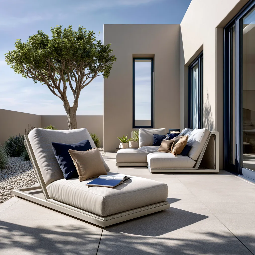
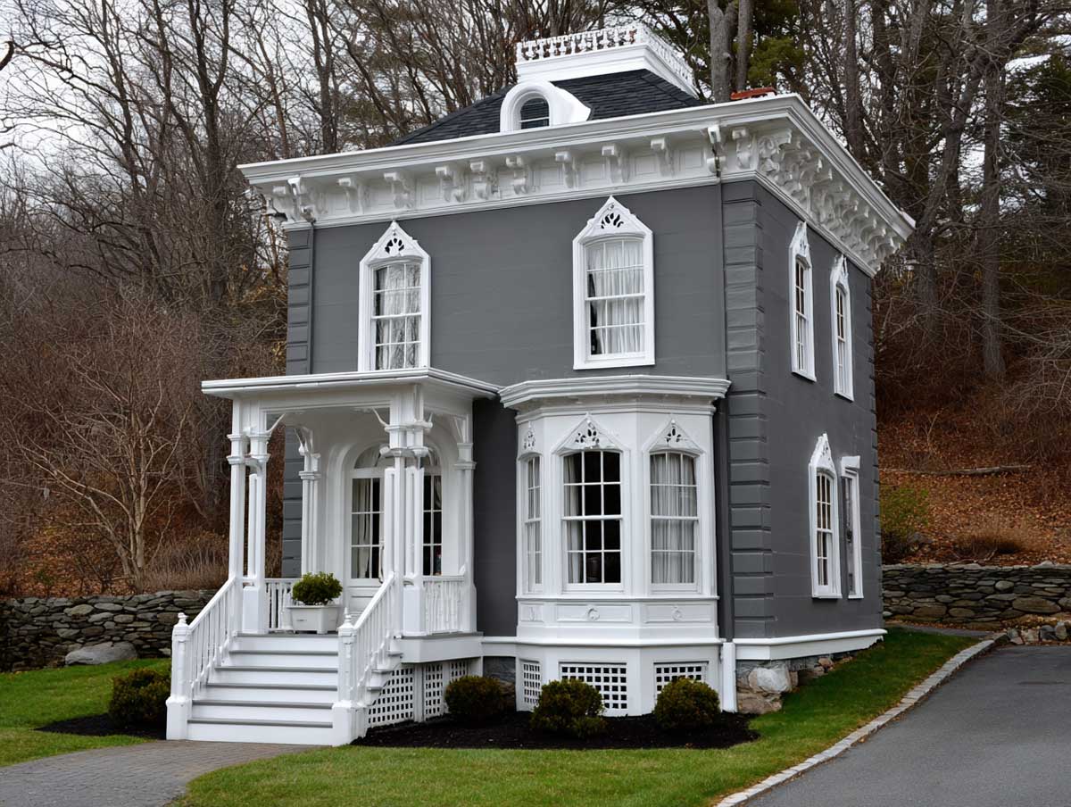
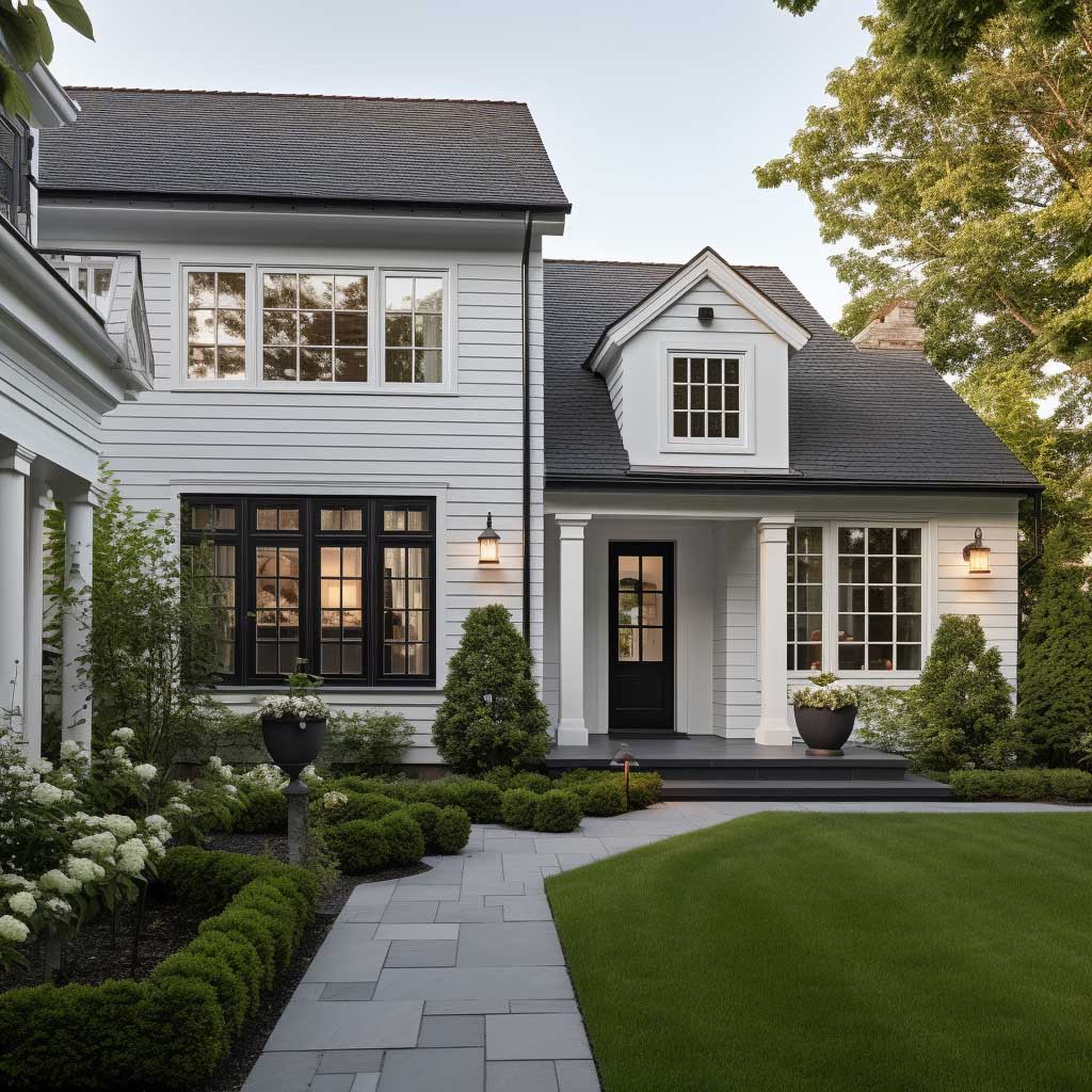
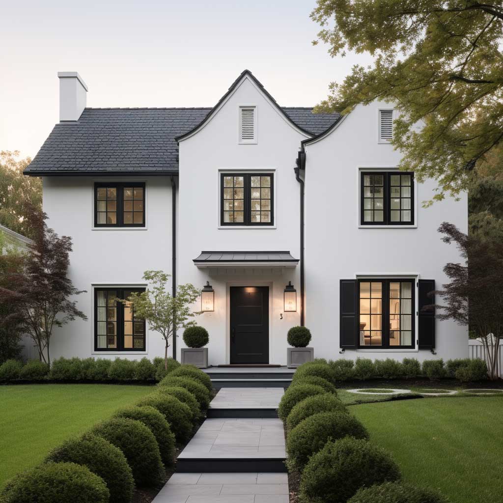
A simple house outside colour combination of soft white walls and charcoal grey trim photographs better than almost any other pairing, and it’s the one realtors keep pointing to when a listing needs more clicks. The pairing works because white reflects light onto the architecture while grey grounds it, so window frames, gutters, and rooflines all read as intentional instead of accidental. You don’t need an architect to pull this off — you need the right undertone of grey and the discipline to stop adding a third colour.
This page walks through three reliable colour directions: the white-and-grey classic, warm earth tones for homes that sit close to greenery, and bold contrast schemes for people who want their house to actually stand out on the block. Each section includes what to budget, what to avoid, and one real number you can use when you’re standing in the paint aisle.
Quick scan:
White + grey is the safest, most resale-friendly house outside colour combination and ages the slowest.
Quality exterior paint runs roughly $50–$75 per gallon, and most homes need a full repaint every 5–10 years depending on siding and climate.
Earth tones blend a house into its lot but show dirt faster than grey.
Bold contrast schemes need the boldest colour kept to one element — usually the door — not the whole facade.
White Walls Stay Cooler, But Grey Trim Is Doing the Real Work
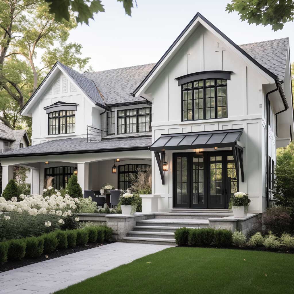
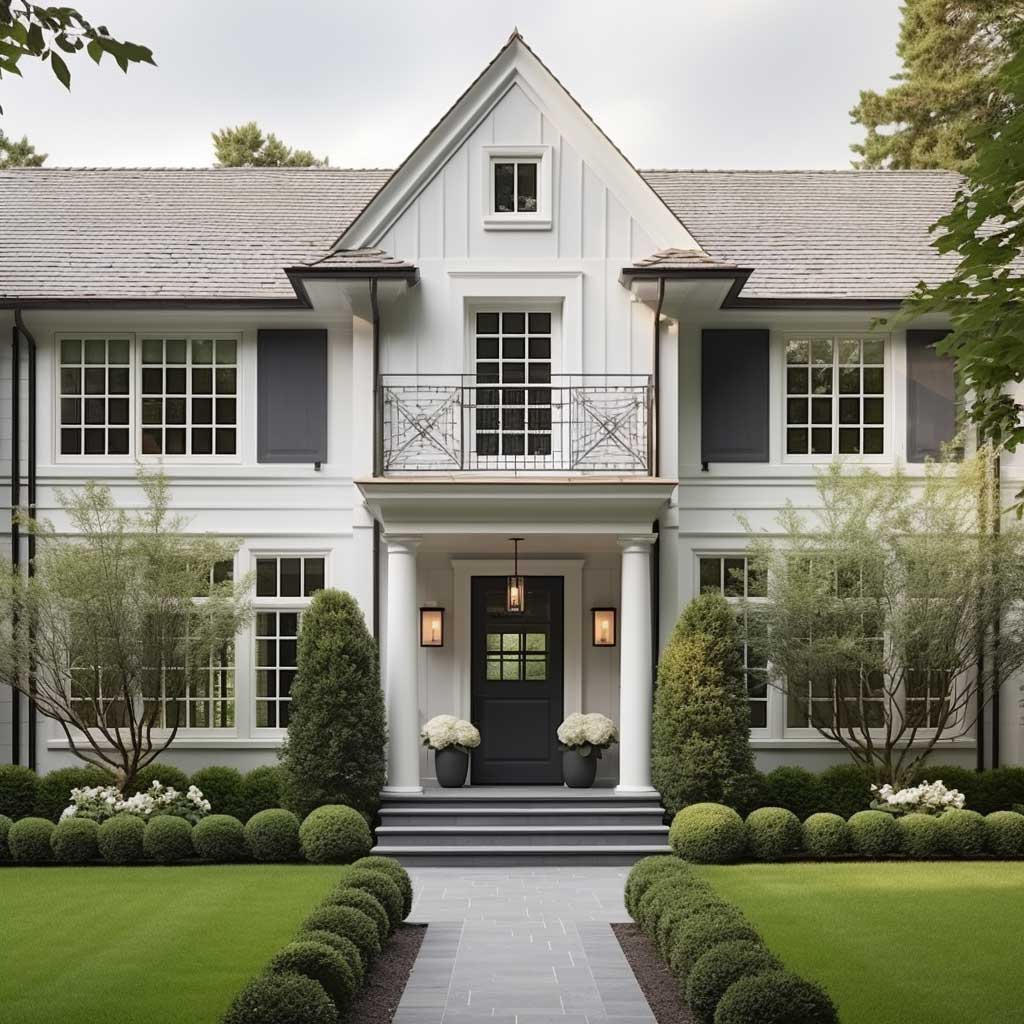

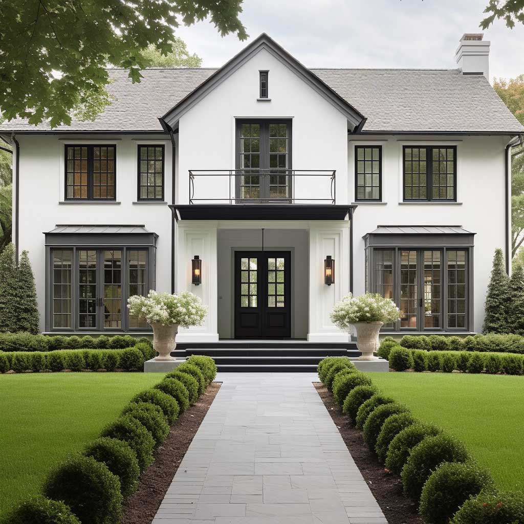
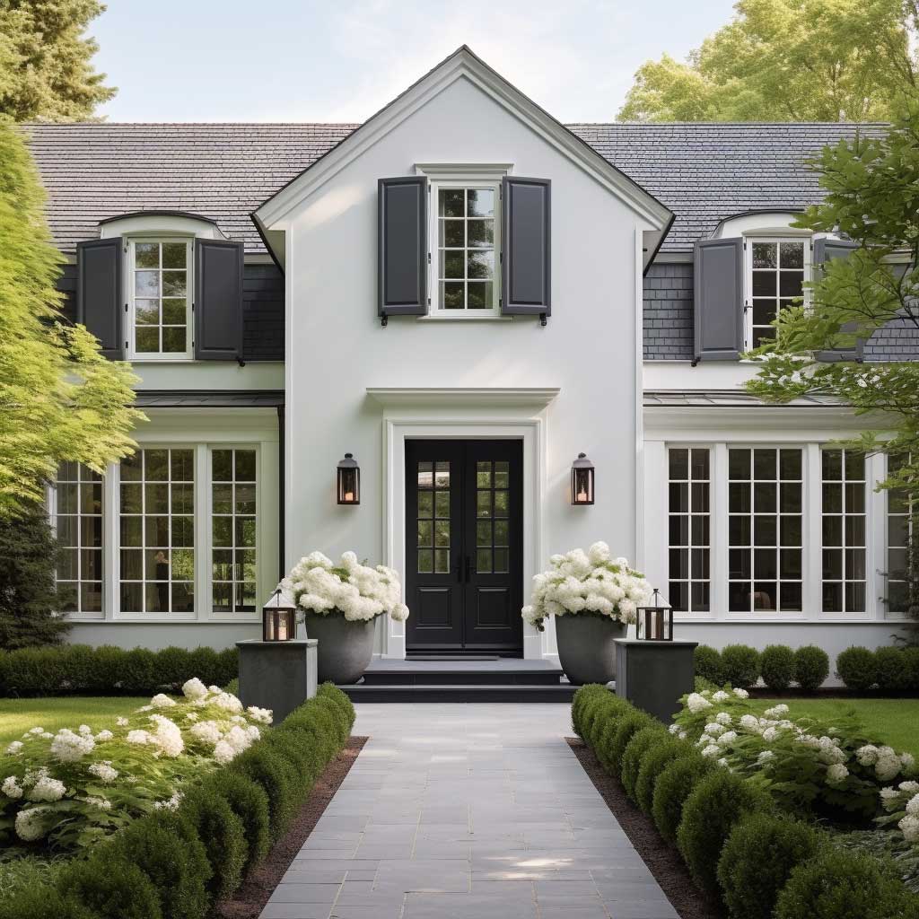
The simple house outside colour combination of white and grey is the one stylists recommend first, mostly because it’s nearly impossible to get wrong. White does the heavy lifting on light reflection — it bounces sunlight instead of absorbing it, which keeps siding temperatures down and reduces how hard your AC works in summer. Grey then steps in as the disciplined counterweight, sharpening window frames, fascia boards, and porch railings so the architecture reads as deliberate.
Sherwin-Williams’ Resilience exterior acrylic latex line runs about $73 a gallon and is built specifically to hold colour through UV exposure, which matters more for grey than people expect — cheap grey paint shifts blue or green within two summers. A budget-friendly A-100 exterior latex sits closer to $49 a gallon and still performs fine on a single-story home with moderate sun. The trick here is testing both sheens on an actual wall section at 8am and again at 4pm, since grey shifts dramatically under shifting light the way denim looks different indoors versus outdoors.
Should you go warm grey or cool grey? It depends on your roof. A cool blue-grey clashes against a warm brown asphalt roof the same way a cold fluorescent bulb clashes against wood furniture — the undertones fight instead of cooperate. Warm “greige” tones (grey with a hint of beige) pair more naturally with brown, tan, or terracotta roofing, while a true cool grey belongs with slate, black, or dark charcoal shingles.

Don’t pick a stark, bright white for a house surrounded by heavy tree cover — it picks up green and yellow shadow reflections that make the siding look dingy within a year. A softer off-white with warm undertones holds its appearance far longer in shaded lots.
The combination scales well across styles too. Crisp white with charcoal trim suits a contemporary build, while a softer ivory paired with light dove grey leans traditional. Either way, the neutral base lets other timeless exterior paint colors in your landscaping — boxwoods, hydrangeas, red brick paths — do the visual heavy lifting instead of competing with the house itself.
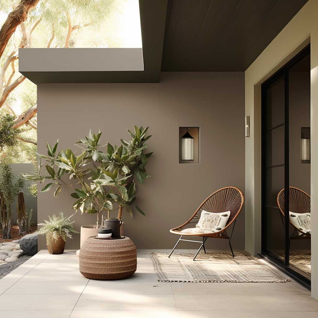
Earth Tones Sit Quietly Until the Light Hits Them Right


Earth tones for a house outer colour scheme work by doing something white and grey can’t: disappearing into the lot rather than standing apart from it. Olive, taupe, burnt sienna, and soft clay shades pull directly from soil and bark, so a house painted in these hues reads less like an object dropped on a property and more like something that grew there.
Wood siding repainted in earth tones typically needs a fresh coat every 3 to 7 years, compared to up to 10 years for vinyl, since wood absorbs moisture and expands with temperature swings more aggressively. That’s a real maintenance trade-off worth weighing before committing — earth tones look effortless in photos but ask more of the homeowner over a decade than a stark white-grey scheme does.
What’s the easiest earth tone to start with? Taupe. It reads almost neutral in flat daylight but warms up noticeably at golden hour, the same way a beige sweater looks different under a porch light than under noon sun. Pair it with a deep brown door and you get contrast without the commitment of a saturated terracotta body colour.


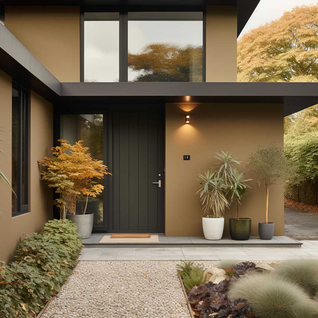
Skip a monochromatic dark brown scheme on a house with little tree cover — without shade and texture variation, deep brown just absorbs heat and shows every water stain. Earth tones need either natural shading or strong architectural lines to keep them from reading flat.
Lighting changes the read on these colours more than any other palette. A taupe wall that looks grey-beige at noon can shift visibly amber by late afternoon, so test swatches at multiple times of day before ordering gallons. Landscaping does double duty here — flowering shrubs against an earth-tone wall create the kind of contrast that white siding gets for free but earth tones have to earn through plant choices.
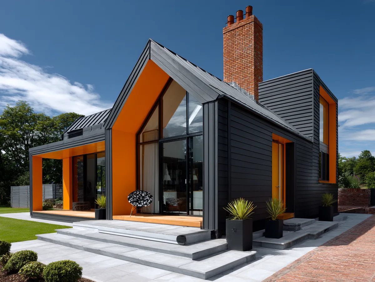
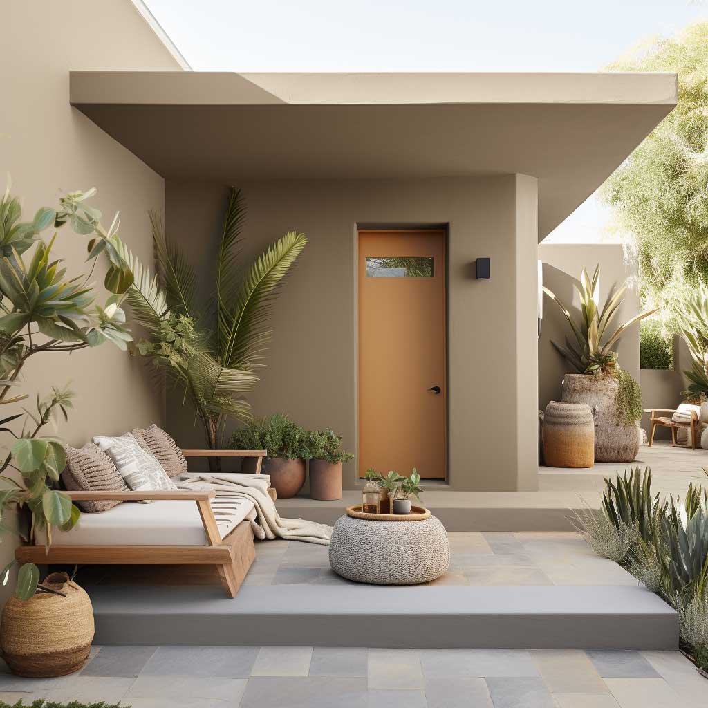
One Bold Door Beats a Whole Bold Facade — Here’s the Home Colour Outside Rule Pros Follow


Bold contrast in a home colour outside scheme works the same way a single statement necklace works on a plain outfit — one strong element, surrounded by restraint, draws the eye exactly where you want it. A soft grey body with a vibrant teal or deep red door creates that pop without tipping the whole house into “too much.”
Front doors get repainted far more often than siding — most homeowners refresh a door colour every 2 to 3 years versus a full exterior repaint every 5 to 10 years — which makes the door the lowest-risk place to experiment with a saturated colour. If navy-on-sky-blue or red-on-grey turns out to be a mistake, fixing it costs a quart of paint, not a full crew.
Will a dark accent colour make a small house look smaller? Slightly, yes — but only if the dark tone covers more than the door, shutters, or a single gable. Confined to one feature, a dark accent actually sharpens the home’s proportions instead of shrinking them, the same way a black belt defines a waistline rather than overwhelming an outfit.
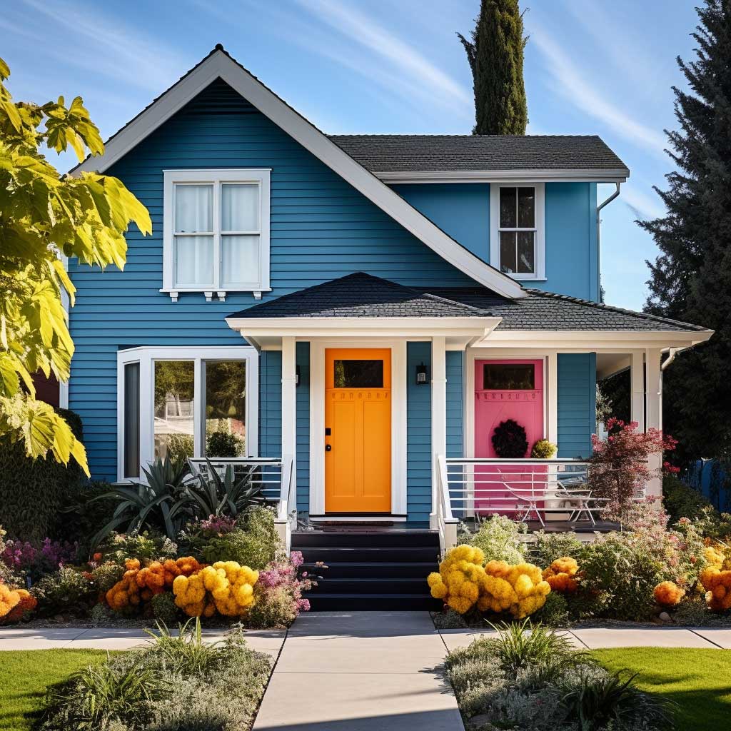


Don’t do this: Don’t pick your accent colour from a 2-inch paint chip under store lighting. Bold colours like teal, red, and navy shift noticeably under direct sun versus shade — what reads as “sophisticated navy” indoors can look nearly black on a sunny south-facing wall. Always test a sample patch outside for at least 48 hours before committing.
Test bold colours under real outdoor light before buying gallons — the difference between a showroom swatch and a sun-soaked wall is bigger than most homeowners expect. Bright colours also tend to fade faster than neutrals, so budget for touch-ups on the door or trim roughly every couple of years if you go this route, even if the body colour holds steady for a decade.
Long-term cost matters here too. Vibrant pigments, particularly reds and deep blues, often require an extra coat for even saturation, which adds to material cost even though the door itself is a small surface. It’s a small trade-off for the visual payoff: a contrasting door is consistently the detail people mention first when they compliment a house.
Selecting the perfect simple house outside colour combination is a creative process that allows homeowners to express their style while enhancing the architectural beauty of their home. Whether you prefer classic tones like white and grey, warm earthy hues, or bold contrasting colors, the key is to choose a palette that resonates with your personal taste and complements the surroundings. A well-chosen color scheme not only elevates the look of your home but also contributes to its overall value and appeal.
| Scheme | Best For | Repaint Interval | Key Risk |
| White + Grey | Resale, traditional and modern builds | 5–10 years | White shows dirt fastest |
| Earth Tones | Wooded or rural lots | 3–7 years on wood siding | Dark shades absorb heat, fade unevenly |
| Bold Contrast | Homeowners wanting standout curb appeal | 2–3 years on accent door, 5–10 on body | Accent colour looks too dark or too bright in direct sun |
Exterior paint typically lasts four to fifteen years depending on climate and material, so whichever scheme you choose, plan your budget around your specific siding type rather than a generic average.
CURB APPEAL CHECKLIST
The right simple house outside colour combination is two colours, not three.
White and grey remains the safest resale choice and the easiest to maintain.
Earth tones need more upkeep on wood siding but blend best with greenery.
Save the boldest colour for one feature — usually the door — and keep everything else quiet. Save this post so you have it the next time you’re standing in the paint aisle.