Welcome to the transformative world of interior color balance. Designing a living space that feels simultaneously inviting and intensely sophisticated requires a delicate touch, particularly when navigating the intricate interplay between cool and warm hues. The combination of muted, shadowy blues and earthy, grounding neutrals offers a masterclass in this exact duality. These shades are far more than mere paint choices; they serve as the foundational elements that dictate the mood, energy, and perceived architectural scale of any room. By understanding how to weave these distinct tones together, you can transform ordinary rooms into breathtaking sanctuaries. This approach to interior styling prioritizes timeless elegance, moving beyond fleeting trends to establish a deeply rooted sense of comfort and elevated design.
Mastering Smoky Blue Greys In Modern Interiors
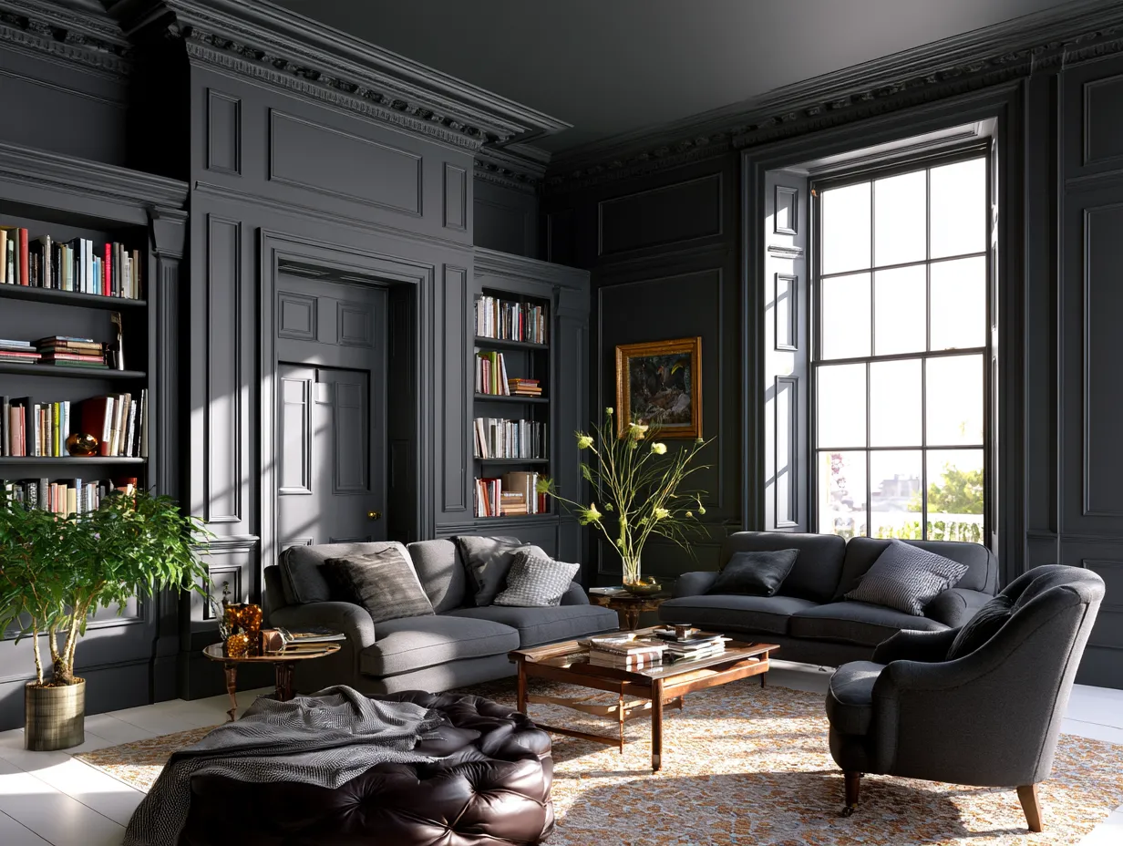
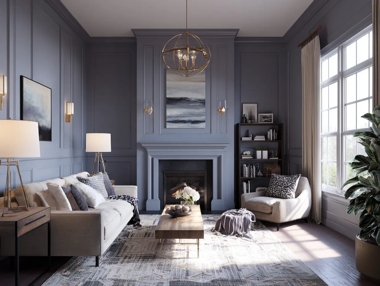
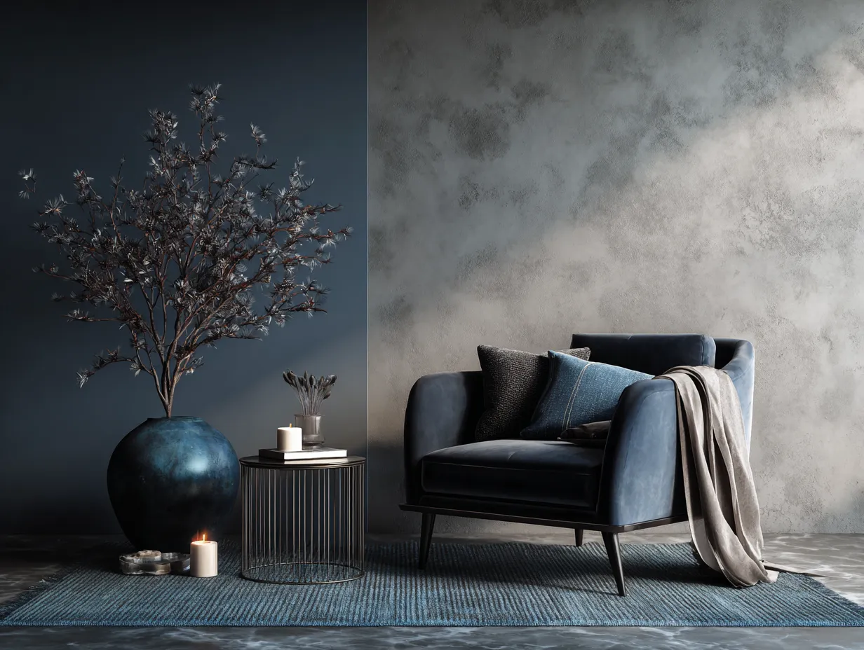
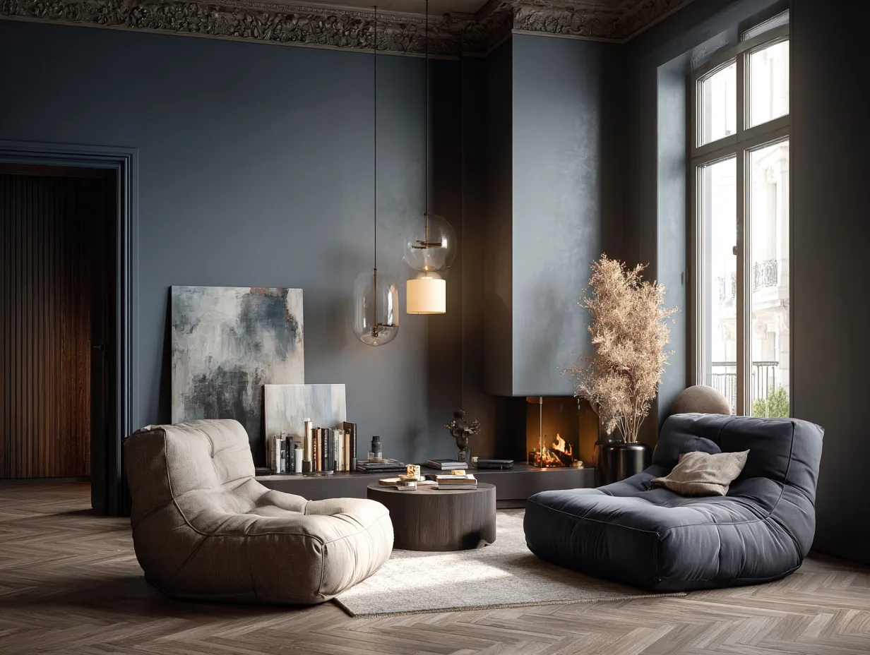
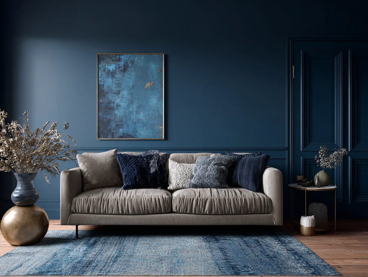
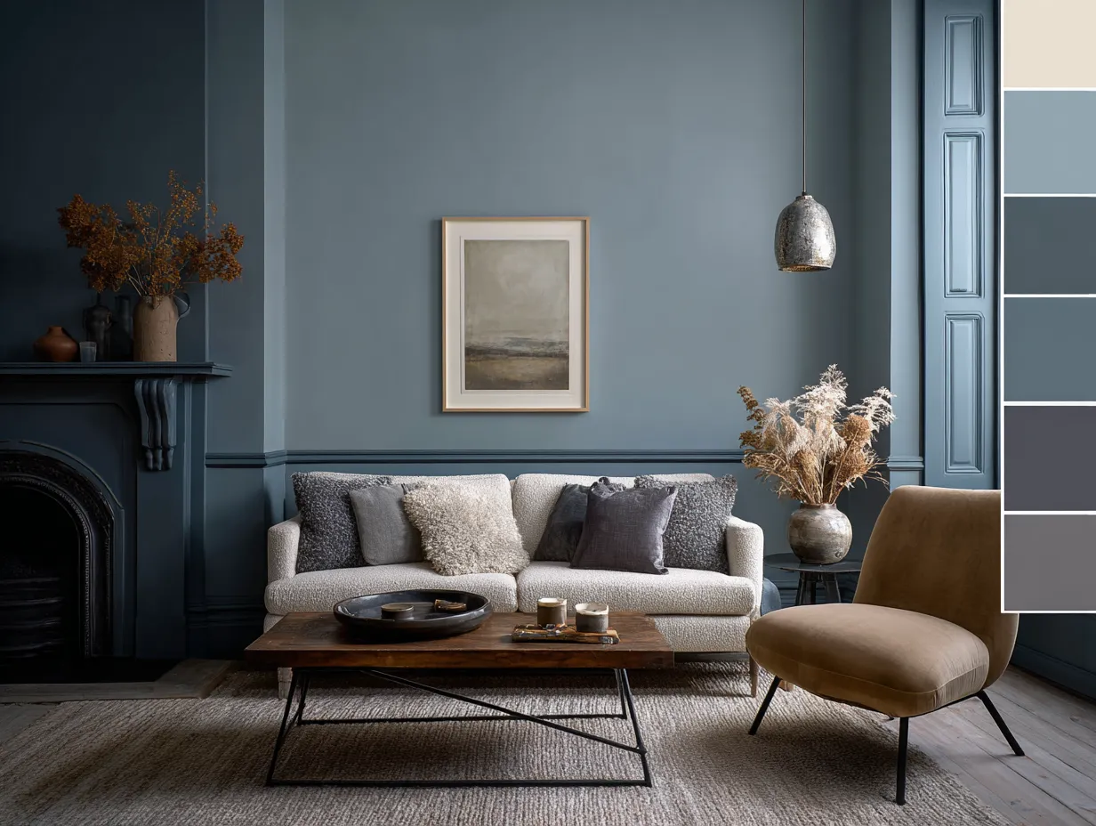
The journey to redefining your living space begins with understanding the profound psychological and visual impact of cool tones. Smoky blue greys possess an inherent sophistication that instantly elevates the perceived value and calm of a room. Unlike stark, primary blues which can feel overwhelming or juvenile, the addition of grey completely neutralizes the intensity, resulting in a mature, atmospheric shade that mimics the sky just before a heavy rain or the deep shadows of a mountain range at dusk. This specific color family is unparalleled in its ability to foster concentration, relaxation, and a sense of boundless space, making it a spectacular choice for a refined home aesthetic.
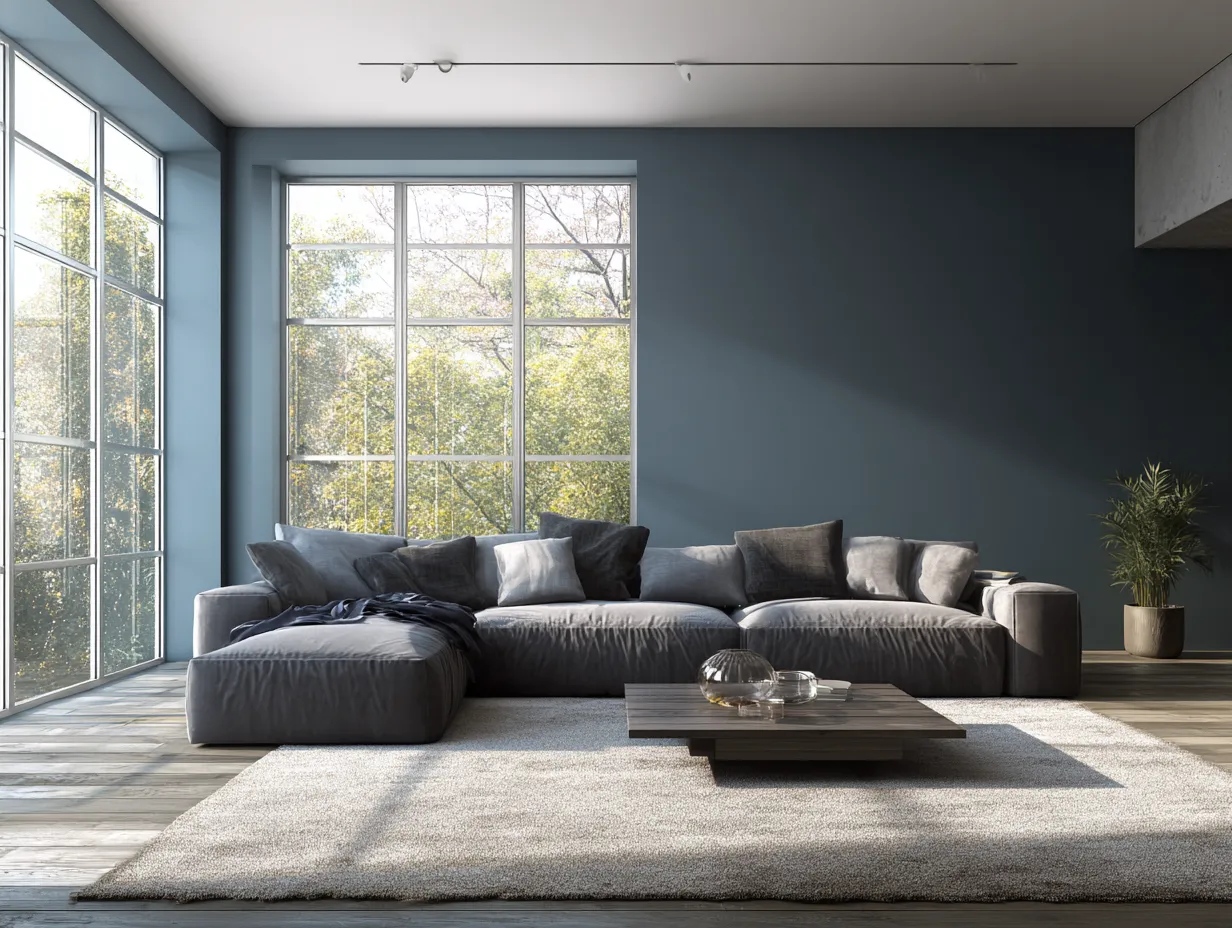
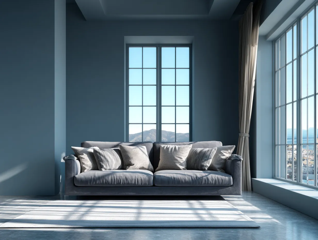
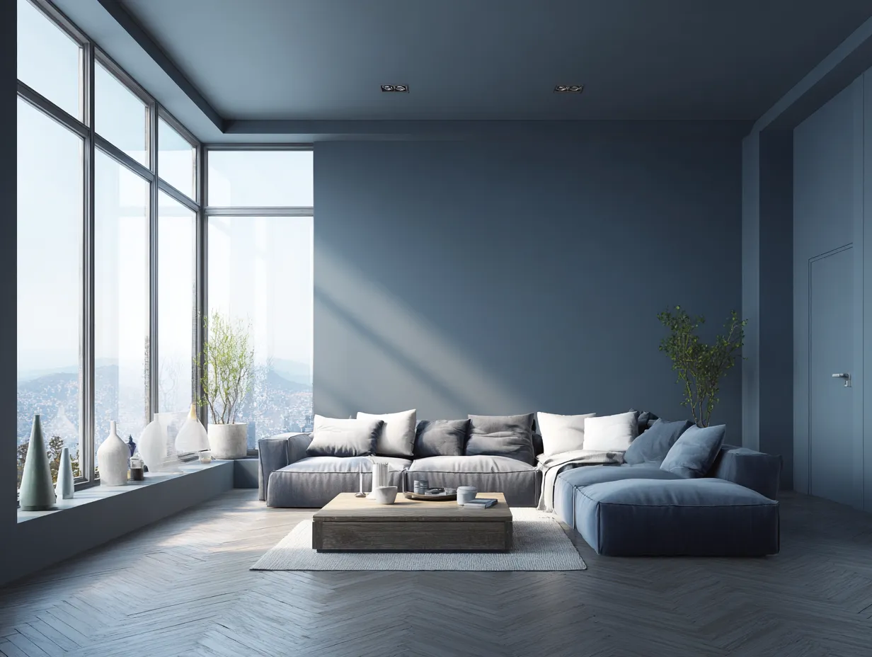
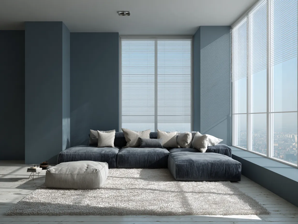
When applying smoky blue greys to your walls, the most critical factor to master is lighting. Natural light profoundly alters how this color reads throughout the day. In an east-facing room, the morning sun will draw out the cooler, crisper undertones, making the space feel energized and fresh. As the day progresses and the sun moves, the shadows will deepen the color, allowing the smoky, charcoal qualities to take center stage. For north-facing rooms, which naturally receive cooler, indirect light, this shade can lean heavily into its grey roots. To prevent the space from feeling cavernous, it is essential to utilize bright, high-contrast white trim and deeply reflective surfaces, such as large mirrors or polished glass tables, which bounce available light back into the environment.
Artificial lighting also plays a pivotal role in showcasing this color. Selecting the correct lightbulb temperature is essential. Bulbs with a color temperature around 3000 Kelvin offer a neutral, slightly warm glow that perfectly complements the cool walls without turning them muddy or green. Installing layered lighting—a combination of overhead fixtures, floor lamps, and wall sconces—allows you to manipulate the shadows and highlights across the walls, bringing the subtle nuances of the smoky blue greys to life.
Beyond standard flat wall applications, incorporating this shade into architectural details can yield breathtaking results. Imagine an entire library or home office enveloped in this color, with the wainscoting, crown molding, and built-in bookshelves painted in a high-gloss finish. The high-gloss sheen not only adds a layer of modern glamour but also reflects light beautifully, creating a dynamic, ever-changing surface. Alternatively, using a flat or matte finish on the walls provides a velvety, luxurious backdrop that makes artwork and furniture pop with incredible clarity.
When curating furniture to sit against this cool backdrop, contrast is your greatest ally. To maintain a modern edge, incorporate pieces with clean, sharp lines. Materials like polished chrome, transparent acrylic, and stark white marble stand out brilliantly against the dark, moody walls. However, the true magic happens when you begin to soften these hard edges. Introducing organic shapes, such as a curved sofa or an asymmetrical coffee table, introduces a necessary fluidity. The smoky blue greys act as a vast, quiet canvas, ensuring that the architectural lines of your furniture are the true focal points of the room. By meticulously controlling the lighting, finishes, and contrasting elements, you establish a space that is deeply complex, visually arresting, and exceptionally calming.
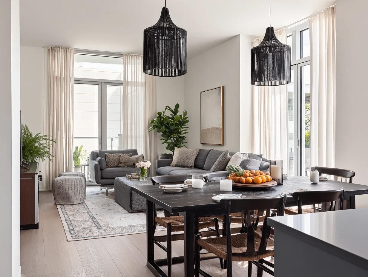
Bringing Warm Taupe Tones Into Your Living Space
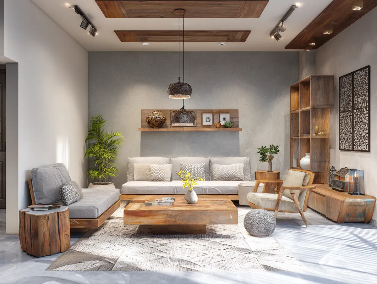
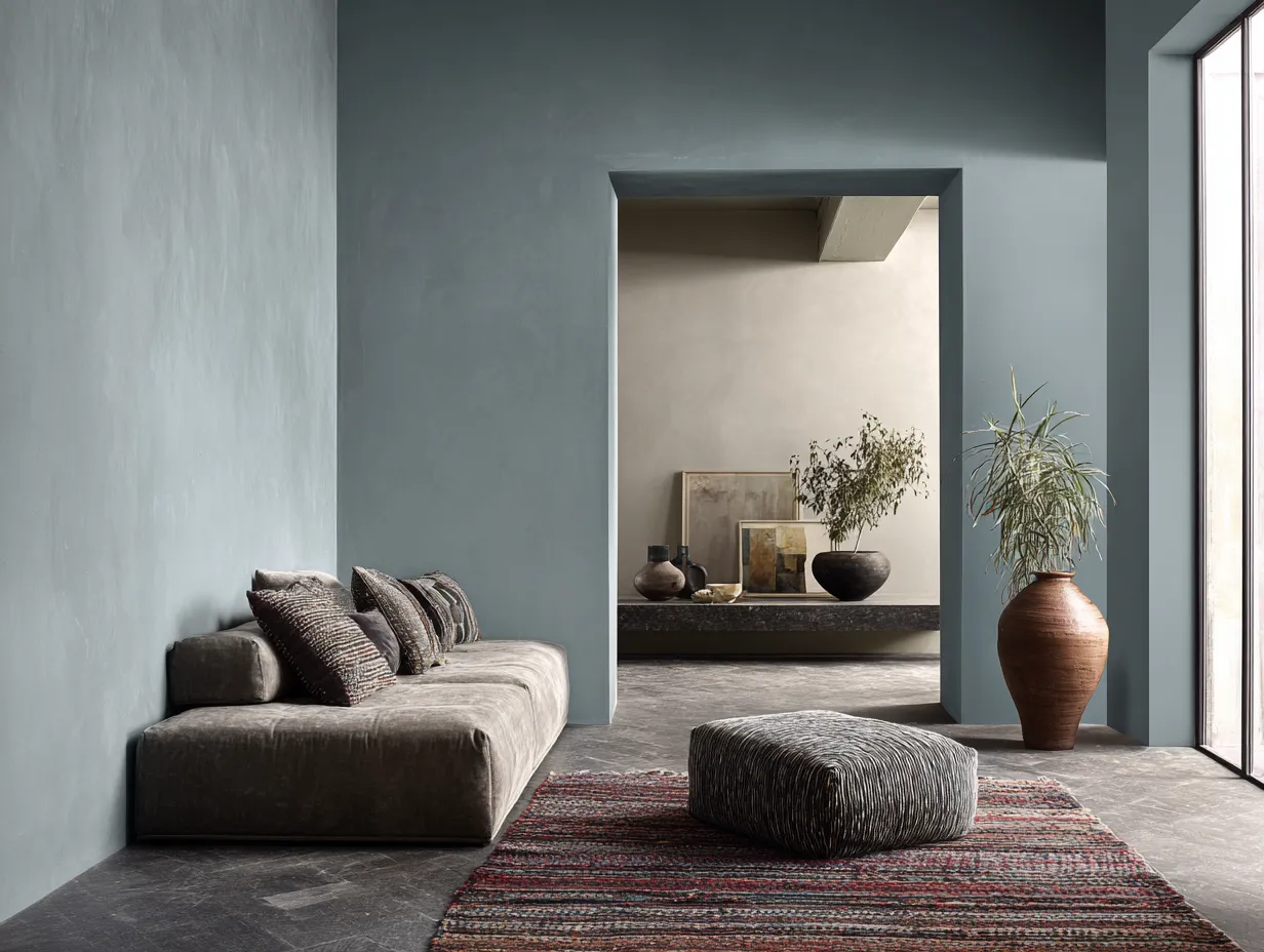
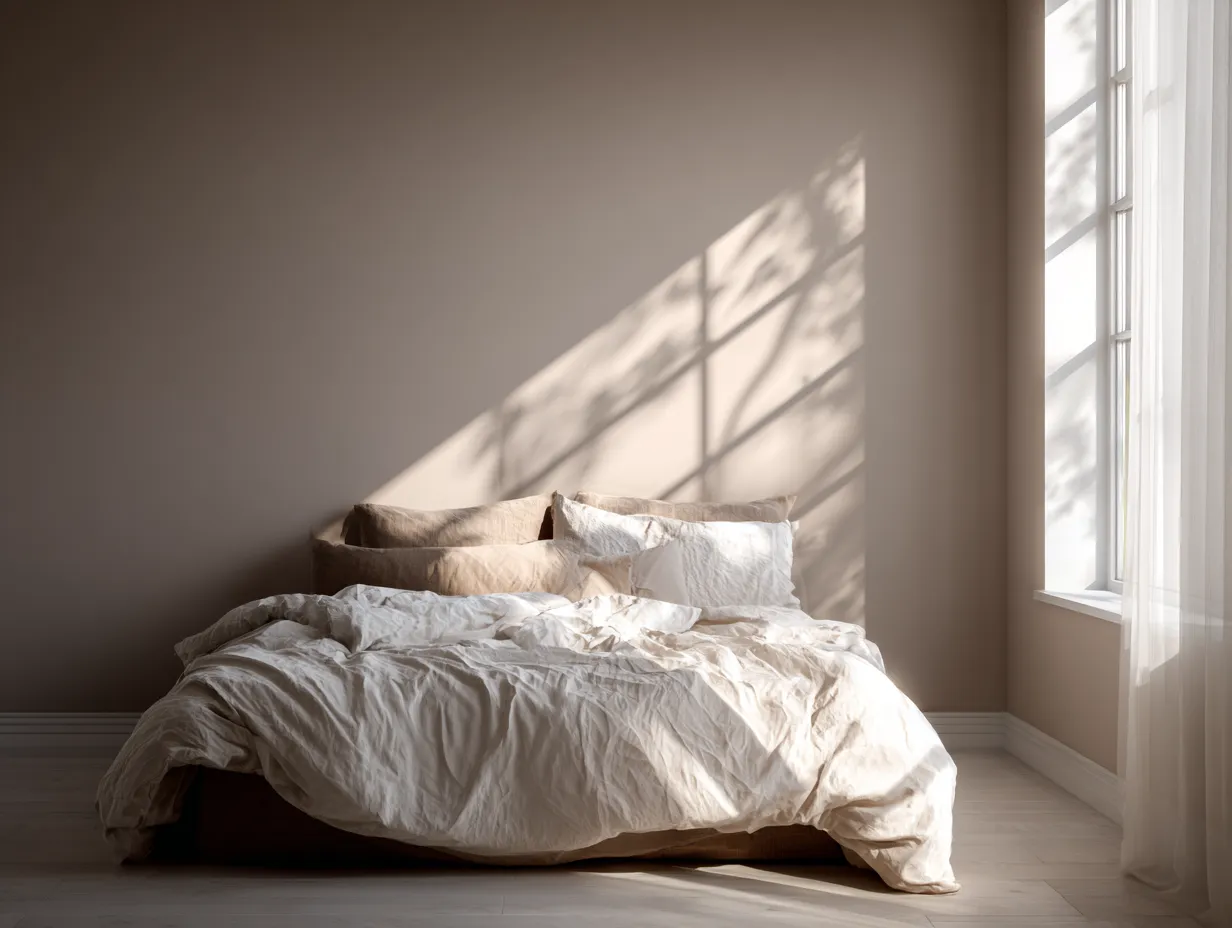
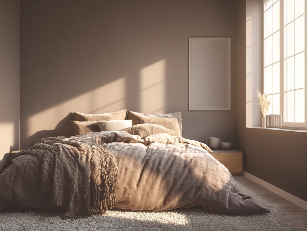
If cool tones provide the atmosphere, earthy neutrals provide the solid ground beneath your feet. Warm taupe is an incredibly versatile and complex color that occupies the sweet spot between grey and brown. It lacks the starkness of a pure, cool grey and avoids the heavy, sometimes dated feel of a dark brown. Instead, it offers a deeply comforting, organic presence that wraps a room in an embrace of subtle warmth. Integrating warm taupe into your living space is about creating a tactile, inviting environment where every surface begs to be touched and experienced.
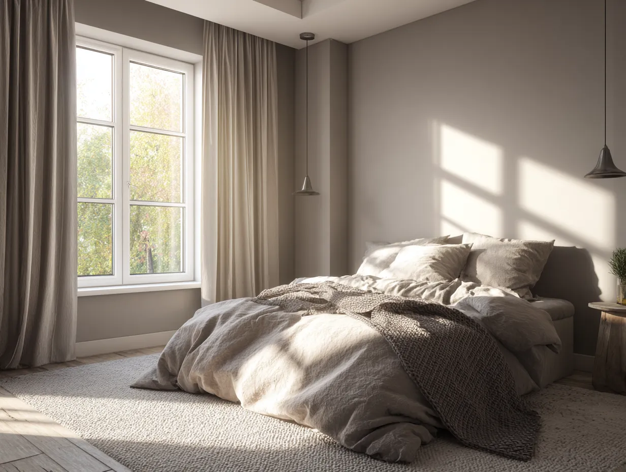
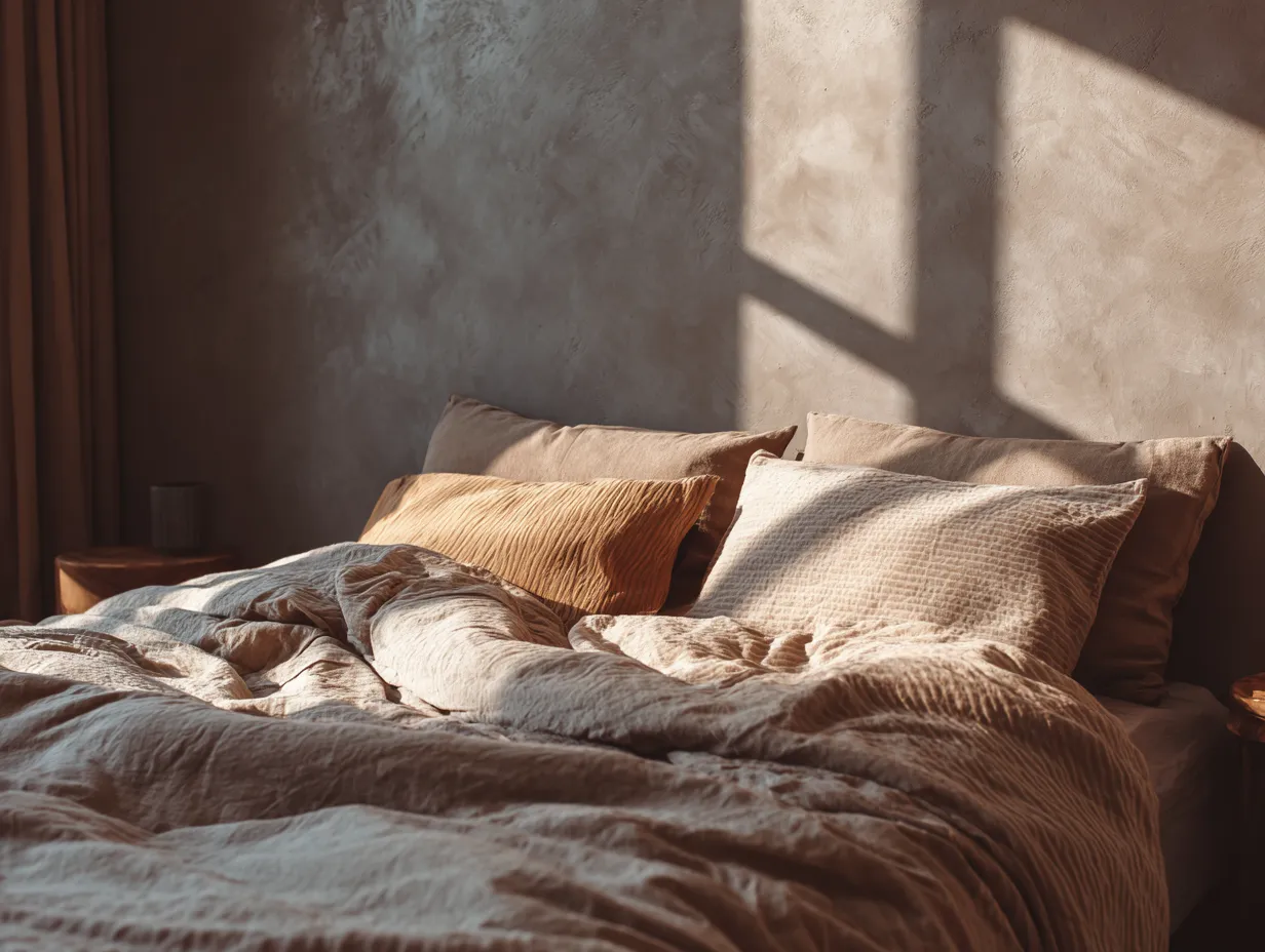
The true strength of warm taupe lies in its multifaceted undertones. Depending on the specific shade you select, taupe can exhibit subtle hints of pink, violet, or green. Understanding these undertones is crucial for achieving a cohesive home aesthetic. A taupe with a slight pink undertone will cast a rosy, flattering glow across a room, making it an exceptional choice for bedrooms and intimate dining areas. Conversely, a taupe with a green undertone feels inherently more connected to nature, working beautifully in sunrooms or spaces with large windows that overlook foliage.
To maximize the impact of this color, you must focus heavily on texture. Because warm taupe is a quiet, unassuming color, relying solely on flat surfaces can result in a space that feels lifeless or sterile. You must build depth through the layering of materials. Imagine a living room where the walls are painted in a flat taupe, the floors are covered in a chunky, woven sisal rug of a similar hue, and the sofa is upholstered in a rich, taupe velvet. The color remains consistent, but the varying textures—the roughness of the sisal, the smoothness of the paint, the plushness of the velvet—create a deeply layered, visually intriguing environment.
This monochromatic, textural approach is particularly effective in spaces designed for rest and rejuvenation. In a bedroom, layering different shades and textures of taupe linens, wool throw blankets, and upholstered headboards creates a cocoon-like effect. It is an exercise in restraint that yields an incredibly luxurious result. Furthermore, warm taupe serves as the perfect bridge between different styles of wood. Whether your home features pale oak flooring, rich walnut cabinetry, or reclaimed barn wood accents, taupe possesses the unique ability to complement them all, tying disparate wooden elements together into a unified design scheme.
When applying this color to hard surfaces, the results are equally stunning. Kitchen cabinetry painted in warm taupe has surged in popularity as a softer, more inviting alternative to stark white or severe black. Paired with unlacquered brass hardware, which develops a beautiful patina over time, taupe cabinets bring a sense of historic charm and lived-in warmth to the heart of the home. Even natural stone choices, such as travertine or certain varieties of marble with earthy veining, can reinforce this color story. By deeply committing to the nuances of taupe and prioritizing tactile materials, you construct a space that feels effortlessly grounded, welcoming, and profoundly elegant.
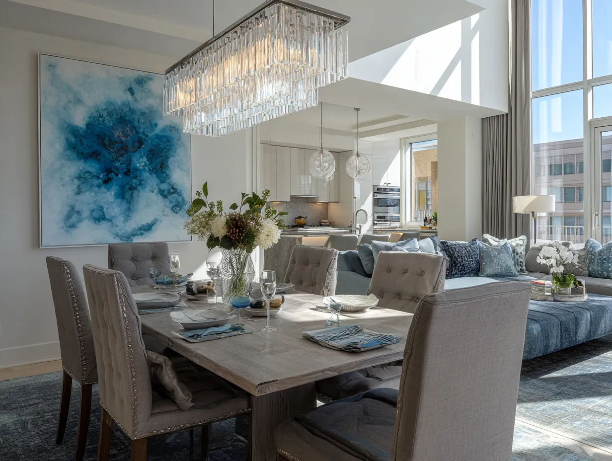
Harmonizing Blue Grey And Taupe For A Perfect Home Aesthetic
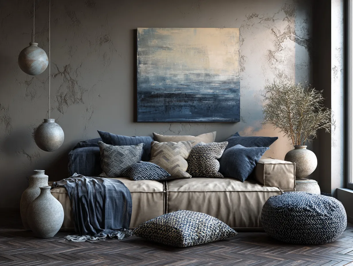
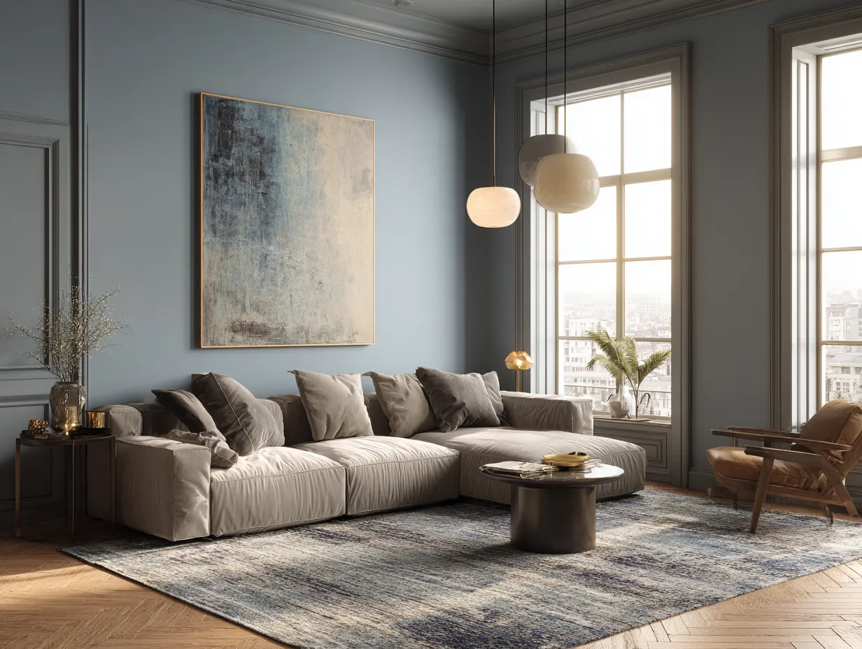
The pinnacle of interior styling is achieved not by using a single color effectively, but by orchestrating a dialogue between opposing forces. The marriage of smoky blue greys and warm taupe represents a perfect balance of yin and yang within a space. The cool, expansive nature of the blue is tethered and grounded by the earthy, intimate warmth of the taupe. Mastering this combination requires an understanding of proportion, transitional elements, and the deliberate placement of contrasting accents to ensure neither color overpowers the other.
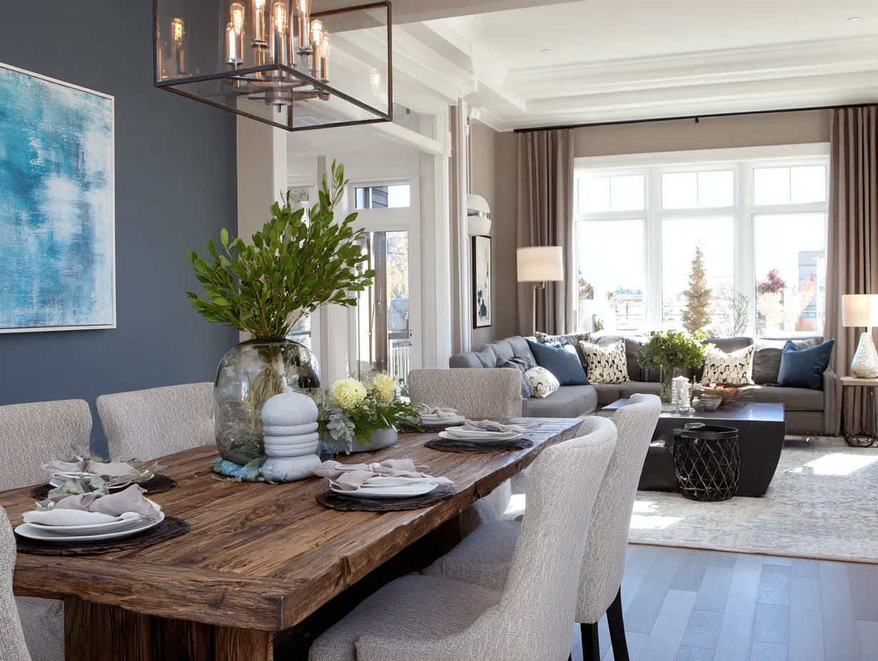
A highly effective method for balancing these two dominant forces is the implementation of the sixty thirty ten rule. In this context, you might choose warm taupe as your dominant color, utilizing it on the walls and large upholstery pieces, accounting for roughly sixty percent of the visual space. Smoky blue greys would then serve as the secondary color, making up thirty percent of the room through elements like large area rugs, heavy window treatments, or painted accent furniture. The final ten percent should be reserved for a completely different accent—perhaps a metallic finish, a pop of bright white, or a deep, rich black to provide visual punctuation and keep the eye moving around the room.
The transition between these two colors must be handled with care to prevent the space from feeling disjointed. This is where patterned textiles and artwork become invaluable tools. A large, abstract canvas that incorporates both smoky blue greys and warm taupe physically bridges the gap between the two palettes, explaining to the viewer’s eye exactly why these colors belong together. Similarly, a beautifully woven patterned rug featuring both shades acts as a unifying anchor for the furniture arrangement. These transitional pieces serve as the visual glue that binds the cool and warm elements into a single, cohesive statement.
Metals and hardware also play a crucial role in harmonizing this palette. Because you are mixing cool and warm wall and furniture tones, you have the freedom to mix metal finishes as well. Polished nickel or chrome will highlight the crispness of the blue-grey, while aged brass or rubbed bronze will draw out the rich undertones of the taupe. Using a combination of these metals throughout the space—for example, brass cabinet hardware paired with a polished nickel faucet—reinforces the duality of the room’s color scheme and adds a layer of curated sophistication.
Furthermore, this balanced palette allows for seamless seasonal transitions. During the colder months, you can enhance the cozy factor by introducing more warm taupe elements, such as heavy knit throw blankets and amber-toned ambient lighting. When the weather warms up, swapping those out for crisp, smoky blue grey linen pillows and silver decorative objects can instantly make the space feel breezier and lighter. By carefully managing proportions, utilizing transitional patterns, and thoughtfully mixing materials, the combination of these two distinct colors creates a dynamic, endlessly fascinating environment that represents the very best of modern interior design.
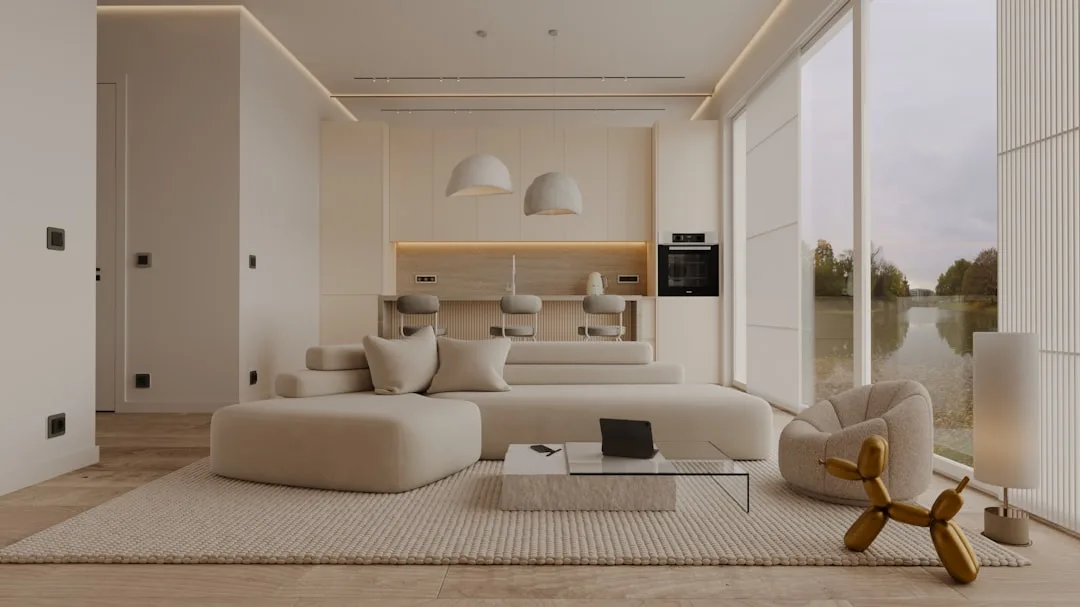
Embracing Your New Palette Stepping away from the safety of pure whites and standard builder greys opens up an entirely new dimension of interior styling. The deliberate combination of shadowy, atmospheric cools and earthy, grounding warms creates a tension that is deeply pleasing to the eye. This approach forces you to consider the tactile nature of your furnishings, the behavior of light within your walls, and the emotional resonance of your space. By carefully curating these elements, you craft a living environment that is not only visually stunning but also uniquely tailored to foster relaxation, inspiration, and everyday luxury.
Related Topics