The transformative power of interior design color themes is undeniable in crafting spaces that resonate with comfort, style, and personality. Selecting the right color palette for your home is more than just picking shades you love; it’s about creating an environment that reflects your identity and enhances your quality of life. This exploration into the world of color themes reveals how strategic choices can turn any home into a personal haven, imbuing each room with a unique atmosphere and emotional tone. From calming retreats to energizing spaces, discover how color themes can redefine the essence of your home.
Serene Sanctuary with Soft Blues and Greens
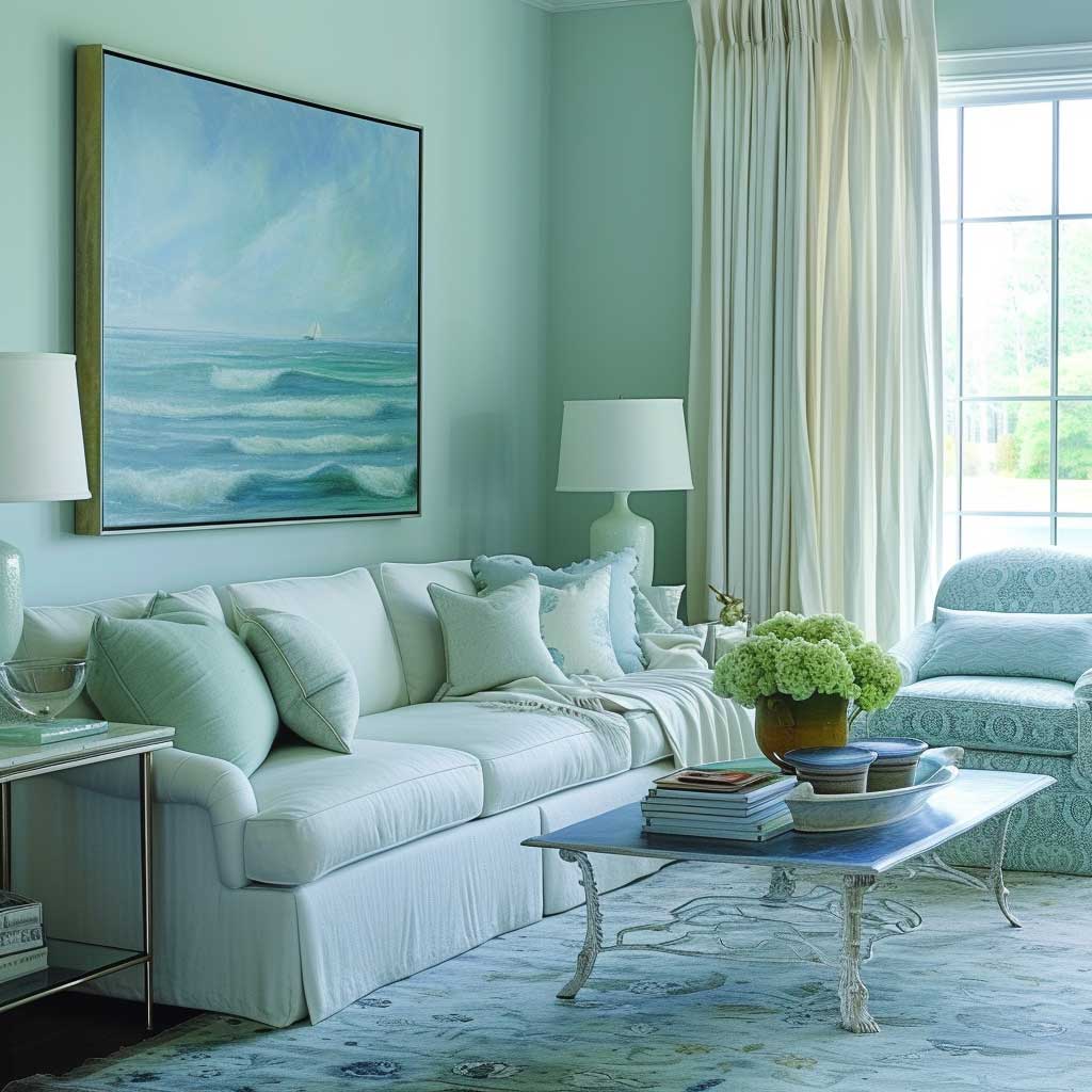
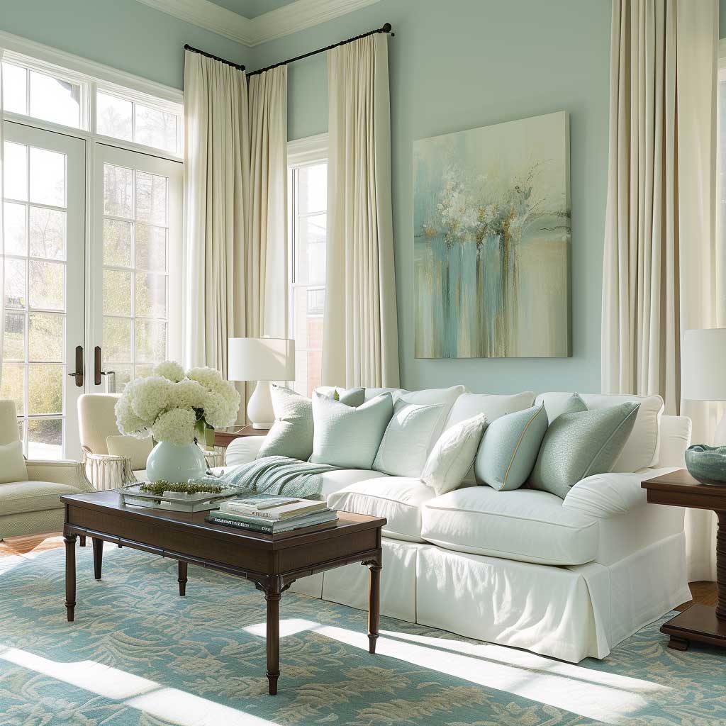
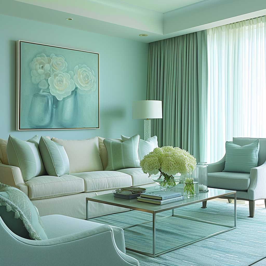
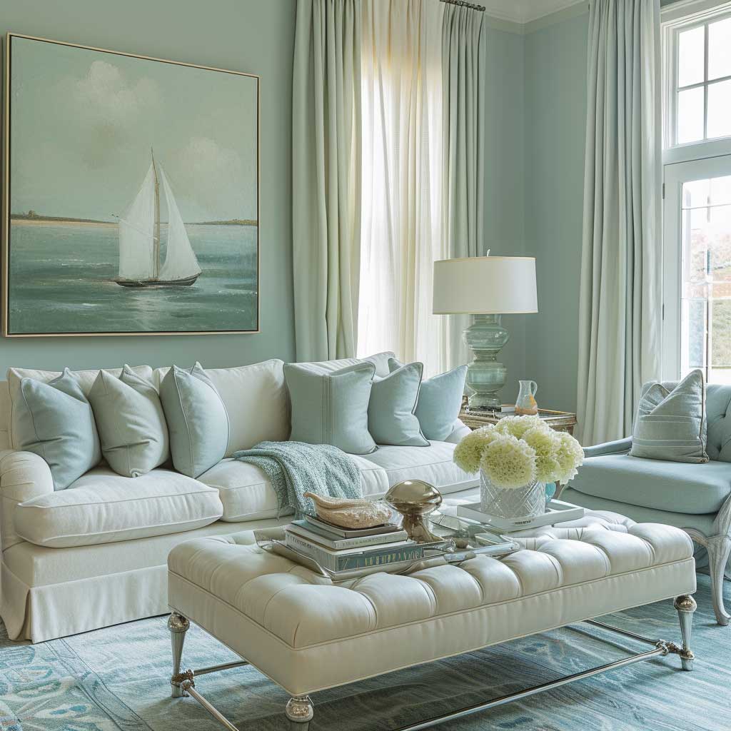
The influence of interior design color themes on the ambiance and mood of a room cannot be overstated. Among the myriad of palettes, the combination of soft blues and greens holds a special place for crafting serene sanctuaries within the home. This color scheme, inspired by the natural elements of sky and foliage, brings a calming and refreshing energy that is both uplifting and grounding. Implementing these hues into a living space invites tranquility, promoting a sense of peace and well-being that is essential in today’s fast-paced world.
Soft blues are reminiscent of the clear sky on a sunny day or the gentle waves of a tranquil sea. In interior design, this color evokes a sense of spaciousness and serenity, making it ideal for areas where relaxation is paramount, such as living rooms and bedrooms. When walls are painted in soft blue, the room becomes a reflective space, encouraging calm and thoughtful moments. The color’s cooling effect also helps in reducing stress levels, making it a perfect backdrop for unwinding after a long day.
Complementing soft blues, green hues draw inspiration from nature’s verdant landscapes, bringing the outdoors inside. Greens are associated with renewal, balance, and harmony. Integrating soft greens into a living area enhances the room’s natural connection, fostering a nurturing environment that soothes the mind and revitalizes the spirit. Whether through wall color, furniture, or accent pieces, greens can subtly energize a space without overwhelming the senses.
The harmonious blend of soft blues and greens in interior design fosters a seamless transition between the natural world and personal living spaces. This color theme not only appeals to the visual senses but also plays a crucial role in emotional well-being. The choice of soft, muted tones ensures that the space remains light and airy, allowing for a versatile backdrop that can be accentuated with textures and patterns to add depth and interest.

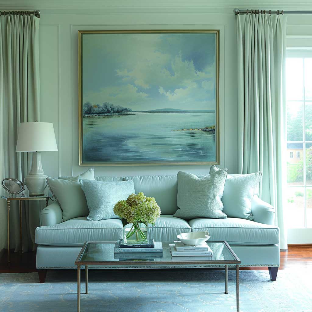
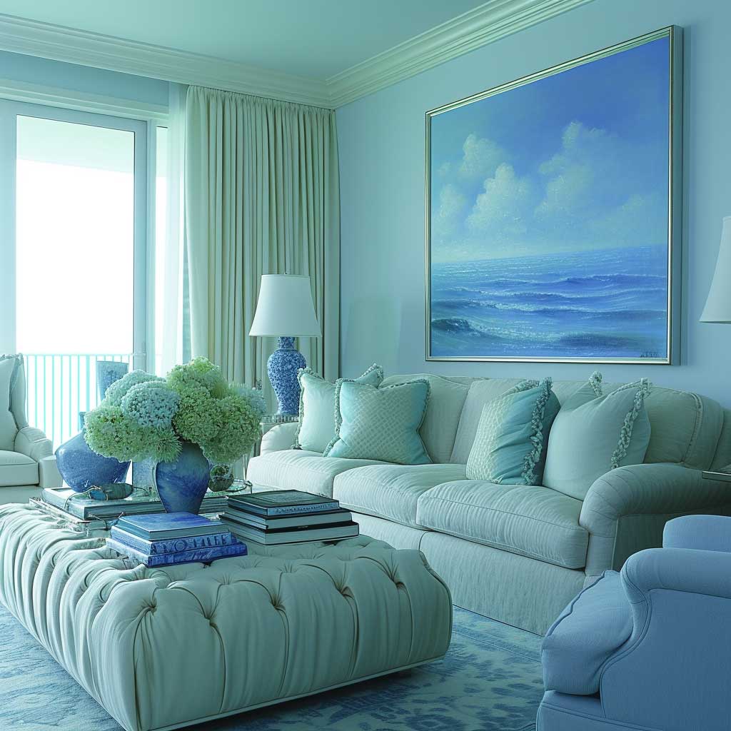
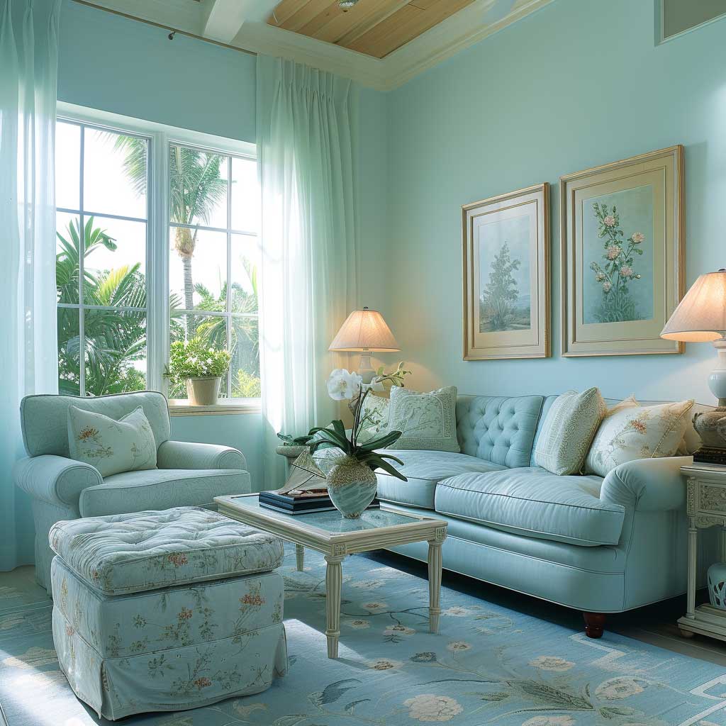
Furnishings in natural materials like wood, wicker, and linen complement the soft blue and green palette, enhancing the connection to nature. Textural contrasts, such as smooth ceramics or plush textiles, introduce tactile diversity, enriching the sensory experience of the room. By incorporating plants and botanical elements, the living space becomes a true sanctuary, alive with the energy of the natural world.
Lighting is another critical aspect that influences the impact of these colors. Natural light accentuates the freshness of blues and greens, while soft, warm artificial lighting can create a cozy and inviting atmosphere in the evenings. The interplay between light and color can dramatically transform the perception and mood of the space, making it feel more open and serene or intimate and comforting, depending on the time of day.
In conclusion, the interior design color themes of soft blues and greens have the power to transform a simple living area into a serene sanctuary. This palette encourages relaxation, reflection, and rejuvenation, making it ideal for creating spaces that serve as a peaceful retreat from the outside world. Through thoughtful application of these colors, complemented by natural materials, textures, and lighting, one can craft a home environment that is not only visually appealing but also emotionally supportive and calming.
Warm Embrace of Rustic Oranges and Browns
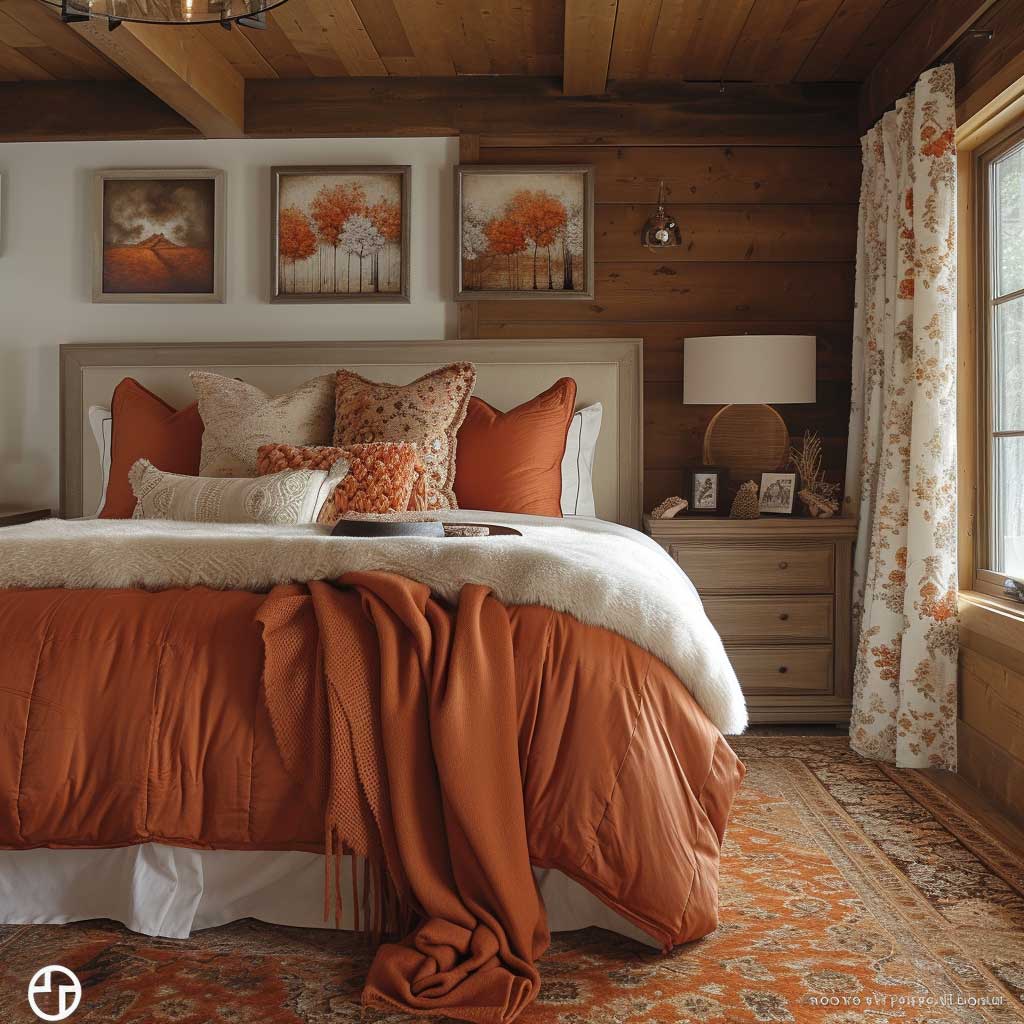
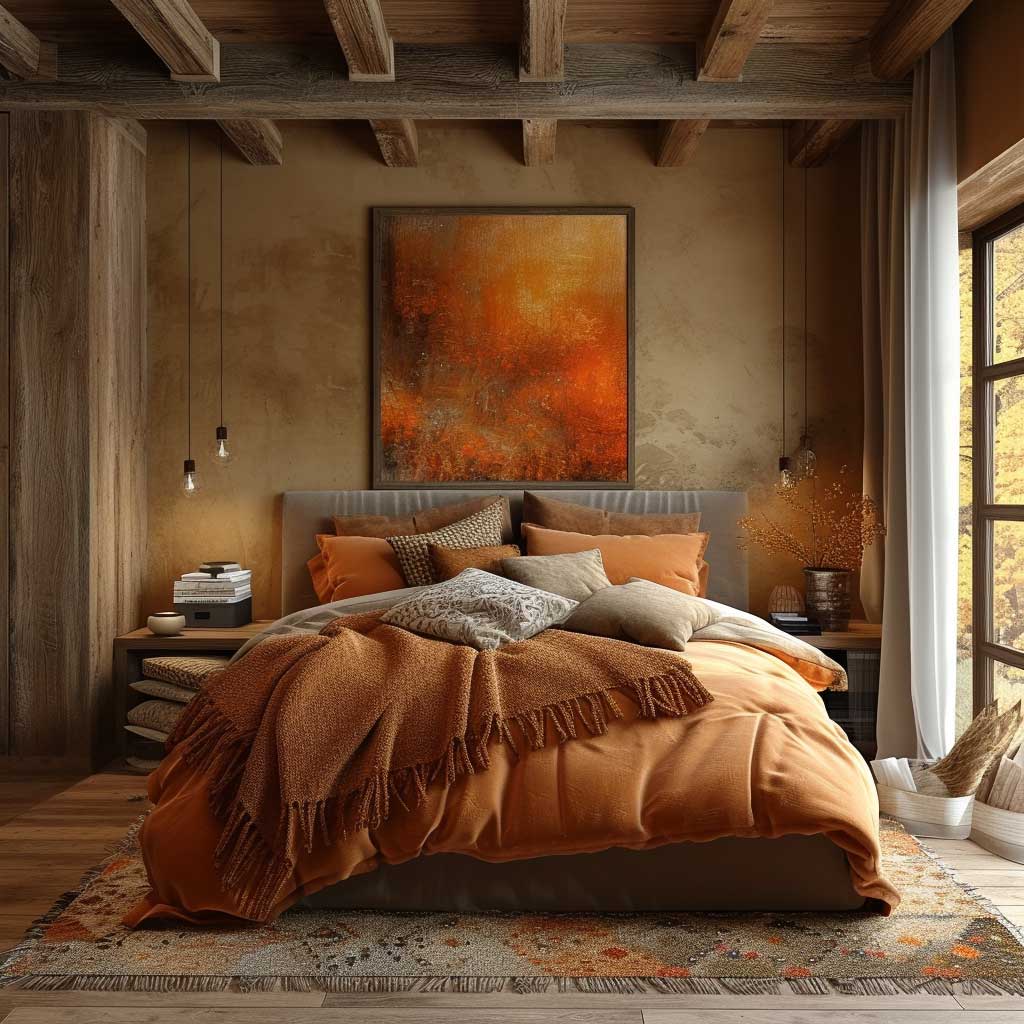
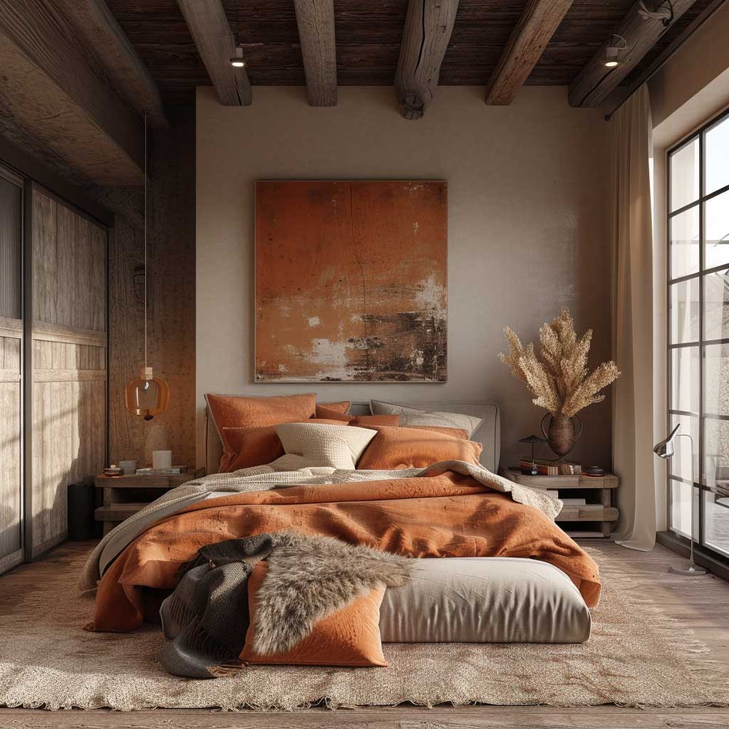
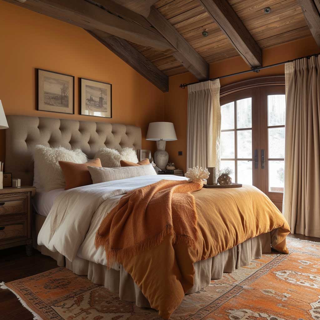
Exploring the warmth and comfort of rustic oranges and browns in interior design reveals a palette deeply rooted in the earth’s natural colors. This theme transcends mere aesthetic appeal, enveloping spaces in a warmth that is both inviting and reassuring. The use of rustic oranges and browns in a living area can transform it into a cozy retreat, reminiscent of autumnal landscapes and the rich, fertile earth. Through strategic application and thoughtful design, these colors can cultivate an environment that embodies warmth, stability, and a sense of welcome, essential for creating a homely sanctuary.
Rustic oranges are evocative of the changing leaves, harvest moons, and glowing sunsets. They inject a living space with a vibrant warmth, stimulating a sense of comfort and togetherness. In interior design, incorporating rustic orange through walls, textiles, or decorative accents can immediately uplift the room’s mood, making it feel more intimate and cozy. This color encourages lively conversations and gatherings, making it an excellent choice for communal areas like the living room or dining area.
Browns serve as the perfect complement to rustic oranges, grounding the energy of orange with their earthy, robust nature. Browns are associated with stability, reliability, and resilience, qualities that transform a house into a home. By integrating various shades of brown, from light beiges to deep chocolates, designers can add depth and dimension to a space. Furniture in rich brown leathers or wooden finishes enhances the rustic theme, fostering a connection with nature and simplicity.
The combination of rustic oranges and browns supports a variety of textures and materials, allowing for a rich sensory experience. Natural fabrics like wool, burlap, and linen can introduce a tactile diversity that invites touch and adds to the overall warmth of the room. Metal accents in copper or bronze not only complement the color scheme but also add a touch of rustic elegance, bridging the gap between traditional warmth and modern sophistication.
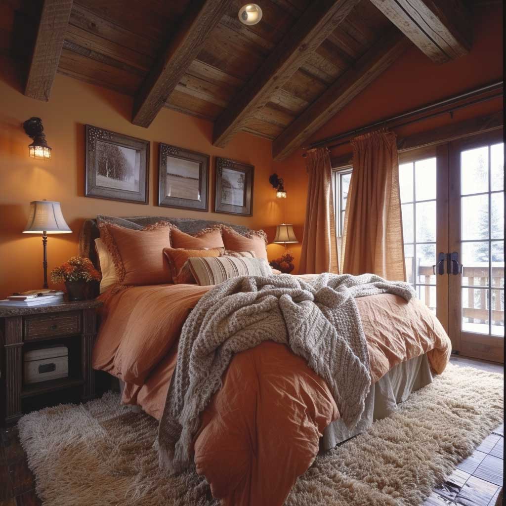
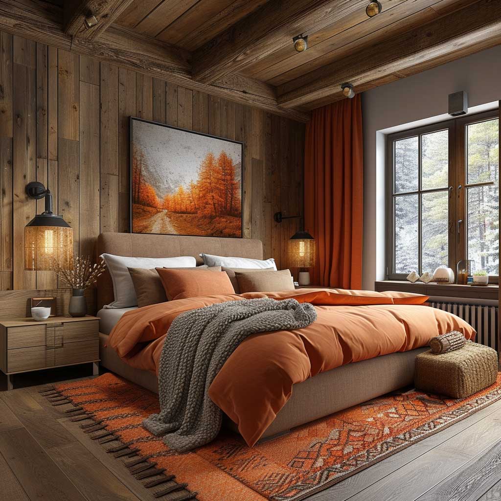
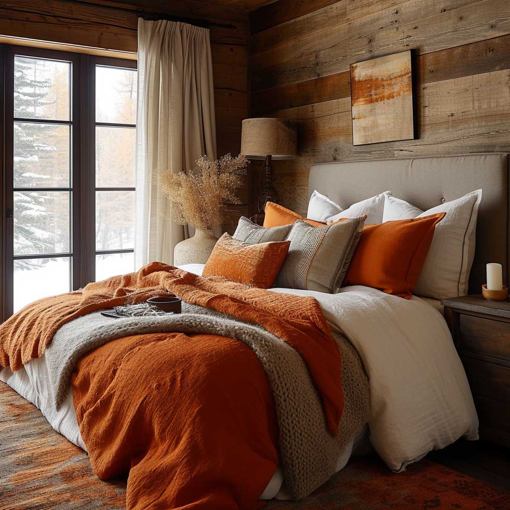
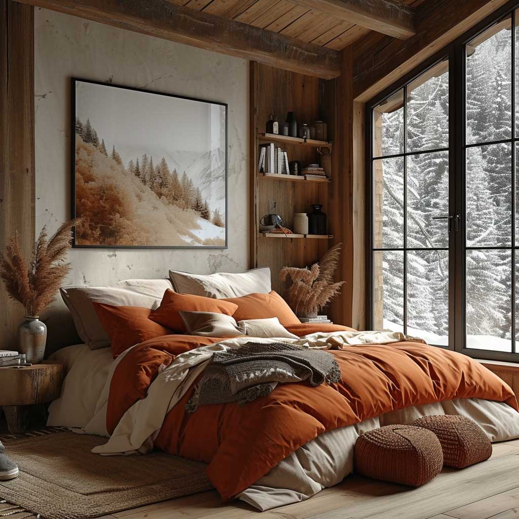
Lighting plays a crucial role in maximizing the cozy ambiance created by these colors. Warm enhances the richness of oranges and browns, casting a glow that mimics the comforting warmth of a fireplace. Incorporating layered lighting through lamps, sconces, and candles can create a soft, enveloping atmosphere that enhances the colors’ comforting qualities.
Incorporating rustic oranges and browns into a living space is not merely about embracing a color trend; it’s about crafting an environment that celebrates warmth, comfort, and the beauty of the natural world. This color theme offers a timeless appeal, creating spaces that are welcoming and comforting, making them ideal for relaxation and rejuvenation.
In conclusion, the interior design color themes of rustic oranges and browns have the unique ability to transform a space into a warm embrace. This palette, inspired by the earth and its changing seasons, invites residents and guests alike to relax and connect in a setting that feels both grounded and invigorated. Through the thoughtful integration of colors, textures, and lighting, one can create a living area that not only serves as a stylish space but also as a comforting haven, reflecting the warmth and richness of the natural world.
Energizing Vibrance of Bright Yellows and Reds
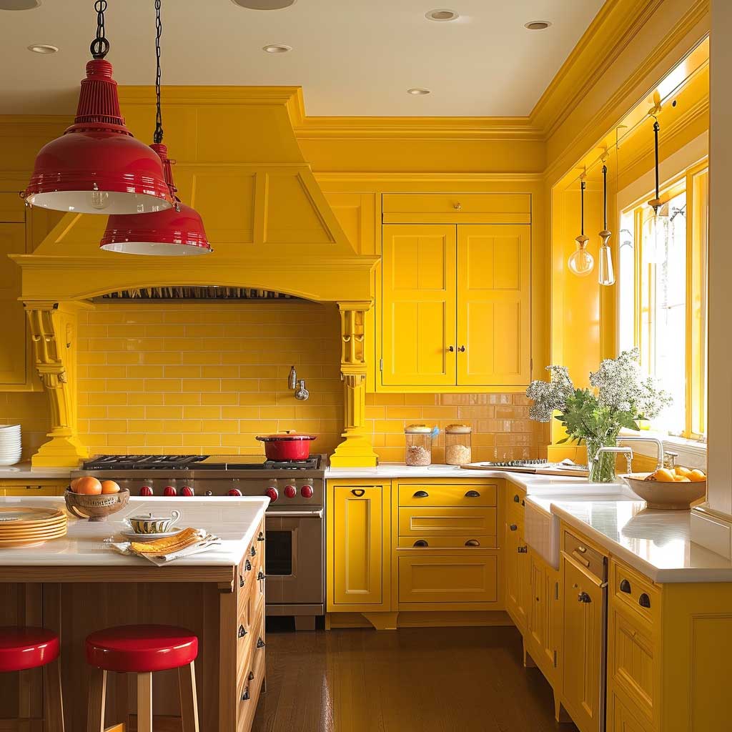
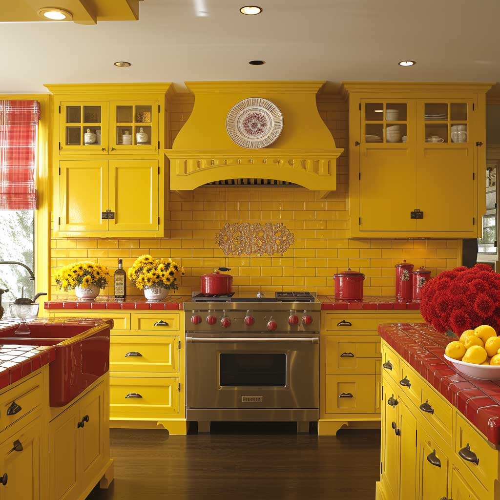
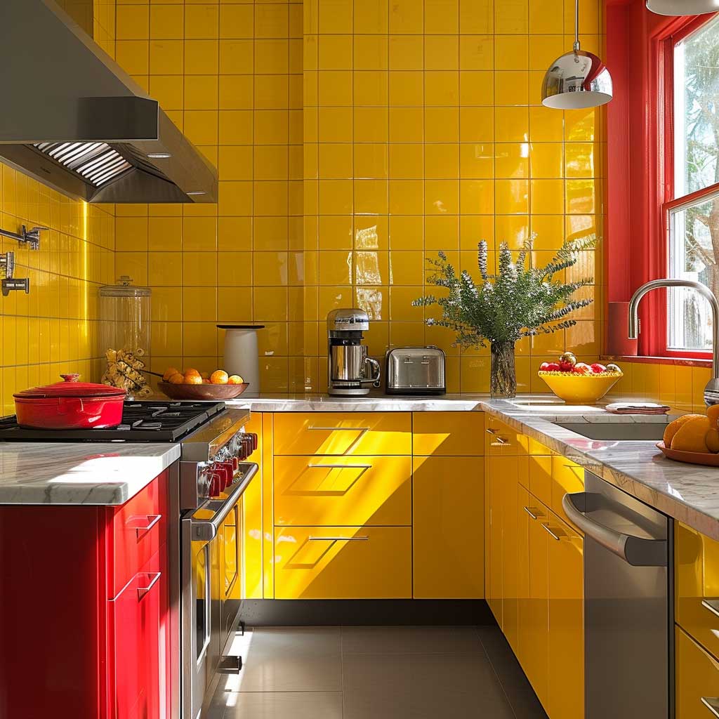
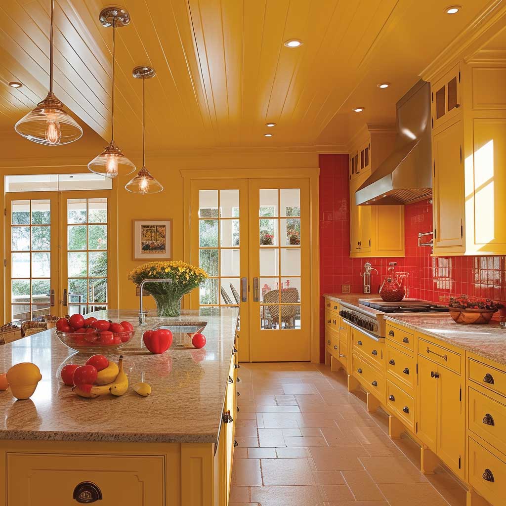
Diving into the world of interior design reveals the transformative power of vibrant color themes, especially when embracing the energizing vibrance of bright yellows and reds. This dynamic duo is not just about creating visual impact; it’s a deliberate choice to infuse living spaces with vitality, warmth, and a sense of joy. In the kitchen, where the heart of the home beats the strongest, incorporating bright yellows and reds can turn the space into a hub of creativity, energy, and warmth, making every moment spent there more lively and invigorating.
Bright yellows capture the essence of sunlight, bringing its cheerful and stimulating energy indoors. This color can instantly elevate moods, encourage communication, and stimulate mental clarity and creativity. Implementing yellow in a kitchen, be it through walls, cabinets, or accents, can make the space feel more open and welcoming. It’s as if the morning sunshine permeates the room, offering a continuous source of positivity and warmth, ideal for spaces where families gather and share.
Reds, with their deep connection to passion, appetite, and vitality, complement bright yellows by adding depth and intensity to the interior design. Red can evoke feelings of warmth and comfort, making it a perfect accent color in a kitchen where culinary exploration and the joy of cooking come to life. Whether it’s a bold red backsplash, vibrant chairs, or decorative accessories, the inclusion of red energizes the space, encouraging dynamism and creativity in culinary endeavors.
The combination of bright yellows and reds in interior design color themes is not just about aesthetics but also about creating an atmosphere that enhances the functionality and emotional experience of the space. This palette encourages a lively environment where cooking and dining become joyous activities rather than mundane tasks. The colors interact to stimulate the senses, enhancing flavors and fostering a deeper appreciation for the meals prepared and shared within the space.
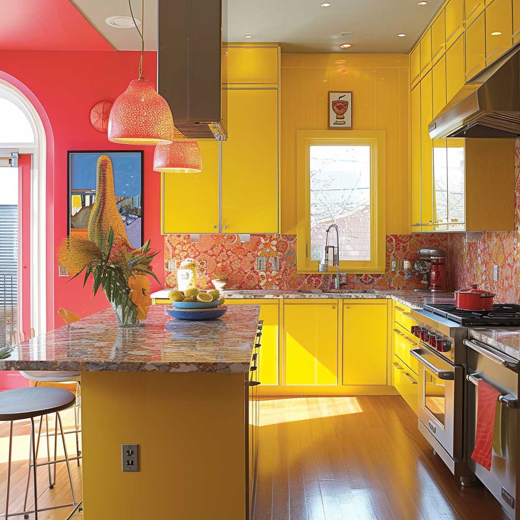

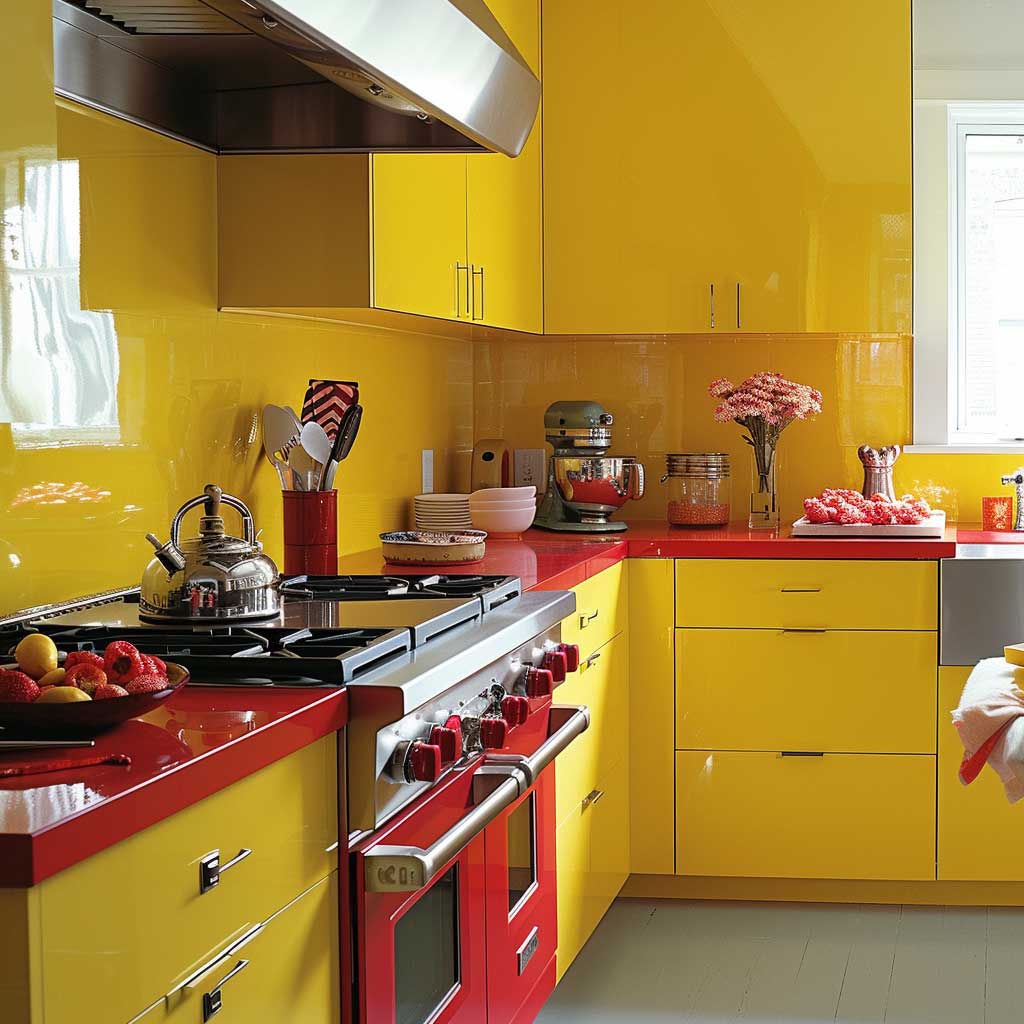
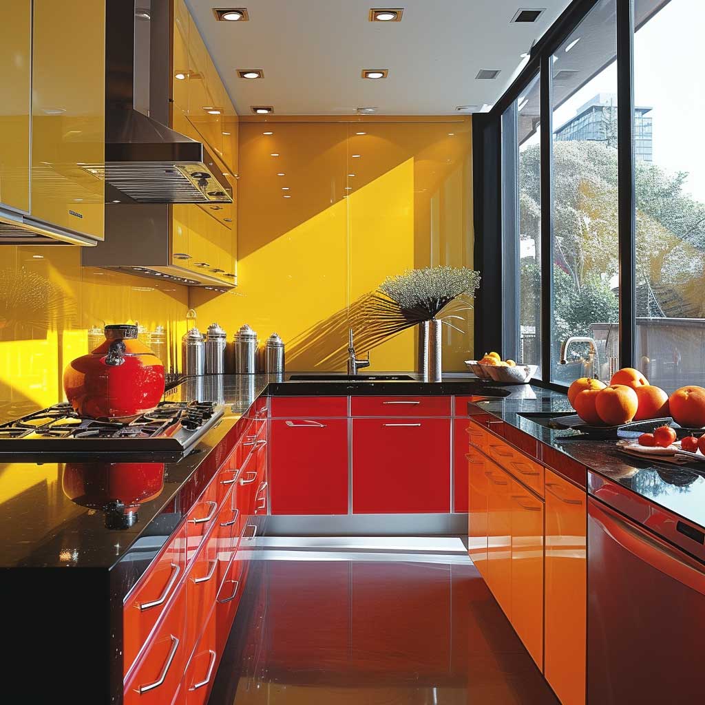
Incorporating these bold colors requires a careful balance to avoid overwhelming the senses. Utilizing neutral tones as a foundation or in larger furnishings can help ground the space, allowing the bright yellows and reds to stand out without dominating. Natural light plays a crucial role in how these colors are perceived, with ample sunlight enhancing their vibrancy and warmth, making the kitchen feel more alive and inviting.
Moreover, these colors can adapt to various design styles, from modern and sleek to rustic and cozy, proving their versatility. The key lies in the selection of materials and finishes that reflect the overall design vision, whether it’s glossy finishes for a contemporary look or matte textures for a more traditional feel.
In conclusion, the strategic use of bright yellows and reds within interior design color themes can transform a kitchen into a vibrant heart of the home. This energetic palette not only beautifies the space but also enhances the emotional and sensory experience of those who spend time in it. By embracing the stimulating warmth of these colors, homeowners can create a kitchen that is not only functional and beautiful but also a source of joy and inspiration, a true testament to the power of color in creating spaces that resonate with energy and life.
Elegant Sophistication in Monochrome Grays
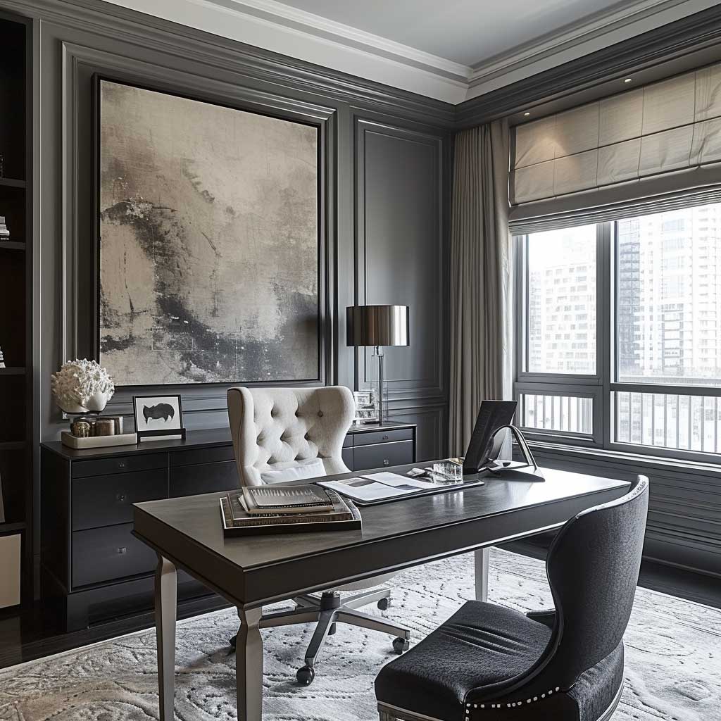
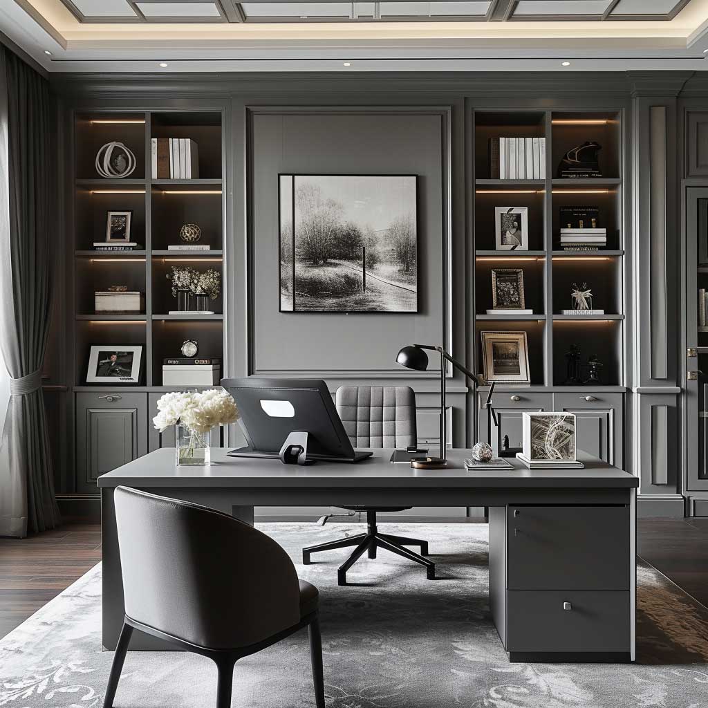
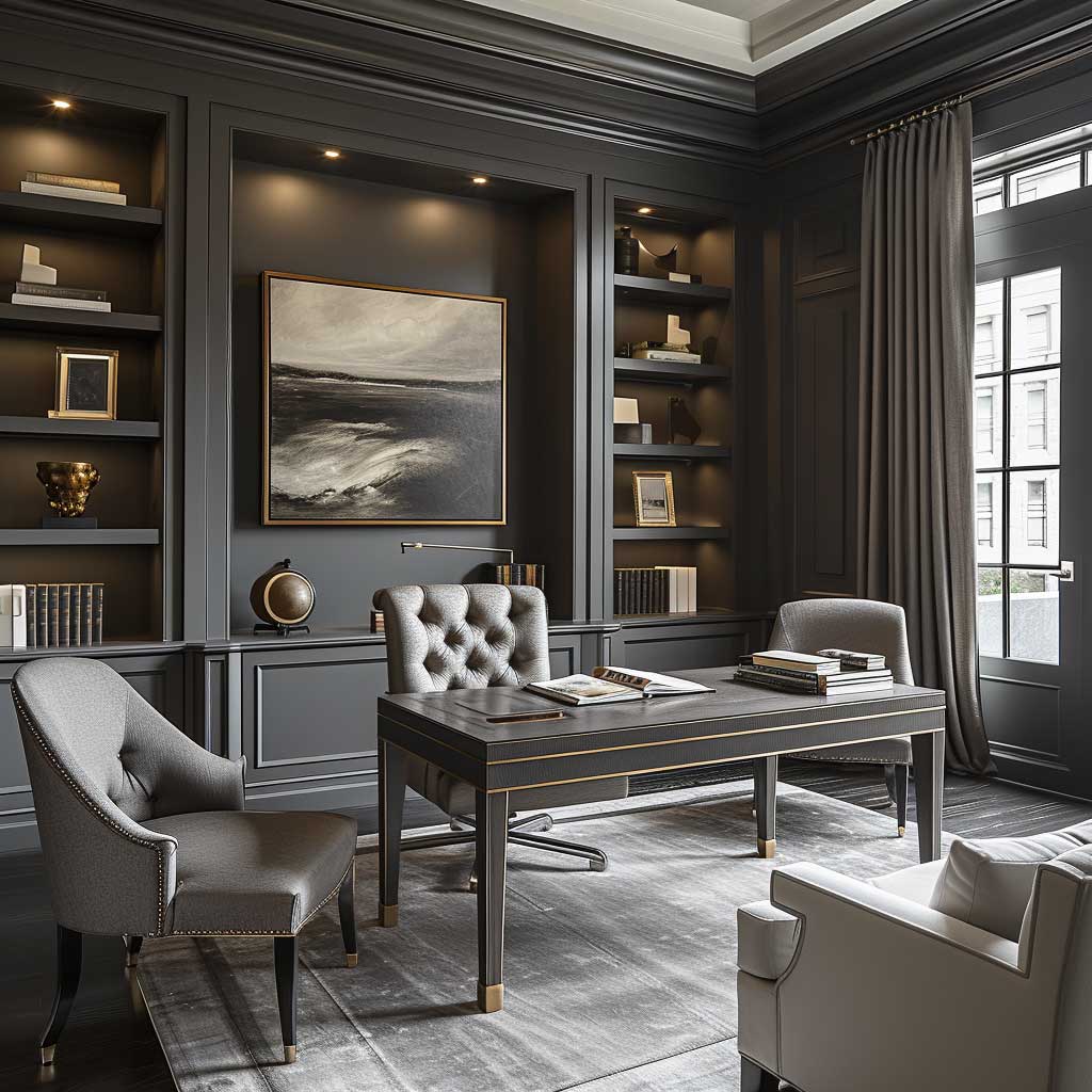
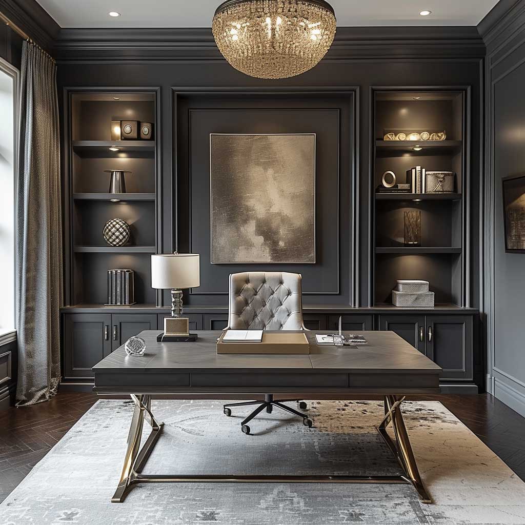
The allure of elegance and sophistication in home interiors often leads designers and homeowners alike to gravitate towards monochrome color schemes, particularly those centered around the timeless appeal of grays. The monochrome gray palette in interior design color themes represents more than a mere trend; it embodies a form of minimalist sophistication that can transform spaces into epitomes of modern elegance. When applied to a home office, this color scheme creates an environment that fosters focus, efficiency, and a professional yet stylish atmosphere.
Grays, with their wide spectrum from light misty tones to deep charcoals, offer a versatile foundation for creating a nuanced and sophisticated space. This color evokes a sense of balance and neutrality, making it an ideal backdrop for a home office where concentration and clarity are paramount. The monochrome approach allows for a seamless flow throughout the room, minimizing distractions and promoting a calm, focused mindset essential for productivity.
Incorporating different shades and textures within the gray palette can add depth and interest to the office without straying from the overall theme of understated elegance. Textured wall coverings, such as a soft gray suede or a patterned wallpaper, can introduce a tactile dimension that enriches the visual experience. Similarly, furnishings in various gray tones, from sleek charcoal desks to plush light gray chairs, enhance the monochrome aesthetic while providing functional comfort and style.
The beauty of a monochrome gray office lies in its ability to serve as a canvas for personal expression. Accents in metallic finishes like silver, chrome, or even gold can add a touch of luxury and sophistication, breaking the monochromatic scheme with subtle yet impactful highlights. Artwork, whether monochromatic or featuring sparse splashes of color, can serve as focal points, adding personality and inspiration to the workspace.
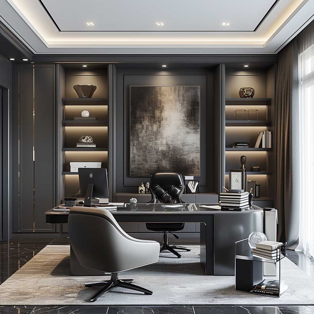
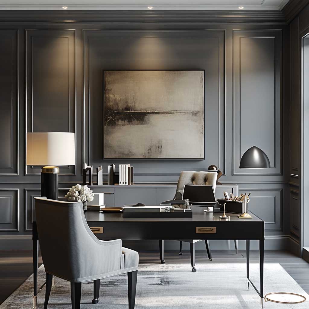
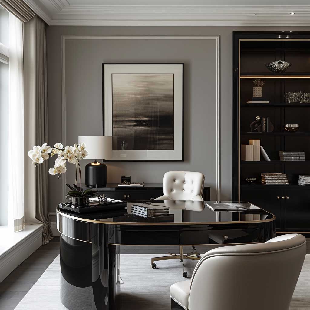
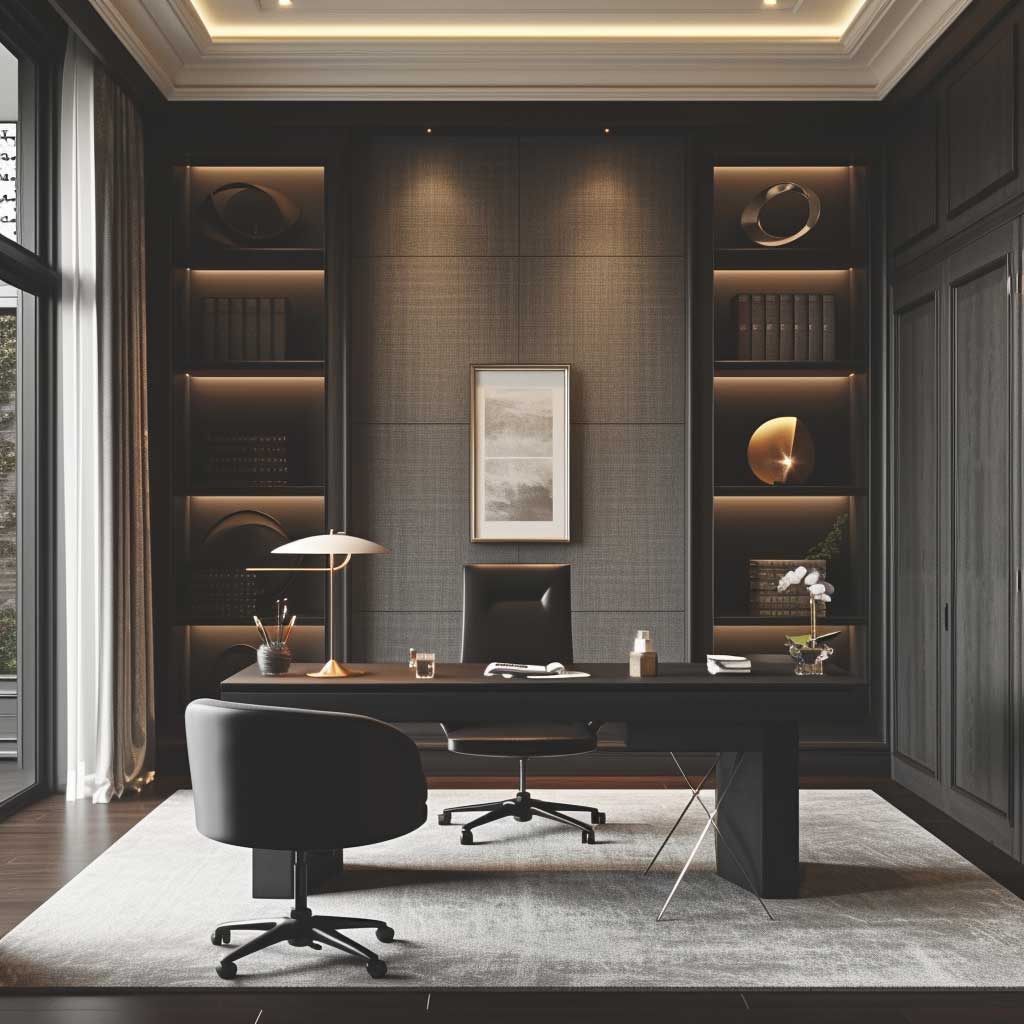
Lighting, both natural and artificial, plays a critical role in the ambiance of a monochrome gray home office. Ample natural light can make the space feel more open and airy, enhancing the various gray shades’ calming properties. Meanwhile, well-placed task lighting and ambient fixtures ensure that the room is functional at all times of the day, further supporting productivity and creativity.
The monochrome gray color theme in a home office offers more than just a stylish interior; it creates a serene environment conducive to thought and creativity. This palette’s strength lies in its simplicity and the sophisticated ambiance it evokes, making it a timeless choice for a workspace. By carefully selecting shades, textures, and accents, one can design a home office that is not only aesthetically pleasing but also a haven of efficiency and inspiration.
In conclusion, embracing a monochrome gray palette in interior design color themes for a home office can significantly transform the space into a sanctuary of modern sophistication and professionalism. This color scheme, with its inherent simplicity and elegance, provides the perfect backdrop for productivity and creativity, allowing individuals to work in an environment that is both stylish and conducive to their professional needs. Through the strategic use of shades, textures, and lighting, a monochrome gray office becomes a testament to the power of color in creating functional, beautiful, and timeless interior spaces.
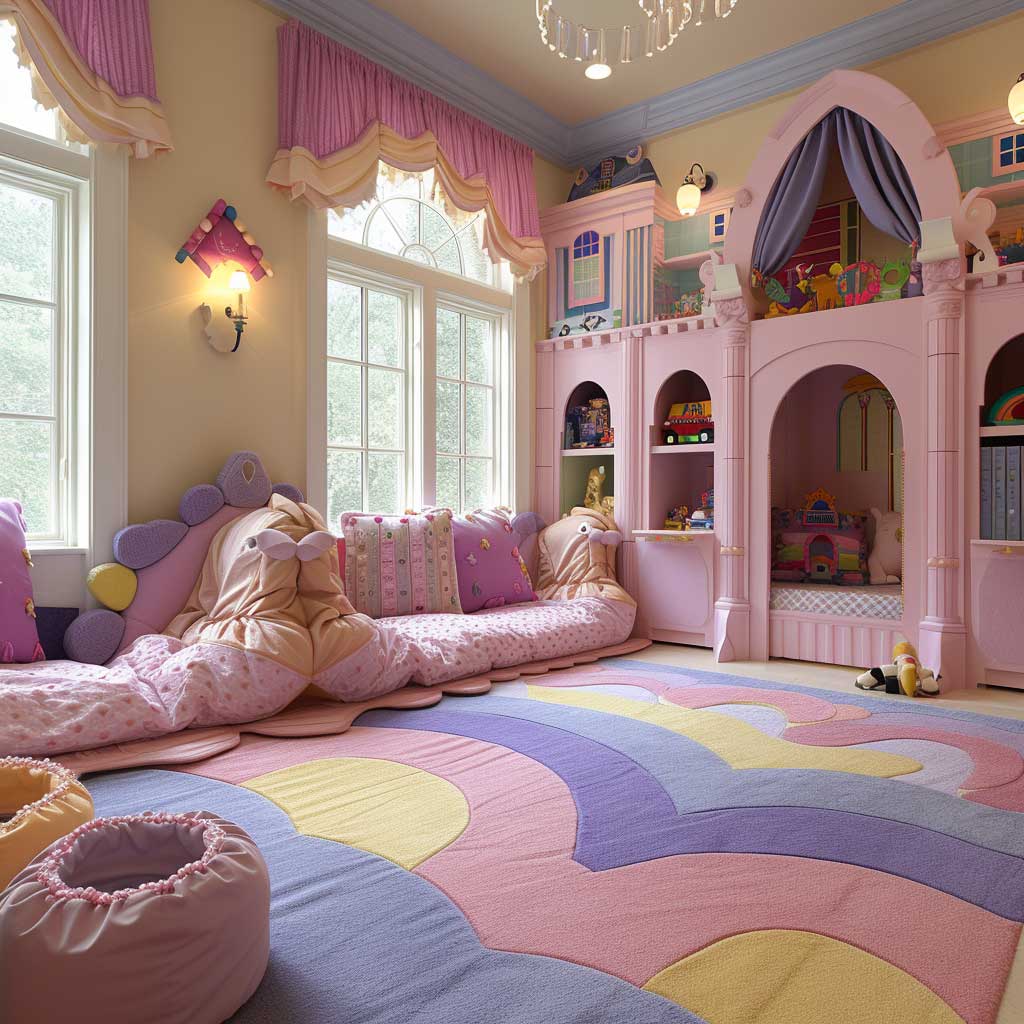
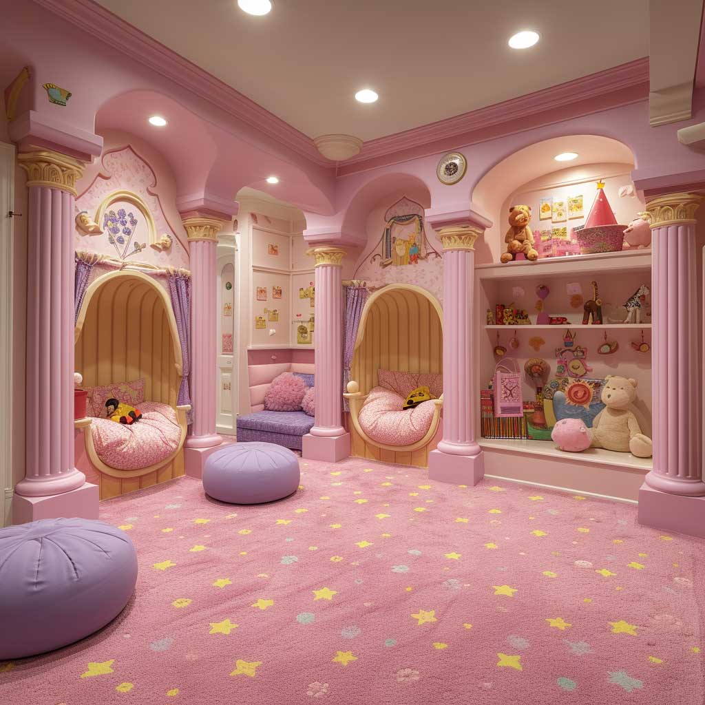
Playful Whimsy in Pastel Pinks and Purples
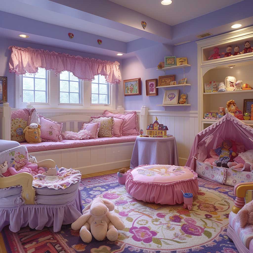
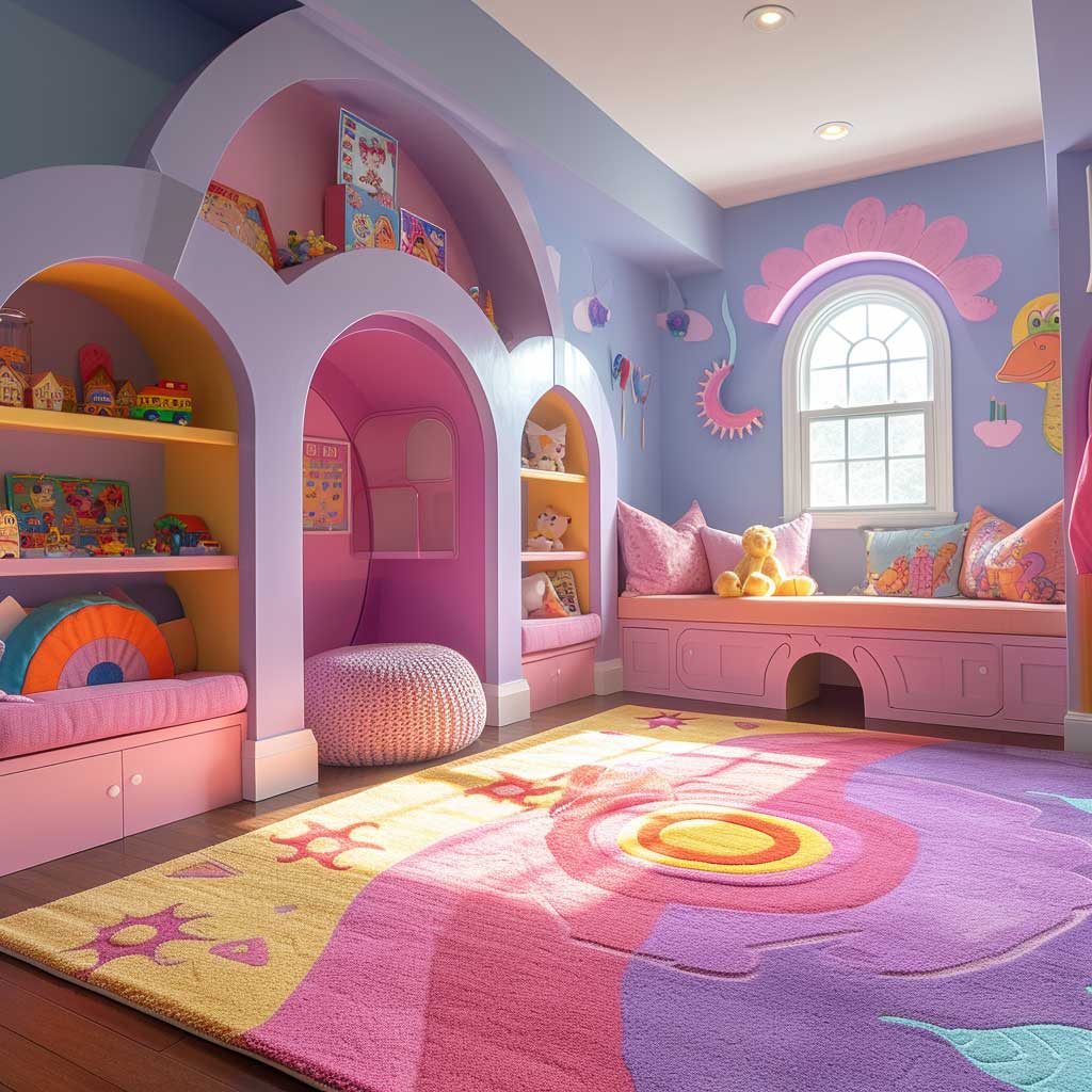
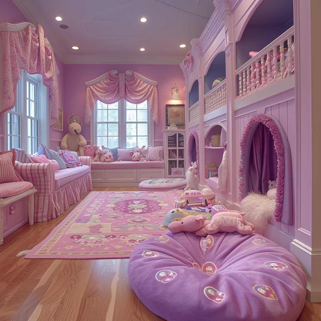
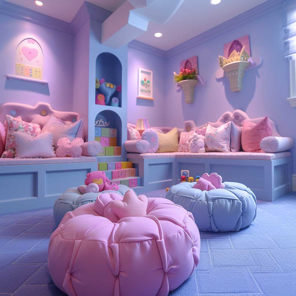
Venturing into the realm of interior design reveals the transformative power of playful and whimsical color themes, particularly those that embrace the gentle allure of pastel pinks and purples. These hues, often associated with whimsy and softness, offer a unique opportunity to craft spaces that radiate joy, creativity, and light-heartedness. When applied to a child’s playroom, the combination of pastel pinks and purples not only creates an aesthetically pleasing environment but also nurtures a setting conducive to imaginative play and growth. This essay explores how these interior design color themes can turn a simple room into a vibrant haven for young minds.
Pastel pinks, with their soft and nurturing qualities, evoke feelings of warmth and comfort, making them an ideal choice for spaces designed for children. This color has the ability to brighten up a room, lending it a gentle, cheerful ambiance that encourages positivity and playfulness. By painting walls or incorporating furniture and textiles in pastel pink, the playroom becomes a welcoming space where children feel loved and secure, fostering an environment where they can freely express themselves and explore their creativity.
Complementing the warmth of pastel pink, pastel purples bring a touch of enchantment and mystery to the playroom. Purple, a color often associated with creativity and imagination, encourages children to dream and think beyond the ordinary. It adds a depth of character to the room, stimulating young minds to embark on imaginative journeys and adventures within the safety of their play space. Pastel purple can be introduced through accent walls, storage units, or decorative accessories, blending seamlessly with pastel pink to create a harmonious and inviting palette.
The magic of utilizing pastel pinks and purples in a playroom lies in their versatility and the way they complement a wide range of design elements. These colors pair beautifully with natural wood, soft whites, and other pastel shades, allowing for a multitude of design options that can adapt as the child grows. Incorporating playful patterns, textures, and interactive decor enhances the room’s sensory appeal, making it an engaging and stimulating environment for children of all ages.
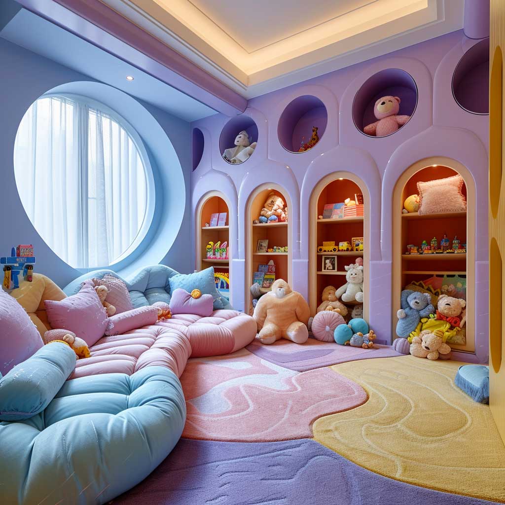
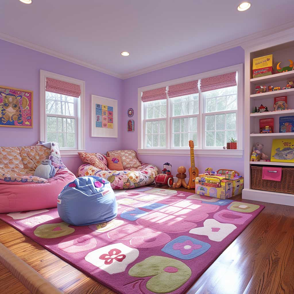
Beyond aesthetics, the choice of pastel pinks and purples in a playroom holds significant psychological benefits. These colors are known for their calming effect, reducing feelings of anxiety and promoting a sense of well-being. In a space designated for play and learning, such a serene atmosphere is invaluable, providing a peaceful backdrop to the vibrant energy of childhood. The colors foster a nurturing environment where children feel safe and supported in their explorations and discoveries.
In conclusion, the application of pastel pinks and purples in interior design color themes for a child’s playroom transcends mere decoration. It creates a space that embodies the essence of childhood—joy, creativity, and boundless imagination. These hues offer a delicate balance of warmth and inspiration, setting the stage for a room that is not only visually appealing but also emotionally nurturing. By embracing the playful whimsy of pastel pinks and purples, designers and parents alike can craft a haven that celebrates the wonder and potential of every child, making every moment spent in the playroom a cherished memory in the making.
Regal Luxury with Deep Purples and Golds
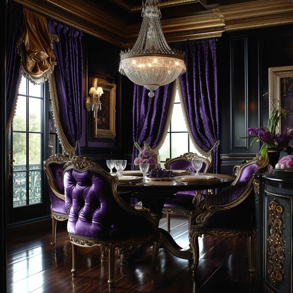
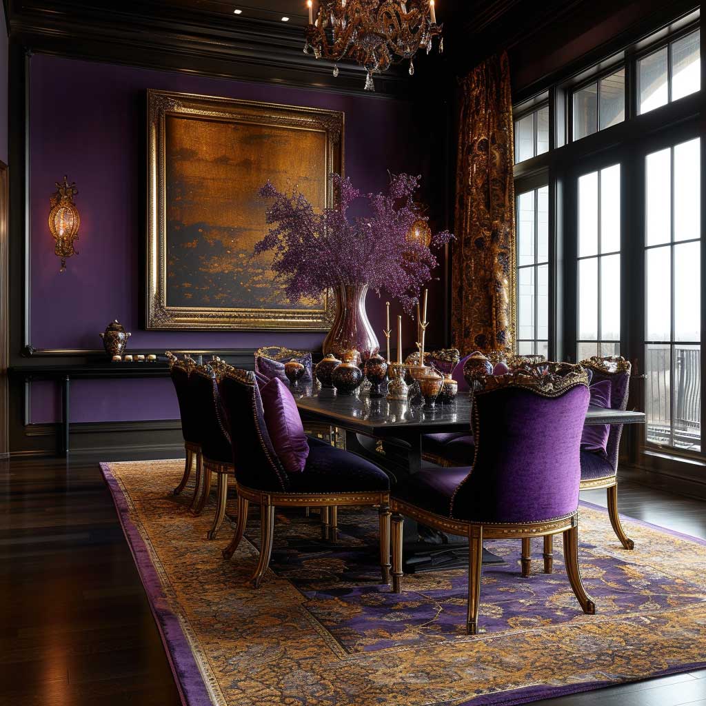
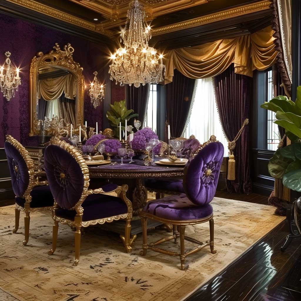

Immersing into the grandeur of regal luxury within interior spaces, especially through the use of deep purples and golds, unveils a palette that is both majestic and profoundly inviting. These hues, rich in historical significance and visual impact, can transform dining areas into spectacular scenes of opulence and sophistication. In this exploration, we delve into how the interior design color themes of deep purple and gold elevate a dining room from merely a place of eating to a luxurious gathering spot, where meals are celebrated with pomp and splendor.
Deep purple, often associated with royalty, luxury, and nobility, brings a profound depth and sophistication to the dining room. This color, when applied to walls or as a primary theme in furnishings, envelops the space in a cloak of luxury that is both striking and intimately inviting. The depth of purple can turn the dining area into a statement of elegance, creating a backdrop that enriches the dining experience with a sense of grandeur and exclusivity.
Complementing the richness of deep purple, gold accents serve as the perfect embellishments to this regal palette. Gold, a symbol of wealth and prosperity, adds a layer of refined elegance and warmth to the dining room. Whether through light fixtures, table settings, or decorative elements, gold accents enhance the luxurious feel of the space, reflecting light and adding a touch of timeless beauty. The interplay between deep purple and gold creates a dining environment that is both opulent and welcoming, encouraging gatherings that are as much a feast for the eyes as they are for the palate.
The selection of materials and textures plays a crucial role in realizing the full potential of these interior design color themes. Luxurious fabrics like velvet or silk in deep purple can be used for drapery or upholstery, offering a tactile richness that complements the visual opulence. Similarly, metallic finishes and ornate patterns in gold can introduce an element of sophistication, elevating the overall aesthetic of the dining room.
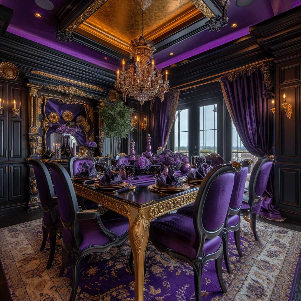
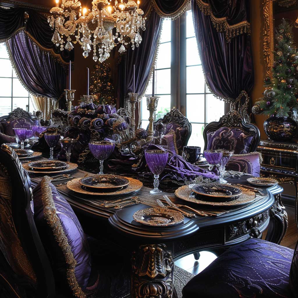
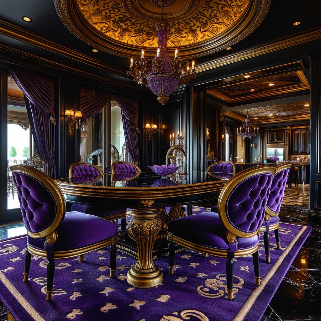
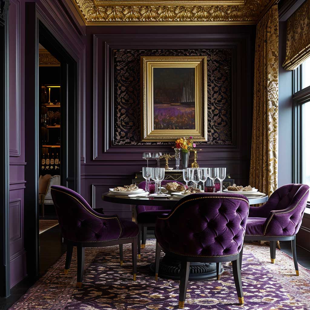
Lighting, too, is essential in bringing out the richness of deep purples and the luminosity of golds. A well-chosen chandelier or elegant wall sconces can cast a warm glow over the dining area, highlighting the luxurious textures and colors while creating an ambiance that is both sumptuous and inviting. The correct lighting can transform the dining experience into something truly magical, enveloping guests in a warm and luxurious atmosphere.
Incorporating deep purples and golds into a dining room design is not just about creating a space that exudes luxury; it’s about crafting an experience that celebrates the art of dining. This color theme invites homeowners and guests to partake in meals within a setting that feels elevated and special, turning every dinner into a lavish banquet. The richness of the palette fosters a sense of occasion, making even the simplest meals feel like grand celebrations.
In conclusion, the luxurious interplay of deep purples and gold within interior design color themes offers a transformative approach to dining room aesthetics. This regal combination not only enhances the beauty and sophistication of the space but also elevates the dining experience to new heights of luxury. By carefully curating colors, materials, and lighting, one can create a dining area that is not only visually stunning but also rich in ambiance, offering a perfect setting for memorable gatherings and sumptuous feasts.
The power of interior design color themes lies in their ability to transform ordinary spaces into reflections of our deepest desires and aspirations. By carefully selecting and implementing color palettes that resonate with our personal style and emotional needs, we can turn our homes into sanctuaries that comfort, inspire, and energize us. Whether seeking solace in serene blues and greens, warmth in rustic oranges, or vibrancy in lively yellows and reds, the right color theme can make all the difference in creating a haven within our homes.
You Might Also Like


Related Topics