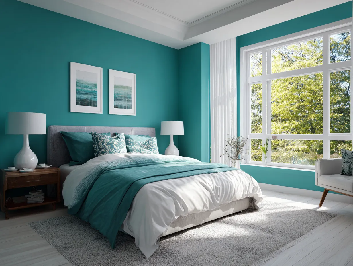
Teal and tangerine sit directly opposite each other on the color wheel, which means they produce the highest chromatic contrast of any complementary pair — a fact that color theorists and film colorists have been exploiting for decades. Pull those two into a real room, and the effect is immediate: warm tangerine advances, cool teal recedes, and the space acquires a depth that no single-color palette can replicate. That optical push-pull is exactly why teal and tangerine color schemes for rooms keep appearing on design boards regardless of what else is trending.
The trick is distribution. Stylists recommend treating teal as the room’s structural color — walls, large upholstery, cabinetry — and reserving tangerine for the pieces that actually move: pillows, throws, ceramics, artwork. Flip that ratio and both colors fight for dominance instead of working as a team. The rooms that pull this palette off consistently are the ones where teal occupies roughly 60–70% of the visual field.
Below you’ll find three distinct applications — living room, bedroom, kitchen — each with a different approach to the same palette. The goal isn’t a single recipe but a set of mechanics you can apply to whichever room you’re working on right now.
– Teal and tangerine are true complementary colors — maximum contrast, natural visual balance.
– Teal works best as the dominant color (walls, sofa, cabinetry); tangerine as the accent (pillows, ceramics, art).
– In the living room: a teal sofa anchored with tangerine cushions reads energetic but not chaotic.
– In the bedroom: teal on the walls or headboard with tangerine bedding creates warmth without sacrificing calm.
– In the kitchen: teal lower cabinets with tangerine countertop accessories or pendant accents is the most livable version of the palette.
– Sherwin-Williams SuperPaint in a teal shade runs about $62/gallon and covers roughly 375 sq ft — enough for a standard bedroom accent wall on one can.
A Teal Sofa Changes the Entire Equation for a Living Room
Teal and tangerine in a living room works because the sofa does the heavy lifting. A deep teal velvet sofa — the kind with a slightly blue-leaning undertone — holds the room together the way a neutral never could. Four tangerine cushions on that sofa is all you need to activate the complementary contrast; interior designer David Silva of HomRem LLC recommends reserving bold orange for strategically placed accents rather than spreading it across large surfaces, since teal already has enough presence on its own. The ratio matters more than the exact shade.
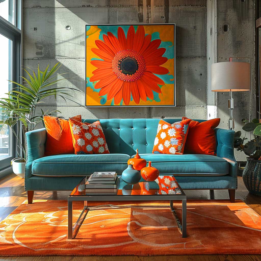
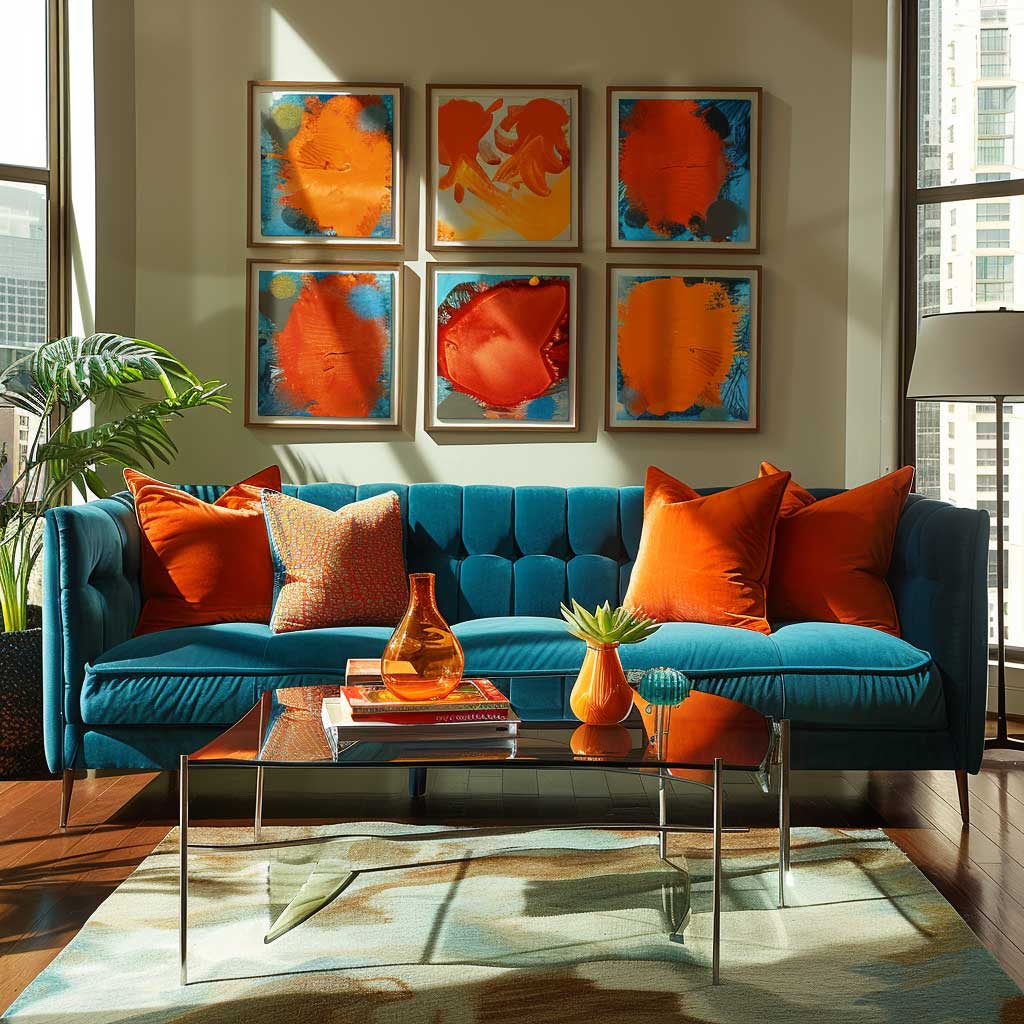
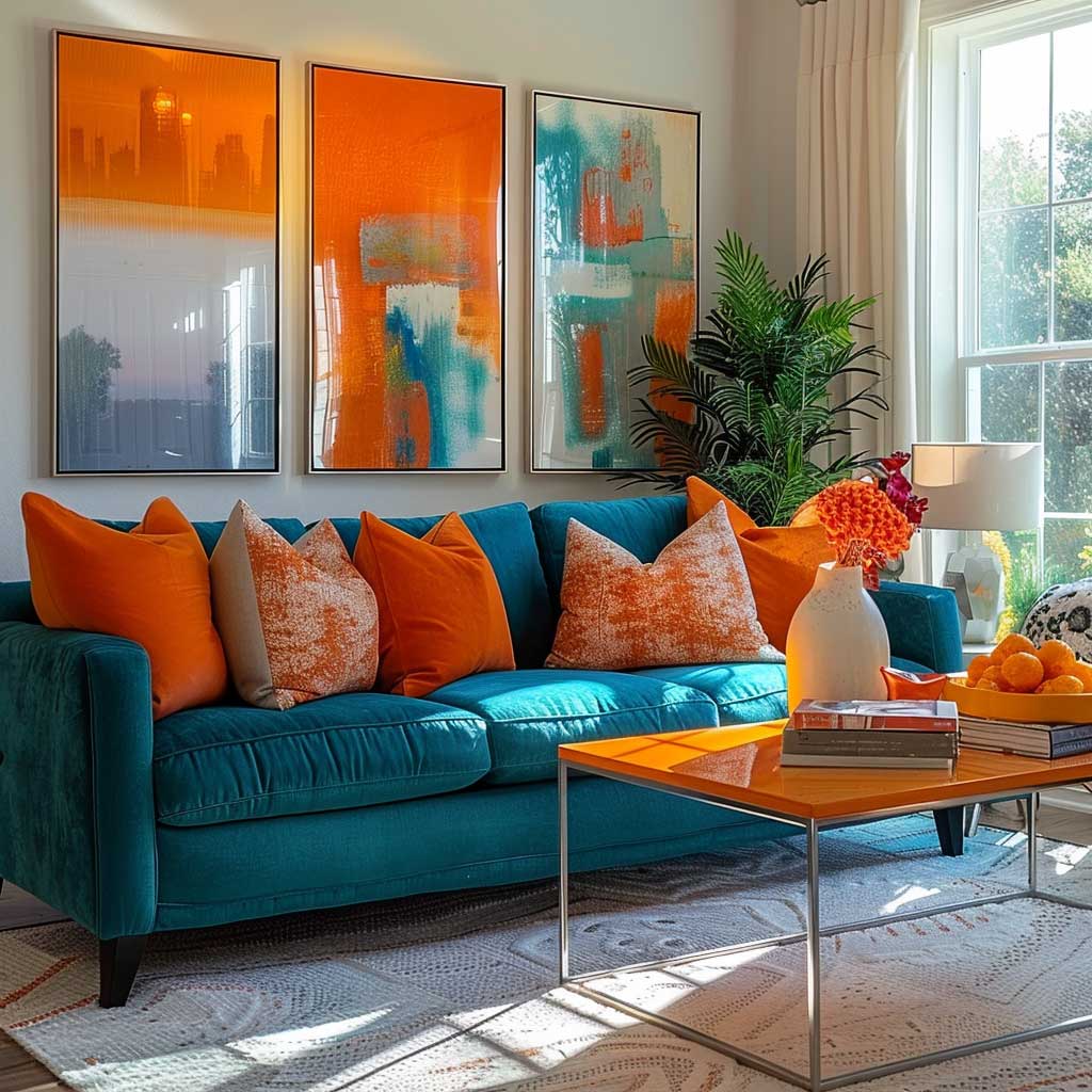
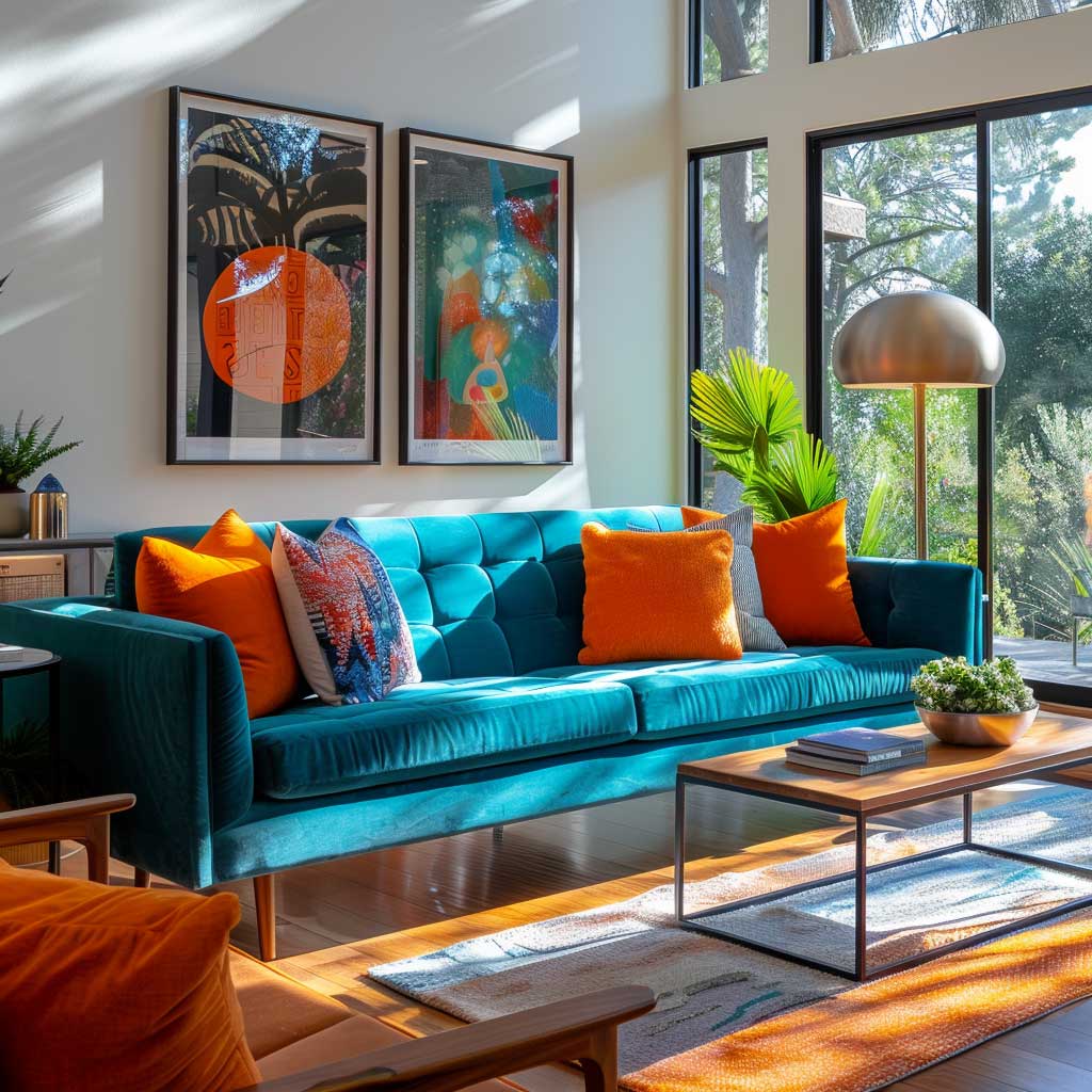
What anchors the palette in a living space is how the two colors interact with natural light. Teal shifts cooler and deeper in shadow; tangerine intensifies in direct sun. A room with south- or east-facing windows will amplify the orange warmth of tangerine accents in the morning and let the teal read as the calmer evening color — something like a built-in mood shift over the course of the day. A low-pile area rug that blends both tones creates continuity across that transition without locking the room into one mood.
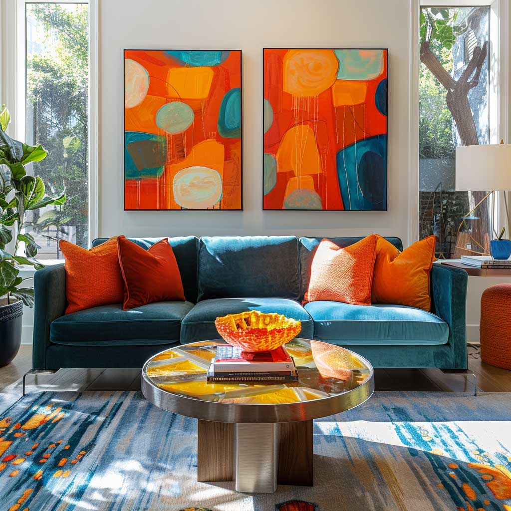
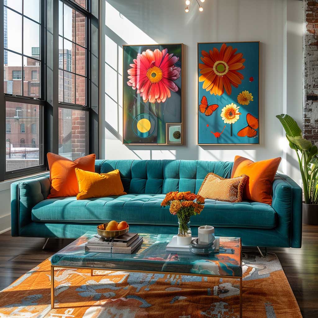
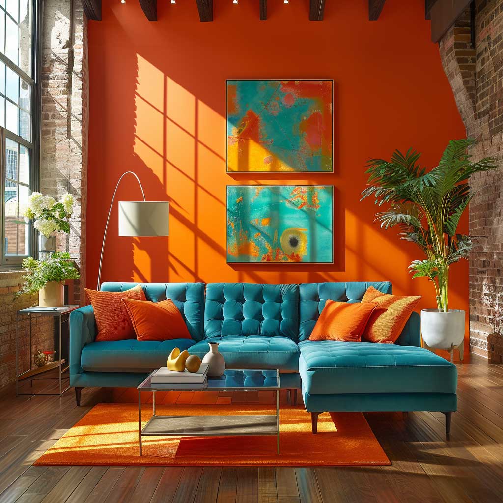

Wall art is where most people miss the opportunity. A canvas or print that contains both teal and tangerine — even in secondary tones — bridges the palette and prevents the room from reading as two rooms that happened to share a sofa. Think of it as a color reference point: the art tells the eye that teal and tangerine belong together rather than competing. Abstract pieces with loose brushwork in both hues tend to do this more naturally than anything overly illustrative. For an internal look at how teal performs as a dominant room color on its own terms, the teal monochromatic interior design breakdown shows exactly which furniture and texture combinations hold the palette together room by room.
Don’t treat every surface as an opportunity for color. A sleek, neutral coffee table — raw oak, matte black, smoked glass — creates visual breathing room between the bold elements. The mistake that makes teal-and-tangerine living rooms look busy rather than bold is usually over-accessorizing the tertiary pieces: side tables, bookshelves, lamp bases. Keep those quiet. The palette is already doing enough work.
Don’t make tangerine the sofa color and teal the accent. It reads as an orange room with some teal thrown in — not a complementary palette. The reason this fails is optical: warm colors advance visually, so a large tangerine sofa dominates the space and makes teal accents look like afterthoughts. Reverse the ratio — teal as the dominant, tangerine as the signal — and both colors get to do their job.
Bedroom Walls in Teal and Tangerine Fabric — Why the Separation Works
Teal and tangerine in a bedroom require a different logic than in a living room, because the goal here is rest — and tangerine is physiologically stimulating. Studies on color psychology show that orange hues can heighten activity levels and socialization, which is exactly what you don’t want before sleep. The solution is spatial separation: teal belongs on the walls or upholstered headboard, and tangerine stays in removable softgoods — the duvet cover, a throw, a stack of cushions. That way the dominant visual impression when you enter the room is the calming teal, and the tangerine reads as warmth rather than stimulation.
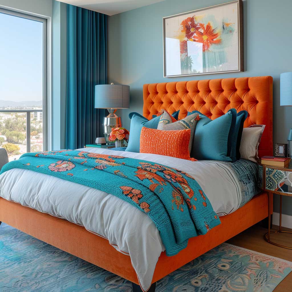
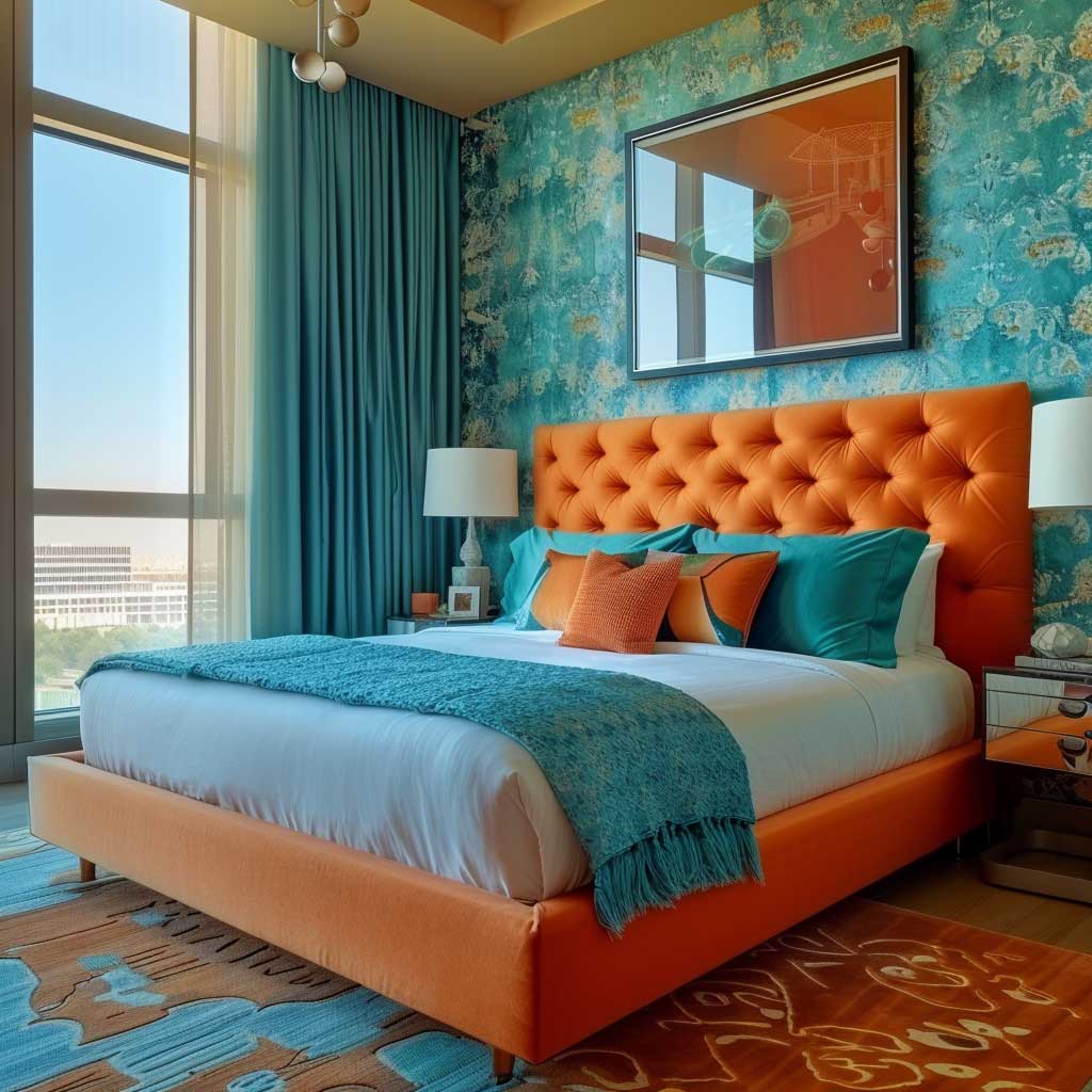
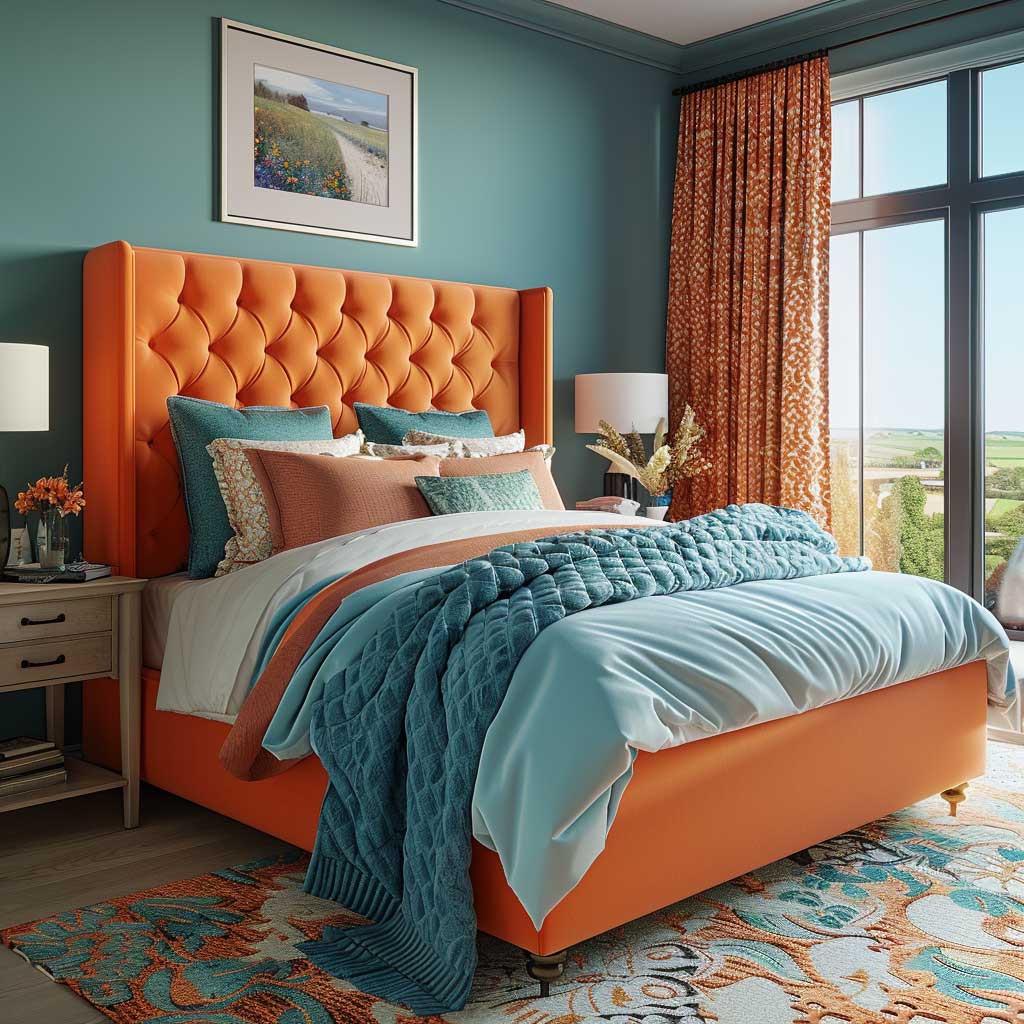
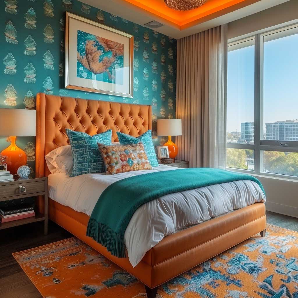
A subtle teal wallpaper pattern — tone-on-tone, geometric or organic — on the wall behind the bed gives the palette depth without adding another color. You’ll notice this works particularly well in bedrooms with limited natural light: the patterned surface catches ambient light in a way that flat paint doesn’t, which makes the room feel more dimensional without changing its energy. Sherwin-Williams SuperPaint in a teal base runs about $62 per gallon and covers 375 square feet per coat, meaning a standard 10×12 bedroom accent wall behind the bed costs well under $30 in paint.
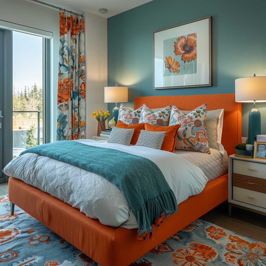
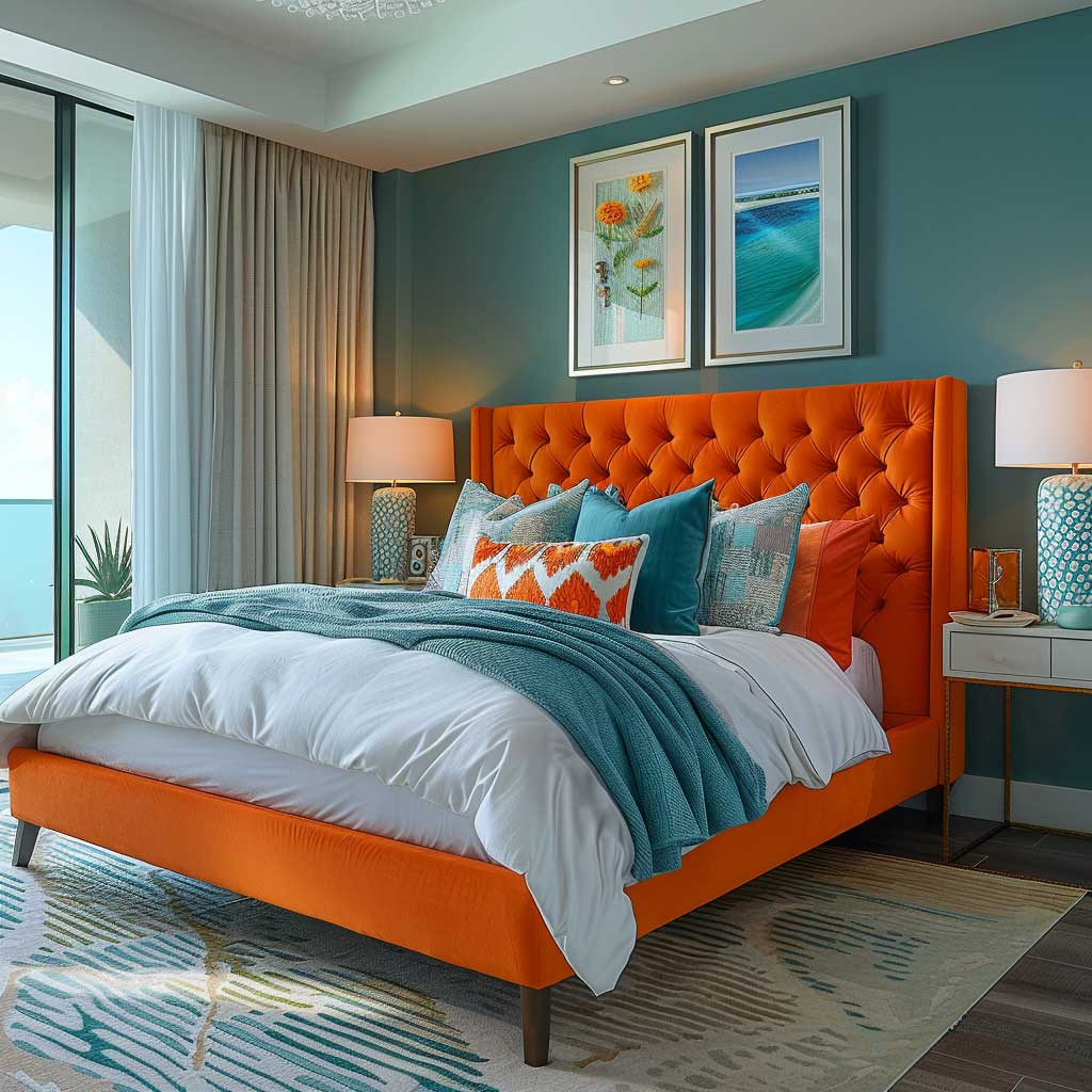
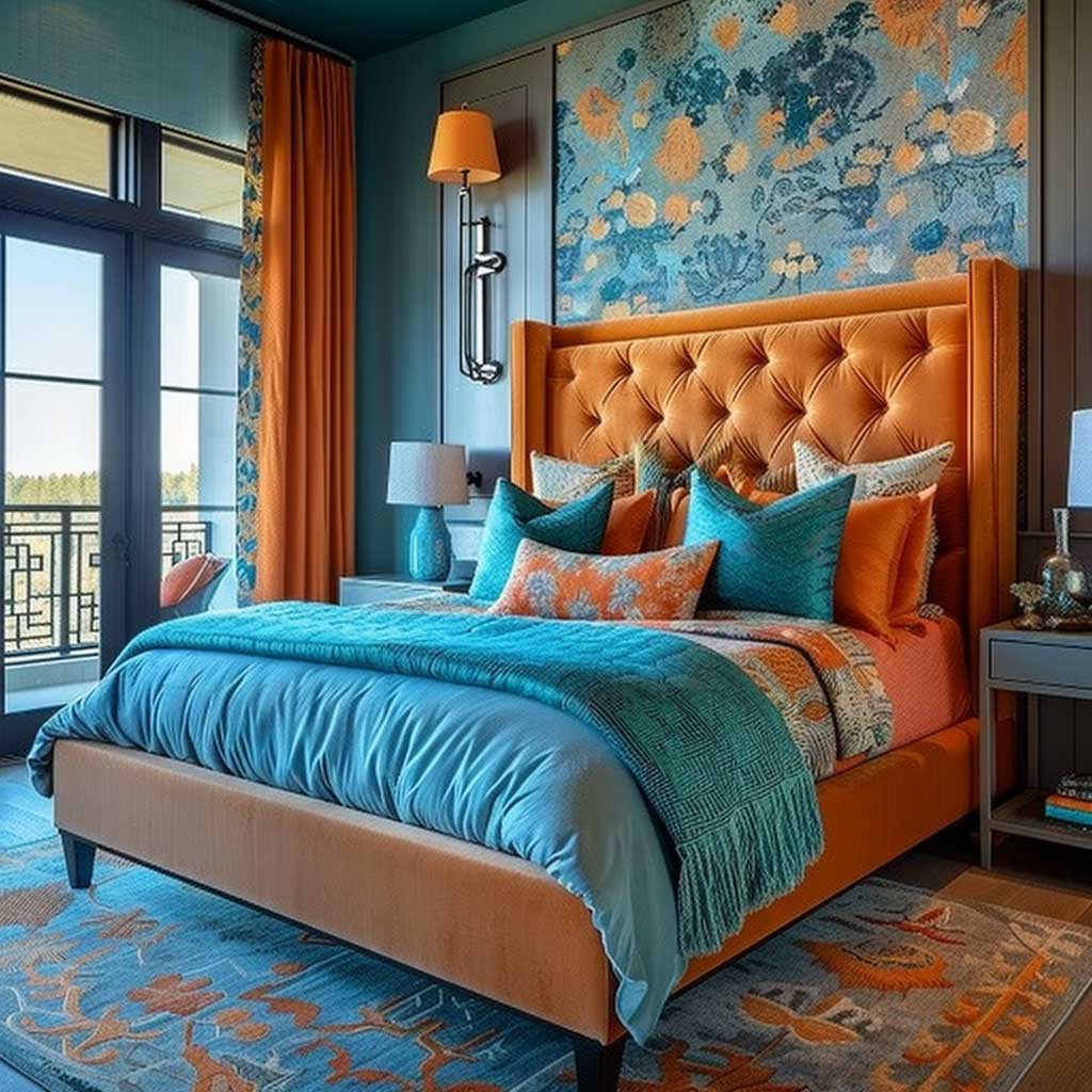
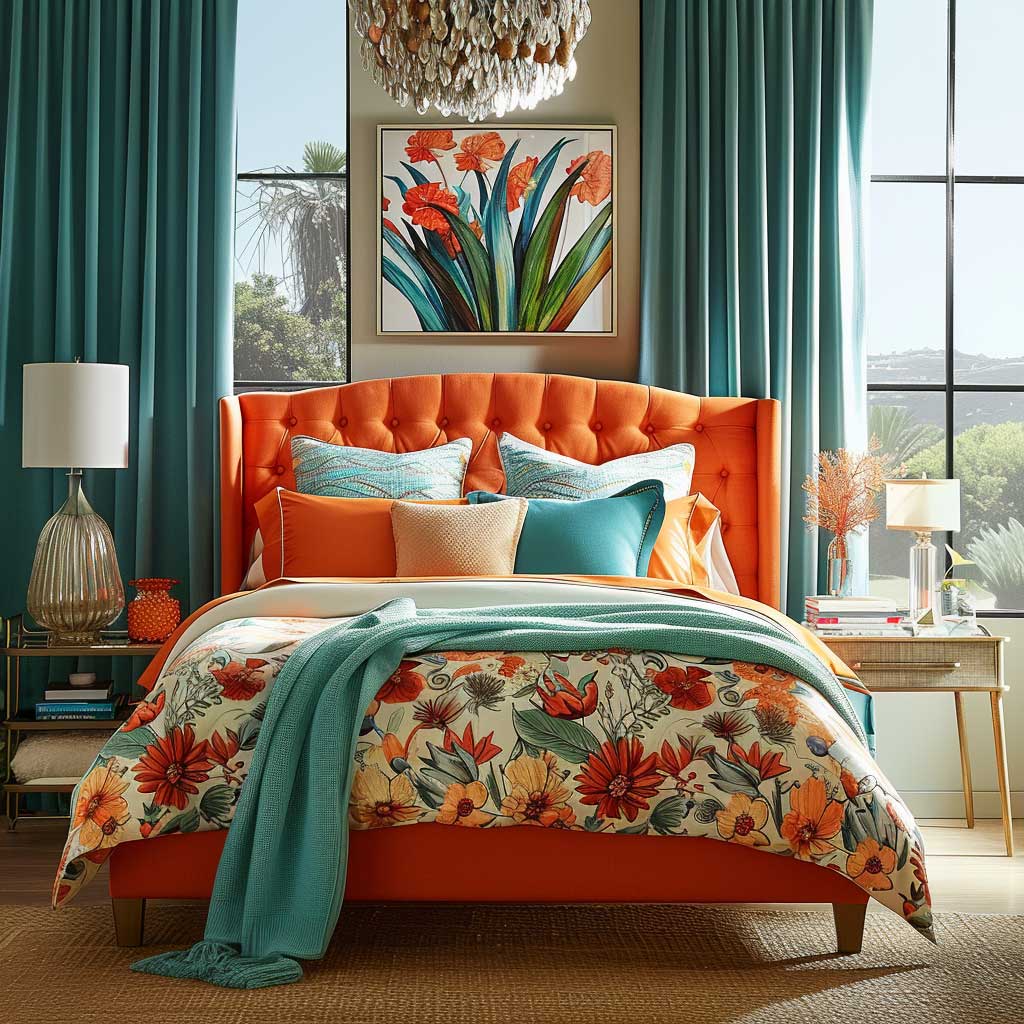
Bedside lamps are the most underrated tool in a teal-and-tangerine bedroom. A warm-white bulb (2700–3000K) cast against teal walls pulls out the green undertones and makes the room feel significantly warmer at night — closer to sage than to a spa. That warmth softens the contrast with tangerine fabric, so the palette feels cohesive even in dim light rather than stark. Try this before committing to any additional accessories; the right light source does more than any amount of throw pillows.
What kills the bedroom version of this palette? Tangerine on the walls. A tangerine accent wall in a bedroom reads as high-energy the moment the lights come on, which is the opposite of a restful space. Save the wall color for teal in every application — the bedroom is the one room where that rule has no exceptions. Framed artwork with both tones, or a single large botanical print, does the job of connecting the palette without adding any chromatic weight to the room’s architecture.
Teal Cabinets in a Modern Kitchen — Where to Bring the Tangerine In
Teal and tangerine in a kitchen requires the most restraint of the three rooms, because kitchens already contain a lot of visual information — appliances, hardware, open shelving, backsplash tile — and the palette can tip from energetic to chaotic quickly. The approach that holds up: teal lower cabinets as the room’s primary color statement, upper cabinets or open shelving in white or a very pale neutral, and tangerine introduced through accessories rather than fixed surfaces. Think ceramic canisters, a fruit bowl, pendant shades, or a row of pots on open hooks. Those elements cost next to nothing to swap out, which matters because kitchen tastes shift over time.
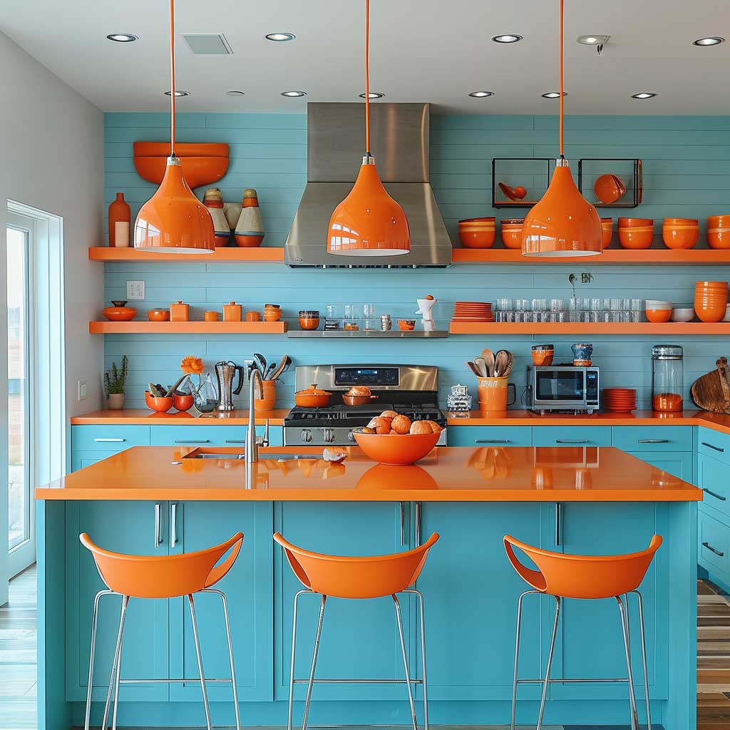
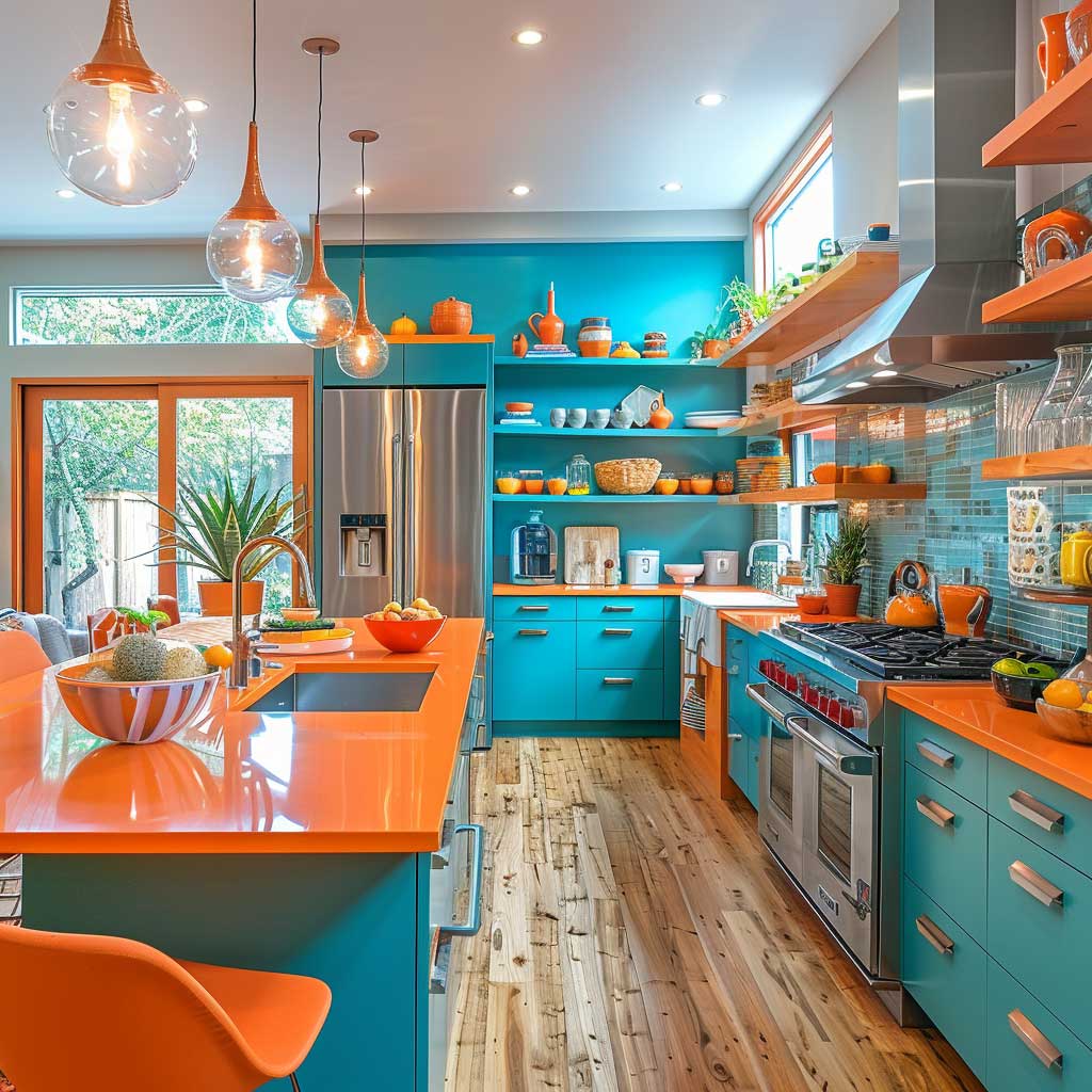
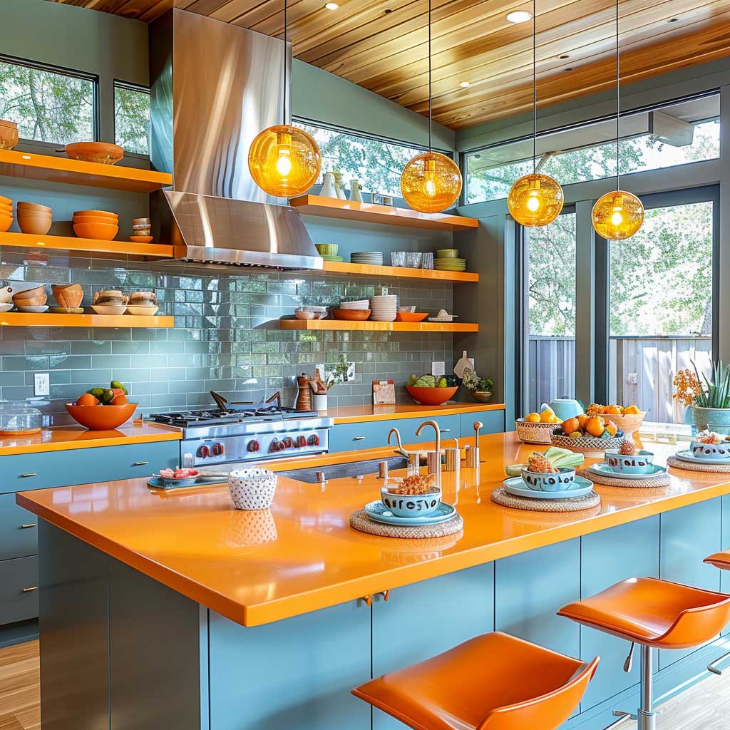
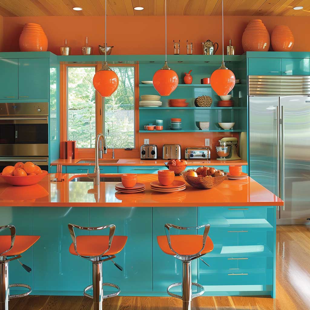
Cabinet refacing — keeping the existing boxes but replacing doors and hardware in a teal finish — runs roughly 50–75% of the cost of a full replacement, according to kitchen remodeling estimates. For a kitchen where you love the layout but want to introduce a teal and tangerine color scheme without a full renovation, that’s the most cost-effective starting point. Matte teal finishes photograph better than gloss and are less likely to show fingerprints, which is a practical argument for them in a working kitchen rather than just an aesthetic one. A common approach is to pair the matte teal with brushed brass hardware — the warm metal reads visually as tangerine’s more sophisticated cousin and lets you keep the tangerine itself reserved for softer, swappable accessories.
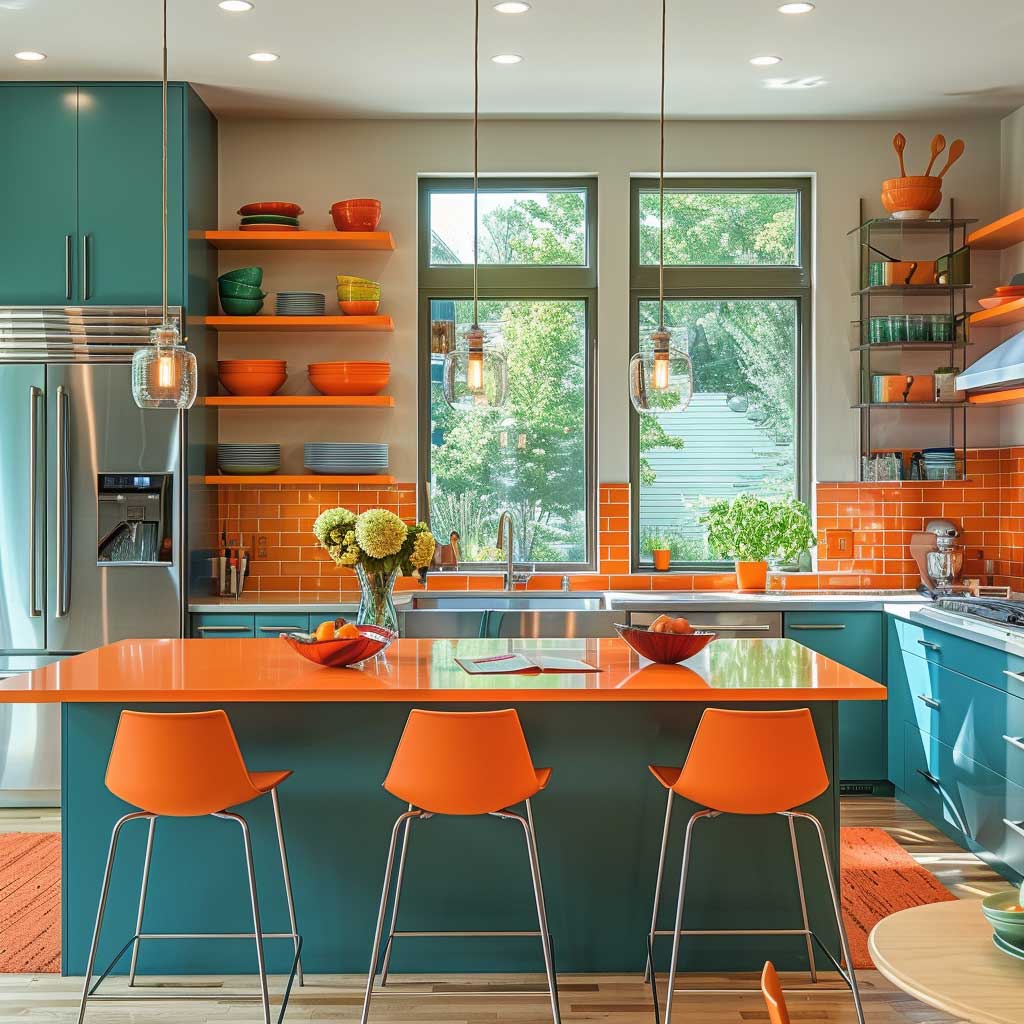
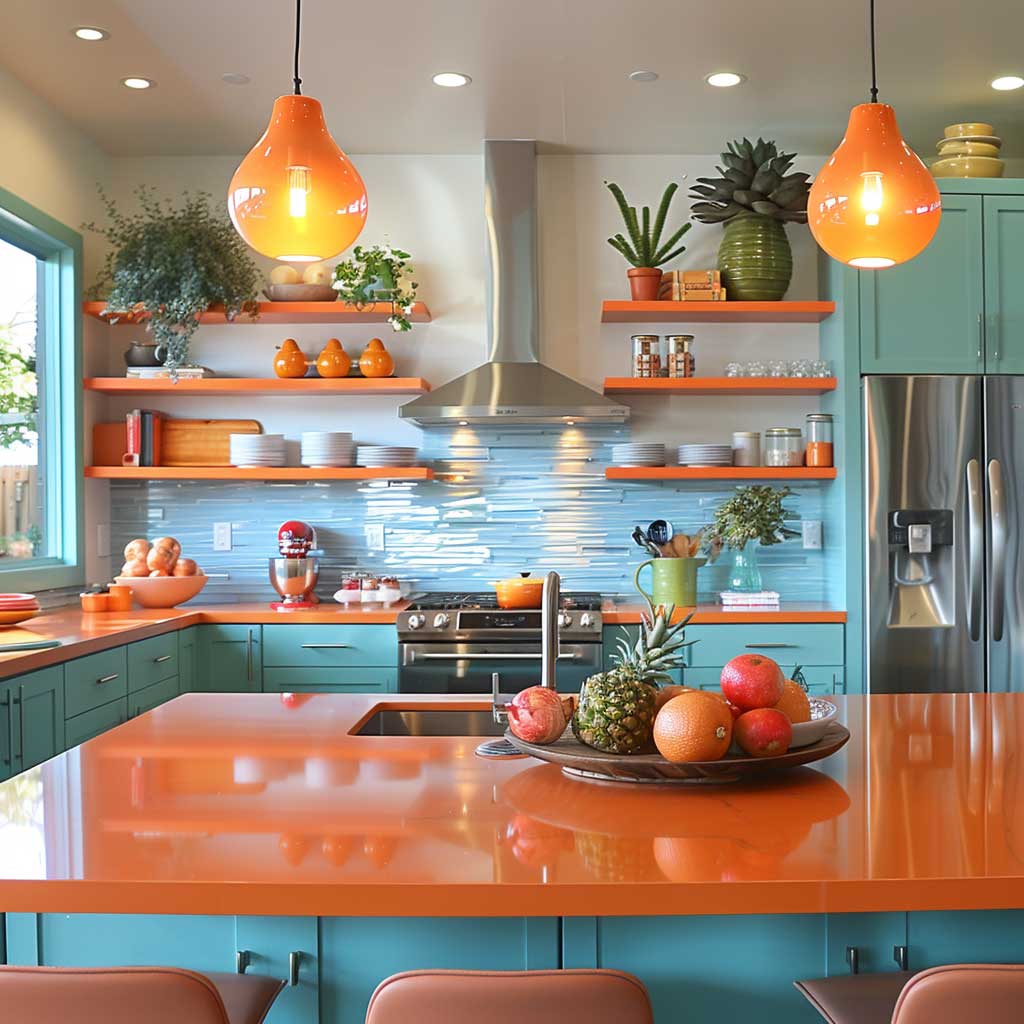
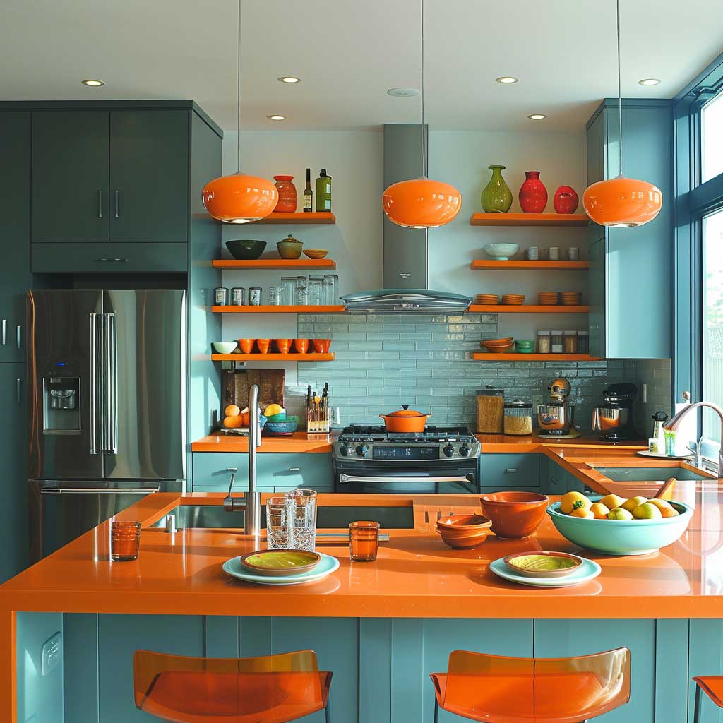
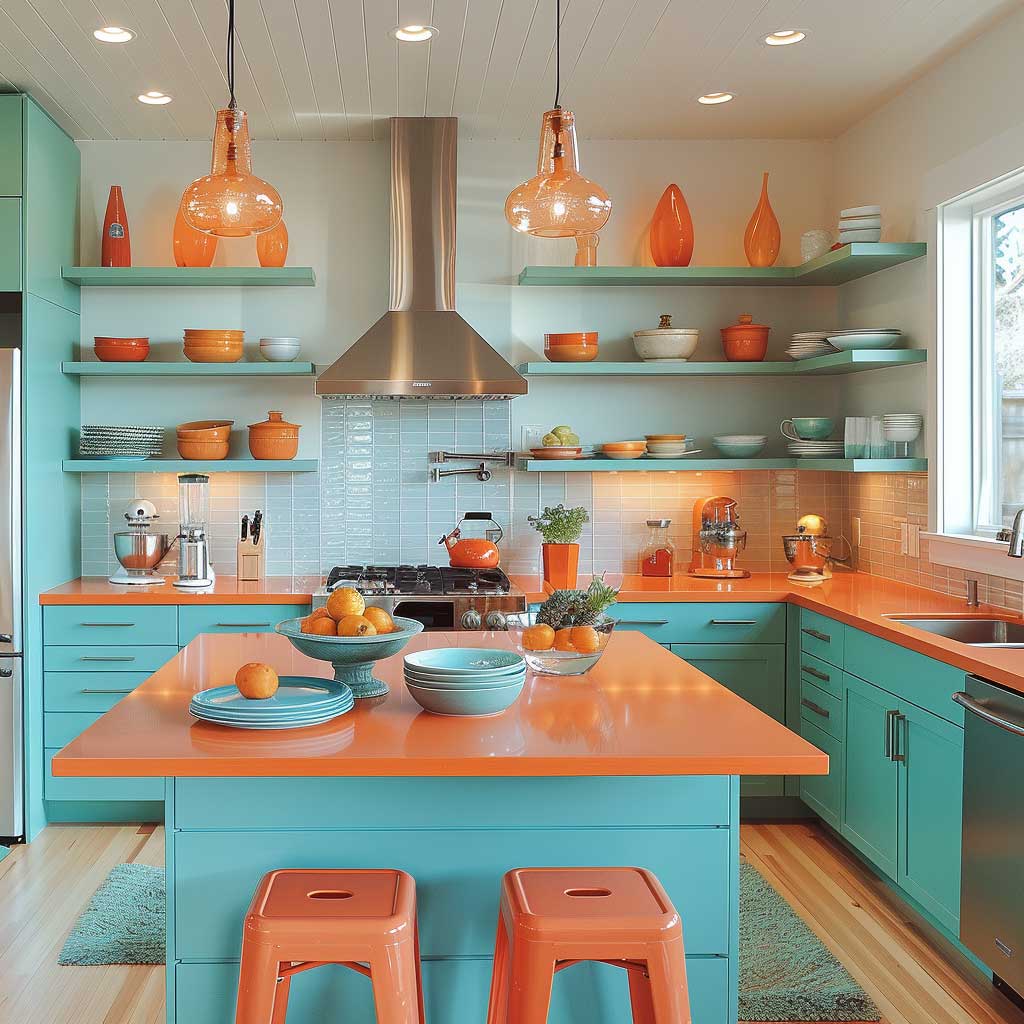
The island is the pivot point. A central island with a teal finish on the cabinetry and a pale stone or white countertop — quartz is the most durable choice for food-prep surfaces — serves as a gathering point that also anchors the palette at eye level. Pendant lights above the island are where tangerine can appear in a fixed fixture without feeling permanent: a linen or glass shade in amber-orange casts warm light downward and reads as part of the palette rather than a decoration. This is the trick here — when the tangerine element also has a functional purpose, it integrates instead of decorating.
For a broader look at how bold color pairs hold up across different interior design eras, the mid-century modern color schemes for interior design roundup is worth reading — teal appeared frequently in that period precisely because mid-century designers understood how it interacted with warm accent colors. Large windows are the kitchen’s best asset with this palette: natural light makes teal appear richer and more vibrant mid-morning, which is exactly when you want the kitchen to feel energized. According to Checkatrade’s interior color analysis, teal is warm, cosy and inviting in ways that pure blue often isn’t — a quality that makes it more livable in a high-use space like a kitchen than most people expect.
| Room | Teal Application | Tangerine Application | Key Risk |
|---|---|---|---|
| Living Room | Sofa + wall art | Cushions, ceramics, artwork | Over-accessorizing tertiary pieces |
| Bedroom | Walls or headboard | Duvet cover, throw blanket | Tangerine on walls disrupts sleep cues |
| Kitchen | Lower cabinets + island | Pendants, canisters, open-shelf props | Tangerine on countertops dates quickly |
Final Read
Teal and Tangerine Holds Because the Physics Are Real
Complementary colors don’t need a trend to justify them. Teal and tangerine produce maximum contrast by definition — they sit opposite on the color wheel and make each other more intense, not less. That’s the structural reason this palette outlasts whatever was fashionable when you painted.
Put teal on the fixed surfaces — walls, cabinetry, large upholstery — and let tangerine live in the movable pieces. The ratio does more work than the specific shade.
Sherwin-Williams SuperPaint in a teal tone costs about $62/gallon and covers a standard accent wall on one can. That’s the lowest-risk entry point if you’re not ready to commit the whole room. Save this post.