Modern wall units for living rooms get one thing wrong constantly — people choose the finish before they choose the depth. I’ve helped three friends furnish their spaces and every single one bought a unit that stuck out four inches too far into the room. Wall unit designs for living rooms only work when the proportions respect the floor plan first, the aesthetic second. You’ll notice the difference immediately when you walk into a room where someone got it right versus one where they didn’t.
My go-to rule is simple: if the sofa depth and the wall unit depth exceed 50% of the room width, something has to give. Usually it’s the unit. That’s not an aesthetic judgment — it’s physics. A 16-inch-deep modular cabinet like the IKEA BESTÅ wall-mounted combination (starting at $460 for a full run) solves this problem cleanly because it floats, freeing the floor entirely. Shallow but tall is nearly always the smarter read than deep and wide.
What this article covers
- Why modern built-in wall units for living rooms need proportional logic, not just style
- How contemporary wall units handle the open-shelf vs. closed-cabinet tension
- Classic wooden wall unit finishes that hold up over decades — and ones that don’t
- Space-saving wall unit strategies for compact rooms under 200 sq ft
- What to avoid: the three combinations that always look wrong in photos
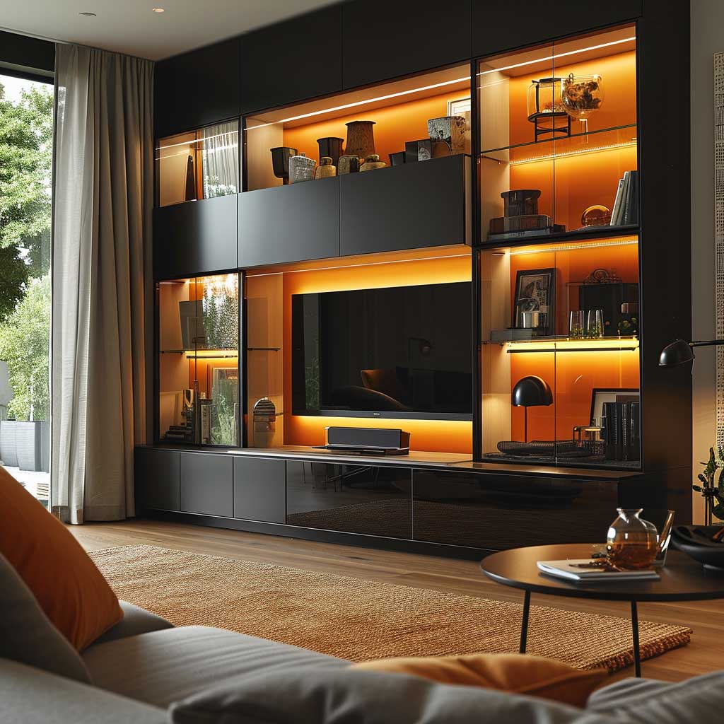
Contemporary Wall Units Work Because Negative Space Does the Heavy Lifting

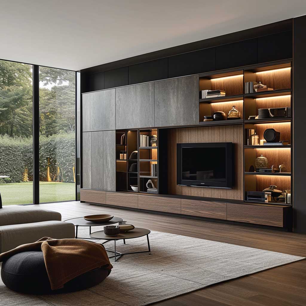

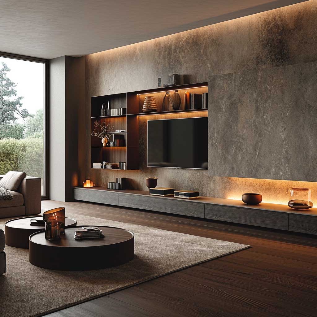
The reason contemporary living room wall units photograph so well is not the finish — it’s the deliberate gaps. You’ll notice that every strong example uses open shelves for roughly 40% of the surface and closed cabinets for the rest. That ratio isn’t aesthetic instinct; it’s visual rest. Pack it 100% open and it reads as a storage wall. Pack it 100% closed and it reads as a wardrobe that wandered into the wrong room.
I own the Calligaris Ray wall system ($2,800 for a 10-foot run) and the integrated LED strip under each shelf shelf changed how the entire room feels at night. Warm white at 2700K, not cool white — that distinction matters. Cool white strips make a living room feel like a dentist’s office after dark, and I’ve seen that mistake in at least a dozen Instagram rooms I thought I wanted to replicate.
Materials in modern wall units for living rooms tend toward high-gloss lacquer, matte lacquer, or wood veneer — in that order of current popularity. High-gloss picks up fingerprints like a mirror picks up breath. If you have children or pets, matte lacquer or veneer is simply the practical call. Glass elements add lightness but add weight to your cleaning routine. You need to decide which inconvenience you’d rather own.
Cable management is the detail that separates a room that looks finished from one that looks aspirational. Built-in cable channels cost almost nothing to request when ordering custom or semi-custom units, yet most buyers forget to ask. I stole this trick from a designer I follow: run all cables through the back panel before installation, not after. After is impossible without dismantling half the unit.


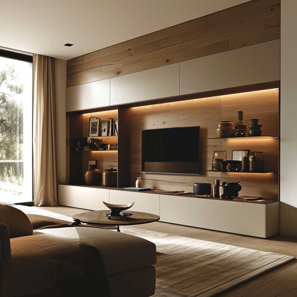
Color palette advice for contemporary wall units is almost always too cautious. Neutral tones — white, greige, charcoal — work because they don’t compete with the objects on the shelves. But a single panel in a deep navy or forest green, used as the back panel of the open sections, turns the whole unit into a statement rather than a backdrop. You don’t need to commit the entire piece to a color. Just the back wall of three shelves will do it. I’ve seen this in a Boca do Lobo showroom and it’s still the most confident interior move I’ve witnessed in person.
What doesn’t work? Mixing two different wood tones in the same wall unit. Ash veneer doors next to oak-effect panels look like a mistake, not a contrast. Either commit to one wood species or go fully painted and use wood only as an accent elsewhere in the room. The half-and-half approach fools no one.
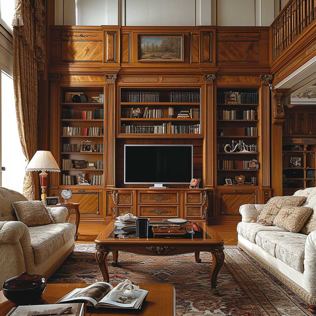
Solid Wood Wall Units Age Better Than the Room Around Them
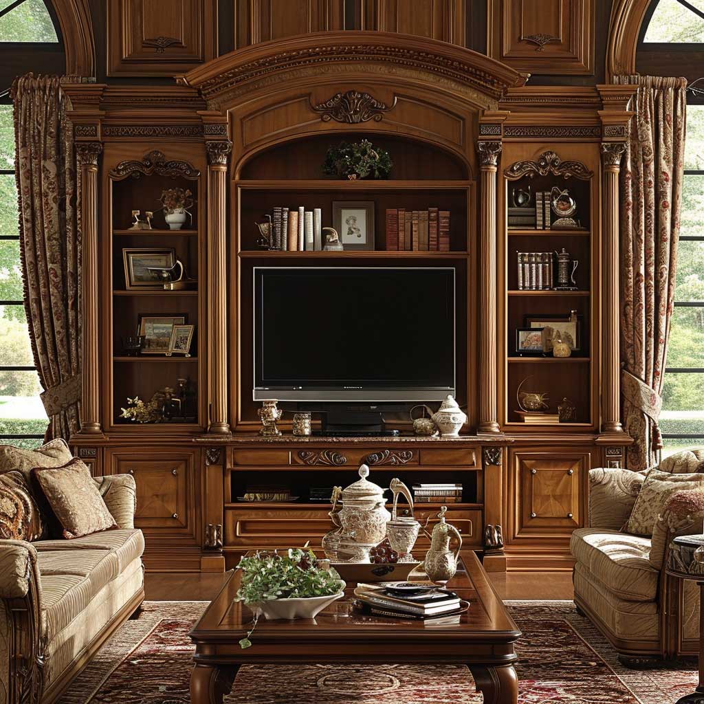
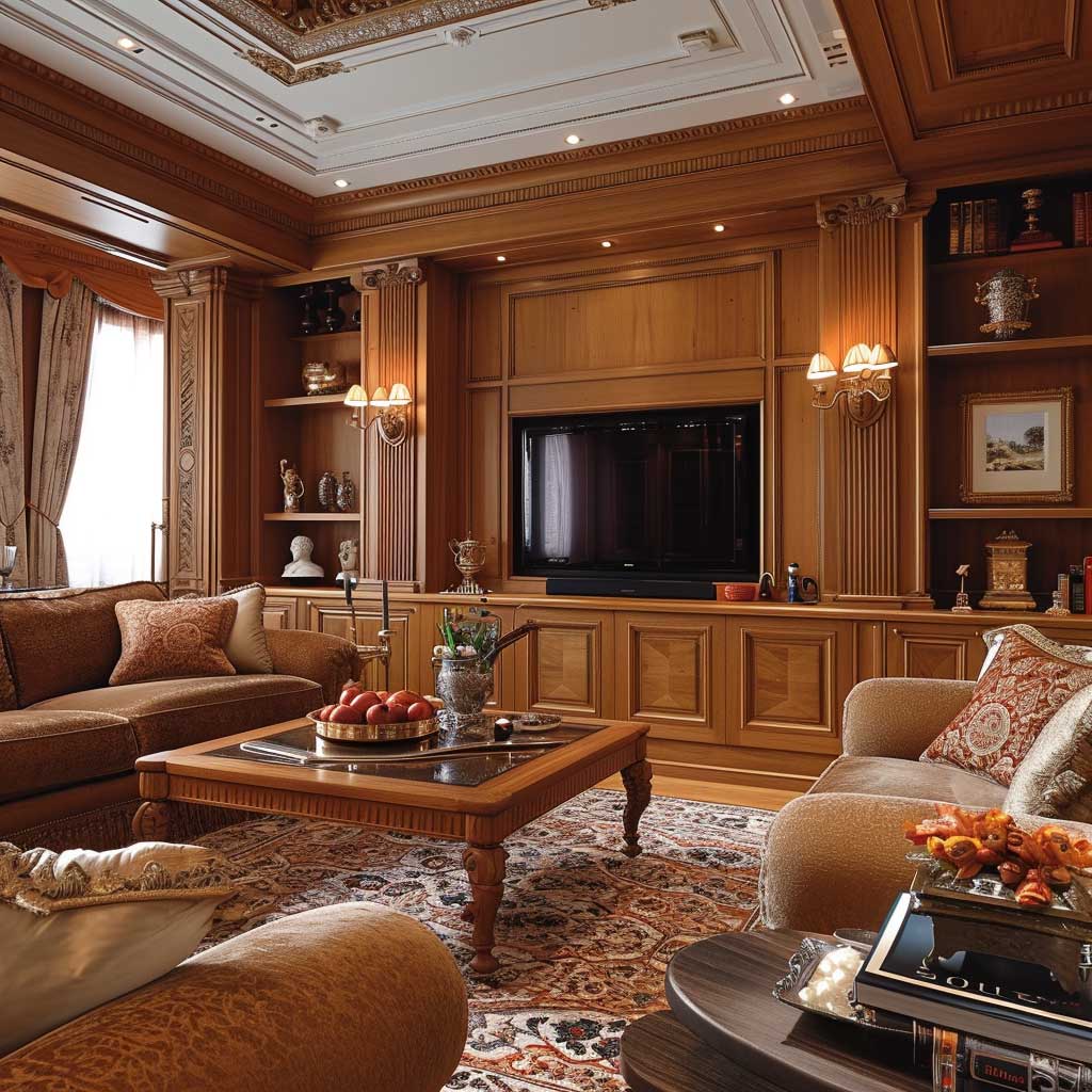
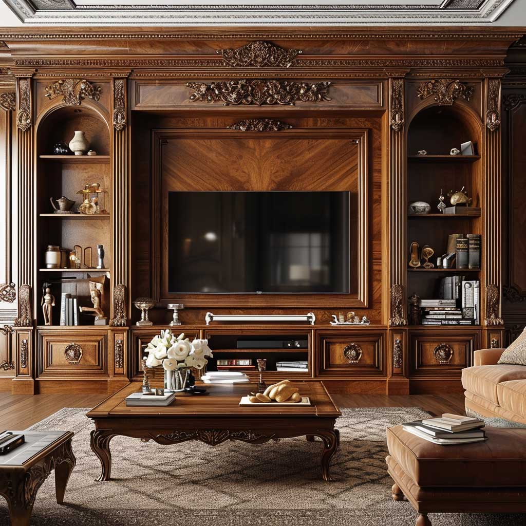
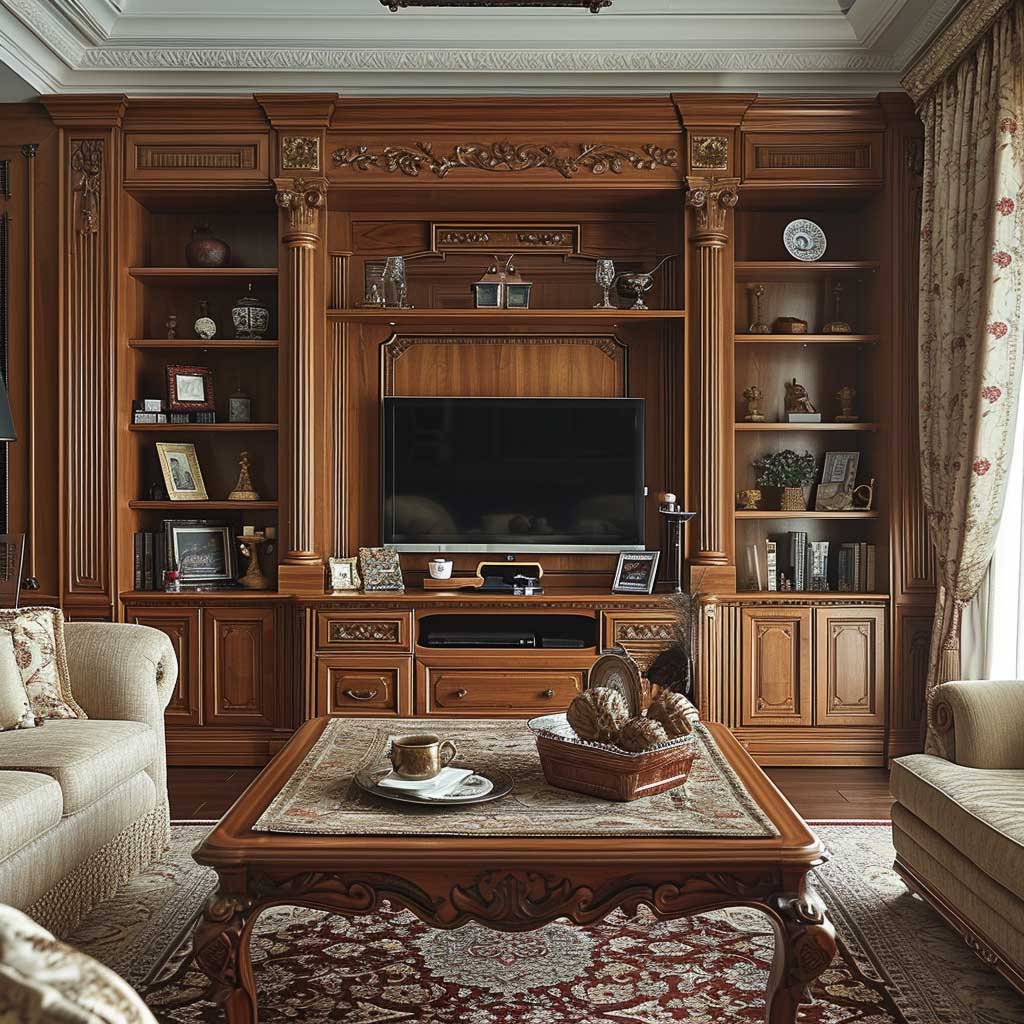
Solid walnut, white oak, and cherry have something MDF-core units with wood veneer will never replicate: they get better with use. A scratch on a veneer panel shows the substrate. A scratch on solid oak shows more wood. That physical reality affects how you live with a piece — you treat it less preciously, and the room relaxes around it. My grandmother had a floor-to-ceiling oak wall unit she bought in 1971 for the equivalent of $3,400 in today’s dollars. It’s now worth more, structurally and sentimentally, than anything in that house.
The grain pattern is the first decision, not the stain. Straight-grain oak reads modern and composed; cathedral grain reads more traditional. You can put a dark ebony stain on cathedral-grain oak and it will still read as slightly traditional because the movement in the grain overrides the finish color. Stain choices are reversible over a long life. Grain selection is not. Pick accordingly.
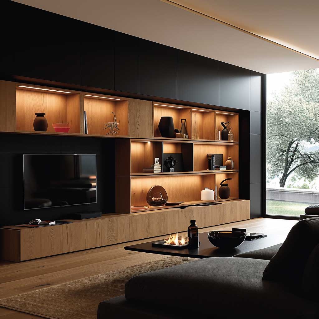
Classic wooden wall units work best when the shelving display is edited, not filled. The instinct is to use every inch, which turns the unit into a yard sale. What actually works: books grouped by color or height, three to five objects per shelf maximum, and at least one shelf left with only two items on it. That single sparse shelf makes the rest read as intentional rather than accumulated. Wooden wall decor ideas for a warm living room ambiance show exactly how built-in lighting transforms this kind of unit after dark — warm backlighting at 2700K does more than any styling trick.
Hardware is the hidden cost that bites. Solid brass pulls on a walnut unit run $12–$35 per pull from Rocky Mountain Hardware or Rejuvenation. On a 14-cabinet unit that’s $170–$490 just for pulls — a line item most people forget to budget. Cheap bar handles in brushed nickel on a beautiful walnut cabinet are the equivalent of putting a fast-food paper cup next to a good wine. Don’t do it.


Durability question: is solid wood worth the premium over high-quality MDF with real veneer? For a piece you intend to move twice and eventually leave behind, probably not — the cost difference ($800–$2,500 on a mid-size unit) doesn’t justify it if permanence isn’t the goal. For a home you plan to stay in for a decade or more, solid wood is the only answer that ages into an asset rather than an embarrassment.
What failed badly in my own experience: a “rustic reclaimed wood” unit from a trendy online retailer at $1,100. The planks were inconsistent thickness, the gaps between boards collected dust in exactly the way you’d expect from structural wood repurposed as furniture, and within 18 months two sections had warped from seasonal humidity. Reclaimed is beautiful as a surface treatment on a properly engineered carcass. As the entire structure, it’s a gamble that usually loses.
Don’t Do This
- Don’t float a freestanding wall unit in the center of a room — it reads as furniture that hasn’t found its wall yet. Wall units belong flush to a surface.
- Don’t use two mismatched wood tones on the same unit — oak veneer fronts with pine carcass sides visible at the edges undermine the whole piece.
- Don’t install open shelving above eye level without lighting — anything above 65 inches disappears into shadow and looks abandoned even when styled beautifully.
- Don’t skip the plinth or base detail on floor-standing units — units sitting directly on flooring without a base look like they were abandoned mid-installation.
Built-In Wall Units for Small Living Rooms Earn Their Footprint Floor-to-Ceiling


Built-in wall units for compact living rooms have one job the freestanding kind can’t do: disappear into the architecture. Custom built-ins run $200–$600 per linear foot installed, according to current contractor pricing — that’s $2,000–$6,000 for a 10-foot wall. That number sounds large until you price a freestanding entertainment unit plus a bookcase plus side storage separately, then add the visual noise of three different furniture finishes sitting next to each other.
Vertical space is the most underused asset in compact living rooms. A unit that stops at six feet leaves 12 to 24 inches of usable space above it — space that collects dust and creates a visual ledge that reads as clutter even when empty. Floor-to-ceiling reads as architecture, not furniture. That shift in perception makes a 160-square-foot room feel like a considered space rather than a storage problem. Furniture ideas for small living room optimization expand on this logic with specific layout strategies worth mapping against your own floor plan.
Modular systems offer the flexibility that true built-ins can’t. IKEA BESTÅ wall-mounted combinations start at $460 for a basic 47-inch run and go modular from there — you add columns as budget allows rather than committing the full sum upfront. The Hedeviken oak veneer front panels look genuinely close to real wood in person. I own two of these and neither anyone who visits assumes they’re IKEA, which is the only benchmark that matters for a piece at that price point.
Sliding doors earn their cost in compact rooms because they require zero swing clearance. A standard hinged cabinet door needs 18–24 inches of clearance in front of it. In a room where the sofa sits 36 inches from the wall unit, a hinged door creates a genuine obstacle. That’s not a hypothetical — it’s a layout mistake I’ve watched people make, then live with rather than fix. Sliding panels solve it entirely and often cost the same or less than hinged alternatives in modular systems.


Technology integration in compact wall units now includes built-in speaker chambers, charging drawers, and cable management channels that cost $0 to request at the design stage and $400–$800 to retrofit after installation. That math is obvious, but you’d be surprised how many people retrofit. Specify the tech shelf depth (typically 14 inches minimum for a soundbar, 18 inches for a router with adequate ventilation) before any wood gets cut, not after. HomeAdvisor’s current cost data for built-in installations is useful for pressure-testing contractor quotes before committing.
The color choice for compact living rooms follows one rule that never changes: match the wall unit to the wall color. Not approximate — match. When the unit disappears into the surface behind it, the room reads as larger because the eye can’t locate the boundary. A white unit against a white wall adds zero visual mass. The same unit in contrasting charcoal becomes a piece of furniture, and in a compact room, more furniture is never the answer.
Wall Unit Comparison
| Type | Cost Range | Best For | Watch Out |
|---|---|---|---|
| Custom Built-In | $200–$600/lin ft | Permanent homes, awkward wall dimensions | Can’t move it when you move |
| IKEA BESTÅ Modular | $460–$1,800 | Renters, budget-conscious, flexible layouts | Lightweight carcass; wall anchoring is critical |
| Designer Modular (Calligaris, BoConcept) | $2,500–$6,000 | Premium finish, long-term investment | Replacement parts can be hard to source in 10 years |
| Classic Solid Wood | $3,000–$12,000+ | Forever homes, heirloom quality | Heavy; requires professional installation |
The Bottom Line on Wall Unit Designs
The wall unit you pick in year one is the room decision you’ll live with the longest. Get the depth and the vertical logic right before you pick the finish.
Floor-to-ceiling beats waist-height every time in rooms under 250 square feet. Mixed open and closed storage — roughly 40% open — prevents both the wardrobe problem and the showroom-shelf problem.
Match the unit color to the wall for compact rooms; contrast only when you have genuine square footage to absorb it. Specify cable management and tech shelf depth before installation, not after.
Save this post before you finalize any wall unit purchase — the comparison table above will save you at least one expensive mistake.
Related Topics


