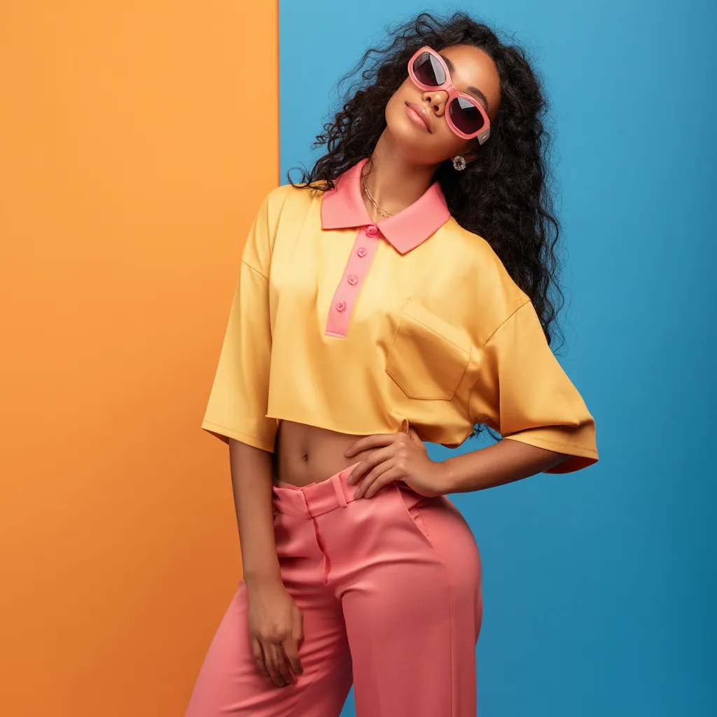
A loose polo outfit built on contrasting bright tones is one of the few casual formulas that reads as deliberate without requiring much effort. The collar adds enough structure at the top to make even the most relaxed silhouette look intentional, and when you pair it with a saturated color on the bottom half, the result is a color-blocked look that stylists have been reaching for all season. Lacoste’s Women’s Loose Fit Polo retails at $135 and remains the benchmark for why the drop shoulder and boxy hem matter — they create the proportional contrast that gives any high-waisted bottom somewhere interesting to land.
Color theory makes the pairing decisions easier than they look. Complementary shades — colors that sit opposite each other on the wheel — create visual tension that reads as fashion-forward rather than accidental. Mint green with fuchsia, scarlet red with turquoise, sky blue with tangerine orange: each of these pairs works because the colors are far enough apart to create contrast but matched in saturation so neither one dominates. Match the intensity, and the outfit makes sense. Drop one shade into a muted territory, and the whole thing unravels.
The three looks below cover the full range — from a pastel-grounded pairing through a jewel-toned clash to a warm-cool combination suited for evenings out. Each one uses the polo as the foundation and lets the bottom half deliver the color story. Accessories stay solid or metallic throughout; the moment a print enters, the two-color architecture falls apart.
- Mint green polo + fuchsia wide-leg trousers: highest energy of the three; white sneakers are the only safe shoe.
- Scarlet red polo + turquoise palazzo pants: the most evening-appropriate combination; pointed-toe heels pull it fully out of casual.
- Sky blue polo + tangerine orange culottes: the most wearable for daytime; a woven tote keeps it grounded.
- High-waisted waistbands are non-negotiable — they create the proportional break that makes the polo look styled, not sloppy.
- Keep every accessory solid, metallic, or neutral. A third bold color collapses the two-color contrast.
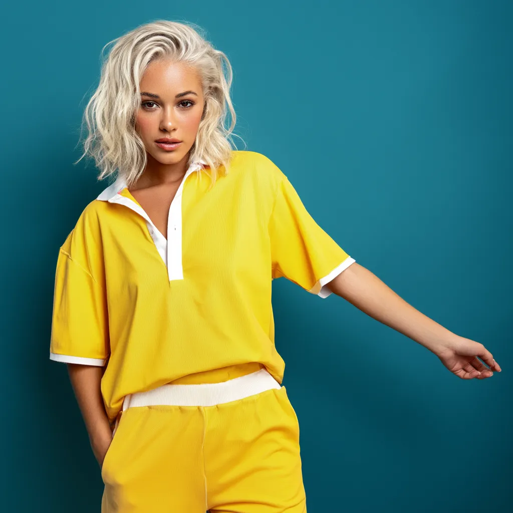
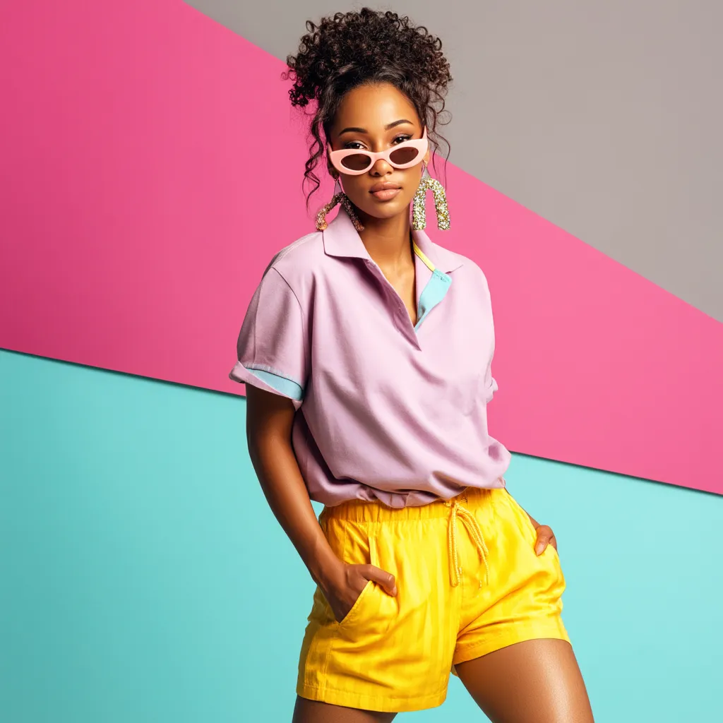
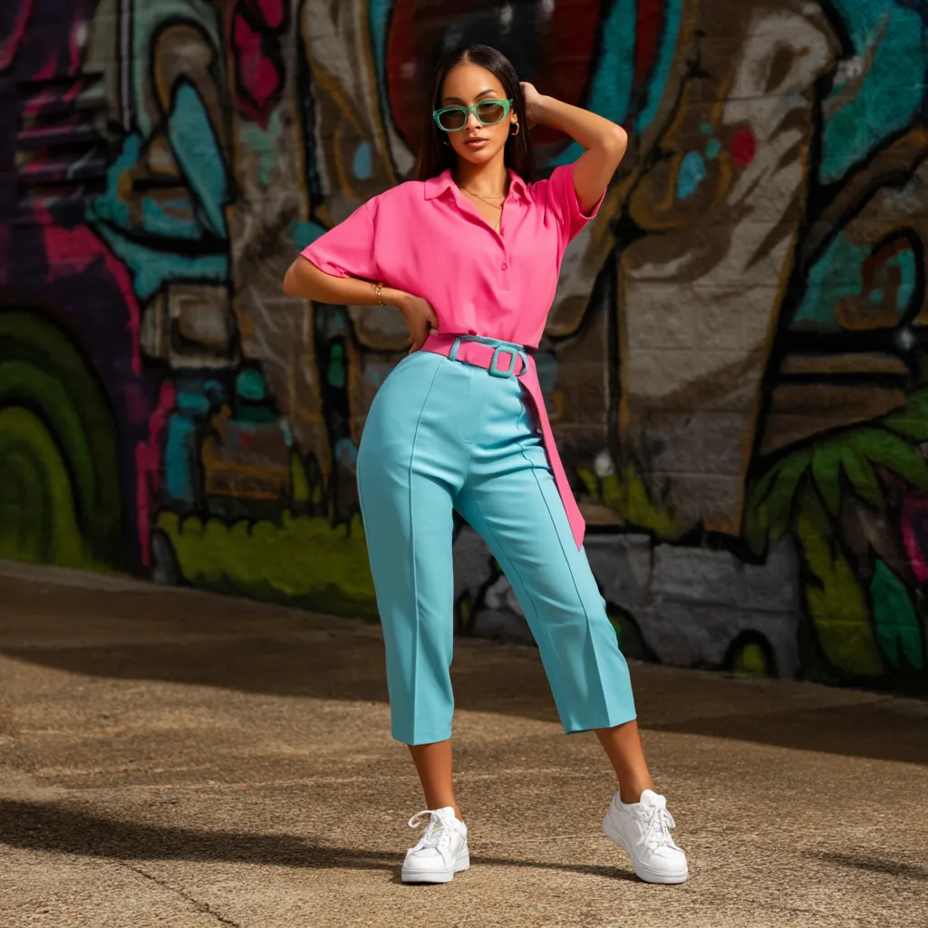
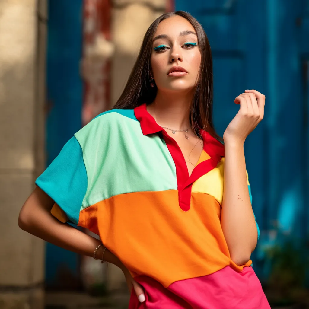
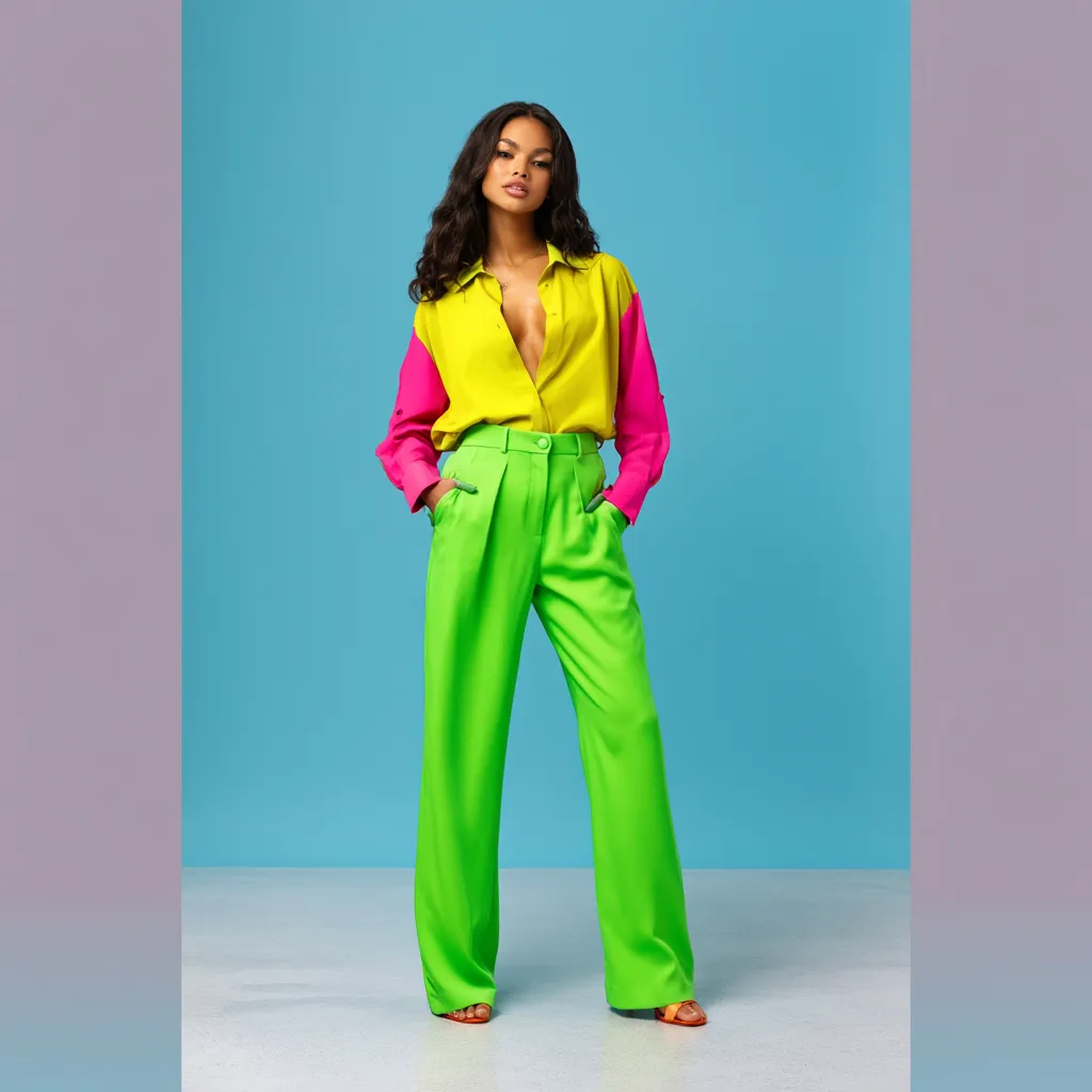
Mint Green Meets Fuchsia — Where Loose Polo Outfit Ideas Go Pastel-Bold
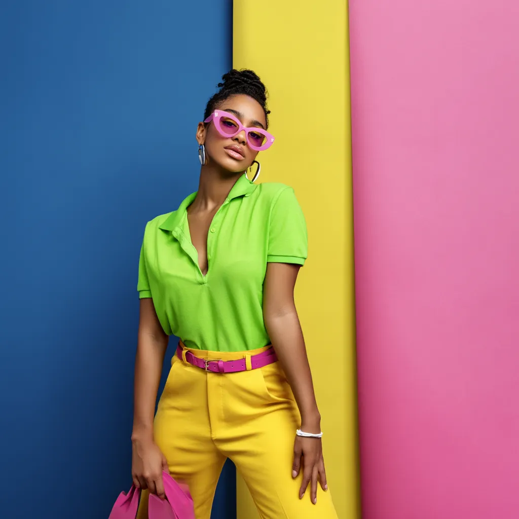
Styling a loose polo outfit with mint green and fuchsia works because the pairing sits on the boundary between complementary and analogous color theory — soft enough to feel fresh, saturated enough to read as intentional. Fashion editors have flagged this combination as one of the most wearable color-blocking formulas precisely because the mint green base cools the intensity of the fuchsia below without washing either shade out. Ask a stylist which pastel works hardest in a color-blocked look, and mint green comes up first.
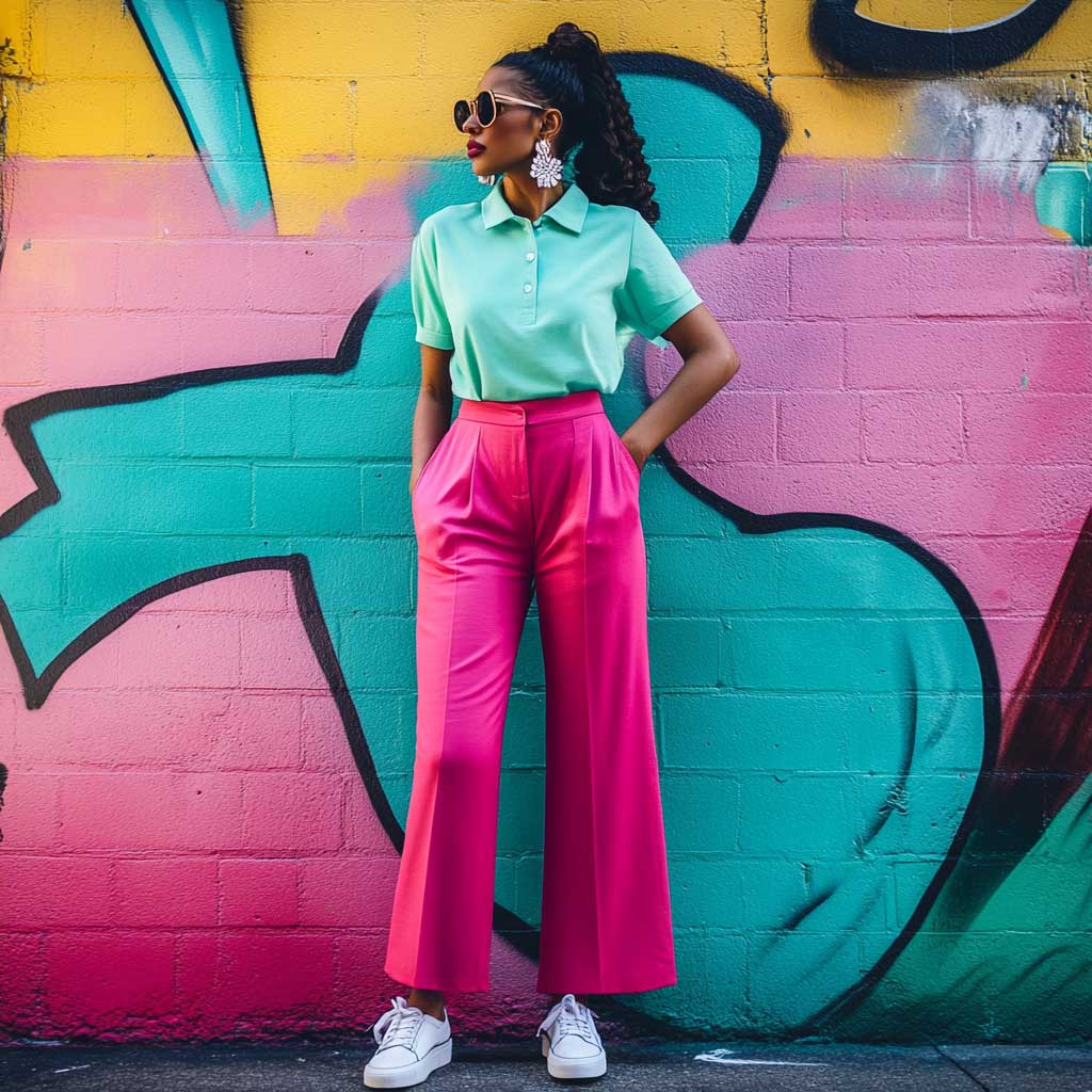


Fuchsia wide-leg trousers in a high-waisted cut pull the eye to the narrowest point of the torso and create the proportional contrast that makes a loose polo look styled rather than thrown on. The wider the leg, the more the polo’s boxy hem reads as deliberate — the two silhouettes mirror each other and the look holds together. Cotton twill handles the heat without sacrificing structure; avoid anything with a stretch waistband, which collapses during wear and kills the proportional logic. Tucking only the front of the polo into the waistband while leaving the back loose is the half-tuck move that separates a refined look from an accidental one.
White leather sneakers are the correct shoe here — not because they’re safe, but because they don’t introduce a third active color into a look that already has two competing leads. A crossbody bag in sand or ecru does the same job at hip level. For jewelry, a single thin gold chain at the collarbone works without competing with the polo’s collar structure. Avoid stacking necklaces across a polo: the collar already frames the neck, and layering reads as noise rather than detail. The mint-and-fuchsia combination works at a coastal market, an afternoon gallery, or a weekend brunch; it doesn’t require a specific context to land well.
The most common mistake with this pairing is going for a muted or dusty fuchsia. The intensity has to match. A washed-out pink next to a true mint reads as faded rather than considered — the mint loses its freshness and the pink looks like a laundry accident. Stay in true fuchsia, full saturation. For more color-block combinations built on the same complementary-color principle, electric blue and hot pink color-blocking outfits cover the same design logic applied to higher-voltage pairings.
Scarlet Red and Turquoise — the Loose Polo Outfit That Reads Evening Without Trying
Scarlet red paired with turquoise is the warm-cool contrast that stylists reach for when the goal is a look that can handle gallery openings and networking dinners without looking overdressed for either. The contrast between a deep warm red and a cool, saturated teal is almost impossible to get wrong once you understand the mechanic: warm tones pull the eye to the upper body, cool tones recede toward the lower half, and the combination creates a visual tension that reads as intentional without needing any additional styling effort. The S/S 26 runways pushed warm-cool color-blocking hard, with designers at multiple houses pairing scarlet with teal or turquoise as a two-color statement.


Turquoise palazzo pants in a wide-leg cut give the lower half of this outfit its structure and movement simultaneously — the wide leg adds volume and flow, while the palazzo’s high-rise waistband keeps the polo tuck secure throughout the day. Palazzo proportions work because the full width of the leg mirrors the polo’s relaxed torso; the look becomes one deliberate silhouette rather than two separate pieces. Why does palazzo work better here than a culotte or a tapered trouser? Because the falling length of a palazzo allows the turquoise to register as a substantial block of color rather than a narrow stripe. A tapered leg shrinks the turquoise area and reduces the impact of the contrast.
White pointed-toe heels are the right call for this combination — pointed-toe silhouettes extend the visual line of the leg beyond the trouser hem and add enough formality to push this look out of daytime territory. A structured bag in white or cream grounds the outfit at the arm without disturbing the two-color story. Silver drop earrings carry enough visual weight to balance the polo collar from below; anything larger than 4 cm competes with the collar’s frame rather than completing it. Tommy Hilfiger’s women’s polo shirts in this territory retail around $59.50 and deliver the right boxy hem proportions for this kind of high-waisted pairing.
Avoid accessorizing this combination with gold tones. Gold reads warm and leans into the red side of the palette — it creates a thermal imbalance that visually makes the turquoise recede. Silver or white metal stays neutral between the two temperature extremes and lets the color contrast do the work alone. The one other thing that kills this look: a logo bag or a printed scarf. Both introduce a visual element that competes with the two-color architecture and makes the outfit read busy rather than bold.
Don’t pair two loose-fitting pieces. A relaxed polo already adds volume at the shoulders and torso — if the palazzo or trousers also have a flowing, unstructured waistband, the outfit reads shapeless. The polo needs a bottom half with a defined, fitted waistband that creates a clear division between torso and legs. Volume on top, structure below — never both simultaneously. A soft elastic waistband that sits 2 cm lower than expected after two hours of wear will undo the entire proportional logic of this look.
Sky Blue and Tangerine Orange — a Warm-Cool Loose Polo Outfit for Daytime
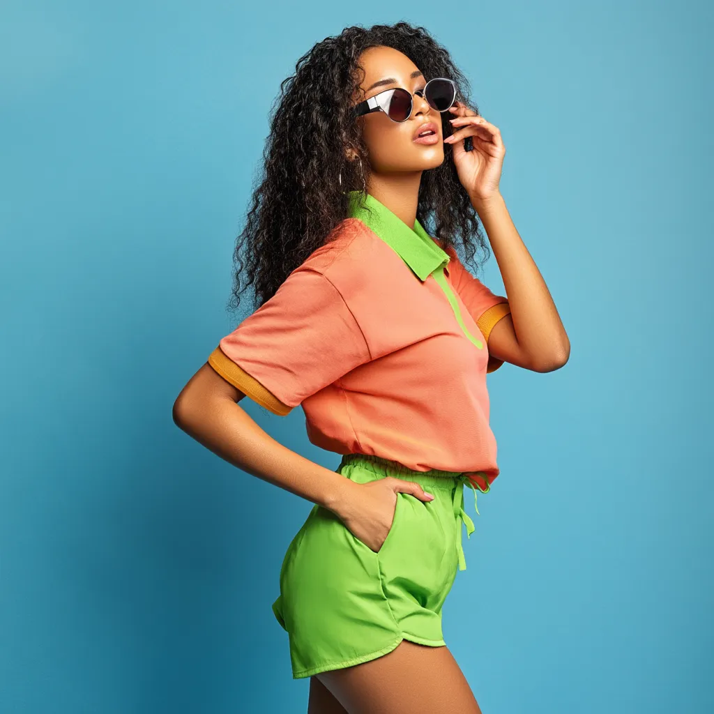
Sky blue and tangerine orange is the warm-cool pairing that functions like the daytime version of the scarlet-and-turquoise look above — same color theory principle, lower temperature, more casual context. Stylists note that blue-and-orange combinations succeed because blue is the most universally flattering cool tone while tangerine’s warmth reads as energizing rather than aggressive. The result is a loose polo outfit for women that can handle a seaside brunch, a city shopping afternoon, or a farmers’ market without looking like it was assembled with too much effort. Nautica’s women’s polo line, with shirts originally priced around $44.50, offers the kind of lightweight cotton piqué that keeps this look from feeling heavy in warm weather.


High-waisted tangerine culottes are the stronger choice over wide-leg trousers for this particular combination. The culotte’s shorter hem length — landing just below the knee — keeps the look proportionally lighter for daytime, and the fabric volume above the knee gives the sky blue polo’s color enough visual contrast area to register clearly. The structured silhouette of the culottes creates a clear horizontal line at the high waist, which is where the two colors divide; that waistband break is the design element that makes the color-blocked logic visible. Beige strappy sandals in leather or nubuck elongate the leg without adding a third color; anything bolder at the ankle draws attention away from the orange and disrupts the two-color story.
A woven rattan or straw tote introduces natural texture that interrupts the two-color palette just enough to ground it without competing. This is the same mechanic that makes espadrilles work in color-blocked outfits — the jute or raffia material sits outside the color story rather than inside it, so it reads as neutral even when it’s technically a warm tan. Round-frame sunglasses add a retro-inspired structural note that complements the polo’s collar. Layered gold necklaces work here where they wouldn’t in the scarlet-and-turquoise pairing, because sky blue is a cool neutral rather than a competing warm tone — the gold reads as an accent rather than a thermal disruption. According to Who What Wear’s colour-blocking trend breakdown for 2026, pairing opposing shades on the color wheel creates visual intrigue while keeping the look balanced — which is exactly the mechanism at work here.
The mistake that most often flattens this combination is choosing the wrong shade of orange. Burnt orange reads warm and earthy — it pushes this look toward autumn and loses the summery freshness that makes sky blue effective. Coral orange reads too pink and reduces the contrast with the blue. Stay in true tangerine: it’s the shade that sits closest to the primary orange on the color wheel, which is what makes the sky blue pop against it. For more polo outfit formulas that use the same proportional logic, vibrant summer polo outfit pairings cover electric blue, hot pink, and coral red combinations with the same high-waisted bottom approach.
| Color Pair | Best Bottom | Right Shoe | Avoid |
|---|---|---|---|
| Mint Green + Fuchsia | High-waisted wide-leg trousers, full length | White leather sneaker | Muted or dusty fuchsia |
| Scarlet Red + Turquoise | Palazzo pants with structured waistband | White pointed-toe heels | Gold accessories, printed bag |
| Sky Blue + Tangerine | High-waisted culottes, below-knee | Beige leather strappy sandal | Burnt orange, coral orange |
The Final Take
Two Colors, One Rule — Match the Intensity and the Look Handles Itself
A loose polo in any of these three combinations needs a high-waisted waistband on the bottom half. That single detail creates the proportional break that makes the polo read as styled rather than oversized.
Complementary color pairing — shades that sit opposite on the color wheel — does the design work for you. Mint and fuchsia, red and turquoise, sky blue and orange all operate on the same principle: opposing hues at matching saturation create contrast that looks deliberate without requiring precision.
Keep every accessory solid, metallic, or neutral. A pattern, a print, or a third saturated color anywhere in the outfit collapses the two-color story. Save this post.