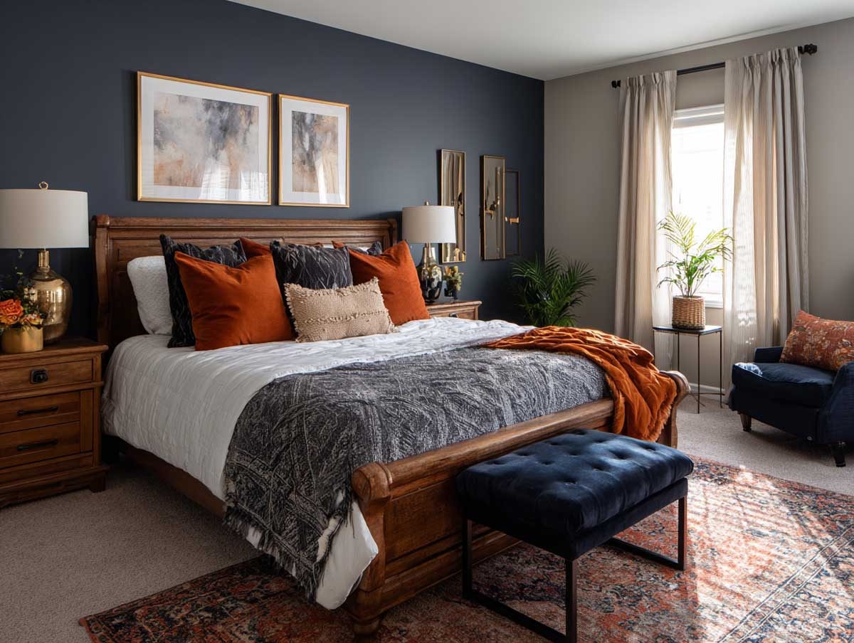
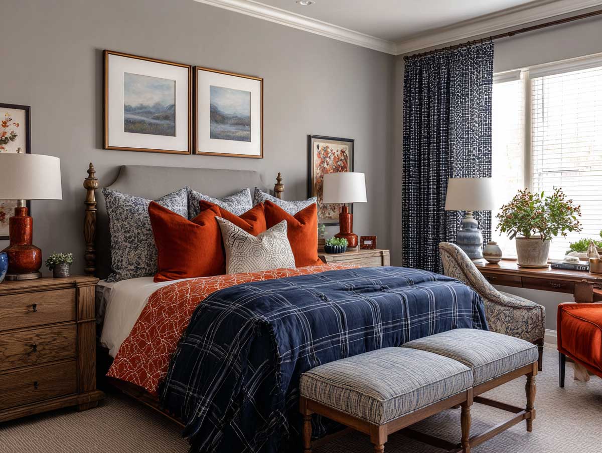
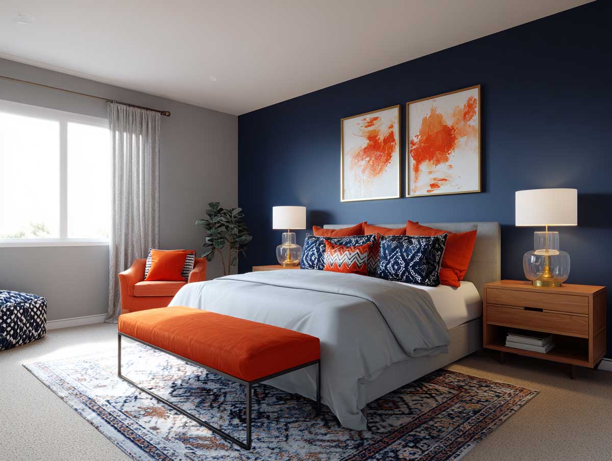
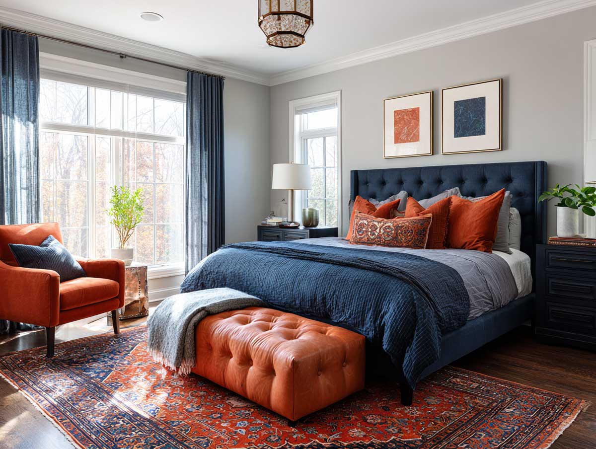
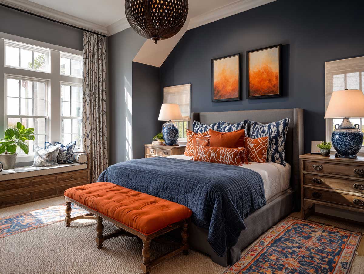
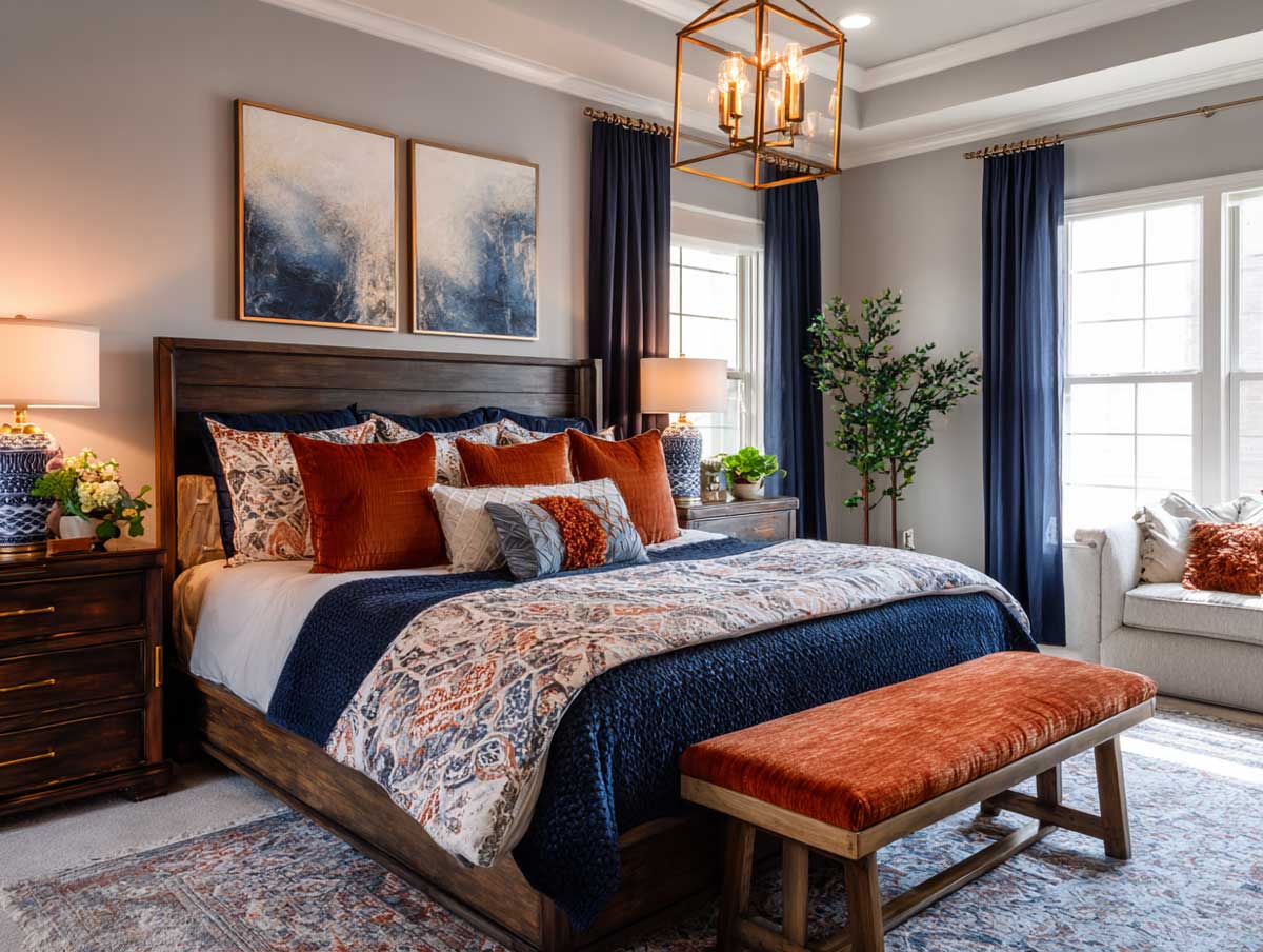
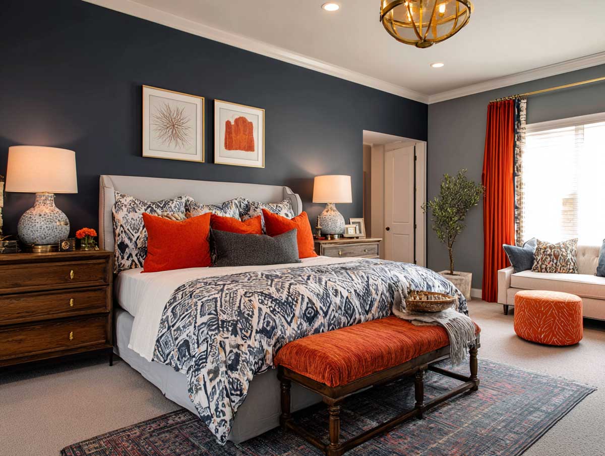
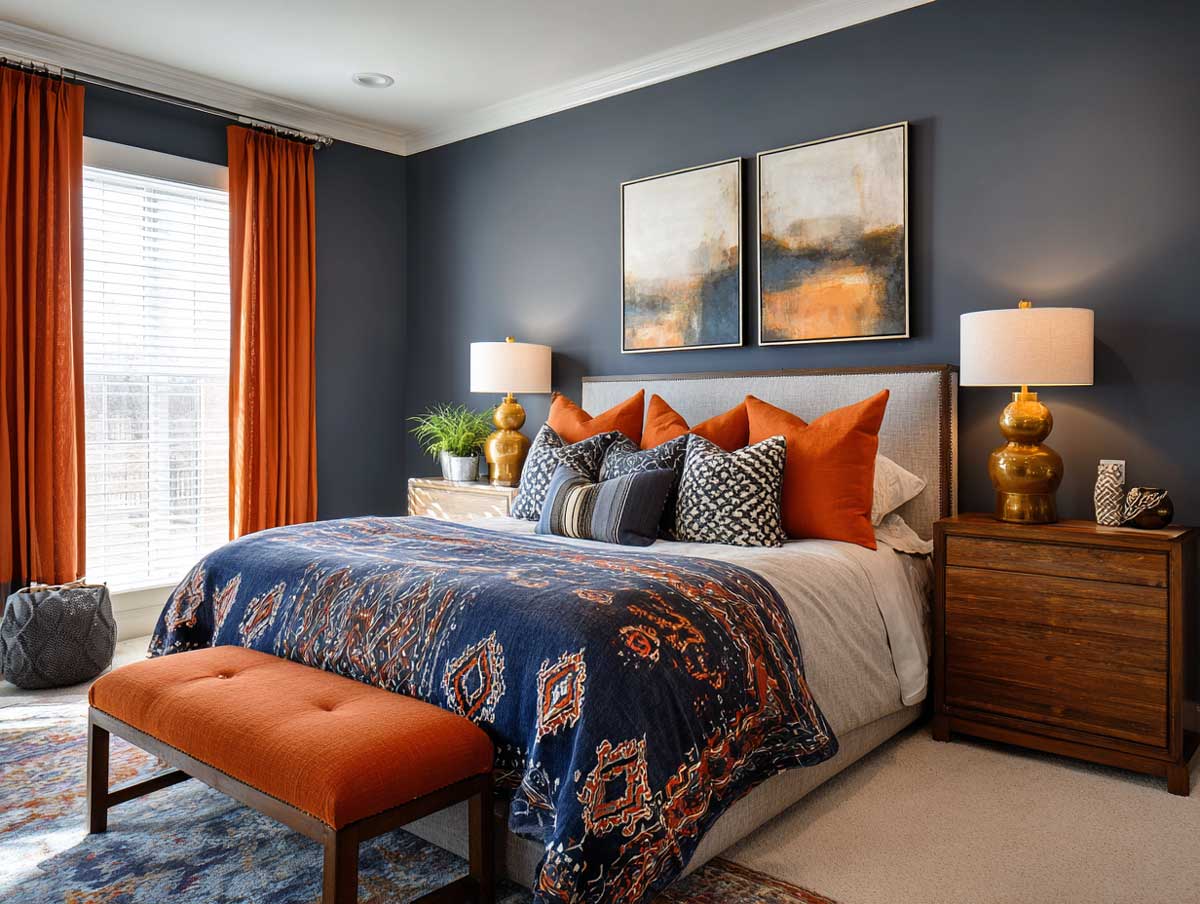
A navy and burnt orange bedroom is one of those pairings that sounds risky until you see it executed well — and then it becomes hard to imagine anything else. Navy anchors a room with the kind of authority that doesn’t need to shout. Burnt orange pushes back with warmth and just enough fire to keep things from going cold. Together, they produce a bedroom that reads as deliberate, lived-in, and genuinely expressive rather than assembled from a color trend.
The reason this combination holds up across so many styles — from stripped-back industrial to layered bohemian — is that it operates on opposing color temperatures. Stylists recommend treating navy as the room’s structural color and burnt orange as the thermal layer that activates it. Benjamin Moore Hale Navy HC-154, one of the most widely used navies in residential interiors, has an LRV of just 8.36, meaning it absorbs most light — a useful counterweight to a warm, advancing hue like burnt orange.
The three concepts below take this pairing in completely different directions: architectural and dramatic, raw and urban, and quiet and intellectual. Each one demonstrates a different ratio of navy to orange, a different material language, and a different emotional register — proving there’s no single correct way to put these colors in a room together.
- Navy works as both a wall color and a structural material — velvet panels, concrete finish, or built-in cabinetry all carry it differently.
- Burnt orange performs best as a single bold element rather than scattered accents: one oversized headboard, one painted ceiling zone, or one glass accent cluster.
- Sherwin-Williams Naval SW 6244 (LRV 4) reads truer and darker than Hale Navy — worth sampling if you want maximum depth.
- Brass and walnut are the bridge materials that keep both colors from fighting each other.
- The 60-30-10 rule applies here: navy as the dominant 60%, neutral surfaces at 30%, burnt orange at 10%.
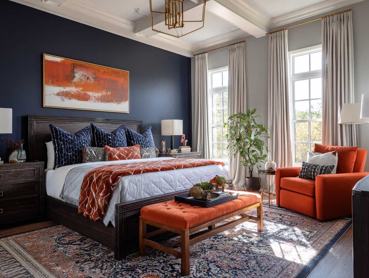
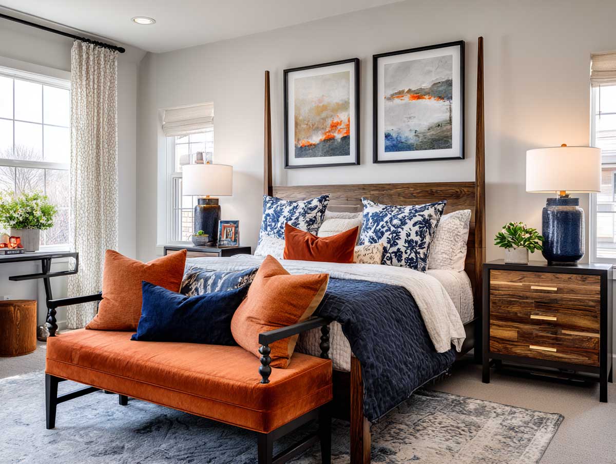
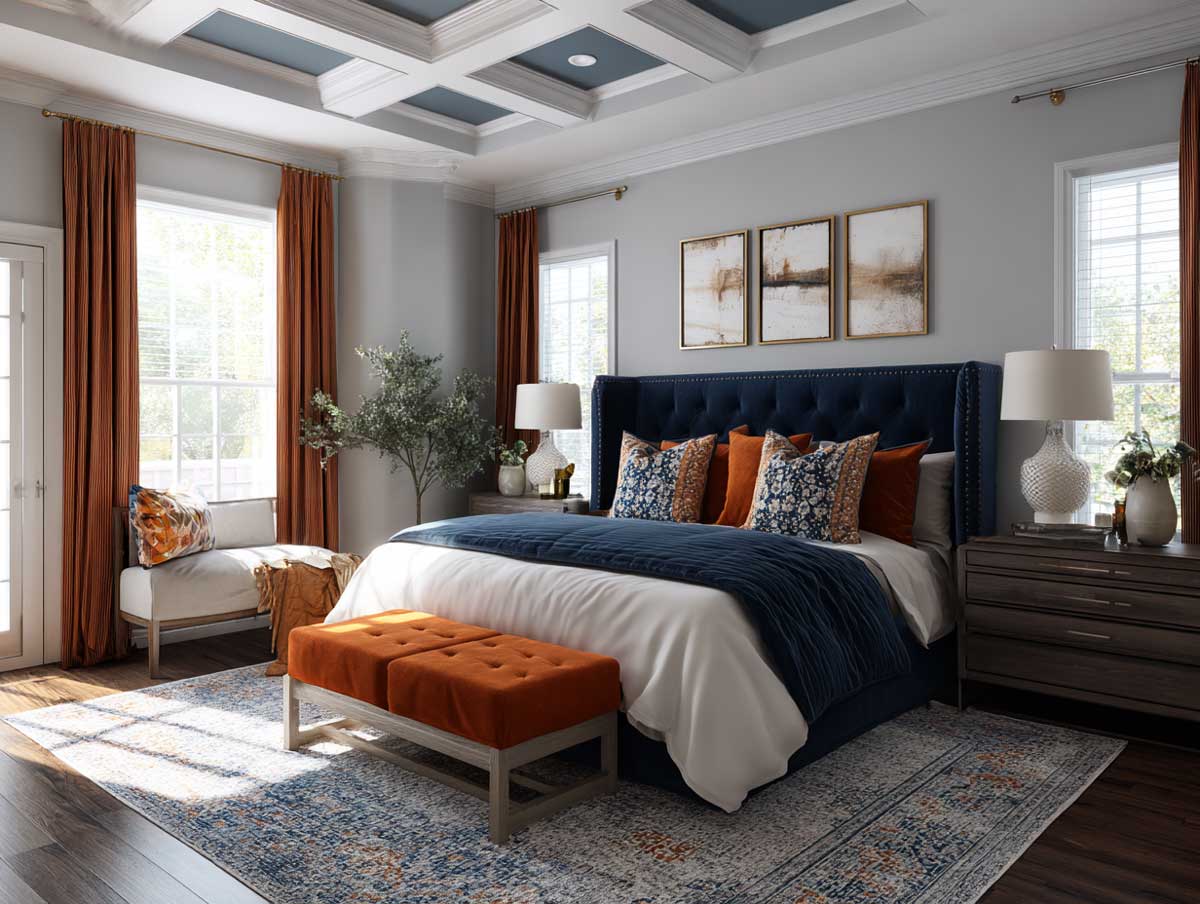
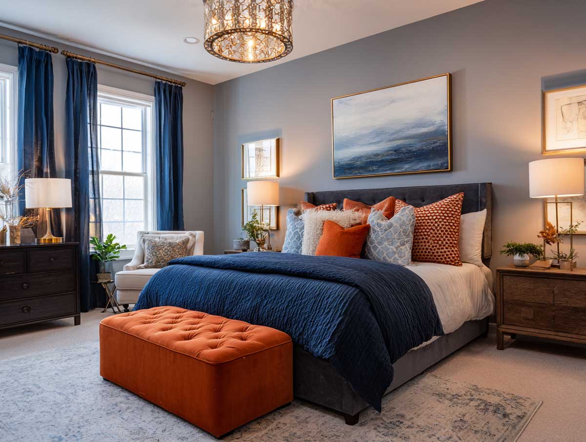
Navy Velvet Panels Meet a Painted Burnt Orange Geometric Ceiling
Navy velvet panels used as architectural wall cladding change the acoustics and the atmosphere of a room simultaneously — the padded vertical columns behind the bed absorb sound and create a rhythm that pulls the eye upward. This is where the geometry begins: the burnt orange ceiling above picks up that upward movement and locks it in place with angular shapes outlined in a deeper sienna. Think of the ceiling as the room’s fifth wall, doing the work that rugs do at floor level — grounding the palette and tying unrelated surfaces into a single visual system.


The walnut bed frame with its arched headboard silhouette echoes the curve implied by the ceiling’s angular shapes — not matching them, but rhyming with them. Brushed brass pendant lights drop from the ceiling in irregular clusters rather than a single centered fixture, which is the right call here: a symmetrical chandelier would compete with the ceiling geometry, whereas scattered pendants read as part of it. Each pendant casts a small, focused pool of warm light that highlights the texture of the navy velvet without washing out the orange overhead.
Terrazzo flooring with ivory, charcoal, and rust-toned aggregates bridges the two dominant colors without choosing sides. A common mistake with this pairing is using a cool-gray floor, which visually cuts the orange off from the rest of the room and makes the whole scheme feel disconnected. Warm-toned terrazzo or oak planking keeps the energy continuous from floor to ceiling. Floating shelves in dark wood hold matte ceramic pieces and one or two sculptural objects — the shelf styling should read as sparse, not gallery-packed, or it competes with the ceiling for visual attention.
What makes this concept instructive is the ratio: burnt orange occupies roughly 10% of the total visible surface, but because it’s overhead, it reads larger than that area suggests. Applying navy as a textured, dimensional material — velvet, not paint — is what prevents the room from feeling flat. On blue wall panelling design for bedrooms, dimensional surface treatments like this consistently outperform flat paint in deep-color applications.
Avoid painting both the ceiling and all four walls in a deep color simultaneously when combining navy and burnt orange. A navy ceiling over navy walls with burnt orange accents leaves nowhere for the eye to land and nowhere for natural light to reflect back into the room. Interior designers consistently recommend keeping at least one large surface — ceiling or one wall — significantly lighter, or limiting the bold ceiling treatment to a defined zone rather than the full overhead plane. The room needs at least one surface that breathes.
A Burnt Orange Headboard Against Navy and Concrete
Navy and burnt orange bedroom ideas that center on a single oversized upholstered headboard are particularly effective because the headboard handles both the color introduction and the softness in one move. Here, the headboard is full-wall-width and rises high — functionally, it acts like a partial accent wall without requiring paint or wallpaper commitment. Burnt orange upholstered king-size bed frames start at around $187 on platforms like Walmart for fabric wingback styles and scale up considerably for velvet or custom upholstery, so this is an accessible entry point into the color even before touching the walls.


The walls behind and beside the headboard are finished in a concrete-effect navy — raw, matte, and deliberately unpolished. This surface shifts with light in a way flat paint doesn’t: morning light reveals texture and cool undertones, while evening lamp light pushes the surface toward warmer gray. That chameleon quality is what keeps a concrete-effect bedroom from feeling like a brutalist afterthought. Wall sconces at mid-height, casting upward, soften the concrete without pretending it’s something else. Do not use downlights only in this context — they flatten the texture and eliminate the drama you paid for.
The furniture logic is industrial restraint: blackened steel nightstands with sharp horizontal lines, a single floating shelf at desk height, Edison bulbs on black pendant cords. The question this room answers is whether warmth can survive inside a raw, hard-surfaced space — and the answer is yes, but only because the headboard is large enough to hold its own. A small or narrow burnt orange element against four walls of navy concrete reads as an afterthought rather than an intention. Scale is the deciding factor. Stylists recommend the headboard footprint be at minimum equal to the mattress width for this visual equation to work.
Two abstract prints above the bed do something clever: one pulls sienna and orange shapes, the other fragments navy and white. Hung at the same height but different sizes, they replicate the room’s core argument — warm vs. cool, soft vs. structured — at a smaller, more personal scale. A common error here is choosing prints that are too matchy, selecting artwork that repeats exact burnt orange and exact navy shades rather than varied tones within each family. The room becomes more interesting when the prints interpret the palette rather than illustrate it literally.
How Navy and Orange Bedroom Ideas Scale From Accents to Architecture
Navy and orange bedroom ideas exist on a spectrum, and one of the most underused positions on that spectrum is the architectural end — where color doesn’t sit on top of furniture and accessories but is built directly into the room’s structure. A floor-to-ceiling navy bookcase covering an entire wall does this most definitively. The structure has both open and closed sections, some backlit at low intensity to highlight objets d’art without blowing out the navy finish. Benjamin Moore Hale Navy HC-154 is a strong choice for built-in joinery: its gray-green undertones prevent the cabinetry from reading as purple in incandescent light, which is the most common complaint about pure navy paint on large furniture pieces.


Burnt orange arrives here not as paint or upholstery but as translucent glass — table lamps, vaseware, and a sculptural room divider. Glass handles color differently from fabric or matte surfaces: it filters and refracts light rather than absorbing it, so the orange shifts between amber, terracotta, and nearly red depending on the angle and time of day. This is the trick. A static burnt orange — the same hue at 10am and 10pm — eventually reads as expected. A translucent orange that changes with light conditions stays interesting. It is, effectively, the room’s own light source within the light source.
The bed is low and modular, dressed in navy sheets with a loosely draped burnt orange throw rather than a tightly coordinated bedding set. The distinction matters: a coordinated set looks purchased as a unit, while a layered combination of separate pieces — cotton sheets, a linen throw, velvet cushions — suggests the room evolved over time rather than arrived complete. Polished oak flooring connects the warmth of the glass accents down to floor level. You’ll notice the ceiling has asymmetrically arranged recessed lights rather than a centered pendant — this is a deliberate choice to avoid a single focal point competing with the bookcase wall, which needs to carry visual weight uncontested. For inspiration on combining warm orange tones with structured, layered bedroom design, the approach used in warm orange bedroom design for couples offers another angle on mixing earthy hues with textured materials.
A mid-century lounge chair in burnt orange leather anchors the room’s reading corner beside a minimal floor lamp and a small navy pedestal table. Leather and glass are two materials that handle burnt orange very differently — the chair is solid and matte, the glass accents are shifting and luminous. Placing both in the same room at different distances from the main light source means the orange is never perceived identically twice, which is what keeps the palette from going flat in a room that uses it so deliberately. The one thing to avoid: adding a second large piece of burnt orange upholstery. One chair and one glass cluster is the right ceiling for this palette; two upholstered orange pieces tips the balance and the navy bookcase loses its authority.
| Concept | Navy Element | Orange Element | Bridge Material |
|---|---|---|---|
| Velvet Panels + Geometric Ceiling | Padded velvet wall panels | Painted geometric ceiling zone | Brushed brass pendants, walnut bed frame |
| Oversized Headboard + Concrete Walls | Concrete-effect wall finish | Full-width upholstered headboard | Blackened steel, Edison bulbs |
| Bookcase Wall + Glass Accents | Built-in floor-to-ceiling cabinetry | Translucent glass lamps and vaseware | Polished oak flooring, burnt orange leather chair |
Color theory explains why navy and burnt orange hold together across such different executions: the two sit almost directly opposite on the color wheel, making them complementary in the technical sense. As color psychologist Tash Bradley of Lick notes, blue tempers orange’s intensity while orange prevents blue from feeling too cold — a balance that works whether the colors are applied through velvet, concrete, or glass. The result is a pairing that reads as harmonious through its friction rather than despite it.
The takeaway
Navy and burnt orange rooms hold because of scale, not just color choice.
Each concept here places the dominant color — navy — as a structural or architectural element first, not as a paint-over-everything solution. Burnt orange functions as the thermal counterweight: one concentrated element per room, large enough to register, restrained enough to let navy lead.
Sherwin-Williams Naval SW 6244 (LRV 4) runs darker than Hale Navy; test both as large samples in your actual light conditions before committing. For upholstered orange accents, velvet reads warmer under artificial light than linen or cotton at the same colorway.
Save this post before your next bedroom planning session.
Related Topics
FAQ
navy and burnt orange bedroom
navy and orange bedroom ideas for different room sizes
burnt orange and navy blue bedroom with concrete walls
navy and burnt orange living room vs bedroom application
what colors and materials go with navy and orange bedroom
how much does it cost to paint a navy bedroom
Complete guide
Bedroom Design Ideas That Actually Change How You Sleep, Feel and Live
Styles, colors, furniture, walls, layouts — 300+ ideas in one place
Complete guide
Blue Home Color Ideas for Every Room and Style
Navy, sky blue, slate, teal — interiors, exteriors, kitchens, bedrooms — all in one place