The right Asian paint colour combination for living room walls does something no new sofa or rug can replicate — it shifts the entire emotional register of the space in one coat. I’ve repainted my own living room three times chasing that feeling, and I finally cracked the formula after the third try. What I learned: most people choose a wall colour and then fight every other element in the room trying to make it work. The combinations below start from the opposite direction — colour first, furniture second, panic never.
Asian Paints’ Royale range is the reference point here, specifically because the shades have precise shade codes you can hand to any painter and get the exact result you saw on screen. That matters more than people admit. Eyeballing a swatch at a store under fluorescent light and then applying it to a north-facing wall at 7 PM are two completely different experiences.
What you’ll find on this page
- Turquoise + yellow — the vibrant pairing that reads energetic without turning chaotic
- White + deep navy — how to pull off the minimalist combination without it feeling clinical
- Muted green + terracotta + beige — the earthy trio that actually holds up in Indian and South Asian light
- Shade codes, finish recommendations, and the one mistake that kills each combination
- FAQ covering two-colour hall combinations, accent walls, and Royale finish types
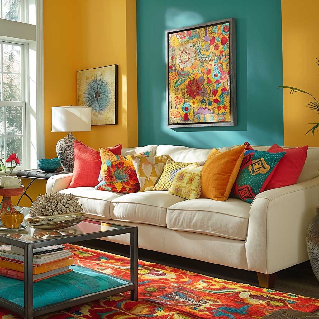
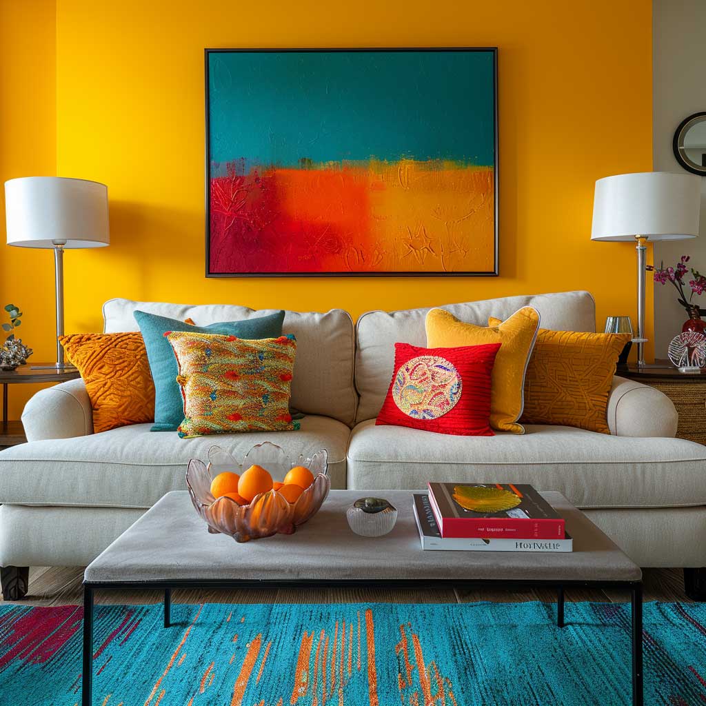
Turquoise and Sunny Yellow — Why This Pairing Works When Nothing Else Wakes the Room Up
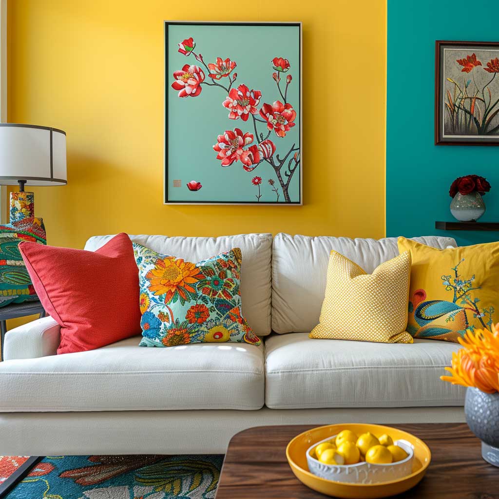

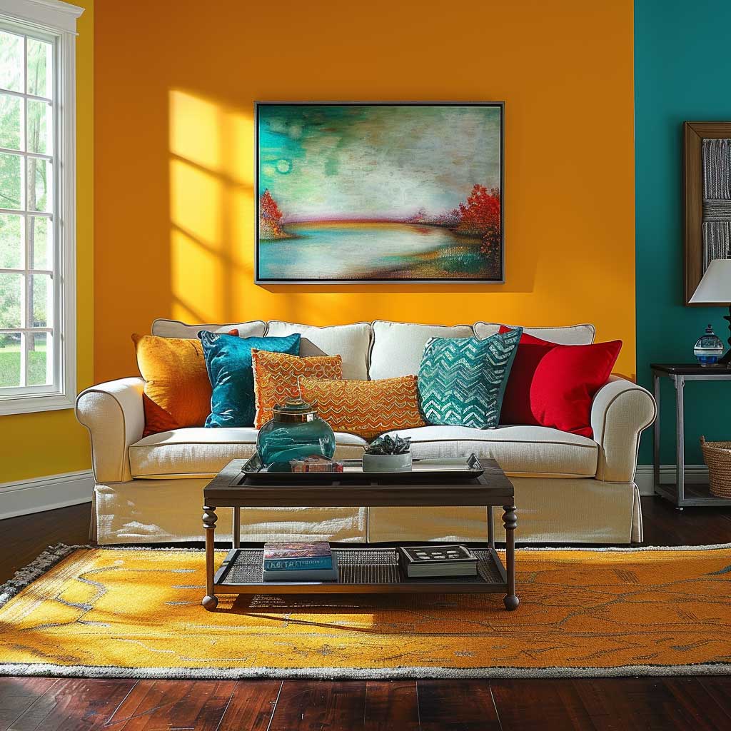
Turquoise on a primary wall reads like the ocean has decided to move inside — which sounds chaotic and ends up being surprisingly liveable. The specific shade I’d reach for is Asian Paints Royale “Aqua Splash” (shade code varies by finish; confirm with your dealer), applied in Royale Shyne for easy wipe-downs in a high-traffic room. The key is keeping the primary wall as the only turquoise surface. Paint the remaining three walls a clean off-white — Royale “Snow White” or “Brilliant White” both work — and let the focal wall do all the talking.
Sunny yellow enters through accessories, never through a second paint wall. You need it in throw pillows ($15–$35 each at IKEA or Pepperfry), a ceramic vase or two on the coffee table, and possibly a framed print above the sofa. That’s it. I tested this with a full yellow accent wall once and the room started looking like a school canteen by afternoon light. Keep the yellow moveable so you can swap it out when you tire of it — the turquoise wall will outlast every furniture trend.
Furniture should be light and low. A cream or pale grey sofa drops far enough into the background that the wall reads as architecture, not decoration. Dark wood coffee tables are my go-to anchor piece here — the warm tone stops the turquoise from feeling cold. Skip chrome or silver metal accents entirely; they make the combination skew clinical. Brass or matte gold hardware is the move.

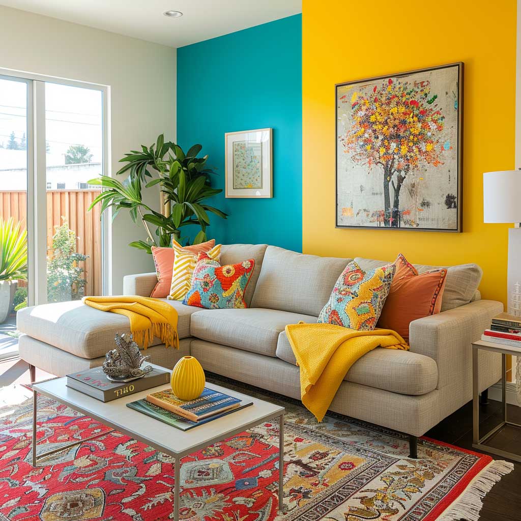

What ruins this combination more than anything else? A patterned rug in competing colours. You’ll notice the whole thing unravels the moment you add a geometric rug in red and orange — the room starts arguing with itself. Stick to a solid jute rug, a plain sisal, or a low-key stripe in grey and cream. The wall is the pattern. Let it be.
North-facing rooms get less direct sunlight, which cools turquoise down to something closer to teal by late afternoon. That’s fine — it reads moody rather than energetic, which suits a room used for evening conversations. South-facing rooms get the full blast of midday light and the turquoise practically vibrates off the wall. Both outcomes are beautiful; just know which one you’re getting before you commit to a full room.
Don’t Do This
Don’t paint two opposite walls in turquoise. The room ends up feeling like a fish tank, and no amount of neutral furniture fixes the imbalance. One feature wall, three neutral walls — that’s the ratio. Also avoid using a bright primary yellow (think hardware-store yellow) anywhere near this combination. It reads aggressive under warm artificial light and wipes out the freshness of the turquoise entirely. If you want warmth, use amber or honey tones in your accessories instead.
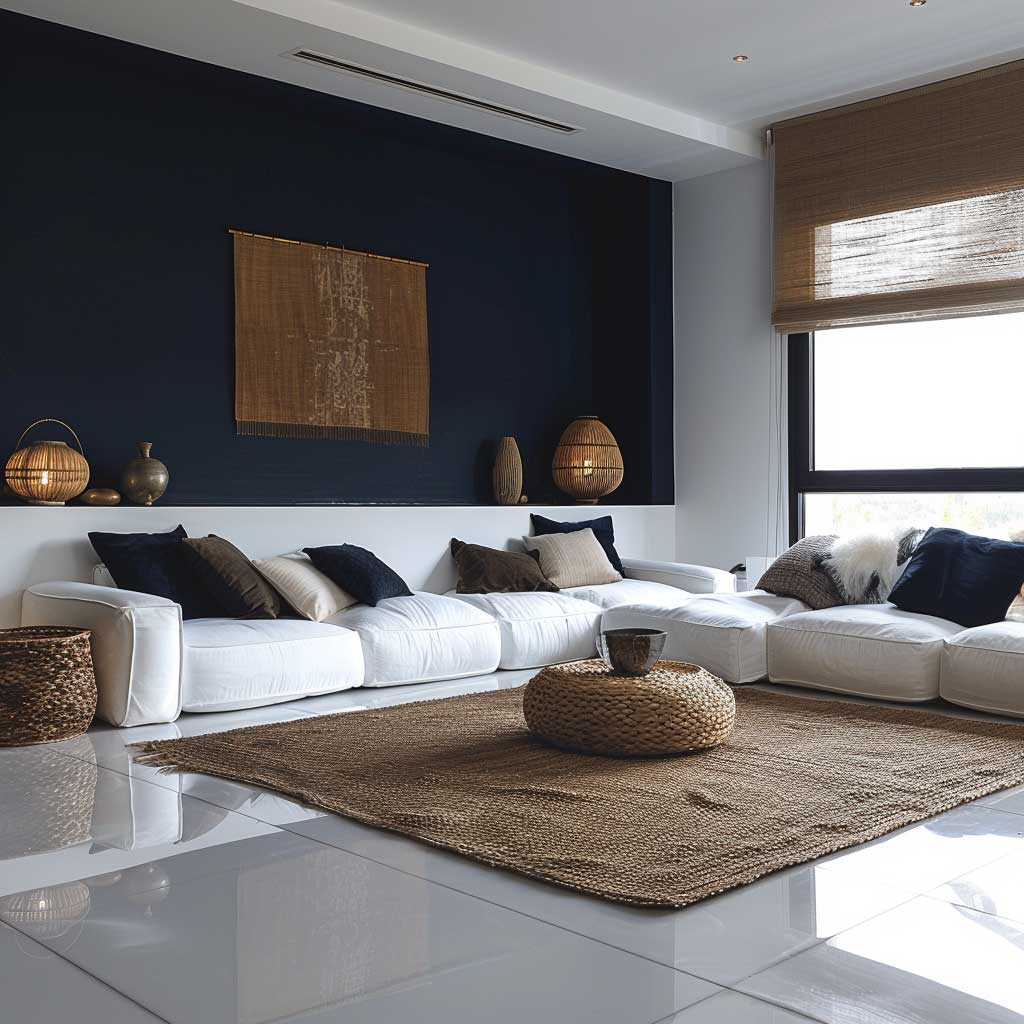
Crisp White Walls, Navy Blue Accents — the Minimalist Formula That Photographs Warm
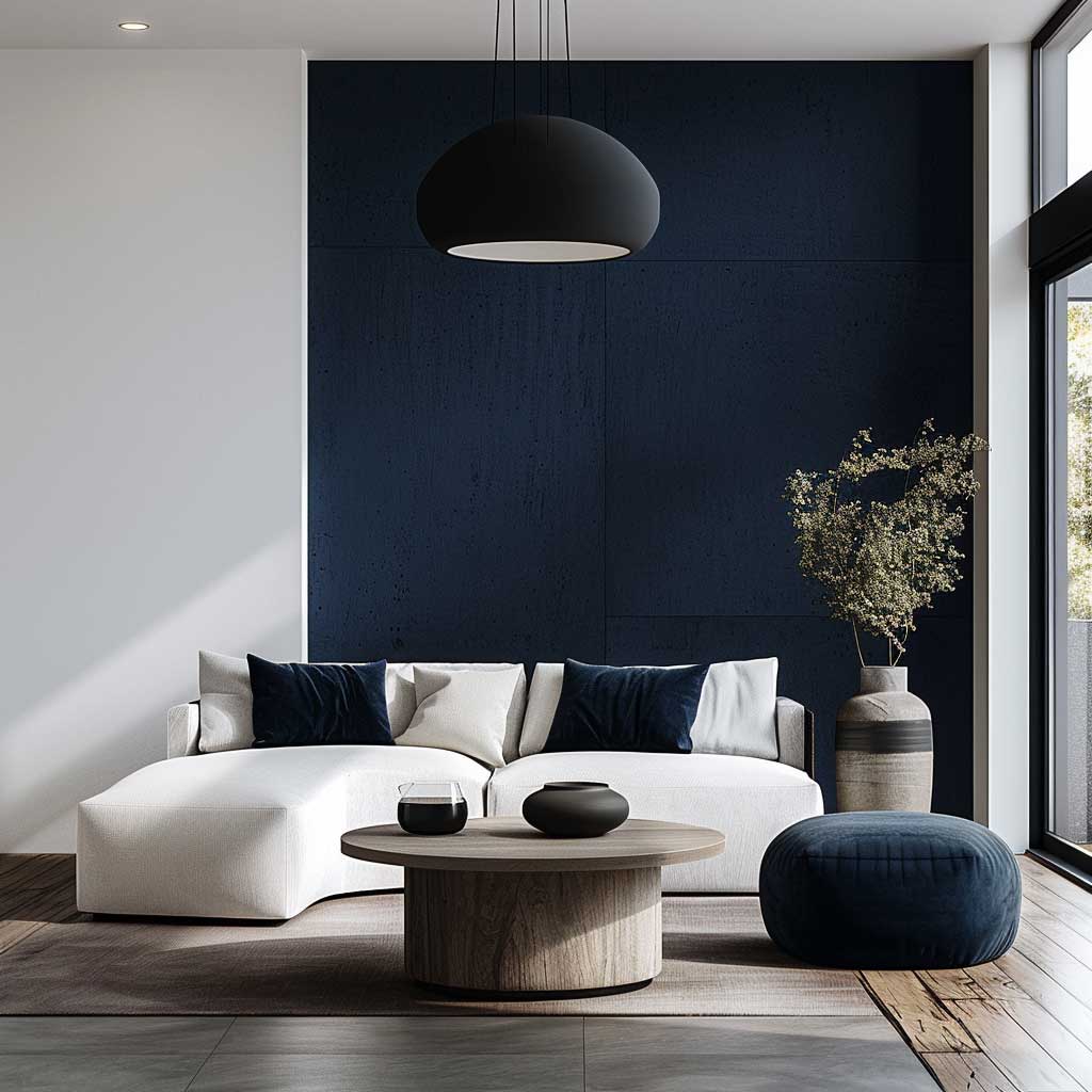
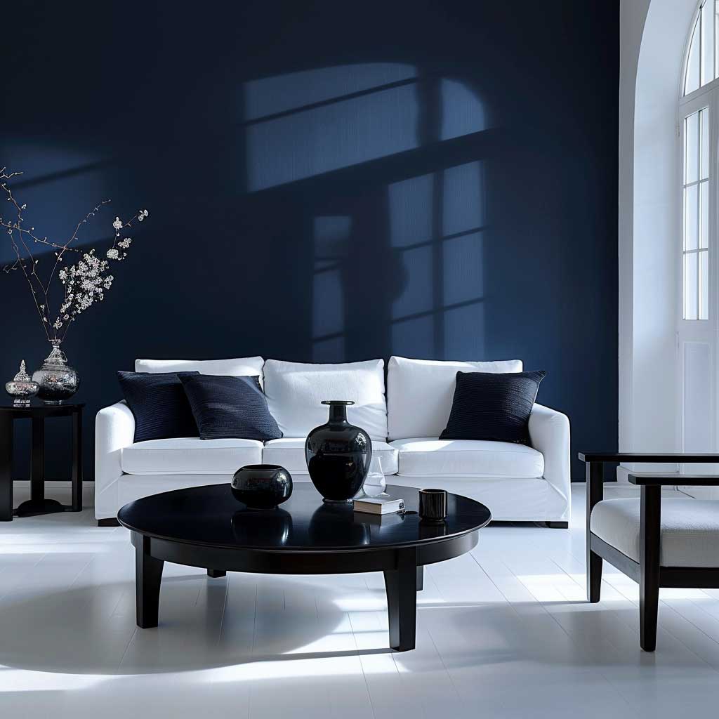
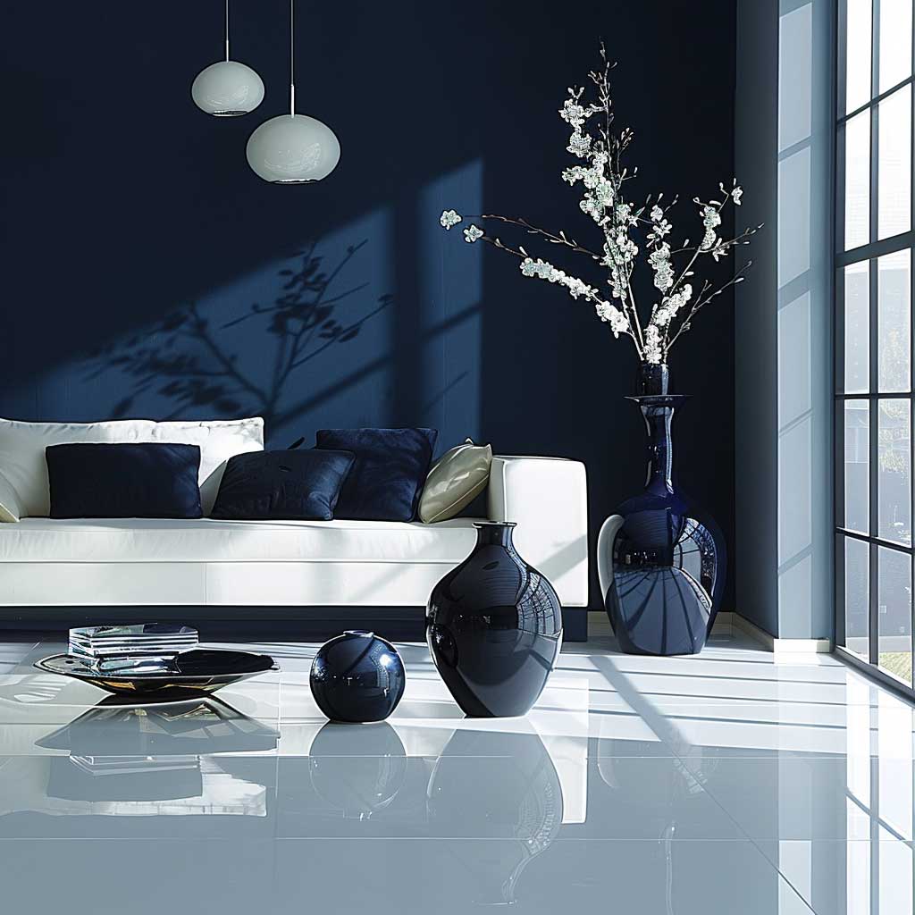
White and navy is the combination I keep recommending to clients who say they want “modern but not cold.” Asian Paints Royale “Brilliant White” on three walls with a navy accent — try “Midnight Rendezvous” or “Indigo Bunting” — on the wall behind the sofa. Both shade families sit in the Royale range and cost roughly ₹4,500–5,000 per 20L can. Budget two cans of white and half a can of navy for a standard living room; the feature wall takes less paint than you think.
The trick this combination pulls is that white reflects whatever light enters the room, so you’re working with your windows rather than fighting them. Your space will look larger. You’ll notice the navy wall doesn’t recede — it advances slightly, which creates a sense of depth that makes the room feel more considered than its actual square footage suggests. Interior designers call this “forced perspective.” I call it the reason small living rooms should never be painted a single flat neutral all the way around.
Furniture in this scheme needs to stay in one of three zones: white, grey, or light wood. A dark charcoal sofa competes with the navy and muddies everything. A white sofa is aspirational and impractical unless you own no food, no pets, and no small humans. My go-to recommendation: a light ash or natural linen sofa from IKEA’s KIVIK range (around $700–900), paired with a low-pile grey rug. Navy accent cushions on the sofa connect the wall colour to the seating without making the whole thing feel matchy.
Lighting changes everything with this palette. Warm bulbs (2700K–3000K) turn the white walls slightly golden by evening and the navy softens to something closer to midnight blue — genuinely beautiful. Cool daylight bulbs (5000K+) push the white toward blue-white and make the navy look harsh. If you’re committed to this combination, spend the $20 on warm LED bulbs before you judge the paint job. Half the time the paint isn’t the problem.
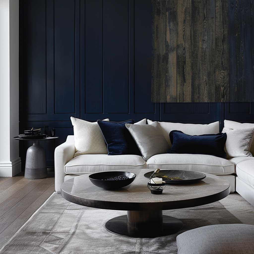

Decor in a white-and-navy room should be edited, not absent. Three well-placed objects beat fifteen scattered ones. I own two black ceramic lamps on a white shelf against the navy wall — the contrast is sharp enough to read from across the room without requiring anything larger. One framed print in black and white above the sofa. Done. The room reads as intentional without feeling styled to within an inch of its life.
For a hall or drawing room version of this combination, you can explore modern drawing room wall paint designs that use the same white-base-plus-dark-accent logic across different finishes and textures — the principle transfers directly.
Muted Green Walls, Terracotta and Beige Accents — the Earthy Combination That Holds Its Ground in South Asian Light

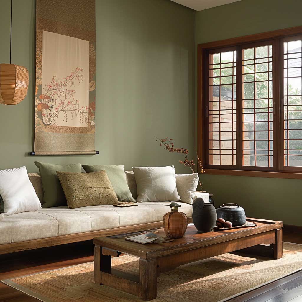


Muted green is one of those wall colours that non-designers consistently underestimate. Not the saturated forest green you’d see in a London restaurant — the softer, greyish-green that reads almost like a neutral until the afternoon light hits it. Asian Paints Royale “Misty Meadows” or “Sage Whisper” (confirm current codes with your dealer) both fall into this category. You paint all four walls in this shade, not just one. The payoff is a room that feels like it’s been exhaling for the last forty years, in the best possible way.
Terracotta is not a wall colour in this scheme — it’s an accent material. Terracotta pots ($8–$25 at any garden centre), clay-coloured cushion covers, a jute or wool rug with warm rust undertones. Terracotta as a wall paint in the same room as green will make you feel like you’re living inside an unglazed ceramic pot. The earthy warmth you’re after comes through objects, not surfaces. Beige operates at the furniture level: a cotton or linen sofa in warm cream, a woven rattan side table, cushions in undyed linen.
South Asian light is intense and warm — which means colours shift more dramatically here between morning and evening than they do in European interiors where most design inspiration photos are taken. A muted green that looks sage in a Stockholm apartment reads noticeably brighter at midday in Chennai or Mumbai. I’d account for this by choosing a shade with a slightly higher grey content than your swatch suggests. Ask your Asian Paints dealer to show you the shade at LRV 45–55 for a result that stays consistent across daylight hours.
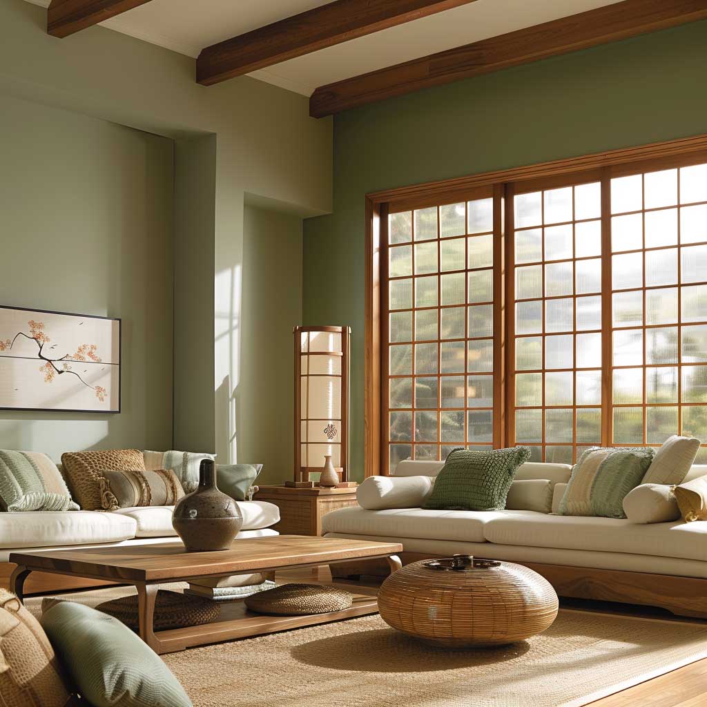
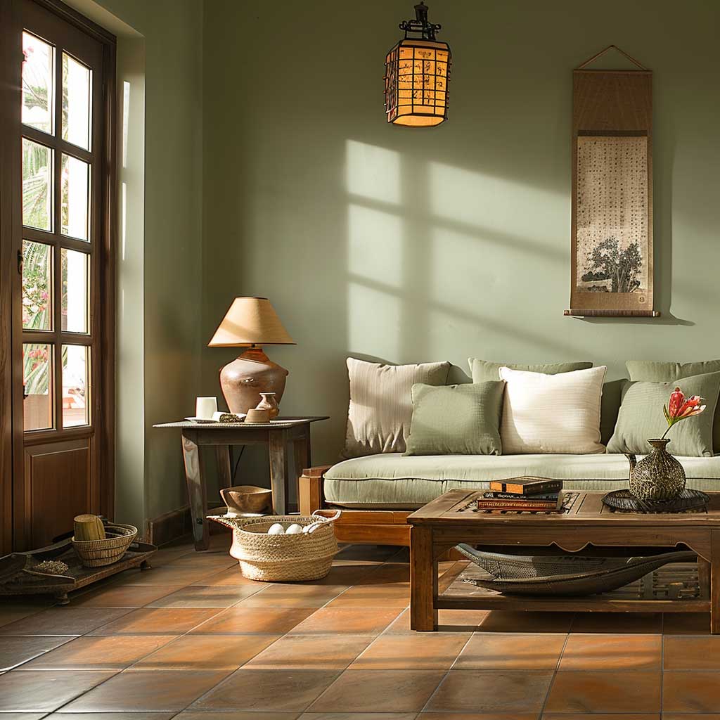
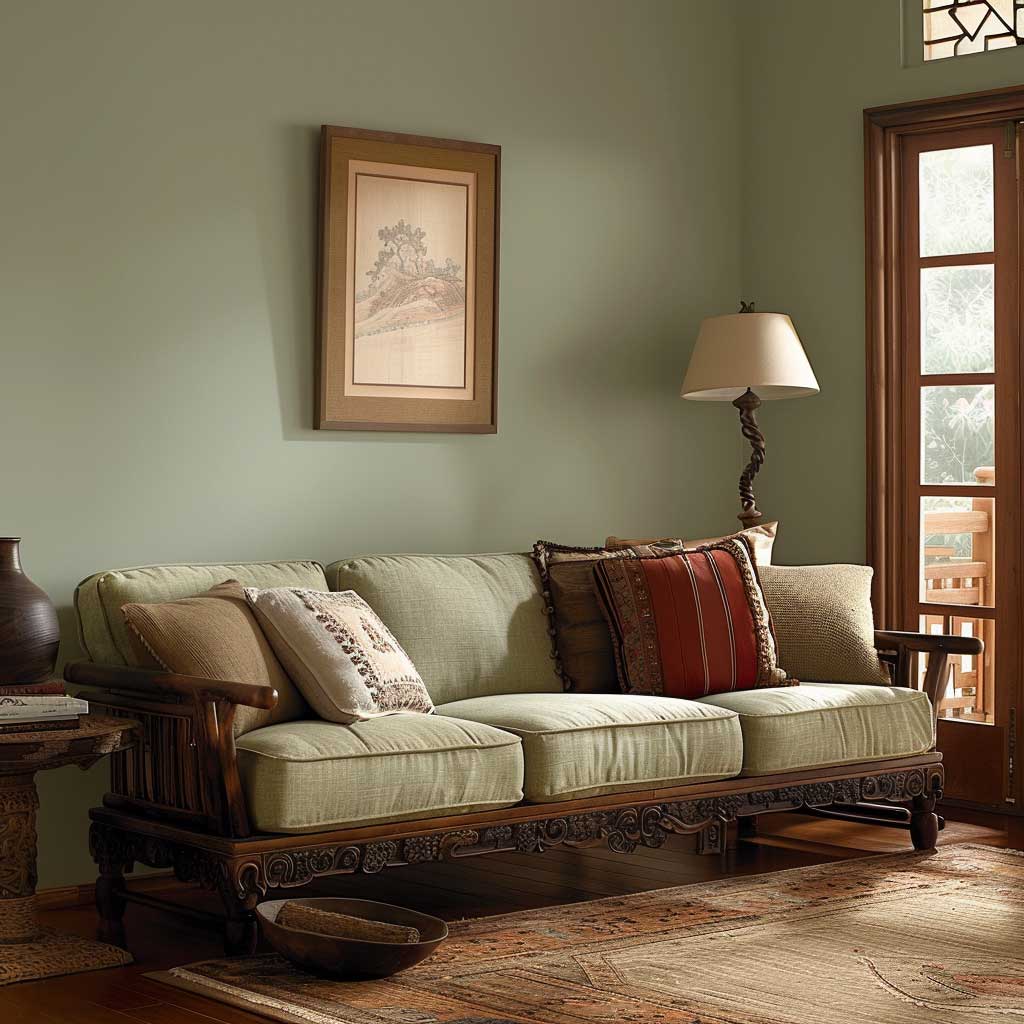
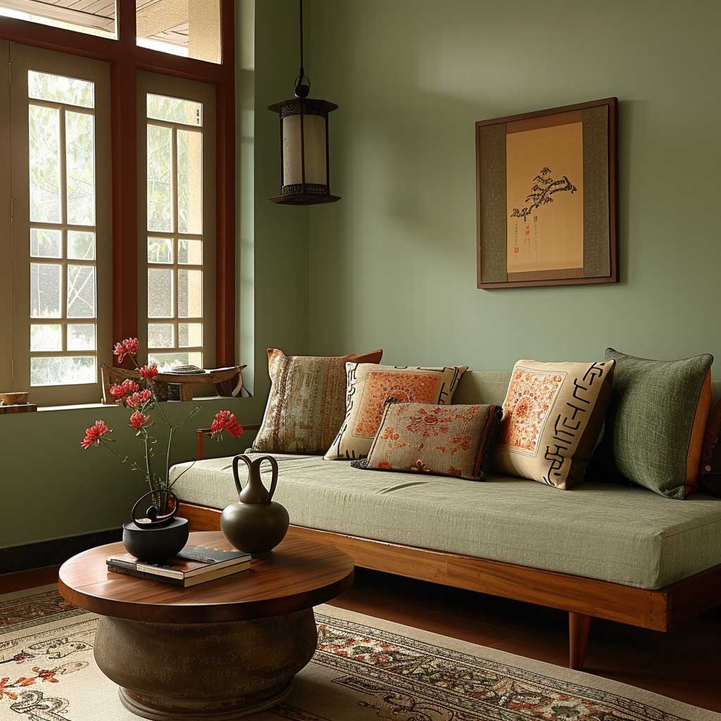
Natural wood furniture is non-negotiable here. The combination of muted green walls plus beige upholstery plus terracotta accessories is like a three-part chord — it only resolves when you add the wood tone as the bass note. Teak, acacia, sheesham, mango wood — all work. Black metal frames do not. I’ve seen this combination wrecked by a sleek black-and-chrome TV unit that the homeowner loved and refused to part with. The room looked like a forest floor with a spaceship parked on it.
Indoor plants are almost redundant here but do add one thing: scale. A large Monstera in the corner or a trailing Pothos on a shelf confirms that the green on the walls is an intentional design choice, not an accident. If you’re looking at other paint colours that perform well under similar conditions, this breakdown of modern living room paint colours covers several shades that sit in the same earthy-neutral family and layer well with this palette.
Asian Paints also offers their five best wall colour combinations directly on their official blog — worth bookmarking if you want shade codes in the Royale range alongside photos from their own projects.
FINAL THOUGHT
The colour on your walls is the last decision most people make. It should be the first.
Pick the combination before you buy a sofa. Before you choose curtains. Before you panic about the rug. Paint costs ₹4,500–5,000 per 20L can and takes a weekend. It’s the cheapest structural change you can make to a room, and the one with the highest return on attention.
Asian Paints’ Royale range gives you consistent colour across different finish levels — Matt, Shyne, Luxury Emulsion — so you can choose the sheen for your lifestyle without sacrificing the shade you fell in love with.
Save this post before you head to the paint store. Shade names fade in memory faster than you’d think.
Related Topics
FAQ
What is the best two-colour Asian Paints combination for a hall or drawing room?
Which Asian Paints Royale finish works best for living rooms?
Does turquoise work as a living room wall colour in India?
How do I choose an Asian Paints colour for a small living room?
What furniture colour works with Asian Paints green walls?
Can I use Asian Paints for a two-colour combination with a code I can give my painter?
You Might Also Like