Quick Scan
- Pinterest named Wasabi one of five official 2026 Palette shades, with chartreuse green searches up +175% — this is a verified trend, not a forecast.
- Over 12 major designers including Prada, Saint Laurent, Valentino, and Alaïa sent chartreuse looks down SS26 runways — making it the season's most cross-designer color story.
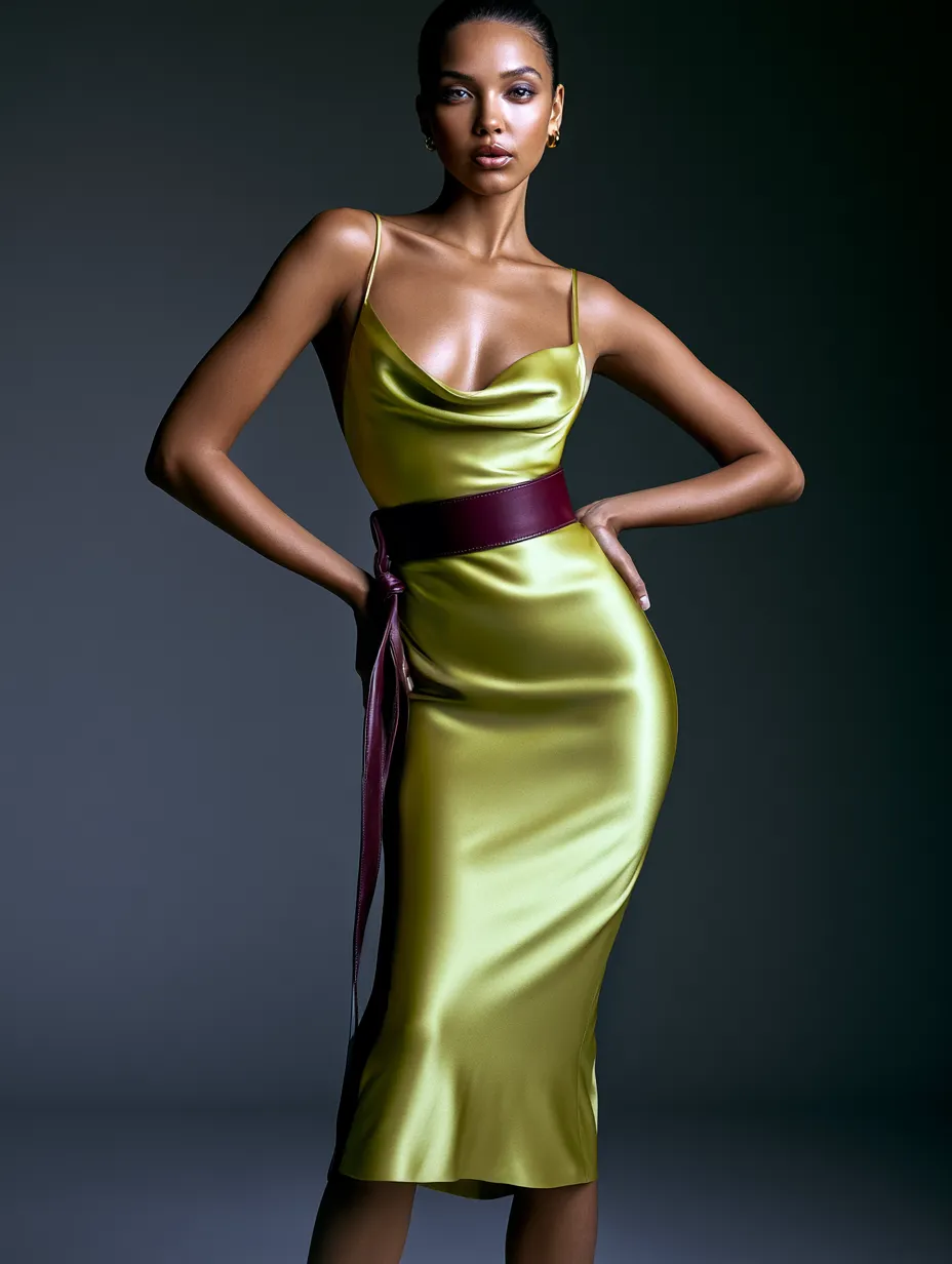
- The burgundy and chartreuse pairing is the single easiest way to wear this color in real life — Marie Claire called it the season's most unexpected and most wearable combination.
- Entry price points exist: Reiss blazer, Dune London suede flats, and Topshop check dress all translate the trend without luxury spend.
- Chartreuse has been building since Gucci's FW2023 show — this is a three-season crescendo, not a one-season spike.
Wasabi green is not asking for permission this season. Since Pinterest named it one of five official 2026 Palette shades — drawn from analysis of over 600 million users’ saves and searches — chartreuse has accelerated from runway curiosity to the defining color statement of spring. Searches for ‘chartreuse green’ have surged +175% on Pinterest alone, and the momentum is not slowing as summer arrives. It is, by almost every metric, the boldest single-color story fashion has produced in years.
What makes this moment feel different from a typical trend cycle is the sheer cross-designer agreement. Prada, Saint Laurent, Simone Rocha, Erdem, Burberry, Dries Van Noten, Issey Miyake, Alaïa, Ferragamo, Balenciaga, and Valentino all sent chartreuse down the SS26 catwalk. That kind of consensus is rare. And with Emma Chamberlain wearing a washed-chartreuse Valentino lace dress and Zoë Kravitz abandoning her usual LBD for a lime satin moment, the celebrity pipeline is fully open. Wasabi green has arrived — and it brought receipts.
Why Wasabi Green Became Spring 2026’s Most Talked-About Color
Chartreuse does not succeed by accident. The color’s 2026 dominance is the cultural crescendo of a multi-year runway build: Gucci’s FW2023 show was staged entirely on a chartreuse carpet, and Sabato De Sarno’s SS2024 Gucci debut featured lime chartreuse coats front and center. By the time Prada made wasabi the through-line of its entire SS26 collection — appearing across bubble skirts, coats, shirts, dresses, and even gloves — the fashion establishment had already been priming audiences for exactly this shade. This is not a fleeting spike. It’s a color that earned its cultural moment across three consecutive seasons.

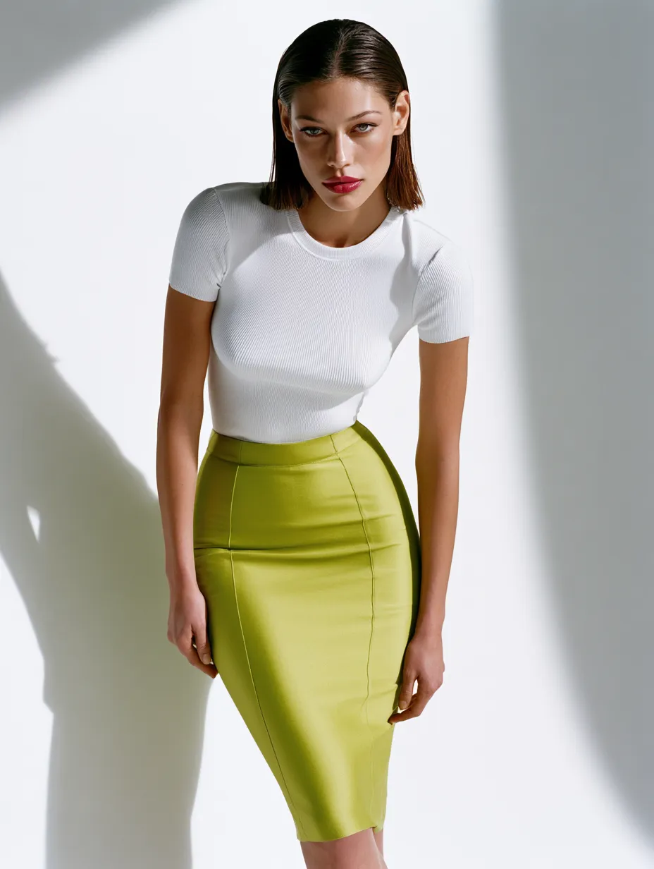
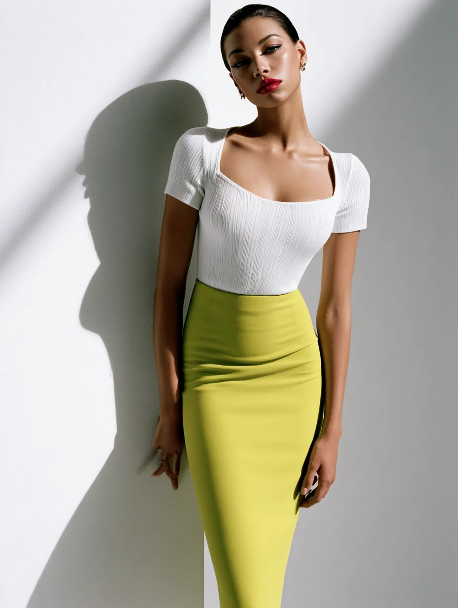

What separates wasabi from other trending greens? Saturation without harshness. The yellow-green sits at a precise midpoint — warmer than lime, cooler than olive — making it flattering across a wider range of skin tones than either extreme. If you’ve ever wondered why chartreuse photographs so well on Instagram and Pinterest, the answer is contrast: it reads as bold in flat light and luminous in natural sun. That quality is exactly what drives saves and shares in a visual-first media environment.
For neutral-wardrobe devotees, the shift toward wasabi might feel jarring. If you prefer building from 10+ Gray and Taupe Outfit Ideas for Every Neutral Colors Wardrobe, chartreuse actually integrates more naturally than you’d expect — a single wasabi accessory against a full-taupe outfit creates impact without requiring you to rebuild your wardrobe from scratch. Start with one entry point, not a full outfit overhaul.
What should you avoid at this stage? Do not wear head-to-toe wasabi without intentional tonal variation. A single flat chartreuse from neckline to hem reads as a costume, not fashion. The designers making this color work — Prada especially — always anchor it with a contrasting texture, a neutral shoe, or a print that pulls the shade out of its pure form. Monochrome chartreuse requires exactly the kind of considered styling most people skip when they’re excited about a new color.
Pinterest data adds another layer of context worth noting: lime-green weddings are up +70% on the platform this year, meaning wasabi green has crossed from fashion into lifestyle and event aesthetics. That crossover reach is how a runway color becomes a cultural color. The shade is no longer just a fashion statement — it is a 2026 visual identity.
Don’t Do This
- Don't wear head-to-toe solid wasabi without tonal variation — it reads as costume rather than fashion, and even Prada anchored the color with contrasting textures and neutral shoes.
- Don't pair chartreuse with orange or coral — both pull the yellow undertone of wasabi into a clashing warm spectrum that looks unintentional rather than bold.
- Don't buy flat synthetic chartreuse at budget price points — polyester in this specific hue reads as fluorescent under artificial light, which is the opposite of the editorial effect you're after.
- Don't assume wasabi only works at full saturation — a washed or dusty chartreuse, like Chamberlain's Valentino lace dress, is more flattering for most complexions and still fully reads as the trend.
Chartreuse Outfit Combinations That Work Beyond the Runway
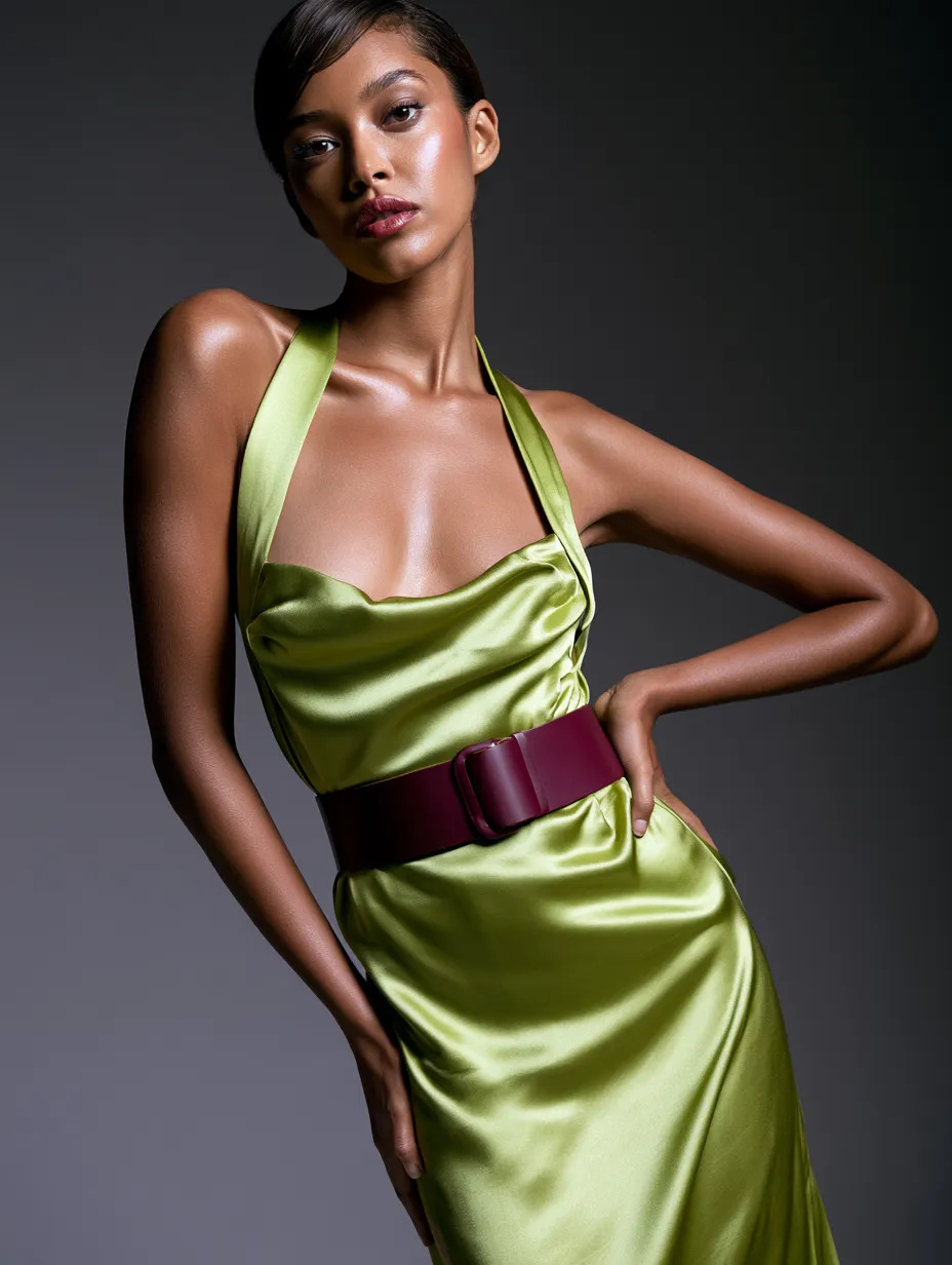
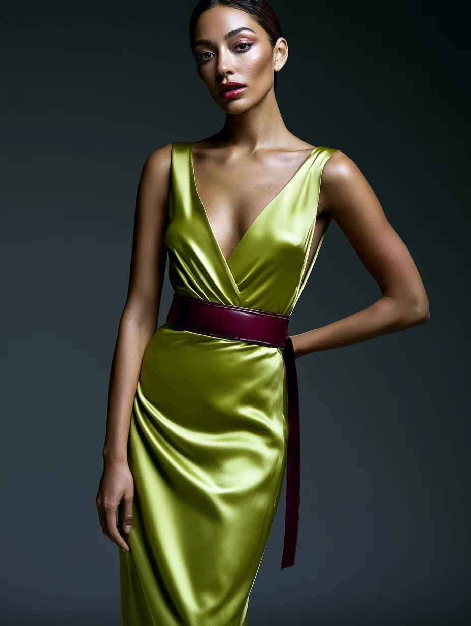
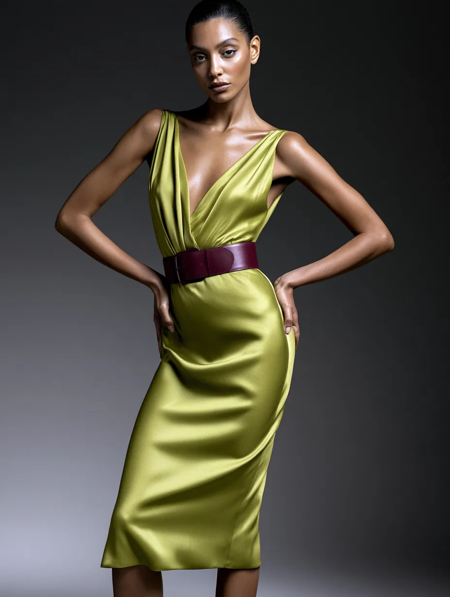
The burgundy and chartreuse pairing is the season’s most-copied color story. It went viral on TikTok after appearing in Prada’s SS26 collection, and Marie Claire called it ‘the season’s most unexpected pairing and the easiest way to make your wardrobe feel current.’ The combination works because deep burgundy pulls the warmth out of wasabi without competing with it — the two colors sit on opposite sides of the color wheel at a distance that creates tension without clashing. A chartreuse blazer over a burgundy slip skirt is three minutes of getting dressed and looks like you planned it for weeks.
For those who want a higher-energy expression, wasabi green reads differently in a nightlife context. If you already gravitate toward bold color combinations after dark, 7+ Bold Nightclub Club Outfit Ideas Featuring Neon Colors shows exactly how to push saturated shades without crossing into costume territory. Chartreuse in a satin bias-cut dress — the silhouette Zoë Kravitz chose — is one of the cleaner ways to wear the color at night. The fabric does the work. You don’t need to add anything else.
What pairs poorly with wasabi? Avoid pairing chartreuse with orange or coral. Both colors pull the yellow undertone of wasabi toward a clashing warm spectrum that reads as unintentional rather than bold. The designers who sent chartreuse down runways this season — Valentino, Alaïa, Ferragamo — consistently grounded the color in neutrals (black, white, cream, burgundy) or let it exist alone against a simple silhouette. Orange is the combination you’ll regret in photos.
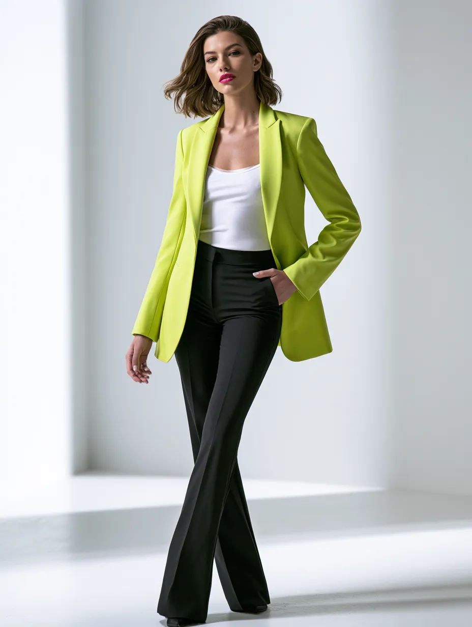
At accessible price points, the runway translation is already here. Reiss offers a chartreuse tailored blazer positioned as a high-voltage runway-to-real-life piece. Dune London carries chartreuse suede flats that work as a color accent without full commitment. Topshop has a chartreuse check dress that layers the shade into a print for those not ready for solid wasabi. None of these require a luxury budget — and all three have appeared on Stylist’s fashion team wish list this spring.
Celebrity styling offers the clearest real-world framework for how to scale this color. Emma Chamberlain wore a washed — not saturated — chartreuse Valentino lace dress that softened the hue into something approachable. Washed or dusty chartreuse is the easiest entry for anyone nervous about the full-intensity shade. You get credit for the trend without the visual commitment of pure wasabi green at maximum saturation.
| Product | Brand | Commitment Level |
|---|---|---|
| Chartreuse Tailored Blazer | Reiss | Medium — wearable as one statement piece |
| Chartreuse Suede Flats | Dune London | Low — color accent only, no outfit overhaul |
| Chartreuse Check Dress | Topshop | Medium — pattern softens full saturation |
| Wasabi Lace Dress | Valentino (as worn by Emma Chamberlain) | High — full color statement, washed tone |
How to Build a Wasabi Green Wardrobe Without Starting Over
The fastest route into wasabi green is through a single garment that already fits your existing wardrobe structure. For most people, that entry point is a blazer or a trouser — both pieces carry strong neutral energy by shape alone, so the color reads as intentional rather than overwhelming. The Reiss chartreuse tailored blazer is the most-cited real-life version of this approach. Wear it open over a white tee and straight black trousers. Done. That combination requires no other styling decision and photographs clearly in any light condition.


Accessories offer an even lower-commitment entry. Dune London’s chartreuse suede flats function as a color accent the way a statement bag does — they shift an entire neutral outfit without replacing anything in your wardrobe. Footwear in a trending color is consistently the most repinned version of a trend on Pinterest because it solves the ‘I want to try this but I don’t want to overcommit’ tension that most readers actually feel. One pair of shoes is not a rebrand. It’s a seasonal footnote that works.
What is the wrong way to approach this color on a budget? Don’t buy fast-fashion wasabi pieces in polyester. Chartreuse at low price points in synthetic fabric has a tendency to read as fluorescent under artificial lighting — which is the difference between fashion-forward and highlighter pen. At this specific hue, fabric quality is not optional. Topshop’s chartreuse check dress works precisely because the pattern diffuses the saturation; a flat synthetic in pure wasabi without any texture or structure will not photograph the way runway images suggest. Fabric matters more with this color than with almost any other trending shade.
How do you know if wasabi green suits your complexion? The shade works most naturally on cool undertones and deep warm skin tones. For medium-warm complexions, the washed or dusty version — the approach Chamberlain used with the Valentino lace dress — closes that gap. If you’ve ever worn olive successfully, wasabi is a more saturated cousin that operates on the same principle. If olive washed you out, reach for washed chartreuse rather than the runway-saturated version.
The broader trend trajectory matters for how you invest in this color. Given that chartreuse has been building for three consecutive runway seasons — from Gucci’s FW2023 carpet to Prada’s full SS26 collection commitment — this is not a one-season wonder. Buying a quality blazer or midi dress in wasabi green in spring 2026 is not a trend gamble. It is a wardrobe investment in a color that has demonstrated staying power across multiple fashion houses and multiple years. That is a different calculation than buying into a color that appeared on two runways and disappeared by August.
FAQ
Is wasabi green the same as chartreuse?
Yes — wasabi green and chartreuse refer to the same yellow-green hue, with 'wasabi' being the 2026 fashion industry's preferred name, popularized by Pinterest's 2026 Palette report. Chartreuse is the traditional color name; wasabi evokes the specific warm, slightly muted version of the shade that dominated SS26 runways. Both terms will surface the same trend in searches.
What skin tones does chartreuse green suit?
Chartreuse works most naturally on cool undertones and deep warm complexions, where it creates high contrast without competing with the skin. For medium-warm undertones, a washed or dusty version of the color — rather than full-saturation wasabi — closes the gap significantly. If olive green works on you, wasabi green operates on the same principle at a higher saturation.
What colors go with wasabi green in an outfit?
Burgundy is the season's most-viral pairing, validated by Prada's SS26 collection and called 'the easiest way to make your wardrobe feel current' by Marie Claire. Black, white, and cream all work as neutral anchors. Avoid orange and coral, which clash with wasabi's yellow-green undertone rather than complementing it.
Will chartreuse green still be trending in summer 2026?
Yes — industry data suggests wasabi's momentum is accelerating into summer rather than fading. Pinterest search volume continues to grow week over week, and the color's three-season runway build (from Gucci FW2023 through Prada SS26) indicates this is a sustained fashion cycle, not a one-season spike.
Where can I buy affordable wasabi green clothing in 2026?
Reiss offers a chartreuse tailored blazer at accessible high-street pricing. Dune London carries chartreuse suede flats as a lower-commitment color entry. Topshop has a chartreuse check dress that softens the saturation through pattern — all three options have appeared on Stylist's spring 2026 fashion wish list.
How do I wear chartreuse green without it looking like a costume?
Keep one wasabi green piece paired with strong neutrals — black trousers, white tee, or cream knitwear. Avoid flat synthetic fabrics, which intensify the hue under artificial light. Grounding the color in a tailored silhouette or a single quality accessory, rather than a full head-to-toe look, is how the designers who championed this color made it feel like fashion rather than a statement costume.
Save this
Wasabi Green Outfits Spring 2026 Reward the Boldest Wardrobe Moves Now
Chartreuse is the rare trend where the data, the runways, and the street all point in the same direction at the same time. Pinterest searches are up +175%, over a dozen designers made it their SS26 signature, and celebrities from Chamberlain to Kravitz have already made the color mainstream. The window to wear this intentionally — before it becomes background noise — is right now.
Pick one entry point: a Reiss blazer, a Dune London flat, or a washed chartreuse dress that softens the commitment without losing the statement. You don't need to rebuild your wardrobe — you need one wasabi green piece that shifts the entire read of what you already own. Save this post.
📌 Save to Pinterest