Bold front door design ideas for houses are the fastest $200 upgrade your curb appeal will ever see — and almost nobody commits hard enough to the color. I’ve stood in paint aisles choosing between three safe greiges and walked away with the one that disappeared against my siding. Huge mistake. A door painted Benjamin Moore Caliente AF-290 on a white or gray house reads from the end of the block. A door painted the same muddy tan as the trim reads as a wall. The difference isn’t style — it’s contrast, and contrast is exactly what this post is about.
Scroll through the red, yellow, and ocean blue sections below. Each one covers hardware pairings, what finish to use, and — importantly — what color combinations make the whole thing look like a mistake.
Quick scan
- Red doors: Benjamin Moore Caliente AF-290 or Heritage Red HC-181 — matte black hardware only
- Yellow doors: Sunny Days 172 — pairs with white trim and brass fixtures, not chrome
- Blue doors: Yarmouth Blue HC-150 or Van Courtland Blue HC-145 — gold or unlacquered brass hardware
- Finish: Semi-gloss or high-gloss for all three — flat paint on a front door chips within a season
- Worst pairing: Bold door + matching shutters = costume, not design
Red Reads Differently on Every House Facade — Here’s Which Ones It Loves
Red front door designs for houses have a 200-year track record for a reason: red is the only warm color that holds against both white and dark exteriors without looking like it’s trying. I painted my previous house with Benjamin Moore Heritage Red HC-181, and the thing I noticed immediately is that it didn’t just stand out — it made the white trim look intentional, like it had always been there. That’s the test worth running before you commit to any color. Does the door make the rest of the facade look deliberate, or accidental?
On modern homes with horizontal lines and minimal ornament, go with a true high-chroma red rather than a brick red or burgundy. Brick red on a flat, contemporary facade looks like an error in the rendering software. The cleaner and more geometric your house, the more you need a pure red — Benjamin Moore’s Caliente AF-290 sits around $65–$75 per quart in their Advance line, which gives you the high-gloss finish that makes the door read as a design decision and not a coat of leftover paint from the garage.


Hardware is where this goes wrong most often. You’ll see red doors paired with polished nickel handles and the result looks like a hotel lobby from 2003. Matte black hardware is the only right answer for a bright red door. It creates contrast without competing with the red and it reads as contemporary even on traditional architecture. I own two of these doors across rental properties and both get unsolicited compliments from neighbors. Neither cost more than $180 for the lockset.
Add potted plants with dark or deep green foliage on either side — not flowering annuals in pink or orange. Those colors fight with the red and turn the whole entrance into a fruit salad. Dark boxwood, olive trees, or simple tall grasses work because they push the eye back to the door, not away from it.
Don’t do this with a red door
- Red door + red shutters: Instantly looks like a fast-food franchise. The door works because it contrasts. Repeat the color and the contrast disappears.
- Red door on a warm-beige or terracotta exterior: Two warm colors compete. The door doesn’t pop — it just blends into an orange blur. Red doors need cool or neutral backdrops.
- Flat finish red paint: Chalks and fades in one summer on a south-facing door. Use semi-gloss or high-gloss, full stop.
Yellow Has a 6-Month Expiration Date Unless You Pick the Right Shade
Sunshine yellow as a front door design idea for houses sounds risky. It isn’t — but only if you avoid the shades that age like a banana. Neon yellows and greenish-yellows look dated inside of a season. The ones that last are clean, warm, and saturated without being toxic: Benjamin Moore Sunny Days 172 is my go-to. I stole this pick from a color consultant I hired for a rental flip, and she was right — it reads as cheerful at noon and golden at 5pm.
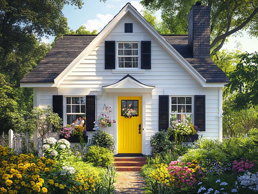


Yellow works architecturally because it does the same thing natural light does — it makes space feel larger. On a smaller cottage or bungalow, the yellow door pushes the entrance forward visually, making the house feel more present on the street. You’ll notice it especially in afternoon light when everything else on the block is reading flat. Black shutters frame the yellow perfectly — not because it’s the classic combo, but because dark frames make the color feel bounded rather than sprawling.
Hardware matters here almost as much as with red. Brass handles on a yellow door are one of the best pairings in exterior design — they share warmth without competing. Chrome and nickel look cold against yellow and make the whole entry feel disconnected. A vintage-style brass lockset runs $90–$140 from Rocky Mountain Hardware or Emtek. Worth every dollar.
For more exterior color combinations that hold up over time, these exterior house color ideas cover palettes that actually photograph well year-round.
Ocean Blue Front Door Designs Last Longer Than Any Other Color on This List
Blue front door design ideas for houses occupy a strange zone: they feel calm enough to look timeless and distinctive enough to hold the eye. That’s a hard balance to pull off. The shades that do it best are mid-to-deep blues with gray undertones — Yarmouth Blue HC-150 and Van Courtland Blue HC-145 from Benjamin Moore are the two I keep recommending, and both sit at roughly $60–$75 per quart in Advance Waterborne Alkyd. You want that line specifically because the formula gives you the leveling and durability of oil with the cleanup of latex.


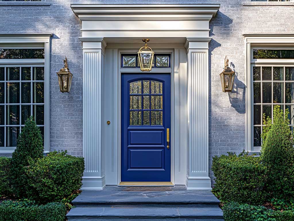
What makes a modern blue front door work against stone, gray brick, or pale stucco is the same reason a navy blazer works in a room full of pattern — it quiets everything down. Light gray or soft white exteriors are the best pairing. Bright white exteriors can make a dark blue door feel heavy, so if your facade is sharp white, lean toward a slightly lighter blue like Van Courtland rather than going deep navy straight away.
Unlacquered brass hardware on a blue door is one of those details that looks expensive when it costs $120. The brass ages naturally and develops a patina that matches the blue beautifully — unlike lacquered brass, which stays candy-gold forever and starts looking cheap after a year. Glass paneling in the door itself adds to the appeal. Frosted or textured glass gives privacy without making the entry feel blocked. I’ve seen geometric frosted panels on blue doors that looked straight out of an architecture magazine.
If your house currently has a dull brown or gray door and a neutral exterior, swapping to blue is the single highest-impact change you can make for under $300 total including paint and hardware. For more ideas on how entrance design shapes the whole facade read this piece on impressive house front entrance design.
For trending colors that go beyond these three, Benjamin Moore’s front door color collection has 670+ shades with swatchable samples you can order online — the Caliente, Yarmouth Blue, and Sunny Days chips together on your actual door panel will tell you more than any screen will.
Save This
A Bold Front Door Color Pays for Itself at First Glance
Pick contrast over coordination. Your door should create tension with the facade — not dissolve into it.
Hardware finish is half the decision. Matte black, unlacquered brass, or aged bronze. Chrome belongs in bathrooms.
Red, yellow, and blue all require a neutral wall behind them to work. Bold door on a bold wall is just noise. Save this post.
Related Topics