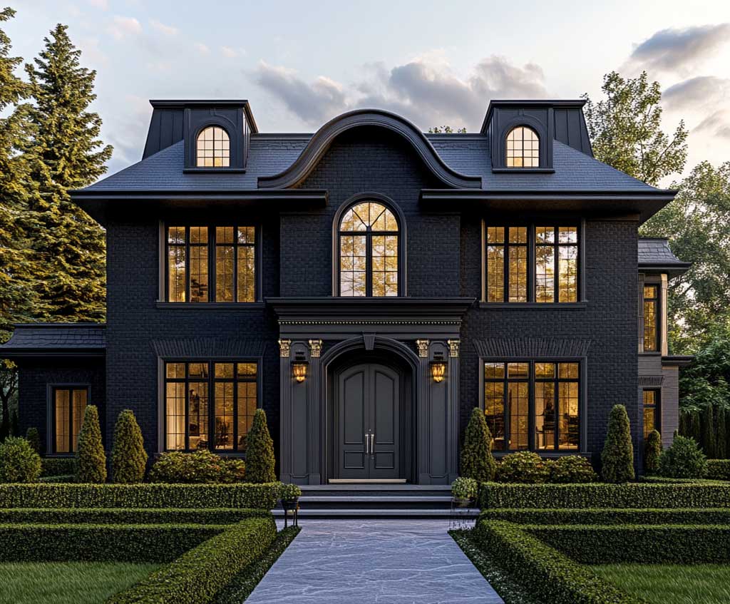
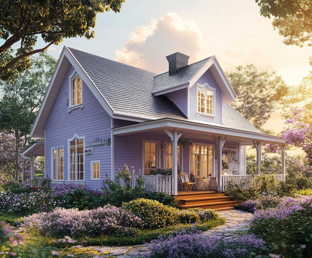
A house color combination outside built on terracotta and sand is one of the few pairings that photograph well, age gracefully, and require almost no explaining to the neighbors. Terracotta carries the weight of the facade with a reddish-brown depth that shifts from copper in morning light to something closer to brick at dusk. Sand trims and accents pull the composition back from the edge — keeping it warm without tipping into rustic cliché.
The combination has Mediterranean roots, but it performs just as well on suburban and coastal homes in sunny climates. The key mechanic is contrast by saturation, not contrast by hue — both colors sit in the same warm family, so the house reads as cohesive even when the trim, shutters, and facade are technically three different shades. Try this with two colors from opposite sides of the wheel and the result rarely holds together the same way.
What most exterior paint guides skip: terracotta is among the most forgiving colors for south-facing walls. Unlike navy or deep green, which can read almost black in direct afternoon sun, a well-chosen terracotta deepens rather than distorts under strong light. That single fact makes it easier to commit to than many bolder options.
- Terracotta walls paired with sand trims create a warm, architecturally legible facade that works in Mediterranean, traditional, and rural contexts.
- Sand walls under a terracotta roof are the inverse — softer, more neutral, with the drama moved upward.
- Sandstone accents (window frames, cornices, door surrounds) are the subtlest application — they highlight architecture without painting the whole story.
- Sherwin-Williams Rookwood Terra Cotta (SW 2803) is a confirmed exterior-rated terracotta. Resilience Exterior Acrylic Latex, suitable for all outdoor surfaces, runs around $73.49 per gallon.
- Terracotta roof tiles last 50–100 years with proper maintenance — a genuine long-term investment, not a trend.
- One gallon of exterior paint covers 350–400 sq ft per coat on smooth siding; rough stucco cuts that to 200–300 sq ft.
Terracotta Walls Pull the House Color Combination Outside Into Focus
A house color combination outside built around terracotta walls and sand trims earns its reputation by doing something most neutral palettes can’t: it reads differently at different hours. At 8 AM the facade looks warm and understated. By golden hour it glows in a way that most painted exteriors simply don’t. Stylists recommend this combination specifically for homes with east- or west-facing elevations, where changing light reveals the full range of the color.
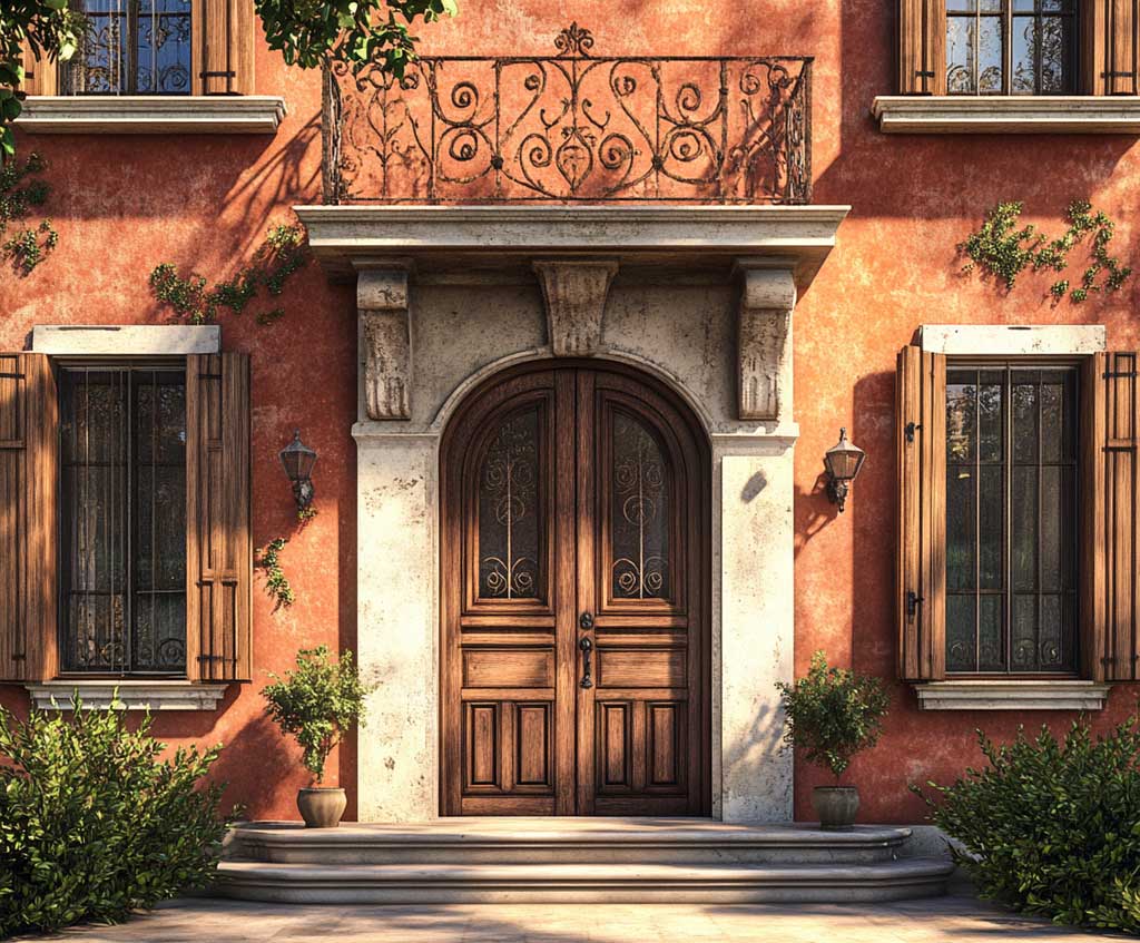
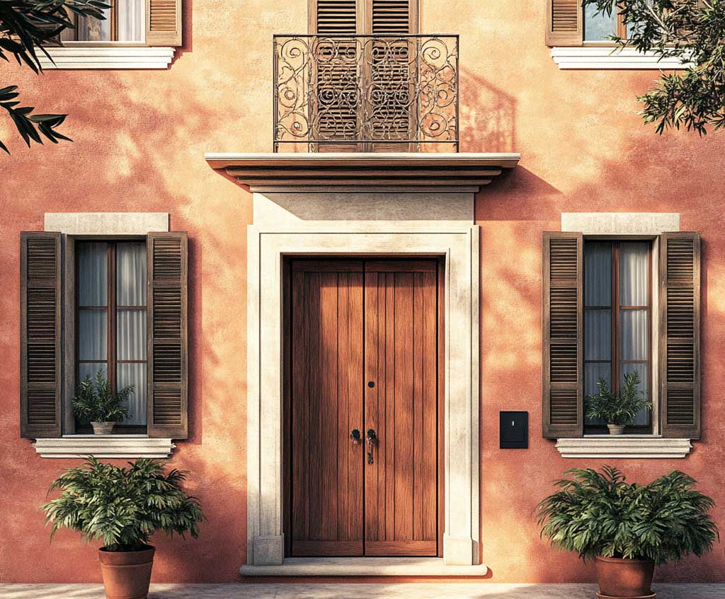
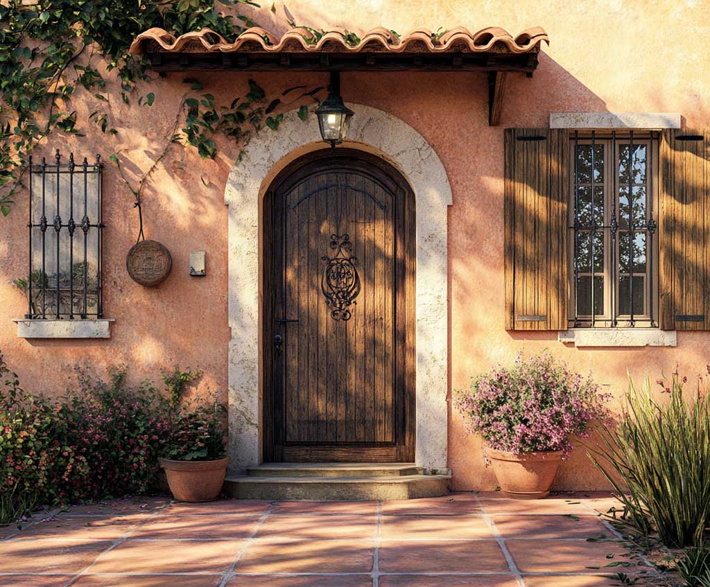
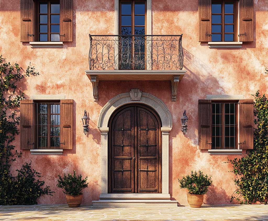
Sherwin-Williams Rookwood Terra Cotta (SW 2803) is a confirmed exterior-rated color that sits at the richer, brick-adjacent end of the terracotta spectrum. It pairs cleanly with sand-tone trims — look for colors in the beige-to-warm-white range with no gray or green undertones, or the warmth of the terracotta will fight the trim rather than be framed by it. A common approach is to test both swatches on the same wall section and check at noon and 4 PM; what looks harmonious under cloud cover often splits apart in direct sun.
Sand trims do specific work here — they’re not decoration, they’re architecture. Door surrounds, window frames, and decorative moldings all read sharper when outlined in a lighter tone against the darker terracotta field. A wooden door with wrought iron hardware is the natural complement: the iron echoes the depth of the terracotta, while the wood grain adds a texture that neither paint color can supply alone. Don’t use a high-gloss finish on terracotta exterior walls — the sheen picks up midday glare and makes the color look orange rather than earthy.
Exterior paint coverage runs 350–400 sq ft per gallon on smooth siding; rough stucco or masonry — common with Mediterranean-style homes that suit this palette — cuts that to 200–300 sq ft per gallon. Budget accordingly before buying. For a broader look at house exterior paint colour combinations organized by architecture and climate, that resource breaks down pairing logic beyond the earth-tone category.
Don’t choose terracotta from a phone screen or printed swatch card. The color is notoriously sensitive to undertone — some terracottas lean orange, others lean brown, and the difference only becomes clear on an actual wall in actual daylight. Paint a 2×2-foot test square directly on your siding and check it over two days at different hours. One afternoon of testing prevents a full repaint.
Don’t match the trim to the wall color hoping for a monochromatic effect. Terracotta on terracotta reads muddy and flat — the facade loses all definition. Trim needs to be at least three shades lighter, ideally in sand, cream, or a warm off-white, to give the architecture anything to work with.
Sand Walls, Terracotta Roof — Flipping the House Color Combination Outside
Choosing sand walls with a terracotta roof moves the drama up off the ground plane and lets the facade stay lighter and more neutral. This version of the house color combination outside suits climates where heat is constant: a lighter body paint reflects more solar radiation than a dark one, which matters more on the walls than on the roof where tile mass handles thermal regulation differently. Terracotta roof tiles have a documented lifespan of 50–100 years, according to multiple roofing sources, which shifts the calculus — the roof becomes a long-term design anchor, not a replaceable accent.
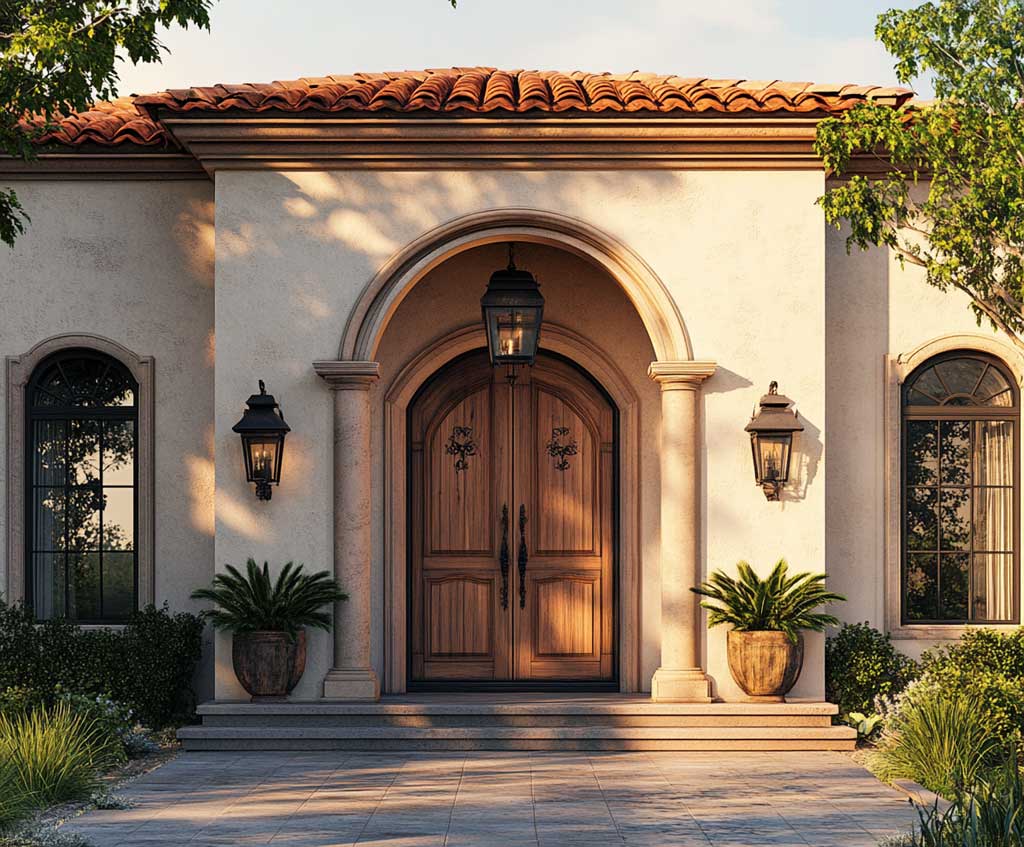
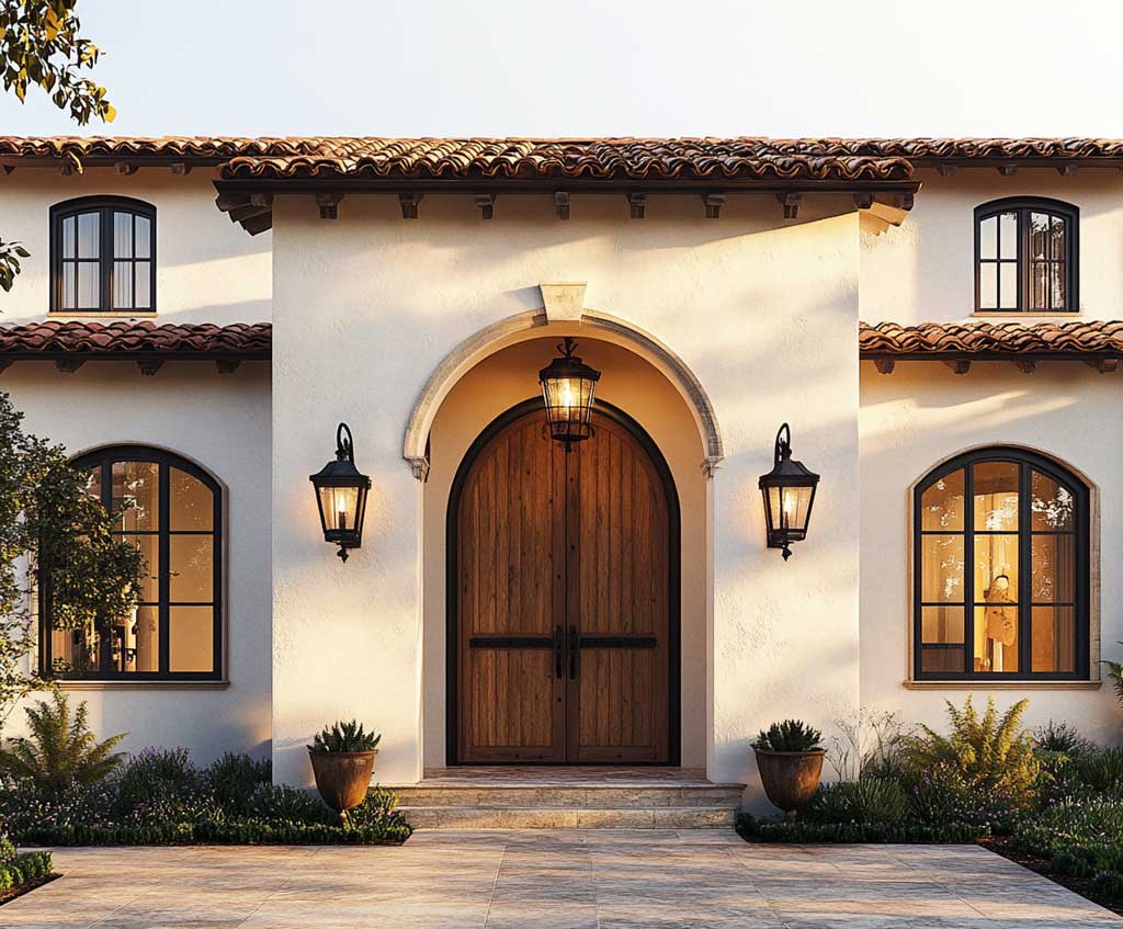
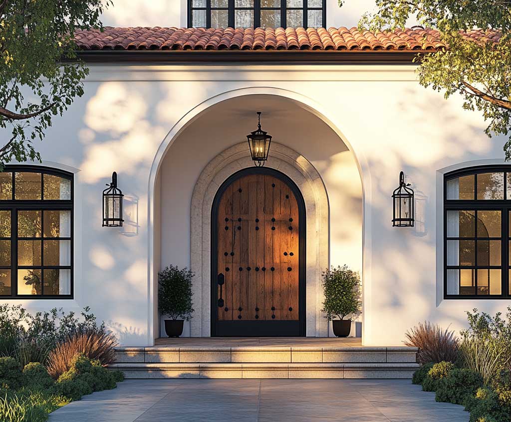
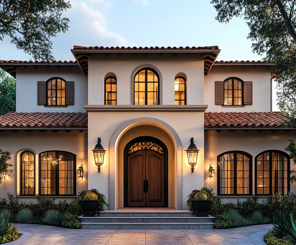
The practical question with this layout is what undertone to pick for the sand wall. Warm beige with yellow undertones reads cohesive under a terracotta roof. Cool greige or gray-beige creates a temperature clash — the roof feels like it belongs to a different house. Sherwin-Williams Resilience Exterior Acrylic Latex ($73.49/gallon) is moisture-resistant and available in custom tints, which makes it a workable base for mixing sand-to-warm-beige shades without switching product lines. A stylish trick: match the sand wall to the mortar color of any stone or brick on the same facade — it reads as deliberate rather than default.
Decorative elements reward restraint here. An arched wooden door with iron hardware repeats the terracotta-and-dark-metal relationship, tying roof to entry. Vintage-style lanterns bracket the entrance without competing with the palette — black or aged-bronze finishes are the safer call over chrome or brushed nickel, which can look cold against warm earthy tones. What doesn’t work: contemporary aluminum window frames in bright white against a sand wall. The contrast is too sharp, too cool, and it pulls the eye to the frames rather than to the overall composition.
How does this differ from terracotta walls with sand trims? With the inverted layout the house reads lighter, more approachable, and slightly less formal. The terracotta overhead creates the warmth overhead rather than surrounding the viewer — a different spatial feeling. Both work; the choice depends on whether you want the drama in the field or the frame. For a related look at how terracotta and other earthy colors work on porch surfaces, see warm colors for porch with terracotta hues.
Sandstone Accents Sharpen the Terracotta House Color Combination Outside
Terracotta with sandstone accents is the version of this house color combination outside where the architecture does the most visible work. Rather than painting the entire trim in one lighter color, sandstone is applied selectively — window surrounds, door frames, cornices, keystones — wherever the building has structural detail worth highlighting. The effect is closer to masonry than to painted wood, which is appropriate: sandstone as a material has been used this way in Mediterranean and European construction for centuries, and the color reference carries that associative weight even when it’s paint.
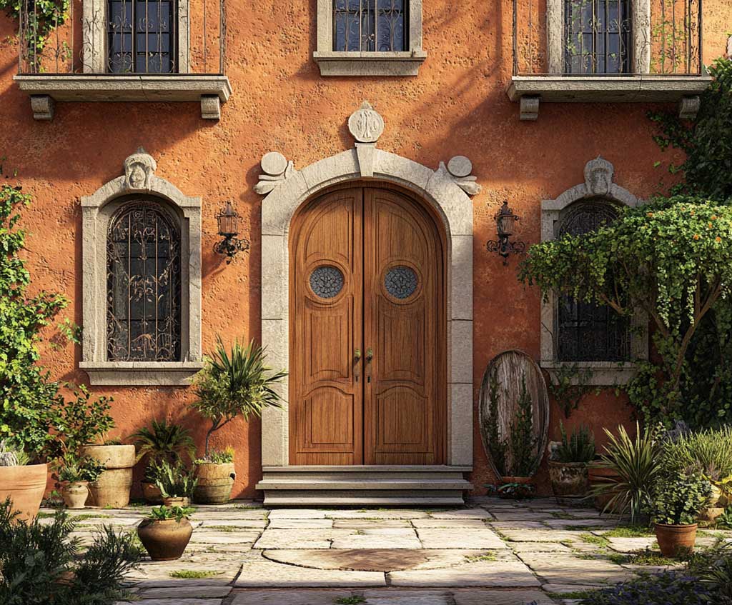
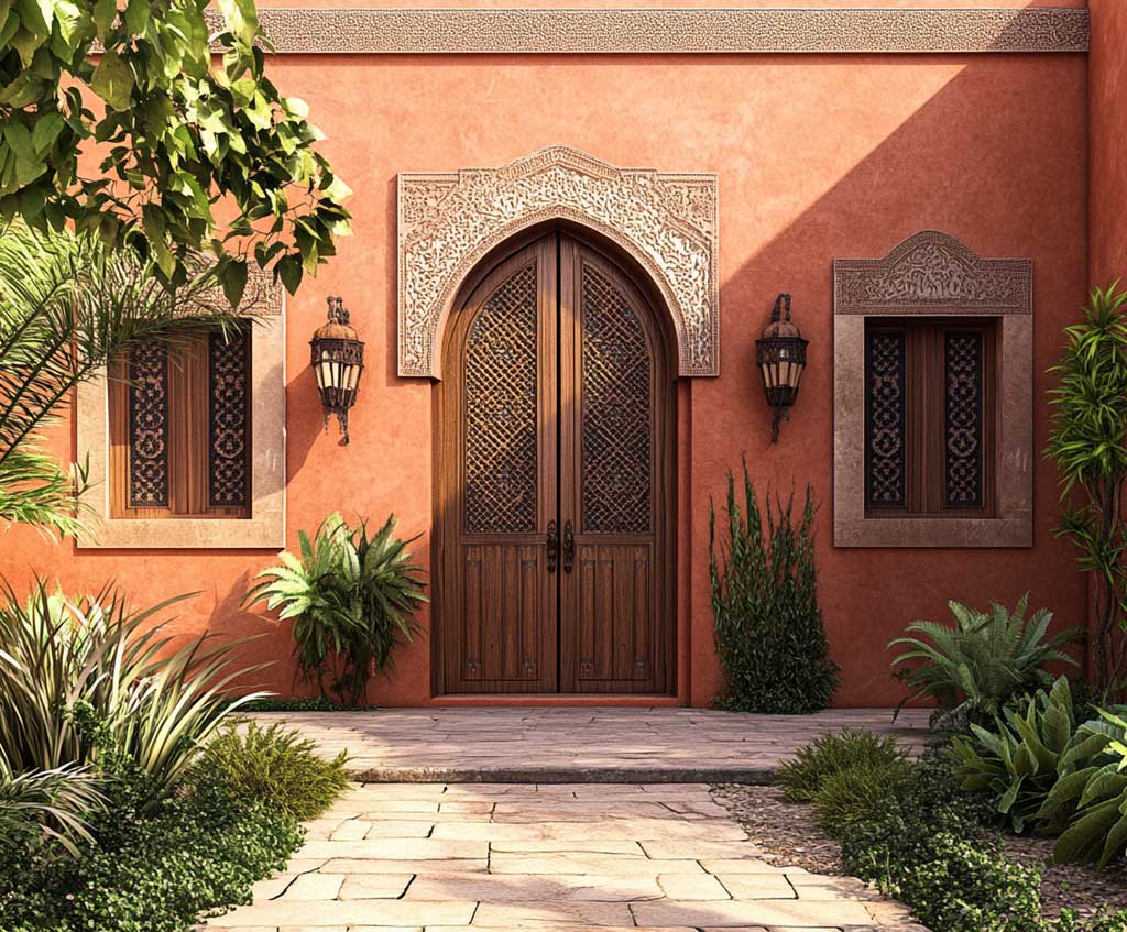
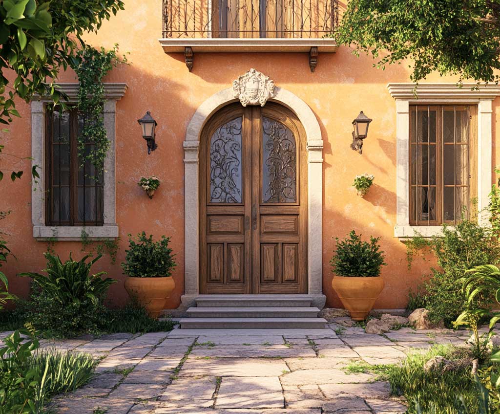
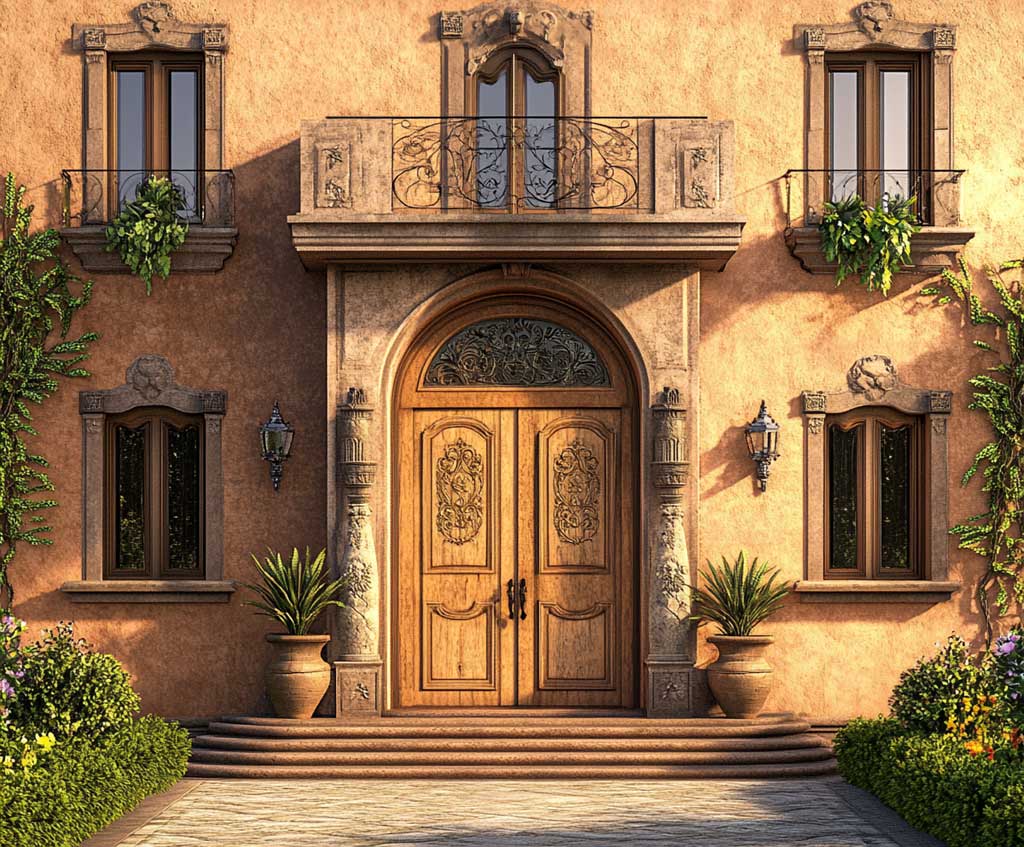
Sandstone as an accent color sits slightly beiger and less bright than sand — think warm taupe with a mineral quality, not cream or off-white. The contrast against terracotta is softer than sand trim, which makes the accents feel more like revealed structure and less like applied decoration. Stylists who work on Mediterranean revival and Spanish colonial properties use this specifically around window openings: a 3–4 inch sandstone border around a window adds depth in a way that flat trim paint on a flat wall doesn’t. The trick here is that the accent works because of where it is, not how much of it there is.
A stone pathway leading to the entrance extends the sandstone logic outward — the eye follows the same pale warm tone from the door surround down to the ground. Clay pots in matching terracotta continue the palette into the garden without effort. Does this mean every material needs to be the same color? No. A dark wooden double door with carved details adds contrast right at the entry point, which is exactly where you want the visual hierarchy to peak. Don’t use bright white here — it breaks the temperature consistency and reads as a mistake rather than a deliberate contrast.
Benjamin Moore’s Baked Terracotta (1202) is in the Classics collection, which tracks with the historical roots this palette draws on. It skews slightly browner than some terracottas, which works particularly well with sandstone tones that have a warm gray-brown edge rather than a yellow-beige one. Sherwin-Williams’ Desert & Southwest exterior schemes include similar earthy pairings organized by climate — useful if you want a validated starting point rather than building the combination from scratch. See Sherwin-Williams’ regional exterior color schemes for a full breakdown organized by architectural tradition and region.
| Variant | Best For | Key Accent Color | Main Risk |
|---|---|---|---|
| Terracotta walls + sand trims | Mediterranean, traditional, sunny climates | Warm cream or sand on frames and moldings | Sand tone with cool undertone clashes with terracotta |
| Sand walls + terracotta roof | Hot climates, European-style homes | Aged bronze or iron hardware | Greige or gray-beige wall reads cold against roof |
| Terracotta walls + sandstone accents | Spanish colonial, Mediterranean revival, villas | Dark wood double door, stone pathway | Bright white accent breaks temperature consistency |
EXTERIOR COLOR PAIRING
Terracotta and sand hold up. The rest of the palette takes care of itself.
Terracotta walls with sand trims are the most direct version — contrast comes from saturation, not hue, so the facade stays cohesive even with three distinct tones. Sand walls under a terracotta roof lighten the whole facade and anchor the drama overhead, which suits hot climates where lighter body paint reflects more heat.
Sandstone accents are the detail-forward approach: they reward homes with actual architectural ornamentation — cornices, keystones, arched surrounds — and read flat on plain-box exteriors.
Sherwin-Williams Resilience Exterior ($73.49/gal) handles the paint side; terracotta tile roofs handle themselves for 50–100 years. Save this post.