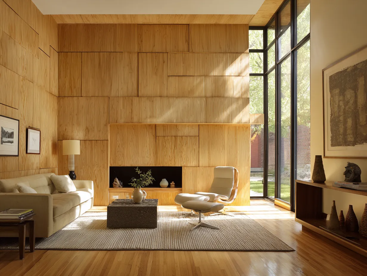
WPC wall panel design keeps showing up on every mood board for a reason: wood-plastic composite panels give you the surface depth of carved timber without the warping, swelling, or $400-per-sheet lumber pricing. I’ve watched homeowners spend months choosing paint colors for a statement wall only to end up with something forgettable — a flat coat of Sherwin-Williams Agreeable Gray that photographs well and changes nothing. A custom interior WPC design cuts that problem at the root. The panel is the wall. It does the work.
WPC is a composite of wood fiber and thermoplastic — usually polyethylene or PVC — pressed at high temperature. Standard panels run 19mm to 30mm thick, 100mm to 300mm wide, and up to 6 meters long, which means a single bedroom accent wall can often be done in a single pass without seams. You’ll pay roughly $8–$18 per square foot installed depending on the profile complexity, versus $30+ for real carved hardwood. The math is obvious.
What you’ll find on this page
- Geometric matte black WPC panels for living rooms — what furniture actually works
- Colorful abstract art motifs on WPC — the color rules nobody tells you
- 3D sculptural WPC panel design — how lighting makes or breaks the whole effect
- A material comparison: WPC vs real wood vs PVC for statement walls
- The one mistake that makes even expensive WPC look cheap
Geometric Matte Black WPC Panels Pull a Room Apart Before They Hold It Together
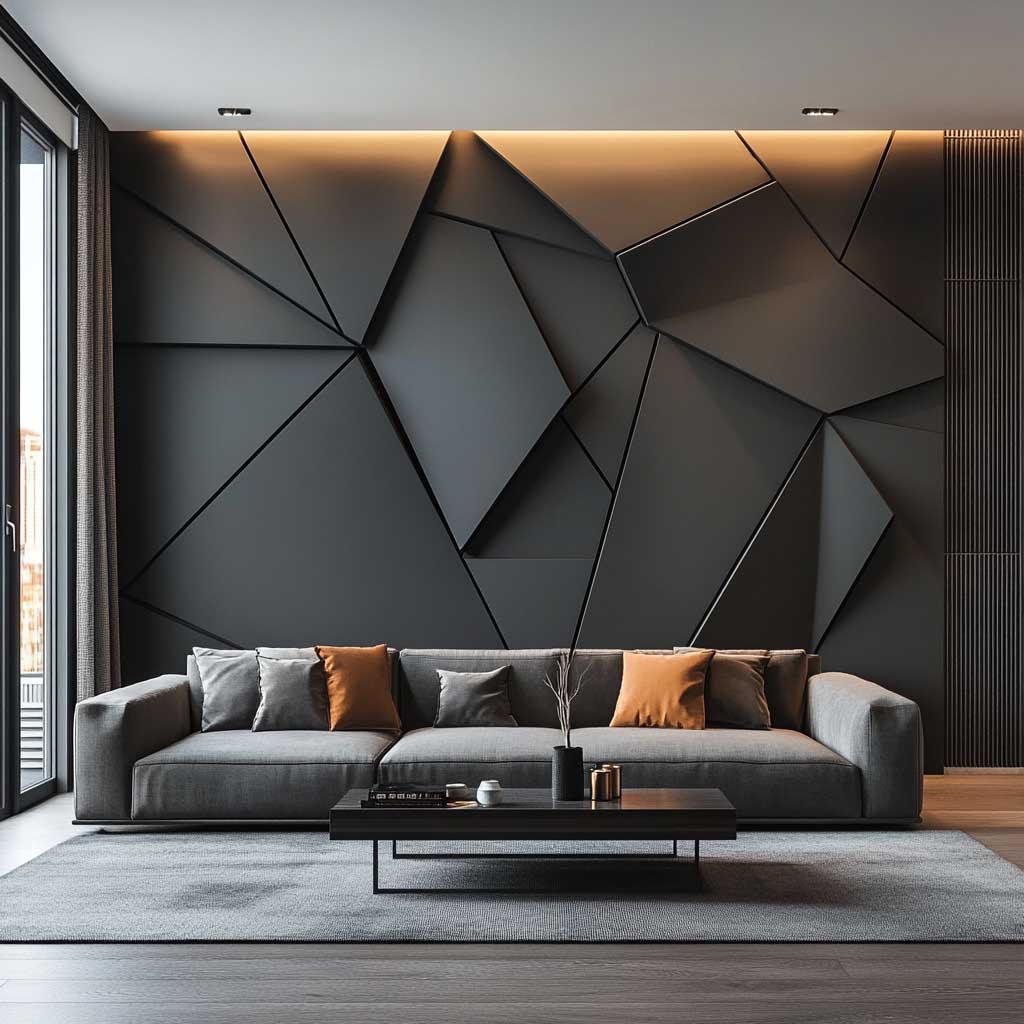
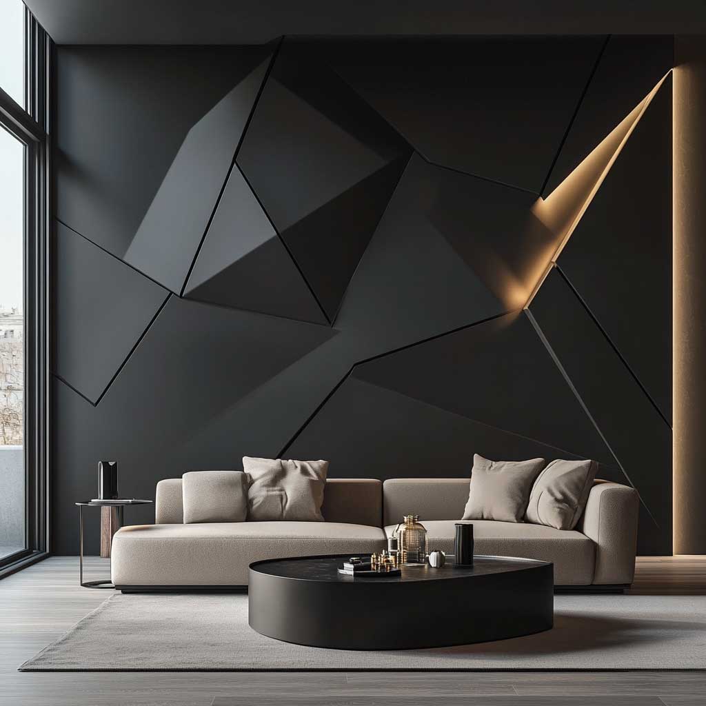
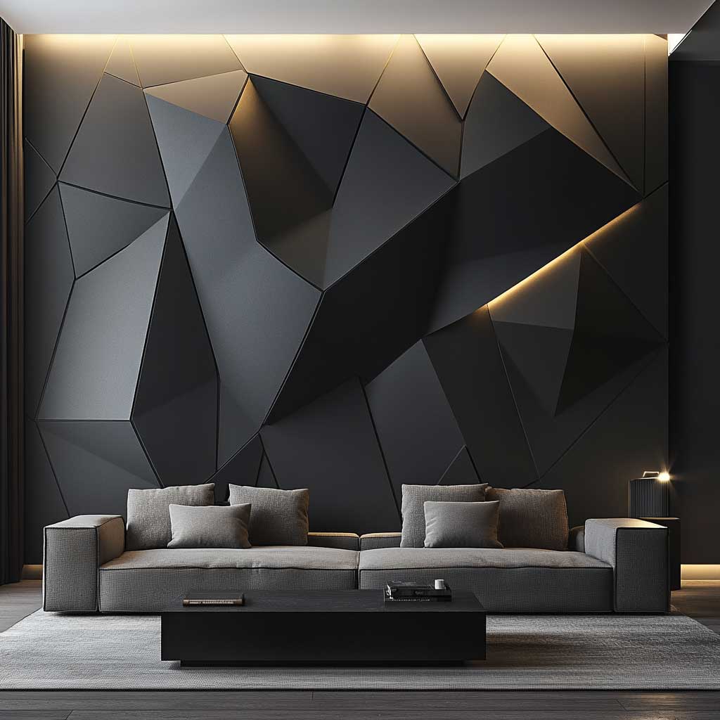
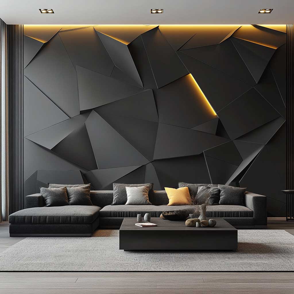
Matte black is the one finish that punishes the wrong room layout. I’ve seen this WPC panel design installed in a small living room with warm-toned flooring and the whole thing collapsed — the wall swallowed the space rather than anchoring it. Geometric WPC panels in matte black need a room with ceiling clearance and at least one pale surface to breathe against. My go-to pairing is a concrete-look plaster ceiling and a low-slung pale gray sofa — the Muuto Outline 3-seater at around $3,200 works exactly right because the flat seat cushion doesn’t compete with the angles.
The geometry itself matters more than the color. Repeating chevrons are overused and starting to look like a 2019 Pinterest board. Asymmetric diamond grids or offset hexagonal layouts read as genuinely custom — and you can have them CNC-routed into a standard WPC slab. Manufacturers like NewTechWood and Oakio both offer custom routing on their flat-panel stock, usually at a $3–$5 per square foot premium. Worth every dollar if you’re doing a full accent wall.
Lighting is where most people leave money on the table. Recessed ceiling spotlights aimed at the wall at a 30-degree angle create shadows inside the geometric channels that make the pattern read twice as deep as it actually is. You’ll notice the difference immediately when you switch from overhead diffuse lighting to directional. Avoid uplights from floor level — they flatten the geometry and make it look like a department store display.
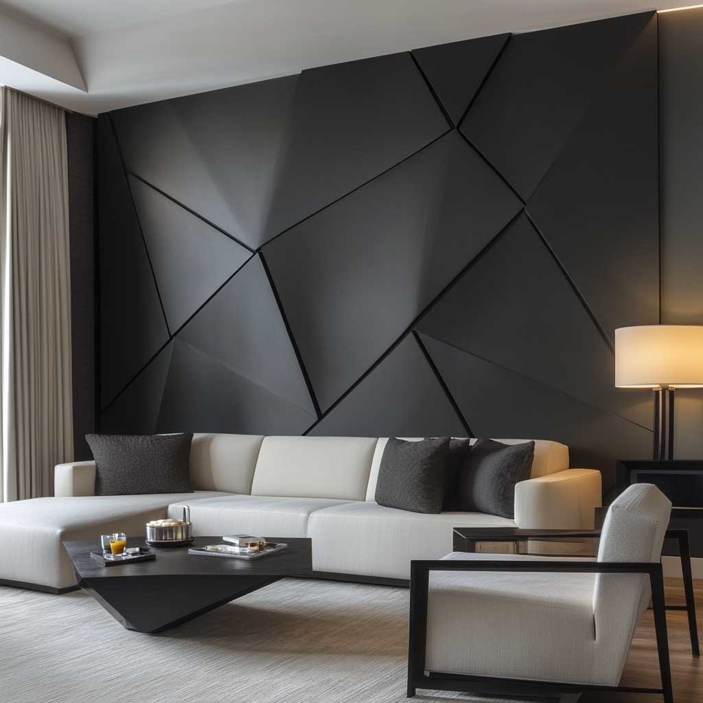
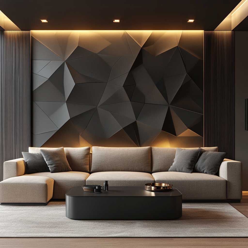
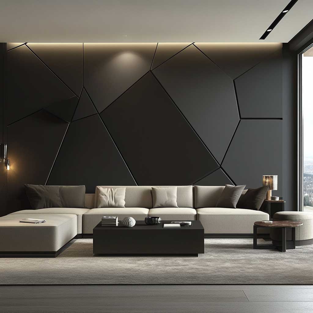
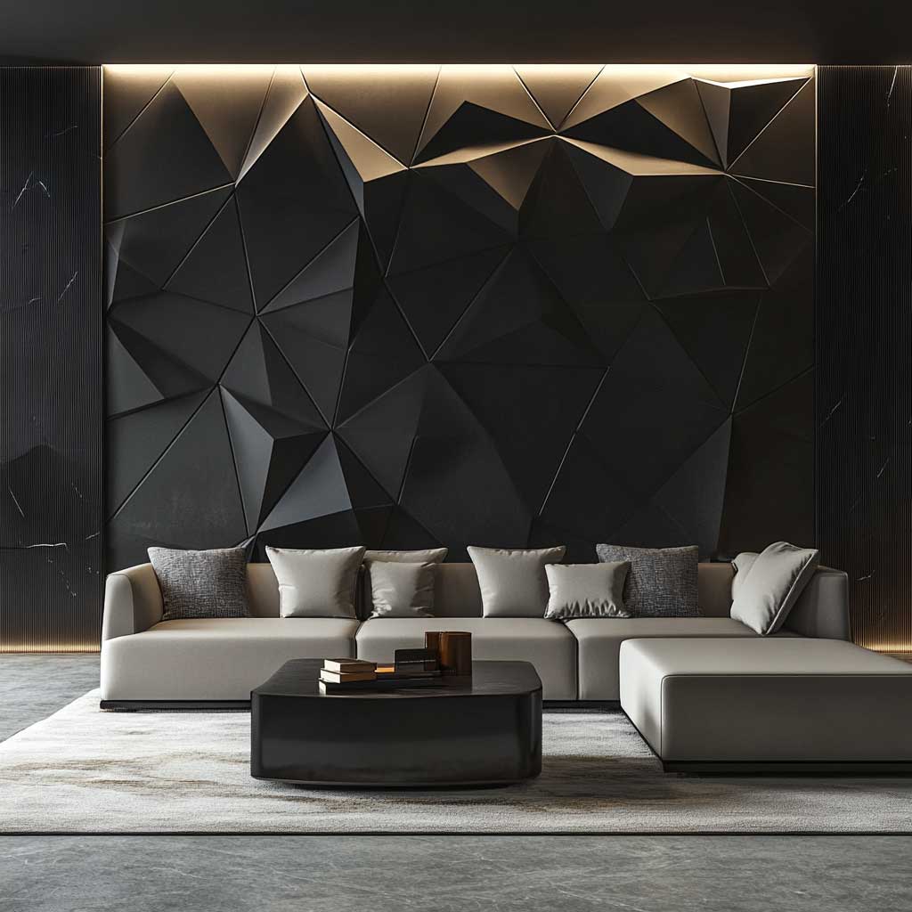
One thing nobody mentions upfront: if you paint the WPC after installation rather than ordering pre-finished panels, you’ll almost certainly end up with uneven sheen inside the routed grooves. Pre-finished matte black from the manufacturer is a controlled coating baked into the surface. Brushed-on site paint in the channels always catches a little gloss from the roller edge. Order finished panels. Trex and Hosung both do matte black in their interior panel lines and ship with UV-stabilized coatings that won’t chalk in direct sun near windows.
Does geometric work in every room? No. Bathrooms with small floor plans turn chaotic with heavy geometric WPC — the eye has nowhere to rest. Keep this look for living rooms and primary bedrooms where the wall has at least 10 feet of uninterrupted run. Anything shorter and the pattern gets truncated before it resolves visually, which is worse than no pattern at all.
Don’t Do This
Avoid mixing two geometric WPC panel designs on adjacent walls in the same room. The logic sounds good — “more pattern, more impact” — but the result is visual noise, not drama. I’ve seen this in two separate renovation projects where clients insisted on wrapping a corner with different geometric profiles. Both redid the second wall within a year. Pick one wall. Commit. The contrast against plain plaster on the other three walls is what gives the WPC panel its power.
Abstract Color on WPC Has Nothing to Do With Bold — It Has to Do With Which Colors Sit Still

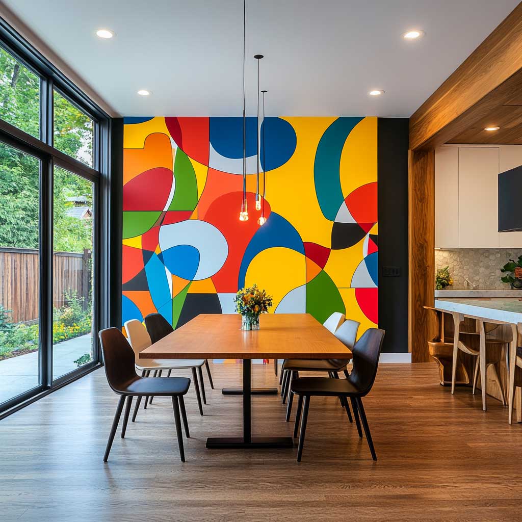
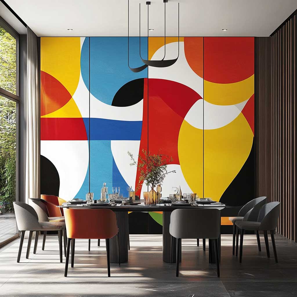
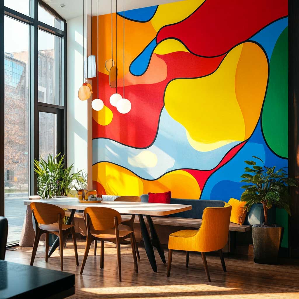
Abstract motifs on WPC panels work when the colors have different visual weights. Red, yellow, and cobalt together read as chaos unless one of them is kept below 20% coverage — I stole this trick from a muralist I watched work in a Kyiv restaurant renovation, and it holds every single time. You want one dominant color (the field), one accent (the pop), and one connector (usually a warm off-white or raw umber) that keeps them from fighting. Without the connector, the wall looks like a kindergarten classroom.
WPC is a genuinely good surface for painted abstract work because the composite skin doesn’t absorb paint the way raw wood does. You get a smooth, consistent ground. For DIY application, prime with a bonding primer like Zinsser Bulls Eye 1-2-3 ($35 per gallon) before your color layers — it locks adhesion even on the waxy surface that cheaper WPC panels sometimes have. Skip the primer and you’ll see peeling along the edges within 18 months.
The dining room is actually the right room for this treatment — not the living room where people stare at the wall for hours during quiet evenings. Dining rooms have shorter, more social occupancy. The abstract WPC wall works like a conversation accelerator: your guests notice it immediately, comment on it, and then get back to talking to each other. It’s furniture for the room’s social energy, not for sustained contemplation.
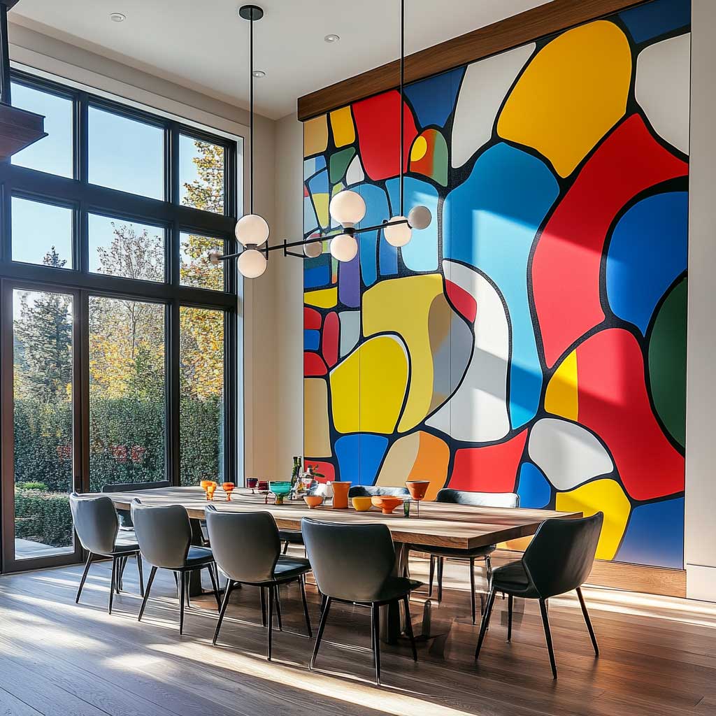
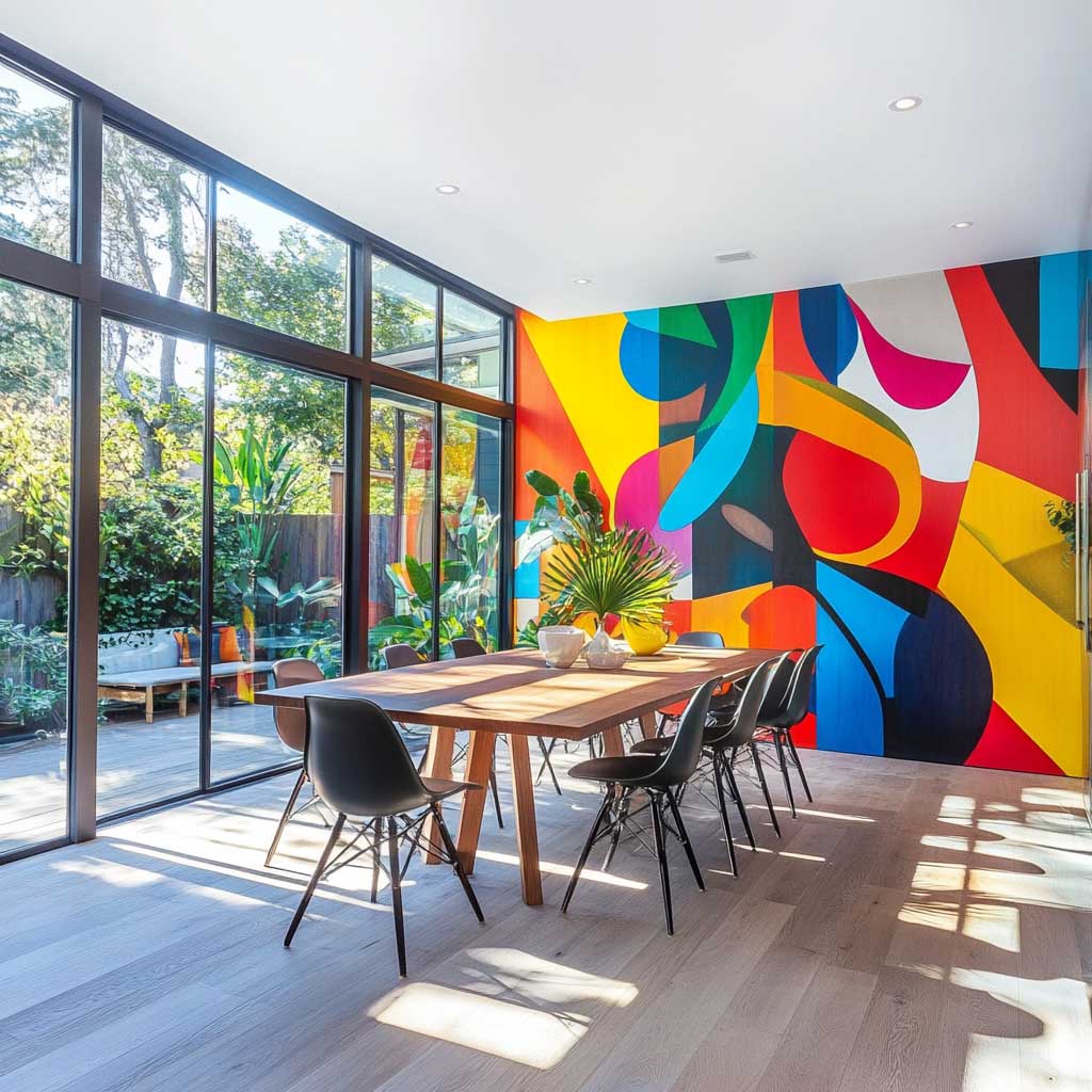
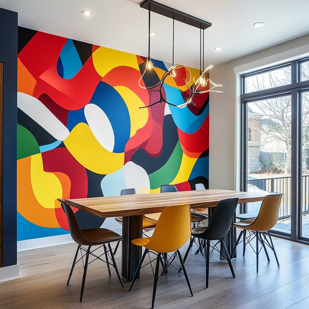
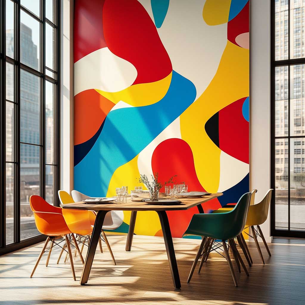
Furniture selection here is non-negotiable: go white or black, nothing in between. A walnut dining table against an abstract multicolor WPC wall creates a mid-tone collision that muddies both. I’ve seen designers try to “warm up” the room by adding terracotta chairs — it killed the abstract wall’s impact instantly. White Eero Saarinen Tulip table (replica runs $400–$600) with black bentwood chairs is the cleanest combination I’ve used, and it keeps the wall as the clear protagonist.
Natural light transforms abstract WPC panels more than any other design type. The colors shift across the day as sun angle changes — what reads as a dominant red at noon becomes almost orange by 4pm in west-facing rooms. That’s a feature, not a bug. If you have large south-facing windows, the abstract motif becomes almost animated throughout the day. Wall panelling designs with strong color work best when the room has at least one full-length window — the flat light from a single north-facing skylight will flatten the palette and kill the effect.
3D Sculptural WPC Panels Belong in the Bedroom Precisely Because Nobody Touches Them
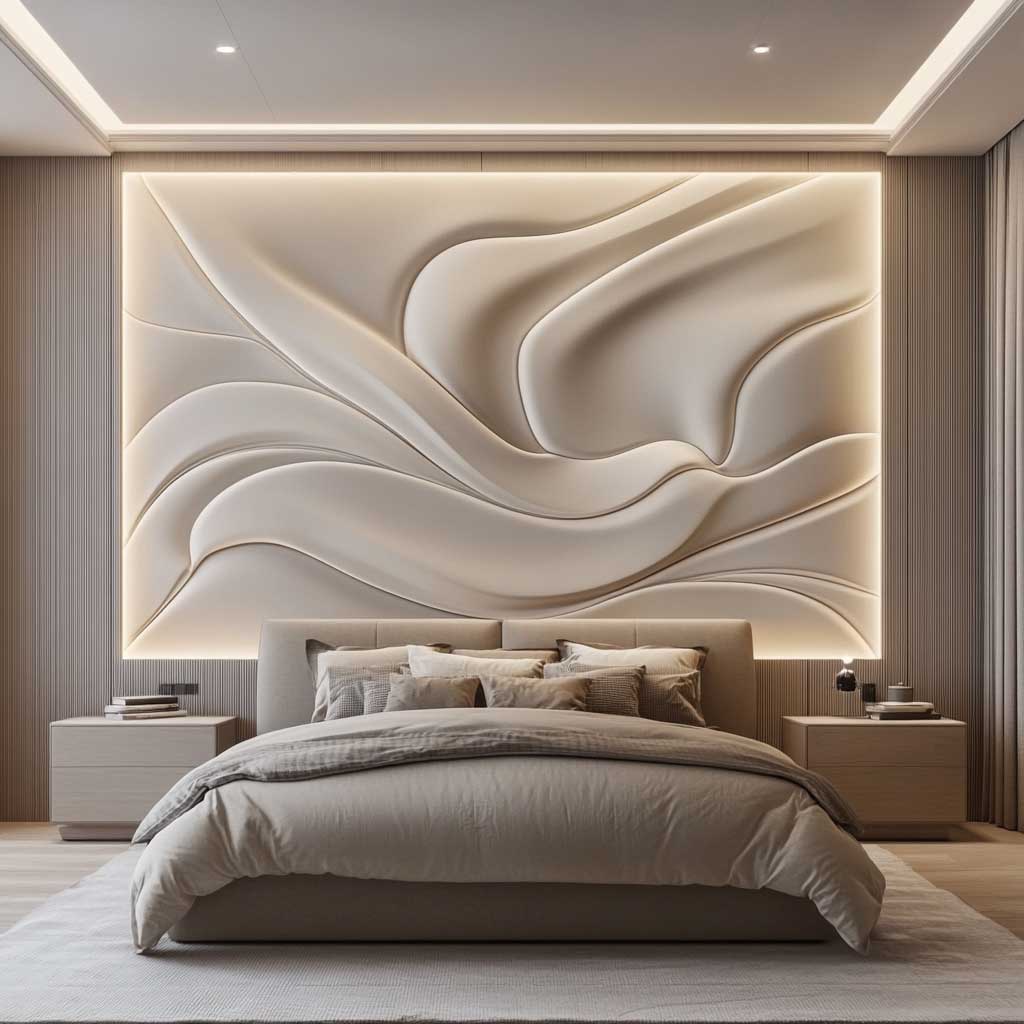

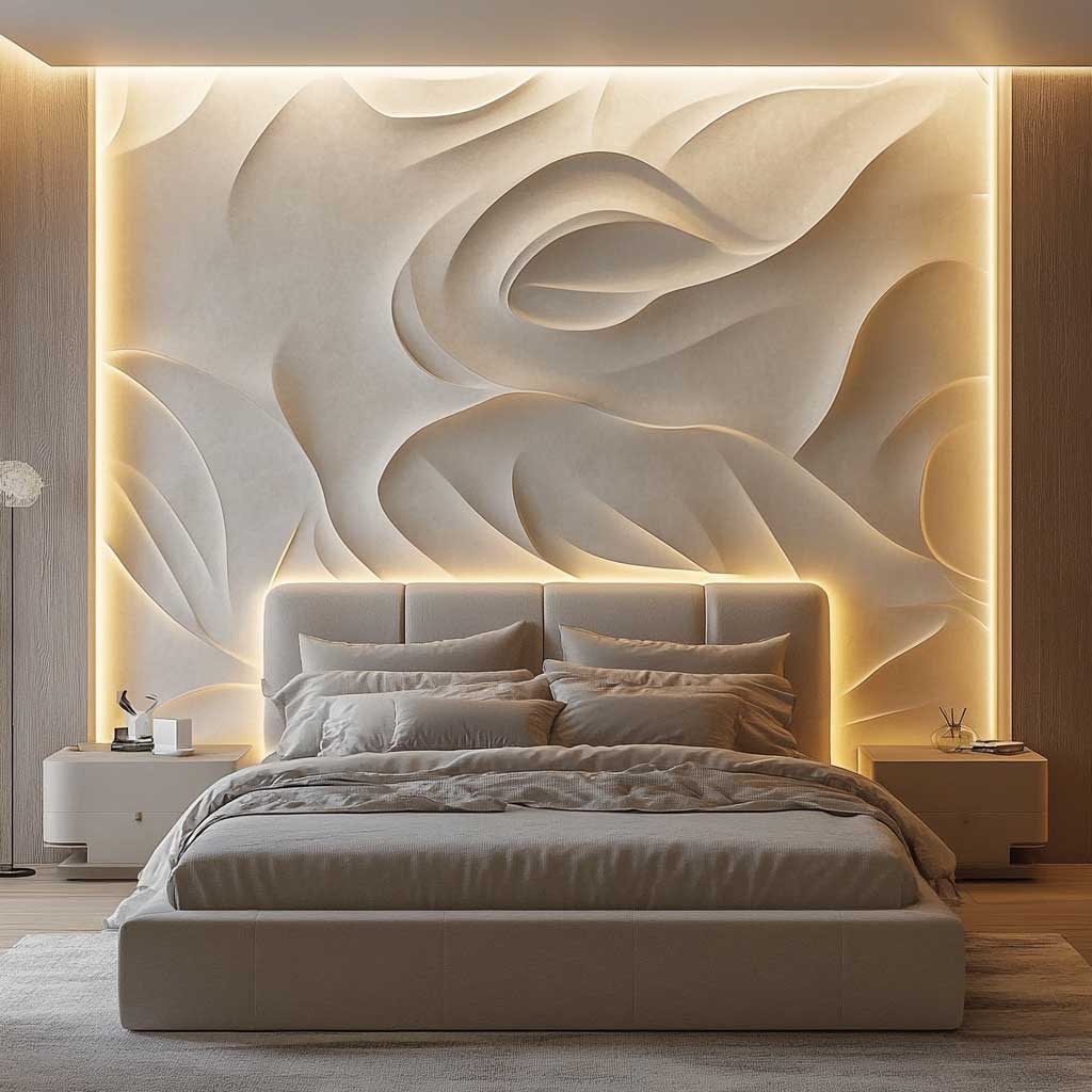
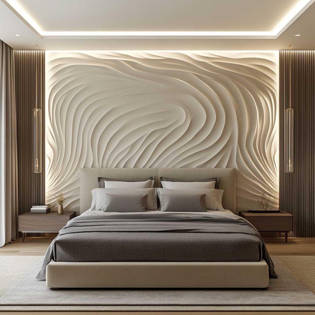
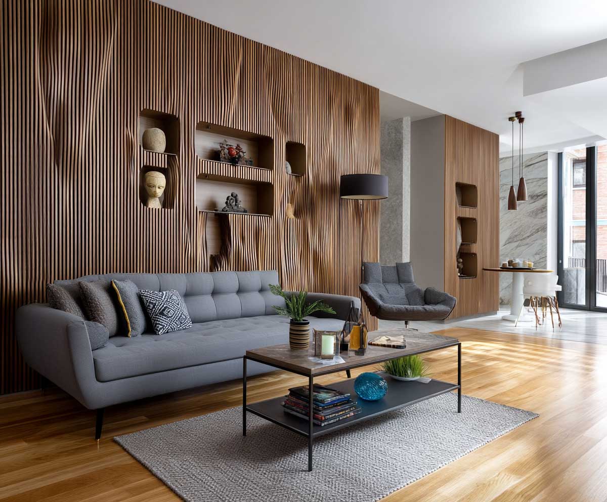
3D sculptural WPC panel design works in bedrooms because bedrooms are low-traffic rooms viewed primarily from a fixed position — lying in bed, looking at the wall behind where you just were. That viewing angle is everything. The relief depth on a carved WPC panel (typically 8mm–20mm depending on the profile) reads dramatically from 8–12 feet away, which is exactly bed-to-wall distance in most primary bedrooms. Move the same panel to a hallway where people view it from 3 feet and it looks flat. Distance is the design element most people forget to account for.
Flowing organic patterns — wave forms, leaf veining, sand ripple textures — are the profiles I’d commission for a bedroom rather than angular geometrics. The organic line is softer on the eye in a room designed for sleep. WPC handles organic CNC routing exceptionally well because the composite material doesn’t split along grain lines the way solid timber does — you can route a concave curve across a full 6-meter panel without a single stress crack. Real wood would need joinery every 600mm.
Bedding choice against a 3D WPC wall is where most bedroom renovations stall. Busy patterns on the duvet — florals, bold stripes, graphic prints — cancel the sculptural wall’s texture completely. The wall and the bed start competing for the same visual register. WPC wall panel designs read cleanest against plain-weave bedding in cream, warm white, or oat linen — the texture of the fabric echoes the texture of the panel without duplicating it. Boll & Branch has a 500-thread-count set in “ivory” at $260 that photographs almost as well as it sleeps.
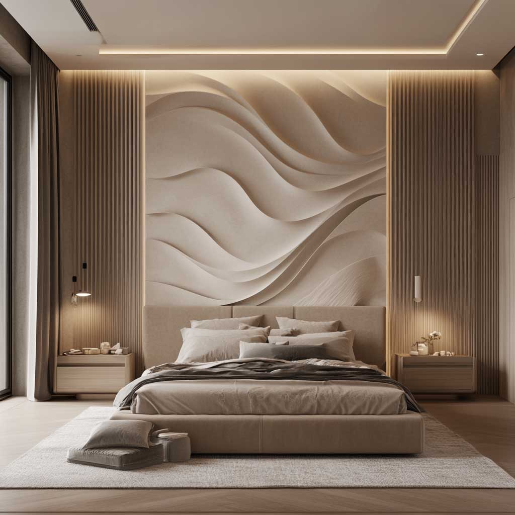
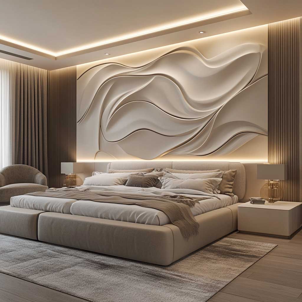
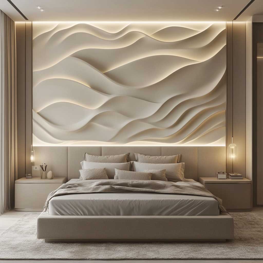
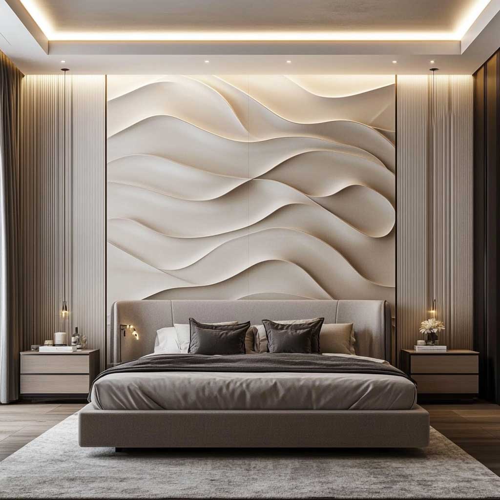
Lighting for a 3D sculptural WPC bedroom panel requires grazing light, not ambient wash. Wall sconces mounted 6–8 inches from the panel surface at eye height (about 60 inches from floor) throw light across the relief at a low angle, which is what makes the shadows appear inside the carved channels. Dimmable bulbs — Philips Hue White Ambiance E26 at $20 each — let you run full brightness for reading and drop to 10% for sleep without losing the texture effect entirely. I own two of these setups across different bedrooms and the low-dim setting is genuinely one of the better things I’ve done to improve how a room feels at night.
What doesn’t work with 3D sculptural WPC: anything that introduces a second focal texture into the same sightline. A macramé wall hanging in front of the panel, a gallery wall of framed art beside it, a cane-front wardrobe adjacent — all of them pull the eye away from the relief and create a visual argument the room can’t resolve. Keep the sculptural wall isolated. One strong element is always more powerful than three medium ones. WPC panel thickness between 19mm and 30mm gives the best shadow depth without making the wall protrude awkwardly into the room.
| Material | Cost (installed, per sq ft) | Moisture Resistance | Custom Routing | Lifespan |
|---|---|---|---|---|
| WPC Panel | $8–$18 | Excellent | Yes — no grain split risk | 25–30 years |
| Solid Hardwood | $30–$60 | Poor (warps) | Limited (grain splits) | 15–20 years with maintenance |
| PVC Panel | $4–$10 | Excellent | Yes | 20+ years |
| MDF with Veneer | $12–$22 | Poor (swells) | Good | 8–12 years |
Final Take
WPC wall panel design is the only material where the installation cost actually reflects the design complexity — not the material price.
Geometric, abstract, or sculptural: the version you choose should be dictated by the room’s viewing distance, not by which Pinterest board you saved last month. A 3D relief panel viewed from 3 feet is wasted money. A flat abstract motif in a room with no natural light is a flat painting on a wall.
Pick the room first. Confirm the viewing distance. Then commission the panel profile. In that order.
Save this post before you start quoting contractors — the material comparison table alone will save you an awkward conversation.
Related Topics