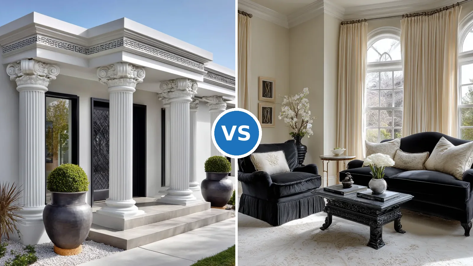
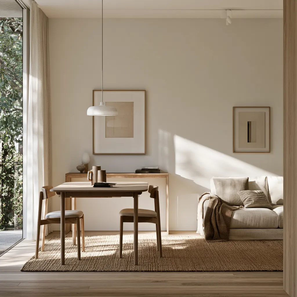
Roman column design can give a modern room or facade a stronger architectural identity without turning it into a historical replica. The key is proportion: the column, capital, base, spacing, and surrounding surfaces need to read as one composition. For a contemporary interior, decorative columns work especially well when they define zones, frame a view, or create a visual axis without pretending to be structural supports.
Modern Roman style interior design works when classical vocabulary is edited rather than copied wholesale. A fluted shaft beside clean furniture, a restrained capital at an opening, or a pair of columns separating living and dining areas can create contrast while keeping the room current. If the goal is a convincing result, start with scale and placement before choosing ornament.
Quick scan
- Use proportion as the main design control.
- Match the capital detail to the visual weight of the room.
- Use columns to frame zones rather than fill empty walls.
- Keep decorative supports visually lighter when the architecture is minimal.
- Check material, spacing, and lighting before adding elaborate ornament.
Roman Column Design Starts With Proportion, Not Ornament
Roman column design starts with proportion because a beautiful capital cannot rescue a shaft that is too thick or too short. Classical references commonly organize a column into base, shaft, and capital, while the complete order can also include an entablature above it. In Vignola-based proportions, the Tuscan order is about 1:7 in diameter-to-height terms, while Corinthian and Composite examples reach about 1:10. Treat these ratios as visual guides rather than rigid construction rules.
What makes a pillar design look convincing in a modern room? Usually it is the relationship between the column and everything around it, not the amount of carving. A slender shaft can reinforce vertical lines in a tall space, while a heavier profile can anchor a low-ceiling composition. Think of the column as the rhythm section of a room: it should support the visual beat without becoming the entire song.
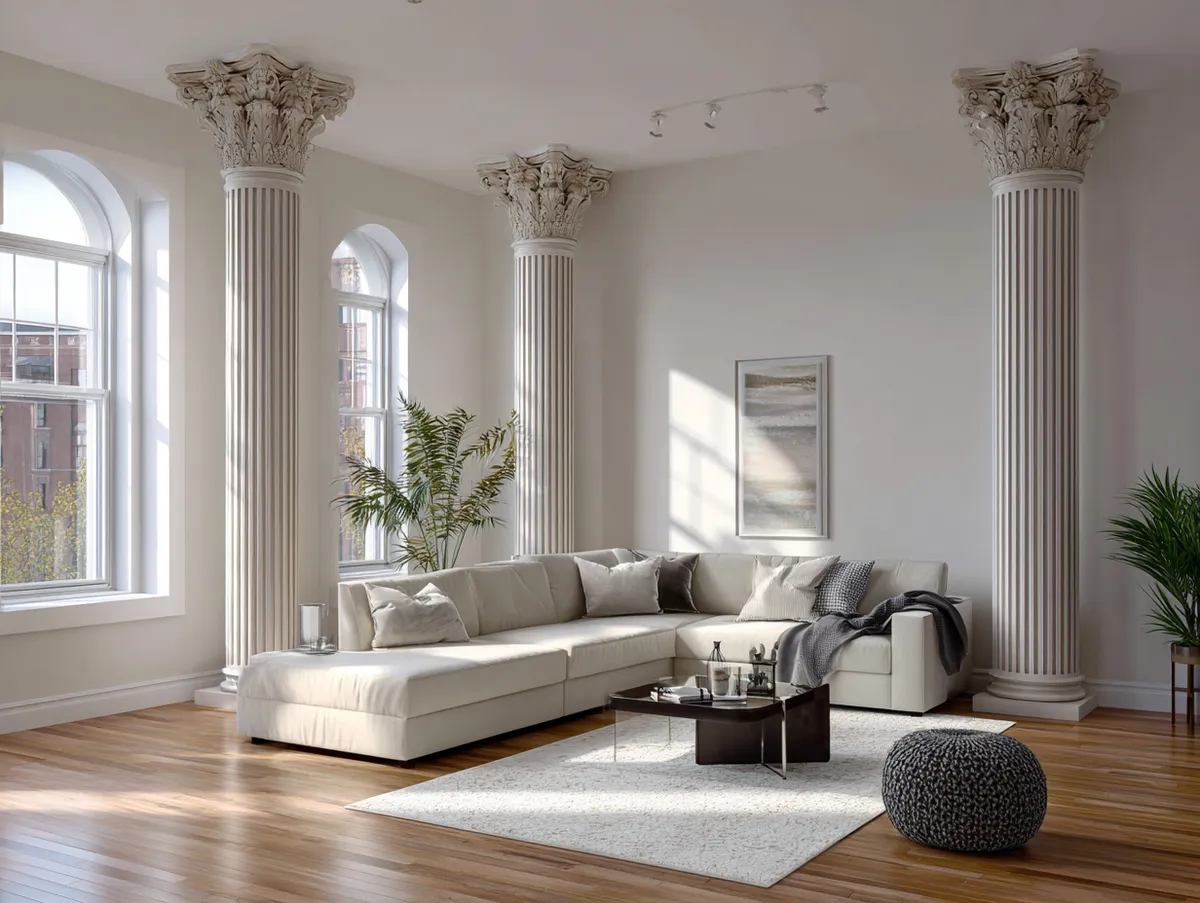
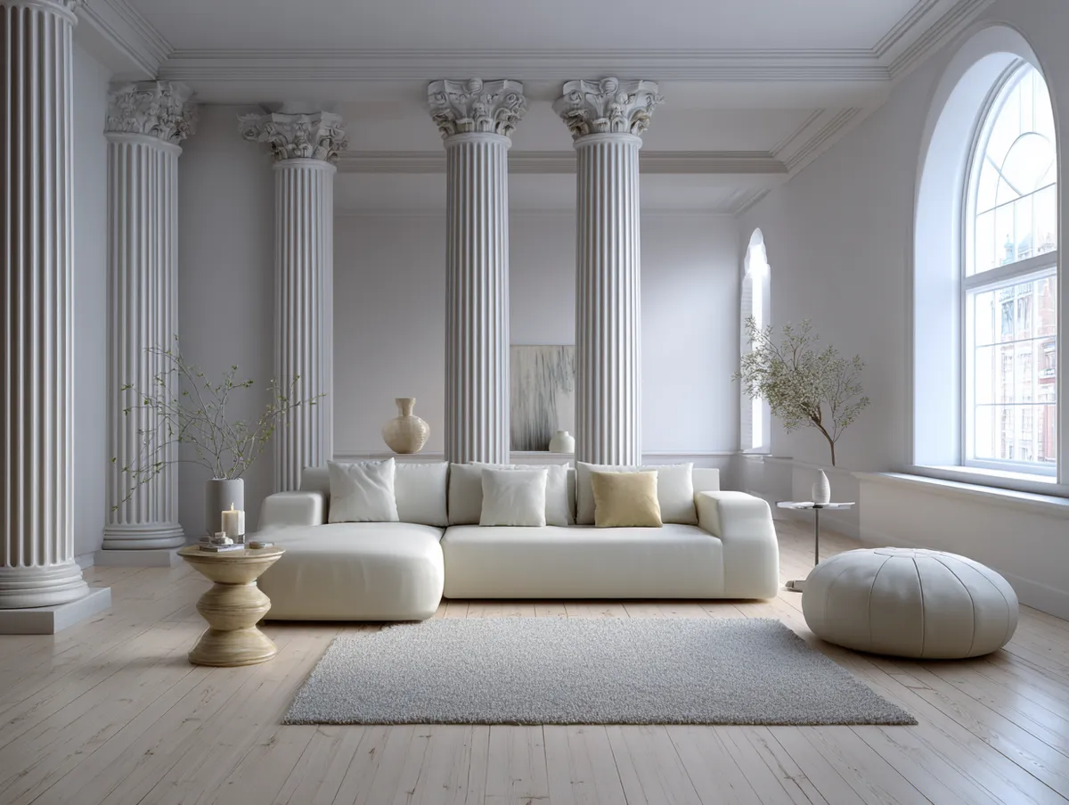
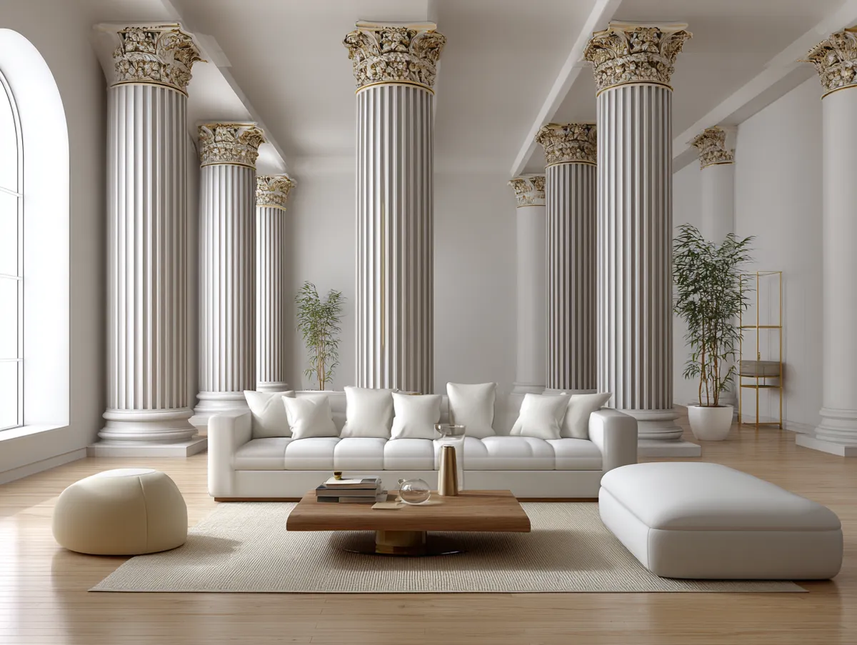
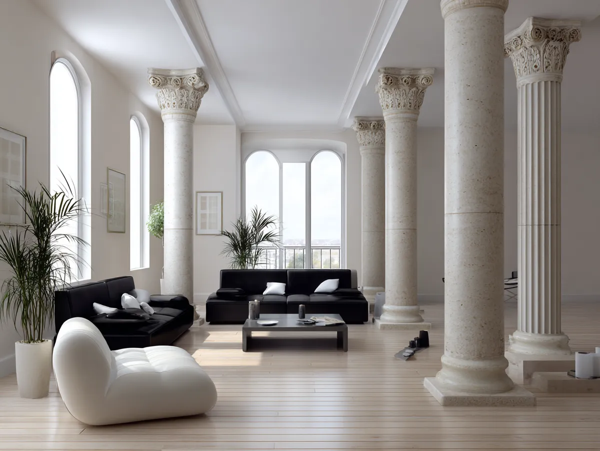
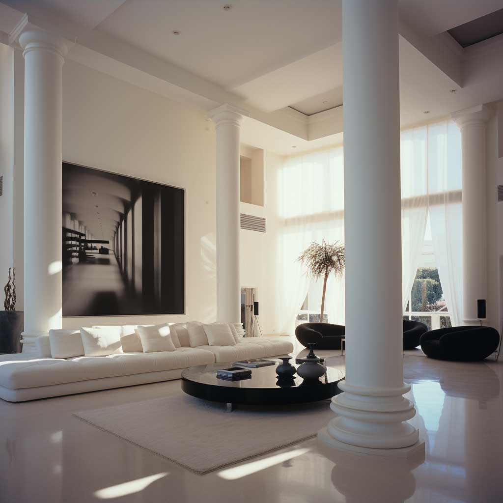

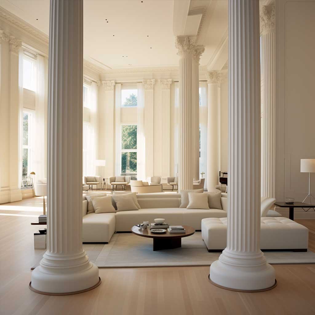
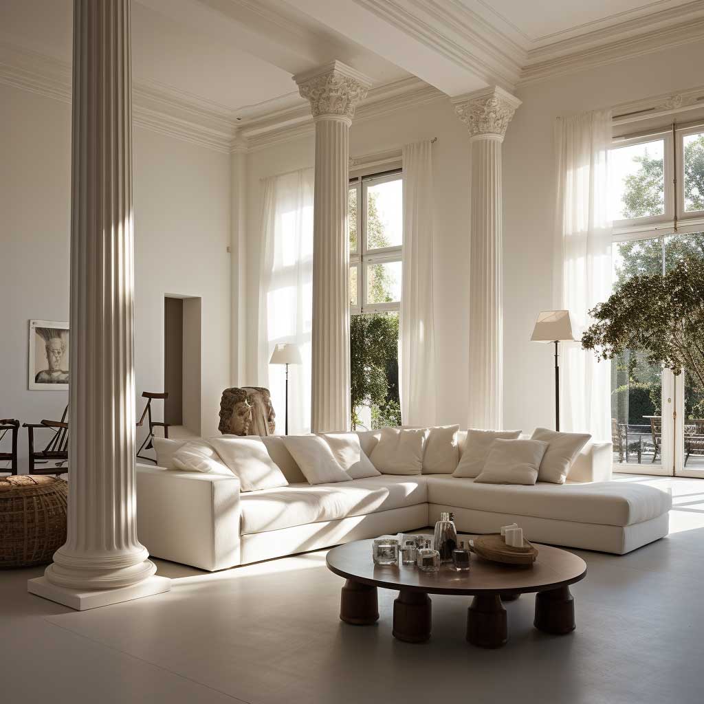
The capital deserves particular attention because it is the quickest visual clue to the chosen order. A University of Illinois architectural reference identifies five classical orders—Doric, Ionic, Corinthian, Tuscan, and Composite—and notes that the capital is one of the easiest ways to distinguish them. If the room already has strong moldings, a simplified capital often works better than another elaborate layer.
For a modern interior, the safest move is to repeat one or two column cues elsewhere: a similar curve in furniture, a matching trim line, or a related finish. Why does this matter? Repetition turns an isolated classical object into part of the architecture. Avoid copying every historical detail; instead, select a recognizable shaft profile and let the surrounding contemporary surfaces carry the restraint.
Don’t Do This
Do not choose a highly ornate capital first and force the rest of the room to follow it. A column that visually dominates every wall can make a modern interior feel themed rather than architectural. Avoid mixing several classical orders in one small room unless the composition clearly calls for it; choose one dominant vocabulary and keep secondary details quiet.
A useful companion for selecting the upper and lower details is this guide to classical column caps and bases, especially when the shaft itself is intentionally restrained. The practical test is simple: step back from the room and check whether the column strengthens the existing lines. If the eye lands on the ornament before the space itself, reduce the detail.
Roman Column Design Gets More Useful When It Defines Space
Roman column design becomes especially useful in open-plan interiors when a dining area, lounge, or entrance needs a visual boundary without a full-height wall. Four columns can create a strong rhythm, while two columns can act like brackets around an opening. The architectural principle is straightforward: repeated vertical elements organize space while preserving visual continuity.
Roman columns are also effective when their finish connects with the rest of the room. White or pale finishes can keep ornate profiles visually light, while stone-like surfaces make the same form feel heavier and more permanent. What should you match first: the column color or its shape? Shape usually matters more at close range, but the finish should still repeat a material or tone already present in the room.
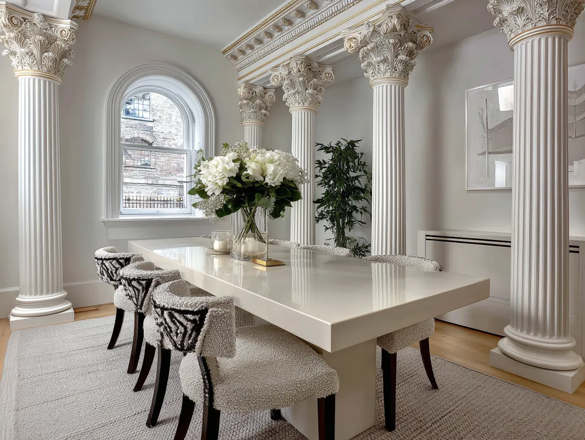
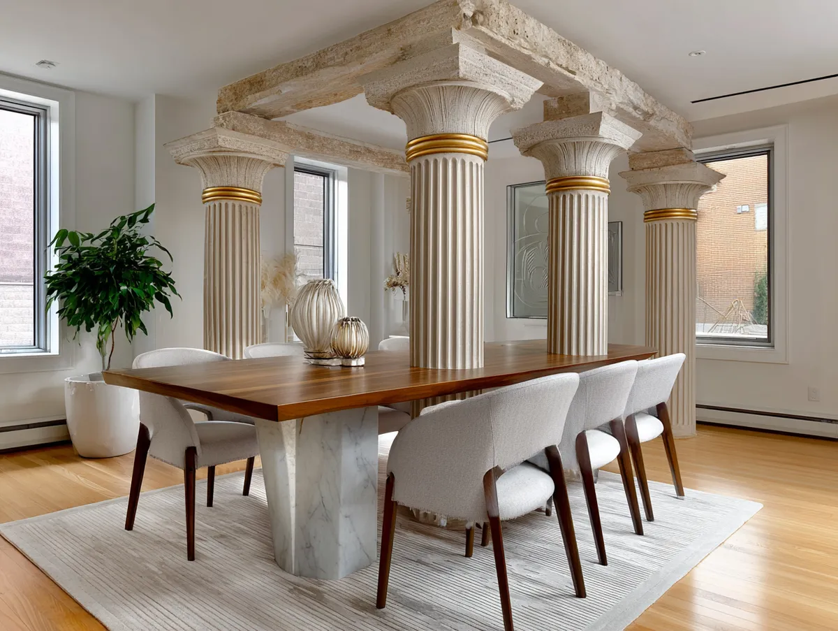
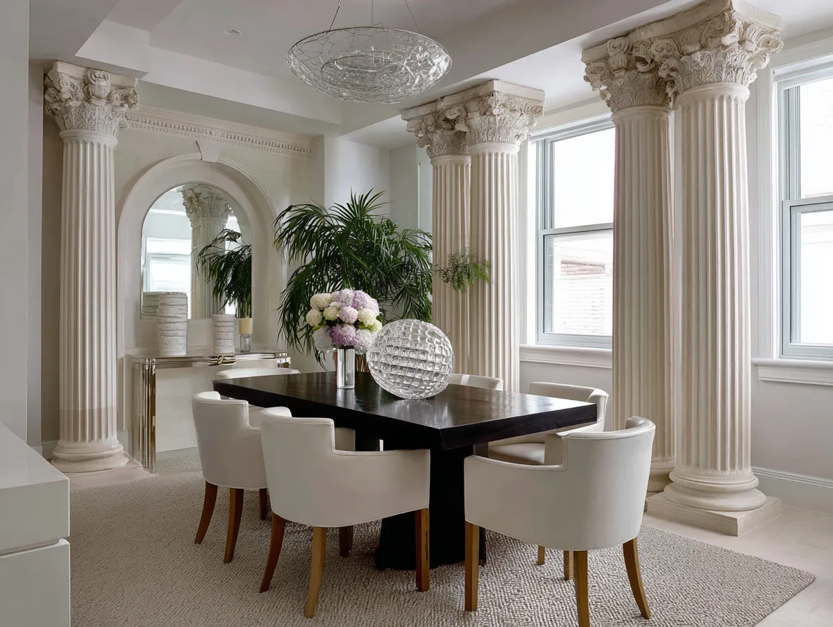
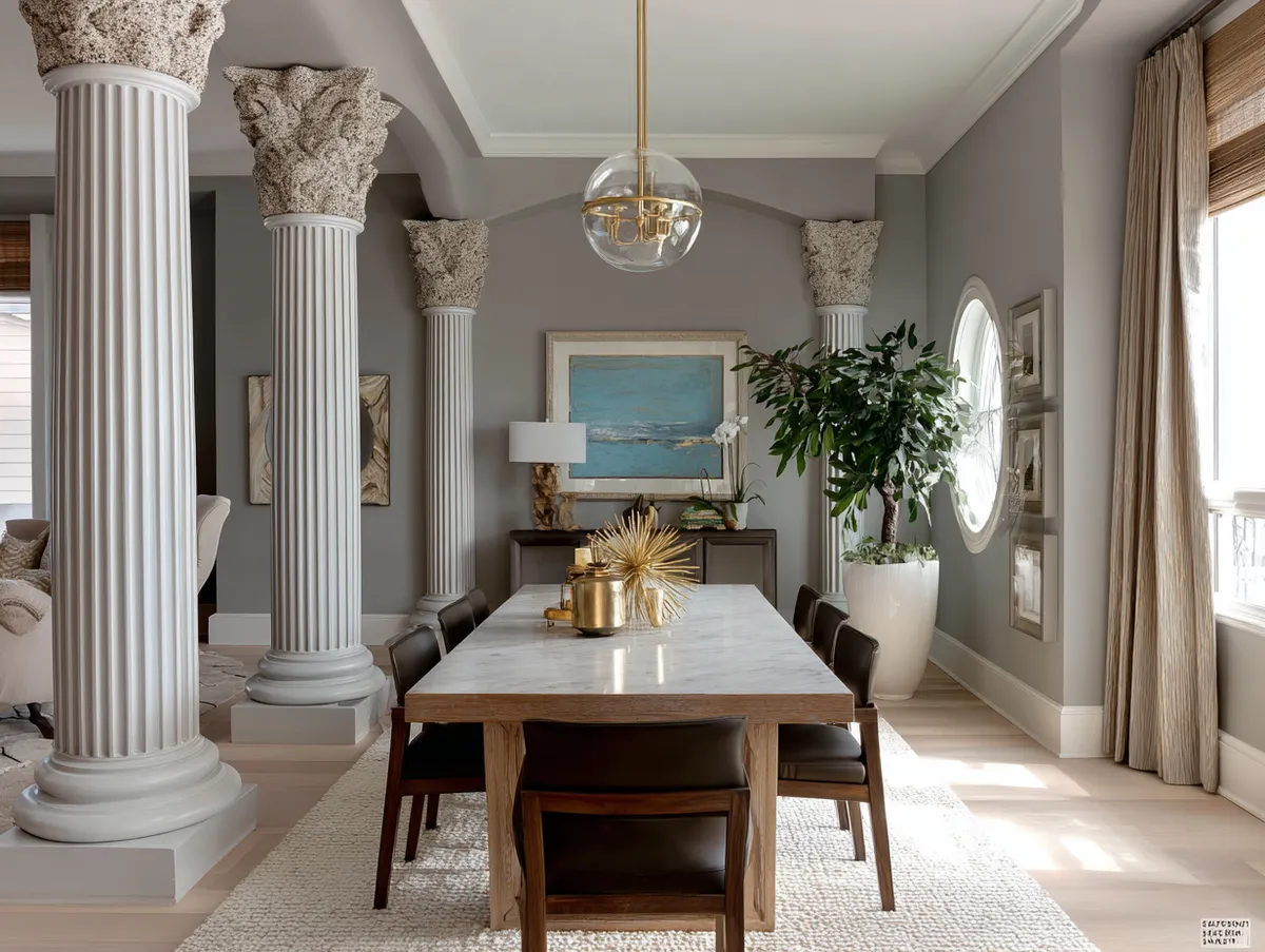
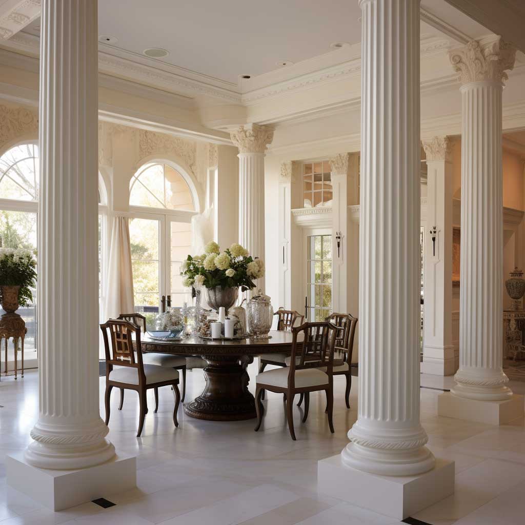
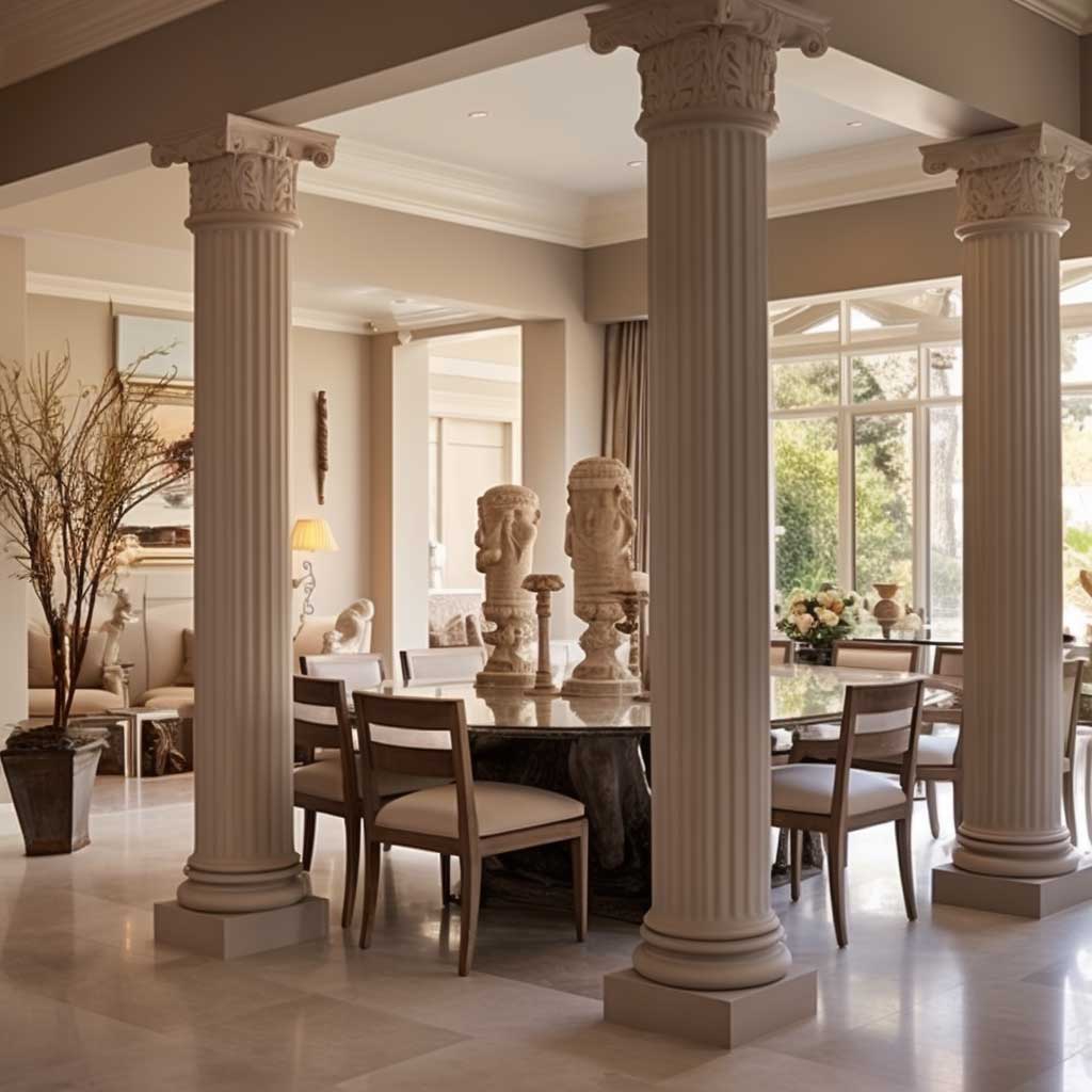

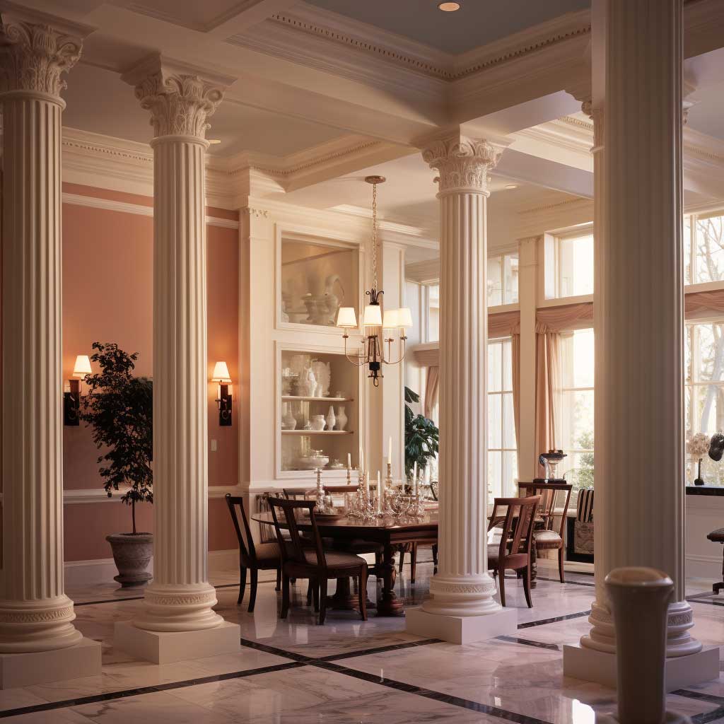
The classical system gives designers a useful numerical reference: Tuscan columns are often represented at roughly 1:7, Doric at 1:8, Ionic at 1:9, and Corinthian or Composite at 1:10 in height-to-diameter relationships. These proportions help explain why a slender Corinthian profile feels more vertical than a heavier Tuscan one. For a contemporary room, use the ratios as a starting sketch and adjust them to the ceiling height and viewing distance.
The University of Illinois reference also describes the column as a system of base, shaft, and capital, with the entablature divided into architrave, frieze, and cornice. That structure is useful even when the installation is purely decorative. Think of it like a tailored suit: the individual pieces matter, but the fit between them determines whether the whole looks convincing.
For historical terminology and proportion references, the University of Illinois guide to classical architectural orders provides a useful independent reference. It records the five-order system and gives representative ratios ranging from 1:7 for Tuscan to 1:10 for Corinthian and Composite. Use those figures to compare visual character rather than to copy a historical building mechanically.
| Order | Typical visual character | Representative ratio | Modern use |
|---|---|---|---|
| Tuscan | Plain and substantial | 1:7 | Minimal, grounded compositions |
| Doric | Strong and restrained | 1:8 | Clean transitional zones |
| Ionic | Slender with volutes | 1:9 | Elegant interiors and entrances |
| Corinthian | Highly ornamented | 1:10 | Formal focal areas |
| Composite | Ionic plus Corinthian detail | 1:10 | Decorative statement spaces |
One anti-pattern is to use the same heavy column profile in every room simply because it looks impressive in a single photograph. In a compact dining area, too much visual mass can shrink the perceived space; in a tall entrance, the same profile may feel under-scaled. Test the design from the normal standing and seating viewpoints before committing to fabrication.
Material also changes the reading of Roman columns. A lightweight decorative shell can provide the appearance of stone while keeping the installation visually and physically lighter, whereas genuine stone communicates mass through both texture and scale. ArtFasad’s decorative column production guide, for example, notes that its products can be made as half-columns for wrapping existing supports and gives the same classical 1:7 to 1:10 proportion range as a design reference. The practical advice is to decide whether the column is a visual skin or a true structural element before selecting the system.
Roman Columns Can Give Modern Exteriors a Stronger Frame
Roman columns can give a modern exterior a clearer entrance hierarchy when they frame rather than overwhelm the facade. The strongest compositions use columns to mark a doorway, terrace, porch, or central axis while leaving the rest of the elevation comparatively quiet. In this setting, the column works like a picture frame: it tells the eye where the architectural focus begins.
A convincing exterior pillar design also depends on repetition and alignment. Bases should relate to the ground line, shafts should rise cleanly through the facade, and capitals should meet the horizontal architecture without awkward gaps. If the building is already detailed around windows and doors, reduce the column ornament so the facade does not become a competition between separate motifs.

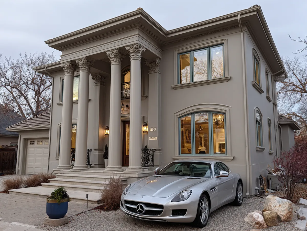
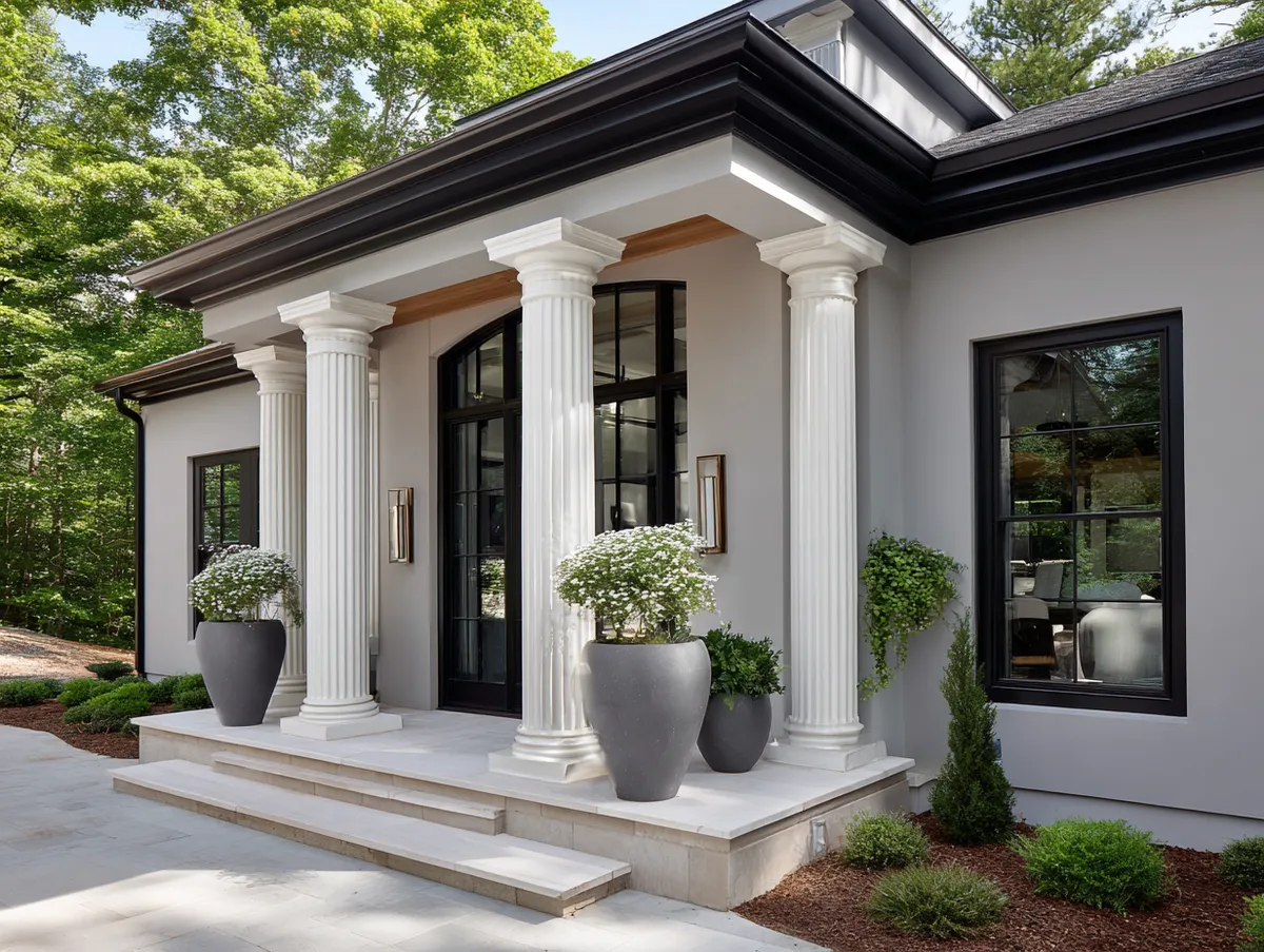
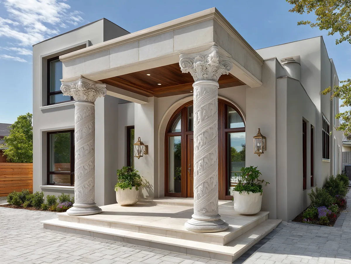
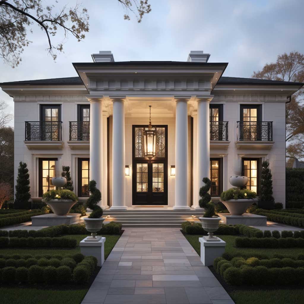
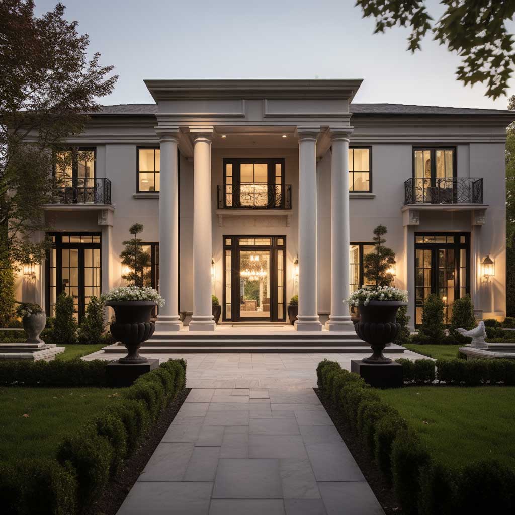
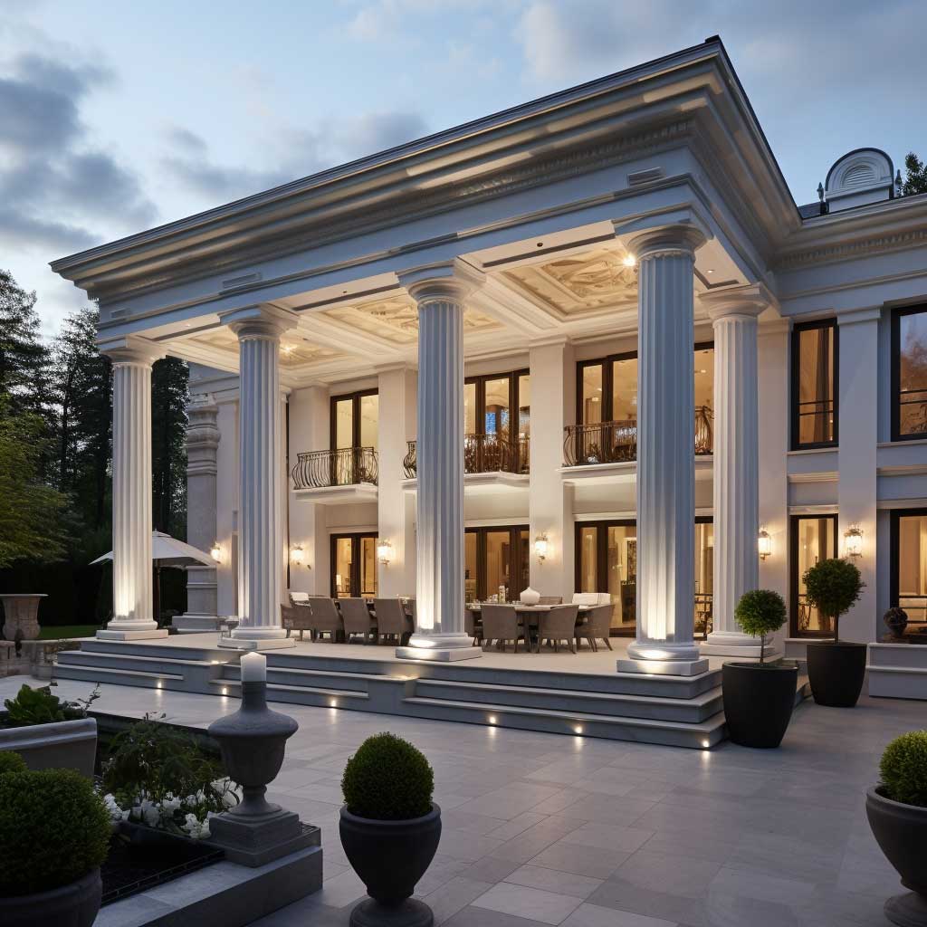
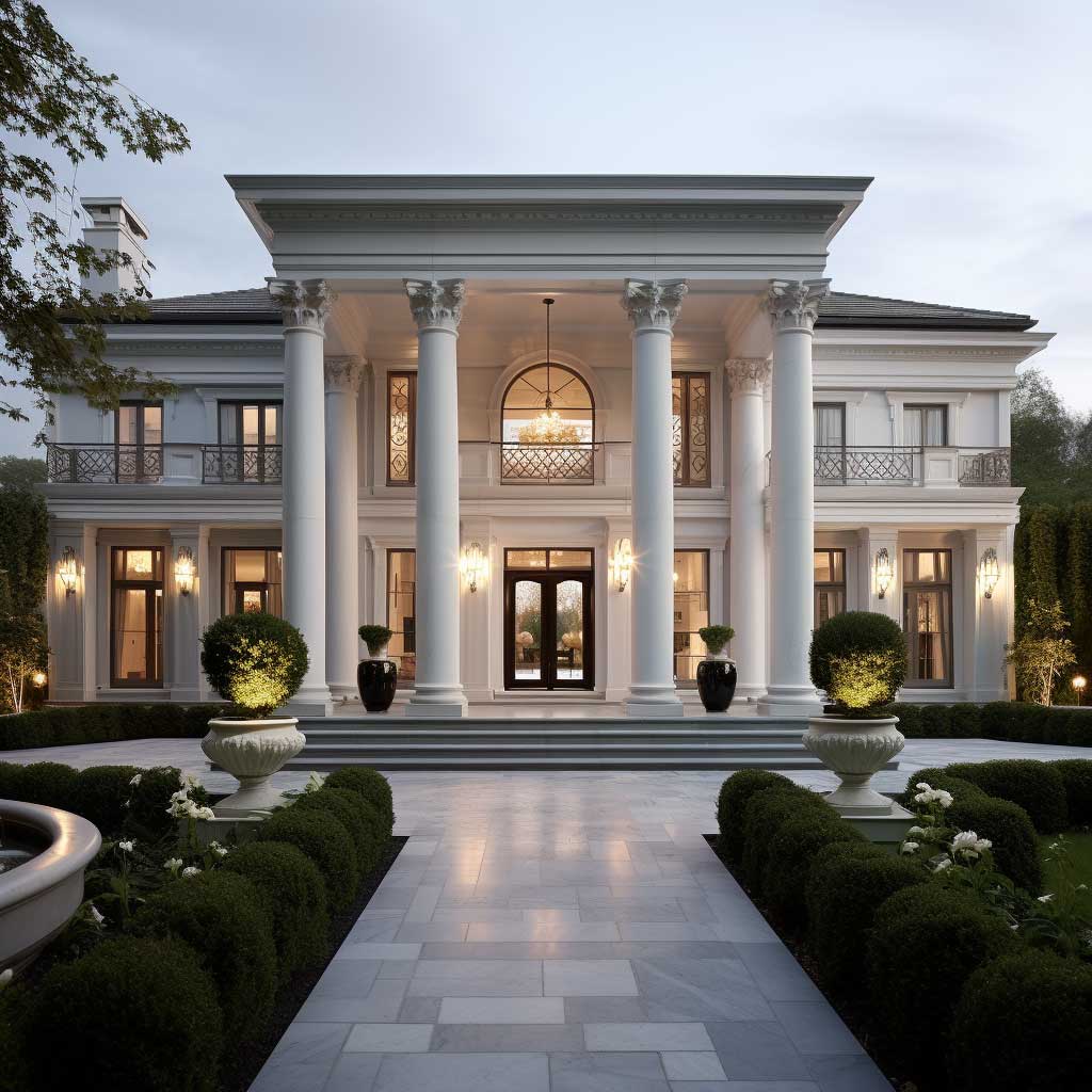
Exterior proportions deserve the same discipline as interior ones, and the five-order tradition offers a useful scale from heavier Tuscan and Doric forms to more slender Ionic, Corinthian, and Composite profiles. A 1:7 proportion reads differently from 1:10 even before ornament is added. Choose the profile according to the height and visual weight of the facade, then tune the capital and base to match its existing architectural language.
Kapiteli, or capitals, are often the smallest component with the biggest visual effect because they terminate the vertical rhythm at eye level and below the roofline. Why do capitals matter so much? They signal the intended order and create a transition into beams, arches, or entablatures. Keep their projection controlled when the facade is modern; excessive depth can make the entrance feel heavier than the building itself.
Another useful rule is to repeat the column geometry in nearby details rather than multiplying decorative pieces. A cornice can echo the capital profile, a doorway can repeat the shaft rhythm, and a low plinth can visually anchor the base. The result should feel like one architectural sentence, not several unrelated quotations.
For a facade with strong classical references, symmetry can do more work than ornament. Pairing columns around an entrance creates a clear axis, while a single column or partial pilaster can provide emphasis where a full colonnade would be excessive. The practical test is to view the elevation from the street distance and remove any detail that disappears or becomes visual noise.
Modern applications also make decorative construction more flexible than traditional masonry. ArtFasad’s column-production information describes half-column elements for cladding existing supports and notes that models can be produced at different heights while maintaining their overall proportions. That makes decorative Roman columns useful for adapting an existing facade, provided the underlying support and installation method are specified separately.
Before finalizing the design, check three things in sequence: the column-to-height relationship, the spacing between repeated elements, and the scale of the capital and base. If those three relationships are coherent, the material and finish become easier decisions. If they are not, adding more ornament will only make the mismatch louder.
THE DESIGN TAKEAWAY
Roman columns work in modern architecture when proportion leads and ornament follows.
- Choose the order by scale and visual weight, not decoration alone.
- Use columns to frame zones, entrances, and axes.
- Keep capitals, bases, and surrounding moldings visually related.