The best wall color for small living rooms isn’t the one you like on your phone screen — it’s the one that makes your ceiling feel taller at 7 PM under warm LED bulbs. I repainted my own 140-square-foot living room twice before landing on the right formula, and the difference wasn’t dramatic in photos. It was dramatic in person. Small. Every foot of perceived space counts. These three colors are the ones I’d put money on: a warm white, a mid-value sky blue, and a soft lavender — each tested under actual conditions, not showroom lighting.
You’ll notice these aren’t trendy. They’ve been earning their keep for decades for one reason: they read light without feeling clinical, and they hold their tone across multiple lighting conditions. That’s rare. Most colors that photograph well look flat or greenish by 9 PM.
Quick Scan
- Best overall wall color for small living rooms: warm white with yellow or pink undertone (not blue-white)
- Best color for a small living room with low light: sky blue — it reads outdoor even in dim conditions
- Best colour combination for small living room: lavender walls + natural oak furniture + white trim
- Avoid: pure bright white (reads cold), saturated navy (absorbs light), grey with blue undertone in north-facing rooms
- Budget reality: Benjamin Moore Aura runs $85–$95/gallon. Two coats minimum. Buy a sample pot first — always.
Warm White Earns Its Reputation by Behaving Differently in Every Light

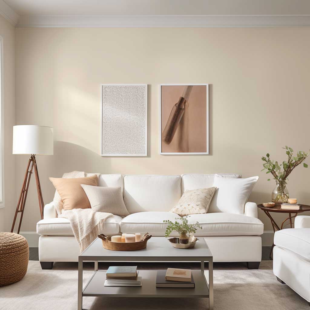
Benjamin Moore Chantilly Lace OC-65 is what I use as the benchmark when a client asks me about the best paint color for a small living room. Around $90/gallon in the Aura line. It has no blue undertone, so it doesn’t go grey under artificial light — the single biggest mistake I see in compact spaces. At noon in full sun it reads crisp. At 9 PM under a warm-white bulb it goes slightly creamy. Both are correct. Neither is a problem.
What does warm white do to a small room? It reflects light rather than absorbing it, which means your windows — even small ones — punch harder. My living room gets about 90 minutes of direct sun per day. On Chantilly Lace the room looks usable all day. I tried Sherwin-Williams Extra White SW 7006 before that and it looked like a dentist’s office by 4 PM. Colour temperature matters more than the name on the tin.
The furniture flexibility is real. I’ve matched this wall to a dark-green velvet sofa, a bleached-oak sectional, and an 80s rattan chair I refuse to throw away. All three worked. Warm white is the only colour that genuinely doesn’t force your hand on furniture. That said, pair it with cool-toned furniture and you’ll lose the warmth immediately — I’ve seen it happen with grey linen sofas, and the result looks like an unfinished rental.
What doesn’t work? Blue-based whites — Sherwin-Williams Alabaster or Benjamin Moore White Dove look beautiful in photos and go muddy in rooms under 150 sq ft with limited windows. You need LRV (light reflectance value) above 85 and a yellow or pink undertone. Below that threshold in a small room, white becomes a liability, not an asset. Also skip the flat finish — eggshell shows the dirt less and reflects just enough light to matter in tight spaces.
My go-to pairing for a small living room with warm white walls: natural linen curtains, a sisal or jute rug, one low-profile sofa in a mid-tone. Keep the ceiling the same white. You’ll notice visitors look up. That’s the point. Matching wall colour to furniture style is a different problem, and one that warm white sidesteps entirely.
Sky Blue Reads Outdoor Even When the Blinds Are Closed
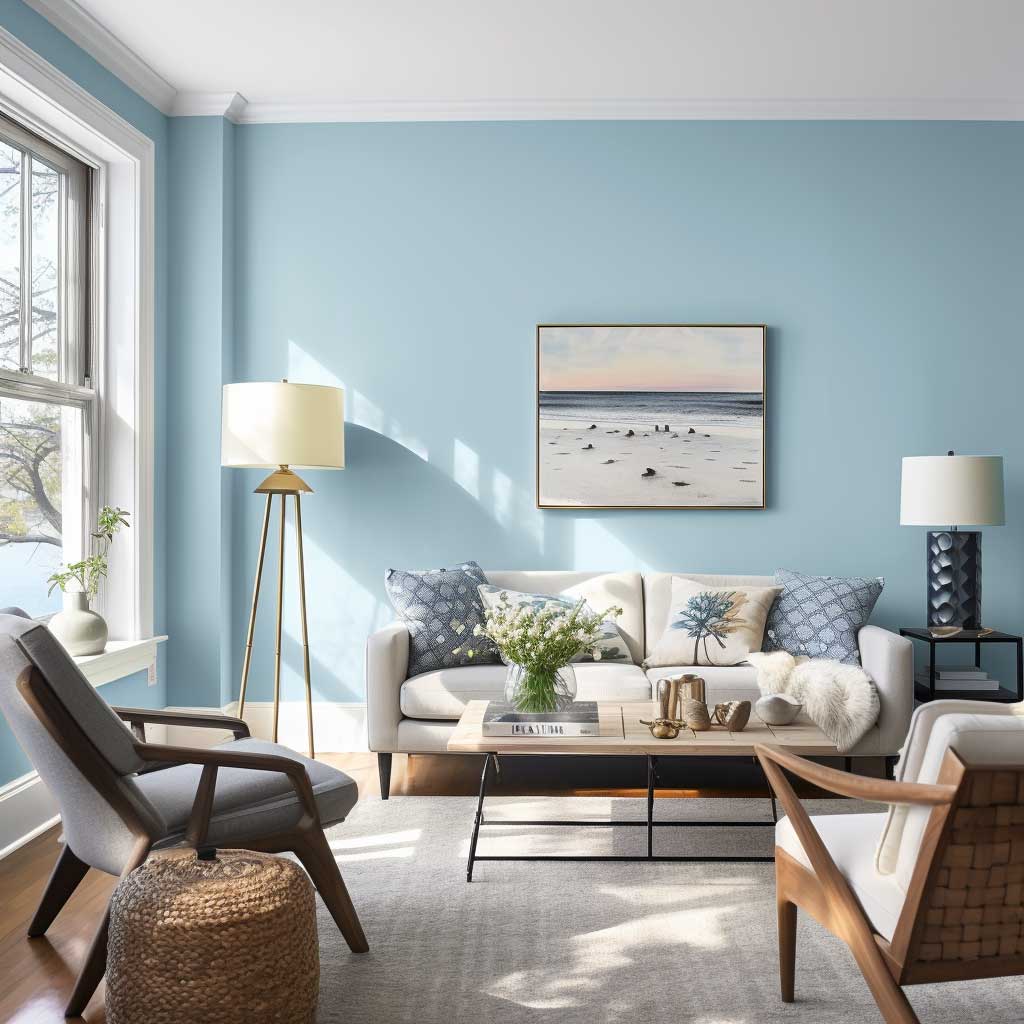
Farrow & Ball Light Blue No. 22 is the sky-blue I keep coming back to — around $115/gallon, which hurts, but the depth of pigment is incomparable. The thing about a mid-value sky blue in a small living room is that it tricks the brain into thinking there’s more light than there is. I stole this trick from a Scandinavian interior designer I worked with briefly: blue reads as sky, and sky reads as open. You’re not just painting a wall. You’re implying a window that isn’t there.
Does it work in dark rooms? Yes — and this is the counterintuitive part. In a room with limited natural light, a warm white sometimes goes yellow and stale by afternoon. A cool sky blue at LRV 65–70 holds its clarity. It doesn’t get dingy the way warm colours do in shade. I’ve used Benjamin Moore Boothbay Gray HC-165 (half the price at $60/gallon in Regal) as a budget alternative with nearly identical performance in dim-condition rooms.
The wall colour combination for a small living room that I’ve seen work consistently: sky blue walls, white-painted trim, pale grey or natural linen sofa, brass or matte-black hardware. Avoid orange-toned wood furniture — it fights the blue and the room starts to look like a Swedish flag. Medium-toned walnut or oak is fine. Dark espresso furniture is fine. Pine is the enemy here.
Don’t Do This
- Don’t test paint swatches on white paper. Pin them directly on the wall and check at 9 AM, 2 PM, and 9 PM. Blue shifts more than any other colour under warm bulbs.
- Don’t paint all four walls a saturated colour in a room under 150 sq ft. One accent wall in navy or forest green is enough. All four walls in a deep tone in a small room feels like being inside a box — I did this once and repainted within three weeks.
- Don’t buy cheap paint to save $20 a gallon — you’ll apply four coats instead of two and spend more in time and money. Behr Marquee or Benjamin Moore Regal are the floor, not the ceiling.
- Don’t match your wall colour to furniture you plan to replace. Pick the wall first. Furniture rotates every few years; wall paint should outlast two sofas.
What doesn’t work in this palette? Mixing sky blue walls with grey curtains. I’ve tried this. The room goes lifeless — two cool tones with no warmth anchor. You need contrast: warm-white curtains, a jute rug, a terracotta or mustard throw pillow. Something that stops the room from reading like a dentist’s waiting area. For layout ideas in tight rooms, this guide on small living room layouts covers furniture placement that makes colour work harder.
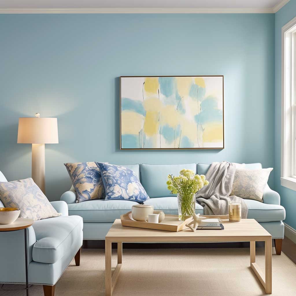
Soft Lavender Gets More Done Than Any Purple Has a Right To

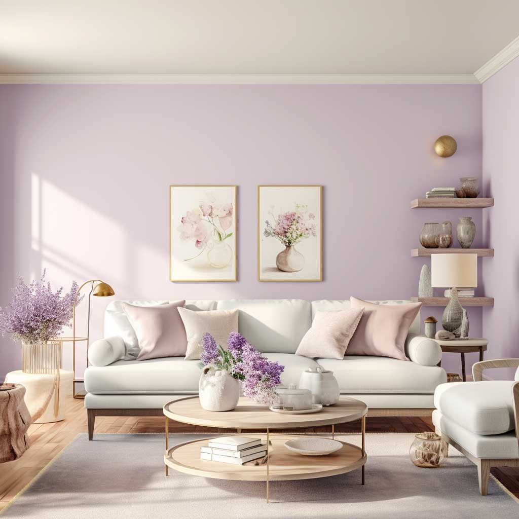
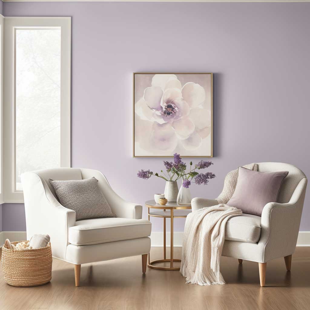
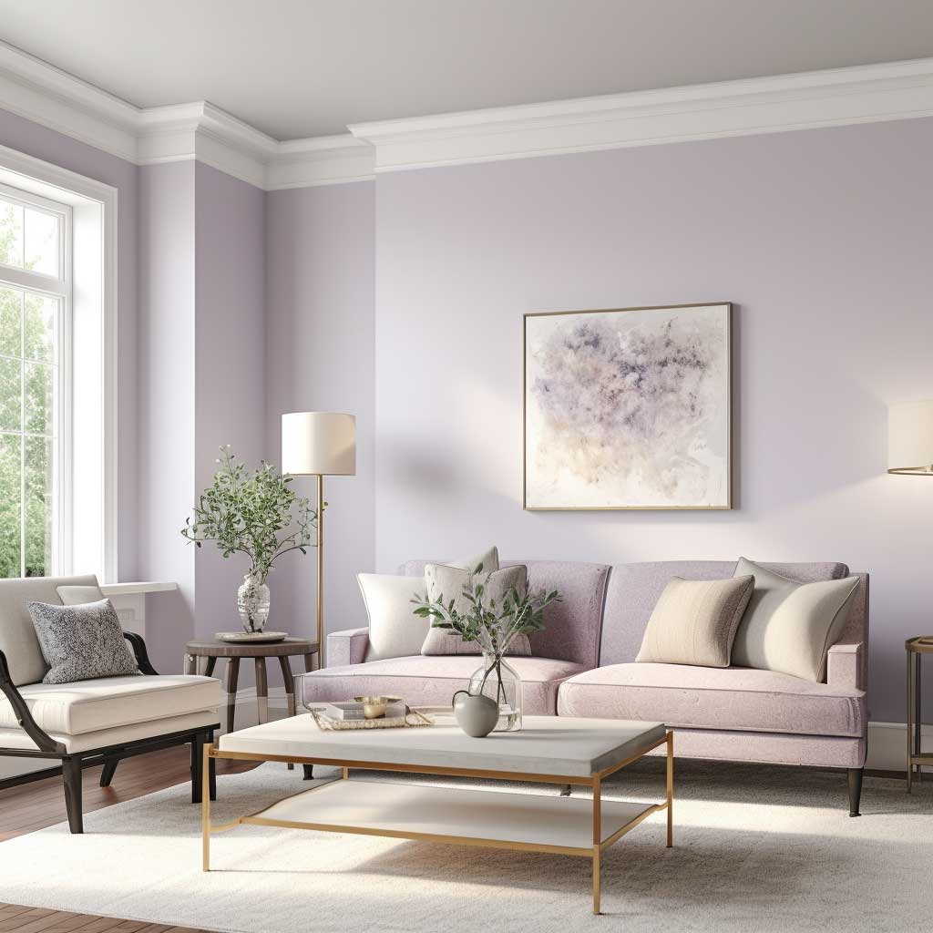
Lavender is the colour most people talk themselves out of, and I’ve watched that decision cost them a room. The muted, almost-grey lavender I’m talking about — Benjamin Moore Violet Mist 1437, about $85/gallon — sits between purple and grey and behaves like neither. It reads warm in morning light and cool in evening light, which is exactly what you want in a small room that you use across multiple times of day. Think of it as a neutral that has slightly more personality than greige.
Why does it work in small spaces specifically? The grey undertone prevents it from advancing toward you the way saturated purples do. A soft lavender at LRV 60–68 sits in the same perceptual range as light grey — it doesn’t compress the room. You get the visual warmth of a colour decision without paying the spatial penalty. I own two rooms painted in this range and neither one has ever felt small to a first-time visitor.
The colour-scheme pairing that I’ve seen fail: lavender walls with pink or rose accents. The combination tips from calm into bedroom, and suddenly the living room looks unintentional. You want contrast anchors. Dark-stained oak, black picture frames, a deep navy throw pillow. Natural materials — linen, rattan, stone — all work. What doesn’t work is anything cream-to-blush in the same space. You end up with a room that reads like a meringue.
For two different wall colors in one room — a question I get regularly — lavender makes a surprisingly useful accent wall in combination with warm white on the remaining three. The lavender wall reads as the colour decision; the white walls recede and open the room. Tom’s Guide has a solid breakdown of which undertones make rooms feel bigger, and light lavender’s grey-blue base is exactly in that bracket. Skip full-room lavender if you have ceilings under 2.5 metres — one wall is enough to land the look without closing the space down.
The anti-advice here is blunt: don’t go full purple. Even slightly more saturated — Sherwin-Williams Lavender SW 6820 — reads as a committed colour choice and halves the perceived square footage. You need the grey in there. If the chip looks obviously purple on the paint swatch, it’s too far. The right shade looks almost beige until it’s on the wall. That’s how you know it’s correct.
For more on how these colours interact with complete sitting room schemes, this sitting room colour combination roundup shows how to extend the palette to furniture and trim.
Final Word
Pick the colour that holds up at 9 PM under your actual bulbs — not the one that looks right on your phone.
Warm white buys you maximum furniture flexibility. Sky blue earns its place in low-light rooms. Soft lavender is the one nobody expects to work until they see it in person.
Buy sample pots before committing to a gallon. Paint three 30cm squares directly on your wall. Check them at morning, afternoon, and evening. That 45-minute exercise will save you a full weekend of repainting.
Save this post and come back to it before your next hardware store run.
Related Topics