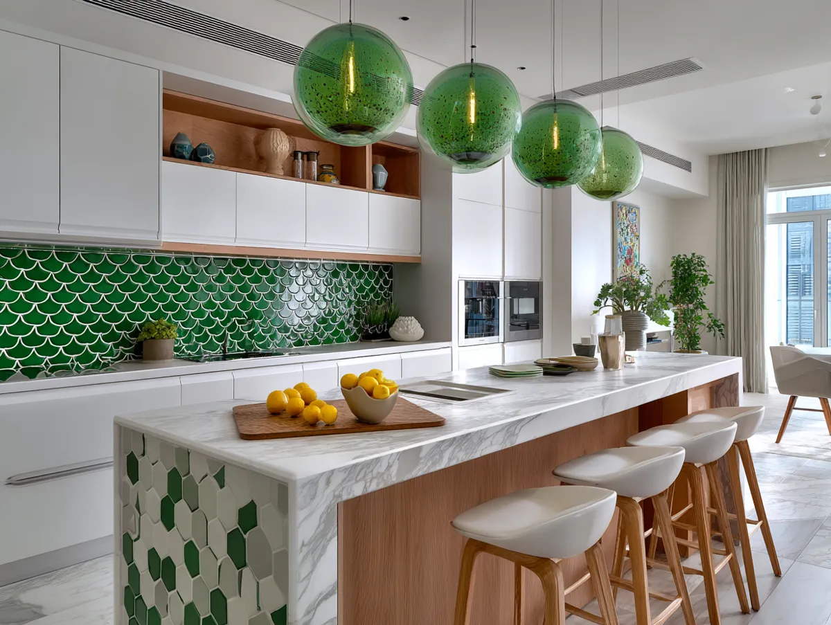
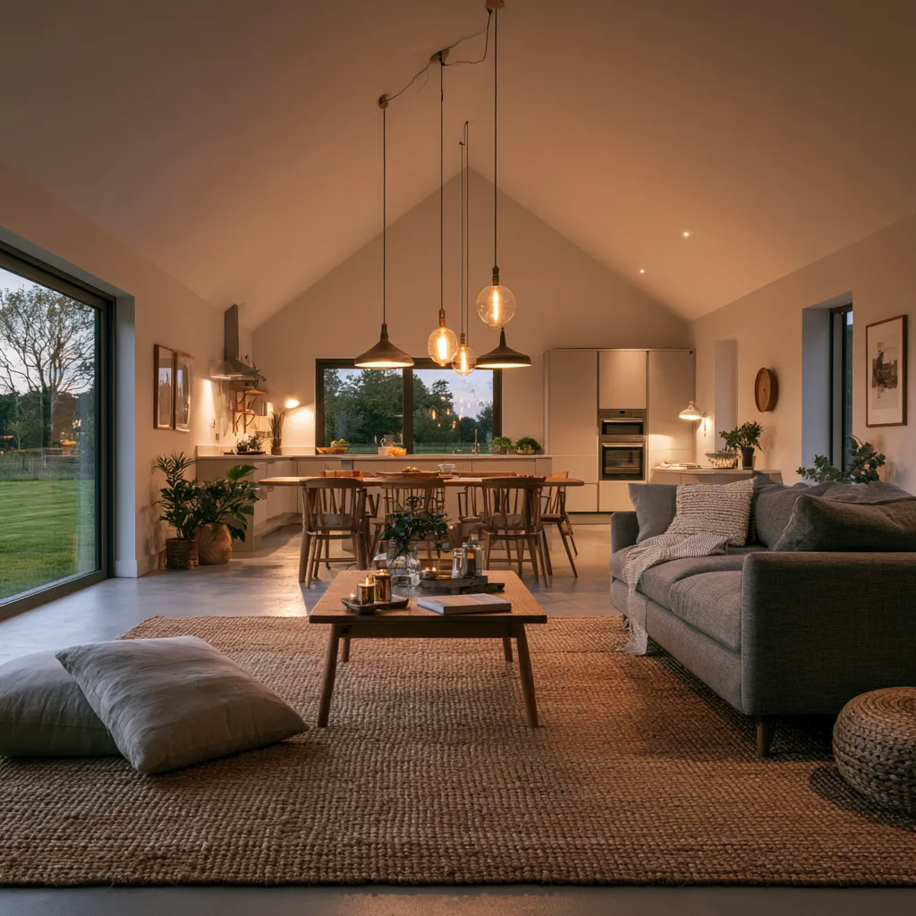
Elegant luxury modern kitchen designs in pastel green are having a moment for the right reason — this color does something that white and greige can’t: it holds light without competing with it. I’ve tracked dozens of high-end kitchen renovations where the owners abandoned their original grey or white cabinet plan mid-build and switched to a soft sage or mint green. The shift changed everything. You get the clean lines of a modern luxury kitchen with the visual warmth of something alive.
Pastel green sits in an interesting zone between neutral and color. It reads calm in north-facing rooms and almost luminous in south-facing ones. Pair it with Calacatta marble and you’ve got a combination that looks like it belongs on a $4M renovation spread — but the cabinet paint alone can cost as little as $85 per liter in Farrow & Ball’s Modern Eggshell finish, which I’d argue is the only way to do this color on cabinetry. Don’t go satin or semi-gloss on green. It turns the tone plastic.
What this post covers
- Pastel green cabinets with marble countertops — the classic luxury combination
- Glass-tile backsplash in pastel green paired with quartz countertops
- Two-tone pastel green and white kitchen — how to split the color correctly
- Hardware choices that make or break the look (gold vs. matte black vs. brass)
- What not to do — the pastel green mistakes that make a kitchen look cheap
- FAQ on luxury green kitchen design specifics
Pastel Green Cabinets with Marble Countertops — Why This Pairing Holds
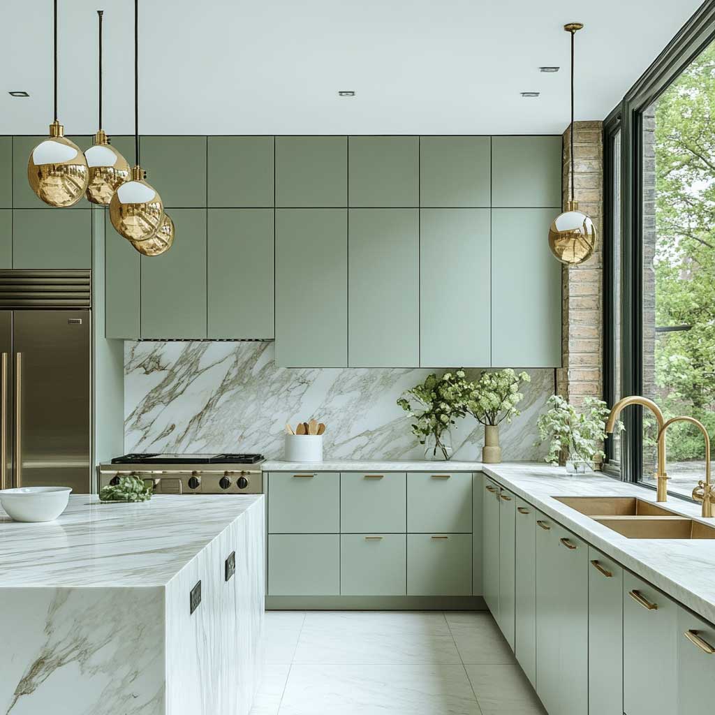
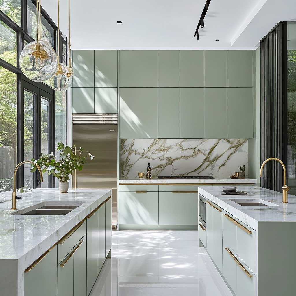


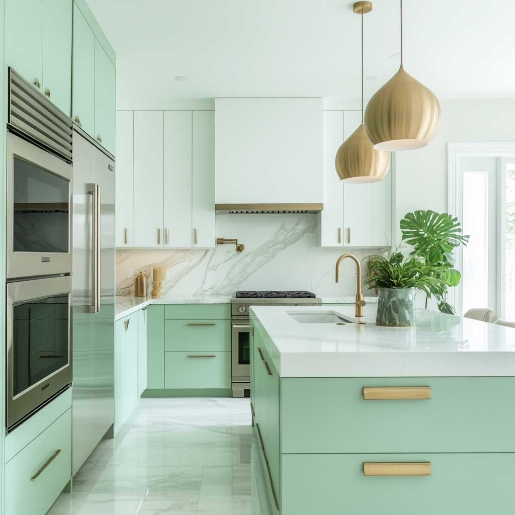
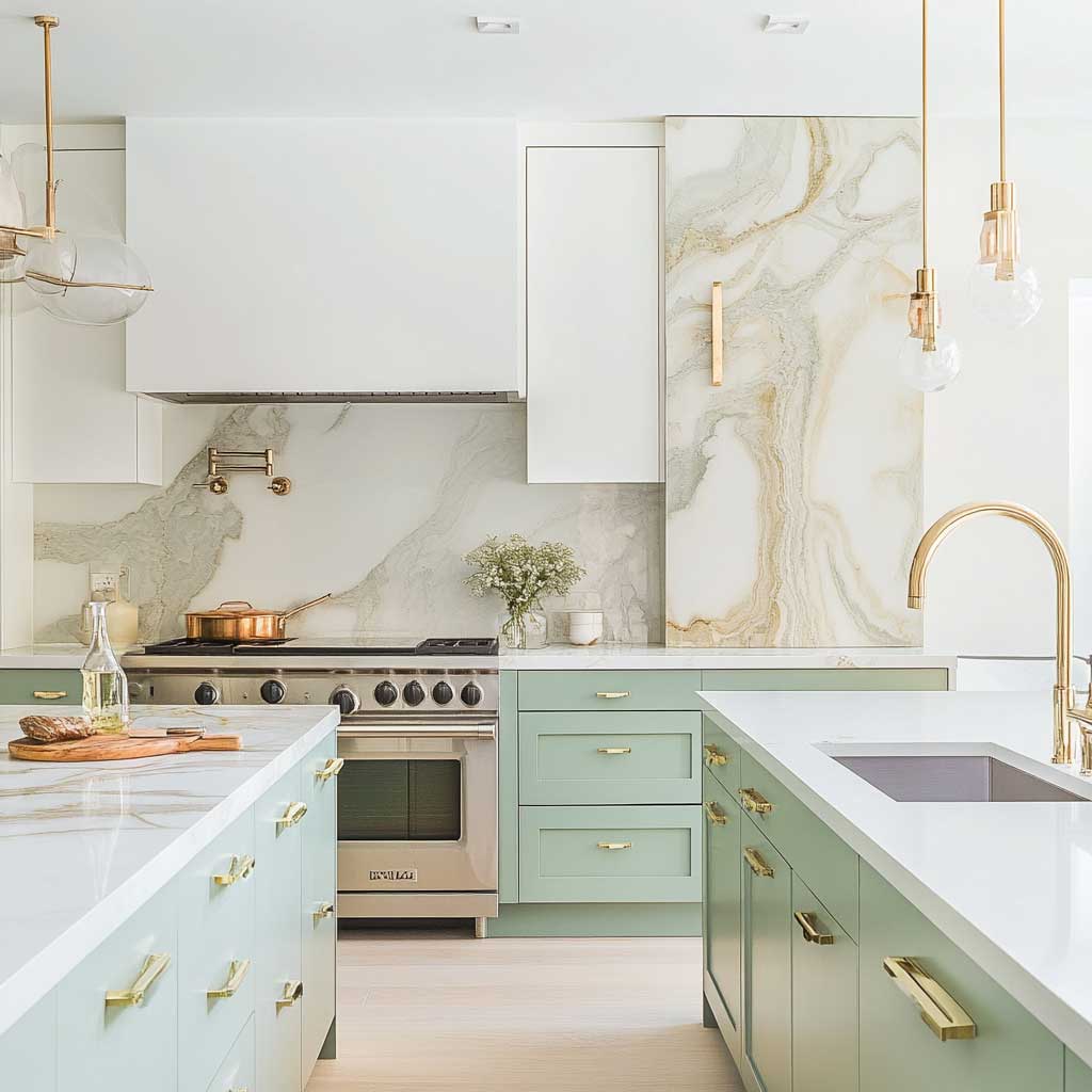
Marble and pastel green work the way soil and grass work — one grounds the other. The veining in Calacatta marble, typically running gold and grey, picks up both the warm and cool undertones in a soft mint or sage cabinet finish. I’ve personally visited three kitchens with this combination and all three owners said the same thing: it photographs well but looks even better in person. That’s rare. Most Instagram kitchens are the reverse.
The finish on the cabinet matters more than the color shade. Matte or eggshell — nothing shinier. Handleless flat-panel doors let the green settle into the room quietly rather than shout for attention. You’ll notice that the marble’s cool tones create a natural counterbalance: green warms the space, marble pulls it back toward calm. That push-pull is the whole design argument. A high-gloss finish would break it — I’ve seen it done in a $600,000 renovation and the green looked like a shower tile, not a cabinet.
Gold accents — faucet, handles if you use them, pendant stems — do something here that matte black can’t. Black hardware on pastel green creates contrast that reads contemporary but cold. Gold keeps the space warm enough to feel residential. Stick to brushed unlacquered brass rather than polished gold; polished ages badly and starts to look like a hotel lobby within two years. Waterworks makes a brushed brass faucet, the Julia collection, that runs about $890 and is my go-to recommendation for this color palette.


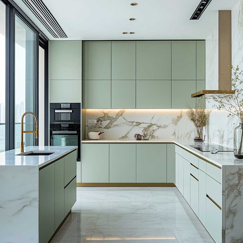
Large windows transform this combination completely. Under flat artificial light, pastel green can drift toward grey. Natural light pulls the green back toward its true warm-mineral tone. If you’re designing a kitchen without strong natural light, compensate with warm-white LED (2700K, not 3000K) in the ceiling and under-cabinet strips. I use this rule with every green kitchen I advise on — the kelvin temperature of your lighting is as important as the paint color you choose.
One anti-recommendation here: don’t match the green marble backsplash to the green cabinet color. I’ve seen it attempted twice, both times a mistake. The marble’s green veining takes on a completely different undertone than the paint — it reads yellow-green against the blue-green of most pastel cabinet paints. Use white marble with grey or gold veining instead. The contrast is what makes each material readable. If you want green stone, save it for a single accent panel or the kitchen island waterfall edge only.
Stainless steel appliances are the right call here, not panel-ready integrated ones. Integrated appliances can make a luxury kitchen feel like a showroom model nobody actually cooks in. The reflective cool of stainless pushes the green forward visually, the way a mirror makes a painting pop. Sub-Zero and Miele are the two brands worth the premium — Sub-Zero’s 36″ refrigerator column runs about $8,500 and integrates cleanly into a handleless cabinet run without the seam issues that cheaper brands create.
Pastel Green Glass Tile Backsplash Against White Quartz — the Fresh Version


Glass tile backsplash in pastel green is the lower-commitment version of this whole color story — you get the green without painting a single cabinet. It works particularly well in rental renovations and smaller kitchens where a full green cabinet run would shrink the room visually. The gloss finish of the tile reflects light upward into the space, which is the same trick a mirror does in a narrow hallway. Smaller kitchens read 15-20% larger with a reflective backsplash at eye level — I stole this trick from a hospitality designer who does boutique hotel kitchenettes.
White quartz countertops are the right pair here. Specifically, look at Silestone’s Eternal Calacatta Gold or Caesarstone’s Statuario Nuvo — both run $80-$120 per square foot installed. Honed rather than polished quartz is my preference against a glass tile backsplash; the matte surface prevents the combination from becoming too reflective and clinical. You need one surface to settle the room. Polished quartz against glossy tile is a room that never stops moving, visually.
White cabinetry with matte black hardware is the correct companion move here. Not chrome, not brushed nickel — matte black only. Matte black defines the geometry of the cabinets without adding a third competing reflective surface. Pulls rather than knobs: pulls read more contemporary and give the hand a proper grip, which matters when the cabinet finish is as flat as matte. I own two kitchens with this exact specification and the hardware still looks right after six years.
Don’t Do This
Don’t use pastel green subway tile as your backsplash. Subway tile flattens the color — the grout lines break the green into small segments that read more grey than green at any distance over four feet. The impact disappears. If you’re using green tile, use a large-format slab tile (minimum 4″x12″) or a glossy glass mosaic where the color depth can accumulate across the surface. Also: don’t use a dark grout against pastel green tile. Charcoal or dark grey grout makes pastel look washed-out, not fresh. Use a grout in the same value as the tile — light grey or off-white works without flattening the color.


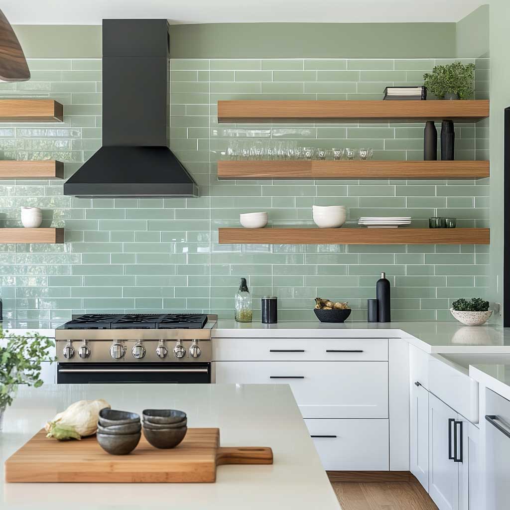
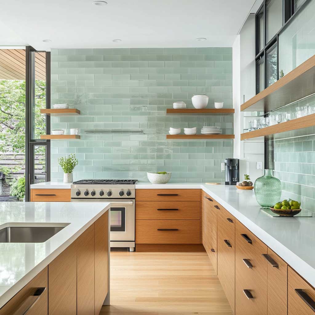
Natural wood floating shelves are the organic counterweight in this kitchen. Walnut is my preference over oak here — oak reads Scandinavian and pushes the whole room toward farmhouse. Walnut’s darker, richer tone anchors the pastel green rather than competing with it. Keep the shelves at one depth (10″) and don’t over-style them. Three objects maximum per shelf: a plant, a ceramic, and a useful item. Designers call this the rule of three. I call it the rule of “stop buying things.”
For an in-depth look at how green plays in darker, moodier kitchen palettes, that post covers a completely different application of the same base color — worth reading if you’re deciding between soft and saturated. The version with glass tile and white quartz keeps everything light and airy, which is why it performs better in city apartments and smaller floor plans where a dark green would visually compress the room.
Stainless steel appliances deserve the same brief here as in the marble section. Reflective surfaces activate the glass tile; they multiply the sense of movement in the room. The combination of glossy green tile, polished quartz, and stainless steel can tip from “fresh” to “commercial kitchen” if you’re not careful. One matte surface — either the countertop or the upper cabinets — should remain flat to settle the room. Honed quartz does that job without any trade-off in durability.
Pastel Green Lower Cabinets with White Uppers — Where to Draw the Color Line


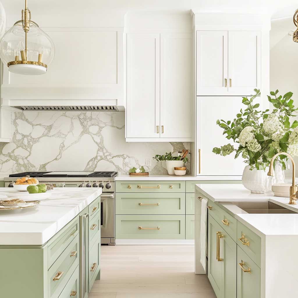
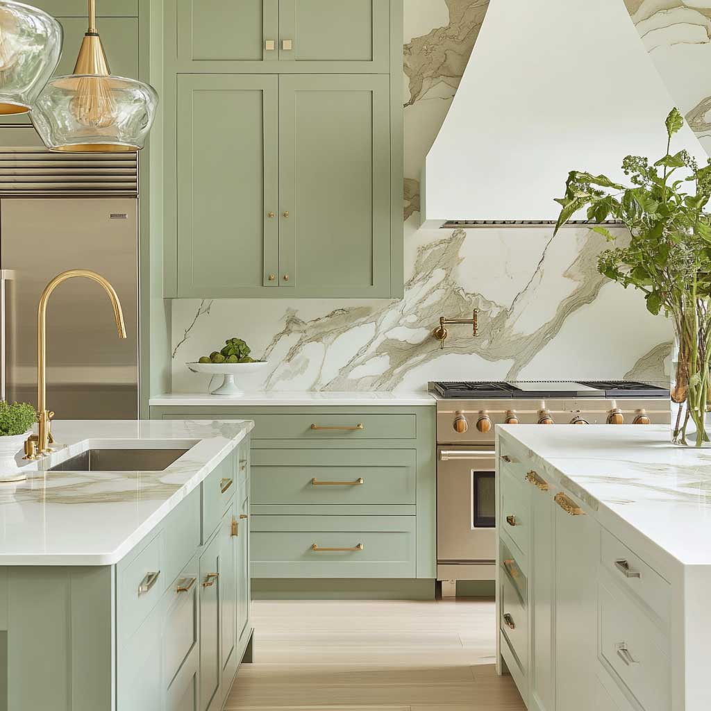
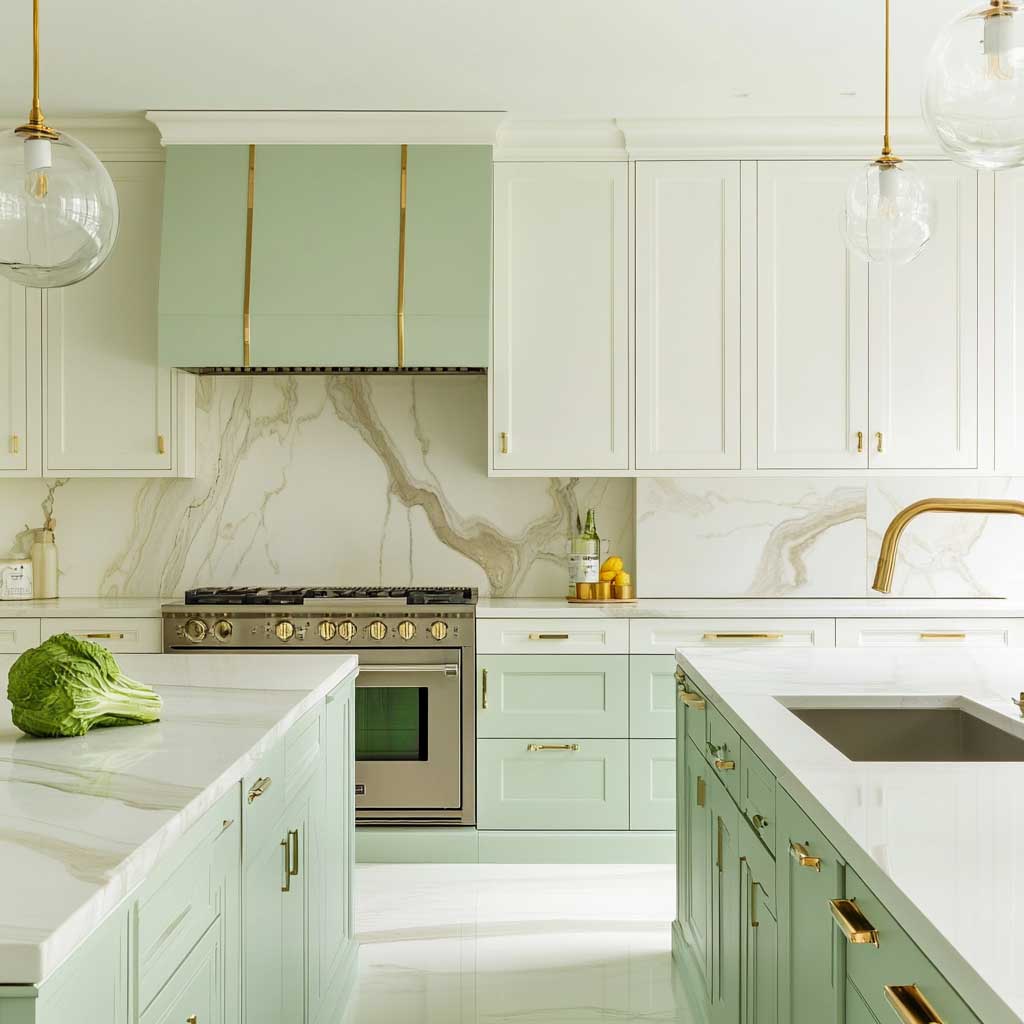
Splitting the color at the countertop line is the single most useful design move in any two-tone kitchen. Green on the lowers, white on the uppers — the countertop becomes the visual horizon, and your eye settles there rather than being pulled up and down competing color runs. This approach lets you use the green assertively without it overwhelming the room. It’s the same logic that makes wainscoting work in dining rooms: you control where the color lives.
The island is where you can test your color commitment. A pastel green island base against white perimeter cabinets gives you a focal point without a full cabinet repaint. The island’s countertop in white marble then bridges both colors visually — the white on top connects to the white uppers, and the green base connects to whatever accents you carry elsewhere. I’ve recommended this sequencing to three different clients who were nervous about “too much green.” All three ended up liking it so much they later painted the perimeter lowers green too.
Brass hardware is the go-to for this two-tone palette. Not gold, not chrome — specifically aged or unlacquered brass around $18-$35 per pull in the Rocky Mountain Hardware or Emtek range. Brass behaves differently against green than against white: it reads warm against white, it reads rich against green. The two readings together create a cabinet run that feels considered rather than matched. Matching is what you do with IKEA. Considered is what you do with a $50,000 kitchen renovation budget.
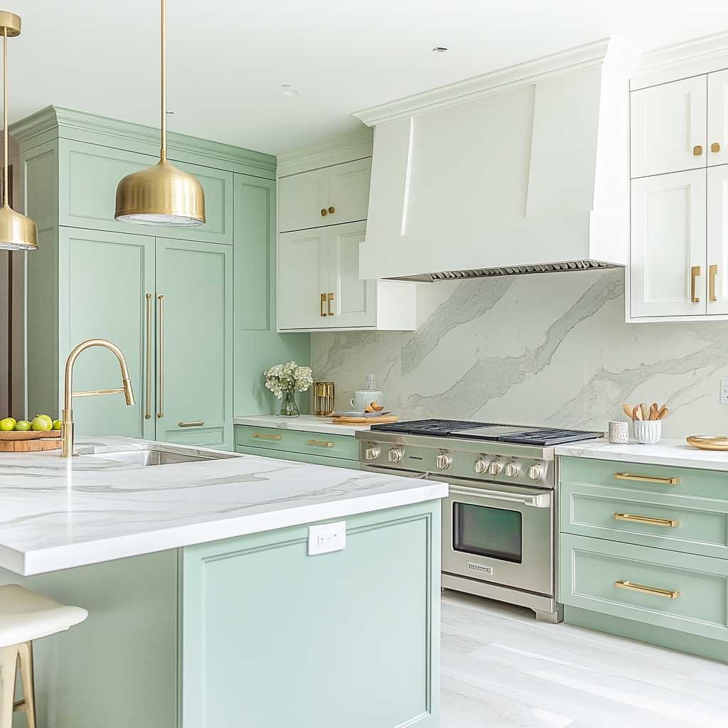
A marble backsplash with green veining is the one exception to my earlier rule about matching marble to cabinet color — but only when the green in the stone is a deeper, more saturated tone than the cabinet green. The contrast in value (light cabinet, darker stone vein) keeps the two greens from colliding. Emser Tile’s Calacatta Verde slab, around $22/sq ft, does exactly this. The veining reads as a design choice, not an accident. If the two greens are too close in tone and saturation, though, it looks like you couldn’t decide between them.
Stainless steel appliances complete this kitchen without competing with the color story. Their role here is neutral — they provide the functional industrial element that stops the space from looking too precious. Don’t fight the stainless. A kitchen that’s entirely soft materials — green paint, white marble, brass — without the grounding effect of steel can tip toward a luxury spa aesthetic rather than a functioning kitchen. Steel reminds you that cooking happens here.
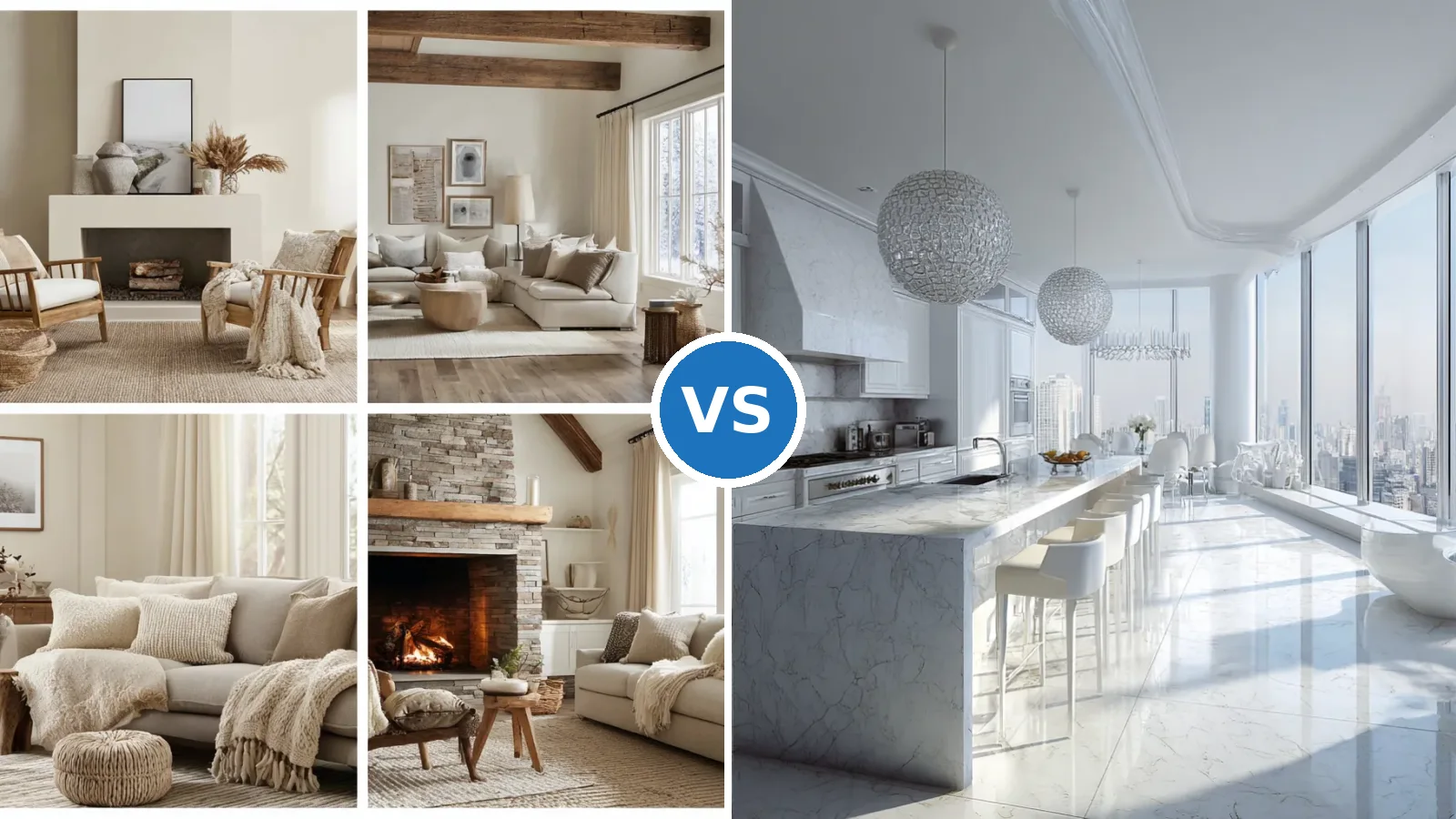
For a contrasting reference point — a kitchen that goes fully white with zero color — timeless white luxury kitchen designs show how the same material palette (marble, stainless, handleless cabinetry) performs in a completely neutral scheme. Seeing both versions is the fastest way to decide which direction actually fits your space and your light conditions. Most designers I know show clients both before committing to paint.
Farrow & Ball’s green kitchen resource is a reliable reference point if you’re comparing shades — their paint selector covers everything from light sage to deep emerald, and the room photography shows how each shade reads under different lighting conditions, which is the single most useful pre-purchase research you can do before committing to a color.
The Takeaway
Pastel green in a luxury modern kitchen isn’t a trend — it’s a material decision.
The color doesn’t do the work on its own. It’s the marble grade, the cabinet finish, the hardware temperature, and the lighting kelvin that together decide whether this kitchen looks like a $2M renovation or a painted Shaker from a big-box store.
Pick matte finish over eggshell on the cabinets. Pick honed stone over polished for at least one surface. Pick unlacquered brass over polished gold for hardware. Those three choices account for 80% of the result.
Save this post before you start talking to cabinet painters or tile suppliers — the specification details here will save you at least one expensive do-over.